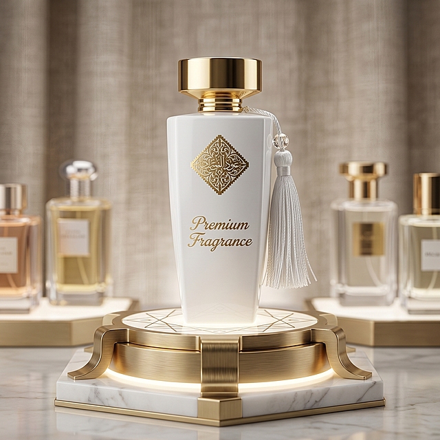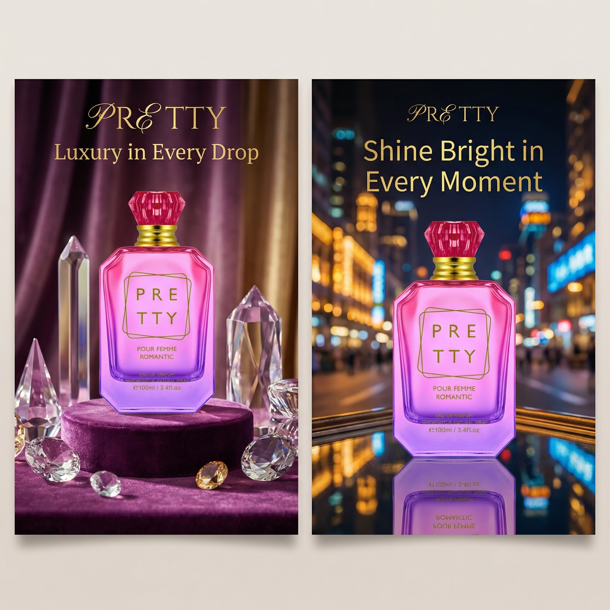

创意预览图

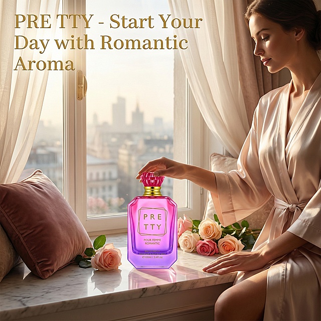
为这款100ml香水,生成7张宣传海报,含人像展示图,卖点集合图(卖点列表展示),场景使用图,香调图,调性图,图片尺寸比例1:1,高级调性,符合欧美审美,海报上的文案是英文,不能有中文,贴合产品卖点,

用户头像

67i16cvgf2n...

2026.01.21
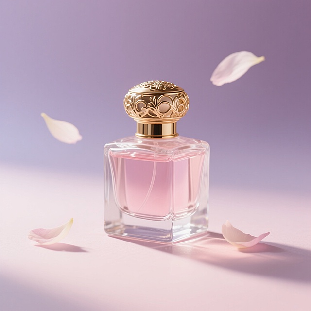
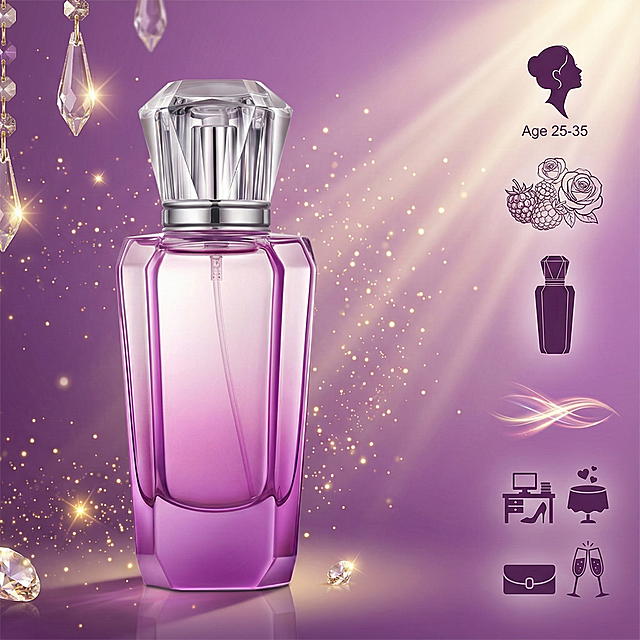
为这款50ml女士香水,生成7张宣传海报,含人像展示图,卖点集合图(卖点列表展示),场景使用图,香调图,调性图,图片尺寸比例1:1,高级调性,符合欧美审美,海报上的文案是英文,不能有中文,贴合产品卖点,卖点参考以下: 1. 客群卖点 精准匹配 25-35 岁「优雅轻奢质感派」都市女性 —— 偏爱 “柔而有层次” 的香调,既痴迷花香的温柔氛围,又拒绝甜腻平庸,追求日常精致与场合气场的双重适配。 2. 香味卖点 「清甜转灵动的轻奢层次香」: 前调树莓 + 玫瑰:以清甜浆果裹着柔玫瑰开场,是不齁甜的鲜活女性感,开篇自带轻盈温柔; 中调醋栗叶 + 粉红胡椒 + 牡丹茉莉:醋栗叶添清新、粉红胡椒缀一丝微辛灵动,叠上牡丹茉莉的柔,让花香调告别单调,层次更显精致; 后调香草 + 雪松:香草暖化甜感,雪松衬出沉稳木质调,甜而不飘,收尾是轻奢优雅的余韵。 3. 外观卖点 「梳妆台摆件级紫钻香水瓶」: 紫色钻石切割瓶身 + 透明钻面瓶盖,自带轻奢华丽质感,摆置是颜值装饰,补香时掏出自带精致气场; 50ml 小巧尺寸,兼顾日常通勤携带与使用时长,精致与实用双在线。 4. 调性卖点 「优雅带灵动的轻奢柔美感」:没有传统花香调的软塌感,是 “紫钻瓶裹着层次香” 的精致特质 —— 清甜开场显温柔、微辛中调添灵动、暖质后调撑气场,适配女性多场合的气质切换。 5. 适用场景卖点 「多场合适配的精致气质香」: 职场通勤:柔香不扰人,紫钻瓶补香显质感; 约会 / 轻社交:层次花香衬出优雅灵动氛围; 轻奢聚会 / 小晚宴:华丽瓶身 + 精致香调,轻松撑得起场合质感。为这款50ml女士香水,生成7张宣传海报,含人像展示图,卖点集合图(卖点列表展示),场景使用图,香调图,调性图,图片尺寸比例1:1,高级调性,符合欧美审美,海报上的文案是英文,不能有中文,贴合产品卖点,卖点参考以下:
1. 客群卖点
精准匹配 25-35 岁「优雅轻奢质感派」都市女性 —— 偏爱 “柔而有层次” 的香调,既痴迷花香的温柔氛围,又拒绝甜腻平庸,追求日常精致与场合气场的双重适配。
2. 香味卖点
「清甜转灵动的轻奢层次香」:
前调树莓 + 玫瑰:以清甜浆果裹着柔玫瑰开场,是不齁甜的鲜活女性感,开篇自带轻盈温柔;
中调醋栗叶 + 粉红胡椒 + 牡丹茉莉:醋栗叶添清新、粉红胡椒缀一丝微辛灵动,叠上牡丹茉莉的柔,让花香调告别单调,层次更显精致;
后调香草 + 雪松:香草暖化甜感,雪松衬出沉稳木质调,甜而不飘,收尾是轻奢优雅的余韵。
3. 外观卖点
「梳妆台摆件级紫钻香水瓶」:
紫色钻石切割瓶身 + 透明钻面瓶盖,自带轻奢华丽质感,摆置是颜值装饰,补香时掏出自带精致气场;
50ml 小巧尺寸,兼顾日常通勤携带与使用时长,精致与实用双在线。
4. 调性卖点
「优雅带灵动的轻奢柔美感」:没有传统花香调的软塌感,是 “紫钻瓶裹着层次香” 的精致特质 —— 清甜开场显温柔、微辛中调添灵动、暖质后调撑气场,适配女性多场合的气质切换。
5. 适用场景卖点
「多场合适配的精致气质香」:
职场通勤:柔香不扰人,紫钻瓶补香显质感;
约会 / 轻社交:层次花香衬出优雅灵动氛围;
轻奢聚会 / 小晚宴:华丽瓶身 + 精致香调,轻松撑得起场合质感。
为这款100ml女士香水,生成6张宣传海报,中东风格,图片尺寸比例1:1,高级调性,符合欧美审美,海报上的文案是英文,不能有中文,贴合产品卖点,卖点参考以下:1. 客群卖点 精准击中 20-35 岁「甜系复古爱好者」—— 偏爱 “少女感 + 精致仪式感” 的风格,既痴迷清甜柔香的温柔感,又爱复古雕花外观带来的装饰级精致度。 2. 香味卖点 「甜而不腻的复古柔润香」: 前调:草莓果肉 + 白桃蜜露 + 铃兰,是咬开粉润鲜果的清甜开场,不冲不齁,自带少女感; 中调:千叶玫瑰 + 茉莉 + 鸢尾花,叠出复古柔花香,像裹着一层细腻甜纱,温柔不张扬; 后调:香草奶油 + 雪松 + 琥珀,用暖润琥珀替代麝香,甜感落得柔和沉稳,余韵是精致的复古温润。 3. 外观卖点 「装饰级甜粉复古香水瓶」: 粉色浮雕雕花 + 复古时钟设计,自带甜系复古精致感,摆在梳妆台既是香水瓶,也是颜值摆件; 100ml 大容量,兼顾日常使用时长与收藏质感,甜妹精致仪式感拉满。 4. 调性卖点 「甜系复古的柔润少女感」:没有廉价甜香的张扬,是 “粉雕复古瓶裹着柔润甜香” 的细腻质感 —— 甜得温柔、复古得柔和,衬出少女的精致底气。 5. 适用场景卖点 「甜系氛围适配的全休闲香」: 约会 / 闺蜜下午茶:柔甜香调衬出少女感,搭复古穿搭更出片; 居家放松:裹着甜润香氛添生活仪式感; 日常通勤:轻甜感不扰人,悄悄衬出精致气质。为这款100ml女士香水,生成6张宣传海报,中东风格,图片尺寸比例1:1,高级调性,符合欧美审美,海报上的文案是英文,不能有中文,贴合产品卖点,卖点参考以下:1. 客群卖点
精准击中 20-35 岁「甜系复古爱好者」—— 偏爱 “少女感 + 精致仪式感” 的风格,既痴迷清甜柔香的温柔感,又爱复古雕花外观带来的装饰级精致度。
2. 香味卖点
「甜而不腻的复古柔润香」:
前调:草莓果肉 + 白桃蜜露 + 铃兰,是咬开粉润鲜果的清甜开场,不冲不齁,自带少女感;
中调:千叶玫瑰 + 茉莉 + 鸢尾花,叠出复古柔花香,像裹着一层细腻甜纱,温柔不张扬;
后调:香草奶油 + 雪松 + 琥珀,用暖润琥珀替代麝香,甜感落得柔和沉稳,余韵是精致的复古温润。
3. 外观卖点
「装饰级甜粉复古香水瓶」:
粉色浮雕雕花 + 复古时钟设计,自带甜系复古精致感,摆在梳妆台既是香水瓶,也是颜值摆件;
100ml 大容量,兼顾日常使用时长与收藏质感,甜妹精致仪式感拉满。
4. 调性卖点
「甜系复古的柔润少女感」:没有廉价甜香的张扬,是 “粉雕复古瓶裹着柔润甜香” 的细腻质感 —— 甜得温柔、复古得柔和,衬出少女的精致底气。
5. 适用场景卖点
「甜系氛围适配的全休闲香」:
约会 / 闺蜜下午茶:柔甜香调衬出少女感,搭复古穿搭更出片;
居家放松:裹着甜润香氛添生活仪式感;
日常通勤:轻甜感不扰人,悄悄衬出精致气质。
[单张主图] LEION VETRTS Daisy Pearl Fresh Eau de Toilette, long-lasting floral fragrance for women. This is a premium atmospheric main image for Amazon cross-border e-commerce, following the high-level atmospheric route. [Reference comparison] The input image provides product appearance details, and the generation strictly retains the product shape, color and decorative elements. [Screen subject] The perfume bottle is placed on the right side of the picture, accounting for about 50% of the picture. Keep the appearance (physical structure, material texture, color, LOGO, daisy and pearl decoration) of this perfume completely consistent with the input product image, eliminate any deformation and color difference, and deal with it carefully. [Composition layout] Adopt the left text and right object scene layout. The left side retains a large area of soft light blank for text placement, and the product is placed on the right side and magnified, and the bottom is supported by light wood grain tabletop. [Scene elements] The background is a low-saturation cream white soft mist gradient, with fresh daisy petals and natural light and shadow falling, soft light and foggy effects, creating a fresh and natural atmosphere, which sets off the product without grabbing the focus. Add 3 thin-line light-colored ICONs at the bottom to correspond to the three selling points respectively. [Copy layout] LEION VETRTS on the top left, DAISY PEARL on the second line, the main title FRESH LONG-LASTING FLORAL in large characters, the auxiliary subtitle LIGHT FRAGRANCE FOR DAILY COMMUTE in small characters. The bottom three light ICONs correspond to the selling point texts: DAISY FLORAL, 8H LONG-LASTING, PREMIUM GLASS. All texts are in English, the text is clear and legible, and placed in the blank space without blocking the perfume. [Light and shadow texture] Main light is natural soft window light from the upper left, auxiliary light fills the right side, the projection is soft and light, the glass bottle highlights the transparent light transmission feeling, the liquid has a warm golden glossy, the petals have clear layers, the overall picture is clean, transparent and high-level, the depth of field is slightly fanned out, and the commercial product photography has a high-level texture. [Color matching font] Main color is cream white, auxiliary color is champagne gold and light leaf green, emphasizing the fresh and gentle atmosphere. The font uses light sans-serif, the main title is larger and thicker, the auxiliary text is smaller, the layers are clear, and the word color has strong contrast with the background. [Proportion resolution] 1:1 proportion, 2K resolution, text is clear and distinguishable, ultra HD. [Negative prompt] Deformation, text confusion, blurred product drawing, cluttered background, watermark, e-commerce platform Logo, Chinese characters, text blocking subject, color difference.[单张主图] LEION VETRTS Daisy Pearl Fresh Eau de Toilette, long-lasting floral fragrance for women. This is a premium atmospheric main image for Amazon cross-border e-commerce, following the high-level atmospheric route. [Reference comparison] The input image provides product appearance details, and the generation strictly retains the product shape, color and decorative elements. [Screen subject] The perfume bottle is placed on the right side of the picture, accounting for about 50% of the picture. Keep the appearance (physical structure, material texture, color, LOGO, daisy and pearl decoration) of this perfume completely consistent with the input product image, eliminate any deformation and color difference, and deal with it carefully. [Composition layout] Adopt the left text and right object scene layout. The left side retains a large area of soft light blank for text placement, and the product is placed on the right side and magnified, and the bottom is supported by light wood grain tabletop. [Scene elements] The background is a low-saturation cream white soft mist gradient, with fresh daisy petals and natural light and shadow falling, soft light and foggy effects, creating a fresh and natural atmosphere, which sets off the product without grabbing the focus. Add 3 thin-line light-colored ICONs at the bottom to correspond to the three selling points respectively. [Copy layout] LEION VETRTS on the top left, DAISY PEARL on the second line, the main title FRESH LONG-LASTING FLORAL in large characters, the auxiliary subtitle LIGHT FRAGRANCE FOR DAILY COMMUTE in small characters. The bottom three light ICONs correspond to the selling point texts: DAISY FLORAL, 8H LONG-LASTING, PREMIUM GLASS. All texts are in English, the text is clear and legible, and placed in the blank space without blocking the perfume. [Light and shadow texture] Main light is natural soft window light from the upper left, auxiliary light fills the right side, the projection is soft and light, the glass bottle highlights the transparent light transmission feeling, the liquid has a warm golden glossy, the petals have clear layers, the overall picture is clean, transparent and high-level, the depth of field is slightly fanned out, and the commercial product photography has a high-level texture. [Color matching font] Main color is cream white, auxiliary color is champagne gold and light leaf green, emphasizing the fresh and gentle atmosphere. The font uses light sans-serif, the main title is larger and thicker, the auxiliary text is smaller, the layers are clear, and the word color has strong contrast with the background. [Proportion resolution] 1:1 proportion, 2K resolution, text is clear and distinguishable, ultra HD. [Negative prompt] Deformation, text confusion, blurred product drawing, cluttered background, watermark, e-commerce platform Logo, Chinese characters, text blocking subject, color difference.