已添加
登录/注册
把前面的4张都换成这样色彩搭配的色调,统一一下风格
把前面的4张都换成这样色彩搭配的色调,统一一下风格
1qphx8kisfh...
2026.01.29
创意延展 × 1
做同款
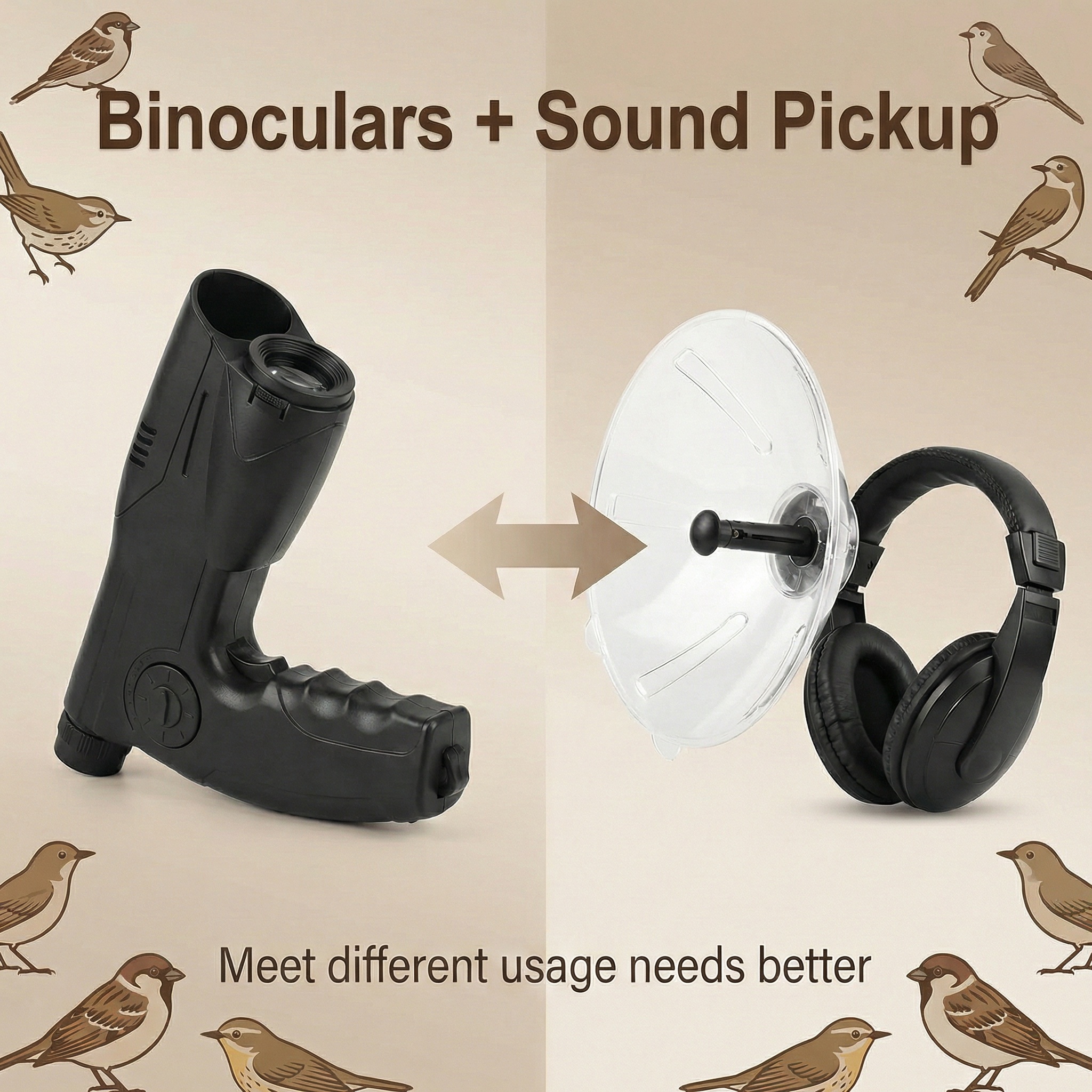
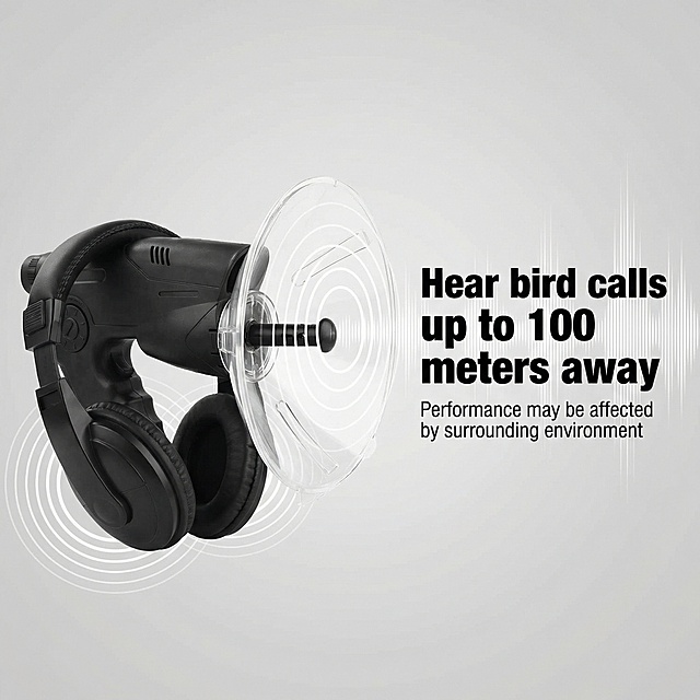
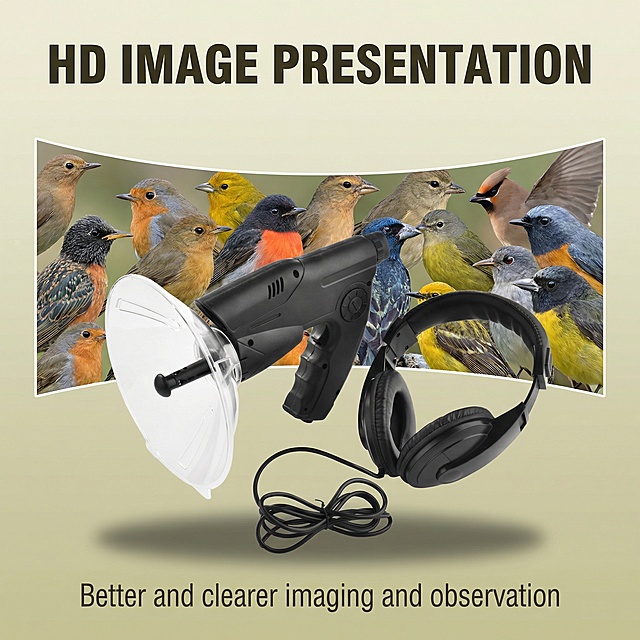
这是款8倍单筒听鸟望远镜 观鸟仪高清户外听鸟器 单筒望远镜 第一张产品主图:突出他的卖点 第2张图:可以听见约100米外鸟叫的声音 , 会受周边环境影响 第3张图:8X听鸟器,远程取景+专业听音 第4张图:望远镜+拾音器的组合更好满足不同需求使用 第5张图:高清画面呈现更好更清晰成像和观察 第6张图:白背景产品主图 第7张图:产品使用场景图 第8张图:透明集音罩,可控制声音大小集音轻松获取 生成图片尺寸1600*1600像素,文字用英文
1qphx8kisfh5yjfg-HB
这是款8倍单筒听鸟望远镜 观鸟仪高清户外听鸟器 单筒望远镜 第一张产品主图:突出他的卖点 第2张图:可以听见约100米外鸟叫的声音 , 会受周边环境影响 第3张图:8X听鸟器,远程取景+专业听音 第4张图:望远镜+拾音器的组合更好满足不同需求使用 第5张图:高清画面呈现更好更清晰成像和观察 第6张图:白背景产品主图 第7张图:产品使用场景图 第8张图:透明集音罩,可控制声音大小集音轻松获取 生成图片尺寸1600*1600像素,文字用英文
创意 × 1
1qphx8kisfh5yjfg-HB
把前面的4张都换成这样色彩搭配的色调,统一一下风格
创意 × 1
1qphx8kisfh5yjfg-HB
这是款8倍单筒听鸟望远镜 观鸟仪高清户外听鸟器 单筒望远镜 第一张产品主图:突出他的卖点 第2张图:可以听见约100米外鸟叫的声音 , 会受周边环境影响 第3张图:8X听鸟器,远程取景+专业听音 第4张图:望远镜+拾音器的组合更好满足不同需求使用 第5张图:高清画面呈现更好更清晰成像和观察 第6张图:白背景产品主图 第7张图:产品使用场景图 第8张图:透明集音罩,可控制声音大小集音轻松获取 生成图片尺寸1600*1600像素,文字用英文
1qphx8kisfh5yjfg-HB
这是款8倍单筒听鸟望远镜 观鸟仪高清户外听鸟器 单筒望远镜 第一张产品主图:突出他的卖点 第2张图:可以听见约100米外鸟叫的声音 , 会受周边环境影响 第3张图:8X听鸟器,远程取景+专业听音 第4张图:望远镜+拾音器的组合更好满足不同需求使用 第5张图:高清画面呈现更好更清晰成像和观察 第6张图:白背景产品主图 第7张图:产品使用场景图 第8张图:透明集音罩,可控制声音大小集音轻松获取 生成图片尺寸1600*1600像素,文字用英文
创意 × 1
1qphx8kisfh5yjfg-HB
这是款8倍单筒听鸟望远镜 观鸟仪高清户外听鸟器 单筒望远镜 第一张产品主图:突出他的卖点 第2张图:可以听见约100米外鸟叫的声音 , 会受周边环境影响 第3张图:8X听鸟器,远程取景+专业听音 第4张图:望远镜+拾音器的组合更好满足不同需求使用 第5张图:高清画面呈现更好更清晰成像和观察 第6张图:白背景产品主图 第7张图:产品使用场景图 第8张图:透明集音罩,可控制声音大小集音轻松获取 生成图片尺寸1600*1600像素,文字用英文
1qphx8kisfh5yjfg-HB
把前面的4张都换成这样色彩搭配的色调,统一一下风格
创意 × 1
1qphx8kisfh5yjfg-HB
这是款8倍单筒听鸟望远镜 观鸟仪高清户外听鸟器 单筒望远镜 第一张产品主图:突出他的卖点 第2张图:可以听见约100米外鸟叫的声音 , 会受周边环境影响 第3张图:8X听鸟器,远程取景+专业听音 第4张图:望远镜+拾音器的组合更好满足不同需求使用 第5张图:高清画面呈现更好更清晰成像和观察 第6张图:白背景产品主图 第7张图:产品使用场景图 第8张图:透明集音罩,可控制声音大小集音轻松获取 生成图片尺寸1600*1600像素,文字用英文
1qphx8kisfh5yjfg-HB
这是款8倍单筒听鸟望远镜 观鸟仪高清户外听鸟器 单筒望远镜 第一张产品主图:突出他的卖点 第2张图:可以听见约100米外鸟叫的声音 , 会受周边环境影响 第3张图:8X听鸟器,远程取景+专业听音 第4张图:望远镜+拾音器的组合更好满足不同需求使用 第5张图:高清画面呈现更好更清晰成像和观察 第6张图:白背景产品主图 第7张图:产品使用场景图 第8张图:透明集音罩,可控制声音大小集音轻松获取 生成图片尺寸1600*1600像素,文字用英文
创意 × 1
1qphx8kisfh5yjfg-HB
这是款8倍单筒听鸟望远镜 观鸟仪高清户外听鸟器 单筒望远镜 第一张产品主图:突出他的卖点 第2张图:可以听见约100米外鸟叫的声音 , 会受周边环境影响 第3张图:8X听鸟器,远程取景+专业听音 第4张图:望远镜+拾音器的组合更好满足不同需求使用 第5张图:高清画面呈现更好更清晰成像和观察 第6张图:白背景产品主图 第7张图:产品使用场景图 第8张图:透明集音罩,可控制声音大小集音轻松获取 生成图片尺寸1600*1600像素,文字用英文
1qphx8kisfh5yjfg-HB
把前面的4张都换成这样色彩搭配的色调,统一一下风格
创意 × 1
1qphx8kisfh5yjfg-HB
这是款8倍单筒听鸟望远镜 观鸟仪高清户外听鸟器 单筒望远镜 第一张产品主图:突出他的卖点 第2张图:可以听见约100米外鸟叫的声音 , 会受周边环境影响 第3张图:8X听鸟器,远程取景+专业听音 第4张图:望远镜+拾音器的组合更好满足不同需求使用 第5张图:高清画面呈现更好更清晰成像和观察 第6张图:白背景产品主图 第7张图:产品使用场景图 第8张图:透明集音罩,可控制声音大小集音轻松获取 生成图片尺寸1600*1600像素,文字用英文
创意 × 1
1qphx8kisfh5yjfg-HB
这是款8倍单筒听鸟望远镜 观鸟仪高清户外听鸟器 单筒望远镜 第一张产品主图:突出他的卖点 第2张图:可以听见约100米外鸟叫的声音 , 会受周边环境影响 第3张图:8X听鸟器,远程取景+专业听音 第4张图:望远镜+拾音器的组合更好满足不同需求使用 第5张图:高清画面呈现更好更清晰成像和观察 第6张图:白背景产品主图 第7张图:产品使用场景图 第8张图:透明集音罩,可控制声音大小集音轻松获取 生成图片尺寸1600*1600像素,文字用英文
1qphx8kisfh5yjfg-HB
这是款8倍单筒听鸟望远镜 观鸟仪高清户外听鸟器 单筒望远镜 第一张产品主图:突出他的卖点 第2张图:可以听见约100米外鸟叫的声音 , 会受周边环境影响 第3张图:8X听鸟器,远程取景+专业听音 第4张图:望远镜+拾音器的组合更好满足不同需求使用 第5张图:高清画面呈现更好更清晰成像和观察 第6张图:白背景产品主图 第7张图:产品使用场景图 第8张图:透明集音罩,可控制声音大小集音轻松获取 生成图片尺寸1600*1600像素,文字用英文
1qphx8kisfh5yjfg-HB
继续, 颜色都用第四张这个色
1qphx8kisfh5yjfg-HB
继续, 颜色都用第四张这个色
1qphx8kisfh5yjfg-HB
继续, 颜色都用第四张这个色
1qphx8kisfh5yjfg-HB
继续, 颜色都用第四张这个色
1qphx8kisfh5yjfg-HB
继续, 颜色都用第四张这个色
1qphx8kisfh5yjfg-HB
根据参考图生成新品环形筋膜枪肌肉按摩器详情页,切片效果设计,产品保持完整,突出英文"Portable & Compact",展示小巧便携特性,尺寸800X800,非白底背景,保持产品原图外观不变,欧美健身风格
1qibmj3g7t9PyBRA-HB
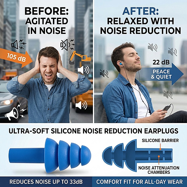
美区风格,左右分栏对比图:左侧是未佩戴耳塞的人在喧闹环境中烦躁捂耳,右侧是佩戴蓝色硅胶耳塞的人放松舒适,画面下方展示耳塞产品,突出使用前后的降噪效果差异,所有文字为英文,字体统一,突出产品主体和硅胶质感,2K画质
GD330150603
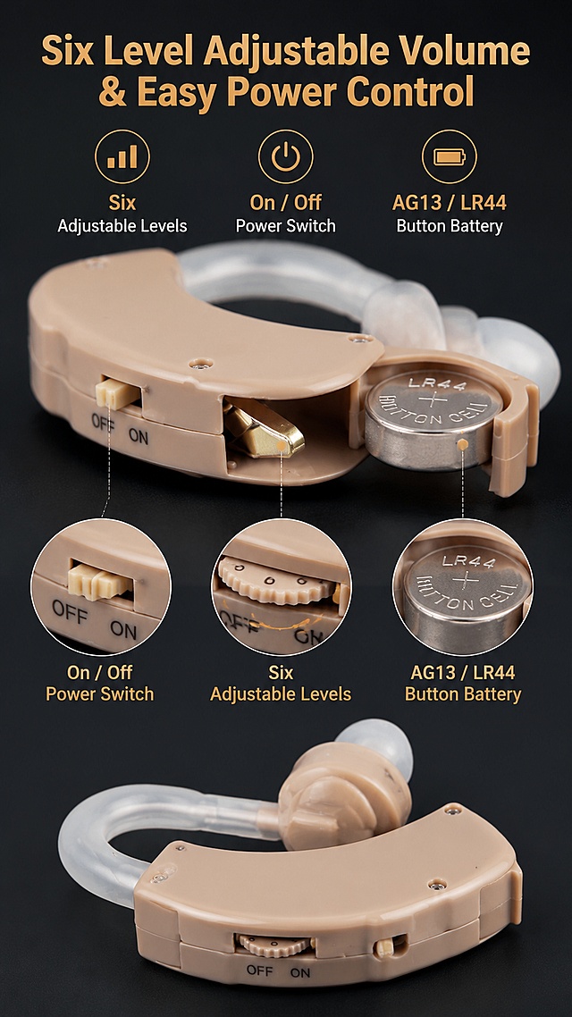
「图片1」,生成英文详情页,商品名称为:隐形助听器,「图片1」「图片1」「图片1」「图片1」「图片1」「图片1」适配其他跨境平台平台,单图比例为9:16,需求屏数为8张。产品信息:Hearing aid MaxSound Output: 130±5 dB MaxSound Gain: 55±5 dB Harmonic Wave Distortion:≤10%(1000Hz) FrequencyRange: 300-4500 Hz Input Noise:≤30 dB Battery: AG13 Button batteries (Randomly ship one battery or without battery.) Working Voltage: dc1.5V Working Current:≤3mA Color: As the picture shows Item Size: 3.8 x 2.1 x 0.9 x 3cm Package Size: 19 x 8.2 x 2cm Net Weight: 9g Package included 1 x JZ-1088A Hearing aid 3 x Earplug (different sizes) 1 x User manual 1 x Box ( optional ) Note 1.Adjust volume to the minimum before wearing. 2.Choose an earplug of slightly bigger size to avoid whistler. 3.Increase volume gradually to avoid sudden increase in sound. 4.If you hear a howling, check the ear (silica gel) is appropriate and whether the size of plug is tight, the appropriate choice of earplugs and plugged, make sure no air leakage. 5.Keep the ear plug clean 6.Remove the battery if you don't use it for long time.
用户r7mzbMAL
「图片1」,生成英文详情页,商品名称为:隐形助听器,「图片1」「图片1」「图片1」「图片1」「图片1」「图片1」适配其他跨境平台平台,单图比例为9:16,需求屏数为8张。产品信息:Hearing aid MaxSound Output: 130±5 dB MaxSound Gain: 55±5 dB Harmonic Wave Distortion:≤10%(1000Hz) FrequencyRange: 300-4500 Hz Input Noise:≤30 dB Battery: AG13 Button batteries (Randomly ship one battery or without battery.) Working Voltage: dc1.5V Working Current:≤3mA Color: As the picture shows Item Size: 3.8 x 2.1 x 0.9 x 3cm Package Size: 19 x 8.2 x 2cm Net Weight: 9g Package included 1 x JZ-1088A Hearing aid 3 x Earplug (different sizes) 1 x User manual 1 x Box ( optional ) Note 1.Adjust volume to the minimum before wearing. 2.Choose an earplug of slightly bigger size to avoid whistler. 3.Increase volume gradually to avoid sudden increase in sound. 4.If you hear a howling, check the ear (silica gel) is appropriate and whether the size of plug is tight, the appropriate choice of earplugs and plugged, make sure no air leakage. 5.Keep the ear plug clean 6.Remove the battery if you don't use it for long time.
用户r7mzbMAL
[第6屏] Comparison With Traditional Hearing Aids. This screen uses [image3] as the product display for our item. [Atmosphere/Style] Neutral comparison style, objective fair, clear column comparison, highlight advantages. [Element Layout] Left-right two column layout. Left column: "Traditional Hearing Aids", right column: "Our Neckband Bluetooth Hearing Aid". Each column has product position, three rows of comparison indicators: Appearance, Function, Operation. In right column, the product shape and structure are consistent with input image; each row compares the difference: traditional are bulky/only hearing aid/complex touch; our are stealthy/dual mode/physical buttons easy to operate. Comparison clear, do not denigrate other products, only show difference. [Light and Shadow] Uniform neutral light, both columns have same brightness, text and product all clear. [Color Scheme] Global background #f8f9fa; left column background #f5f5f5; right column background #e8f5e9; text dark gray, advantage checkmarks green. [Perspective Composition] Left-right comparison, clear contrast, reading flow from top indicators -> left-right comparison. [Text Layout] Main title at top: "What Makes Our Hearing Aid Different"; comparison indicators: "Appearance", "Functions", "Operation"; labels for each item, all English, clear readable text, checkmarks mark our advantages. [Proportion Resolution] 9:16 vertical ratio, 4K resolution, clear text, high definition. [Negative Prompt] Product deformation, color deviation, Chinese characters, watermark, text confusion, exaggerated bias
用户r7mzbMAL
超写实数码产品摄影。 主体:一对挂耳耳机严格参照上传产品图,完整保留所有可见组件、支架结构、轮廓、比例、银色金属材质、黑色海绵耳罩颜色,与上传图完全一致;耳机竖直展示放置在纯色背景前,自然融入光影,与场景共处同一物理空间,背景无其他同类电子产品。 构图:中长焦,正面平视,双耳机对称分布在画面两侧。 风格:极简产品摄影。 场景:干净简约电商展示场景。 空间承载:浅灰色微水泥背景台,干净简洁无杂物。 配色 / 材质:银灰 / 黑色 / 浅灰;金属 / 海绵 / 微水泥。 光影:主光从两侧斜前方45°打亮,均匀照亮耳机侧颜,金属呈现细腻反光,无明显硬阴影。 参数:4K超清写实。严格锁定宽高比为 9:16
创意 × 1
1r2dfukz6ld2vf7Q-HB











![[第6屏] Comparison With Traditional Hearing Aids. This screen uses [image3] as the product display for our item.
[Atmosphere/Style] Neutral comparison style, objective fair, clear column comparison, highlight advantages.
[Element Layout] Left-right two column layout. Left column: "Traditional Hearing Aids", right column: "Our Neckband Bluetooth Hearing Aid". Each column has product position, three rows of comparison indicators: Appearance, Function, Operation. In right column, the product shape and structure are consistent with input image; each row compares the difference: traditional are bulky/only hearing aid/complex touch; our are stealthy/dual mode/physical buttons easy to operate. Comparison clear, do not denigrate other products, only show difference.
[Light and Shadow] Uniform neutral light, both columns have same brightness, text and product all clear.
[Color Scheme] Global background #f8f9fa; left column background #f5f5f5; right column background #e8f5e9; text dark gray, advantage checkmarks green.
[Perspective Composition] Left-right comparison, clear contrast, reading flow from top indicators -> left-right comparison.
[Text Layout] Main title at top: "What Makes Our Hearing Aid Different"; comparison indicators: "Appearance", "Functions", "Operation"; labels for each item, all English, clear readable text, checkmarks mark our advantages.
[Proportion Resolution] 9:16 vertical ratio, 4K resolution, clear text, high definition.
[Negative Prompt] Product deformation, color deviation, Chinese characters, watermark, text confusion, exaggerated bias](https://gd-cms.dancf.com/gd-cms/xi19e5/0/856a9428-3fed-486d-b48d-f976564cd2dc16724.jpeg?x-oss-process=image/resize,w_640,type_6/sharpen,120/interlace,1)

