已添加
登录/注册
图1图2替换到图3
图1图2替换到图3
A匡威
2026.03.10
编辑
修复清晰换3个欧美儿童
A匡威
自动识别并移除右下角的文字水印“豆包AI生成”,自然修复被移除区域,保持原图尺寸、分辨率和内容对齐,输出干净无水印的图片,保留图片原有的所有内容、文字、风格和色彩不变
GD1257857662
自动识别并移除右下角的文字Logo水印,自然修复被移除区域,保持原图尺寸、分辨率和所有原始内容不变,输出干净无水印的图片
GD1257857662
自动识别并移除右下角的文字Logo水印,自然修复被移除区域,保持原图尺寸、分辨率和所有原始内容不变,输出干净无水印的图片
GD1257857662
自动识别并移除右下角的文字Logo水印,自然修复被移除区域,保持原图尺寸、分辨率和所有原始内容不变,输出干净无水印的图片
GD1257857662
[第1屏] 详情页头图-跨境新款多彩打印相机即拍即得拍立得相机新品宣传海报。本屏使用【图1】作为商品主体(正面展示),【图2】作为背面展示辅助。 [氛围/风格] 清新童趣活力风,奶黄暖色调,参考图风格,商业摄影质感,温馨明亮。 [元素布局] 拍立得相机置于画面中下偏右,正面展示,占比约55%-60%;相机出纸口吐出一张彩色照片;左上留标题区,背景为浅奶黄色渐变,点缀柔和光斑和云朵元素;左下角漂浮2-3张拍立得风格照片(儿童笑脸、生活场景);相机机身结构、颜色(白+奶黄)、按键布局、屏幕、镜头与输入产品图完全一致。 [光影质感] 左上方柔和自然光照明,右下自然投影,机身保留清晰高光,整体明亮通透,色彩饱和度适中。 [配色色系] 全局底色 #FFF9CC(浅奶黄色);主色奶黄+白色;辅助色深灰标题字、浅橙点缀。 [视角构图] 正面微仰视,产品为视觉中心,阅读动线左上标题 → 右侧产品 → 底部卖点标签。 [文字版式] 版式为左上大标题 + 右侧产品 + 底部卖点胶囊。主标题「即拍即得 秒拍秒印」,副标题「多彩打印 记录成长每一刻」,两行粗黑体左对齐;标题下小字英文装饰「Instant Print Camera」;底部3个圆角卖点胶囊:「双摄高清」「一键操作」「便携轻巧」;文字不遮挡相机主体。 [比例分辨率] 9:16 竖版比例,4K分辨率,文字清晰可辨,高清画质。 [负向提示词] 相机变形,缺件错件,颜色偏差,水印,文字错乱,文字过小,产品图模糊,背景杂乱,结构错误。
跟单 丰琴
ak47*
自动识别并移除右下角的文字Logo水印,自然修复被移除区域,保持原图尺寸、分辨率和所有原始内容不变,输出干净无水印的图片
GD1257857662
将图片缩成正方形比例,画面铺满不要留白,其余内容完全不变
GD388195156
自动识别并移除右下角的文字水印“豆包AI生成”,自然修复被移除区域,保持原图尺寸、分辨率和内容对齐,输出干净无水印的图片,保留图片原有的所有内容、文字、风格和色彩不变
GD1257857662
Double-sided design feature page. Use vertical slice layout to show both sides of the photo frame: left slice shows the front side holding two photos, right slice shows the back side holding another two photos. Highlight the feature that one frame can display 4 photos 6-inch each on double sides, double-sided design saves more desktop space. Use slice to separate the two views, product is not cut. Keep product structure, wood color, size completely consistent with original product. Prominent large English title "Double-Sided Design Holds 4 Photos". Background is modern neutral style not pure white. 800x800, commercial product photo, clear text, high definition. Show the rotating design and double-sided feature, one product per image.
GD710319684
自动识别并移除右下角的文字水印“豆包AI生成”,自然修复被移除区域,保持原图尺寸、分辨率和内容对齐,输出干净无水印的图片,保留图片原有的所有内容、文字、风格和色彩不变
GD1257857662
将图片缩成正方形比例,画面铺满无留白,其余内容完全不变
GD388195156
将图上所有中文替换为对应英文文案,整体风格、画面布局和产品展示保持不变,主标题翻译为 'Versatile Shapes' 和 'Creative Shooting Made Easy',正文文案翻译为 'Freely adjust to various shapes, meet diverse shooting needs, and enjoy unlimited creative exploration.'
1RoLnhG4
将图上所有中文替换为对应英文文案,整体风格、画面布局和产品展示保持不变,主标题翻译为 'Versatile Shapes' 和 'Creative Shooting Made Easy',正文文案翻译为 'Freely adjust to various shapes, meet diverse shooting needs, and enjoy unlimited creative exploration.'
1RoLnhG4
将图上所有中文替换为对应英文文案,整体风格、画面布局和产品展示保持不变,主标题翻译为 'Versatile Shapes' 和 'Creative Shooting Made Easy',正文文案翻译为 'Freely adjust to various shapes, meet diverse shooting needs, and enjoy unlimited creative exploration.'
1RoLnhG4
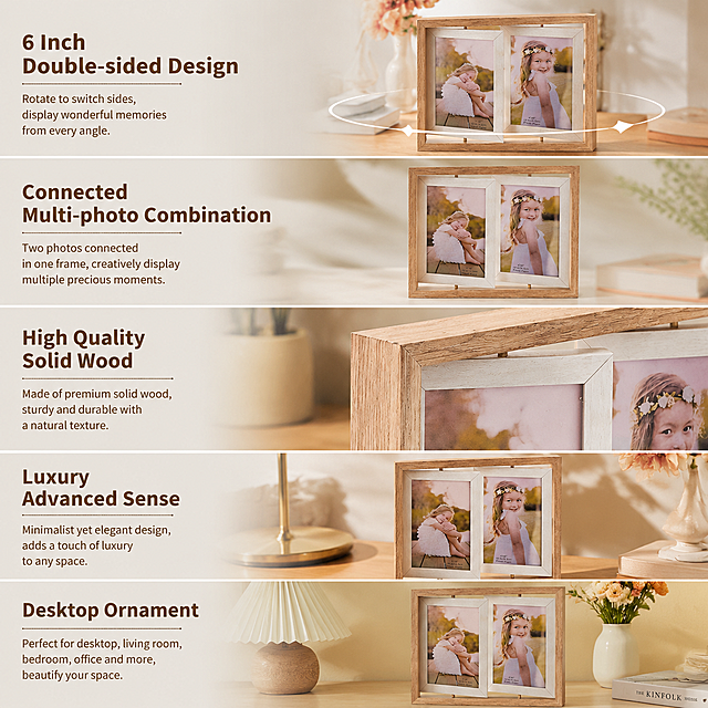
Feature details page. Use slice segmentation design, do not cut the product. Shows the core product features: 6 Inch double-sided design, connected multi-photo combination, high quality solid wood, luxury advanced sense, desktop ornament. Large prominent English feature titles next to each product slice section. Product is the creative European wooden double-sided couple rotating photo frame, keep product appearance 100% consistent with original image, do not change product. Each feature uses a slicing line to separate the text area from product area, highlight different features one by one. Background is warm modern home style not pure white. 800x800, high resolution, commercial product photo, clear English text, highlight each product feature. One product per image.
GD710319684
自动识别并移除右下角的文字Logo水印,自然修复被移除区域,保持原图尺寸、分辨率和所有原始内容不变,输出干净无水印的图片
GD1257857662
[Main Image 6] Upgraded Multi-color Ink Screen highlight main image. [Style & Atmosphere] Highlight display technology style, consistent with the overall set of styles, European and American cross-border style. [Picture Quality] Super clear commercial photography, high resolution, restore the ink screen display details, product shape consistent with the original. [Elements] Left side is the multi-color ink screen display effect of this product, showing a delicate color photo, right side is the comparison of traditional black and white ink screen, clearly highlight the upgrade advantage. The product is placed in the center, contrast display, the background is clean light gray, focus on the comparison effect. [Light & Shadow] Uniform soft light, clear display of the ink screen details, multi-color screen picture is delicate, high reduction, black and white screen contrast obvious, layered picture. [Color Matching] Multi-color screen natural color reproduction, contrast the black and white single tone, the contrast is obvious, the overall tone coordination. [Perspective & Composition] Left-right contrast composition, full screen no border, 1:1 proportion, prominent comparison theme. [Text Layout] Large title at the top: "Upgraded Multi-color Ink Screen Richer Colors Finer Picture", the two comparison areas are marked "Upgraded Multi-color" and "Traditional Black & White", all English text, clear contrast, prominent selling points. 2048px resolution, ultra HD. [Negative prompt] Deformed product, unclear screen, color distortion, text disorder, Chinese characters, extra messy elements
GD726445653
将图片背景替换为浅木色桌面,背景为简约家居环境,添加暖调自然光,保留原有的所有产品、文字和布局
1qjfd6t0taWrYKrQ-HB
保留原图中三台儿童拍立得相机的所有外观、颜色、结构、细节完全不变,产品本体之外的所有原有文字、图标、手持手机元素全部清除,替换为充满童趣的儿童乐园风格非纯色背景,背景包含柔和的马卡龙色卡通城堡、云朵装饰和浅彩色渐变地面,整体光影与产品自然融合,突出一次性胶片相机主体,画面和谐协调,在画面顶部添加醒目文字“儿童高清打印相机”,在画面中上部添加文字“升级彩色打印 告别普通款黑白打印!”,在画面底部添加文字“前后双摄像头丨护眼高清屏 丨蓝牙双用打印”,所有新增文字不遮挡相机产品,整体画面比例与原图保持一致,画质4K高清
GD388195156
保留原图中三台儿童拍立得相机的所有外观、颜色、结构、细节完全不变,产品本体之外的所有原有文字、图标、手持手机元素全部清除,替换为充满童趣的儿童乐园风格非纯色背景,背景包含柔和的马卡龙色卡通城堡、云朵装饰和浅彩色渐变地面,整体光影与产品自然融合,突出一次性胶片相机主体,画面和谐协调,在画面顶部添加醒目文字“儿童高清打印相机”,在画面中上部添加文字“升级彩色打印 告别普通款黑白打印!”,在画面底部添加文字“前后双摄像头丨护眼高清屏 丨蓝牙双用打印”,所有新增文字不遮挡相机产品,整体画面比例与原图保持一致,画质4K高清
GD388195156
[Page 7] AliExpress detail page - 4-Color HD Display vs traditional black and white ink screen comparison. [Atmosphere Style] Clear objective comparison, professional contrast layout. [Elements Layout] Top title, two comparison areas arranged left and right below. Left side is our product with 4-color display, right side is traditional black and white ink screen product. Use our product appearance consistent with input image (https://gdesign-dam-hz.dancf.com/36766293930002554/93b29b5cc21a4541ab10b75ef21616df.jpg), keep structure and color unchanged. Show the difference of screen display effect directly. [Lighting Texture] Even soft lighting, both products same lighting condition, clear contrast of display effect. [Color Scheme] Global background: #f8f9fa; Product display areas white background, make screen color stand out. [Perspective Composition] Left-right symmetrical comparison layout, eye-level perspective, both products fully visible. [Text Layout] Top title "4-Color HD Display Vivid & Eye-Friendly", left label "This Product: Four-Color Display", right label "Traditional: Only Black & White". Bottom summary text: "Supports rich colorful display, retains low blue light and eye-friendly, visible under sunlight. All English, no Chinese, title bold, labels clear, contrast obvious. [Proportion Resolution] 3:4 (9:16) vertical ratio, 4K resolution, text clearly recognizable, ultra high definition. [Negative prompt] Product deformation, color bias, contrast unclear, text confusion, Chinese characters, extreme words, watermark, messy background.
GD726445653
修改图片:去掉图中的白色长方形,去除所有原有文字,去除右上角小图里的白色边框;将图片改为正方形比例,画面铺满无留白;替换背景并将背景虚化,突出粉色拍立得相机;添加文字:标题"拍立得相机",文案"即拍即得,3秒出片,无墨更省心"、"先预览后打印,告别废片浪费",整体画面和谐,添加的文字不能遮盖相机,其余部分保持完全不变。
GD388195156
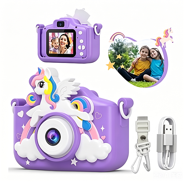
[第1屏] 详情页头图-儿童拇指相机新品宣传海报。本屏使用图1到图6作为不同颜色款式的商品主体,参考图10提取撞色排版风格。 [氛围/风格] 活力撞色潮流风,色彩明快,商业摄影质感,童趣数码产品氛围。 [元素布局] 6款不同配色相机错落排版展示在画面中下部,每个相机保持外观、结构、颜色与输入产品图一致;顶部预留大标题区域,文案区左上分层排版,产品占比约65%,背景搭配几何色块拼接装饰。 [光影质感] 顶部柔光打亮产品,产品下方自然投影,整体明亮通透,色彩饱和度适中,产品轮廓清晰。 [配色色系] 全局底色参考红、黄、蓝撞色拼接,主色红、黄、蓝三原色撞色,辅助色白色、浅灰。 [视角构图] 俯视排版,产品矩阵错落分布为视觉中心,阅读动线从上到下,标题区 → 产品矩阵 → 底部卖点标签。 [文字版式] 顶部主标题「童趣拇指相机」,副标题「随手记录美好童年」,大字体加粗左对齐;右上角两行卖点「高清拍照录像」「小巧便携随身」用白色圆角胶囊标签展示;左下角标注「多色可选满足喜好」;所有文字清晰不遮挡产品主体,符合移动端可读性要求。 [比例分辨率] 9:16竖版比例,4K分辨率,文字清晰可辨,高清画质。 [负向提示词] 产品变形,颜色偏差,缺件错件,结构错误,水印,文字错乱,文字过小,产品图模糊,背景杂乱。
6bmfrjtskzGMqWw-HB

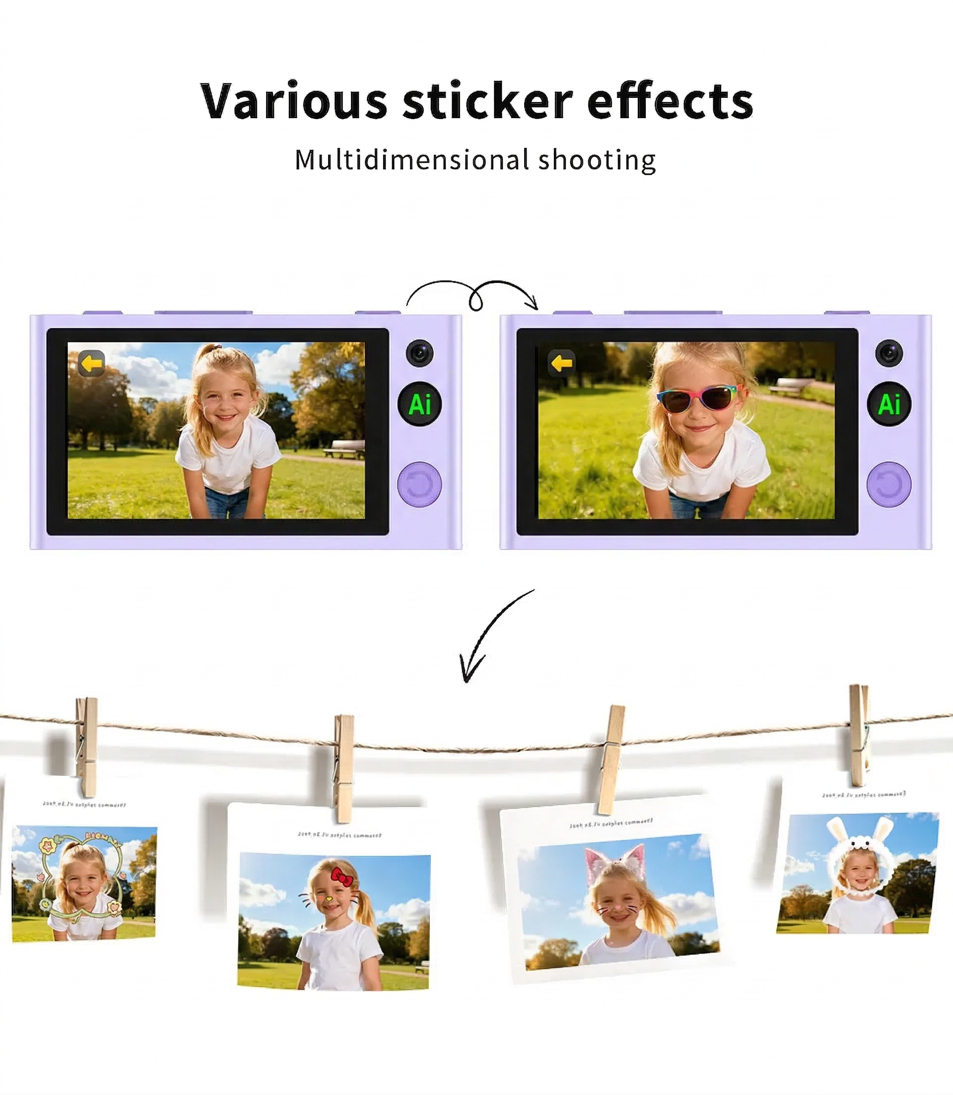






![[第1屏] 详情页头图-跨境新款多彩打印相机即拍即得拍立得相机新品宣传海报。本屏使用【图1】作为商品主体(正面展示),【图2】作为背面展示辅助。
[氛围/风格] 清新童趣活力风,奶黄暖色调,参考图风格,商业摄影质感,温馨明亮。
[元素布局] 拍立得相机置于画面中下偏右,正面展示,占比约55%-60%;相机出纸口吐出一张彩色照片;左上留标题区,背景为浅奶黄色渐变,点缀柔和光斑和云朵元素;左下角漂浮2-3张拍立得风格照片(儿童笑脸、生活场景);相机机身结构、颜色(白+奶黄)、按键布局、屏幕、镜头与输入产品图完全一致。
[光影质感] 左上方柔和自然光照明,右下自然投影,机身保留清晰高光,整体明亮通透,色彩饱和度适中。
[配色色系] 全局底色 #FFF9CC(浅奶黄色);主色奶黄+白色;辅助色深灰标题字、浅橙点缀。
[视角构图] 正面微仰视,产品为视觉中心,阅读动线左上标题 → 右侧产品 → 底部卖点标签。
[文字版式] 版式为左上大标题 + 右侧产品 + 底部卖点胶囊。主标题「即拍即得 秒拍秒印」,副标题「多彩打印 记录成长每一刻」,两行粗黑体左对齐;标题下小字英文装饰「Instant Print Camera」;底部3个圆角卖点胶囊:「双摄高清」「一键操作」「便携轻巧」;文字不遮挡相机主体。
[比例分辨率] 9:16 竖版比例,4K分辨率,文字清晰可辨,高清画质。
[负向提示词] 相机变形,缺件错件,颜色偏差,水印,文字错乱,文字过小,产品图模糊,背景杂乱,结构错误。](https://gd-cms.dancf.com/gd-cms/xi19e5/0/071f081b-33f9-448d-aaf9-b9d8d3a7d20027019.jpeg?x-oss-process=image/resize,w_640,type_6/sharpen,120/interlace,1)


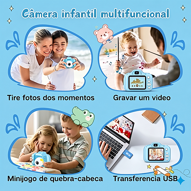




![[Main Image 6] Upgraded Multi-color Ink Screen highlight main image.
[Style & Atmosphere] Highlight display technology style, consistent with the overall set of styles, European and American cross-border style.
[Picture Quality] Super clear commercial photography, high resolution, restore the ink screen display details, product shape consistent with the original.
[Elements] Left side is the multi-color ink screen display effect of this product, showing a delicate color photo, right side is the comparison of traditional black and white ink screen, clearly highlight the upgrade advantage. The product is placed in the center, contrast display, the background is clean light gray, focus on the comparison effect.
[Light & Shadow] Uniform soft light, clear display of the ink screen details, multi-color screen picture is delicate, high reduction, black and white screen contrast obvious, layered picture.
[Color Matching] Multi-color screen natural color reproduction, contrast the black and white single tone, the contrast is obvious, the overall tone coordination.
[Perspective & Composition] Left-right contrast composition, full screen no border, 1:1 proportion, prominent comparison theme.
[Text Layout] Large title at the top: "Upgraded Multi-color Ink Screen
Richer Colors Finer Picture", the two comparison areas are marked "Upgraded Multi-color" and "Traditional Black & White", all English text, clear contrast, prominent selling points. 2048px resolution, ultra HD.
[Negative prompt] Deformed product, unclear screen, color distortion, text disorder, Chinese characters, extra messy elements](https://gd-cms.dancf.com/gd-cms/xi19e5/0/ec5a448d-a408-4e4c-8a1b-b8fddb662ed64570.png?x-oss-process=image/resize,w_640,type_6/sharpen,120/interlace,1)


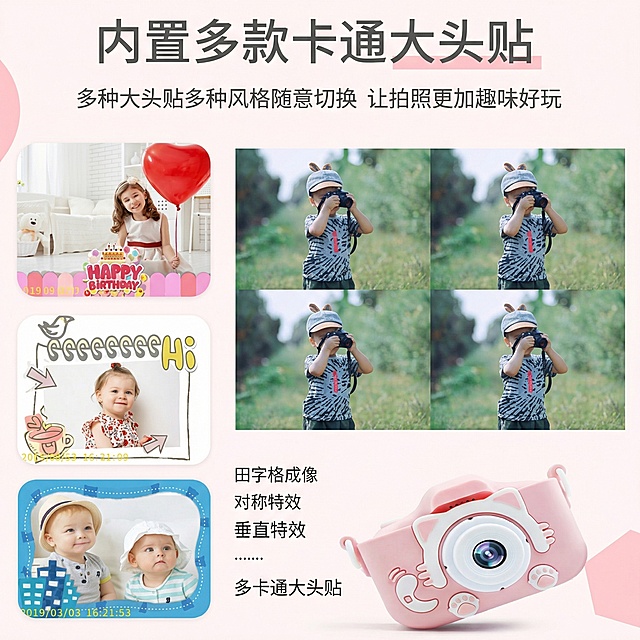
![[Page 7] AliExpress detail page - 4-Color HD Display vs traditional black and white ink screen comparison. [Atmosphere Style] Clear objective comparison, professional contrast layout. [Elements Layout] Top title, two comparison areas arranged left and right below. Left side is our product with 4-color display, right side is traditional black and white ink screen product. Use our product appearance consistent with input image (https://gdesign-dam-hz.dancf.com/36766293930002554/93b29b5cc21a4541ab10b75ef21616df.jpg), keep structure and color unchanged. Show the difference of screen display effect directly. [Lighting Texture] Even soft lighting, both products same lighting condition, clear contrast of display effect. [Color Scheme] Global background: #f8f9fa; Product display areas white background, make screen color stand out. [Perspective Composition] Left-right symmetrical comparison layout, eye-level perspective, both products fully visible. [Text Layout] Top title "4-Color HD Display Vivid & Eye-Friendly", left label "This Product: Four-Color Display", right label "Traditional: Only Black & White". Bottom summary text: "Supports rich colorful display, retains low blue light and eye-friendly, visible under sunlight. All English, no Chinese, title bold, labels clear, contrast obvious. [Proportion Resolution] 3:4 (9:16) vertical ratio, 4K resolution, text clearly recognizable, ultra high definition. [Negative prompt] Product deformation, color bias, contrast unclear, text confusion, Chinese characters, extreme words, watermark, messy background.](https://gd-cms.dancf.com/gd-cms/xi19e5/0/66cadde7-9440-41a9-87fc-dd0f21c9ac69155.png?x-oss-process=image/resize,w_640,type_6/sharpen,120/interlace,1)

![[第1屏] 详情页头图-儿童拇指相机新品宣传海报。本屏使用图1到图6作为不同颜色款式的商品主体,参考图10提取撞色排版风格。
[氛围/风格] 活力撞色潮流风,色彩明快,商业摄影质感,童趣数码产品氛围。
[元素布局] 6款不同配色相机错落排版展示在画面中下部,每个相机保持外观、结构、颜色与输入产品图一致;顶部预留大标题区域,文案区左上分层排版,产品占比约65%,背景搭配几何色块拼接装饰。
[光影质感] 顶部柔光打亮产品,产品下方自然投影,整体明亮通透,色彩饱和度适中,产品轮廓清晰。
[配色色系] 全局底色参考红、黄、蓝撞色拼接,主色红、黄、蓝三原色撞色,辅助色白色、浅灰。
[视角构图] 俯视排版,产品矩阵错落分布为视觉中心,阅读动线从上到下,标题区 → 产品矩阵 → 底部卖点标签。
[文字版式] 顶部主标题「童趣拇指相机」,副标题「随手记录美好童年」,大字体加粗左对齐;右上角两行卖点「高清拍照录像」「小巧便携随身」用白色圆角胶囊标签展示;左下角标注「多色可选满足喜好」;所有文字清晰不遮挡产品主体,符合移动端可读性要求。
[比例分辨率] 9:16竖版比例,4K分辨率,文字清晰可辨,高清画质。
[负向提示词] 产品变形,颜色偏差,缺件错件,结构错误,水印,文字错乱,文字过小,产品图模糊,背景杂乱。](https://gd-cms.dancf.com/gd-cms/xi19e5/0/ac6c7a76-8760-4a6e-9935-37424e45eff231908.jpeg?x-oss-process=image/resize,w_640,type_6/sharpen,120/interlace,1)