
commercial food marketing poste… - 图片创意预览

commercial food marketing poste…

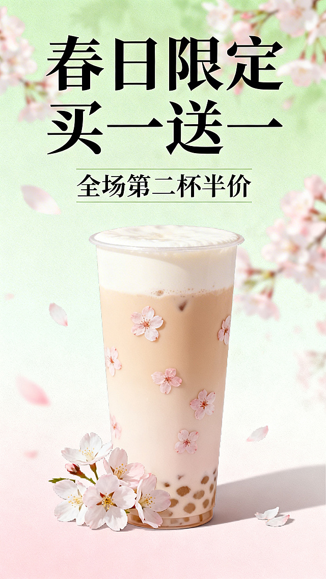
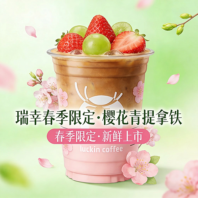
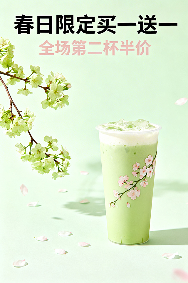
commercial food marketing poster, professional brand visual design, Luckin Coffee spring limited Luo

用户头像

GD228700681

2026.03.13
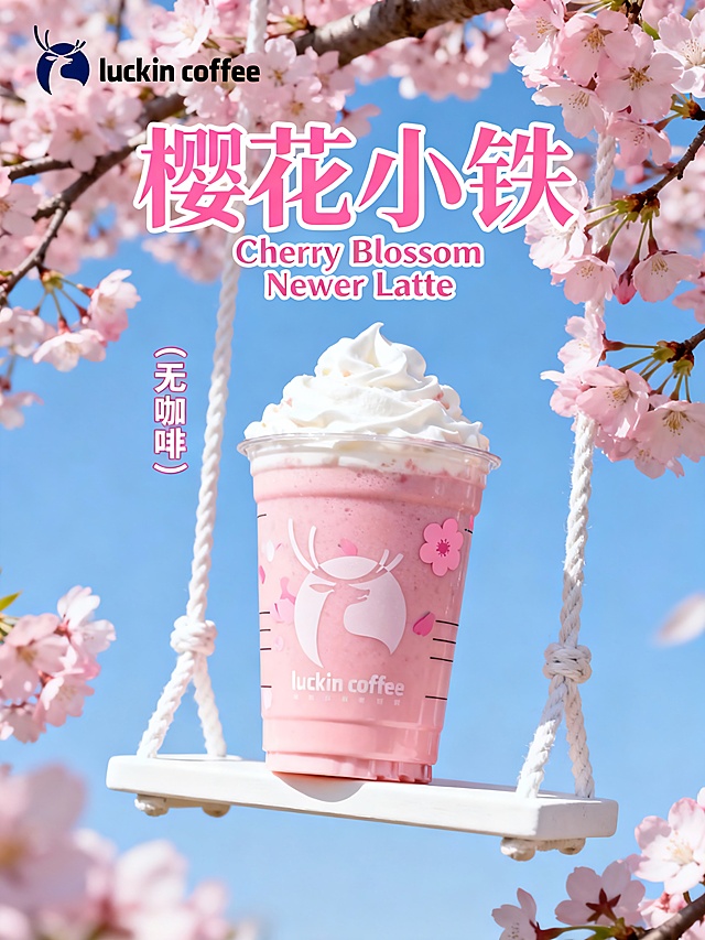
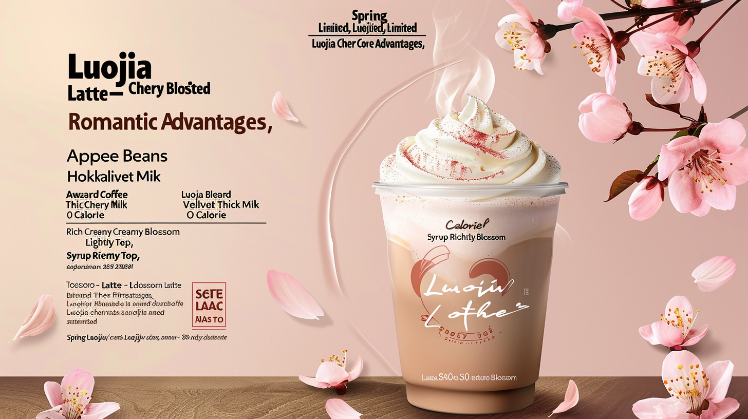
commercial food marketing poster, professional brand visual design, Luckin Coffee spring limited Luojia Cherry Blossom Latte, strong visual impact and clear hierarchical layout, follow the design principles of contrast, repetition and alignment, the main body of the poster is the product as the absolute visual center, the copy is concise and prominent, the key information is clear at a glance, soft cherry pink and warm coffee brown as the main color matching (high contrast between light and dark, not gaudy), the secondary color is fresh white and light wood grain beige, the overall tone is romantic and fresh in spring, full cup of Luojia Cherry Blossom Latte is placed in the golden section of the poster, dense and smooth cream top with natural fine bubble texture, the cup body with minimalist cherry blossom pattern is clearly visible, transparent cup body showing the delicate velvet texture of the drink, soft natural light + side light three-dimensional lighting, no glare, the drink has a faint luster, a few fresh cherry blossom petals are scattered around the cup (moderate amount, not redundant, repeated design elements to echo the cherry blossom theme), the poster copy is typeset in alignment, the large font highlights the core theme, the medium font displays the core selling points, the small font supplements the brand information, the copy content is highly recognizable (black/brown font with light pink background for contrast, easy to read), 8K ultra-high definition, ultra-detailed, sharp focus, film texture, professional commercial poster standard, brand visual consistency, the overall picture is concise and advanced, no redundant elements, highlighting the core information of "spring limited, Luojia Cherry Blossom Latte, three core advantages, romantic ritual sense". Poster core information typesetting: main title (top center alignment, extra large bold font, cherry blossom pink): "珞珈樱花拿铁 春季限定". core selling points (three points repeated typesetting, medium size, brown bold): 1. "IIAC 金奖咖啡豆" 2. "北海道丝绒厚奶" 3. "0 卡樱花糖浆". taste selling points (small label on the left of product, thin font with white stroke): "绵密奶油顶 轻甜不腻 丝滑入口". brand information (bottom center alignment, small font, standard brand color): "瑞幸咖啡 luckin coffee 连续咖啡品牌 金奖品质 现点现做". visual decorations: floating cherry blossom petals, simple cherry blossom line patterns echoing the cup pattern. --style raw --v 6.0commercial food marketing poster, professional brand visual design, Luckin Coffee spring limited Luojia Cherry Blossom Latte, strong visual impact and clear hierarchical layout, follow the design principles of contrast, repetition and alignment, the main body of the poster is the product as the absolute visual center, the copy is concise and prominent, the key information is clear at a glance, soft cherry pink and warm coffee brown as the main color matching (high contrast between light and dark, not gaudy), the secondary color is fresh white and light wood grain beige, the overall tone is romantic and fresh in spring, full cup of Luojia Cherry Blossom Latte is placed in the golden section of the poster, dense and smooth cream top with natural fine bubble texture, the cup body with minimalist cherry blossom pattern is clearly visible, transparent cup body showing the delicate velvet texture of the drink, soft natural light + side light three-dimensional lighting, no glare, the drink has a faint luster, a few fresh cherry blossom petals are scattered around the cup (moderate amount, not redundant, repeated design elements to echo the cherry blossom theme), the poster copy is typeset in alignment, the large font highlights the core theme, the medium font displays the core selling points, the small font supplements the brand information, the copy content is highly recognizable (black/brown font with light pink background for contrast, easy to read), 8K ultra-high definition, ultra-detailed, sharp focus, film texture, professional commercial poster standard, brand visual consistency, the overall picture is concise and advanced, no redundant elements, highlighting the core information of "spring limited, Luojia Cherry Blossom Latte, three core advantages, romantic ritual sense". Poster core information typesetting: main title (top center alignment, extra large bold font, cherry blossom pink): "珞珈樱花拿铁 春季限定". core selling points (three points repeated typesetting, medium size, brown bold): 1. "IIAC 金奖咖啡豆" 2. "北海道丝绒厚奶" 3. "0 卡樱花糖浆". taste selling points (small label on the left of product, thin font with white stroke): "绵密奶油顶 轻甜不腻 丝滑入口". brand information (bottom center alignment, small font, standard brand color): "瑞幸咖啡 luckin coffee 连续咖啡品牌 金奖品质 现点现做". visual decorations: floating cherry blossom petals, simple cherry blossom line patterns echoing the cup pattern. --style raw --v 6.0
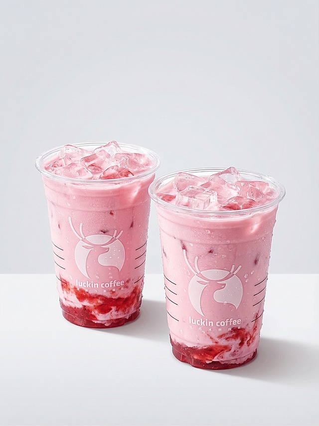
[第3屏] 成分/产地屏 - LuckyCup 真实水果与精选原料展示。本屏使用【图3】作为商品主体,保持水果特调咖啡杯型、水果环绕、飞溅动态完全一致。 [氛围/风格] 清新活力,夏日清爽,商业摄影质感,原料真实自然,跨境电商风格。 [元素布局] 水果特调咖啡杯位于画面中央偏下,占比约45%;上方青柠切片正往下滴果汁,水花飞溅动态;周围环绕大量新鲜水果:青柠、柠檬、蓝莓、树莓、黑莓、草莓、薄荷叶,水果元素占画面约50%以上;背景为虚化的绿色植物叶片背景;杯身红色国王Logo和白色文字保持原样。 [光影质感] 自然光从上方照射,水珠晶莹剔透,水果表面有新鲜水珠质感,整体明亮清新,色彩饱和度适中。 [配色色系] 全局底色 #E8F5E9 浅薄荷绿渐变;主色青柠绿+咖啡棕;辅助色莓果红、蓝莓紫、奶白色。 [视角构图] 正面微俯视,产品居中,水果环绕包围,阅读动线从上到下。 [文字版式] 顶部居中标题。主标题"Real Fruit Infusions",副标题"Freshly Squeezed Goodness";下方三个圆形原料标签:"Natural Fruit" / "No Artificial Flavors" / "Vitamin Rich";字体为现代无衬线体,深绿色字色。所有文字为英文,清晰可读。 [比例分辨率] 9:16 竖版比例,4K分辨率,文字清晰可辨,高清画质。 [负向提示词] 杯身变形,缺件错件,颜色偏差,水印,中文字符,文字错乱,产品图模糊,Logo变形。[第3屏] 成分/产地屏 - LuckyCup 真实水果与精选原料展示。本屏使用【图3】作为商品主体,保持水果特调咖啡杯型、水果环绕、飞溅动态完全一致。
[氛围/风格] 清新活力,夏日清爽,商业摄影质感,原料真实自然,跨境电商风格。
[元素布局] 水果特调咖啡杯位于画面中央偏下,占比约45%;上方青柠切片正往下滴果汁,水花飞溅动态;周围环绕大量新鲜水果:青柠、柠檬、蓝莓、树莓、黑莓、草莓、薄荷叶,水果元素占画面约50%以上;背景为虚化的绿色植物叶片背景;杯身红色国王Logo和白色文字保持原样。
[光影质感] 自然光从上方照射,水珠晶莹剔透,水果表面有新鲜水珠质感,整体明亮清新,色彩饱和度适中。
[配色色系] 全局底色 #E8F5E9 浅薄荷绿渐变;主色青柠绿+咖啡棕;辅助色莓果红、蓝莓紫、奶白色。
[视角构图] 正面微俯视,产品居中,水果环绕包围,阅读动线从上到下。
[文字版式] 顶部居中标题。主标题"Real Fruit Infusions",副标题"Freshly Squeezed Goodness";下方三个圆形原料标签:"Natural Fruit" / "No Artificial Flavors" / "Vitamin Rich";字体为现代无衬线体,深绿色字色。所有文字为英文,清晰可读。
[比例分辨率] 9:16 竖版比例,4K分辨率,文字清晰可辨,高清画质。
[负向提示词] 杯身变形,缺件错件,颜色偏差,水印,中文字符,文字错乱,产品图模糊,Logo变形。