已添加
登录/注册
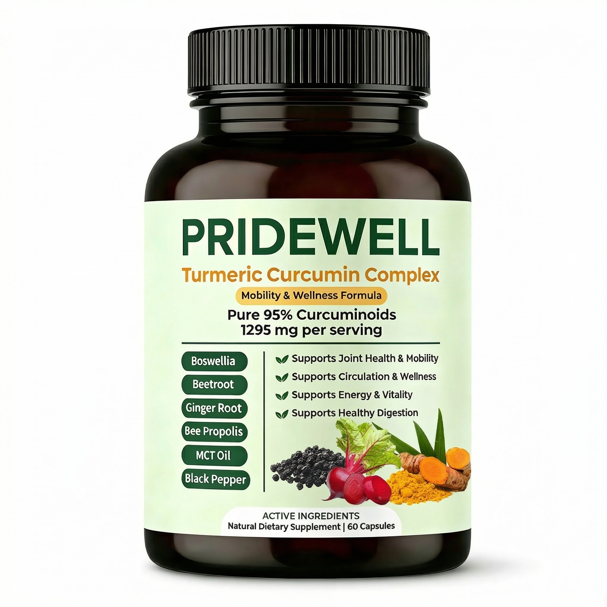
基于图中的姜黄素复合物瓶身,保持产品外观完全不变,背景替换为纯白色,高清实拍质感,产品居中占画面85%以上,标签清晰可读,无任何多余装饰和文字,仅保留产品本身
GD606034506
2026.03.26
做同款
姜黄素复合物保健品亚马逊主图,简约舒适风格,1:1比例,画面主体为上传的PRIDEWELL姜黄素复合物产品瓶,背景干净浅绿,突出产品瓶身的95%姜黄素纯度标识,整体适配跨境平台风格
155****8900
[第4屏] 产品功效对比,展示本产品高浓度8:1提取物对比普通同类产品,左右对比版式。氛围风格:简约清晰信息对比,客观真实,符合亚马逊审美。元素布局:左右分栏,左栏为普通产品标注 "Regular Extract",右栏为 "Our 8:1 Concentrated Extract",本产品图放在右栏,保持包装颜色结构和原图一致,两栏用深色分割线区分,增加柱状示意图展示有效成分浓度差异。光影质感:均匀柔光,对比清晰,文字突出。配色色系:全局底色 #F8F4F1,左栏浅灰底,右栏浅粉底,主色保留产品红粉色。文字版式:顶部主标题 "Higher Concentration Better Support",左右分栏标注浓度差异,底部总结 "More Active Compounds Per Serving",每个主要单词首字母大写,信息清晰。比例分辨率:4:3比例,4K分辨率,文字清晰可辨,高清画质。负向提示词:虚假夸大图表,文字错乱,产品变形,颜色偏差,中文字符
创意 × 1
GD746692657
[第4屏] 产品功效对比,展示本产品高浓度8:1提取物对比普通同类产品,左右对比版式。氛围风格:简约清晰信息对比,客观真实,符合亚马逊审美。元素布局:左右分栏,左栏为普通产品标注 "Regular Extract",右栏为 "Our 8:1 Concentrated Extract",本产品图放在右栏,保持包装颜色结构和原图一致,两栏用深色分割线区分,增加柱状示意图展示有效成分浓度差异。光影质感:均匀柔光,对比清晰,文字突出。配色色系:全局底色 #F8F4F1,左栏浅灰底,右栏浅粉底,主色保留产品红粉色。文字版式:顶部主标题 "Higher Concentration Better Support",左右分栏标注浓度差异,底部总结 "More Active Compounds Per Serving",每个主要单词首字母大写,信息清晰。比例分辨率:4:3比例,4K分辨率,文字清晰可辨,高清画质。负向提示词:虚假夸大图表,文字错乱,产品变形,颜色偏差,中文字符
GD746692657
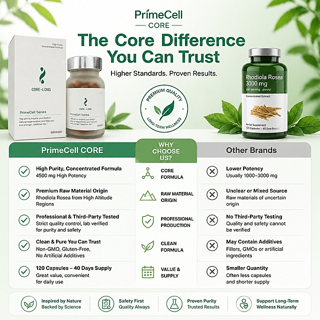
Amazon 1:1 square main image, product display, the product is PrimeCell Series CORE dietary supplement bottle, pure white background, high-end minimalist style, all English text, show the product bottle clearly, no additional elements. The product is PrimeCell CORE, basic core product of PrimeCell Series, supports long-term stable operation of cellular energy system, addresses decreased NAD+ level and reduced mitochondrial efficiency with age, symptoms of energy instability and slower recovery. Produced by Japanese Sunsho Pharmaceutical, Japan's second largest pharmaceutical company.
GD113126190
GUT-VIVE gut health supplement, product featured prominently, "GUT-VIVE" "PrimeCell Series" "Gut Flora Revitalization" "Supports Long-Term Gut Health", clean professional design for Amazon, 1:1 ratio, all text in English
1r45eznk6nLt2KKQ-HB
继续
1q0kyapt0o-HB
Generate a 1:1 square Amazon cross-border e-commerce main image for GUT-VIVE gut health supplement bottle, fully in English. Reference the style of the second image, highlight product features, show the product bottle, list the raw material selling points: Starch (Japanese domestic), Natto culture extract powder, 5 kinds of compound lactic acid bacteria, Ginger extract powder, Hydroxypropyl methylcellulose (HPMC), Vitamin C, Niacinamide (Vitamin B3), Natural extracted Vitamin E, Magnesium stearate, Calcium pantothenate, Caramel color, Vitamin B6, Micron silica, Vitamin B1, Vitamin A, Vitamin B2, Folic acid, Vitamin D, Vitamin B12. Clean professional health product main image style.
1r45eznk6nLt2KKQ-HB
保留瓶子和所有文字信息、包装内容完全不变,仅将背景修改为干净纯净的纯白色
me110
[第4屏] 核心功效 benefits 展示页-PrimeCell CORE three core benefits. This screen uses [image1] as product main body. [atmosphere/style] Premium minimalist style, consistent with the overall deep green gold color matching, commercial design texture, referencing the reference card layout. [element layout] Product bottle on the left, three benefit cards stacked vertically on the right. Each benefit has a golden check circle icon. Product bottle is placed on the left, accounting for about 40% of the screen, maintaining original product characteristics. Three benefits: activate cell function, antioxidant protection, anti-aging support. [light and shadow texture] Front soft light, clear product layering, icon lines clear. [color scheme] Background off-white, benefit card background deep green, text gold and white, color matching coordination. [perspective composition] Left product right text card layout, clear information level. [text layout] Top main title "PrimeCell CORE Benefits", deep green large font; 1. "Activate Cells" activate mitochondrial function, boost cellular energy; 2. "Antioxidant" neutralize free radicals, protect cell health; 3. "Anti-Aging" support cell renewal, slow aging process; bottom brand slogan "Science · Purity · Renewal"; all English text, clear and readable. [proportion resolution] 2:3 vertical ratio, 1K resolution, high-definition picture quality, text clearly recognizable. [negative prompt] product deformation, wrong text, color deviation, blurred product, watermark, Chinese characters.
KKK-Cheisty
[主图-4] 天然成分展示,Anti-Inflammatory Herbal Blend。 [氛围风格] 天然成分健康展示,清新专业。 [画质] 商业摄影质感、光线柔和通透、产品清晰真实、画面干净高级。 [元素] 用户提供的产品瓶身放置在画面中心,保持产品外观与原图完全一致。围绕产品瓶身,自然散落摆放天然核心原料Turmeric(姜黄根块)的实物,原料新鲜干净,大小搭配合理不拥挤,背景为低饱和米白渐变,整体天然健康氛围。商品主体占比约55%,原料围绕布局合理不遮挡瓶身主要信息。 [光影] 自然柔光,模拟自然光线下的产品陈列,突出原料的天然质感与产品瓶身清晰细节。 [配色] 米白浅渐变背景,姜黄原料自然暖黄色点缀,主标题深棕色,文字清晰配色自然舒适。 [视角构图] 中心主体产品,周围环绕天然原料,平衡饱满,整体干净不杂乱。 [文字版式] 画面顶部大粗体文字:POTENT HERBAL BLEND,下方居中文字:NATURAL TURMERIC | ANTI-INFLAMMATORY,文字位于产品上方空白区域,不遮挡主体,全英文清晰可读,无衬线字体干净专业。 [输出要求] 1:1比例,2048x2048px,超高清商业摄影质感。 [负向提示词] 变形,文字错乱,产品图模糊,背景杂乱,水印,电商平台Logo,中文,人工合成原料
GD746692657
Ideal for: people over 30, anti-aging focus, long work consumption, long-term wellness management, PrimeCell CORE supplement, all English text, 1:1 square, Amazon main image, office lifestyle background with product, reference layout from sample image.
GD113126190
电商详情页成分解析页,URENUS每日免疫复合胶囊优质原料展示。本张使用【图7】作为参考版式和产品主体。画面风格:暖橙白配色,天然健康感,成分扇形展示。元素布局:产品瓶身位于画面左侧,占比约40%;右侧扇形展开5种核心成分实物图+中文名称;背景浅米色渐变,柔和自然。光影质感:柔和自然光,成分实物图清晰有质感,整体温暖明亮。配色色系:全局底色#FFF8F3浅米色;主色#D9532F暖橙色;辅助色天然食材原色。视角构图:左右布局,左瓶右成分,阅读动线从产品→扇形成分。文字版式:顶部大标题「甄选优质原料 科学配比」粗黑体橙色;右侧扇形5种成分从上到下:1.橙子切片「维生素C(抗坏血酸)」2.黄色D3分子「维生素D3」3.接骨木果「接骨木提取物」4.人参根「人参提取物」5.锌元素食材「锌(葡萄糖酸锌)」;每个成分配对应实物图+中文标签,文字清晰。产品瓶身英文保持原样不翻译。
1q0hmzxach-HB
PrimeCell Series CORE, premium NMN dietary supplement bottle, minimalist white background, high-end product photography, product is in the center, professional lighting, 1:1 square, Amazon cross-border e-commerce main image, all English text. Japan Sunsho Pharmaceutical Co., Ltd. production.
GD113126190
「图片1」,生成电商主图(8张),商品名称是PrimeCell系列CORE,卖点是【1】CORE 是 PrimeCell 系列中的基础型核心产品,用于支持细胞能量系统的长期稳定运行。随着年龄增长,人体 NAD⁺ 水平下降、线粒体效率减弱,常表现为精力不稳、恢复变慢【2】产品以 NMN、辅酶 Q10、PQQ、白藜芦醇,姜黄素 为核心成分,从 NAD⁺ 与线粒体能量通路出发,支持日常能量代谢与抗氧化需求,适合长期服用,作为健康管理方案的“能量底盘”【3】原材料:β-烟酰胺单核苷酸(日本国产)、淀粉分解物、辅酶Q10、白藜芦醇、吡咯并喹啉醌钠盐、生姜提取物、羟丙甲纤维素(HPMC)、微粒二氧化硅、硬脂酸镁、焦糖色素。内容量:27g(300mg×90粒)【4】不少用户在连续使用约 7 天后,开始感受到精力稳定度、清醒感或日常恢复感的变化;而 CORE 的长期价值,体现在 60 天以上的持续使用与周期管理趋势 中。【5】适合人群:30+ 开始关注抗衰与精力管理的人群,长期工作消耗、希望建立稳定状态的人群,需要长期健康管理基础支持的用户。【6】日本三生医药生产,三生医药是日本第二大制药企业。,适配亚马逊/跨境平台,主图比例为1:1,全英文文案,参考图片「图片1」「图片1」「图片1」「图片1」「图片1」「图片1」
1r45eznk6nLt2KKQ-HB
[第8张] 产品信息规格页 - 服用说明与参数详情。本张使用【图2】作为产品标准照,瓶身英文保留。 [氛围/风格] 简洁专业信息卡风格,浅灰蓝底色,清晰易读,专业可信。 [元素布局] 画面上方为产品瓶身正面图,占比约35%,居中展示;下方为产品信息卡片,分栏展示规格参数和服用说明;背景为浅灰蓝色,干净整洁。 [光影质感] 均匀柔光照明,瓶身清晰,整体明亮干净。 [配色色系] 全局底色 #F0F4F8 浅灰蓝;主色深蓝 #1A237E 标题;辅助色深灰正文。 [视角构图] 正面平视,上下布局,阅读动线顶部产品图 → 中部标题 → 下方信息卡。 [文字版式] 顶部大标题「产品信息」,深蓝粗黑体。下方信息卡分左右两栏:左栏「产品规格」:品牌:URENUS,品名:pH友好型维生素C胶囊,规格:60粒/瓶,净含量:以包装为准,产地:英国。右栏「服用说明」:食用方法:每日1粒,温水送服,储存方式:阴凉干燥处,注意事项:不可替代均衡饮食,请勿超量服用。底部小字温馨提示:「本品为膳食营养补充剂,不能代替药物治疗」。所有文字为简体中文,清晰易读。 [比例分辨率] 3:4 竖版比例,4K 分辨率,文字清晰可辨,高清画质。 [负向提示词] 瓶身变形,文字错乱,文字过小,颜色偏差,水印,医疗功效承诺,瓶身英文被翻译。
1q0hmzxach-HB
Common Gut Concerns & Our Solution 痛点解决详情页,左侧排列三个深绿色带金边卡片,分别介绍肠胃不适问题和产品解决方案,右侧放置PrimeCell GUT-VIVE产品瓶图,整体为白色简约健康风格
1r45eznk6nLt2KKQ-HB
重新生成
1q0gm34tdf-HB
重新生成
1q0gm34tdf-HB
[第1屏] 详情页头图主视觉-PrimeCell Series GUT-VIVE 膳食补充胶囊宣传海报。 [氛围/风格] 专业简约跨境电商风格,清晰商业摄影质感,参考参考图的高级质感排版,配色沉稳大气。 [元素布局] PrimeCell GUT-VIVE保健品瓶放在画面右侧区域,占据画面 60%-65% 主体。保持瓶身浅米色透明玻璃瓶、银色瓶盖、白色标签、深紫色品牌Logo和文字、瓶内棕色胶囊的物理结构、材质质感、颜色与输入产品图【图1】一致,保持包装文字内容清晰可辨。背景上半部分为深绿色渐变色,左侧区域预留完整标题空间,底部搭配浅白色装饰边,整体简约干净不花哨,突出产品本身。 [光影质感] 左上方柔和主光照亮瓶身,右下方形成自然柔和阴影,整体明暗层次清晰,产品边缘真实清晰,包装标签文字锐利可读。 [配色色系] 全局底色:#2D6659(深绿);主体配色:米白瓶身+银色瓶盖+深紫品牌字+深绿背景;辅助色:#FFFFFF(白色标题)+ #D4AF37(金色装饰)。参考参考图【图2】【图3】【图4】的深绿+金+白配色体系。 [视角构图] 正面平视,产品位于画面右侧中上区域,左侧完整留给品牌和产品标题,整体构图平衡稳定,符合亚马逊4:3比例阅读动线。 [文字版式] 左文右图版式,左侧区域从上到下依次为品牌logo位置、主标题、副标题,右下角为日本原产角标。主标题 "PrimeCell Series" 白色无衬线字体,字号大且清晰。副标题 "GUT-VIVE Dietary Supplement" 白色小号字体。下方核心卖点 "Supports Gut Regeneration & Vitality" 白色轻量字体。右下角放置金色角标 "Made in Japan",所有文字不遮挡产品主体,层级清晰。 [比例分辨率] 4:3 横版比例,4K分辨率,文字清晰可辨,超高清。 [负向提示词] 瓶身变形,瓶盖错位,包装文字错乱,颜色偏差,水印,文字模糊,背景杂乱,夸张装饰元素,中文乱入。
1r45eznk6nLt2KKQ-HB
[主图-2] Vitamin C Gummies成分与原料展示图。 [氛围风格] 纯净科学感 自然原料风 清透高级 1688专业品质; [画质] 商业摄影质感、光线柔和通透、产品清晰真实、画面干净高级。 [元素] 维生素C软糖透明瓶位于画面左侧,瓶身完整清晰。右侧围绕瓶身布置核心原料:新鲜橙子(完整+切片)、紫锥菊花朵与叶片、锌元素矿物晶体小摆件、浅金色营养胶囊数颗。底部为浅米色大理石台面,背景为淡蓝到白色的渐变光晕,有柔和的圆形光斑与分子结构线条装饰。前景有2-3颗橙黄色小熊软糖从瓶口倾倒而出,动态自然,表面有晶莹光泽。**保持产品瓶身外观(即物理结构、材质质感、颜色、标签设计)与输入产品图一致,杜绝任何变形和色差,精细化处理**。商品主体占比约60%;画面满屏无边框。 [光影] 顶部柔光为主光,均匀照亮原料与瓶身;右侧侧逆光勾勒橙子切片与软糖的通透边缘;底部台面有柔和倒影,整体光线干净明亮,科学实验室质感。 [配色] 主色橙黄、鲜绿;辅色白色、浅蓝、淡金。 [视角构图] 45度俯视视角,产品与原料呈扇形展开;前中后景分层清晰,景深中等偏浅,突出主体与核心原料。 [文字版式] 右上负空间右对齐留安全边距。主标题"KEY INGREDIENTS",深绿色大号粗体无衬线字;下方四个圆形成分图标横向排列,每个图标内有简笔图案+英文名称:图标1橙子图案+"Vitamin C"、图标2花朵图案+"Echinacea"、图标3矿物图案+"Zinc"、图标4软糖图案+"Natural Flavor"。图标下方小字说明"Scientifically Formulated",灰色细体。底部中间"Dietary Supplement",白色字配半透明深绿底条。所有文字清晰可读,横排从左到右。 [输出要求] 1:1比例,文字清晰锐利,画面超高清商业摄影质感。 [负向提示词] 变形,文字错乱,产品图模糊,背景杂乱,水印,电商平台Logo,多余的手,畸形手,肢体穿模。
GD491458934
[第4张] 详情页草本精华页 - 天然植物成分展示。本张使用【图1】作为商品主体。 [氛围/风格] 自然清新健康风格,植物元素点缀,温暖有生机。 [元素布局] 产品瓶身置于画面右侧中部,占比约40%,正面展示;左侧和下方环绕四种草本成分的实物/植物插画:绿茶叶片、覆盆子果实、黑胡椒粒、肉桂棒+生姜根;每种植物成分旁有标注卡片,说明成分名称和含量;背景为暖绿色渐变到暖金色,有自然光线从左上方洒入,点缀散落的叶片装饰。 [光影质感] 左上方自然光感,植物叶片有通透感,瓶身柔和高光,整体温暖有生机。 [配色色系] 全局底色 #E8F0E0 暖绿渐变至浅金;主色 #5A8A5A 自然绿;辅助色 #D4A843 金黄色、#FFFFFF 白色卡片、#8B4513 棕色点缀。 [视角构图] 右物左文环绕式布局,产品在右,植物元素在左下环绕,阅读动线从左上标题 → 中部植物成分 → 右侧产品。 [文字版式] 左上主标题「草本植物精华 天然成分加持」,副标题「精选四大天然植物提取物」;四个成分卡片悬浮标注:「绿茶提取物 120mg」配茶叶图、「覆盆子酮 50mg」配覆盆子图、「黑胡椒提取物 2.5mg」配黑胡椒图、「专属混合配方 50mg」配肉桂生姜图;卡片为白底圆角,标题加粗绿色,含量金色小字。 [比例分辨率] 9:16 竖版比例,4K分辨率,文字清晰可辨,高清画质。 [负向提示词] 产品变形,标签错乱,文字过小,水印,背景杂乱,颜色偏差。
医学营养~慧美丽健康
画面展示一瓶VC咀嚼片产品,标注50mg含量与橙子元素,突出天然、免疫支持与日常能量补充功能。
就叫小籽叭
参考图一的瓶子摆放角度,将图二的维生素D3保健品瓶调整到和图一完全一致的前倾角度,保持图二产品本身的所有标签文字、颜色、图案细节和瓶子比例完全不变,生成一张纯白背景的精修商品图,专业商业棚拍光影,保持商品结构和包装细节100%还原
NOW携泰
重新参考图一的瓶子摆放前倾角度,精准将图二的维生素C保健品瓶调整到和图一完全一致的前倾角度,严格保持图二产品本身的所有标签文字、颜色、图案细节和瓶子比例完全不变,不得改变任何包装内容,生成一张纯白背景的精修商品图,专业商业棚拍光影,保证商品结构和包装细节100%还原清晰
NOW携泰
PrimeCell 系列GUT-VIVE膳食补充剂产品首屏宣传图,商品图位于右侧,深绿色弧形背景,左侧金色品牌logo和大标题"GUT-VIVE",副标题"PrimeCell Series Dietary Supplement",宣传语"Supports Gut Regeneration & Vitality",右下角有金色徽章"Made in Japan",风格参考https://gdesign-dam-hz.dancf.com/36778185241643066/796c766a5f294cffb5e4d16f89930d4f.png,专业亚马逊保健品详情页首屏,深绿白金色调,高级简约风格
1r45eznk6nLt2KKQ-HB





![[第4屏] 产品功效对比,展示本产品高浓度8:1提取物对比普通同类产品,左右对比版式。氛围风格:简约清晰信息对比,客观真实,符合亚马逊审美。元素布局:左右分栏,左栏为普通产品标注 "Regular Extract",右栏为 "Our 8:1 Concentrated Extract",本产品图放在右栏,保持包装颜色结构和原图一致,两栏用深色分割线区分,增加柱状示意图展示有效成分浓度差异。光影质感:均匀柔光,对比清晰,文字突出。配色色系:全局底色 #F8F4F1,左栏浅灰底,右栏浅粉底,主色保留产品红粉色。文字版式:顶部主标题 "Higher Concentration Better Support",左右分栏标注浓度差异,底部总结 "More Active Compounds Per Serving",每个主要单词首字母大写,信息清晰。比例分辨率:4:3比例,4K分辨率,文字清晰可辨,高清画质。负向提示词:虚假夸大图表,文字错乱,产品变形,颜色偏差,中文字符](https://gd-cms.dancf.com/gd-cms/xi19e5/0/6e66a696-5792-4d2f-8ceb-5a2642af895242961.png?x-oss-process=image/resize,w_640,type_6/sharpen,120/interlace,1)

![[第4屏] 产品功效对比,展示本产品高浓度8:1提取物对比普通同类产品,左右对比版式。氛围风格:简约清晰信息对比,客观真实,符合亚马逊审美。元素布局:左右分栏,左栏为普通产品标注 "Regular Extract",右栏为 "Our 8:1 Concentrated Extract",本产品图放在右栏,保持包装颜色结构和原图一致,两栏用深色分割线区分,增加柱状示意图展示有效成分浓度差异。光影质感:均匀柔光,对比清晰,文字突出。配色色系:全局底色 #F8F4F1,左栏浅灰底,右栏浅粉底,主色保留产品红粉色。文字版式:顶部主标题 "Higher Concentration Better Support",左右分栏标注浓度差异,底部总结 "More Active Compounds Per Serving",每个主要单词首字母大写,信息清晰。比例分辨率:4:3比例,4K分辨率,文字清晰可辨,高清画质。负向提示词:虚假夸大图表,文字错乱,产品变形,颜色偏差,中文字符](https://gd-cms.dancf.com/gd-cms/xi19e5/0/e877354a-d84a-4f34-999d-deac3e14038e42833.png?x-oss-process=image/resize,w_640,type_6/sharpen,120/interlace,1)





![[第4屏] 核心功效 benefits 展示页-PrimeCell CORE three core benefits. This screen uses [image1] as product main body.
[atmosphere/style] Premium minimalist style, consistent with the overall deep green gold color matching, commercial design texture, referencing the reference card layout.
[element layout] Product bottle on the left, three benefit cards stacked vertically on the right. Each benefit has a golden check circle icon. Product bottle is placed on the left, accounting for about 40% of the screen, maintaining original product characteristics. Three benefits: activate cell function, antioxidant protection, anti-aging support.
[light and shadow texture] Front soft light, clear product layering, icon lines clear.
[color scheme] Background off-white, benefit card background deep green, text gold and white, color matching coordination.
[perspective composition] Left product right text card layout, clear information level.
[text layout] Top main title "PrimeCell CORE Benefits", deep green large font; 1. "Activate Cells" activate mitochondrial function, boost cellular energy; 2. "Antioxidant" neutralize free radicals, protect cell health; 3. "Anti-Aging" support cell renewal, slow aging process; bottom brand slogan "Science · Purity · Renewal"; all English text, clear and readable.
[proportion resolution] 2:3 vertical ratio, 1K resolution, high-definition picture quality, text clearly recognizable.
[negative prompt] product deformation, wrong text, color deviation, blurred product, watermark, Chinese characters.](https://gd-cms.dancf.com/gd-cms/xi19e5/0/19880d58-1928-45e9-a888-ab2f70892f5649328.jpeg?x-oss-process=image/resize,w_640,type_6/sharpen,120/interlace,1)
![[主图-4] 天然成分展示,Anti-Inflammatory Herbal Blend。
[氛围风格] 天然成分健康展示,清新专业。
[画质] 商业摄影质感、光线柔和通透、产品清晰真实、画面干净高级。
[元素] 用户提供的产品瓶身放置在画面中心,保持产品外观与原图完全一致。围绕产品瓶身,自然散落摆放天然核心原料Turmeric(姜黄根块)的实物,原料新鲜干净,大小搭配合理不拥挤,背景为低饱和米白渐变,整体天然健康氛围。商品主体占比约55%,原料围绕布局合理不遮挡瓶身主要信息。
[光影] 自然柔光,模拟自然光线下的产品陈列,突出原料的天然质感与产品瓶身清晰细节。
[配色] 米白浅渐变背景,姜黄原料自然暖黄色点缀,主标题深棕色,文字清晰配色自然舒适。
[视角构图] 中心主体产品,周围环绕天然原料,平衡饱满,整体干净不杂乱。
[文字版式] 画面顶部大粗体文字:POTENT HERBAL BLEND,下方居中文字:NATURAL TURMERIC | ANTI-INFLAMMATORY,文字位于产品上方空白区域,不遮挡主体,全英文清晰可读,无衬线字体干净专业。
[输出要求] 1:1比例,2048x2048px,超高清商业摄影质感。
[负向提示词] 变形,文字错乱,产品图模糊,背景杂乱,水印,电商平台Logo,中文,人工合成原料](https://gd-cms.dancf.com/gd-cms/xi19e5/0/11d69653-4201-4bd2-b8f2-a59f17f90b221822.jpeg?x-oss-process=image/resize,w_640,type_6/sharpen,120/interlace,1)


![[第8张] 产品信息规格页 - 服用说明与参数详情。本张使用【图2】作为产品标准照,瓶身英文保留。
[氛围/风格] 简洁专业信息卡风格,浅灰蓝底色,清晰易读,专业可信。
[元素布局] 画面上方为产品瓶身正面图,占比约35%,居中展示;下方为产品信息卡片,分栏展示规格参数和服用说明;背景为浅灰蓝色,干净整洁。
[光影质感] 均匀柔光照明,瓶身清晰,整体明亮干净。
[配色色系] 全局底色 #F0F4F8 浅灰蓝;主色深蓝 #1A237E 标题;辅助色深灰正文。
[视角构图] 正面平视,上下布局,阅读动线顶部产品图 → 中部标题 → 下方信息卡。
[文字版式] 顶部大标题「产品信息」,深蓝粗黑体。下方信息卡分左右两栏:左栏「产品规格」:品牌:URENUS,品名:pH友好型维生素C胶囊,规格:60粒/瓶,净含量:以包装为准,产地:英国。右栏「服用说明」:食用方法:每日1粒,温水送服,储存方式:阴凉干燥处,注意事项:不可替代均衡饮食,请勿超量服用。底部小字温馨提示:「本品为膳食营养补充剂,不能代替药物治疗」。所有文字为简体中文,清晰易读。
[比例分辨率] 3:4 竖版比例,4K 分辨率,文字清晰可辨,高清画质。
[负向提示词] 瓶身变形,文字错乱,文字过小,颜色偏差,水印,医疗功效承诺,瓶身英文被翻译。](https://gd-cms.dancf.com/gd-cms/xi19e5/0/759b1e66-a037-42e0-b4c3-6d3b114525ca16247.png?x-oss-process=image/resize,w_640,type_6/sharpen,120/interlace,1)


![[第1屏] 详情页头图主视觉-PrimeCell Series GUT-VIVE 膳食补充胶囊宣传海报。
[氛围/风格] 专业简约跨境电商风格,清晰商业摄影质感,参考参考图的高级质感排版,配色沉稳大气。
[元素布局] PrimeCell GUT-VIVE保健品瓶放在画面右侧区域,占据画面 60%-65% 主体。保持瓶身浅米色透明玻璃瓶、银色瓶盖、白色标签、深紫色品牌Logo和文字、瓶内棕色胶囊的物理结构、材质质感、颜色与输入产品图【图1】一致,保持包装文字内容清晰可辨。背景上半部分为深绿色渐变色,左侧区域预留完整标题空间,底部搭配浅白色装饰边,整体简约干净不花哨,突出产品本身。
[光影质感] 左上方柔和主光照亮瓶身,右下方形成自然柔和阴影,整体明暗层次清晰,产品边缘真实清晰,包装标签文字锐利可读。
[配色色系] 全局底色:#2D6659(深绿);主体配色:米白瓶身+银色瓶盖+深紫品牌字+深绿背景;辅助色:#FFFFFF(白色标题)+ #D4AF37(金色装饰)。参考参考图【图2】【图3】【图4】的深绿+金+白配色体系。
[视角构图] 正面平视,产品位于画面右侧中上区域,左侧完整留给品牌和产品标题,整体构图平衡稳定,符合亚马逊4:3比例阅读动线。
[文字版式] 左文右图版式,左侧区域从上到下依次为品牌logo位置、主标题、副标题,右下角为日本原产角标。主标题 "PrimeCell Series" 白色无衬线字体,字号大且清晰。副标题 "GUT-VIVE Dietary Supplement" 白色小号字体。下方核心卖点 "Supports Gut Regeneration & Vitality" 白色轻量字体。右下角放置金色角标 "Made in Japan",所有文字不遮挡产品主体,层级清晰。
[比例分辨率] 4:3 横版比例,4K分辨率,文字清晰可辨,超高清。
[负向提示词] 瓶身变形,瓶盖错位,包装文字错乱,颜色偏差,水印,文字模糊,背景杂乱,夸张装饰元素,中文乱入。](https://gd-cms.dancf.com/gd-cms/xi19e5/0/83464641-d51d-41c7-93de-4df5379fbfe61178.png?x-oss-process=image/resize,w_640,type_6/sharpen,120/interlace,1)
![[主图-2] Vitamin C Gummies成分与原料展示图。
[氛围风格] 纯净科学感 自然原料风 清透高级 1688专业品质;
[画质] 商业摄影质感、光线柔和通透、产品清晰真实、画面干净高级。
[元素] 维生素C软糖透明瓶位于画面左侧,瓶身完整清晰。右侧围绕瓶身布置核心原料:新鲜橙子(完整+切片)、紫锥菊花朵与叶片、锌元素矿物晶体小摆件、浅金色营养胶囊数颗。底部为浅米色大理石台面,背景为淡蓝到白色的渐变光晕,有柔和的圆形光斑与分子结构线条装饰。前景有2-3颗橙黄色小熊软糖从瓶口倾倒而出,动态自然,表面有晶莹光泽。**保持产品瓶身外观(即物理结构、材质质感、颜色、标签设计)与输入产品图一致,杜绝任何变形和色差,精细化处理**。商品主体占比约60%;画面满屏无边框。
[光影] 顶部柔光为主光,均匀照亮原料与瓶身;右侧侧逆光勾勒橙子切片与软糖的通透边缘;底部台面有柔和倒影,整体光线干净明亮,科学实验室质感。
[配色] 主色橙黄、鲜绿;辅色白色、浅蓝、淡金。
[视角构图] 45度俯视视角,产品与原料呈扇形展开;前中后景分层清晰,景深中等偏浅,突出主体与核心原料。
[文字版式] 右上负空间右对齐留安全边距。主标题"KEY INGREDIENTS",深绿色大号粗体无衬线字;下方四个圆形成分图标横向排列,每个图标内有简笔图案+英文名称:图标1橙子图案+"Vitamin C"、图标2花朵图案+"Echinacea"、图标3矿物图案+"Zinc"、图标4软糖图案+"Natural Flavor"。图标下方小字说明"Scientifically Formulated",灰色细体。底部中间"Dietary Supplement",白色字配半透明深绿底条。所有文字清晰可读,横排从左到右。
[输出要求] 1:1比例,文字清晰锐利,画面超高清商业摄影质感。
[负向提示词] 变形,文字错乱,产品图模糊,背景杂乱,水印,电商平台Logo,多余的手,畸形手,肢体穿模。](https://gd-cms.dancf.com/gd-cms/xi19e5/0/d27629f7-c7b6-4d5c-ade4-33c6287f59f33869.jpeg?x-oss-process=image/resize,w_640,type_6/sharpen,120/interlace,1)

![[第4张] 详情页草本精华页 - 天然植物成分展示。本张使用【图1】作为商品主体。
[氛围/风格] 自然清新健康风格,植物元素点缀,温暖有生机。
[元素布局] 产品瓶身置于画面右侧中部,占比约40%,正面展示;左侧和下方环绕四种草本成分的实物/植物插画:绿茶叶片、覆盆子果实、黑胡椒粒、肉桂棒+生姜根;每种植物成分旁有标注卡片,说明成分名称和含量;背景为暖绿色渐变到暖金色,有自然光线从左上方洒入,点缀散落的叶片装饰。
[光影质感] 左上方自然光感,植物叶片有通透感,瓶身柔和高光,整体温暖有生机。
[配色色系] 全局底色 #E8F0E0 暖绿渐变至浅金;主色 #5A8A5A 自然绿;辅助色 #D4A843 金黄色、#FFFFFF 白色卡片、#8B4513 棕色点缀。
[视角构图] 右物左文环绕式布局,产品在右,植物元素在左下环绕,阅读动线从左上标题 → 中部植物成分 → 右侧产品。
[文字版式] 左上主标题「草本植物精华 天然成分加持」,副标题「精选四大天然植物提取物」;四个成分卡片悬浮标注:「绿茶提取物 120mg」配茶叶图、「覆盆子酮 50mg」配覆盆子图、「黑胡椒提取物 2.5mg」配黑胡椒图、「专属混合配方 50mg」配肉桂生姜图;卡片为白底圆角,标题加粗绿色,含量金色小字。
[比例分辨率] 9:16 竖版比例,4K分辨率,文字清晰可辨,高清画质。
[负向提示词] 产品变形,标签错乱,文字过小,水印,背景杂乱,颜色偏差。](https://gd-cms.dancf.com/gd-cms/xi19e5/0/2d9598ec-1726-4e14-90c4-72feb1ecda0e23976.jpeg?x-oss-process=image/resize,w_640,type_6/sharpen,120/interlace,1)