
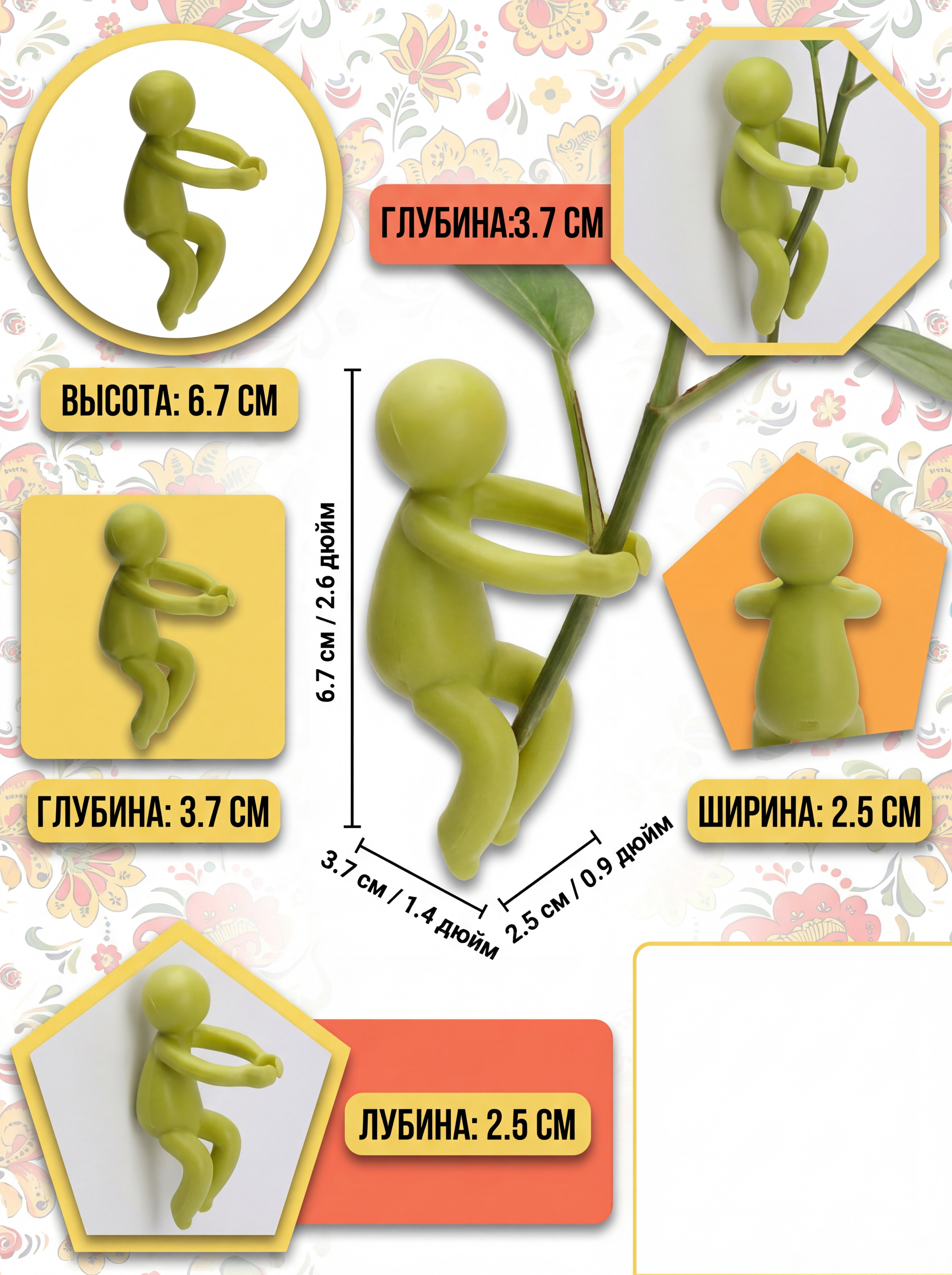

展示浅绿色小人形植物固定支架的产品尺寸,使用不同形状分框排版,…
展示浅绿色小人形植物固定支架的产品尺寸,使用不同形状分框排版,添加俄文尺寸标注,风格和主图保持一致,3:4比例,层次感强,色彩明快,右下角空白不要内容,符合俄罗斯消费者审美

GD759842882
2026.04.07展示浅绿色小人形植物固定支架的产品尺寸,使用不同形状分框排版,添加俄文尺寸标注,风格和主图保持一致,3:4比例,层次感强,色彩明快,右下角空白不要内容,符合俄罗斯消费者审美
GD759842882
2026.04.07






![[Main Image-4] Product Dimension Size Display of 3D Gecko Bookmark.
[Atmosphere Style] Simple and clear, objective and intuitive, which is convenient for users to understand the product size.
[Picture Quality] Clear picture, accurate labeling, commercial shooting texture, high definition.
[Elements] The whole orange gecko bookmark is placed in the center of the picture, and the size annotation is directly marked on the side of the product. It is marked in centimeters (cm) and inches (in) at the same time, which conforms to the reading habit of cross-border users. Maintain the product appearance (physical structure, material texture, color) absolutely consistent with the input product, prevent any deformation and color difference. The product occupies 70% of the picture, the picture is full-screen without border.
[Background] Pure light gray background, clean and concise, so that the size annotation is clearer.
[Light and Shadow] Even soft studio light, no harsh shadow, clear display of product outline and size marking.
[Color Matching] Light gray background with orange product, black size text, clear hierarchy, strong readability.
[Perspective Composition] Front head-up perspective, product centering, complete outline.
[Text Layout] The size data is marked on the right side of the product, the annotation line is thin and clear, the text size is moderate, which is convenient for reading. The title "Product Size" is placed at the top, which is clear at a glance.
[Proportion Resolution] 1:1 proportion, 2K resolution, clear text, super HD.
[Negative Prompt] Deformation, watermark, text confusion, blurred product picture, messy background.](https://gd-cms.dancf.com/gd-cms/xi19e5/0/e52b3a0a-6261-4eb5-b9a2-d1677e6d813f17229.jpeg?x-oss-process=image/resize,w_640,type_6/sharpen,120/interlace,1)


![[Main Image 5] Climbing monkey ornament size specification display, hanging on the vine, clear dimension marking: Total Rope Length 50CM (19.7in), Each Monkey Height 7CM (2.76in). Mark the size with thin lines and text next to the product, clear and not crowded. Light grey gradient background, product centered, keep product shape and color consistent with original image. Text "Perfect for Homestay Garden Courtyard Decoration" placed at the bottom. 1:1 square, commercial product specification photography, super high definition. Negative prompt: distortion, text disorder, blurry product, messy background, watermark, platform logo](https://gd-cms.dancf.com/gd-cms/xi19e5/0/2f0a16e6-77a6-4b32-b924-e3a29e8a5f0777626.jpeg?x-oss-process=image/resize,w_640,type_6/sharpen,120/interlace,1)


![Add product size information on the right side of the picture based on the original image. Keep the product (green macaw pendant, black iron ring, hook) completely unchanged, do not change any product color, shape and position. Add the following size text information in the right blank area:
Length: 17 cm (6.69 in)
Height: 50 cm (19.69 in)
Width: 11 cm (4.33 in)
Iron Ring Diameter: 30 CM (11.81 in)
Text for black clear sans-serif, background is pure white, high contrast, clear reading, do not block the product. Keep the overall picture 1:1 square, pure white background, product display unchanged. [Picture quality] 2K resolution, super clear, text clear recognizable. Negative prompt: deformation, product change, text blur, text disorder.](https://gd-cms.dancf.com/gd-cms/xi19e5/0/b0b7cfdd-9ad7-4147-9470-f9b518719646253.png?x-oss-process=image/resize,w_640,type_6/sharpen,120/interlace,1)


![[Main Image 3] Close-up detail shot of climbing monkey ornament, focus on the fur texture and facial details of the monkeys, the vine rope material. Soft natural light, highlight the texture of resin material and handmade details. Keep product color and shape consistent with original image. 1:1 square, low saturation natural background, close-up composition, commercial product detail photography. English text: "Premium Resin Material" placed on the top negative space, clear text. Super high definition. Negative prompt: distortion, text disorder, blurry product, messy background, watermark, platform logo](https://gd-cms.dancf.com/gd-cms/xi19e5/0/279f832c-7e9e-456f-9e03-848dccaba18978228.jpeg?x-oss-process=image/resize,w_640,type_6/sharpen,120/interlace,1)



![[Main Image 5] Frog pen holder dimension reference display. Place the green frog pen holder next to a standard 15cm ruler, clearly show product length, width, height size, white background, no clutter. [Atmosphere Style] Clear and intuitive size display, help users quickly understand product actual size. [Quality] Clear studio photography, sharp focus, size scale clear and readable. [Elements] Product placed next to the ruler, the size scale is aligned with the product outline, keep green frog product 100% consistent with input image, no deformation. Product and ruler occupy 85% of frame. [Light and Shadow] Uniform soft studio light, no shadow interference, size scale clear. [Color Matching] Pure white background, product green and black ruler scale high contrast, easy to read. [Perspective Composition] Top-down flat lay perspective, product and ruler arranged horizontally. [Text Layout] No extra marketing text, comply with cross-border platform rules. [Proportion Resolution] 1:1 ratio, 2K resolution. [Negative prompt] Deformation, watermark, messy text, blurred product, messy background, Chinese characters](https://gd-cms.dancf.com/gd-cms/xi19e5/0/fd389067-9fc6-467c-b304-663c780a871d13274.png?x-oss-process=image/resize,w_640,type_6/sharpen,120/interlace,1)


![[主图-5] 欗木桌面置物架尺寸规格参数图。
[氛围风格] 规范清晰 跨境电商信息图风格 简洁专业。
[画质] 商业摄影质感 产品清晰 标注线精准 画面干净专业。
[元素] 欗木桌面置物架正面视角居中放置 完整展示整体轮廓。产品周围有清晰的尺寸标注线和箭头 标注关键尺寸:总宽度45.5cm/17.9inch 总高度34.5cm/13.6inch 左侧层高度12.5cm/4.9inch 中间层高度20cm/7.9inch。标注线为细深灰色 箭头清晰 尺寸数字醒目。背景为浅暖灰色渐变 简洁专业。保持产品外观结构材质与输入产品图完全一致 颜色准确无偏差。置物架上可放少量极简小物作为比例参照 但不遮挡尺寸标注。
[光影] 正面均匀柔光 产品各面亮度均匀 结构清晰 边缘干净 阴影极淡 突出产品轮廓和尺寸标注的可读性。
[配色] 主色原木暖棕色 背景浅暖灰色 标注线深灰色 数字黑色 整体专业清晰。
[视角构图] 正面平视角度 产品居中 四周留出足够空间放置尺寸标注 构图平衡 信息层次清晰。
[文字版式] 画面顶部居中大字标题"Dimensions" 粗体无衬线深棕色。尺寸数字标注在对应尺寸线旁 黑色粗体 字号适中清晰 同时标注厘米和英寸两种单位 格式如"45.5cm / 17.9\""。底部有一行小字"Compact Size & Spacious Storage" 深灰色 居中。所有文字为英文 清晰可读 不遮挡产品主体。
[输出要求] 1:1比例 文字清晰锐利 超高清商业摄影质感。
[负向提示词] 变形 文字错乱 产品模糊 背景杂乱 水印 电商平台Logo 中文文字 标注线模糊 尺寸错误。](https://gd-cms.dancf.com/gd-cms/xi19e5/0/e524fdc6-1cc6-4b8a-a307-cf9c5a92d0e322937.jpeg?x-oss-process=image/resize,w_640,type_6/sharpen,120/interlace,1)