已添加
登录/注册
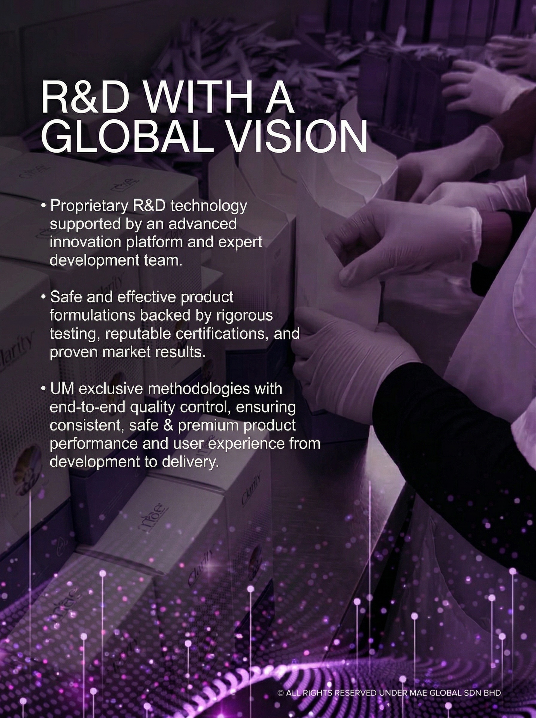
比例3:4, 整体颜色紫黑色 ,把#1的左半部 融入进 #2里…
比例3:4, 整体颜色紫黑色 ,把#1的左半部 融入进 #2里 (需要换图,看到一点手的动作)
GD450342182
2026.04.07
编辑
帮我把这张图改为宽800,高600.其他内容不做修改,只是修改整体的尺寸
venuschen
阿里国际站详情页研发实力板块主图,浅白色背景搭配淡蓝色简约科技纹理,整体为写实+简约科技风,无艺术化滤镜。从上到下层级分明:顶部标题区居中排列,主标题"In-depth R&D Insight"使用无衬线粗体深蓝色,字号最大;副标题"We help you refine materials, optimize performance, and design packaging that perfectly fits your local market."使用无衬线常规体深灰色,字号适中,行高1.5。下方核心展示区为三栏等宽横向布局:第一栏是材料研发模块,顶部是🔬图标加"Material Refinement"无衬线深灰色文字,下方是明亮整洁的实验室场景特写,研发人员观察纸尿裤护理品原材料微观结构,有显微镜和高分子吸水材料、透气无纺布的纹理示意图;第二栏是性能优化模块,顶部是⚙️图标加"Performance Optimization"无衬线深灰色文字,下方是产品性能测试动态画面,展示吸水速率测试、防漏结构模拟、透气性检测,搭配简化数据图表;第三栏是本地化包装模块,顶部是🎨图标加"Localized Packaging"无衬线深灰色文字,下方是多款适配欧美、东南亚市场的定制化纸尿裤护理品包装设计稿陈列,旁边是设计师电脑屏幕上的包装设计界面。所有图标为线条简约风,颜色与主标题一致,所有文字无遮挡,英文规范无错别字,整体专业严谨符合欧美市场审美。
venuschen
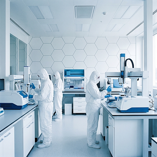
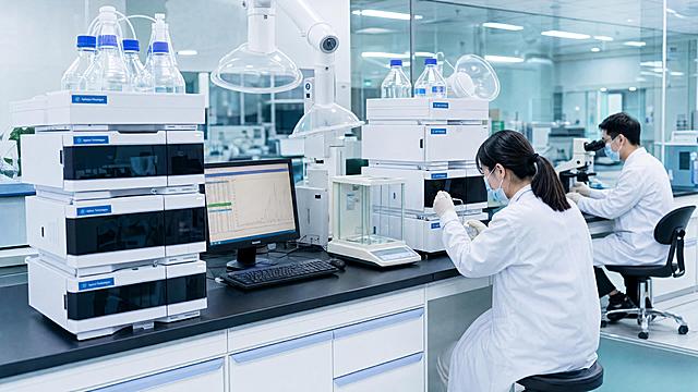
一个干净规整的现代化实验室场景,写实风格,蓝白色调为主,光线明亮柔和,具有清晰的光影层次和细腻的质感表现。画面中有身着白色防护服的研究人员在先进的白色和蓝色精密仪器设备旁工作,背景是带有规则几何图案的白色墙面。构图采用三分法,空间感强,整体氛围专业、严谨、科技感十足,适合作为背景使用。
1q3731qkki2colcha-HB
Amazon listing infographic main image, application scenarios page. Modern laboratory interior scene with clean white walls, lab benches, and scientific equipment in soft focus background. The three-in-one testing instrument system placed on a central lab bench in working state. Top title in large bold text: "For Professional Laboratory Use". Four small scenario thumbnail images arranged in a 2x2 grid at bottom, each with English label: top-left "Pharmaceutical QC" with lab vials scene, top-right "Food & Beverage Testing" with beverage bottles scene, bottom-left "Chemical Research" with beakers scene, bottom-right "Cosmetic Quality Control" with cosmetic bottles scene. Each thumbnail has a thin white border and label below. Cool blue-gray color palette, bright clean laboratory lighting. Keep all three instruments' appearance, structure, color, material texture exactly consistent with input product image. Instruments are the clear focal point, background softly blurred. All text in English, modern sans-serif font. No Chinese characters. 1:1 square ratio, commercial lab photography style, professional and trustworthy. Negative: messy lab, deformed products, Chinese text, people faces, watermarks.
6btiomxhf7yOr1g-HB
模块化洁净室场景图,纯图布局无文案。场景为现代化生物医药实验室内部,模块化洁净室自然放置在实验室中央,周围有穿着洁净服的研发人员在旁操作实验设备,地面是环氧地坪,远处有实验台、试剂架等实验室常见设施,整体环境整洁专业。采用柔和的室内冷白光,色温4000K,光线均匀自然,营造真实使用场景氛围,让用户直观看到产品实际应用效果。产品占画面30%,自然融入环境不突兀,整体风格干净专业,1:1比例800×800像素
1qurjhjcbfb30wnQ-HB
[Screenshot 3] Core Patented Ingredients Screen - Display the patented formula ingredients of the ampoule essence. No product appearance required, focus on ingredient information. [Atmosphere/Style] Professional scientific research style, soft pink low-saturation background, clean and layered, highlight the core ingredients as the main visual. [Element Layout] The whole screen is divided into left and right columns, each column lists three patented ingredients, each ingredient with name and patent number; each patent information uses independent card design, the core ingredient name is enlarged, and the patent number is placed below; core ingredient elements occupy more than 50% of the screen space, large and eye-catching. [Light and Shadow Texture] Soft diffuse light, clear text, moderate contrast, card with subtle shadow to increase layering. [Color Matching] Global background color #f8e8eb; card background #ffffff; text color #333333, low saturation, clean and professional. [Perspective Composition] Two-column vertical composition, clear information hierarchy, easy to read. [Text Layout] Main title at the top "Patented Core Ingredients", each ingredient line: ingredient name + patent number, information arranged neatly, all text in English, no Chinese characters; each patent information has clear spacing, comfortable reading experience. [Proportion Resolution] 9:16 vertical ratio, 4K resolution, clear text, high-definition image quality. [Negative Prompt] Text confusion, wrong patent number, Chinese characters, cluttered layout, blurry picture, distorted text
Febby
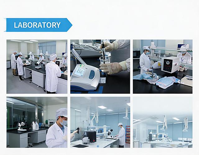
阿里国际站详情页实验室实力展示图,整体风格专业、洁净、现代。顶部放置醒目的蓝色箭头形状标题栏,居中显示白色大写英文"LABORATOR"。下方将5张实验室相关图片以2行3列的网格形式整齐拼接,第2行第3个位置留空,图片之间保留2px的白色间距,整体视觉干净利落。5张图片分别为:1. 实验室全景图:多名穿着白大褂的技术人员在实验台进行纸尿裤检测;2. 实验室特写图:技术人员使用精密仪器进行pH值测试;3. 实验室操作图:技术人员使用专业设备对纸尿裤进行性能测试;4. 实验室细节图:技术人员使用显微镜观察纸尿裤材质结构;5. 实验室空景图:现代化、洁净的实验室整体环境。所有图片保持清晰、无水印,色彩统一为明亮的专业实验室风格,排版参考FACTORY SHOW的布局风格,保持视觉一致性。
venuschen
从参考图中提取右下角的FTMR发酵日粮核心技术板块配图(实验室、科研人员做实验场景),高清还原,去除周围文字和其他板块,仅保留这张图片内容,3:1横版比例,1K高清画质
GD1569870409
将中间的多款护肤品产品间距拉大,让产品分散开不拥挤,保持整体构图、文字排版、玻璃实验仪器和极简高级风格不变,光影和整体质感保持一致
censor-4S2k9ysI
给图片中的人物戴上一副贴合面部的透明护目镜
王金歌
现代化高科技实验室场景,画面干净规整,适合作为背景。明亮的白色与蓝色调为主,洁净的白色墙面镶嵌着深蓝色方块瓷砖,地面为光滑的浅灰色。前景有两位身着全套白色防护服、佩戴护目镜和口罩的科研人员,一位正坐在操作台边专注查看电脑屏幕,另一位站立于大型精密仪器前操作控制面板。实验室中央和后方分布着多台先进的白色与银色相间的分析仪器、设备,带有蓝色显示屏和控制面板,仪器间有金属管道和电缆有序连接。右侧有机械臂装置,左侧前景有透明玻璃容器和绿色植物点缀。整体光线均匀柔和,以冷色调为主,营造出专业、严谨、先进且一尘不染的科研氛围,构图平衡,空间感强,视觉层次分明,信息传达清晰,符合高科技科研环境的审美与功能需求。
1qax0xsjan18k8lg9-HB
高清工业设备配图3:食品质量检测实验室,精密检测仪器,高效液相色谱仪、天平、显微镜等设备,实验人员穿着白大褂进行样品检测,台面整洁,明亮干净的实验室环境,科技感专业风,蒂芙尼蓝冷色调,4K超清画质,真实摄影质感,横版宽幅。
GD805870976
[第7屏] 工厂资质屏-生产工厂认证与资质展示。 [氛围/风格] 专业可信,清晰展示资质认证,低调严谨风格。 [元素布局] 顶部标题,左侧工厂生产环境示意图,右侧排列常见国际认证标识区域,每个认证配名称标注,主体占比约75%,布局均衡不拥挤。 [光影质感] 均匀布光,认证标识清晰,环境图干净。 [配色色系] 全局底色 #f0f0f0,主色深灰,认证标识保持官方颜色,文字黑色。 [视角构图] 左图右认证排版,信息分区清晰。 [文字版式] 顶部标题Professional Factory & Global Certifications,右侧依次列出ISO 9001, CE, RoHS certifications,每个认证配简短说明,文字大小适中,清晰可读。所有文字使用英文。 [比例分辨率] 16:9横版比例,宽度1920像素,高度1080像素,4K分辨率,高清画质,文字清晰可辨。 [负向提示词] 虚构授权标识,夸张背景,文字错乱,中文字符,侵权元素。
1q20fwosf01ic73i3-HB
一个干净规整的现代化实验室场景,采用写实风格,以蓝白色调为主,光线明亮柔和,具有清晰的光影层次和细腻的质感表现。画面中可见身着白色防护服的研究人员在先进的白色和蓝色精密仪器设备旁工作,背景是带有规则几何图案的白色墙面。构图采用三分法,空间感强,整体氛围专业、严谨、科技感十足,适合作为背景使用。
1qax0xsjan18k8lg9-HB
洁净生产车间中的成品质检环节,三到四位质检人员穿着统一的蓝色无尘服、防护帽和口罩,围绕在一台现代化检测设备或操作台前,正在认真查看产品或检测数据。人物动作专注、自然,视线集中在设备或产品上,体现严谨细致的质检流程。检测设备应具有工业质检和医疗护理产品检测的感觉,例如带有传送结构、指示灯、检测面板、简单的仪器装置,但不要过于复杂,不要科幻。桌面与设备周围整洁有序,产品摆放规整,空间干净明亮。背景保持洁净车间风格,白色、浅灰色和淡蓝色为主,空间通透,有安全、规范、可信赖的氛围。画面重点表现“成品质检、确保安全”,让人感受到品牌在出厂前经过严格把关。人物不要对镜头摆拍,不要笑得夸张,重点是自然工作状态和专业性。光线柔和明亮,细节真实清晰,整体适合电商详情页作为安全背书图。写实商业摄影风格,高级感、专业感、信任感强。要求:突出质检动作和检测设备,避免人物过多导致画面拥挤,避免车间脏乱或生活化,不要文字、不要水印、不要杂乱logo
衝衝CC
参考图片的文字排版、玻璃实验仪器和整体极简高级的画面风格,将中间的产品替换为抠出后的多款护肤品,保持构图和文案内容不变,保留所有玻璃仪器只替换中间产品,整体保持干净简约的摄影质感,光影和参考图一致
censor-4S2k9ysI
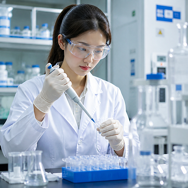
女科研人员戴着白色丁腈手套做科学实验,实验室场景,高清超清画质
阙爷
生物医药研究场景,实验室明亮整洁,先进的科研设备如PCR仪、显微镜、培养皿整齐排列,穿着白色实验服的科研人员专注操作,背景有DNA双螺旋结构模型和分子结构图,整体呈现科技感与严谨氛围,画面清晰,细节丰富,色彩以蓝色和白色为主调,充满专业与创新的视觉感受
叶子mola
整体尺寸改为宽800,高600.内容都不变,就是整体尺寸请修改
venuschen
调整图片为横屏,保持现有四宫格布局和文字 'OUR TEAM',生成8:3比例(1200长450宽)的高清图片,提升清晰度,保留所有内容和原风格
678wb4xmj-HB
6btiomxhf7yOr1g-HB
优化画面中左侧桌面上的化妆品纸盒,让纸盒外观更高端精美,包装设计更美观清晰,保持原图的生产车间场景和所有文字内容不变
678wb4xmj-HB
颜色改成紫色系
用户aDfsYxI4
微生物实验室内部场景,展示生物安全操作规范,实验人员穿戴实验服、手套和护目镜进行规范操作,周围摆放生物安全标识,整体干净严谨的科学氛围,高清科普风格
6anhcooi9YTJZOg-HB
帮我去除图中所有字体
用户XnVsDvPy








![[Screenshot 3] Core Patented Ingredients Screen - Display the patented formula ingredients of the ampoule essence. No product appearance required, focus on ingredient information.
[Atmosphere/Style] Professional scientific research style, soft pink low-saturation background, clean and layered, highlight the core ingredients as the main visual.
[Element Layout] The whole screen is divided into left and right columns, each column lists three patented ingredients, each ingredient with name and patent number; each patent information uses independent card design, the core ingredient name is enlarged, and the patent number is placed below; core ingredient elements occupy more than 50% of the screen space, large and eye-catching.
[Light and Shadow Texture] Soft diffuse light, clear text, moderate contrast, card with subtle shadow to increase layering.
[Color Matching] Global background color #f8e8eb; card background #ffffff; text color #333333, low saturation, clean and professional.
[Perspective Composition] Two-column vertical composition, clear information hierarchy, easy to read.
[Text Layout] Main title at the top "Patented Core Ingredients", each ingredient line: ingredient name + patent number, information arranged neatly, all text in English, no Chinese characters; each patent information has clear spacing, comfortable reading experience.
[Proportion Resolution] 9:16 vertical ratio, 4K resolution, clear text, high-definition image quality.
[Negative Prompt] Text confusion, wrong patent number, Chinese characters, cluttered layout, blurry picture, distorted text](https://gd-cms.dancf.com/gd-cms/xi19e5/0/db13d6c3-c7c6-46b6-a317-8cdb7a0fae043129.jpeg?x-oss-process=image/resize,w_640,type_6/sharpen,120/interlace,1)





![[第7屏] 工厂资质屏-生产工厂认证与资质展示。
[氛围/风格] 专业可信,清晰展示资质认证,低调严谨风格。
[元素布局] 顶部标题,左侧工厂生产环境示意图,右侧排列常见国际认证标识区域,每个认证配名称标注,主体占比约75%,布局均衡不拥挤。
[光影质感] 均匀布光,认证标识清晰,环境图干净。
[配色色系] 全局底色 #f0f0f0,主色深灰,认证标识保持官方颜色,文字黑色。
[视角构图] 左图右认证排版,信息分区清晰。
[文字版式] 顶部标题Professional Factory & Global Certifications,右侧依次列出ISO 9001, CE, RoHS certifications,每个认证配简短说明,文字大小适中,清晰可读。所有文字使用英文。
[比例分辨率] 16:9横版比例,宽度1920像素,高度1080像素,4K分辨率,高清画质,文字清晰可辨。
[负向提示词] 虚构授权标识,夸张背景,文字错乱,中文字符,侵权元素。](https://gd-cms.dancf.com/gd-cms/xi19e5/0/e11bf6bd-0615-4cc3-9069-c0c0ec9a85b410665.jpeg?x-oss-process=image/resize,w_640,type_6/sharpen,120/interlace,1)