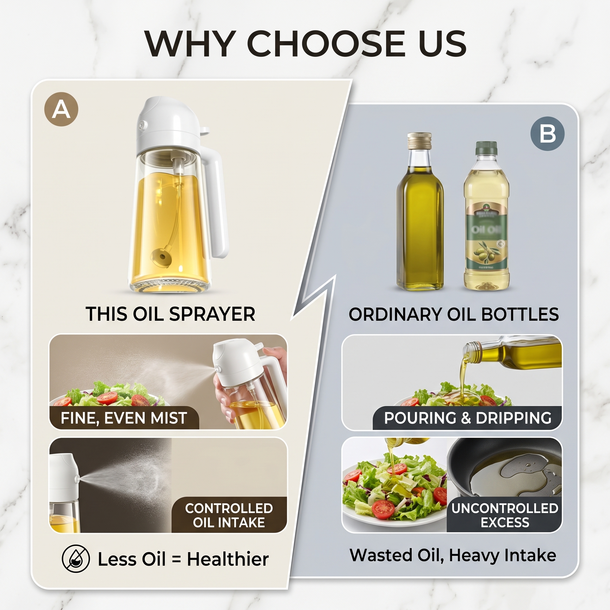

Comparison page: this oil sprayer vs ordinary oil bottles. Show the difference in oil output, highli
1qibmj3g7t9...
2026.04.29Comparison page: this oil sprayer vs ordinary oil bottles. Show the difference in oil output, highli
1qibmj3g7t9...
2026.04.29![[Main Image 4] Multi-scene application display, show where the oil bottle can be used. Clean modern kitchen countertop background, 3-grid layout: first grid shows using for salad, second grid shows using for air fryer preparation, third grid shows using for BBQ grilling. Product placed in center bottom, text at top "MULTIPLE USES FOR ALL COOKING SCENARIOS". Keep product appearance consistent with input. Warm natural kitchen lighting, fresh and inviting atmosphere, fit European and American aesthetic. 1:1 square, 2048x2048, 2K, all English. Negative prompt: distortion, text confusion, cluttered props.](https://gd-cms.dancf.com/gd-cms/xi19e5/0/b5942437-8da2-4896-9e6e-47d69da941b462053.jpeg?x-oss-process=image/resize,w_640,type_6/sharpen,120/interlace,1)

![[Main Image 4] Multi-scenario adaptation display diagram.
[Atmosphere Style] natural life atmosphere, warm and practical;
[Image Quality] commercial photography texture, natural soft light, real clear, picture clean and comfortable.
[Elements] Divide the picture into 4 small grids, showing the oil bottle in different usage scenarios: kitchen countertop, air fryer preparation, salad mixing, BBQ and baking scene, a product in each small grid. **Keep the product appearance (physical structure, material texture, color) exactly the same as the input product picture in each scene, eliminate any deformation and color difference, fine processing**. Each scene is real, the product matches the scene naturally, the light is unified. Each grid has a certain spacing, the picture is not crowded.
[Light and Shadow] natural soft light, uniform brightness, consistent light direction across all four grids, the overall picture is bright and transparent.
[Color Matching] based on the natural color of each scene, the overall tone is coordinated, the product stands out, and it will not be obtrusive.
[Perspective Composition] 宫格 layout, each scene is flat lay or head-up perspective.
[Text Layout] The main title "MULTIPLE SCENARIOS" at the top, each small grid is marked with the scene name below: "Kitchen" "Air Fryer" "Salad" "BBQ & Baking", the text is small but clear, does not cover the product.
[Proportion Resolution] 1:1 proportion, 4k resolution; text clear readable, super high definition.
[Negative prompt] deformation, watermark, text disorder, blurred product picture, messy background, inconsistent product shape in different grids](https://gd-cms.dancf.com/gd-cms/xi19e5/0/8f7c0810-8457-4587-9876-65abefdc552c433.png?x-oss-process=image/resize,w_640,type_6/sharpen,120/interlace,1)

![[Main Image 2] Dual function demonstration, 2-in-1 pour & spray oil bottle. Light gray gradient background, split layout showing two usage modes: left side shows pouring oil on salad, right side shows spraying oil on grilled BBQ food. Keep product appearance consistent with input image. Main title "DUAL FUNCTION 2 IN 1 DESIGN" at top, large bold sans-serif font. Small labels: "POUR MODE" "SPRAY MODE" next to each demo. Commercial bright natural light, clean and bright, product clear. 1:1 square, 2048x2048, 2K, all text in English, no Chinese. Negative prompt: distortion, text confusion, watermark.](https://gd-cms.dancf.com/gd-cms/xi19e5/0/4aa8818b-d522-472e-a266-e6f67fd4f9d562477.jpeg?x-oss-process=image/resize,w_640,type_6/sharpen,120/interlace,1)





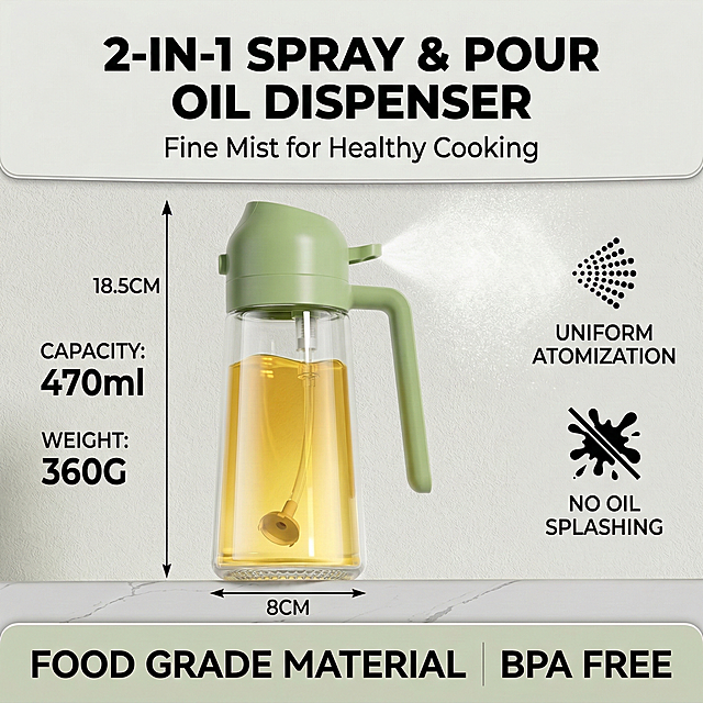
![替换原图中的瓶子,保持原图片整体排版、文字内容、背景颜色和所有文案位置不变,只将瓶子替换为第二张图的新款琥珀色透明玻璃瓶(淡黄色精油、白色胶头滴管、双层瓶身结构),保持瓶子的位置、大小比例和原图一致,替换后整体光影和风格和原图统一,所有文字保持清晰可辨认不变形。原图文案标题:Customizable Essential Oil,四个卖点:Customizable Ingredients、100% Natural Botanical Extracts、Customizable Packaging、Light Texture Fast Absorption,保留所有内容和排版位置不变。[画质] 保持商业摄影高清质感,产品清晰,整体干净高级,符合跨境电商规范。[负向提示词] 文字变形,文字错乱,瓶子变形,背景变色,排版错乱](https://gd-cms.dancf.com/gd-cms/xi19e5/0/15ec360f-9ee5-4152-bb7c-8aa35331c9aa8596.jpg?x-oss-process=image/resize,w_640,type_6/sharpen,120/interlace,1)


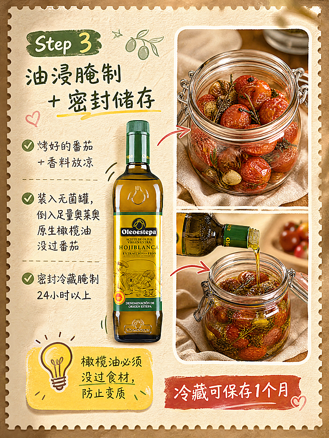
![[Main Image 2] 2 in 1 dual function core卖点展示图。
[Atmosphere Style] modern minimalist kitchen, bright clean;
[Image Quality] commercial photography texture, soft bright natural light, product clear real, picture clean advanced.
[Elements] Glass oil bottle placed in the center of the modern minimalist kitchen countertop, clean light wood countertop with white tile backsplash, a small amount of clean kitchen utensils around, do not grab the focus. **Keep the product appearance (physical structure, material texture, color) exactly the same as the input product picture, eliminate any deformation and color difference, fine processing**. This product supports dual functions of Mist and Stream, the picture focuses on highlighting this core selling point. Product subject accounts for about 60% of the picture, full screen without border.
[Light and Shadow] soft natural light from the side window, bright and transparent, showing the transparency of the glass and the texture of stainless steel, light and shadow level clear.
[Color Matching] main color off-white and light wood color, secondary color black and stainless steel silver, overall fresh and clean.
[Perspective Composition] 45 degree oblique view, medium depth of field, focus on the product.
[Text Layout] The main title "2 IN 1 DESIGN" at the top left, bold large font, dark gray. Below the two function labels: left "MIST SPRAY" right "STREAM POUR", small icons on the left of each label, corresponding to the mist spray and linear pouring functions, the text is clear, the contrast is strong, do not block the product.
[Proportion Resolution] 1:1 proportion, 4k resolution; text clear readable, super high definition.
[Negative prompt] deformation, watermark, text disorder, blurred product picture, messy background](https://gd-cms.dancf.com/gd-cms/xi19e5/0/34e0c6c2-6162-4037-840a-6facd4954e92515.png?x-oss-process=image/resize,w_640,type_6/sharpen,120/interlace,1)


![[主图 7] 规格定制说明图,保持产品外观一致不变形。[氛围风格] 简约高级清晰;[画质] 商业摄影质感,画面干净高级,文字清晰;[元素] 产品放置画面中心位置,背景干净浅灰白色;四周简约文字分点标注产品特性:Customizable Ingredients, Customizable Packaging, 100% Natural Botanical Extracts, Light Texture Fast Absorption;每个要点前配简约对勾小图标;产品主体占比约60%;[光影] 均匀柔光,产品突出清晰;[配色] 浅灰白背景,深灰色文字,产品自然色调;[视角构图] 中心对称构图,产品+文字排版规整;[文字版式] 顶部主标题 "Customizable Essential Oil" 深棕色加粗居中;下方分四行左对齐排列卖点文字图标,灰色常规字号;[比例分辨率] 1:1比例,2k分辨率,超高清文字清晰可辨;[负向提示词] 变形,产品模糊,文字错乱,背景杂乱,中文,夸张夸大词汇](https://gd-cms.dancf.com/gd-cms/xi19e5/0/793a574b-cdf1-459a-bb67-3a968ceb98c18580.png?x-oss-process=image/resize,w_640,type_6/sharpen,120/interlace,1)



![[详情图13] 使用场景合集展示。[氛围/风格] 多场景展示,突出多用性。[画面元素] 三宫格纵向排列,分别展示:厨房煎炒控油、烧烤喷油、沙拉轻食喷油,三个场景光影统一风格一致,产品保持同一款式。[文字版式] 顶部大标题 "满足多样烹饪场景",每个小图标注场景名称,排版整齐干净。[尺寸分辨率] 750×1200px,3:4比例,2k分辨率。保留产品外观不变。](https://gd-cms.dancf.com/gd-cms/xi19e5/0/565e3fe2-0483-4f82-9f38-578d66c8c0dc15288.jpg?x-oss-process=image/resize,w_640,type_6/sharpen,120/interlace,1)

![[第3屏] 成分功效解析屏-卷发定型摩丝,天然植物成分展示。
[氛围/风格] 专业科研质感,干净简约,低饱和自然配色。
[元素布局] 双行网格布局,每个成分占比超过30%屏幕,左侧展示完整椰子切片,右侧展示乳木果油滴,整体画面成分元素占比超过50%,突出天然成分。产品信息放在底部,不抢主视觉。
[光影质感] 柔和均匀光线,材质纹理清晰,通透自然。
[配色色系] 全局底色 #ebf4e9,主色椰肉米白+乳木果油黄绿,辅助色浅灰文字。
[视角构图] 居中对称构图,成分元素为视觉核心,信息清晰易读。
[文字版式] 顶部主标题 "Natural Ingredients For Healthy Curls",每行网格左图右文:左侧椰子图标,右侧文字 "Coconut Oil: Moisturizes & Softens";左侧乳木果图标,右侧文字 "Shea Oil: Nourishes & Smooths",文字大小适中清晰。
[比例分辨率] 16:9 横版比例,4K 分辨率,文字清晰可辨。
[负向提示词] 中文字符,元素比例过小,背景杂乱,虚假宣传,水印。](https://gd-cms.dancf.com/gd-cms/xi19e5/0/74112b8f-225a-4d2e-a691-bc0c4bb61cbd40208.png?x-oss-process=image/resize,w_640,type_6/sharpen,120/interlace,1)