已添加
登录/注册
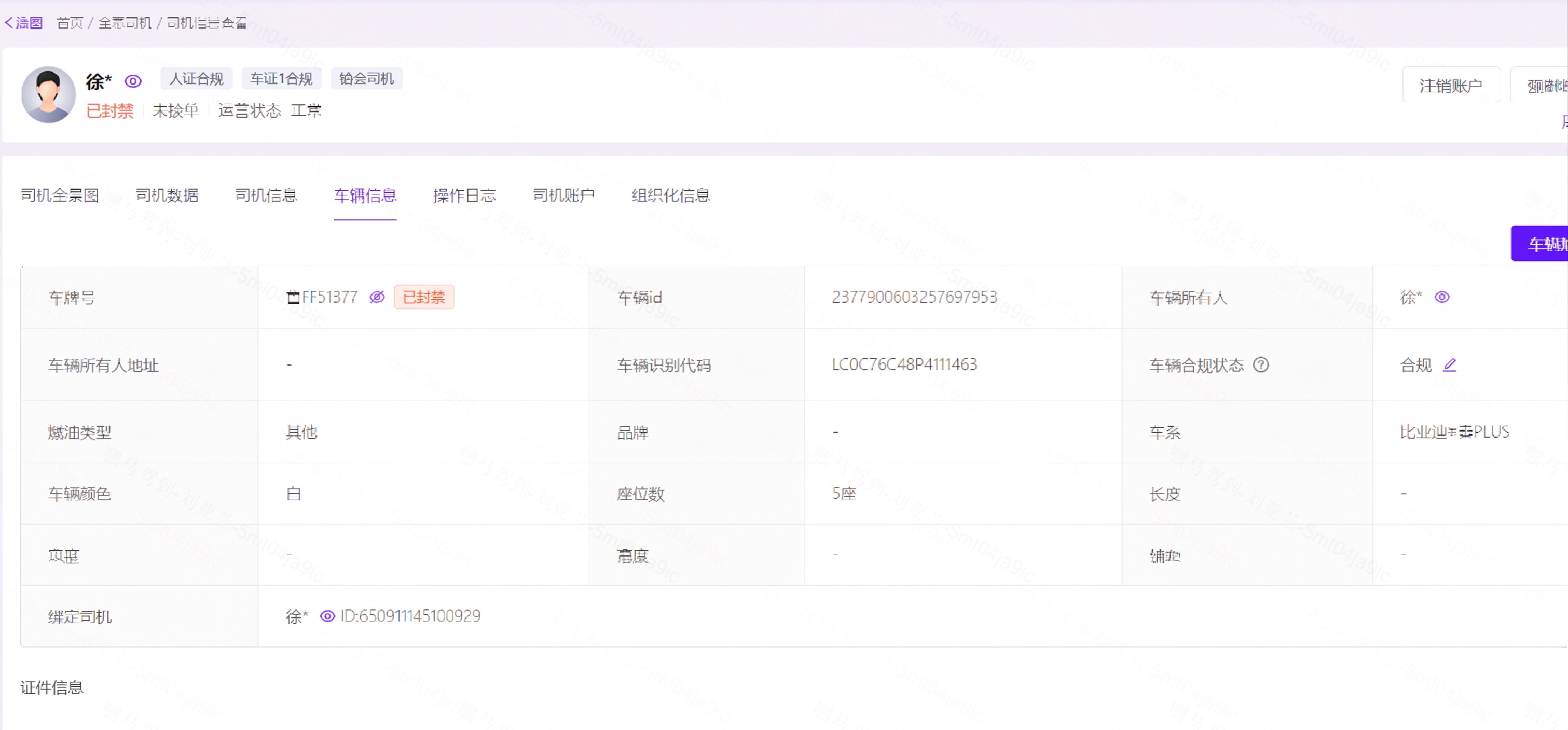
修改图片,将车牌号旁的文字“未出车”改成“已封禁”,其余所有内容保持不变
GD395751123
2026.04.28
做同款
修改图片,将车牌号旁的文字“未出车”改成“已封禁”,其余所有内容保持不变
GD395751123
将图中保险期限的文字从“2025-01-03至2026-01-02”修改为“2025-07-17至2026-07-17”,保持字体、字号、颜色、位置与原图完全一致,其余所有内容、界面布局、样式均保持不变,画面清晰自然,无修改痕迹
1q00sxzxbe-HB
把红框内的2021-07-05 10:49:17改成:2025-04-22 10:49:17
品牌战略
大幅调整UI布局结构,让排版和原图有明显区别,必须保持导航栏在页面最顶部,保留原图所有功能模块和全部文字信息,风格不夸张变化
用户UbYvWF2S
重新排版图片里的内容,让整体排列更有序整齐,提升设计感,保留全部内容和文字信息不改变
用户UbYvWF2S
修改这个UI页面布局,保持所有内容和文字信息不变,调整各个模块的位置和排布方式,让新布局和原设计稿有明显区别
用户UbYvWF2S
修改UI排版,保留原图整体风格不做夸张变化,将导航栏固定放在页面顶部,保留原图全部功能和内容信息,重新优化排版布局,做出和原图不一样的排版结构
用户UbYvWF2S
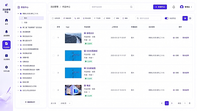
完全按照用户上传图片的布局、内容和风格生成活动管理平台作品中心页面,保留左侧导航栏、作品树形目录,以及右侧作品列表所有内容、按钮、配色和布局,保持原设计风格不变。
1r4quyeubaDB5fqw-HB
完全重构UI排版,让布局结构和原图差异非常明显,所有文字信息、功能模块和导航栏位置(顶部)完全保留,仅重新排布各模块位置
用户UbYvWF2S
重新美化设计这个企业后台数据统计界面,让UI更现代化、美观清晰,保持原有所有数据、表格内容和布局不变,升级视觉风格,采用更简洁现代的设计,提升界面层次感和专业性
186****5851
移除图片左上角的文字'volvo呼叫中心',使用和原导航栏相同的深蓝色背景填充,保持界面其他内容、布局和颜色完全不变
GD965343187
生成一张网页端UI设计图,宽高比为16:9。整体风格为深色专业风,与之前所有页面保持完全一致的视觉体系,左侧侧边导航栏当前“⚙️ 设置”菜单项高亮显示,所有导航栏文字全部替换为中文,不得出现英文,右侧为内容区。侧边栏所有文字均为中文,内容与之前保持一致,仅切换选中态到设置。右侧内容区:顶部页面标题“系统设置”字体稍大,采用分组卡片形式,每组一个设置区域:分组1账户信息,包含当前头像缩略图+“更换头像”按钮、昵称输入框默认显示“吴建旭”、登录邮箱输入框默认显示“xxx@example.com”、“🔒 修改密码”按钮;分组2品牌信息,右上角小标签“💡 未来版本:您的品牌信息将用于文章的品牌露出”,包含品牌名称输入框默认显示“智宅焕”、品牌Logo上传区域+当前Logo缩略图、品牌简介多行文本输入框默认显示示例简介;分组3写作偏好,包含默认写作语气下拉框选项“深度专业”“通俗易懂”“犀利直接”、默认文章长度下拉框选项“短文(800字)”“中长文(1500字)”“长文(2500字)”、自动保存频率下拉框选项“每30秒”“每1分钟”“每5分钟”;分组4数据与存储,显示当前存储用量“已使用 156MB / 总计 1GB”、“📤 导出全部数据”按钮、“🗑️ 清空缓存”低调灰色按钮。底部操作区为主按钮高亮样式“💾 保存设置”。设置页信息层级清晰分组明确,品牌信息扩展点低调可见,所有中文文字清晰可见,字体使用无衬线体,整个页面所有文字均为中文,不得保留任何英文导航项。
678typ3ch-HB
修改数据:曝光私信改为267,发布评论改为139,发布视频改为4,添加好友改为16,接待人数改为97,消息处理数改为103,转化人数改为26,处理好友申请改为8,保持文字字体和颜色和原图一致,其他内容布局不变
1q1jkg78qn22ff2ub-HB
安防集成平台后台门禁历史记录查询页面,白色背景商务风,每个门对应历史开门记录列表,人员车辆分开显示,白色底色商务设计
GD835856161
再次修改UI排版,与当前这张图的布局结构做出明显差异,保持导航栏在页面顶部,保留所有文字信息和功能不变
用户UbYvWF2S
安防集成平台后台设备接入管理页面,白色背景商务风,可输入厂商名称,选择对接协议,设备列表展示,白色底色商务设计
GD835856161
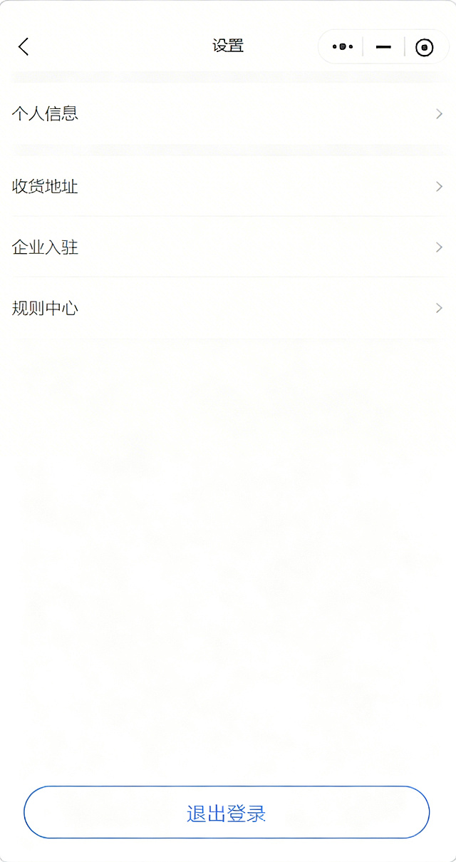
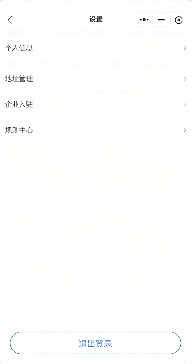
在原图设置页面的“企业入驻”选项下方新增“规则中心”一栏,保持整体UI样式和排版一致,其余内容不变
GD720042415
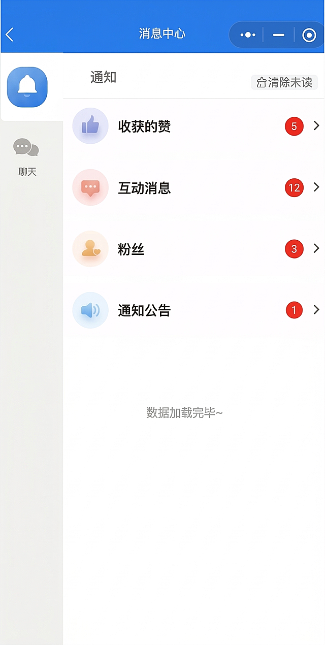
基于原图片进行修改,将列表中“回复”这个文字选项修改为“互动消息”,保持原界面布局、配色、图标和其他内容都不变
GD459476474
将图中文字“懂车帝”修改为“易湃”,将“卖车通-IM微聊”修改为“新车订单”,保持原UI风格、字体和排版不变
1q0g4bcqz9-HB
修正这张巨量营销后台截图的数值,使其逻辑合理:1. 总消耗为10424486.48元,时间跨度为2025-03-24到2026-03-24(1年),因此日消耗应为28560.23元;2. 日预算设置为50000元;3. 账户余额应大于日消耗,修改为125680.75元;4. 共享钱包余额修改为15000.00元;5. 竞价投放福利余额修改为68520.36元;其余内容保持和原图完全一致,界面元素、布局、文字样式均不改变,仅修改上述数字,保证数字显示自然符合界面风格。
GD891326228
将设置页面里的“收货地址”文字修改为“地址管理”,保持整体UI样式、排版和其余内容不变,之前已新增“规则中心”一栏需保留
GD720042415
生成问卷调研系统后台管理页面的任务列表页设计,遵循如下布局结构: 顶部左侧为「新建任务」按钮,右侧为搜索框「搜索任务...」 接下来是Tab切换栏,包含全部 | 草稿(3) | 进行中(8) | 已关闭(34)几个选项 然后是过滤栏:场景筛选:[全部 ▼] 部门:[全部 ▼] 时间:[最近30天 ▼] 主体是任务表格,表头包含:任务名称 | 场景(彩色标签) | 部门 | 时间范围 | 状态(标签)| 已填/总数(含进度条)| 剩余名额 | 可见范围 | 操作(查看/统计/更多 ▼) 表格样例行:任务名称「2025年度考核」,场景标签「人员考核」,状态「进行中」,进度「67%」 表格样例行:任务名称「食堂满意度调查」,场景标签「满意度」,状态「进行中」,进度「89%」 操作菜单“更多”下拉包含:编辑任务(仅草稿)、发布任务(仅草稿)、查看进度、二维码管理、统计分析、关闭任务、删除(仅草稿) 表格下方是分页器:< 1 2 3 ... > 整体风格采用现代简约浅色UI设计,和参考图一致的清爽后台系统风格,保持干净的卡片式布局和一致的配色规范
1q8ikq3gq43vii6m-HB
修改这张中国人民保险投保方案图片,将投保人、被保人、车主姓名/名称均从“武汉市长江新区小彪百货营业部(个体工商户)”改成“湖北莼川建设工程有限公司”,车牌号鄂WQR678改成鄂L1J055,车型名称从江淮HFC5043CCYP91K2C2V仓栅式运输车改成程力威牌CLW5163GSSD5,初登日期2019/01/04改成2019/09/19,使用性质营业货车改成重型载货专项作业车,保留原图片其他所有内容和排版样式不变,保持清晰干净
GD207343025
对远程银行全渠道数据进行科学分类,分为服务运营、业务协同两个大板块,使用柱状图对比不同业务进量,使用饼图展示各类占比数据,使用条形图对比完成率,设计极简科技风BI数据看板,图表清晰,数据一目了然
1qwb45pisqOy-05Q-HB
修正这张磁力智投后台截图的数据:1. 账户可用余额改为12000000,红包可用余额改为15230.5,今日预算改为12000000,当日实耗广告花费改为11270136.81,消耗进度改为93.9%;2. 花费板块、封面曝光数、素材曝光数、行为数旁边的黑色平曲线修改为平缓上升的合理数据曲线,保持原界面的风格、颜色、排版完全不变
GD891326228













![生成问卷调研系统后台管理页面的任务列表页设计,遵循如下布局结构:
顶部左侧为「新建任务」按钮,右侧为搜索框「搜索任务...」
接下来是Tab切换栏,包含全部 | 草稿(3) | 进行中(8) | 已关闭(34)几个选项
然后是过滤栏:场景筛选:[全部 ▼] 部门:[全部 ▼] 时间:[最近30天 ▼]
主体是任务表格,表头包含:任务名称 | 场景(彩色标签) | 部门 | 时间范围 | 状态(标签)| 已填/总数(含进度条)| 剩余名额 | 可见范围 | 操作(查看/统计/更多 ▼)
表格样例行:任务名称「2025年度考核」,场景标签「人员考核」,状态「进行中」,进度「67%」
表格样例行:任务名称「食堂满意度调查」,场景标签「满意度」,状态「进行中」,进度「89%」
操作菜单“更多”下拉包含:编辑任务(仅草稿)、发布任务(仅草稿)、查看进度、二维码管理、统计分析、关闭任务、删除(仅草稿)
表格下方是分页器:< 1 2 3 ... >
整体风格采用现代简约浅色UI设计,和参考图一致的清爽后台系统风格,保持干净的卡片式布局和一致的配色规范](https://gd-cms.dancf.com/gd-cms/xi19e5/0/195b7aee-d00c-47c8-9aa1-c469b90bb68629679.jpg?x-oss-process=image/resize,w_640,type_6/sharpen,120/interlace,1)