已添加
登录/注册
现代感与商务感结合的扁平风设计,轻拟物元素增强视觉层次,印刷风排版清晰传达产品使用指南,无节日信息。
哒哒咚咚
2026.04.29
做同款
保留原始图片整体排版布局和产品展示,仅将所有中文替换为对应的英文,翻译内容: 第一部分:原中文'不粘涂层 易脱模,采用进口涂层 不粘效果更佳 易脱模 易清理',替换为'NON-STICK COATING, EASY DEMOLDING Imported coating for superior non-stick performance, easy demolding and cleaning'; 第二部分:原中文'受热均匀,采用镀铝板材,导热快,受热均匀',替换为'UNIFORM HEATING Made of aluminized sheet metal, fast heat conduction and uniform heating'; 保持原有英文标题,保持整体配色、版式不变,产品图片保留不变,文字位置和排版和原图一致。
1r8o826tw6EDH_TA-HB
将这张图内所有中文文字替换为英文,保留原图片布局、颜色风格和左侧烤盘产品图不变。注意事项译为Precautions,产品特点译为Product Features,文字内容翻译:注意事项:1. Before first use, rinse with clean water, dry, apply a thin layer of baking tray oil (oil without salt or corrosivity), put it into the baking tray, set the temperature to 200°C, bake empty for 10 minutes, take it out to cool, wipe it clean and then use it. 2. Do not leave baked or unbaked products in the mold for a long time. 3. Do not use hard objects such as steel balls to scrape the baking tray. 4. Do not use salad oil to smear the baking tray. 产品特点:1. Made of aluminized material, lightweight, good thermal conductivity, saves baking time. 2. Integrated large size, no welding points, multiple functions waiting for you to discover.
1r8o826tw6EDH_TA-HB
「图片1」,生成一屏360°立体烘烤热风循环系统详情页,商品名称为Convection oven,适配阿里国际平台,单图比例为3:4,需求屏数为1张。热空气循环,进行烘焙,效率极高,能够满足高端烹饪需求。
Anil
[第3屏] 核心卖点总览页,展示测温枪的六大核心优势。 [氛围/风格] 简约现代科技风,干净通透,专业可信,符合跨境电商审美,商业展示质感。 [元素布局] 顶部大标题,下方六个卖点卡片分为两行三列排列,每个卡片包含一个简约图标、主标题和副标题,整体卡片间距均匀,不拥挤,留足留白。每个卖点卡片背景为浅白色,边框用产品主色橙黄色点缀,卡片大小一致,排版规整。 [光影质感] 整体光线均匀明亮,每个卡片阴影柔和,图标和文字清晰突出,无明显光影死角。 [配色色系] 全局底色:#F5F5F5(浅灰);卡片底色:#FFFFFF(纯白);主体配色:#FFA826(橙黄边框与图标) + #222222(深灰文字);辅助色:#888888(浅灰副标题)。 [视角构图] 平面平视构图,满屏分布,顶标题下六卡片,1:1比例平衡舒适,阅读动线从上到下从左到右。 [文字版式] 顶部主标题 "Core Advantages",深灰色粗体,居中,字号约画面宽度8%。六个卖点分别为: 1. Icon + "Fast Reading" + "One Second Measure" 2. Icon + "Non-contact" + "Hygienic & Safe" 3. Icon + "Clear Display" + "Green Backlight" 4. Icon + "Versatile" + "Bbq Baking Steak" 5. Icon + "Ergonomic" + "Comfortable Grip" 6. Icon + "Auto Power Off" + "Energy Saving" 所有文字均为英文,每个卖点主标题粗体深灰,副标题常规浅灰,字号适中,移动端清晰可读,无中文字符。 [比例分辨率] 1:1方图比例,4K分辨率,文字清晰可辨,超高清。 [负向提示词] 中文字符,文字错乱,卡片变形,排版杂乱,水印,背景花哨,夸张过度,绝对化宣传。
1pzzr5n3hj-HB
保留原始图片整体排版布局和产品展示,仅将所有中文替换为对应的英文,翻译内容:原中文'食品级涂层安全环保,轻松一翻,即可成型脱模',替换为'FOOD-GRADE COATING, SAFE AND ECO-FRIENDLY Easy flipping for quick demolding and shaping'; 保持整体配色、版式不变,产品图片保留不变,文字位置和排版和原图一致。
1r8o826tw6EDH_TA-HB
Replace all Chinese text with English, keep original composition, product display and style. Top big text: "Carbon Steel Craft", second line big text: "Even Heating", small text: "Safe and odorless, avoid local over-baking." Keep the hands holding the opened toast box with bread inside, maintain the original wooden board and plain background. Commercial product photography, high definition, clear and legible English text, keep all product details, color and texture consistent with original image. 1:1 square ratio, 2K resolution.
奶龙的左脚皮
[Main Image 6] Comparison with ordinary trays. Keep this product appearance consistent with input image. Left and right comparison layout: left side this product, marked "Our Stainless Steel Tray", right side ordinary plastic tray, marked "Ordinary Tray". Compare three dimensions with checkmarks and crosses: Material: ✓Food-grade / ×Unknown
GD488911950
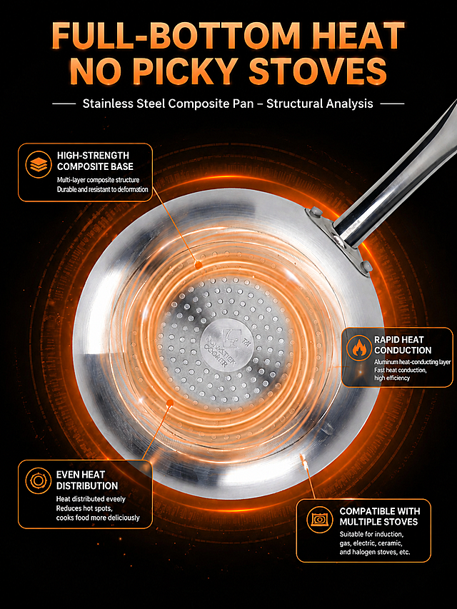
将这张炒锅产品说明图中的所有中文翻译成英文,保持原有的黑色橙色配色风格、锅具产品展示布局、构图和光影效果完全不变,只替换文字为对应的英文
奶龙的左脚皮
亚马逊A+第二张图,双图布局,左侧展示"Heavy-Gauge Carbon Steel + Food-Grade Non-Stick Coating",右侧对比"No More Sticking - Perfect Results Every Time",包含对应文案,突出材质和不粘特性对比,专业跨境电商风格
GD389677683
保留原图所有构图和元素,仅将图上的所有中文替换为对应英文:大标题“产品参数”换成“Product Parameters”,“产品名称”换成“Product Name”,“空气炸锅硅油纸”换成“Air Fryer Silicone Oil Paper”,“产品材质”换成“Product Material”,“双面硅加工耐油纸”换成“Double-sided Silicone-treated Oil-resistant Paper”,“产品尺寸”换成“Product Size”,“20*16*4.5cm”保留数字不变,“适用范围”换成“Applicable Range”,“3-6L空气炸锅”换成“3-6L Air Fryers”,“用途”换成“Usage”,“烤鸡翅、薯条、炸鸡、烤红薯等空气炸锅垫纸”换成“Air fryer liner paper for roasting chicken wings, french fries, fried chicken, sweet potatoes and more”,保持文字排版位置不变,保持原图风格和画质。
1pzt3wbyai-HB
保留原图所有产品展示、尺寸标注、构图和配色,仅把所有中文替换为对应英文:产品特点 → Product Features,防油防粘,高温耐热 → Oil-resistant, non-stick, high-temperature resistant;产品用途 → Product Usage,锅中蒸烤、烘焙、煎炸等 → Steaming, baking, frying in pan etc.;参数为手工测量,存在误差,请以收到实物为准 → Manual measurement, error exists, subject to actual product received,保持文字的排版、位置、颜色和字体风格一致,不改变任何视觉元素。
1pzt3wbyai-HB
以图中的耐热硅胶防溅罩为元素,适用于日常烹饪,可放入洗碗机清洗,设计6张跟耐热硅胶防溅罩有关的图,物体主体特征不变,英语,比例 「1:1」
灿灿ovo
[商品] 使用【图1】Scotch-Brite 海绵百洁布;保留黄绿双色外观与双面结构;产品颜色、比例、材质与原图一致。 [画面] 第8张 信任保障,目标是降低购买顾虑,展示耐用性与使用注意事项。采用认证检测型 + 使用说明型组合。浅绿渐变背景。画面上方中央放置 1 片百洁布,周围环绕 4 个圆形图标卡片呈放射状排列,分别代表:耐用测试(百洁布弯折不变形)、多表面安全(不锈钢/陶瓷/玻璃图标矩阵)、易清洗晾干(悬挂晾干图示)、人体工学握持(手握图示)。画面下方有一个横向白色圆角信息条,列出 "Care Tips":Rinse After Use / Hang to Dry / Do Not Use on Hot Surfaces / Replace When Worn。整体信息丰富但有序,可信专业。 [视觉] 套系策略:风格=东南亚明亮洁净商业摄影风;标题字=现代无衬线粗体;正文字=简洁无衬线体;主色=清新绿;背景延展=浅绿到淡白的同色渐变背景,带细腻质感;强调色=活力黄;标题色=深森林绿;正文色=中灰;组件=圆形图标卡片、白色圆角信息条、细线引线;光影=均匀柔光,产品有立体感,图标卡片扁平简洁。 [文字] 顶部大标题 "Built to Perform. Made to Last.",粗体深森林绿,字号最大;副标题 "Quality You Can Trust for Daily Use" 浅灰色。4 个圆形图标卡片下方各配英文短标题:"Long-Lasting Durability" "Safe on Surfaces" "Easy to Maintain" "Comfort Grip"。底部信息条标题 "Care Tips" 深绿色粗体,4 条注意事项为中灰色,用黄色小圆点分隔。所有文字为英文,横排。不使用 Best、No.1 等极限词。 [规格] 图片比例 1:1,4K,避免变形、错字、文字过小、夸大宣传、虚假认证、产品颜色改变、水印、中文。
GD722065653
编辑这张披萨盘参数图,要求清除'品牌 爱满屋'文字,把'尺寸 7寸 8寸 9寸'放到表格左侧,将图片所有中文文字翻译成英文,确保所有英文字母清晰可辨认,修改图片整体比例为3:4,保留原有的三个披萨盘尺寸标注和产品内容排版,底图保持不变。
林小沐呐
将图片中第一个文案里的1.65改为1.5,第二个文案里的0.14改为0.1,保持其他内容、布局和风格完全不变
p8ECHwLM
Redesign 360° 3D Convection Baking System page to match the style of reference image [image2]. Keep the content of image1, change the background, layout, text color and card style to be consistent with the overall style of other pages. [Reference style from image2] : Light gray #F0F2F5 global background, dark blue #0a2463 main title color, dark gray body text color, white rounded corner card for content blocks, consistent font style and size, clean professional layout. [Keep original content] : Title 360° 3D Convection Baking System
Anil
[商品] 使用【图3】5棍鸡肉卷华夫机正面角度+【图1】铭牌细节图;保留产品全部结构、颜色、材质,铭牌上的文字(Waffle Maker, Model:5H, Dimensions, Volts, Power, Production Date, MADE IN CHINA, CE)完全保留不改动。 [画面] 目标:细节与安全品质展示,突出做工材质和安全设计。构图:左侧大图展示产品正面(占40%),右侧纵向排列3个细节放大圆/方框:上方=不粘烤盘特写(水滴在表面滚落示意不粘效果),中间=防烫把手+不锈钢铰链细节,下方=铭牌参数标签特写(清晰可见)。背景:深灰色渐变,简洁专业。 [视觉] 套系策略:风格=跨境极简商业摄影风;标题字=现代无衬线粗体(英文字体);正文字=简洁无衬线体;主色=深炭黑+不锈钢银灰;背景延展=深炭灰渐变+金属质感;强调色=暖橙金,用于细节标注圈和图标;标题色=纯白;正文色=浅银灰;组件=圆形放大框、细线引线、细节标签;光影=均匀布光,突出材质纹理和金属反光。 [文字] 顶部主标题"Built To Last, Designed For Safety"。三个细节分别配文:"Food-Grade Non-Stick Coating - Easy Cleanup"、"Heat-Resistant Handle & Stainless Steel Hinges"、"CE Certified - Reliable Quality"。底部补充"Stainless Steel Body For Durability"。全部文字横向排版,铭牌原有文字保留不修改。 [规格] 图片比例9:16竖版,4K分辨率,medium质量。避免变形、错字、文字过小、铭牌文字被修改或翻译、产品结构改变、冷蓝色调。
6aw8q0yl9FyX7ug-HB
以图中的隔热硅胶手套为元素,烤箱手套,烹饪烘焙厨房隔热手套,设计6张跟隔热硅胶手套有关的图,物体主体特征不变,英语,欧美模特,比例 「16:9」
灿灿ovo
对这张蜂蜡面包袋使用步骤四宫格电商图进行整体视觉风格和排版升级,保持四步使用说明和产品主体不变,提升为高端精致的现代电商详情页风格,统一暖色调配色,优化四宫格布局和文字排版层级,增强画面质感和高级感,保留所有英文文案内容
GD899491528
使用商品详情页技能根据商品图「图片1」生成详情页,参考图为「图片1」,商品名称为Gas heating Powder Coating Oven ,卖点为Low operating cost natural gas curing oven, high thermal efficiency Uniform hot air circulation, ±1℃ precise temperature control Multi safety protection, explosion-proof design for powder coating workshop Fast heating speed, boost daily production capacity Support LPG & city natural gas, customized size available Durable stainless steel liner, easy maintenance Low emission, environmental friendly for factory compliance,适配平台为其他跨境平台,图片比例为9:16,需求屏数为8张,
GD265524083
[主图-7] 使用安心与材质适配,展示百洁布适用的多种厨房表面,帮助用户了解安全使用范围,减少顾虑,突出多表面适用。 [统一基调] 跨境 TikTok Shop 1:1 方图,英文文案,东南亚视觉偏明亮洁净,主色为洁净白+清新绿+活力黄,标题字色深绿,辅助字色中灰,强调色为品牌亮黄;字体为现代无衬线粗体,组件为圆角图标卡片矩阵,整体信息清晰、可信。 [画面] 浅米白渐变背景,画面中央偏上放置 1 片黄绿双色百洁布,呈正面视角,占画面约 40%。下方为 2 行 3 列的圆角图标卡片矩阵,共 6 个卡片,每个卡片内有一个简洁的厨房材质图标与英文名称,分别代表:Stainless Steel(不锈钢)、Ceramic(陶瓷)、Glass(玻璃)、Non-Stick Cookware(不粘锅,用绿色对勾标识海绵面适用)、Sink(水槽)、Countertop(台面)。每个图标上方有小对勾符号表示安全适用。画面右上角有一个亮绿色圆形标签,写 "Safe for Daily Use"。底部有一行小字说明 "Use scrub side for tough stains sponge side for delicate surfaces",引导正确使用双面。产品外观、颜色、比例与输入图完全一致。 [光影质感] 商业信息图质感,光线均匀柔和,产品有轻微投影,图标卡片简洁扁平,整体干净专业、可信。 [配色] 浅米白背景,深绿标题,亮绿强调色,灰色辅助文字;图标卡片为白色圆角,图标用深绿线条;整体洁净、专业。 [文字版式] 顶部大标题 "Safe on Multiple Surfaces",粗体深绿色,字号最大;副标题 "For All Your Kitchen Needs" 浅灰色;6 个材质卡片名称为英文,字号中等;底部说明文字为小号深灰色。所有文字为英文,放在负空间,不遮挡产品主体。 [输出要求] 1:1 比例 2048x2048,图标清晰,文字锐利可读;禁止使用 Best、No.1 等极限词,禁止变形、错字、模糊、杂乱、水印、平台 Logo、中文。
GD722065653
保留原始图片整体排版布局和产品展示,仅将所有中文替换为对应的英文,翻译内容:原中文'边缘光滑设计·不易划伤,边缘光滑设计,不会划伤手,安全放心,持久耐用',替换为'SMOOTH EDGE DESIGN, NOT EASY TO SCRATCH Smooth edge design, will not scratch hands, safe and reliable, durable'; 保持整体配色、版式不变,产品图片保留不变,文字位置和排版和原图一致。
1r8o826tw6EDH_TA-HB
[主图-7] 材质安全与使用安心图,展示海绵擦适用的安全材质范围和正确使用提示,减少误用顾虑,增强信任感。 [统一基调] 马来西亚TikTok Shop东南亚风格,明亮暖调,主色活力橙+清新绿+洁净白+浅木色,标题深棕橙色粗体无衬线,辅助字深灰,圆角信息卡,整体温馨可信有家庭感。去除所有3M/Scotch-Brite标识。 [画面] 画面采用左右结构:左侧是"Safe For"安全适用材质矩阵,用6个圆形图标展示可安全使用的材质表面——不粘锅涂层、陶瓷餐具、不锈钢水槽、玻璃器皿、塑料容器、瓷砖台面,每个图标下方有英文名称。右侧是一块大号橙色圆点海绵擦主视觉,旁边有一个绿色盾牌+对勾的安全认证图标,以及一只手轻轻握住海绵擦展示人体工学握感的特写。背景是温暖的浅木色厨房台面+柔和自然光,有少量绿色植物点缀,营造家庭温馨安全感。底部有一条使用小贴士区域,用图标+短文字展示正确使用建议:轻柔按压即可、冲洗后晾干、避免使用于高敏感漆面。 [光影质感] 温馨家庭场景摄影质感,自然光从侧上方洒下,产品有柔和阴影,木材质感真实,整体温暖可信。 [配色] 背景浅木色+白色,产品橙色,安全标识用清新绿色,图标底色为浅灰圆形,整体温暖明亮。 [文字版式] 顶部大标题英文"Safe For Your Whole Kitchen",副标题"Non-Scratch For Delicate Surfaces"。左侧6个材质图标下方分别标注英文:"Non-Stick"、"Ceramic"、"Stainless Steel"、"Glass"、"Plastic"、"Tile"。底部小贴士区域文字:"Gentle Pressure Works Best"、"Rinse & Air Dry"、"Avoid High Heat"。所有文字无衬线,标题粗体深橙色,说明文字深灰色。 [输出要求] 1:1正方形,2048x2048,图标清晰,文字锐利,整体温馨可信。负向:变形、错字、模糊、3M字样、Scotch-Brite、中文、杂乱、水印、平台Logo、医疗化表达。
GD722065653
[第2屏] 痛点对比屏-护锅优势对比展示(英文版)。氛围风格:fresh comparison style, left-right split layout, soft natural light, commercial photography. Elements layout: this screen uses【图1】as product, split screen into left and right, left shows traditional metal scraper scratches non-stick pan coating, right shows this silicone spatula stirs gently in intact non-stick pan, middle split by light gray line. Silicone spatula appearance is same as original image. Background is uniform light off-white, small light gray icons at bottom. Light and shadow: uniform soft light on both sides, no hard shadows, clear contrast. Color scheme: overall background #FAF7F2 (light off-white); left side dark gray metal + damaged black pan, right side off-white silicone + intact light gray non-stick pan; auxiliary color #D4A373 (accent) + #2C2C2C (text). Perspective: front eye-level, symmetrical left-right layout, enough text space on top and bottom, reading flow from left to right. Text layout: main title on top "No More Scratches, Protect Your Pans" dark brown bold, center aligned. Left subtitle "Traditional Metal Scraper" with red cross icon, right subtitle "Soft Silicone Spatula" with green check icon. Three selling points at bottom "Works on All Cookware, Protects Coating, Extends Pan Life", text arranged clearly, not crowded. Proportion: 9:16 vertical, 4K resolution, text clear. Negative prompt: product deformation, exaggerated comparison, watermark, text distortion, wrong pan structure, color deviation.
TT张TT
Product information sheet with timeline flow layout, text and icons only, no product photos. Light gray and blue color scheme. Top: main title with decorative underline. Content flows vertically: About section with 4 numbered feature blocks each having icon on left and text on right. Divider line. Printing Instructions as horizontal timeline with 6 steps connected by arrows, each step with icon above and text below. Warning callout box with border. Bottom section: brand and contact details arranged in a row with icons. Clean corporate style, English text, vertical A4 2:3 ratio, organized informational sheet design.
觅金双星




![[第3屏] 核心卖点总览页,展示测温枪的六大核心优势。
[氛围/风格] 简约现代科技风,干净通透,专业可信,符合跨境电商审美,商业展示质感。
[元素布局] 顶部大标题,下方六个卖点卡片分为两行三列排列,每个卡片包含一个简约图标、主标题和副标题,整体卡片间距均匀,不拥挤,留足留白。每个卖点卡片背景为浅白色,边框用产品主色橙黄色点缀,卡片大小一致,排版规整。
[光影质感] 整体光线均匀明亮,每个卡片阴影柔和,图标和文字清晰突出,无明显光影死角。
[配色色系] 全局底色:#F5F5F5(浅灰);卡片底色:#FFFFFF(纯白);主体配色:#FFA826(橙黄边框与图标) + #222222(深灰文字);辅助色:#888888(浅灰副标题)。
[视角构图] 平面平视构图,满屏分布,顶标题下六卡片,1:1比例平衡舒适,阅读动线从上到下从左到右。
[文字版式] 顶部主标题 "Core Advantages",深灰色粗体,居中,字号约画面宽度8%。六个卖点分别为:
1. Icon + "Fast Reading" + "One Second Measure"
2. Icon + "Non-contact" + "Hygienic & Safe"
3. Icon + "Clear Display" + "Green Backlight"
4. Icon + "Versatile" + "Bbq Baking Steak"
5. Icon + "Ergonomic" + "Comfortable Grip"
6. Icon + "Auto Power Off" + "Energy Saving"
所有文字均为英文,每个卖点主标题粗体深灰,副标题常规浅灰,字号适中,移动端清晰可读,无中文字符。
[比例分辨率] 1:1方图比例,4K分辨率,文字清晰可辨,超高清。
[负向提示词] 中文字符,文字错乱,卡片变形,排版杂乱,水印,背景花哨,夸张过度,绝对化宣传。](https://gd-cms.dancf.com/gd-cms/xi19e5/0/f7239337-0a18-48ac-87be-2031b02e64812848.png?x-oss-process=image/resize,w_640,type_6/sharpen,120/interlace,1)



![[Main Image 6] Comparison with ordinary trays. Keep this product appearance consistent with input image. Left and right comparison layout: left side this product, marked "Our Stainless Steel Tray", right side ordinary plastic tray, marked "Ordinary Tray". Compare three dimensions with checkmarks and crosses: Material: ✓Food-grade / ×Unknown](https://gd-cms.dancf.com/gd-cms/xi19e5/0/cdd9bc80-1ccb-4fbb-b565-8aedad643e0617952.png?x-oss-process=image/resize,w_640,type_6/sharpen,120/interlace,1)



![[商品] 使用【图1】Scotch-Brite 海绵百洁布;保留黄绿双色外观与双面结构;产品颜色、比例、材质与原图一致。
[画面] 第8张 信任保障,目标是降低购买顾虑,展示耐用性与使用注意事项。采用认证检测型 + 使用说明型组合。浅绿渐变背景。画面上方中央放置 1 片百洁布,周围环绕 4 个圆形图标卡片呈放射状排列,分别代表:耐用测试(百洁布弯折不变形)、多表面安全(不锈钢/陶瓷/玻璃图标矩阵)、易清洗晾干(悬挂晾干图示)、人体工学握持(手握图示)。画面下方有一个横向白色圆角信息条,列出 "Care Tips":Rinse After Use / Hang to Dry / Do Not Use on Hot Surfaces / Replace When Worn。整体信息丰富但有序,可信专业。
[视觉] 套系策略:风格=东南亚明亮洁净商业摄影风;标题字=现代无衬线粗体;正文字=简洁无衬线体;主色=清新绿;背景延展=浅绿到淡白的同色渐变背景,带细腻质感;强调色=活力黄;标题色=深森林绿;正文色=中灰;组件=圆形图标卡片、白色圆角信息条、细线引线;光影=均匀柔光,产品有立体感,图标卡片扁平简洁。
[文字] 顶部大标题 "Built to Perform. Made to Last.",粗体深森林绿,字号最大;副标题 "Quality You Can Trust for Daily Use" 浅灰色。4 个圆形图标卡片下方各配英文短标题:"Long-Lasting Durability" "Safe on Surfaces" "Easy to Maintain" "Comfort Grip"。底部信息条标题 "Care Tips" 深绿色粗体,4 条注意事项为中灰色,用黄色小圆点分隔。所有文字为英文,横排。不使用 Best、No.1 等极限词。
[规格] 图片比例 1:1,4K,避免变形、错字、文字过小、夸大宣传、虚假认证、产品颜色改变、水印、中文。](https://gd-cms.dancf.com/gd-cms/xi19e5/0/c707b9e1-05bc-4150-8d9d-3d2dd62875488317.jpeg?x-oss-process=image/resize,w_640,type_6/sharpen,120/interlace,1)


![Redesign 360° 3D Convection Baking System page to match the style of reference image [image2]. Keep the content of image1, change the background, layout, text color and card style to be consistent with the overall style of other pages.
[Reference style from image2] : Light gray #F0F2F5 global background, dark blue #0a2463 main title color, dark gray body text color, white rounded corner card for content blocks, consistent font style and size, clean professional layout.
[Keep original content] : Title 360° 3D Convection Baking System](https://gd-cms.dancf.com/gd-cms/xi19e5/0/a6a7e3db-d31a-4e81-a8a9-0a600aaf6e4d38013.png?x-oss-process=image/resize,w_640,type_6/sharpen,120/interlace,1)
![[商品] 使用【图3】5棍鸡肉卷华夫机正面角度+【图1】铭牌细节图;保留产品全部结构、颜色、材质,铭牌上的文字(Waffle Maker, Model:5H, Dimensions, Volts, Power, Production Date, MADE IN CHINA, CE)完全保留不改动。
[画面] 目标:细节与安全品质展示,突出做工材质和安全设计。构图:左侧大图展示产品正面(占40%),右侧纵向排列3个细节放大圆/方框:上方=不粘烤盘特写(水滴在表面滚落示意不粘效果),中间=防烫把手+不锈钢铰链细节,下方=铭牌参数标签特写(清晰可见)。背景:深灰色渐变,简洁专业。
[视觉] 套系策略:风格=跨境极简商业摄影风;标题字=现代无衬线粗体(英文字体);正文字=简洁无衬线体;主色=深炭黑+不锈钢银灰;背景延展=深炭灰渐变+金属质感;强调色=暖橙金,用于细节标注圈和图标;标题色=纯白;正文色=浅银灰;组件=圆形放大框、细线引线、细节标签;光影=均匀布光,突出材质纹理和金属反光。
[文字] 顶部主标题"Built To Last, Designed For Safety"。三个细节分别配文:"Food-Grade Non-Stick Coating - Easy Cleanup"、"Heat-Resistant Handle & Stainless Steel Hinges"、"CE Certified - Reliable Quality"。底部补充"Stainless Steel Body For Durability"。全部文字横向排版,铭牌原有文字保留不修改。
[规格] 图片比例9:16竖版,4K分辨率,medium质量。避免变形、错字、文字过小、铭牌文字被修改或翻译、产品结构改变、冷蓝色调。](https://gd-cms.dancf.com/gd-cms/xi19e5/0/7067daae-db25-458b-bb1b-1052a6ac1a6537106.jpeg?x-oss-process=image/resize,w_640,type_6/sharpen,120/interlace,1)


![[主图-7] 使用安心与材质适配,展示百洁布适用的多种厨房表面,帮助用户了解安全使用范围,减少顾虑,突出多表面适用。
[统一基调] 跨境 TikTok Shop 1:1 方图,英文文案,东南亚视觉偏明亮洁净,主色为洁净白+清新绿+活力黄,标题字色深绿,辅助字色中灰,强调色为品牌亮黄;字体为现代无衬线粗体,组件为圆角图标卡片矩阵,整体信息清晰、可信。
[画面] 浅米白渐变背景,画面中央偏上放置 1 片黄绿双色百洁布,呈正面视角,占画面约 40%。下方为 2 行 3 列的圆角图标卡片矩阵,共 6 个卡片,每个卡片内有一个简洁的厨房材质图标与英文名称,分别代表:Stainless Steel(不锈钢)、Ceramic(陶瓷)、Glass(玻璃)、Non-Stick Cookware(不粘锅,用绿色对勾标识海绵面适用)、Sink(水槽)、Countertop(台面)。每个图标上方有小对勾符号表示安全适用。画面右上角有一个亮绿色圆形标签,写 "Safe for Daily Use"。底部有一行小字说明 "Use scrub side for tough stains sponge side for delicate surfaces",引导正确使用双面。产品外观、颜色、比例与输入图完全一致。
[光影质感] 商业信息图质感,光线均匀柔和,产品有轻微投影,图标卡片简洁扁平,整体干净专业、可信。
[配色] 浅米白背景,深绿标题,亮绿强调色,灰色辅助文字;图标卡片为白色圆角,图标用深绿线条;整体洁净、专业。
[文字版式] 顶部大标题 "Safe on Multiple Surfaces",粗体深绿色,字号最大;副标题 "For All Your Kitchen Needs" 浅灰色;6 个材质卡片名称为英文,字号中等;底部说明文字为小号深灰色。所有文字为英文,放在负空间,不遮挡产品主体。
[输出要求] 1:1 比例 2048x2048,图标清晰,文字锐利可读;禁止使用 Best、No.1 等极限词,禁止变形、错字、模糊、杂乱、水印、平台 Logo、中文。](https://gd-cms.dancf.com/gd-cms/xi19e5/0/e78c4416-48ab-420c-b6da-dc9d80e502278562.jpeg?x-oss-process=image/resize,w_640,type_6/sharpen,120/interlace,1)

![[主图-7] 材质安全与使用安心图,展示海绵擦适用的安全材质范围和正确使用提示,减少误用顾虑,增强信任感。
[统一基调] 马来西亚TikTok Shop东南亚风格,明亮暖调,主色活力橙+清新绿+洁净白+浅木色,标题深棕橙色粗体无衬线,辅助字深灰,圆角信息卡,整体温馨可信有家庭感。去除所有3M/Scotch-Brite标识。
[画面] 画面采用左右结构:左侧是"Safe For"安全适用材质矩阵,用6个圆形图标展示可安全使用的材质表面——不粘锅涂层、陶瓷餐具、不锈钢水槽、玻璃器皿、塑料容器、瓷砖台面,每个图标下方有英文名称。右侧是一块大号橙色圆点海绵擦主视觉,旁边有一个绿色盾牌+对勾的安全认证图标,以及一只手轻轻握住海绵擦展示人体工学握感的特写。背景是温暖的浅木色厨房台面+柔和自然光,有少量绿色植物点缀,营造家庭温馨安全感。底部有一条使用小贴士区域,用图标+短文字展示正确使用建议:轻柔按压即可、冲洗后晾干、避免使用于高敏感漆面。
[光影质感] 温馨家庭场景摄影质感,自然光从侧上方洒下,产品有柔和阴影,木材质感真实,整体温暖可信。
[配色] 背景浅木色+白色,产品橙色,安全标识用清新绿色,图标底色为浅灰圆形,整体温暖明亮。
[文字版式] 顶部大标题英文"Safe For Your Whole Kitchen",副标题"Non-Scratch For Delicate Surfaces"。左侧6个材质图标下方分别标注英文:"Non-Stick"、"Ceramic"、"Stainless Steel"、"Glass"、"Plastic"、"Tile"。底部小贴士区域文字:"Gentle Pressure Works Best"、"Rinse & Air Dry"、"Avoid High Heat"。所有文字无衬线,标题粗体深橙色,说明文字深灰色。
[输出要求] 1:1正方形,2048x2048,图标清晰,文字锐利,整体温馨可信。负向:变形、错字、模糊、3M字样、Scotch-Brite、中文、杂乱、水印、平台Logo、医疗化表达。](https://gd-cms.dancf.com/gd-cms/xi19e5/0/3178e6fe-48f3-4f48-90e4-e6b6c86d59428406.jpeg?x-oss-process=image/resize,w_640,type_6/sharpen,120/interlace,1)
![[第2屏] 痛点对比屏-护锅优势对比展示(英文版)。氛围风格:fresh comparison style, left-right split layout, soft natural light, commercial photography. Elements layout: this screen uses【图1】as product, split screen into left and right, left shows traditional metal scraper scratches non-stick pan coating, right shows this silicone spatula stirs gently in intact non-stick pan, middle split by light gray line. Silicone spatula appearance is same as original image. Background is uniform light off-white, small light gray icons at bottom. Light and shadow: uniform soft light on both sides, no hard shadows, clear contrast. Color scheme: overall background #FAF7F2 (light off-white); left side dark gray metal + damaged black pan, right side off-white silicone + intact light gray non-stick pan; auxiliary color #D4A373 (accent) + #2C2C2C (text). Perspective: front eye-level, symmetrical left-right layout, enough text space on top and bottom, reading flow from left to right. Text layout: main title on top "No More Scratches, Protect Your Pans" dark brown bold, center aligned. Left subtitle "Traditional Metal Scraper" with red cross icon, right subtitle "Soft Silicone Spatula" with green check icon. Three selling points at bottom "Works on All Cookware, Protects Coating, Extends Pan Life", text arranged clearly, not crowded. Proportion: 9:16 vertical, 4K resolution, text clear. Negative prompt: product deformation, exaggerated comparison, watermark, text distortion, wrong pan structure, color deviation.](https://gd-cms.dancf.com/gd-cms/xi19e5/0/a7d9c487-6387-42bc-a61d-47a900657b1313686.png?x-oss-process=image/resize,w_640,type_6/sharpen,120/interlace,1)
