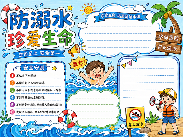
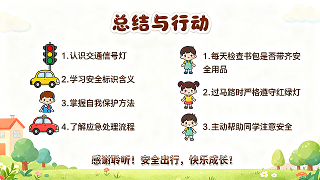
基于参考图重新生成一张网络安全主题手抄报,黑白为主色调,使用红… - 图片创意预览

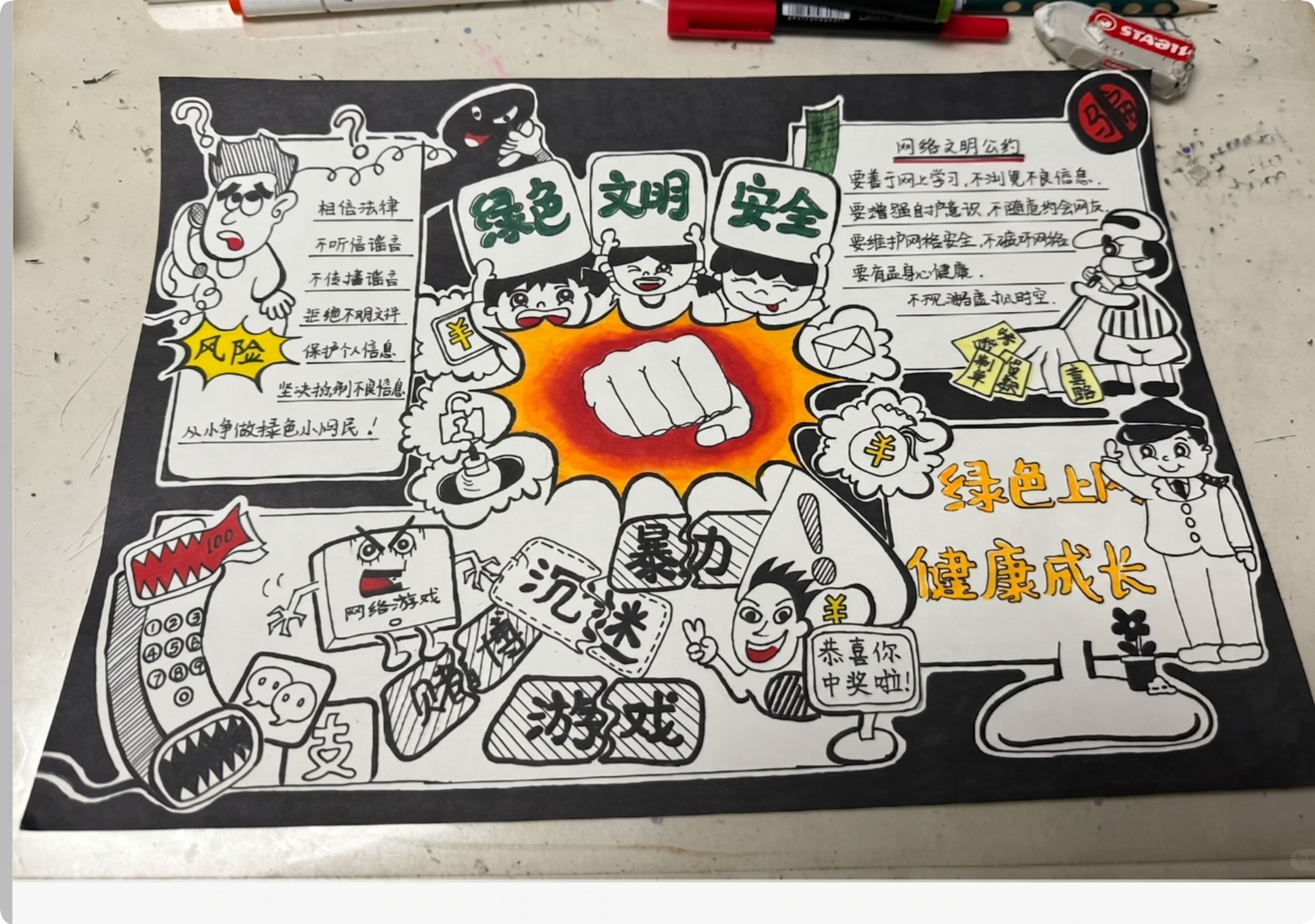
基于参考图重新生成一张网络安全主题手抄报,黑白为主色调,使用红…

基于参考图重新生成一张网络安全主题手抄报,黑白为主色调,使用红色、黄色、绿色作为点缀,手抄报内容紧扣网络安全知识和防范常识,版面美观,适合六年级学生参赛,内容包含网络安全防范知识,整体保持手抄报的手绘

一张A4横版校园安全科普手抄报海报,扁平插画风格,色彩明亮活泼,适合中小学生阅读。整体采用四宫格分区布局,顶部为报头区,下方分为左右两大栏,每栏上下两个栏目,共四个科普栏目,版式精美,信息层次分明。 【报头区】顶部横幅,主标题大字醒目:"安全伴我行",副标题:"防欺凌·防诈骗·交通安全·消防安全 科普专刊",配有盾牌、红绿灯、火焰、警示标志等安全主题装饰图标。 【栏目一:对校园欺凌说"不"】左上区域,橙色系卡片边框。 小标题:"什么是校园欺凌?" 内容:校园欺凌不仅指打架斗殴,还包括语言欺凌(起侮辱性绰号、嘲笑挖苦)、社交欺凌(孤立、排挤)和网络欺凌(在网上发布侮辱性言论或隐私)。 小标题:"遭遇欺凌怎么办?" 三条要点:不沉默——勇敢向老师家长报告或拨打报警电话;不硬扛——保持冷静寻找机会逃离,生命安全第一;不旁观——看到同学被欺负及时向大人求助。 温馨提示:《未成年人保护法》是保护我们的坚强后盾。 【栏目二:反诈防骗 警钟长鸣】右上区域,紫色系卡片边框。 小标题:"识破常见骗术" 内容:游戏陷阱——免费领皮肤、低价充值诱导点击钓鱼链接;冒充熟人——盗取QQ微信账号以生病急用钱为由要求转账,务必电话核实。 小标题:"防骗'三不一多'原则" 内容:未知链接不点击,陌生来电不轻信,个人信息不透露,转账汇款多核实。一旦发现被骗,立即保留证据并告诉家长报警。 【栏目三:交通安全 文明出行】左下区域,蓝色系卡片边框。 小标题:"步行与骑行安全" 内容:过马路要"一停二看三通过",走斑马线,不闯红灯,不在马路上追逐打闹或低头看手机,注意远离大货车盲区。未满12周岁不骑自行车上路,未满16周岁不骑电动车。 小标题:"乘车安全" 内容:乘坐私家车系好安全带,儿童坐后排。乘坐公交车坐稳扶好,不将头手伸出窗外。坚决不坐超载、无牌无证的"黑车"。 【栏目四:消防安全 牢记心间】右下区域,红色系卡片边框。 小标题:"家庭防火小常识" 内容:用火用电不离人,燃气灶做饭人不离开厨房,电热器蚊香远离易燃物,人走断电,不用湿手碰插座。电动车不进楼,切勿将电动车或电池带入室内充电。 小标题:"火场逃生口诀" 内容:小火快跑,浓烟关门。门外浓烟密布时关好门,用湿布堵住门缝,在窗边等待救援。遇到火灾第一时间拨打119报警,说清地点和火势。中小学生不参与救火,首要任务是逃生。 每个栏目配有对应主题的简笔画小图标(如盾牌、警示铃、红绿灯、灭火器等),文字清晰易读,字号适中,四周留有安全边距。背景为浅色系渐变,整体风格统一活泼,充满校园手抄报的手绘感。 画面中所有信息区域必须填充完整合理的内容,不得出现空白框、空白占位、横线待填写区域、空列表项、空单元格,确保是完整可用的成品海报。画面中所有数字必须精确渲染,不得错位、遗漏或编造。一张A4横版校园安全科普手抄报海报,扁平插画风格,色彩明亮活泼,适合中小学生阅读。整体采用四宫格分区布局,顶部为报头区,下方分为左右两大栏,每栏上下两个栏目,共四个科普栏目,版式精美,信息层次分明。

【报头区】顶部横幅,主标题大字醒目:"安全伴我行",副标题:"防欺凌·防诈骗·交通安全·消防安全 科普专刊",配有盾牌、红绿灯、火焰、警示标志等安全主题装饰图标。

【栏目一:对校园欺凌说"不"】左上区域,橙色系卡片边框。
小标题:"什么是校园欺凌?" 内容:校园欺凌不仅指打架斗殴,还包括语言欺凌(起侮辱性绰号、嘲笑挖苦)、社交欺凌(孤立、排挤)和网络欺凌(在网上发布侮辱性言论或隐私)。
小标题:"遭遇欺凌怎么办?" 三条要点:不沉默——勇敢向老师家长报告或拨打报警电话;不硬扛——保持冷静寻找机会逃离,生命安全第一;不旁观——看到同学被欺负及时向大人求助。
温馨提示:《未成年人保护法》是保护我们的坚强后盾。

【栏目二:反诈防骗 警钟长鸣】右上区域,紫色系卡片边框。
小标题:"识破常见骗术" 内容:游戏陷阱——免费领皮肤、低价充值诱导点击钓鱼链接;冒充熟人——盗取QQ微信账号以生病急用钱为由要求转账,务必电话核实。
小标题:"防骗'三不一多'原则" 内容:未知链接不点击,陌生来电不轻信,个人信息不透露,转账汇款多核实。一旦发现被骗,立即保留证据并告诉家长报警。

【栏目三:交通安全 文明出行】左下区域,蓝色系卡片边框。
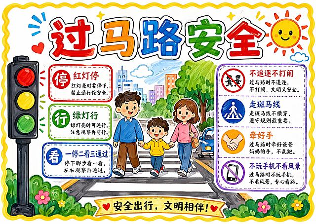
小标题:"步行与骑行安全" 内容:过马路要"一停二看三通过",走斑马线,不闯红灯,不在马路上追逐打闹或低头看手机,注意远离大货车盲区。未满12周岁不骑自行车上路,未满16周岁不骑电动车。
小标题:"乘车安全" 内容:乘坐私家车系好安全带,儿童坐后排。乘坐公交车坐稳扶好,不将头手伸出窗外。坚决不坐超载、无牌无证的"黑车"。

【栏目四:消防安全 牢记心间】右下区域,红色系卡片边框。
小标题:"家庭防火小常识" 内容:用火用电不离人,燃气灶做饭人不离开厨房,电热器蚊香远离易燃物,人走断电,不用湿手碰插座。电动车不进楼,切勿将电动车或电池带入室内充电。
小标题:"火场逃生口诀" 内容:小火快跑,浓烟关门。门外浓烟密布时关好门,用湿布堵住门缝,在窗边等待救援。遇到火灾第一时间拨打119报警,说清地点和火势。中小学生不参与救火,首要任务是逃生。

每个栏目配有对应主题的简笔画小图标(如盾牌、警示铃、红绿灯、灭火器等),文字清晰易读,字号适中,四周留有安全边距。背景为浅色系渐变,整体风格统一活泼,充满校园手抄报的手绘感。

画面中所有信息区域必须填充完整合理的内容,不得出现空白框、空白占位、横线待填写区域、空列表项、空单元格,确保是完整可用的成品海报。画面中所有数字必须精确渲染,不得错位、遗漏或编造。
A hand-drawn marker-style Chinese hand-copied newspaper (手抄报) about eye protection and vision care. Theme: protecting eyesight. Marker style, pure white background, fresh and lively atmosphere. A4 horizontal layout (297x210mm). Layout structure: - Top center: main title "爱护眼睛 · 保护视力" in bold colorful marker font with cute cartoon eyes and glasses illustrations. Subtitle below: "明亮眼睛看世界". Decorative label "心灵的窗户" with heart icon. - Left section: "护眼小常识" box - introduction to why eye protection matters, with a big friendly eye character illustration. Short text about eyes being our windows to the world. - Middle-left section: "护眼'三不要'" box with red warning style - three things NOT to do: 1. 不要躺着看书 (don't read while lying down) 2. 不要长时间看手机电脑 (don't stare at screens too long) 3. 不要在强光或昏暗处看书 (don't read in too bright or dim light) Each with a small crossed-out icon illustration. - Middle-right section: "护眼好习惯" box with green positive style - three good habits: 1. 认真做眼保健操 (do eye exercises) 2. 多去户外活动 (more outdoor activities) 3. 保持正确坐姿 (keep correct sitting posture) Each with a small checkmark icon illustration. - Right top section: "20-20-20法则" box - the 20-20-20 rule explained: every 20 minutes, look at something 20 feet away for 20 seconds. With a clock and distance illustration. - Right bottom section: "食物也护眼" box - healthy foods for eyes: carrots, blueberries, spinach, fish, eggs. Each with a cute small food drawing. Bottom banner: "6月6日 全国爱眼日" with colorful stars. Decorative elements: eyes, glasses, stars, hearts, lightbulbs, sun, trees, book icons scattered around. Hand-drawn wavy borders around each section. All text in Chinese. Style: authentic marker pen hand-drawn feel with visible marker strokes, bold black outlines, bright color palette of blue, green, yellow, orange, red. Clean white paper background with subtle paper texture. Each content section is filled with complete, reasonable Chinese text content - no blank boxes or empty placeholders. Layout is balanced, educational and fun for students.A hand-drawn marker-style Chinese hand-copied newspaper (手抄报) about eye protection and vision care. Theme: protecting eyesight. Marker style, pure white background, fresh and lively atmosphere. A4 horizontal layout (297x210mm).

Layout structure:
- Top center: main title "爱护眼睛 · 保护视力" in bold colorful marker font with cute cartoon eyes and glasses illustrations. Subtitle below: "明亮眼睛看世界". Decorative label "心灵的窗户" with heart icon.

- Left section: "护眼小常识" box - introduction to why eye protection matters, with a big friendly eye character illustration. Short text about eyes being our windows to the world.

- Middle-left section: "护眼'三不要'" box with red warning style - three things NOT to do:
  1. 不要躺着看书 (don't read while lying down)
  2. 不要长时间看手机电脑 (don't stare at screens too long)
  3. 不要在强光或昏暗处看书 (don't read in too bright or dim light)
  Each with a small crossed-out icon illustration.

- Middle-right section: "护眼好习惯" box with green positive style - three good habits:
  1. 认真做眼保健操 (do eye exercises)
  2. 多去户外活动 (more outdoor activities)
  3. 保持正确坐姿 (keep correct sitting posture)
  Each with a small checkmark icon illustration.

- Right top section: "20-20-20法则" box - the 20-20-20 rule explained: every 20 minutes, look at something 20 feet away for 20 seconds. With a clock and distance illustration.

- Right bottom section: "食物也护眼" box - healthy foods for eyes: carrots, blueberries, spinach, fish, eggs. Each with a cute small food drawing.

Bottom banner: "6月6日 全国爱眼日" with colorful stars.

Decorative elements: eyes, glasses, stars, hearts, lightbulbs, sun, trees, book icons scattered around. Hand-drawn wavy borders around each section.

All text in Chinese. Style: authentic marker pen hand-drawn feel with visible marker strokes, bold black outlines, bright color palette of blue, green, yellow, orange, red. Clean white paper background with subtle paper texture. Each content section is filled with complete, reasonable Chinese text content - no blank boxes or empty placeholders. Layout is balanced, educational and fun for students.