![[Main image 2] Core selling poi… - 图片创意预览](https://gd-cms.dancf.com/gd-cms/xi19e5/0/11944157-eba9-404f-9a17-1b490261d40a24175.png)

[Main image 2] Core selling poi…
[Main image 2] Core selling points function display image of Calamine Soap. [Atmosphere style] UGC f

GD180407460
2026.05.11[Main image 2] Core selling points function display image of Calamine Soap. [Atmosphere style] UGC f
GD180407460
2026.05.11![[第4张] 亚马逊跨境详情页肤质适配页 - 多肤质适用与温和配方卖点展示。本张使用【图1】中的橙色面霜罐作为产品主体,置于画面底部中央,产品外观与输入图一致。
[氛围/风格] 清新温和,专业可信,跨境极简信息卡风格,商业设计质感。
[元素布局] 画面上方横向排列四个圆形肤质卡片,等距分布,占画面上半部分约50%;每个卡片内有对应肤质的肌肤纹理微距示意 + 肤质名称;卡片下方中央放置橙色面霜罐,占比约25%;背景为浅米色到淡橙色的柔和渐变;画面点缀水滴、叶片等温和元素;产品罐身颜色、形状、文字与输入图完全一致。
[光影质感] 均匀柔光照明,产品底部自然投影,卡片有轻微悬浮感,整体明亮柔和。
[配色色系] 全局底色浅米白 #FAF5EE;主色暖橙 #FF8C42;辅助色淡绿 #A8D5BA、淡粉 #F8C8C8、淡紫 #D4C5E2、米色卡片底;文字色深灰 #333333。
[视角构图] 上下结构,上四卡片下产品,阅读动线顶部标题 → 四卡片 → 底部产品 + 标语。
[文字版式] 全英文文案。顶部居中主标题「For Every Skin Type」,副标题「Gentle Oil-Free Formula」;四个圆形卡片分别标注:「Dry Skin · Deep Hydration」「Oily Skin · Lightweight」「Combination · Balanced Glow」「Sensitive · Gentle & Calm」;产品下方标注「Dermatologist Tested · Non-Comedogenic」;文字清晰,层级分明。
[比例分辨率] 1:1 正方形比例,1K 分辨率,文字清晰可辨,高清画质。
[负向提示词] 中文字符,产品变形,颜色偏差,医疗承诺,文字过小,水印,画面杂乱。](https://gd-cms.dancf.com/gd-cms/xi19e5/0/dbd10566-029d-4946-a045-aa9af147502c16867.jpeg?x-oss-process=image/resize,w_640,type_6/sharpen,120/interlace,1)

![[主图 1] Calamine Soap product hero shot. [氛围 style] UGC native style for TikTok, fresh clean bathroom atmosphere. [Quality] Commercial photography texture, soft bright natural light, clear product details, clean high-class picture. [Elements] Place the packaging box and pink square soap of Calamine Soap in the center of the picture, placed on the clean white bathroom countertop, with a small succulent potted plant next to it as decoration. Keep the product appearance (physical structure, material texture, color) absolutely consistent with the input product image, eliminate any deformation and color difference, fine processing. Product主体占比严格控制在 85% 以上,满屏无边框。[Light and shadow] Bright natural light from the window, soft light, high light transmission, clean and not gray. Main light on the side, ambient light as fill, clear layers, highlight the clean texture of the product. [Color matching] Main color white bathroom, auxiliary product pink, fresh and clean. [Perspective composition] Head-up view, centered composition, clear focus. [Text layout] Top negative space center alignment, large text "CALAMINE SOAP", bold sans-serif font, dark gray, maximum size. The bottom three columns evenly arranged, each column has the core selling point, the text is "CALAMINEItching Relief", "SOOTHINGOil Control", "CLEARAnti Acne", white text on light pink bottom, strong contrast, clear reading. Text is not blocked, keep a safe margin. [Proportion resolution] 1:1 proportion, 2K resolution, clear and distinguishable text, ultra high definition. [Negative prompt] Deformation, watermark, text disorder, blurry product picture, messy background, Chinese characters.](https://gd-cms.dancf.com/gd-cms/xi19e5/0/866eb34b-179b-4813-b879-8e396427d23e24892.png?x-oss-process=image/resize,w_640,type_6/sharpen,120/interlace,1)
![[单张主图] 儿童敏感肌日常护肤面霜,高级氛围感主图,传递森系清新自然的品牌调性。
[画面主体] 保持白色面霜罐外观、物理结构、材质质感、颜色与输入产品图绝对一致,杜绝任何变形和色差,精细化处理。产品放置在画面中下部,占比约45%,保持完整居中展示。
[构图版式] 采用原生成分型版式,产品融入核心植物成分的自然森系场景,产品仍为视觉主体,植物元素不遮挡瓶身。
[场景元素] 背景为柔焦的浅绿森林清新氛围,点缀真实绿色叶片、白色玫瑰花瓣和轻柔水雾,营造植物萃取天然纯净的感觉;画面留白充足,左侧自然留白区域排版文字信息,不遮挡产品主体。搭配3个简约细线图标分别对应植物萃取、温和配方、适合敏感肌卖点。
[文案版式] 左上留白处左对齐排版,主标题“Natural plant extract Gentle skincare”,大号细无衬线字体;副标题“Daily care for children & sensitive skin”,小号字体;底部三个图标旁分别配文字“Plant Extraction”、“Gentle Formula”、“Hypoallergenic”,均为英文,所有文字为低饱和深绿色,与背景形成清晰对比,不遮挡产品。
[光影质感] 主光为柔和的自然侧窗光,辅光为环境漫反射反光,产品轮廓有清晰浅投影,背景虚化浅景深,突出产品主体;整体通透干净,商业高级静物摄影质感,材质真实自然,高光柔和不溢出。
[配色字体] 主色调为浅米白和柔绿色,低饱和配色,辅助色为白色花瓣的奶白色和叶片深绿色;字体采用细无衬线字体,字重轻盈克制,符合高级干净治愈风格。
[比例分辨率] 1:1 比例,2K 分辨率,文字清晰可辨,超高清。
[负向提示词] 变形,水印,错字,糊字,伪Logo,主体遮挡,背景杂乱,低清晰度,错误结构,中文内容,营销夸大词汇](https://gd-cms.dancf.com/gd-cms/xi19e5/0/40895b1f-04a1-407c-9332-9a7c96cb812d12.png?x-oss-process=image/resize,w_640,type_6/sharpen,120/interlace,1)


![[详情页 8] 整套购买优势,展示五瓶精华整齐排列在一起,上方大标题 "Complete Your Skincare Routine",下方列出整套搭配功效英文说明,突出一站式解决多种肌肤问题,商业摄影质感,光线柔和通透,产品清晰真实,画面干净高级,符合欧美市场审美,全英文展示,3:4构图,2k分辨率,超高清,负向提示词:变形,水印,文字错乱,产品图模糊,背景杂乱](https://gd-cms.dancf.com/gd-cms/xi19e5/0/3a2412df-aa21-48a3-a9a2-8aaa2208edc216438.jpeg?x-oss-process=image/resize,w_640,type_6/sharpen,120/interlace,1)
![[主图] 贻贝神经酰胺修红霜功效原理展示
[氛围风格] 高级简约,科研专业感,浅色明亮背景
[画质] 商业摄影质感,超高清,文字清晰锐利,画面干净通透
[元素] 简洁版式,上半部分展示一罐打开的面霜,保持原图粉色膏体质感,下半部分用图标和短句展示修护皮肤屏障原理:三个步骤图标依次为「Soothe Redness」「Repair Damage」「Strengthen Barrier」,每个步骤配简约线描图标和英文说明,整体布局清晰,背景浅亮干净,符合跨境平台规范
[光影] 均匀柔和柔光,整体明亮通透,无硬阴影,层次清晰
[配色] 主色调浅米白,图标深色,文字黑色对比清晰,配色极简高级
[视角构图] 居中排版,满铺无边框,构图均衡舒适,留白充足
[文字版式] 顶部大标题 "Repair Your Skin Barrier",粗体无衬线大字,下半部分分三栏排列步骤,每栏顶部图标,下方文字说明,字体大小对比清晰,全部使用英文
[比例分辨率] 1:1比例,2048x2048 2K分辨率,文字清晰可辨
[负向提示词] 变形,水印,文字错乱,背景杂乱,多余装饰,中文内容,夸大词汇,遮挡产品主体](https://gd-cms.dancf.com/gd-cms/xi19e5/0/ca68c619-9b45-4f27-89b7-28fccf6d5d5d3861.png?x-oss-process=image/resize,w_640,type_6/sharpen,120/interlace,1)






![[主图 3] 姜黄曲酸皂质地展示,微距特写皂体切面。保持姜黄曲酸皂整体材质颜色与原产品一致,极致微距拍摄皂体切割面,展示皂体细腻紧实的天然手工质地。画面左上角浅灰色负空间添加英文卖点文字:"GENTLE CLEANSING"。右下角添加小字:"SMOOTH SKIN"。背景为简洁低饱和米白色,无多余杂物。商业摄影微距质感,纹理清晰真实,画面干净高级。光影:柔和侧光突出皂体质感纹理,肌理清晰有层次,不生硬。配色:低饱和暖姜黄调配浅米白背景。视角构图:微距平视,皂体切面占主体,构图饱满不裁切。文字版式:左对齐,主卖点大号粗体无衬线,副标题小一半字号,深灰色文字与浅背景强对比,不遮挡主体。1:1比例,2K分辨率,超高清。负向提示词:变形,水印,文字错乱,质地模糊,背景杂乱,夸大词汇,中文,多余杂物](https://gd-cms.dancf.com/gd-cms/xi19e5/0/3c4d2962-2047-4424-a0f6-e5673f0e446830898.png?x-oss-process=image/resize,w_640,type_6/sharpen,120/interlace,1)

![[主图-4] 商品疑问回答图,针对常见私护问题解答,参考参考图粉色简约风格,浅粉色渐变背景,中心大号透明玻璃质感数字"0",四周六个圆形图标分别标注六项无添加:No alcohol, No mineral oil, No soap base, No fluorescent agent, No pigment, No hormones,主标题文字是"SAFE FORMULA WITH 6 ADDITIVE-FREE",整体排版对称简约,文字全部为英文,字体清晰,风格统一,1:1比例,4K分辨率,参考了图三的版式风格,所有文字均为英文不出现中文。](https://gd-cms.dancf.com/gd-cms/xi19e5/0/c933c38b-ec0c-40f5-8dcd-9c704312a04213220.png?x-oss-process=image/resize,w_640,type_6/sharpen,120/interlace,1)

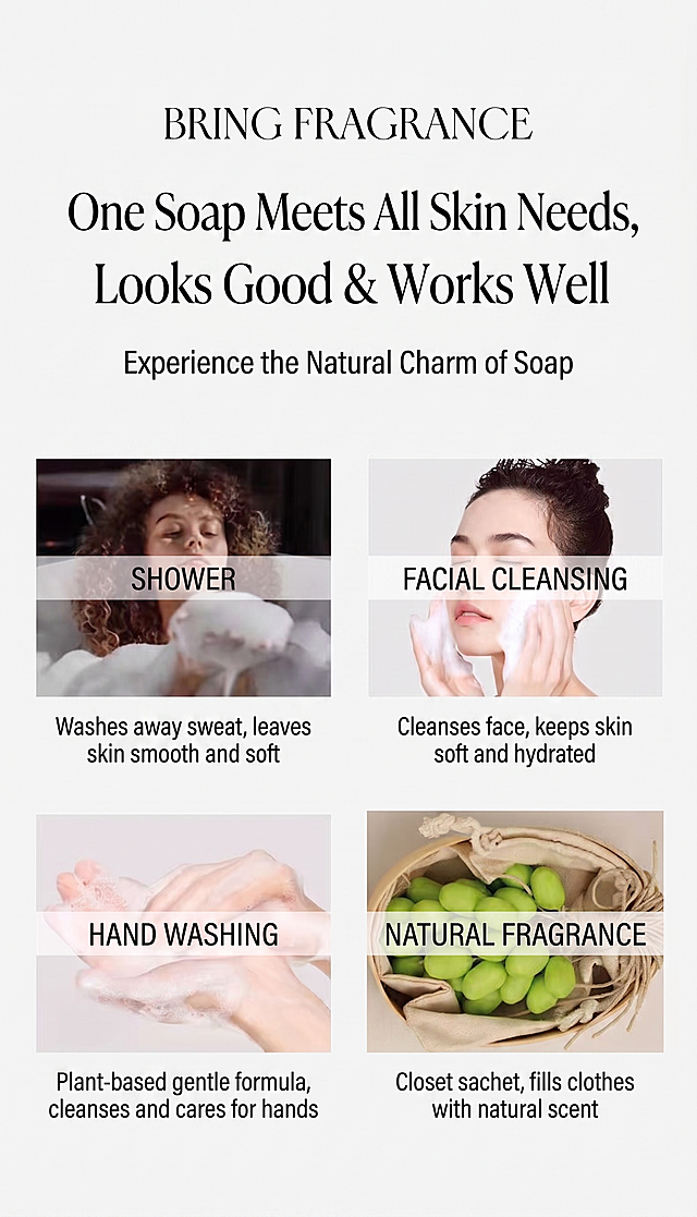


![[第7屏] Suitable Skin Types & Concerns. This screen uses [image1] for product placement at the bottom. [Atmosphere/Style] Clear information card style, easy understanding. [Element Layout] Top is title, middle is four grid cards for different skin types/concerns, bottom is Hally body lotion product. Each grid has an icon + short description. Product at bottom accounts for 25% height. [Lighting and Texture] Uniform soft light, clear card layering, product appearance consistent with original image. [Color Matching] Global background #f8fafc, each grid has light different low saturation background, text dark gray. [Perspective and Composition] Top title - middle grids - bottom product, vertical clear layout. [Text Layout] Main title](https://gd-cms.dancf.com/gd-cms/xi19e5/0/87aa9149-fd42-4535-acc9-527bf2f3d0fe51496.jpeg?x-oss-process=image/resize,w_640,type_6/sharpen,120/interlace,1)