
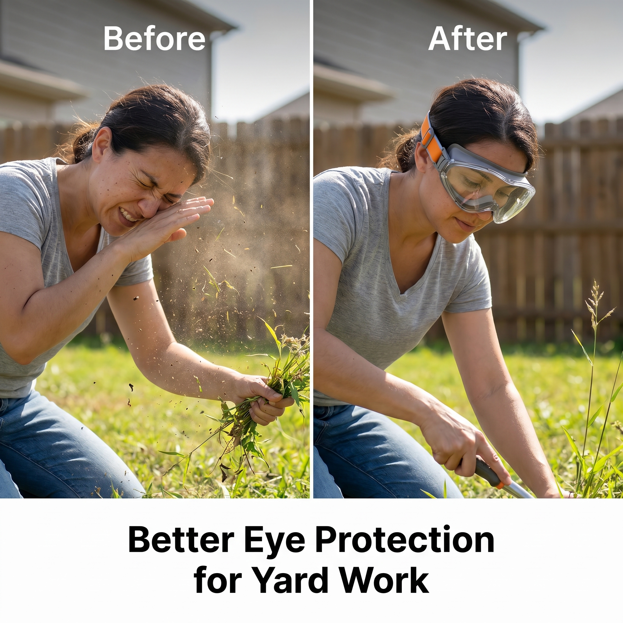

Create a clean comparison-style…
Create a clean comparison-style TikTok Shop US product image with a split-screen layout. On the left

GD909034736
2026.05.12Create a clean comparison-style TikTok Shop US product image with a split-screen layout. On the left
GD909034736
2026.05.12


![[第2屏] Pain Point Comparison of Daily Eye Protection.本屏使用【图1】作为商品主体,保持商品外观结构与颜色一致。
[氛围/风格] Clear information contrast style, real scene contrast, simple layout, commercial practical style, easy to understand.
[元素布局] The screen is divided into left and right parts. The left side shows the problem: common ordinary glasses without side protection, dust and wind can easily enter the eyes, the picture shows a small amount of dust particles near the side gap; The right side shows the solution: this protective goggles with integrated side shield, the side is completely protected, dust and wind are blocked. Each side accounts for 50% of the width, the product occupies 60% of the vertical space of each area, keep the product structure clear.
[光影质感] Uniform soft lighting, clear contrast between left and right, product details are visible, the overall picture is clean and not messy.
[配色色系] Global background color: #F5F7FA (light cool gray); left problem area with light red translucent label, right solution area with light green translucent label; text color dark gray.
[视角构图] Left and right horizontal comparison layout, the same product perspective, contrast intuitive.
[文字版式] Top main title "Before Vs After: Better Eye Protection", left area title "No Side Protection" with small label "Dust & Wind Invasion", right area title "Full Side Shield" with small label "Block Dust & Wind". Each title is placed at the top of the corresponding area, the font is clear, does not block the main body of the product, all text is in English, conform to the capitalization rules, no Chinese.
[比例分辨率] 9:16 vertical ratio, 4K resolution, clear and readable text.
[负向提示词] Product deformation, structural inconsistency, color deviation, text confusion, Chinese characters, exaggerated dirty picture, watermark, guide button.](https://gd-cms.dancf.com/gd-cms/xi19e5/0/34bf57ec-f959-4587-bae0-d8cc1c97e4972774.png?x-oss-process=image/resize,w_640,type_6/sharpen,120/interlace,1)




![[商品] 使用【图3】挡泥板安装前后对比图;保留左侧无挡泥板时车身泥水飞溅脏污状态、右侧安装挡泥板后洁净状态;保留黑色挡泥板安装于车轮后方的真实位置和功能方向。
[画面] 目标:痛点直击+效果对比,让用户直观感知产品价值。构图:左右PK分栏版式,左侧Before区(灰色调)展示无挡泥板的脏污车身,右侧After区(亮色调)展示安装后的洁净车身,中间有明显视觉分隔。产品占画面约50%。背景:左侧深灰渐变,右侧浅灰渐变,形成对比。阅读动线:从左到右对比阅读。
[视觉] 套系策略:风格=亚马逊极简专业商业摄影风;标题字=现代无衬线粗体(英文字体);正文字=简洁无衬线体;主色=深炭灰;背景延展=基于深炭灰做左右深浅对比渐变;强调色=活力橙(用于Before的叉号标签)+ 亮绿色(用于After的对勾标签);标题色=白色/深灰对比;正文色=浅灰/深灰对比;组件=圆形状态标签(叉号/对勾)、底部说明卡;光影=自然光效,真实车身质感。
[文字] 顶部大标题:Protect Your Tesla From Dirt & Damage;左侧标签:Before - Without Mud Flaps, Mud & Gravel Splashing;右侧标签:After - With Mud Flaps, Clean & Protected。底部补充说明:No more frequent car washes. Keep your Model Y looking new。文字全部横向排版。
[规格] 图片比例1:1方图,4K分辨率,负向提示:避免产品变形、挡泥板位置错误、颜色改变、文字竖排、中文文案、贬损竞品、绝对化用语、模糊。](https://gd-cms.dancf.com/gd-cms/xi19e5/0/f7ceadce-bc50-4bde-904c-348b30bc1d5b25176.jpeg?x-oss-process=image/resize,w_640,type_6/sharpen,120/interlace,1)







![[第6屏] 真人操作使用演示,无动力手推式扫地机。本屏使用【图1】作为商品主体,保持产品结构、材质、颜色与原图完全一致。
[氛围/风格] 真实生活场景,欧美中老年男性真人操作,自然松弛,真实可信,符合亚马逊用户偏好。
[元素布局] 场景设置在家庭后院草坪,散落少量枯叶,产品放在画面中心偏右下,真人站在产品后方,双手握住推杆顶部,身体微微前倾,正在向前推动扫地机,人物上半身入镜,表情轻松自然。产品主体清晰可见,占据画面约50%大小,保持原有结构比例不变。背景为绿色草坪和远处木栅栏,自然柔和虚化,突出前景人物和产品。
[光影质感] 下午自然日光斜射,光线柔和,人物和产品形成自然投影,明暗层次分明,产品材质细节清晰可见。
[配色色系] 全局自然绿色草坪背景;产品保持原灰黑配色,人物穿着浅卡其色休闲衬衫,整体色调自然和谐。
[视角构图] 斜侧视角,人物+产品组合构图,横版61:25,主体突出,背景简洁不杂乱。
[文字版式] 左上角主标题 "Effortless Cleaning For Your Yard",黑色加粗无衬线字体,不遮挡人物和产品主体,所有文字为英文。
[比例分辨率] 61:25横版比例,4K分辨率,文字清晰可辨,超高清。
[负向提示词] 产品变形,结构错误,缺件错件,颜色偏差,出现中文字符,文字错乱,水印,人物动作僵硬,表情不自然,产品比例失调,违规内容。](https://gd-cms.dancf.com/gd-cms/xi19e5/0/695a7c45-d51b-4ecf-b186-e9861dd0b617554.png?x-oss-process=image/resize,w_640,type_6/sharpen,120/interlace,1)
![[第6张 清洁效果对比] 前后清洁效果对比Banner,1200:900竖版比例重新排版。卖点内容不变:Can effectively remove 99% of dirt & dust,Keep your home clean and safe for your family。竖版上下布局:顶部橙色色块文案区,大字号白色粗体文字;下方左右分栏BEFORE/AFTER对比场景,左侧脏乱客厅右侧干净客厅孩子玩耍,中间拖把清洁过渡;欧式家庭室内场景,明亮日光,强烈对比效果,与整套风格统一。](https://gd-cms.dancf.com/gd-cms/xi19e5/0/204ccb19-86ef-4d56-ace5-dc1cc10fb2725874.jpeg?x-oss-process=image/resize,w_640,type_6/sharpen,120/interlace,1)
