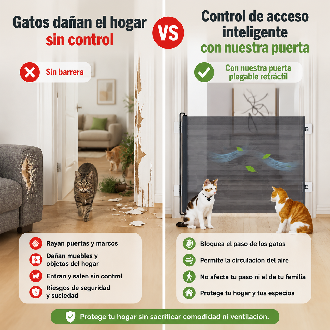

Diagrama comparativo de puerta…
Diagrama comparativo de puerta plegable para gatos: izquierda: sin barrera, gatos entran y salen lib

1q0gvt6dx2h...
2026.05.19Diagrama comparativo de puerta plegable para gatos: izquierda: sin barrera, gatos entran y salen lib
1q0gvt6dx2h...
2026.05.19




![[Main Image 5] Pain point solution display, light blue gradient background. [Atmosphere Style] Clear contrast, intuitive functional expression. [Image Quality] Commercial photography, soft light, clear contrast. [Elements] Split screen contrast display: left side is the daily problem, water and food scattered on the floor; right side is after using the feeding mat, the mat absorbs spilled water and food crumbs, the floor remains clean and dry. The product is shown in full view on the right. Keep product shape consistent with original image. Text labels: Left "Spilled Food & Water Mess", Right "Keeps Floor Clean & Dry". No Chinese or trademarks. [Lighting] Even soft light, clear contrast between left and right. [Color Matching] Main color light blue, contrast clear, text dark blue. [Perspective Composition] Left-right split layout, clear comparison. [Proportional Resolution] 1:1 ratio, 2048px * 2048px, 2K resolution. [Negative Prompt] Text disorder, deformation, blurred picture, watermark, Chinese characters, trademark.](https://gd-cms.dancf.com/gd-cms/xi19e5/0/6fa2d9ca-763e-4914-bd0a-1bceef04210d73153.jpeg?x-oss-process=image/resize,w_640,type_6/sharpen,120/interlace,1)


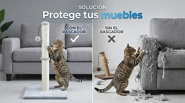
![[第2屏] Cat scratch damage solution, pain point and solution comparison display. This screen uses [image 1] as the product main body, keep the product structure and material consistent with the original image.
[氛围/风格] Clear contrast commercial style, clean layout, real home scene, objective display effect contrast.
[元素布局] The screen is divided into left and right parts, the left shows the pain point before use: a sofa with obvious cat claw scratches, the right shows the effect after use: intact sofa with our cat scratcher placed beside. Each part accounts for 50% of the width, product is placed on the right bottom, product size and structure consistent with the original image.
[光影质感] Uniform soft light, clear contrast between left and right, no harsh shadows, all elements clearly visible.
[配色色系] Global background color: #F5F0E6 (warm light beige); text color: #333333; left damage area natural transition, right intact area clean and bright.
[视角构图] Left and right horizontal contrast structure, flat layout, clear perspective, easy to read at a glance.
[文字版式] Title at the top of the whole screen "Stop Furniture Damage From Cat Scratching", each major word capitalized, font size 7% of screen width. Left small title "Without Scratcher: Sofa Damaged", right small title "With Our Scratcher: Furniture Protected", each small title font size 5% of screen width. Text is placed at the top of each comparison area, do not cover the core display content.
[比例分辨率] 4:3 proportion, 4K resolution, all text clearly readable.
[负向提示词] product deformation, distorted structure, color deviation, watermark, text messy, exaggerated scary damage, Chinese characters, false comparison.](https://gd-cms.dancf.com/gd-cms/xi19e5/0/cdcea942-71d7-4b62-8212-bdb2956c1a0c2291.png?x-oss-process=image/resize,w_640,type_6/sharpen,120/interlace,1)