![[Main Image 3] Close-up detail… - 图片创意预览](https://gd-cms.dancf.com/gd-cms/xi19e5/0/7d9e7582-34bc-4b1e-a9d4-dc559e1c97d81444.png)

[Main Image 3] Close-up detail…
[Main Image 3] Close-up detail image of gold embossed alphabet stickers, highlighting the 3D embosse

吃饭坐小孩那桌°
2026.05.21[Main Image 3] Close-up detail image of gold embossed alphabet stickers, highlighting the 3D embosse
吃饭坐小孩那桌°
2026.05.21![[Main Image 4] Display the material and viscosity of gold embossed alphabet stickers, and the picture shows the sticker being bent and peeled off by hand, highlighting the flexibility of the transparent base material and good adhesion. Keep the shape, color and embossed texture of the gold alphabet completely consistent with the original product, accurately restore the arrangement of the alphabet. Atmosphere: real hand experience, highlighting the superior performance of the material. Image quality: commercial photography texture, clear picture, real hand feeling, high texture. Light: soft light, showing the translucent texture of the base material and the metallic luster of gold, the picture is bright and transparent. Color matching: light off-white background, focus on the product itself, gold stickers contrast clearly. Perspective composition: the product is tilted and held by hand, focus on the bending part to show the material flexibility, the picture is full without extra borders. Text description: add two labels at the bottom: "Transparent PET Backing", "Strong Adhesion", simple font. Proportion resolution: 1:1 proportion, 1000×1000px, 2K resolution, super high definition. Negative prompt: Deformation, watermark, text confusion, blurred product image, messy background. Keep the product text details unchanged, accurately restore the picture details uploaded by the product image](https://gd-cms.dancf.com/gd-cms/xi19e5/0/404f0dc5-ae24-43e7-ab0f-641cb76a0b301471.png?x-oss-process=image/resize,w_640,type_6/sharpen,120/interlace,1)

![[Main Image 1] Gold embossed alphabet and number stickers, pure white background. The entire sticker sheet is centered on the frame, with the product accounting for 85% of the frame. Keep all the text details of the product exactly the same as the input image, accurately restore the shape, color, arrangement and gold embossed three-dimensional texture of the original product. Extract the original Daiso logo and place it in the safe area in the upper left corner. Atmosphere: clean and high-end commercial product photography style. Image quality: commercial photography texture, soft and even light, clear and real product, clean and high-end picture. Light: soft studio light from the front, the three-dimensional sense of embossing is clearly highlighted, the gold has a low-key metallic luster, no glare, and the layering is distinct. Color matching: pure white background, gold stickers, the overall color is simple and clean. Perspective composition: flat overhead view, product centered, full screen without border, no cutting. Text: Do not add any extra marketing text other than the logo, keep it in accordance with the cross-border Amazon specification. Proportion resolution: 1:1 proportion, 1000×1000px, 2K resolution, super high definition. Negative prompt: Deformation, watermark, text confusion, blurred product image, messy background. Keep the product text details unchanged, accurately restore the picture details uploaded by the product image](https://gd-cms.dancf.com/gd-cms/xi19e5/0/6831a1a7-f276-44ae-9af1-3312d931b00b1393.jpg?x-oss-process=image/resize,w_640,type_6/sharpen,120/interlace,1)


![[主图2] 独角兽背贴细节卖点封面图。
[氛围风格] 微距特写风格,突出工艺细节品质
[画质] 商业微距摄影,细节清晰锐利,质感真实
[元素] 画面中心放大展示独角兽羽翼纹理细节,局部特写呈现清晰羽毛分层雕刻,羽毛纹理凹凸可见;放大镜标注效果突出超强凹凸质感;保持产品颜色和纹理与原图一致,主体占比约75%;背景浅灰纯色
[光影] 侧光拍摄,利用光影对比突显羽毛的凹凸层次,沟壑清晰,纹理分明
[配色] 主色珍珠白羽翼,浅灰背景,深色文字,对比清晰
[视角构图] 微距特写,焦点锁定在羽毛纹理,浅景深突出细节
[文字版式] 底部信息条排列三个核心卖点:分层雕刻 纹理清晰 立体凹凸,每个卖点配小图标,文字清晰不遮挡主体
[输出要求] 1:1 比例,超高清画质,文字清晰可读
[负向提示词] 模糊,变形,纹理不清,文字错乱,水印,平台Logo](https://gd-cms.dancf.com/gd-cms/xi19e5/0/39e20ff0-4d16-477f-963f-b9654d5ec46b3550.jpeg?x-oss-process=image/resize,w_640,type_6/sharpen,120/interlace,1)



![[第1屏] 详情页头图-专业3D立体字宣传海报。
[氛围/风格] 工业高级感,简洁专业商务风格,商业摄影质感,画面精致干净,突出产品立体金属质感。
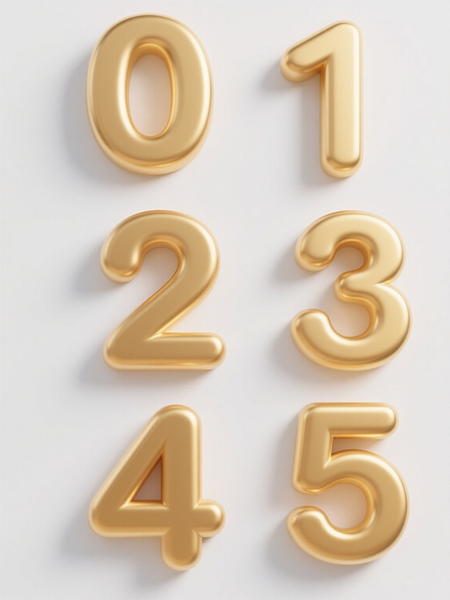
[元素布局] 本屏使用图1到图5作为商品主体参考,展示多款不同颜色和造型的3D立体字。画面左侧放置主标题区,右侧摆放金色3D立体字作为主视觉主体,保持原产品的立体结构、金属质感、颜色和轮廓一致。主体占画面约70%,背景上半部分为浅灰色简约背景,下半部分加入白色信息条,整体构图均衡,留有呼吸空间。
[光影质感] 左侧主光均匀照亮产品,突出立体字的金属光泽和雕刻层次感,右侧自然形成柔和阴影,整体明暗层次清晰,产品边缘真实清晰。
[配色色系] 全局底色:#F5F5F5(浅灰);主体配色:金色、香槟金、红铜色、黑色、蓝色,搭配白色文字和浅灰色背景;辅助色:#333333(深灰标题字)。
[视角构图] 正面45度斜视角,主体产品位于画面右侧偏上区域,左侧完整留白用于标题,符合从上到下的阅读动线,画面干净突出产品。
[文字版式] 左文右图版式,顶部左侧主标题为“立体雕刻 3D好看”,加粗深灰色字体,字号约为画面宽度的8%,主标题下方副标题“定制立体广告发光字”,字号约为主标题的40%。再下方列出3个核心卖点:“多种材质可选”、“精准切割成型”、“色泽均匀持久”,每个卖点一行,配小图标,左对齐,文字不遮挡主体产品。
[比例分辨率] 9:16竖版,4K分辨率,文字清晰可辨,超高清。
[负向提示词] 产品变形,结构错误,颜色偏差,文字错乱,水印,产品模糊,背景杂乱,缺件错件。](https://gd-cms.dancf.com/gd-cms/xi19e5/0/e24f0862-c342-4f41-9afe-50b725208dc82145.png?x-oss-process=image/resize,w_640,type_6/sharpen,120/interlace,1)
![[第1屏] 详情页头图-专业3D立体字宣传海报。
[氛围/风格] 工业高级感,简洁专业商务风格,商业摄影质感,画面精致干净,突出产品立体金属质感。
[元素布局] 本屏使用图1到图5作为商品主体参考,展示多款不同颜色和造型的3D立体字。画面左侧放置主标题区,右侧摆放金色3D立体字作为主视觉主体,保持原产品的立体结构、金属质感、颜色和轮廓一致。主体占画面约70%,背景上半部分为浅灰色简约背景,下半部分加入白色信息条,整体构图均衡,留有呼吸空间。
[光影质感] 左侧主光均匀照亮产品,突出立体字的金属光泽和雕刻层次感,右侧自然形成柔和阴影,整体明暗层次清晰,产品边缘真实清晰。
[配色色系] 全局底色:#F5F5F5(浅灰);主体配色:金色、香槟金、红铜色、黑色、蓝色,搭配白色文字和浅灰色背景;辅助色:#333333(深灰标题字)。
[视角构图] 正面45度斜视角,主体产品位于画面右侧偏上区域,左侧完整留白用于标题,符合从上到下的阅读动线,画面干净突出产品。
[文字版式] 左文右图版式,顶部左侧主标题为“立体雕刻 3D好看”,加粗深灰色字体,字号约为画面宽度的8%,主标题下方副标题“定制立体广告发光字”,字号约为主标题的40%。再下方列出3个核心卖点:“多种材质可选”、“精准切割成型”、“色泽均匀持久”,每个卖点一行,配小图标,左对齐,文字不遮挡主体产品。
[比例分辨率] 9:16竖版,4K分辨率,文字清晰可辨,超高清。
[负向提示词] 产品变形,结构错误,颜色偏差,文字错乱,水印,产品模糊,背景杂乱,缺件错件。](https://gd-cms.dancf.com/gd-cms/xi19e5/0/45f48ffd-6fe3-4743-9ac7-6d1517e597472110.png?x-oss-process=image/resize,w_640,type_6/sharpen,120/interlace,1)











![[第7屏] 材质细节微距,突出产品高清高粘的特性。本屏使用【图2】的产品材质特写。
[氛围/风格] 微距细节展示,专业材质表现,清晰质感,低饱和背景突出产品。
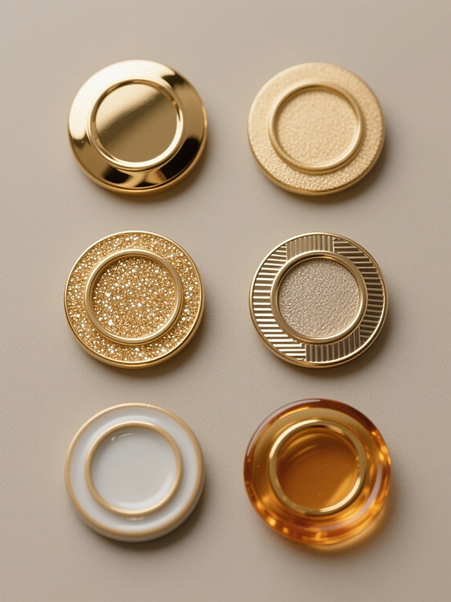
[元素布局] 产品边缘和材质局部特写占画面大部分区域,展示产品的厚度、透明度和背胶质感,边缘细节清晰,材质层次分明,产品结构与实物图一致。
[光影质感] 侧光打光,突出产品厚度和透明度,形成清晰的光线折射效果,展示高分子材质的细腻质感。
[配色色系] 浅灰色渐变背景,产品透明,背胶部分浅米色,文字深灰色,干净专业。
[视角构图] 微距特写视角,聚焦产品材质细节,让消费者清晰看到产品品质。
[文字版式] 顶部主标题 "High Quality Polymer Material",下方分点标注: "Four levels of coating", "High definition transparency", "Strong adhesion no bubble", "Thickened durable",每个卖点文字简洁,排列整齐不遮挡特写主体。
[比例分辨率] 9:16,4K分辨率,文字清晰可辨。
[负向提示词] 材质模糊,结构变形,颜色失真,文字遮挡主体](https://gd-filems.dancf.com/198478215/presigned/e2759a2828cb4dc19aedfa2231be20eb930187.jpg?auth_key=1789344000-99a55216783046a2ad6d6cb52916bfbe-0-7c0197e686a2ea4a5d0119a76abba9ef&x-oss-process=image/resize,w_640,type_6/sharpen,120/interlace,1)