已添加
登录/注册
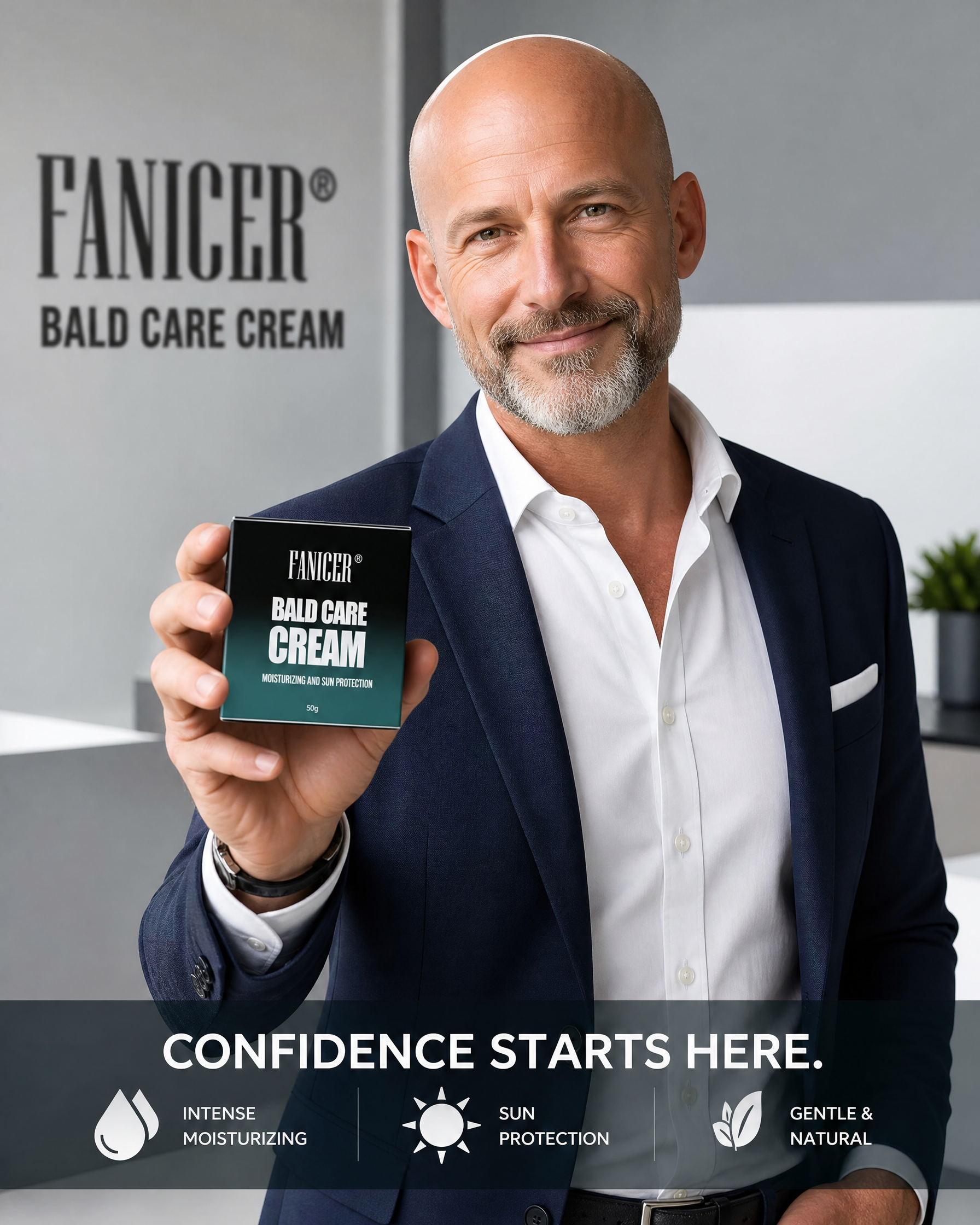
欧美成熟男士手持FANICER光头霜产品包装盒展示,简约商务风…
欧美成熟男士手持FANICER光头霜产品包装盒展示,简约商务风格背景,展示品牌和产品,全英文,适合亚马逊故事图
CC瀚
2026.05.27
做同款
欧美光头男士展示使用FANICER Bald Care Cream,涂抹在头皮上,干净简约男士护肤场景,清晰展示产品使用,全英文标注,适合亚马逊故事图
CC瀚
欧美男士户外出行,使用FANICER光头霜后头皮得到防晒保护,轻松舒适户外活动,展示产品防晒保护功效,全英文,适合亚马逊故事图
CC瀚
对比展示使用FANICER光头霜前后头皮效果,使用前头皮干燥粗糙,使用后头皮光滑保湿,欧美男士前后对比,全英文标注,高端男士护肤风格,适合亚马逊故事图
CC瀚
巧克力色风格英文微生态男士生发水详情页,延续暖调高端质感,单独突出无有害化学成分、温和不刺激的卖点,列出不添加的成分(如无硅油、无酒精、无人工色素、无刺激性防腐剂等),和原有巧克力色系列风格统一
1qts3740wxafjHFA-HB
生成一张9:16比例的科颜氏高保湿面霜跨境电商推广海报,整体风格清透高级、简约精致,写实商业摄影风格。主标题为"BARRIER STRENGTH. SKIN RESILIENCE.",副标题为"Squalane-powered. Clinically proven.",装饰文案为"ULTRA FACIAL CREAM",核心卖点分别是"Strengthen Your Skin's Moisture Barrier"、"24/7 Long-Lasting Hydration"、"Fast-Absorbing & Non-Greasy"。100% 还原上传商品图的产品外形、包装、LOGO、印刷文字,以上传图为唯一商品主体来源,完整保留原图的瓶型、轮廓、结构、比例、瓶盖、标签版式、品牌logo、容量信息、材质质感、颜色与正面朝向。产品放置在简约浅色亚克力几何台面上,背景为渐变浅白色,搭配虚化水珠点缀,顶部自然光+侧前方柔光,整体氛围清透高级,文字排版分区清晰,主标题在上部,产品在中部,卖点分标签展示在底部,文字清晰可读不遮挡主体,版式精美,核心目标为商品转化,画面比例9:16
竟夜殇
[垫图] https://gdesign-dam-hz.dancf.com/35893936645589081/5da59eabf06e444a8a6427ee621d987f.jpg [主图主题] Shampoo core efficacy ingredients display [氛围风格] Clean scientific sense, high-end soft light, transparent efficacy presentation [画面元素] Shampoo bottle placed at bottom center, four 3D rendered efficacy element floating around top, each corresponds to one core efficacy, elements connected with thin white lines pointing to product, clean minimalist light gray background, soft light enhances transparent layering, background full screen without border [配色色系] Main color: clean light gray; auxiliary colors: warm gold elements, product bottle brown, soft white light effect [视角构图] Front centered composition, clear layering from foreground to background [文字版式] Place four core efficacy texts next to each 3D element: " INTENSIVE REPAIR DAMAGED HAIR " " SMOOTH SPLIT ENDS " " STRENGTHEN HAIR ROOTS " " PROTECTION IN COLD CLIMATE ", font is minimalist sans-serif, dark brown, moderate size, clear text hierarchy, thin lines connect elements and texts, clean and professional layout
1qvjvtwiv1yBm5ew-HB
[主图 5] Sebum Barrier Soothing Cream使用场景展示 [氛围风格] 高级简约,现代轻奢生活场景感 [画质] 商业摄影质感,光线柔和通透,产品清晰真实,画面干净高级 [元素] BANLITI面霜放置在现代简约浴室洗手台边缘,保持产品外观与输入参考图绝对一致,无变形色差。背景是浅灰色大理石纹理台面和干净瓷砖墙面,旁边点缀一片新鲜尤加利叶作为自然装饰,不抢占产品主体焦点。产品主体占画面约65%,自然融入场景,传递日常护肤使用感。顶部添加简洁文字"Daily Barrier Care",不遮挡产品 [光影] 柔和自然光从侧面照射,营造通透干净氛围,产品轮廓清晰,环境光影自然柔和 [配色] 低饱和浅灰调,产品红色品牌文字作为视觉点缀,整体简约高级 [视角构图] 略微俯视平视角度,产品偏右下位置,左侧预留自然空间,构图舒适平衡 [文字版式] 顶部负空间文字居中,简洁小号无衬线字体,深灰色清晰不突兀 [比例分辨率] 1:1比例,2048x2048px,2k分辨率,文字清晰可辨,超高清 [负向提示词] 变形,水印,文字错乱,场景杂乱,多余道具,夸大宣传,中文
678wb4xmj-HB
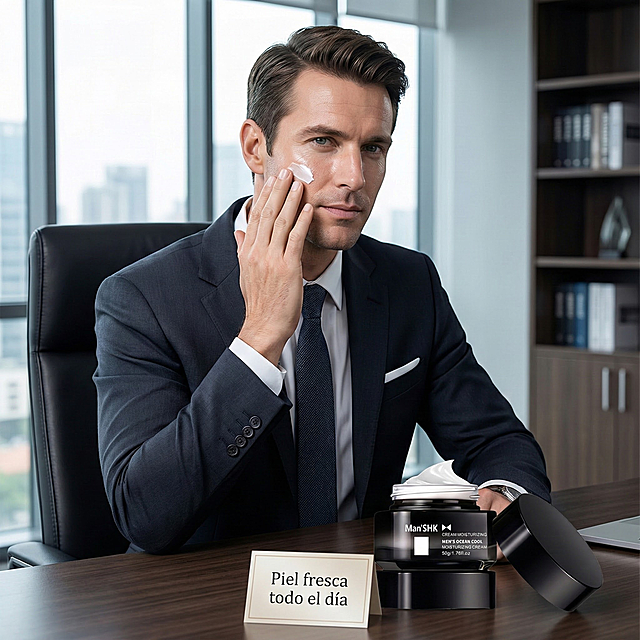
以图中的男士面霜为元素,欧美男人使用面霜,补水控油持久滋润显白防干裂,物体主体特征不变,设计6张跟男士面霜有关的广告图,西班牙语,比例 「1:1」
灿灿ovo
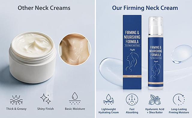
Amazon A+ comparison banner, 970x600 pixels, horizontal left-right split layout, minimalist light blue-gray background, thin white vertical dividing line in the middle. Left side: a generic cheap neck cream jar with thick greasy texture, shiny oily finish after application, simple basic moisturizing only, with minimal English text icons showing 'Thick & Greasy', 'Shiny Finish', 'Basic Moisture'. Right side: the exact blue and white firming neck cream bottle and its blue box from the reference product photo, placed neatly as in original product shot, with lightweight hydrating cream texture, fast absorption, hyaluronic acid and shea butter nourishing ingredients, long-lasting firming and moisturizing, with minimal English text icons showing 'Lightweight Hydrating Cream', 'Fast Absorbing', 'Hyaluronic Acid + Shea Butter', 'Long-Lasting Firming Moisture'. Minimalist icon and text difference points on top and bottom areas. No exaggerated medical claims. Realistic high-definition commercial product photography, clean premium comparison chart quality, suitable for Amazon A+ page, no watermark, no extra text, no Chinese characters, all text in English.
GD405947920
[第4张] 亚马逊跨境电商详情页 - 使用场景与产品规格信息页。High Protein Keratin Hair Treatment 高蛋白角蛋白头发护理剂。本张使用产品图作为商品主体参考。 [氛围/风格] 真实生活场景感,极简高级,浴室居家氛围,温暖舒适。 [元素布局] 上半部分为浴室场景:产品瓶身放置在大理石洗手台上,旁边有毛巾、梳子等浴室用品,背景是柔和的浴室环境;下半部分为产品规格信息区;产品瓶身结构、材质、颜色与输入产品图保持一致。 [光影质感] 柔和自然光从窗户照入,温暖色调,瓶身有自然高光,场景真实有层次。 [配色色系] 全局底色上半部分暖白场景,下半部分浅灰蓝信息区;主色白色+金色;辅助色深灰文字。 [视角构图] 上下分栏构图,上场景下信息,阅读动线从上到下。 [文字版式] 上半部分场景角落标注"At Home Salon Experience";下半部分左产品右参数表布局;参数表包含:Product Name "High Protein Keratin Hair Treatment",Net Content "200ml / 6.76 fl oz",Key Ingredients "Keratin, Argan Oil, Vitamin E",Suitable For "All Hair Types",Benefits "Repair, Straighten, Nourish";底部一行"Professional Hair Care at Home";全部英文,无衬线字体,清晰可读。 [负向提示词] 产品变形,缺件错件,颜色偏差,水印,文字错乱,产品图模糊,中文字符,夸大宣传。
GD785336678
[主图-3] 质地与使用效果 - 顺直光泽发丝微距特写。本张使用【图4】作为产品展示。 [氛围风格] 纯净高级沙龙风,丝滑质感,商业微距摄影质感,高端洗护氛围。 [画质] 商业摄影质感,光线柔和通透,发丝细节清晰,画面干净高级。 [元素] 画面主体为一束顺直光泽的深棕色长发丝特写,占画面约50%,发丝垂坠感强,表面有均匀的光泽条带,根根分明顺滑;产品瓶身置于画面右下角,占比约20%,斜放在浅灰色大理石台面上;背景为浅灰白色渐变,左上角有几滴透明的乳白护理霜质地特写,展示产品细腻柔滑的质地;产品瓶身外观、颜色、文字标识与输入图完全一致,杜绝变形和色差。 [光影] 侧逆光勾勒发丝轮廓光,正面柔光补光,发丝有明显的高光反射带,整体明亮通透有质感。 [配色] 主背景色 #F5F5F5 浅灰白;主色深棕发丝+白色产品;辅助色银色瓶盖+浅灰大理石台面。 [视角构图] 发丝为主产品为辅的构图,阅读动线上方发丝效果 → 左上角质地特写 → 右下角产品瓶身。 [文字版式] 左上角主标题「SLEEK & SHINY RESULTS」,副标题「Salon-Grade Smoothness」;发丝旁三个细线标签:「Frizz-Free」「Thermal Protection」「Long-Lasting Shine」;右下角产品旁标注「Step 2 Treatment」;所有文字为深灰色无衬线字体,纤细高级,排版精致不拥挤。 [输出要求] 1:1比例,2048px×2048px,文字清晰锐利,超高清商业摄影质感。 [负向提示词] 产品变形,发丝不自然,水印,文字错乱,颜色偏差,人物面部,中文文字。
GD751633937
「图片1」,生成一套主图(5张),商品名称是丰盈定型发粉 温和成分免洗蓬松控油清新清爽持久定型发粉 产品名称 丰盈定型发粉 关键词 头发定型 毛重 75.14g 成分 改性玉米淀粉、淀粉辛烯基琥珀酸铝,,适配亚马逊/跨境平台,主图比例为1:1第一张图为模特加商品,可以是男模特,突出发型,手里拿着产品,配上相关的英文文字,剩下四张照片要有商品成分,商品效果优势,商品使用步骤方式,以及商品效果对照,商品的背景颜色统一为渐变浅灰色,商品主图中可以加一些相关元素,使整体比较协调,图中文字全部都是英文
67blqraup42nr6a-HB
[第3张] 亚马逊跨境详情页效果展示页 - 欧美模特蓬松柔顺发丝效果。本张使用【图1】产品图作为右下角产品展示元素,主体为欧美女性模特的发丝效果。 [氛围/风格] 真实自然,高级洗护大片感,柔光唯美,跨境亚马逊真实模特风格,不夸张。 [元素布局] 画面中上为欧美女性模特背影/侧背影,展示一头蓬松丰盈、有光泽的柔顺长发,发丝占画面主体约60%;模特为浅棕或金色长发,发质健康有光泽,发丝根根分明有蓬松感;右下角放置洗发水+发膜套装产品小图(来自图1),占比约15%;背景为浅米色渐变+柔和光斑;左侧有三个效果标签。 [光影质感] 侧后方逆光勾勒发丝轮廓光,正面柔光补光,发丝有自然高光和层次,整体温暖柔和。 [配色色系] 全局底色 #F8F4EF 暖米白;主色金棕发丝 + 酒红产品标;辅助色浅米色背景 + 白色文字框;点缀色金色高光。 [视角构图] 模特侧后方视角,发丝为视觉中心,阅读动线左侧效果标签 → 中部发丝主体 → 右下产品图。 [文字版式] 全英文文案。左侧竖排三个圆角白色卡片标签,从上到下:"VOLUMINOUS" 下 "Full-bodied, bouncy hair"、"SILKY SMOOTH" 下 "Tames frizz & flyaways"、"STRONGER" 下 "Less breakage, more resilience";顶部小字标题 "Visible Results You Can Feel";右下角产品图旁标注 "Shampoo + Mask Set";字体清晰现代。 [比例分辨率] 9:16 竖版比例,4K分辨率,文字清晰可辨,高清画质。 [负向提示词] 中文字符,水印,面部变形,发丝不自然,产品图变形,夸大效果,医疗化表述,亚洲面孔。
GD751633937
[第3张] 亚马逊跨境电商详情页 - 头发修复前后对比图。High Protein Keratin Hair Treatment 高蛋白角蛋白护理剂效果展示。 [氛围/风格] 真实自然,商业摄影质感,护发效果真实可信,欧美女性背影。 [元素布局] 画面左右分栏对比:左侧为使用前的背影,头发毛躁干枯、分叉无光泽;右侧为使用后的背影,头发顺滑亮泽、笔直柔顺;同一女性背影,长发及腰,从后脑勺到背部上半部分;中间有垂直分割线和箭头指示"Before"和"After";底部融入产品瓶身。 [光影质感] 柔和自然光,发丝细节清晰,前后对比光线一致,突出发质差异。 [配色色系] 全局底色浅米灰渐变;主色自然发色;辅助色金色分割线和标签。 [视角构图] 正背面视角,左右对称分栏构图,阅读动线从左Before → 中间箭头 → 右After → 底部产品。 [文字版式] 左上角"Before"标签,右上角"After"标签,金色圆角标签;中间垂直分割线带箭头;底部主标题"Transform Frizzy to Silky",副标题"Visible Results in One Use";全部英文,无衬线字体,文字清晰不遮挡发丝细节。 [负向提示词] 变形,水印,文字错乱,中文字符,夸大效果,面部露出,医疗化表述,过度美化不真实。
GD785336678
[Main Image 3] Cream texture close-up display. Keep product jar appearance consistent with original image. Open the jar lid, ultra macro shot to show the fine smooth texture of cream, light smear on glass to show its easy spreadability. Fresh light green natural background, with a few small water droplets decoration. Soft natural light through transparent glass, highlight the delicate texture of the cream. Text description: "Silky Non-greasy Texture" in English. Simple high-end composition, 1:1 square, 2K resolution, super clear details. Negative prompt: deformation, watermark, text confusion, blurry texture, Chinese characters
678wb4xmj-HB
琥珀色棕色玻璃精油瓶,黑色螺旋瓶盖,保持原有产品外观和瓶身标签文字,严禁扭曲改变产品形态。置于天然矿业石材质台面上,暖棕自然色调,参考天然自然风格。侧逆光。【产品受光面泛起暖棕黄色,暗部及边缘映射深灰色矿石的光晕。绝对禁止纯白高光,彻底物理融合】。产品居中特写构图,微侧视角调整空间感。将原参考图的木质道具替换为天然矿石纹理,重构背景细节,保留50%参考图自然氛围。严格锁定宽高比为 1:1。4K分辨率。
1q3w4ndjxe-HB
将这几张产品图风格进行修改,生成与原图风格不一样的产品图,产品细节不变,图中产品为抗衰老面霜
1qirq437odrpXJ4g-HB
[Screenshot 2] Efficacy Data Screen - Gentle Nourishing, Suitable for Sensitive Skin for Ampoule Essence. This screen uses [image2] as the texture subject reference. [Atmosphere/Style] Minimalist professional beauty aesthetic, soft pink background, clean layout, commercial photography texture, focus on displaying the test data results. [Element Layout] Hand smear texture shot of the essence occupies the lower half of the screen, accounting for about 50% of the space, keep the original texture and hand movement; upper half is the title and data list area, light pink gradient background; data points are arranged vertically, each with percentage and description text; keep the texture and composition consistent with the original picture, all text converted to English. [Light and Shadow Texture] Soft natural light, uniform brightness, clear texture of the essence on the arm, soft transition between light and shadow. [Color Matching] Global background color #f9f0f2; main color black text, auxiliary color dark gray description, high contrast to ensure readability. [Perspective Composition] Vertical composition, reading flow: top title → middle data → bottom texture picture, hierarchical clarity. [Text Layout] Main title at the top "Gentle Care For Sensitive Skin", four lines of data below: one hundred percent of testers agree it is gentle and non-irritating, one hundred percent of testers agree it improves skin brightness, one hundred percent of testers agree it firms skin, one hundred percent of testers agree it has anti-wrinkle benefits; all text in English, correctly formatted, clear and readable, no Chinese characters. [Proportion Resolution] 9:16 vertical ratio, 4K resolution, clear text, high-definition image quality. [Negative Prompt] Text confusion, Chinese characters, blurry texture, product deformation, watermark, text too small, false data
Febby
[主图-4] 效果对比图,任务是展示使用前后的发质变化(毛躁卷曲vs顺滑直亮),用before/after对比作为证据组件,配合产品建立信任。 [统一基调] 纯净科技感、专业沙龙质感;主背景为深灰到浅灰的渐变过渡(左侧深右侧浅),辅助色银灰+深墨蓝,强调色淡蓝光泽;主标题字体为干净现代无衬线粗体,辅助文字为同家族细体。 [画面] 画面左右分栏对比,左侧暗调区域标注"BEFORE",展示一束毛躁、卷曲、无光泽的深棕色发丝特写;右侧亮调区域标注"AFTER",展示一束顺滑、笔直、有光泽的同色系发丝特写;中间垂直分割线处放置2号蛋白护理霜瓶身(银色盖)的半侧面特写,产品横跨分割线,象征转变;发丝特写为真实发质微距质感,能看清毛鳞片状态差异。 [光影质感] Before侧光线偏暗偏冷,突出毛躁凌乱;After侧光线明亮柔和,突出顺滑光泽;中间产品瓶身光影过渡自然,超写实微距摄影质感。 [配色] 左深灰右浅灰渐变背景,深墨蓝主文字,银灰分割线,淡蓝光泽点缀;产品白瓶本色。 [文字版式] 顶部居中大标题"FROM FRIZZY TO SLEEK";左侧上方"BEFORE"粗体白字,下方小字"Curly Unruly Dry";右侧上方"AFTER"粗体深墨蓝字,下方小字"Straight Smooth Shiny";底部一行细体小字"Results may vary";左上角保留BK KERAPLEX品牌小Logo(白字);所有文字为英文。 [输出要求] 1:1正方形,2048x2048,对比强烈但真实不夸大,产品清晰不变形;负向:夸大效果、人物面部、瓶身变形、文字模糊、出现中文、水印、绝对化用词。
GD751633937
保持原图所有内容、文字、布局、产品完全不变,仅调整画布尺寸为2752x1536像素,画面元素按原比例适配新尺寸,不改变任何内容细节
1q003b1a5c-HB
保持原图所有内容、文字、布局、产品完全不变,仅调整画布尺寸为2752x1536像素,画面元素按原比例适配新尺寸,不改变任何内容细节
1q003b1a5c-HB
[第2张] 亚马逊跨境电商详情页 - 角蛋白成分机理功效页。High Protein Keratin Hair Treatment 高蛋白角蛋白头发护理剂。 [氛围/风格] 专业科研感,极简高级,护发科技感,真实分子结构示意。 [元素布局] 画面中央为放大的发丝横截面3D示意图,展示角蛋白分子填充修护受损毛鳞片的过程;左侧是角蛋白分子结构模型,右侧是修护后的顺滑发丝对比;底部融入产品瓶身小图;核心分子和发丝元素占画面60%以上,大尺寸呈现。 [光影质感] 冷调科技光感,分子结构带微光边缘,发丝有丝绸般光泽,整体干净通透。 [配色色系] 全局底色深蓝灰到浅蓝渐变;主色白色+淡蓝色分子;辅助色金色高亮修护区域。 [视角构图] 平视居中构图,阅读动线从上到下:标题 → 中央机理示意 → 底部卖点和产品。 [文字版式] 顶部主标题"Keratin Repair Technology",副标题"Deeply Nourish Each Strand";画面左右两侧编号标注:1 "Keratin Molecules" 2 "Fill Damaged Cuticles" 3 "Smooth & Shiny Finish";底部产品旁标注核心成分"High Protein Formula";全部英文,无衬线字体,文字清晰。 [负向提示词] 变形,水印,文字错乱,文字过小,中文字符,医疗化表述,夸大宣传。
GD785336678
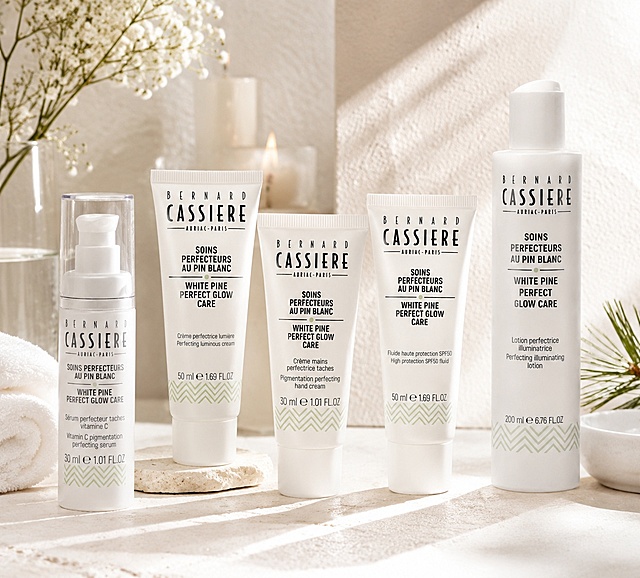
請將這五支產品自然融合至第一張圖的場景中,整體光影、色溫與環境氛圍需一致,讓產品看起來像原本就存在於畫面內。 產品擺放位置,以高級感陳列方式呈現,可略帶前後層次與角度變化,避免過於呆板。 產品表面需保留原有質感與文字、細節等,並根據場景光源加入自然反射、高光與陰影,使產品與背景環境完美融合。 整體風格維持法式高級 SPA 感、乾淨柔和、具有精品保養品廣告氛圍。 產品視角需配合背景鏡頭角度進行輕微透視調整,使其符合場景觀看角度。 僅允許視角匹配,不允許改變產品本身結構。 保持產品原始圓柱體比例、瓶身高度、直徑與標籤位置。 不得出現瓶身傾斜、壓縮、拉長、變胖、變細、凹陷或文字變形。 Logo 與包裝文字需完整保留。根據場景光源產生自然陰影、反射
艹宣品平面設計工作室
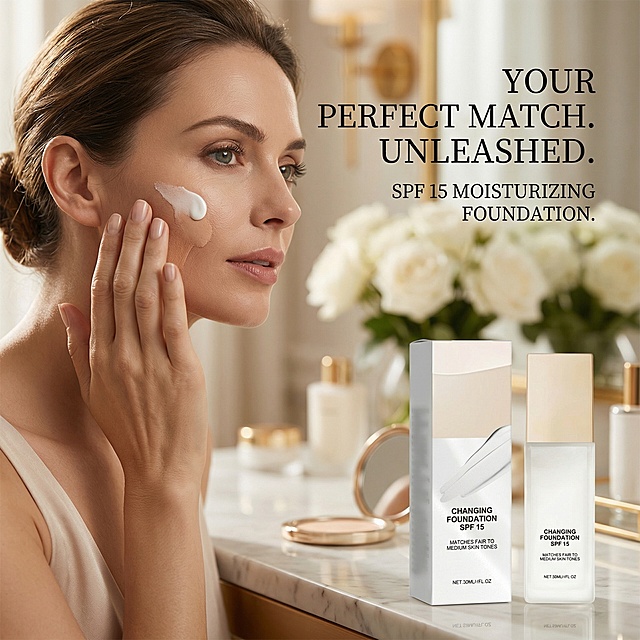
帮我生成图片:以图中的保湿粉底液为元素,欧美女人使用保湿粉底液,设计6张跟保湿粉底液有关的图,物体主体特征不变,英语,比例 「1:1」
灿灿ovo
[第5屏] 产品五大核心功效展示,Farger Bond Repair洗发露泰文详情页。 [氛围/风格] 高级简约列表版式,保持整体浅米金配色,干净商业质感。 [元素布局] 顶部标题,下方竖排五个功效模块,每个功效模块左侧带金色对勾圆形图标,右侧是功效标题和简短说明。左侧图标对齐,右侧文字对齐,整体排列整齐。产品放置在右下角作为小型展示,保持外观和原图一致。 [光影质感] 均匀柔和布光,每个功效模块层次分明,图标有金色高光,整体明暗清晰,产品光影真实。 [配色色系] 全局底色 #f8f6f3;图标金色圆形背景,文字黑色,功效标题棕金色,整体配色和前面页面统一。 [视角构图] 竖向列表构图,从上到下阅读,符合移动端单栏浏览习惯,间距合适,不拥挤。 [文字版式] 全部文字使用泰文。顶部主标题 "ประสิทธิภาพ 5 ข้อ หลังการใช้"(五大核心功效),居中棕金色加粗。五个功效分别为: 1. ซ่อมแซมผมเสียจากการทำสี ฟอก ดัด ยืด 修护漂染烫拉直受损发质 2. ลดผมชี้ฟู ให้ผมเรียบลื่นขึ้น 减少毛躁 发丝更顺滑 3. ลดอาการผมขาดหลุดร่วง 提升发丝韧性减少断发 4. เพิ่มความนุ่มลื่นและเงางาม 增加柔顺光泽感 5. เตรียมผมสำหรับทรีทเม้นท์ขั้นต่อไป 为后续发膜护理打基础 每个功效图标在左,文字在右,排版整齐,文字清晰,不遮挡任何元素。 [比例分辨率] 1:1 正方形比例,4K分辨率。 [负向提示词] 排版错乱,图标变形,产品外观错误,文字模糊,中文字符,颜色偏差,背景杂乱。
GIOW







![[垫图] https://gdesign-dam-hz.dancf.com/35893936645589081/5da59eabf06e444a8a6427ee621d987f.jpg
[主图主题] Shampoo core efficacy ingredients display
[氛围风格] Clean scientific sense, high-end soft light, transparent efficacy presentation
[画面元素] Shampoo bottle placed at bottom center, four 3D rendered efficacy element floating around top, each corresponds to one core efficacy, elements connected with thin white lines pointing to product, clean minimalist light gray background, soft light enhances transparent layering, background full screen without border
[配色色系] Main color: clean light gray; auxiliary colors: warm gold elements, product bottle brown, soft white light effect
[视角构图] Front centered composition, clear layering from foreground to background
[文字版式] Place four core efficacy texts next to each 3D element: " INTENSIVE REPAIR
DAMAGED HAIR " " SMOOTH
SPLIT ENDS " " STRENGTHEN
HAIR ROOTS " " PROTECTION
IN COLD CLIMATE ", font is minimalist sans-serif, dark brown, moderate size, clear text hierarchy, thin lines connect elements and texts, clean and professional layout](https://gd-cms.dancf.com/gd-cms/xi19e5/0/31c90635-4e17-4998-82c2-e1517b15037a6919.jpg?x-oss-process=image/resize,w_640,type_6/sharpen,120/interlace,1)

![[主图 5] Sebum Barrier Soothing Cream使用场景展示
[氛围风格] 高级简约,现代轻奢生活场景感
[画质] 商业摄影质感,光线柔和通透,产品清晰真实,画面干净高级
[元素] BANLITI面霜放置在现代简约浴室洗手台边缘,保持产品外观与输入参考图绝对一致,无变形色差。背景是浅灰色大理石纹理台面和干净瓷砖墙面,旁边点缀一片新鲜尤加利叶作为自然装饰,不抢占产品主体焦点。产品主体占画面约65%,自然融入场景,传递日常护肤使用感。顶部添加简洁文字"Daily Barrier Care",不遮挡产品
[光影] 柔和自然光从侧面照射,营造通透干净氛围,产品轮廓清晰,环境光影自然柔和
[配色] 低饱和浅灰调,产品红色品牌文字作为视觉点缀,整体简约高级
[视角构图] 略微俯视平视角度,产品偏右下位置,左侧预留自然空间,构图舒适平衡
[文字版式] 顶部负空间文字居中,简洁小号无衬线字体,深灰色清晰不突兀
[比例分辨率] 1:1比例,2048x2048px,2k分辨率,文字清晰可辨,超高清
[负向提示词] 变形,水印,文字错乱,场景杂乱,多余道具,夸大宣传,中文](https://gd-cms.dancf.com/gd-cms/xi19e5/0/626be2ac-6c7b-429f-9543-a14da6bda62925703.png?x-oss-process=image/resize,w_640,type_6/sharpen,120/interlace,1)

![[第4张] 亚马逊跨境电商详情页 - 使用场景与产品规格信息页。High Protein Keratin Hair Treatment 高蛋白角蛋白头发护理剂。本张使用产品图作为商品主体参考。
[氛围/风格] 真实生活场景感,极简高级,浴室居家氛围,温暖舒适。
[元素布局] 上半部分为浴室场景:产品瓶身放置在大理石洗手台上,旁边有毛巾、梳子等浴室用品,背景是柔和的浴室环境;下半部分为产品规格信息区;产品瓶身结构、材质、颜色与输入产品图保持一致。
[光影质感] 柔和自然光从窗户照入,温暖色调,瓶身有自然高光,场景真实有层次。
[配色色系] 全局底色上半部分暖白场景,下半部分浅灰蓝信息区;主色白色+金色;辅助色深灰文字。
[视角构图] 上下分栏构图,上场景下信息,阅读动线从上到下。
[文字版式] 上半部分场景角落标注"At Home Salon Experience";下半部分左产品右参数表布局;参数表包含:Product Name "High Protein Keratin Hair Treatment",Net Content "200ml / 6.76 fl oz",Key Ingredients "Keratin, Argan Oil, Vitamin E",Suitable For "All Hair Types",Benefits "Repair, Straighten, Nourish";底部一行"Professional Hair Care at Home";全部英文,无衬线字体,清晰可读。
[负向提示词] 产品变形,缺件错件,颜色偏差,水印,文字错乱,产品图模糊,中文字符,夸大宣传。](https://gd-cms.dancf.com/gd-cms/xi19e5/0/5fc983b2-36f4-4831-b30e-6015b94c0f002190.jpeg?x-oss-process=image/resize,w_640,type_6/sharpen,120/interlace,1)

![[主图-3] 质地与使用效果 - 顺直光泽发丝微距特写。本张使用【图4】作为产品展示。
[氛围风格] 纯净高级沙龙风,丝滑质感,商业微距摄影质感,高端洗护氛围。
[画质] 商业摄影质感,光线柔和通透,发丝细节清晰,画面干净高级。
[元素] 画面主体为一束顺直光泽的深棕色长发丝特写,占画面约50%,发丝垂坠感强,表面有均匀的光泽条带,根根分明顺滑;产品瓶身置于画面右下角,占比约20%,斜放在浅灰色大理石台面上;背景为浅灰白色渐变,左上角有几滴透明的乳白护理霜质地特写,展示产品细腻柔滑的质地;产品瓶身外观、颜色、文字标识与输入图完全一致,杜绝变形和色差。
[光影] 侧逆光勾勒发丝轮廓光,正面柔光补光,发丝有明显的高光反射带,整体明亮通透有质感。
[配色] 主背景色 #F5F5F5 浅灰白;主色深棕发丝+白色产品;辅助色银色瓶盖+浅灰大理石台面。
[视角构图] 发丝为主产品为辅的构图,阅读动线上方发丝效果 → 左上角质地特写 → 右下角产品瓶身。
[文字版式] 左上角主标题「SLEEK & SHINY RESULTS」,副标题「Salon-Grade Smoothness」;发丝旁三个细线标签:「Frizz-Free」「Thermal Protection」「Long-Lasting Shine」;右下角产品旁标注「Step 2 Treatment」;所有文字为深灰色无衬线字体,纤细高级,排版精致不拥挤。
[输出要求] 1:1比例,2048px×2048px,文字清晰锐利,超高清商业摄影质感。
[负向提示词] 产品变形,发丝不自然,水印,文字错乱,颜色偏差,人物面部,中文文字。](https://gd-cms.dancf.com/gd-cms/xi19e5/0/481afe7d-ec30-4f2b-8b0f-d99f691a315e21999.png?x-oss-process=image/resize,w_640,type_6/sharpen,120/interlace,1)



![[第3张] 亚马逊跨境详情页效果展示页 - 欧美模特蓬松柔顺发丝效果。本张使用【图1】产品图作为右下角产品展示元素,主体为欧美女性模特的发丝效果。
[氛围/风格] 真实自然,高级洗护大片感,柔光唯美,跨境亚马逊真实模特风格,不夸张。
[元素布局] 画面中上为欧美女性模特背影/侧背影,展示一头蓬松丰盈、有光泽的柔顺长发,发丝占画面主体约60%;模特为浅棕或金色长发,发质健康有光泽,发丝根根分明有蓬松感;右下角放置洗发水+发膜套装产品小图(来自图1),占比约15%;背景为浅米色渐变+柔和光斑;左侧有三个效果标签。
[光影质感] 侧后方逆光勾勒发丝轮廓光,正面柔光补光,发丝有自然高光和层次,整体温暖柔和。
[配色色系] 全局底色 #F8F4EF 暖米白;主色金棕发丝 + 酒红产品标;辅助色浅米色背景 + 白色文字框;点缀色金色高光。
[视角构图] 模特侧后方视角,发丝为视觉中心,阅读动线左侧效果标签 → 中部发丝主体 → 右下产品图。
[文字版式] 全英文文案。左侧竖排三个圆角白色卡片标签,从上到下:"VOLUMINOUS" 下 "Full-bodied, bouncy hair"、"SILKY SMOOTH" 下 "Tames frizz & flyaways"、"STRONGER" 下 "Less breakage, more resilience";顶部小字标题 "Visible Results You Can Feel";右下角产品图旁标注 "Shampoo + Mask Set";字体清晰现代。
[比例分辨率] 9:16 竖版比例,4K分辨率,文字清晰可辨,高清画质。
[负向提示词] 中文字符,水印,面部变形,发丝不自然,产品图变形,夸大效果,医疗化表述,亚洲面孔。](https://gd-cms.dancf.com/gd-cms/xi19e5/0/1ff2079f-1406-4626-992a-e62515067e2d3237.png?x-oss-process=image/resize,w_640,type_6/sharpen,120/interlace,1)
![[第3张] 亚马逊跨境电商详情页 - 头发修复前后对比图。High Protein Keratin Hair Treatment 高蛋白角蛋白护理剂效果展示。
[氛围/风格] 真实自然,商业摄影质感,护发效果真实可信,欧美女性背影。
[元素布局] 画面左右分栏对比:左侧为使用前的背影,头发毛躁干枯、分叉无光泽;右侧为使用后的背影,头发顺滑亮泽、笔直柔顺;同一女性背影,长发及腰,从后脑勺到背部上半部分;中间有垂直分割线和箭头指示"Before"和"After";底部融入产品瓶身。
[光影质感] 柔和自然光,发丝细节清晰,前后对比光线一致,突出发质差异。
[配色色系] 全局底色浅米灰渐变;主色自然发色;辅助色金色分割线和标签。
[视角构图] 正背面视角,左右对称分栏构图,阅读动线从左Before → 中间箭头 → 右After → 底部产品。
[文字版式] 左上角"Before"标签,右上角"After"标签,金色圆角标签;中间垂直分割线带箭头;底部主标题"Transform Frizzy to Silky",副标题"Visible Results in One Use";全部英文,无衬线字体,文字清晰不遮挡发丝细节。
[负向提示词] 变形,水印,文字错乱,中文字符,夸大效果,面部露出,医疗化表述,过度美化不真实。](https://gd-cms.dancf.com/gd-cms/xi19e5/0/de240f65-4c7d-45b1-be3b-9458e45489292292.jpeg?x-oss-process=image/resize,w_640,type_6/sharpen,120/interlace,1)
![[Main Image 3] Cream texture close-up display. Keep product jar appearance consistent with original image. Open the jar lid, ultra macro shot to show the fine smooth texture of cream, light smear on glass to show its easy spreadability. Fresh light green natural background, with a few small water droplets decoration. Soft natural light through transparent glass, highlight the delicate texture of the cream. Text description: "Silky Non-greasy Texture" in English. Simple high-end composition, 1:1 square, 2K resolution, super clear details. Negative prompt: deformation, watermark, text confusion, blurry texture, Chinese characters](https://gd-cms.dancf.com/gd-cms/xi19e5/0/4436fc25-ac72-442b-936c-3d8b62ba749b1589.jpeg?x-oss-process=image/resize,w_640,type_6/sharpen,120/interlace,1)


![[Screenshot 2] Efficacy Data Screen - Gentle Nourishing, Suitable for Sensitive Skin for Ampoule Essence. This screen uses [image2] as the texture subject reference.
[Atmosphere/Style] Minimalist professional beauty aesthetic, soft pink background, clean layout, commercial photography texture, focus on displaying the test data results.
[Element Layout] Hand smear texture shot of the essence occupies the lower half of the screen, accounting for about 50% of the space, keep the original texture and hand movement; upper half is the title and data list area, light pink gradient background; data points are arranged vertically, each with percentage and description text; keep the texture and composition consistent with the original picture, all text converted to English.
[Light and Shadow Texture] Soft natural light, uniform brightness, clear texture of the essence on the arm, soft transition between light and shadow.
[Color Matching] Global background color #f9f0f2; main color black text, auxiliary color dark gray description, high contrast to ensure readability.
[Perspective Composition] Vertical composition, reading flow: top title → middle data → bottom texture picture, hierarchical clarity.
[Text Layout] Main title at the top "Gentle Care For Sensitive Skin", four lines of data below: one hundred percent of testers agree it is gentle and non-irritating, one hundred percent of testers agree it improves skin brightness, one hundred percent of testers agree it firms skin, one hundred percent of testers agree it has anti-wrinkle benefits; all text in English, correctly formatted, clear and readable, no Chinese characters.
[Proportion Resolution] 9:16 vertical ratio, 4K resolution, clear text, high-definition image quality.
[Negative Prompt] Text confusion, Chinese characters, blurry texture, product deformation, watermark, text too small, false data](https://gd-cms.dancf.com/gd-cms/xi19e5/0/b6b3401e-df7a-4915-805a-06e4db249db83352.jpeg?x-oss-process=image/resize,w_640,type_6/sharpen,120/interlace,1)

![[主图-4] 效果对比图,任务是展示使用前后的发质变化(毛躁卷曲vs顺滑直亮),用before/after对比作为证据组件,配合产品建立信任。
[统一基调] 纯净科技感、专业沙龙质感;主背景为深灰到浅灰的渐变过渡(左侧深右侧浅),辅助色银灰+深墨蓝,强调色淡蓝光泽;主标题字体为干净现代无衬线粗体,辅助文字为同家族细体。
[画面] 画面左右分栏对比,左侧暗调区域标注"BEFORE",展示一束毛躁、卷曲、无光泽的深棕色发丝特写;右侧亮调区域标注"AFTER",展示一束顺滑、笔直、有光泽的同色系发丝特写;中间垂直分割线处放置2号蛋白护理霜瓶身(银色盖)的半侧面特写,产品横跨分割线,象征转变;发丝特写为真实发质微距质感,能看清毛鳞片状态差异。
[光影质感] Before侧光线偏暗偏冷,突出毛躁凌乱;After侧光线明亮柔和,突出顺滑光泽;中间产品瓶身光影过渡自然,超写实微距摄影质感。
[配色] 左深灰右浅灰渐变背景,深墨蓝主文字,银灰分割线,淡蓝光泽点缀;产品白瓶本色。
[文字版式] 顶部居中大标题"FROM FRIZZY TO SLEEK";左侧上方"BEFORE"粗体白字,下方小字"Curly Unruly Dry";右侧上方"AFTER"粗体深墨蓝字,下方小字"Straight Smooth Shiny";底部一行细体小字"Results may vary";左上角保留BK KERAPLEX品牌小Logo(白字);所有文字为英文。
[输出要求] 1:1正方形,2048x2048,对比强烈但真实不夸大,产品清晰不变形;负向:夸大效果、人物面部、瓶身变形、文字模糊、出现中文、水印、绝对化用词。](https://gd-cms.dancf.com/gd-cms/xi19e5/0/4cf5b32a-99f3-47e8-b964-745d7b4b48c625440.png?x-oss-process=image/resize,w_640,type_6/sharpen,120/interlace,1)


![[第2张] 亚马逊跨境电商详情页 - 角蛋白成分机理功效页。High Protein Keratin Hair Treatment 高蛋白角蛋白头发护理剂。
[氛围/风格] 专业科研感,极简高级,护发科技感,真实分子结构示意。
[元素布局] 画面中央为放大的发丝横截面3D示意图,展示角蛋白分子填充修护受损毛鳞片的过程;左侧是角蛋白分子结构模型,右侧是修护后的顺滑发丝对比;底部融入产品瓶身小图;核心分子和发丝元素占画面60%以上,大尺寸呈现。
[光影质感] 冷调科技光感,分子结构带微光边缘,发丝有丝绸般光泽,整体干净通透。
[配色色系] 全局底色深蓝灰到浅蓝渐变;主色白色+淡蓝色分子;辅助色金色高亮修护区域。
[视角构图] 平视居中构图,阅读动线从上到下:标题 → 中央机理示意 → 底部卖点和产品。
[文字版式] 顶部主标题"Keratin Repair Technology",副标题"Deeply Nourish Each Strand";画面左右两侧编号标注:1 "Keratin Molecules" 2 "Fill Damaged Cuticles" 3 "Smooth & Shiny Finish";底部产品旁标注核心成分"High Protein Formula";全部英文,无衬线字体,文字清晰。
[负向提示词] 变形,水印,文字错乱,文字过小,中文字符,医疗化表述,夸大宣传。](https://gd-cms.dancf.com/gd-cms/xi19e5/0/6091739c-cdc4-43ec-93dd-7a8bac38c0f32407.jpeg?x-oss-process=image/resize,w_640,type_6/sharpen,120/interlace,1)

![[第5屏] 产品五大核心功效展示,Farger Bond Repair洗发露泰文详情页。
[氛围/风格] 高级简约列表版式,保持整体浅米金配色,干净商业质感。
[元素布局] 顶部标题,下方竖排五个功效模块,每个功效模块左侧带金色对勾圆形图标,右侧是功效标题和简短说明。左侧图标对齐,右侧文字对齐,整体排列整齐。产品放置在右下角作为小型展示,保持外观和原图一致。
[光影质感] 均匀柔和布光,每个功效模块层次分明,图标有金色高光,整体明暗清晰,产品光影真实。
[配色色系] 全局底色 #f8f6f3;图标金色圆形背景,文字黑色,功效标题棕金色,整体配色和前面页面统一。
[视角构图] 竖向列表构图,从上到下阅读,符合移动端单栏浏览习惯,间距合适,不拥挤。
[文字版式] 全部文字使用泰文。顶部主标题 "ประสิทธิภาพ 5 ข้อ หลังการใช้"(五大核心功效),居中棕金色加粗。五个功效分别为:
1. ซ่อมแซมผมเสียจากการทำสี ฟอก ดัด ยืด 修护漂染烫拉直受损发质
2. ลดผมชี้ฟู ให้ผมเรียบลื่นขึ้น 减少毛躁 发丝更顺滑
3. ลดอาการผมขาดหลุดร่วง 提升发丝韧性减少断发
4. เพิ่มความนุ่มลื่นและเงางาม 增加柔顺光泽感
5. เตรียมผมสำหรับทรีทเม้นท์ขั้นต่อไป 为后续发膜护理打基础
每个功效图标在左,文字在右,排版整齐,文字清晰,不遮挡任何元素。
[比例分辨率] 1:1 正方形比例,4K分辨率。
[负向提示词] 排版错乱,图标变形,产品外观错误,文字模糊,中文字符,颜色偏差,背景杂乱。](https://gd-cms.dancf.com/gd-cms/xi19e5/0/87f51373-af2b-429a-bfbf-4a7fe54a4c8e7882.png?x-oss-process=image/resize,w_640,type_6/sharpen,120/interlace,1)