已添加
登录/注册
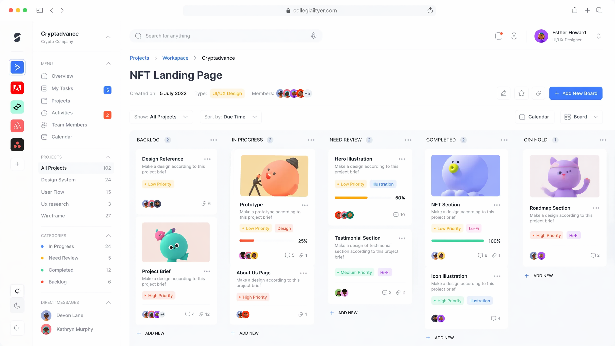
参考原图风格,重新生成清晰的NFT项目管理看板网页界面设计,保…
参考原图风格,重新生成清晰的NFT项目管理看板网页界面设计,保持原布局和3D卡通形象风格
缘絮90000
2026.05.30
做同款
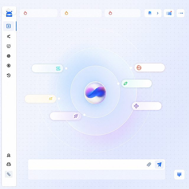
参考当前图片的深色磨砂玻璃风格项目管理dashboard界面,保持整体布局结构、UI组件和设计风格不变,重新生成清晰的画面内容
Olivia000
基于参考图的产品原型,重新设计一组4个跨境金融App首页UI界面,横向并排展示,主色调蓝色系,灰白底色,白色组件底板,极简高级感,国际化风格,干净清爽,现代简约,专业金融质感,界面包含:顶部用户头像和邮箱Hi, user@email.com、KYC认证状态(分别为未认证、已通过、认证中、已通过)、上传个人档案按钮、USD账户余额卡片($0.00,可用冻结,查看账户余额)、充值付款兑换三个功能图标、银行账户区域(暂无账户/已有SGB BANK账户)、开通账户按钮、底部首页订单我的导航栏。英文界面,无中文,UI设计稿,高保真,Figma风格,清晰锐利
GD406626525
Close-up of a futuristic computer screen UI showing a clearly labeled "Token Balance" indicator, the value transitions from 240 to 239, captured mid-update with both states partially visible and connected by a rapid decrement animation trail. The core visual style is cinematic photorealism, high-precision real screen shooting effect, UI has physical display texture instead of pure CG. 50mm close-up lens (not extreme macro), retain complete UI semantic structure. Medium depth of field, Token area is clear, while surrounding UI modules can be identified. Motion blur in the direction of value change (240 → 239) with a clear downward trailing trajectory. The screen has slight bloom, sub-pixel details, glass reflection. The UI design language is a minimalist task interface with a clear field label "Token Balance". The numerical reduction is presented as jump + trail afterimage, not single frame replacement. 240 moves up and fades out quickly, 239 enters from below and locks, there is a blue energy track connecting the two, the system metaphor is that Token is continuously consumed as a resource, reflecting the logic of exploitation. The main colors are pure white, neon blue, cool gray, the highlight blue on the value change path is the accent color. The overall style is bright, cold, industrial oppression vision. The picture shows a complete but compact part of the working interface, not an isolated number. The field label "Token Balance" is clearly visible in the upper right corner, the value on its right is changing: the afterimage above is 240, translucent with upward trailing, the middle is a blue energy transition track, the current value 239 is clear and stable, occupying the visual focus. Other parts of the interface such as task list, progress bar, data flow are slightly blurred, but still recognizable as a continuously working system. The whole change process presents a continuous downward jump, not random flickering. The composition is the rule of thirds with upper right weight, Token area is the visual anchor. First-person working perspective, keyframe freezing in fast-paced editing, but retaining motion trail. The atmosphere is oppressive, continuous consumption, irreversible decline, systematic exploitation, the indifferent order of efficiency first. Ultra-detailed, 8K, realistic UI rendering, motion trail clarity, high dynamic range, subtle glow bloom, cinematic exposure
GD510107466
修改报告顶部banner图,参考提供的粉紫色渐变层叠山形几何banner样式,调整色调适配整体蓝白商务界面,保留原标题"Group IT Radar Report",保持其余页面内容和背景不变
创意 × 2
小王要加油
Two side-by-side landing page mockups for a modern SaaS product text rendering test. Left mockup uses English UI text, right mockup uses identical layout with Japanese UI text. Clean, readable typography, polished website screenshot style, modern minimalist SaaS design, high-quality with clear text rendering. Layout similarity maintained between both versions.
GD146165340
Two side-by-side landing page mockups for a modern SaaS product text rendering test. Left mockup uses English UI text, right mockup uses identical layout with Japanese UI text. Clean, readable typography, polished website screenshot style, modern minimalist SaaS design, high-quality with clear text rendering. Layout similarity maintained between both versions.
GD146165340
将第一张图的界面内容调整为第二张图的倾斜透视视角,但保持完全平视,没有任何仰视或俯视角度。界面内容完全保留第一张图的原样,包括左侧菜单栏、中间流程图节点、顶部工具栏等所有元素不变,只是整体做水平方向的倾斜旋转,呈现正平视角度的斜侧视角,带有轻微的立体感和屏幕边框效果,视线与屏幕中心完全水平
用户eoJiy4wV
按照原型图修改:页面中间是长方形报告样式,报告顶部放置banner图,下方放报告主要内容,报告左右两侧留白并添加简约商务背景装饰,保持B端专业风格,16:9尺寸
创意 × 2
小王要加油
超精细高保真企业级SaaS后台管理系统工作台首页,UI设计稿。左侧深色侧边栏:顶部品牌logo区带渐变图标,导航菜单每项有精致线性图标+文字+角标,选中项有渐变背景高亮和左侧指示条,底部用户信息卡片带头像和退出按钮。顶部导航栏:面包屑导航,全局搜索框带放大镜图标和快捷键提示,主题切换按钮,通知铃铛带红色数字角标,设置齿轮,用户头像下拉。主内容区:欢迎语横幅带渐变背景和装饰图形,四个数据统计卡片(总用户、今日订单、月营收、转化率)每个都有独特渐变色图标、数字、同比增长百分比箭头、迷你折线图sparkline。下方两栏布局:左栏是最近7天访问量趋势柱状图,带图例和交互提示;右栏是热门内容排行榜。再下方是最近操作记录表格。整体采用深浅模式切换的蓝紫色系,极致细腻的阴影层次,12px圆角,充足留白,像素级对齐,专业B端设计,Figma级高保真
1q2rqdj61m-HB
参考原图的毛玻璃渐变风格,重新生成零售SaaS行业登录页面,左侧加入商店和购物车相关元素,保留右侧登录表单布局,保持整体蓝色渐变主调,移除所有水印,保留新拟态轻拟物玻璃质感设计风格
6al4juyud7pPE0A-HB
根据参考图重新设计生成相同内容的账单管理APP仪表盘界面,保持布局、文案和配色不变,尺寸调整为1024x500像素
SUPLER
根据参考图重新设计生成相同内容的账单管理APP仪表盘界面,保持布局、文案和配色不变,尺寸调整为1024x500像素
SUPLER
保留图中原有的整体视觉布局、图例结构和尺寸,去掉图中所有的文字文案,仅保留图形和背景元素
洋子222
将图1的任务管理APP界面,替换到图2的iPad壳套展示图中,制作成2064×2752px的App Store上架图
1qrueebafuJN7veA-HB
1:1还原参考图片的布局结构,保留分栏排版、标题框样式和整体配色框架,生成相同结构的空白模板,方便后续编辑内容
1r4is6gzneafHB-g-HB
企业官网CMS系统概念图,现代科技感风格。画面展示一个现代化的企业网站后台管理界面,有仪表盘、数据图表、内容模块的抽象化视觉呈现,蓝色和青色的科技色调,背景有渐变光效和网络连线元素,整体简洁大气专业,体现企业级内容管理系统的高端感和科技感。画面中没有任何文字。
1qb6sjnzuv-HB
对原型图进行UI重设计,生成商务扁平风格界面:保持原有所有文字内容完全不变,优化页面布局、视觉层级、色彩搭配和字体排版,使用实色填充纯色卡片,采用面性实心icon风格,卡片为圆角矩形实色底,文字左对齐进入按钮改为渐变色块跳转按钮,合理留白间距,统一配色提升精致感,整体商务干净高级,自适应尺寸,修正原型不合理布局
大陆机电-UI设计
对原型图进行UI重设计,生成商务扁平风格界面:保持原有所有文字内容完全不变,优化页面布局、视觉层级、色彩搭配和字体排版,使用实色填充纯色卡片,采用面性实心icon风格,卡片为圆角矩形实色底,文字左对齐进入按钮改为渐变色块跳转按钮,合理留白间距,统一配色提升精致感,整体商务干净高级,自适应尺寸,修正原型不合理布局
大陆机电-UI设计
将参考图的背景修改为纯黑色,保留原有的手机、银行卡和文字内容不变
wubijing
我正在生成一篇标题为《在线作图工具全面盘点:主流平台功能与易用性对比》的文章,请帮我生成4张符合文章主题内容的配图,不要出现人像和文字!不要太单调,不要诡异。
1q0kwkpngn100pgto-HB
一张左右对比风格的信息图,深蓝渐变背景,扁平化设计,横版16:9,不包含任何文字。左半部分:色调偏灰冷,画面显示一个结构混乱、信息缺失的门店官网页面,页面信息不全或相互矛盾,AI搜索框中显示无法识别信任分低,门店图标模糊不清。中间有一个向右的橙色箭头。右半部分:色调偏暖橙,画面显示一个结构清晰、信息完整的门店官网页面,页面包含多个模块,官网页面连接到AI对话气泡,气泡内显示门店被推荐,门店图标清晰明亮。整体形成鲜明对比。
用户Y7RcsyWS
保持毛玻璃拟态UI卡片风格和整体布局不变,将中间卡片的标题从"租赁业务"改为"租赁服务",卡片内容保持清单、环形饼图、叉车等租赁服务相关元素。三张卡片错落叠放,整体采用蓝紫色渐变柔和光晕背景,白色纯净底色,半透明磨砂质感,光影柔和通透,现代简约科技风格
douzi123
金融IT科技风格图片,适用于网站宣传,低代码金融应用开发,天蓝色科技背景搭配模块化积木代码块,高效开发科技感
1qyibvi2oyM9838w-HB
胡罗洛
将中间的地球替换为白色模型建筑园区,保持界面其他元素不变
圆圆0