已添加
登录/注册
「图片1」把这张图的产品换成黑色+金色字体的
「图片1」把这张图的产品换成黑色+金色字体的
1qzip1d3v3j...
2026.06.14
做同款
「图片1」把这张图的产品换成黑色+金色字体的
1qzip1d3v3jgUphw-HB
「图片1」重新做这张图,把产品换成黑色,字体为金色,箭头指向数字小的方向
1qzip1d3v3jgUphw-HB
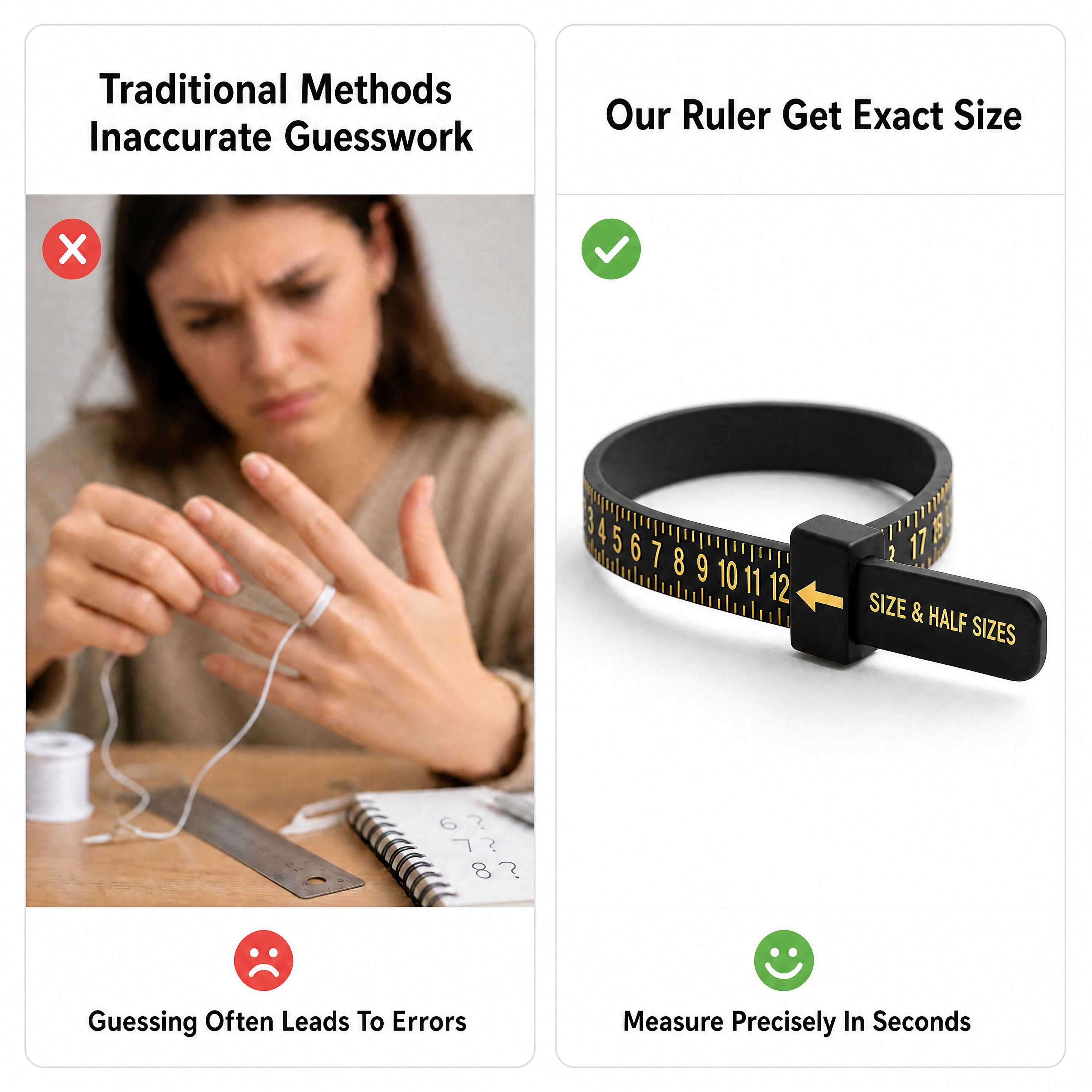
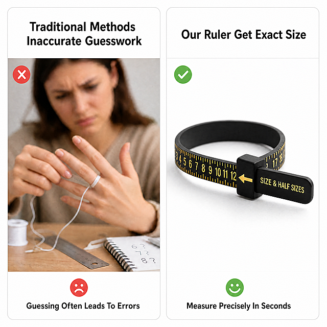
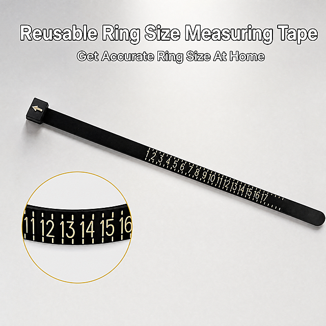
「图片1」「图片1」「图片1」「图片1」我要把这个手指尺放到TikTok美区售卖,我需要5张产品主图,8屏产品详情图,图片要保留产品原型,不能改变产品外形。产品核心功能: 通过环绕式测量,精准读取戒指尺码 滑动箭头锁定读数,避免误判 一人即可操作,无需他人协助 可重复使用,适合全家/全店使用
1qzip1d3v3jgUphw-HB
「图片1」「图片1」「图片1」「图片1」我要把这个手指尺放到TikTok美区售卖,我需要5张产品主图,8屏产品详情图,图片要保留产品原型,不能改变产品外形。产品核心功能: 通过环绕式测量,精准读取戒指尺码 滑动箭头锁定读数,避免误判 一人即可操作,无需他人协助 可重复使用,适合全家/全店使用
1qzip1d3v3jgUphw-HB
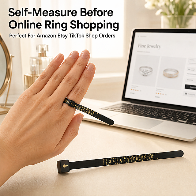
线上买戒指前测尺寸 — Amazon/Etsy/TikTok Shop购戒前自测,依据这个场景做一个产品场景图,保持产品为黑色尺+金色字体
1qzip1d3v3jgUphw-HB
「图片1」「图片1」「图片1」「图片1」我要把这个手指尺放到TikTok美区售卖,我需要5张产品主图,8屏产品详情图,图片要保留产品原型,不能改变产品外形。产品核心功能: 通过环绕式测量,精准读取戒指尺码 滑动箭头锁定读数,避免误判 一人即可操作,无需他人协助 可重复使用,适合全家/全店使用
1qzip1d3v3jgUphw-HB
「图片1」「图片1」「图片1」「图片1」我要把这个手指尺放到TikTok美区售卖,我需要5张产品主图,8屏产品详情图,图片要保留产品原型,不能改变产品外形。产品核心功能: 通过环绕式测量,精准读取戒指尺码 滑动箭头锁定读数,避免误判 一人即可操作,无需他人协助 可重复使用,适合全家/全店使用
1qzip1d3v3jgUphw-HB
Based on the provided bracelet helper product image, keep the product main body unchanged, generate a product scene image with European and American models, including before and after comparison of the model using the product and product detail close-ups, highlight the main product, highlight the product subject and texture, all text on the image must be English, no Chinese characters, keep font style consistent, 2K resolution, high-end commercial product photography, attractive for purchase
m19902
「图片1」「图片1」「图片1」「图片1」我要把这个手指尺放到TikTok美区售卖,我需要5张产品主图,8屏产品详情图,图片要保留产品原型,不能改变产品外形。产品核心功能: 通过环绕式测量,精准读取戒指尺码 滑动箭头锁定读数,避免误判 一人即可操作,无需他人协助 可重复使用,适合全家/全店使用
1qzip1d3v3jgUphw-HB
生成类似的对比图,中间圆圈去掉,文案和箭头也去掉,模特头发颜色变成棕色,动作改变
优爱菜鸟
「图片1」「图片1」「图片1」「图片1」我要把这个手指尺放到TikTok美区售卖,我需要5张产品主图,8屏产品详情图,图片要保留产品原型,不能改变产品外形。产品核心功能: 通过环绕式测量,精准读取戒指尺码 滑动箭头锁定读数,避免误判 一人即可操作,无需他人协助 可重复使用,适合全家/全店使用
1qzip1d3v3jgUphw-HB
[Main Image 4] Multi-scenario application of digital caliper. Keep product consistent with original image. [Atmosphere] Practical UGC style, real use scenarios. [Quality] Clear commercial photography, natural light, real scenes. [Elements] Top title, lower 4-grid layout. 4 grids show: 1. Measuring wood in DIY; 2. Measuring metal parts for industry; 3. Measuring jewelry for craft; 4. Measuring 3D print part. Product can be placed at top/side, consistent with original. Each scenario natural and correctly shows use. [Lighting] Natural soft light, uniform, clear measurement state. [Color] Light professional tone, natural color matching, no harsh contrast. [Composition] Top title + 4-grid, full screen, layered, no border. [Text] All English. Top title: "WIDELY USED IN MULTIPLE SCENARIOS". Grid labels: DIY WOODWORKING, METAL MEASUREMENT, JEWELRY MAKING, 3D PRINTING. No Chinese, clear. [Resolution] 1:1, 2048x2048 2K. [Negative] Deformation, watermark, blurry, cluttered layout, Chinese characters
GD428197820
A set of commercial product photos for Shein cross-border e-commerce, 8 pictures in total. The main product is a bracelet wearing aid with a metal hook and a macaron color silicone handle, keep the product's physical structure unchanged, 4 different color handles in each image. Pictures include product showcase and usage demonstrations with models, all models are European and American women, with real skin texture, showing the process of the model using the tool to hook the bracelet clasp and easily fasten the bracelet. The style is modern minimalist commercial photography, with hard side light, high contrast, clear texture, real color reproduction, highlighting the product, the pictures do not contain any Chinese text, only keep necessary English text, all fonts are consistent in style. Negative prompts: Chinese characters, Asian face, distorted product, deformed handle, missing parts, soft focus, blurry, low contrast,平光, watermark, logo, wrong text
今晚去偷🌙
「图片1」「图片1」「图片1」「图片1」我要把这个手指尺放到TikTok美区售卖,我需要5张产品主图,8屏产品详情图,图片要保留产品原型,不能改变产品外形。产品核心功能: 通过环绕式测量,精准读取戒指尺码 滑动箭头锁定读数,避免误判 一人即可操作,无需他人协助 可重复使用,适合全家/全店使用
1qzip1d3v3jgUphw-HB
商业级时尚科技杂志内页排版,整体风格极简高级,低饱和浅灰哑光背景,光影干净柔和,无杂乱元素,文字格式全统一。主标题【Tired Of These Troubles? We Have The Perfect Solution】,位于画面顶部左对齐,统一格式:加粗无衬线大号英文字体,字重700,黑色;副标题【Solve All Your Pain Points In One Smart Eyewear】,位于主标题下方左对齐,统一格式:常规无衬线中号英文字体,字重400,深灰色。信息布局:画面采用左右5:5分栏杂志式排版,左栏为【用户痛点区】,从上到下4组痛点可视化内容,每组为左侧红色禁止小图标+右侧痛点场景写实小图(骑行手持拍摄、vlog画面晃动、开车接电话、普通墨镜功能单一),每组小图下方预留痛点文案排版位,统一格式:常规无衬线小号字体,深灰色;右栏为【产品解决方案区】,视觉主体为亮黑色智能眼镜正面居中特写,拍摄角度为正脸平视,清晰展示双摄结构,眼镜四周搭配4个绿色对勾图标,每个图标右侧预留对应解决方案文案排版位,统一格式:常规无衬线小号字体,黑色。设计感强调:杂志式对称分栏排版,痛点与解决方案强对比,视觉逻辑清晰,30秒内让用户快速共情并感知产品价值,整体风格与全系列统一无割裂感。
五块5554
product infographic, 1200:900 vertical ratio, black velcro strap roll, hand cutting strap with household scissors, left side contrast graphic: wasteful single-use plastic zip ties with X mark, right side: reusable cut-to-length velcro strap with check mark. Clean white background, soft studio light. Large english headline "Cut To Any Length You Need", sub-text "No More Waste Of Disposable Cable Ties". Elegant sans-serif text layout, text placed on blank area without blocking product, amazon premium A+ graphic, photorealistic, redesigned vertical composition
GD899491528
「图片1」,生成电商主图(5张),商品名称是可调节束腰带,卖点是「图片1」「图片1」「图片1」「图片1」「图片1」,并再帮我根据这些卖点另外再拓展一些卖点,适配亚马逊/跨境平台,主图比例为1:1
GD182869734
「图片1」,生成一套主图(6张),商品名称是不锈钢美甲剪刀,卖点是外观好看,实用,商品规格如图「图片1」,生成的图片中不要出现商标和中文,适配亚马逊/跨境平台,主图比例为1:1
GD207730565
[移动端第4张 · 4:3横版] Amazon高级A+尺寸规格页 — 三色皮带尺寸参数与调节孔展示。本张使用【图3】作为商品主体(三色皮带全貌+尺寸标注)。 [氛围/风格] 极简信息图风格 + 产品实拍质感,清晰易读,专业可信。 [元素布局] 画面上半部分展示三条皮带水平排列(黑/卡其/芥末黄从上到下),金色扣具朝左,皮带下方有细线引出标注:左侧标注「Length: 105cm / 41.3in」,右侧标注「Width: 1.4cm / 0.55in」;画面下半部分左侧为皮带调节孔区域放大特写,展示多排均匀打孔,配文字「Multiple Adjustment Holes」;下半部分右侧为尺码适配信息卡片,写「Fits Most Waist Sizes」「Easy to Adjust」;背景为浅米色,底部有浅灰色细分割线;皮带颜色、宽度、扣具形状与输入图完全一致。 [光影质感] 顶部均匀柔光,产品清晰锐利,阴影极浅,整体明亮干净,信息突出。 [配色色系] 全局底色 #FAF7F2(极浅米白);主色为皮带三色;辅助色为浅灰分割线、米色卡片底;文字色为深炭灰。 [视角构图] 上下结构,上半部分产品全貌+尺寸标注,下半部分左右分栏(细节特写+信息卡片),阅读动线从上到下。 [文字版式] 顶部居中标题「Size Information」,无衬线体加粗;尺寸标注为细体无衬线英文+数字;下半部分两个信息块各有小标题和说明文字;右下角有小号提示「Manual measurement may have an error of 1-2cm」;所有文字为英文,深炭灰色,字号适中清晰。 [比例分辨率] 4:3横版比例,width=1600 height=1200,4K分辨率,高清画质。 [负向提示词] 皮带变形、尺寸标注错误、颜色偏差、文字错乱、文字过小、水印、中文字符、背景杂乱、产品模糊。
GD207730565
[移动端第4张 · 4:3横版] Amazon高级A+尺寸规格页 — 三色皮带尺寸参数与调节孔展示。本张使用【图3】作为商品主体(三色皮带全貌+尺寸标注)。 [氛围/风格] 极简信息图风格 + 产品实拍质感,清晰易读,专业可信。 [元素布局] 画面上半部分展示三条皮带水平排列(黑/卡其/芥末黄从上到下),金色扣具朝左,皮带下方有细线引出标注:左侧标注「Length: 105cm / 41.3in」,右侧标注「Width: 1.4cm / 0.55in」;画面下半部分左侧为皮带调节孔区域放大特写,展示多排均匀打孔,配文字「Multiple Adjustment Holes」;下半部分右侧为尺码适配信息卡片,写「Fits Most Waist Sizes」「Easy to Adjust」;背景为浅米色,底部有浅灰色细分割线;皮带颜色、宽度、扣具形状与输入图完全一致。 [光影质感] 顶部均匀柔光,产品清晰锐利,阴影极浅,整体明亮干净,信息突出。 [配色色系] 全局底色 #FAF7F2(极浅米白);主色为皮带三色;辅助色为浅灰分割线、米色卡片底;文字色为深炭灰。 [视角构图] 上下结构,上半部分产品全貌+尺寸标注,下半部分左右分栏(细节特写+信息卡片),阅读动线从上到下。 [文字版式] 顶部居中标题「Size Information」,无衬线体加粗;尺寸标注为细体无衬线英文+数字;下半部分两个信息块各有小标题和说明文字;右下角有小号提示「Manual measurement may have an error of 1-2cm」;所有文字为英文,深炭灰色,字号适中清晰。 [比例分辨率] 4:3横版比例,width=1600 height=1200,4K分辨率,高清画质。 [负向提示词] 皮带变形、尺寸标注错误、颜色偏差、文字错乱、文字过小、水印、中文字符、背景杂乱、产品模糊。
GD207730565
[第3张] 亚马逊跨境详情页结构细节特写 - 钢卷尺关键部位放大展示。本张使用【图1】作为商品主体,重点展示尺带刻度、锁止按钮、尺钩三个细节部位,保持产品外观与原图一致。 [氛围/风格] 工业精密风,微距特写质感,专业工具细节展示,跨境电商风格。 [元素布局] 画面采用主图+三细节放大框布局:左侧为卷尺主体侧视角度,占比约40%,尺带部分拉出展示刻度;右侧上下排列三个圆形或方形放大窗口,分别用引线指向产品对应部位:第一个放大窗口指向尺带刻度区域,展示公英制双刻度清晰度;第二个放大窗口指向黑色锁止按钮,展示防滑纹理与按压结构;第三个放大窗口指向金属尺钩,展示金属质感与挂钩设计;背景为深灰蓝渐变,突出金属与精密感。 [光影质感] 侧上方硬光照明,突出金属质感与橡胶纹理;细节放大窗口内光线更亮,清晰展示细节;整体光影有层次,专业精密感。 [配色色系] 全局底色 #2C3E50 深灰蓝渐变;细节窗口边框使用产品黄 #FFCC00;引线为白色虚线;文字白色 #FFFFFF 与浅灰 #B0BEC5 搭配。 [视角构图] 产品左侧45度侧视,右侧细节标注,阅读动线从左到右,从上到下。 [文字版式] 全部英文,无中文字符。画面顶部主标题 "Precision Engineering in Every Detail";三个细节窗口分别标注:"Clear Dual Markings" 下方小字 "Wear-Resistant Printing";"Anti-Slip Lock Button" 下方小字 "One-Hand Operation";"Steel Belt Clip Hook" 下方小字 "Secure & Durable";每个标注配简短说明文字,字体清晰。 [比例分辨率] 9:16 竖版比例,4K分辨率,文字清晰可辨,高清画质。 [负向提示词] 产品变形,颜色偏差,中文字符,水印,文字错乱,刻度模糊,结构错误,背景杂乱,产品缺件。
GD550392596
[第2张] 亚马逊跨境详情页核心卖点总览 - 钢卷尺四大功能卖点图标展示。本张使用【图1】作为商品主体,保持产品外观与原图一致,产品置于画面上方。 [氛围/风格] 工业专业风,极简信息卡片式设计,跨境电商风格,清晰易读。 [元素布局] 产品卷尺位于画面上方居中,占比约35%,正面视角展示;下方区域为2x2四宫格卖点卡片布局,共四个信息卡片,每个卡片包含图标+标题+简短描述;背景为浅灰蓝纯色,卡片为白色圆角矩形,带有细微阴影;卡片之间留有均匀间距。 [光影质感] 产品顶部柔光照明,底部自然投影;卡片为扁平化设计,轻微阴影增加层次感,整体明亮清晰。 [配色色系] 全局底色 #E8EDF2 浅灰蓝;卡片底色 #FFFFFF 纯白;图标使用工业蓝 #2C5F8D 和产品黄 #FFCC00 双色搭配;文字深灰 #333333。 [视角构图] 正面平视视角,上产品下信息的上下构图,阅读动线从上至下。 [文字版式] 全部英文,无中文字符。顶部产品上方小标题 "Built for Professional Use";四个卖点卡片分别为:左上卡片配尺子图标 "Dual Scale System" 下方小字 "Metric & Imperial Readings";右上卡片配盾牌图标 "Heavy Duty Casing" 下方小字 "ABS + Rubber Protection";左下卡片配锁图标 "One-Hand Lock" 下方小字 "Smooth & Secure Stop";右下卡片配便携挂钩图标 "Belt Clip Design" 下方小字 "Easy Carry On Site";所有文字清晰可读,主标题加粗。 [比例分辨率] 9:16 竖版比例,4K分辨率,文字清晰可辨,高清画质。 [负向提示词] 产品变形,颜色偏差,中文字符,水印,文字错乱,文字过小,卡片变形,背景杂乱,产品模糊。
GD550392596
[商品] 使用【图6】的提手与肩带细节;保留黑色网布提手、白色加厚海绵内芯(1.5cm厚度)、可调节黑色塑料扣、反穿透气网布垫、尼龙织带带反光线;修复面料毛边,增强海绵蓬松感和网布纹理,不改变结构与颜色。 [画面] 亚马逊高级A+移动端提手与人性化设计页,上下两组左右对比型 + 底部调节扣特写。上组:提手厚度对比(1.5cm加厚海绵 vs 0.5cm薄款),左侧绿色对勾,右侧红色叉号,中间橙色闪电VS。下组:网布垫正反两面特写,突出可翻转双面使用、柔软透气。右下角放大圆形特写:黑色塑料日字调节扣,标注"Adjustable Strap"。顶部通栏标题。 [视觉] 套系策略:风格=亚马逊极简真实商业摄影风;标题字=现代无衬线粗体(英文字重Bold);正文字=简洁无衬线体(Regular);主色=品牌橙(#FF7A00 系)+ 炭黑;背景延展=浅暖灰到米白渐变,卡片白底圆角;强调色=深橙,仅用于圆形放大框、引线、VS图标;标题色=深炭灰;正文色=中暖灰;组件=圆角对比卡片、绿色对勾、红色叉号、圆形放大框、细线引线;光影=正面均匀柔光,材质纹理清晰,阴影柔和。 [文字] 顶部主标题"Comfortable Handle & Adjustable Straps",副标题"Lift with Ease, Fit Your Height Perfectly"。每组下方横排文字:上组左"Thick Padded Handle (1.5cm)"右"Thin Padding Hurts Hands";下组左"Reversible Soft Mesh"右"Rough and Uncomfortable"。右下角圆形框旁横排"Adjustable Strap Buckle"。全部文字横排。 [规格] 移动端4:3横版,4K,quality=medium,文件小于6MB;避免材质失真、文字竖排、医疗承诺、价格信息、站外链接。
GD207730565
[主图-4] 产品细节与多场景适用展示图,突出可调节、隐形贴合、多用途三大卖点。 [统一基调] 浅米色极简背景,柔和时尚摄影光;标题字色为深炭灰色,辅助字色为中灰色,图标为深炭灰色细线风格;无衬线粗体标题字,小号无衬线说明字;整体风格简约高级、信息清晰。 [画面] 左侧为产品主视觉:特写展示黑色弹力带的带孔细节和白色圆形固定扣的扣合结构,弹力带平铺展开一段,固定扣扣在孔位上,旁边放一颗未使用的固定扣做对比,微距质感突出织带纹理和扣面光滑度。右侧为三个竖向排列的卖点图标+文字组合:第一个卖点图标为可调节滑块样式,标题"Adjustable Fit",说明"Multiple hole positions for custom sizing";第二个卖点图标为隐形眼睛/隐藏符号样式,标题"Invisible Under Clothes",说明"No bulk seamless look";第三个卖点图标为多件衣服(衬衫/T恤/连衣裙)简笔画样式,标题"Versatile Use",说明"Works with shirts tops dresses"。 [光影质感] 柔和侧光突出弹力带编织纹理和固定扣的立体感,产品下方有自然接触阴影。 [配色] 浅米色背景,深炭灰标题和图标,中灰说明文字,黑色弹力带+白色固定扣。 [文字版式] 顶部大标题"Premium Quality Smart Design";右侧卖点标题粗体,说明文字常规字重小号;全部英文,无衬线字体;文字放在右侧负空间,不遮挡产品主体。 [输出要求] 1:1比例,2048x2048,产品细节清晰,纹理真实,文字清晰可读,无水印,无平台Logo。
GD630876328
将这张图的整体背景更换为高级低饱和浅浅蓝色,保持所有产品部件、文字、分栏布局完全不变,只替换背景颜色,让画面呈现高级清爽的浅蓝色风格,保持产品质感和文字清晰度不变,整体风格统一高级,8K超高清
GD899491528







![[Main Image 4] Multi-scenario application of digital caliper. Keep product consistent with original image.
[Atmosphere] Practical UGC style, real use scenarios.
[Quality] Clear commercial photography, natural light, real scenes.
[Elements] Top title, lower 4-grid layout. 4 grids show: 1. Measuring wood in DIY; 2. Measuring metal parts for industry; 3. Measuring jewelry for craft; 4. Measuring 3D print part. Product can be placed at top/side, consistent with original. Each scenario natural and correctly shows use.
[Lighting] Natural soft light, uniform, clear measurement state.
[Color] Light professional tone, natural color matching, no harsh contrast.
[Composition] Top title + 4-grid, full screen, layered, no border.
[Text] All English. Top title: "WIDELY USED IN MULTIPLE SCENARIOS". Grid labels: DIY WOODWORKING, METAL MEASUREMENT, JEWELRY MAKING, 3D PRINTING. No Chinese, clear.
[Resolution] 1:1, 2048x2048 2K.
[Negative] Deformation, watermark, blurry, cluttered layout, Chinese characters](https://gd-cms.dancf.com/gd-cms/xi19e5/0/7d2186c7-689e-45ea-a8fc-c89411149a3613015.png?x-oss-process=image/resize,w_640,type_6/sharpen,120/interlace,1)








![[移动端第4张 · 4:3横版] Amazon高级A+尺寸规格页 — 三色皮带尺寸参数与调节孔展示。本张使用【图3】作为商品主体(三色皮带全貌+尺寸标注)。
[氛围/风格] 极简信息图风格 + 产品实拍质感,清晰易读,专业可信。
[元素布局] 画面上半部分展示三条皮带水平排列(黑/卡其/芥末黄从上到下),金色扣具朝左,皮带下方有细线引出标注:左侧标注「Length: 105cm / 41.3in」,右侧标注「Width: 1.4cm / 0.55in」;画面下半部分左侧为皮带调节孔区域放大特写,展示多排均匀打孔,配文字「Multiple Adjustment Holes」;下半部分右侧为尺码适配信息卡片,写「Fits Most Waist Sizes」「Easy to Adjust」;背景为浅米色,底部有浅灰色细分割线;皮带颜色、宽度、扣具形状与输入图完全一致。
[光影质感] 顶部均匀柔光,产品清晰锐利,阴影极浅,整体明亮干净,信息突出。
[配色色系] 全局底色 #FAF7F2(极浅米白);主色为皮带三色;辅助色为浅灰分割线、米色卡片底;文字色为深炭灰。
[视角构图] 上下结构,上半部分产品全貌+尺寸标注,下半部分左右分栏(细节特写+信息卡片),阅读动线从上到下。
[文字版式] 顶部居中标题「Size Information」,无衬线体加粗;尺寸标注为细体无衬线英文+数字;下半部分两个信息块各有小标题和说明文字;右下角有小号提示「Manual measurement may have an error of 1-2cm」;所有文字为英文,深炭灰色,字号适中清晰。
[比例分辨率] 4:3横版比例,width=1600 height=1200,4K分辨率,高清画质。
[负向提示词] 皮带变形、尺寸标注错误、颜色偏差、文字错乱、文字过小、水印、中文字符、背景杂乱、产品模糊。](https://gd-cms.dancf.com/gd-cms/xi19e5/0/11b64dab-21c5-41e4-bdda-ea093279e65920901.png?x-oss-process=image/resize,w_640,type_6/sharpen,120/interlace,1)
![[移动端第4张 · 4:3横版] Amazon高级A+尺寸规格页 — 三色皮带尺寸参数与调节孔展示。本张使用【图3】作为商品主体(三色皮带全貌+尺寸标注)。
[氛围/风格] 极简信息图风格 + 产品实拍质感,清晰易读,专业可信。
[元素布局] 画面上半部分展示三条皮带水平排列(黑/卡其/芥末黄从上到下),金色扣具朝左,皮带下方有细线引出标注:左侧标注「Length: 105cm / 41.3in」,右侧标注「Width: 1.4cm / 0.55in」;画面下半部分左侧为皮带调节孔区域放大特写,展示多排均匀打孔,配文字「Multiple Adjustment Holes」;下半部分右侧为尺码适配信息卡片,写「Fits Most Waist Sizes」「Easy to Adjust」;背景为浅米色,底部有浅灰色细分割线;皮带颜色、宽度、扣具形状与输入图完全一致。
[光影质感] 顶部均匀柔光,产品清晰锐利,阴影极浅,整体明亮干净,信息突出。
[配色色系] 全局底色 #FAF7F2(极浅米白);主色为皮带三色;辅助色为浅灰分割线、米色卡片底;文字色为深炭灰。
[视角构图] 上下结构,上半部分产品全貌+尺寸标注,下半部分左右分栏(细节特写+信息卡片),阅读动线从上到下。
[文字版式] 顶部居中标题「Size Information」,无衬线体加粗;尺寸标注为细体无衬线英文+数字;下半部分两个信息块各有小标题和说明文字;右下角有小号提示「Manual measurement may have an error of 1-2cm」;所有文字为英文,深炭灰色,字号适中清晰。
[比例分辨率] 4:3横版比例,width=1600 height=1200,4K分辨率,高清画质。
[负向提示词] 皮带变形、尺寸标注错误、颜色偏差、文字错乱、文字过小、水印、中文字符、背景杂乱、产品模糊。](https://gd-cms.dancf.com/gd-cms/xi19e5/0/26f12e22-c812-4632-b5bd-9d6517fa5f0e20554.png?x-oss-process=image/resize,w_640,type_6/sharpen,120/interlace,1)
![[第3张] 亚马逊跨境详情页结构细节特写 - 钢卷尺关键部位放大展示。本张使用【图1】作为商品主体,重点展示尺带刻度、锁止按钮、尺钩三个细节部位,保持产品外观与原图一致。
[氛围/风格] 工业精密风,微距特写质感,专业工具细节展示,跨境电商风格。
[元素布局] 画面采用主图+三细节放大框布局:左侧为卷尺主体侧视角度,占比约40%,尺带部分拉出展示刻度;右侧上下排列三个圆形或方形放大窗口,分别用引线指向产品对应部位:第一个放大窗口指向尺带刻度区域,展示公英制双刻度清晰度;第二个放大窗口指向黑色锁止按钮,展示防滑纹理与按压结构;第三个放大窗口指向金属尺钩,展示金属质感与挂钩设计;背景为深灰蓝渐变,突出金属与精密感。
[光影质感] 侧上方硬光照明,突出金属质感与橡胶纹理;细节放大窗口内光线更亮,清晰展示细节;整体光影有层次,专业精密感。
[配色色系] 全局底色 #2C3E50 深灰蓝渐变;细节窗口边框使用产品黄 #FFCC00;引线为白色虚线;文字白色 #FFFFFF 与浅灰 #B0BEC5 搭配。
[视角构图] 产品左侧45度侧视,右侧细节标注,阅读动线从左到右,从上到下。
[文字版式] 全部英文,无中文字符。画面顶部主标题 "Precision Engineering in Every Detail";三个细节窗口分别标注:"Clear Dual Markings" 下方小字 "Wear-Resistant Printing";"Anti-Slip Lock Button" 下方小字 "One-Hand Operation";"Steel Belt Clip Hook" 下方小字 "Secure & Durable";每个标注配简短说明文字,字体清晰。
[比例分辨率] 9:16 竖版比例,4K分辨率,文字清晰可辨,高清画质。
[负向提示词] 产品变形,颜色偏差,中文字符,水印,文字错乱,刻度模糊,结构错误,背景杂乱,产品缺件。](https://gd-cms.dancf.com/gd-cms/xi19e5/0/c4a2e3b7-b309-4c03-b776-1f37e2c721ac12484.png?x-oss-process=image/resize,w_640,type_6/sharpen,120/interlace,1)

![[第2张] 亚马逊跨境详情页核心卖点总览 - 钢卷尺四大功能卖点图标展示。本张使用【图1】作为商品主体,保持产品外观与原图一致,产品置于画面上方。
[氛围/风格] 工业专业风,极简信息卡片式设计,跨境电商风格,清晰易读。
[元素布局] 产品卷尺位于画面上方居中,占比约35%,正面视角展示;下方区域为2x2四宫格卖点卡片布局,共四个信息卡片,每个卡片包含图标+标题+简短描述;背景为浅灰蓝纯色,卡片为白色圆角矩形,带有细微阴影;卡片之间留有均匀间距。
[光影质感] 产品顶部柔光照明,底部自然投影;卡片为扁平化设计,轻微阴影增加层次感,整体明亮清晰。
[配色色系] 全局底色 #E8EDF2 浅灰蓝;卡片底色 #FFFFFF 纯白;图标使用工业蓝 #2C5F8D 和产品黄 #FFCC00 双色搭配;文字深灰 #333333。
[视角构图] 正面平视视角,上产品下信息的上下构图,阅读动线从上至下。
[文字版式] 全部英文,无中文字符。顶部产品上方小标题 "Built for Professional Use";四个卖点卡片分别为:左上卡片配尺子图标 "Dual Scale System" 下方小字 "Metric & Imperial Readings";右上卡片配盾牌图标 "Heavy Duty Casing" 下方小字 "ABS + Rubber Protection";左下卡片配锁图标 "One-Hand Lock" 下方小字 "Smooth & Secure Stop";右下卡片配便携挂钩图标 "Belt Clip Design" 下方小字 "Easy Carry On Site";所有文字清晰可读,主标题加粗。
[比例分辨率] 9:16 竖版比例,4K分辨率,文字清晰可辨,高清画质。
[负向提示词] 产品变形,颜色偏差,中文字符,水印,文字错乱,文字过小,卡片变形,背景杂乱,产品模糊。](https://gd-cms.dancf.com/gd-cms/xi19e5/0/db85dea0-78cb-474b-8902-51c88205efa012482.png?x-oss-process=image/resize,w_640,type_6/sharpen,120/interlace,1)
![[商品] 使用【图6】的提手与肩带细节;保留黑色网布提手、白色加厚海绵内芯(1.5cm厚度)、可调节黑色塑料扣、反穿透气网布垫、尼龙织带带反光线;修复面料毛边,增强海绵蓬松感和网布纹理,不改变结构与颜色。
[画面] 亚马逊高级A+移动端提手与人性化设计页,上下两组左右对比型 + 底部调节扣特写。上组:提手厚度对比(1.5cm加厚海绵 vs 0.5cm薄款),左侧绿色对勾,右侧红色叉号,中间橙色闪电VS。下组:网布垫正反两面特写,突出可翻转双面使用、柔软透气。右下角放大圆形特写:黑色塑料日字调节扣,标注"Adjustable Strap"。顶部通栏标题。
[视觉] 套系策略:风格=亚马逊极简真实商业摄影风;标题字=现代无衬线粗体(英文字重Bold);正文字=简洁无衬线体(Regular);主色=品牌橙(#FF7A00 系)+ 炭黑;背景延展=浅暖灰到米白渐变,卡片白底圆角;强调色=深橙,仅用于圆形放大框、引线、VS图标;标题色=深炭灰;正文色=中暖灰;组件=圆角对比卡片、绿色对勾、红色叉号、圆形放大框、细线引线;光影=正面均匀柔光,材质纹理清晰,阴影柔和。
[文字] 顶部主标题"Comfortable Handle & Adjustable Straps",副标题"Lift with Ease, Fit Your Height Perfectly"。每组下方横排文字:上组左"Thick Padded Handle (1.5cm)"右"Thin Padding Hurts Hands";下组左"Reversible Soft Mesh"右"Rough and Uncomfortable"。右下角圆形框旁横排"Adjustable Strap Buckle"。全部文字横排。
[规格] 移动端4:3横版,4K,quality=medium,文件小于6MB;避免材质失真、文字竖排、医疗承诺、价格信息、站外链接。](https://gd-cms.dancf.com/gd-cms/xi19e5/0/3c62bd81-adc4-414b-8d12-4d5d665361628806.jpeg?x-oss-process=image/resize,w_640,type_6/sharpen,120/interlace,1)
![[主图-4] 产品细节与多场景适用展示图,突出可调节、隐形贴合、多用途三大卖点。
[统一基调] 浅米色极简背景,柔和时尚摄影光;标题字色为深炭灰色,辅助字色为中灰色,图标为深炭灰色细线风格;无衬线粗体标题字,小号无衬线说明字;整体风格简约高级、信息清晰。
[画面] 左侧为产品主视觉:特写展示黑色弹力带的带孔细节和白色圆形固定扣的扣合结构,弹力带平铺展开一段,固定扣扣在孔位上,旁边放一颗未使用的固定扣做对比,微距质感突出织带纹理和扣面光滑度。右侧为三个竖向排列的卖点图标+文字组合:第一个卖点图标为可调节滑块样式,标题"Adjustable Fit",说明"Multiple hole positions for custom sizing";第二个卖点图标为隐形眼睛/隐藏符号样式,标题"Invisible Under Clothes",说明"No bulk seamless look";第三个卖点图标为多件衣服(衬衫/T恤/连衣裙)简笔画样式,标题"Versatile Use",说明"Works with shirts tops dresses"。
[光影质感] 柔和侧光突出弹力带编织纹理和固定扣的立体感,产品下方有自然接触阴影。
[配色] 浅米色背景,深炭灰标题和图标,中灰说明文字,黑色弹力带+白色固定扣。
[文字版式] 顶部大标题"Premium Quality Smart Design";右侧卖点标题粗体,说明文字常规字重小号;全部英文,无衬线字体;文字放在右侧负空间,不遮挡产品主体。
[输出要求] 1:1比例,2048x2048,产品细节清晰,纹理真实,文字清晰可读,无水印,无平台Logo。](https://gd-cms.dancf.com/gd-cms/xi19e5/0/e22bad6f-1b33-484b-a99b-c6406ae0cea110894.jpeg?x-oss-process=image/resize,w_640,type_6/sharpen,120/interlace,1)
