已添加
登录/注册
改为竖版图,符合手机看的习惯
改为竖版图,符合手机看的习惯
684nqi1drm1...
2026.06.16
编辑
[商品] 使用【图5】URENUS甜菜根胶囊正反瓶身图;保留两瓶的所有标签文字、Logo、条形码、认证图标、底部文字;瓶身所有英文不翻译、不改写,保留深蓝色瓶身、白色瓶盖、紫红色标签渐变的颜色和结构比例。 [画面] 页面目标:高纯度优质品质展示,正反瓶身+认证+成分说明。上方大标题,中部左右并排放置正反两瓶产品,占画面50%,右侧上下排列两个圆形认证徽章(GMP、HACCP),底部一个圆角长框展示配料信息,浅粉色渐变背景,信息层级清晰,三层视觉结构。 [视觉] 套系策略:风格=国内电商高级健康商业摄影风;标题字=粗黑体大号字;正文字=简洁无衬线中黑体;主色=甜菜根紫红色;背景延展=浅粉色到淡紫红色渐变背景,同色系深浅层级;强调色=深紫红色,用于小面积标签、图标、高亮底纹;标题色=深紫红色;正文色=深酒红+中灰;组件=圆角胶囊标签、细线图标、色块底衬;光影=正面柔光,瓶身有高光,底部柔和投影。 [文字] 顶部居中主标题「高纯度 优品质」超大字号粗体深紫红色;右侧圆形徽章内文字「GMP 优质生产」「HACCP 认证」;底部圆角框内标题「配料成分」,内容「甜菜根提取物10:1标准化至1.43%硝酸盐,植物纤维素胶囊」;文字全部横排,清晰可读。 [规格] 图片比例3:4竖版,4K分辨率,负向提示:避免瓶身文字翻译、条形码变形、认证标识错误、产品比例失调、虚假功效宣称。
1q0hmzxach-HB
电商详情页第八张,规格信息页——120粒大容量。本张使用【图8】作为产品手持参考,将英文全部替换为中文,瓶身英文保留不翻译。 [氛围/风格] 高端健康风,手持倒出胶囊动态展示,商业摄影质感,视觉冲击力强。 [元素布局] 画面右侧一只手倾斜药瓶,将浅绿色胶囊倒在另一只手掌中,产品占比约50%;左侧为规格信息区;背景为浅灰蓝带斜向光影条纹。瓶身外观与输入图一致,标签英文原样保留。 [光影质感] 左上方柔光,手部皮肤质感自然,胶囊有通透光泽,瓶身金属盖有高光,整体明亮高级。 [配色色系] 全局底色 #D6E4E5 浅灰蓝;主色 #0F4C5C 墨绿;辅助色 #B08968 金棕。 [视角构图] 左文右物布局,阅读动线左上主标题 → 左侧规格数字 → 右侧手持产品。 [文字版式] 左侧上下排版,全中文。主标题「传统活力配方」超大字号墨绿粗体;下方超大数字「120」墨绿粗体,金棕色标签「粒/瓶」;底部4个圆形认证图标横向排列:「纯素」「英国制造」「有机」「非转基因」。文字大气醒目,信息层级清晰。 [比例分辨率] 3:4竖版比例,4K分辨率,文字清晰锐利。 [负向提示词] 英文残留,文字错乱,手部变形,瓶身变形,颜色偏差,水印。
1q0hmzxach-HB
在保持原海报整体构图、风格、文案、背景和其他元素不变的基础上,调整两款产品的大小:将左侧的USANA健康包(盒装)放大至原来的1.5倍,将雌青舒(瓶装)缩小至原来的0.9倍。其余两款产品(钙镁维生素KD、蔓越莓胶原蛋白饮)大小保持不变。四款产品仍保持横向陈列,位置关系不变,整体画面平衡协调。产品外形、包装、LOGO、印刷文字、颜色与正面朝向严格与上传图保持一致,不得改变。主标题"御龄全套"、副标题及所有文字标签保持原样不变。清新简单风格,柔和浅米色背景,写实商业摄影质感,柔光照明,阴影柔和。
6buvdcby36O1Mwg-HB
保健品海报
是夏七吖
保留这张详情页的全部设计、文字、构图不变,只去除右侧产品瓶身包装上的 Lot # 2241204 和 Exp. 12/2027 文字信息,左侧瓶身不需要修改,用瓶身原有白色背景填充,保持瓶身外观和其他文字完整不变。比例为9:16,保持整体风格和画质不变。
1q8hbh00zd-HB
[第1屏] 详情页头图-Key of health Prostate Care前列腺护理胶囊产品宣传海报。本屏使用【图1】和【图2】拼接展示商品主体,瓶身结构、包装文字、认证标识与输入产品图一致。 [氛围/风格] 简约专业的跨境健康护理风格,低饱和绿色渐变背景,真实商业摄影质感,整体客观可信。 [元素布局] 产品瓶身居中放置,占画面约65%-70%,顶部预留大标题区域,底部预留信息条区域。产品轮廓、瓶身颜色、标签版式与原图完全一致。背景搭配浅橄榄绿色渐变,增加柔和光影层次。 [光影质感] 顶部柔光打亮瓶身,右侧自然投影,瓶身标签文字清晰可见,整体明暗均匀通透。 [配色色系] 全局底色 #F0F5F0;主色:瓶身白色+标签绿色;辅助色:深绿色文字,浅灰色背景渐变。 [视角构图] 正面平视,产品为视觉中心,阅读动线:顶部标题 → 中心产品 → 底部信息条。 [文字版式] 版式:顶部标题 + 中心产品 + 底部信息条。主标题「Natural Prostate Support」,副标题「Key of Health Prostate Care」,主标题加粗深绿色,副标题浅灰色,均顶部居中。底部信息条标注:"One Capsule Daily | Vegan Friendly",文字清晰不遮挡产品主体。 [比例分辨率] 9:16 竖版比例,4K分辨率,文字清晰可辨,高清画质。 [负向提示词] 瓶身变形,包装文字错乱,缺件错件,颜色偏差,中文字符,绝对化宣传,水印,背景杂乱
1q8hbh00zd-HB
电商详情页第1张——女性备孕营养胶囊主图头图海报。本张使用【图6】作为产品主体,保持瓶身外观、颜色、材质、标签结构完全一致,瓶身英文标签不翻译不改动。 [氛围/风格] 高级医疗保健海报风,柔和梦幻,商业摄影质感,视觉冲击力强,干净通透。 [元素布局] 产品瓶身置于画面右侧中央,占比约55%-60%,正面展示;左侧为大面积标题区;底部有柔和光晕和淡紫色渐变台面承托;背景有淡淡的分子结构光点装饰,营造科技营养感;瓶身玻璃质感、银色瓶盖、深蓝紫色标签与原图一致。 [光影质感] 左上方柔光主照明,右侧辅助光勾勒瓶身轮廓,底部柔和投影,整体明亮高级,玻璃通透有高光。 [配色色系] 全局底色 #E6D9F2 浅紫渐变;主色深紫 #5A4A8C;辅助色白色、淡金点缀。 [视角构图] 正面微仰视,产品为视觉中心,阅读动线左上大标题 → 中部副标题 → 右侧产品 → 底部信息条。 [文字版式] 左上大标题区,主标题「女性备孕 营养支持」超大字号粗黑体深紫色,有视觉冲击力;副标题「活性叶酸+锌+多维配方 科学呵护孕育之路」白色底纹深紫字;底部左侧三个圆形图标+短标签:「活性叶酸5-MTHF」「吡啶甲酸锌」「24种营养成分」;右下角标注「60粒装 英国制造」;所有文字为简体中文,清晰可读,不遮挡瓶身主体。 [比例分辨率] 3:4竖版比例,4K分辨率,文字清晰可辨,高清画质。 [负向提示词] 瓶身变形,标签文字错乱,颜色偏差,水印,文字过小,产品模糊,背景杂乱,极限词,医疗承诺。
1q0hmzxach-HB
电商详情页第7张——全营养综合配方页。本张使用【图8】作为产品+人物主体,保持瓶身外观一致,瓶身英文标签不翻译,人物为亚洲女性形象。 [氛围/风格] 温馨希望感,明亮柔和,商业摄影质感,孕育主题氛围。 [元素布局] 画面右侧为亚洲女性(穿白色背心)坐在床上,手持验孕棒,面带微笑看向手中的验孕棒,表情温馨喜悦;画面左下角放置产品瓶身,占比约30%;背景为明亮的卧室场景,白色床品,柔和自然光;左上为大标题区;整体氛围充满希望与温暖。 [光影质感] 窗边自然光,柔和明亮,人物肤色自然,产品瓶身有通透高光。 [配色色系] 全局底色明亮白色+淡紫渐变,温馨明亮;主色深紫 #5A4A8C 标题;辅助色白色、暖肤色。 [视角构图] 人物在右侧,产品在左下,标题在左上,阅读动线左上标题→左下产品→右侧人物。 [文字版式] 左上主标题「全面女性营养配方」超大字号粗黑体深紫色;副标题「含多种有助于正常生育与生殖功能的营养素」;下方三条小图标+文字:「24种维生素矿物质」「5种传统植物精华」「活性叶酸+锌+辅酶Q10」;所有文字简体中文,清晰可读。 [比例分辨率] 3:4竖版比例,4K分辨率,文字清晰可辨,高清画质。 [负向提示词] 人物变形,产品变形,标签错乱,水印,文字过小,医疗承诺,极限词。
1q0hmzxach-HB
成分详情与品质认证图,详情页第五张。本张使用【图5】作为基础,将英文翻译为中文并重新排版。浅蓝背景,上方展示产品瓶身正反两面(瓶身英文标签保留不翻译),右侧竖排三个圆形认证徽章改为中文:「英国原装进口」「GMP品质认证」「值得信赖品质」。下方大中文标题「全成分透明公开」,成分列表全部翻译为中文:叶黄素(万寿菊)、番茄红素、胶囊壳(羟丙基甲基纤维素)、小米草(小米草属)、越橘(欧洲越橘)、玉米黄质(万寿菊)、虾青素(雨生红球藻)、胡萝卜根、维生素A(醋酸视黄酯)、α-硫辛酸。底部加服用说明:「服用方法:每日1粒」「注意事项:不可超过推荐剂量,膳食补充剂不能替代均衡饮食」。专业严谨,深蓝+浅蓝配色,中文简体,文字清晰。
1q0hmzxach-HB
把版式改成上面产品下面文字
1q2gzzeuo818nov00-HB
小红书孕产种草温馨海报,风格为温馨治愈小红书种草风,画面比例9:16,分辨率4k。主标题文案为"科学备孕 叶酸优选",副标题文案为"夫妇同补 好孕连连",装饰文案为"#备孕好物 #孕产种草",卖点文案为:科学配比营养、备孕夫妇同补、专业研发。主体商品为蕴美韵佳活性叶酸多维片,包含蓝色M型男士款、粉色I型女士款,100%还原上传商品图的产品外形、包装、LOGO、印刷文字、净含量,包装、配色、产品结构均与上传图保持一致。背景为柔和干净的浅暖色调,搭配轻柔渐变光影,营造安心温暖的备孕氛围。商品放置在浅米色柔和台面上,前景点缀虚化的浅粉色花朵,背景虚化,景深自然,整体排版分区明确,产品作为主视觉清晰展示,文字放在负空间不遮挡主体,版式精美。
徐|蕴美韵佳SEO
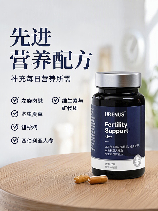
电商详情页先进配方页,高级营养混合配方。本张使用【图8】作为参考版式,【图2】作为产品瓶身参考,将所有英文翻译成中文重新排版。产品瓶身置于右侧木质桌面上,旁边散落两颗胶囊,背景为模糊的室内家居场景。左侧文字区:主标题大字「先进营养配方」,副标题「补充每日营养所需」。下方4个带对勾的核心成分:「左旋肉碱」「冬虫夏草」「锯棕榈」「西伯利亚人参」,右侧补充「维生素与矿物质」。浅灰蓝背景,温暖自然光感,专业高级风格,中文大字排版,有视觉冲击力,文字清晰。产品瓶身结构与原图一致,瓶身英文品牌名保留。
1q0hmzxach-HB
电商详情页先进配方页,高级营养混合配方。本张使用【图8】作为参考版式,【图2】作为产品瓶身参考,将所有英文翻译成中文重新排版。产品瓶身置于右侧木质桌面上,旁边散落两颗胶囊,背景为模糊的室内家居场景。左侧文字区:主标题大字「先进营养配方」,副标题「补充每日营养所需」。下方4个带对勾的核心成分:「左旋肉碱」「冬虫夏草」「锯棕榈」「西伯利亚人参」,右侧补充「维生素与矿物质」。浅灰蓝背景,温暖自然光感,专业高级风格,中文大字排版,有视觉冲击力,文字清晰。产品瓶身结构与原图一致,瓶身英文品牌名保留。
1q0hmzxach-HB
参考图片风格,上传您的商品图,生成1套详情页「图片1」是我的商品图
S2QTi4jL
[主图-1] 美国进口原料 植萃女性内在调理卖点主图 [统一基调] 淘宝天猫女性保养品主图,专业品质植萃天然风格,整体清新高级,背景以渐变森林绿+米白柔光为主,标题字用深墨绿粗体非衬线字体,辅助字用深灰,强调色用金棕色,卡片和图标用圆角细线白底细边样式,整套主标题字体统一为干净非衬线粗体。 [画面] 产品瓶身居中偏右,占画面约55%,正面完整展示VEKM茯苓当归片白色瓶身与绿色标签,瓶身有真实曲面贴标透视和细腻高光。左侧为植萃成分证据区:悬浮三颗透明玻璃球分别盛放茯苓块、当归片、草本颗粒,每颗成分球下方有细引线连接到对应小标签;背景是虚化的清晨森林绿叶与柔和光斑,底部有少量散落的真实草本叶片和浅米色台面,产品底部有自然接触阴影。左上角放VEKM品牌Logo小标。 [光影质感] 商业摄影3D渲染质感,柔光箱主光从左上45度打下,瓶身有柔和高光带和渐变阴影,成分球有玻璃通透折射效果,整体光线均匀干净,植萃叶片有自然透光感。 [配色] 主背景渐变森林绿到米白,标题深墨绿,辅助文字深灰,强调金棕色,成分球透明玻璃质感,绿色只作背景和植萃点缀不抢产品主体。 [文字版式] 画面右上区域为主标题区,最大号粗体字写"美国进口原料",下方稍小字写"植萃女性内在调理",再下方三行小图标+短文案:"茯苓当归 双植萃配方" "60片大容量 每日养护" "特殊膳食 耐力营养型"。文字全部横排左对齐,放在产品右侧负空间,不遮挡瓶身主体。底部右下角小字标注"图片仅供参考"。 [输出要求] 1:1正方形 2048x2048,文字清晰可读,产品完整清晰不变形,瓶身标签文字准确,无错字无模糊。负向:禁止变形、错字、模糊、杂乱背景、水印、平台Logo、医疗功效暗示、绝对化用语、夸张前后对比。
淡陌安然
「图片1」,生成详情页,商品名称为PrimeCell 系列 GUT-VIVE,适配亚马逊平台,单图比例为2:3,需求屏数为8张。全英文输出,主要卖点:1.日本三生医药生产,三生医药是日本第二大制药企业。2.GUT-VIVE 是 PrimeCell 系列中,以微生态管理为切入点的基础型产品。 肠道微生态与能量代谢、免疫状态、皮肤与口腔状态密切相关,是长期健康管理中不可忽视的一环。产品以 复合益生菌、纳豆激酶、综合维生素 为基础,支持肠道微生态平衡与日常状态管理,适合长期使用,作为整体健康方案的重要底座。3.原材料:淀粉(日本国产)、纳豆菌培养提取物粉末(纳豆菌提取物、难消化糊精,含大豆)、5种复合乳酸菌、生姜提取物粉末、羟丙甲纤维素(HPMC)、维生素C、烟酰胺(维生素B3)、天然萃取维生素E、硬脂酸镁、泛酸钙、焦糖色素、维生素B6、微粒二氧化硅、维生素B1、维生素A、维生素B2、叶酸、维生素D、维生素B12。4.7 天可感知体验,不少用户在连续使用约 7 天后,会对舒适度、规律性或整体状态出现体感变化; 长期建议结合 60 天周期持续使用,观察稳定趋势。(体感因人而异)5.GUT-VIVE 的差异化并非来自单一菌株,而是体现在菌群组合逻辑、协同路径设计与稳定性控制上,形成更适合长期管理的结构。6.适合人群:肠胃功能偏弱、状态反复人群 关注“肠–口–皮”整体状态管理的人群、需要长期健康基础维护的用户。参考图片:「图片1」「图片1」「图片1」「图片1」「图片1」「图片1」「图片1」「图片1」
1r45eznk6nLt2KKQ-HB
[主图-4] 多种维生素B+C日常补充场景展示。 [氛围风格] 家居治愈风,温馨生活化,自然舒适; [画质] 商业摄影质感、光线柔和通透、产品清晰真实、画面干净高级; [元素] 维生素瓶身放置在干净的浅色客厅茶几上,旁边放着一杯温水和一本打开的杂志,营造日常居家补充的温馨场景。一位年轻女性的手刚好看向瓶身,自然不夸张。保持产品外观与输入产品图绝对一致,杜绝任何变形和色差,精细化处理。商品主体占比约60%,画面满屏无边框。背景是柔和虚化的浅色沙发,增加家居氛围感,不抢主体。 [光影] 下午窗边柔和自然光,整体氛围慵懒温馨,光影自然过渡。 [配色] 浅暖米色调,整体干净柔和,治愈温馨。 [视角构图] 生活化Vlog平视视角,景深较浅,突出产品主体,氛围自然。 [文字版式] 画面左下角横排写"日常营养补充",深棕色粗体,上方小字写"适合现代人的健康选择",浅棕色小字,不遮挡产品主体。 [输出要求] 1:1比例,文字清晰可辨,超高清商业摄影质感,保持产品外观不变; [负向提示词] 变形,文字错乱,产品图模糊,背景杂乱,水印,电商平台Logo,夸大医疗功效,绝对化用语,人物脸部夸张变形
GD110898905
三重核心成分解析详情页。本张使用【图4】作为参考构图,保留胶囊大特写视觉元素。深青绿色(#2A9D8F)纯色背景,画面中央两颗米白色胶囊大特写,质感通透有光泽。三组成分信息分布在胶囊周围,用白色圆角标签框+引线标注:左上「海洋胶原蛋白 源自深海鱼类提取」,右上「维生素C 助力胶原蛋白正常生成」,下方「玻尿酸 润泽保湿配方」。顶部大标题「三重精研配方」粗白大字,副标题「每一粒都是精心甄选」。整体视觉冲击力强,成分清晰明了,商业摄影质感,光影柔和,文字清晰可读。
1q0hmzxach-HB
[第5张] 植萃成分配方页 - 7种植萃成分加持。本张使用【图6】作为产品和成分信息参考,瓶身英文保留。 [氛围/风格] 自然植萃健康风,浅米色背景,清新自然,专业可信。 [元素布局] 画面上方展示产品瓶身正面+背面双瓶组合,占比约40%,瓶身英文保持原样;下方为7种植萃成分图标网格展示,每种成分配植物小图标和名称;背景为浅米色,点缀植物叶片装饰元素。 [光影质感] 顶部柔光均匀照明,瓶身有自然高光,整体明亮清新。 [配色色系] 全局底色 #FFF8E7 浅米黄;主色深棕文字+绿色植物元素;辅助色金色点缀。 [视角构图] 正面平视,上下布局,阅读动线顶部产品展示 → 中部标题 → 下方成分网格。 [文字版式] 顶部大标题「7种植萃精华 协同增效」,深棕色粗黑体,居中;下方2行4列网格展示成分:「薄荷叶」「二甲基砜(MSM)」「大蒜鳞茎」「越橘果」「小麦草」「紫花苜蓿」「红甜菜根」「胡萝卜根」,每项配简约植物线稿图标。底部小字说明「每粒添加多种天然植萃,营养更全面」。所有文字为简体中文。 [比例分辨率] 3:4 竖版比例,4K 分辨率,文字清晰可辨,高清画质。 [负向提示词] 瓶身变形,文字错乱,文字过小,颜色偏差,水印,瓶身英文被翻译,成分名称错误。
1q0hmzxach-HB
[商品] 使用【图2】益普利生牌维生素C咀嚼片背面成分说明瓶身图;保留白色药瓶、黄色标签、配料表、营养成分说明、"每片含维生素C 213.0mg"文字、批准文号、生产企业信息及所有瓶身原有文字;瓶身结构、比例、颜色保持原样,成分文字清晰化。 [画面] 目标:成分高含量专张,突出单片213mg维C,数据可视化强冲击。构图:中心大数字+左侧瓶身,数字"213mg"占画面核心位置,约30%画面占比;左侧放置产品瓶身背面(成分面),占画面约40%;背景为香橙果肉纹理微距虚化+维C分子结构示意图案装饰;底部有新鲜橙子横切面特写作为视觉锚点。阅读动线:从中心大数字向左看产品成分,向下看原料图示。 [视觉] 套系策略:风格=国内电商健康营养风,清新活力商业摄影;标题字=现代无衬线粗黑体,圆润有力;正文字=简洁无衬线体;主色=暖橙黄;背景延展=基于暖橙黄做深浅渐变、同色系光晕和细腻柔光质感;强调色=鲜橙色,仅用于小面积图标、引线、标签和高亮关键词;标题色=深橙棕色;正文色=中暖灰色;组件=圆角浅底信息卡、细线引线、圆形icon;光影=左前侧暖柔光,产品右侧有柔和轮廓光,整体明亮通透。 [文字] 顶部主标题"高含量维C 一片顶得上",副标题"每片含维生素C 213mg";中心超大数字"213mg/片";右侧3个信息点:"满足成人每日补充需求"、"适合果蔬摄入不足人群"、"营养素补充剂";底部小字说明数据来源;所有文字横向排版,大数字醒目,正文手机端可读。 [规格] 图片比例9:16竖版,4K,避免变形、错字、文字过小、冷蓝/蓝灰背景、瓶身颜色改变、包装文字错乱、医疗功效承诺、绝对化用语。
1qhasw67ffTic8Mw-HB
[第2屏] 核心痛点与功效说明屏,Key of health Prostate Care解决日常前列腺健康问题。本屏使用产品包装核心视觉,文字分点说明痛点与解决方式。 [氛围/风格] 简约清晰信息图风格,温和绿色调,专业可信,信息层级分明。 [元素布局] 顶部放置产品缩小图,下方分左右两栏布局,左栏列举常见痛点,右栏说明产品功效,产品保持原有外观结构,占比约20%。每栏配对应小图标。 [光影质感] 均匀柔和室内光线,图标与文字清晰锐利,无生硬阴影。 [配色色系] 全局底色 #F8FBF8,主色:绿色标题,黑色正文,白色信息卡片底。 [视角构图] 上下构图,上产品下内容,信息阅读从上到下流畅自然。 [文字版式] 主标题「Support Your Prostate Health」居中顶栏,下方分栏:左栏痛点:"Frequent Urination | Weak Flow | Incomplete Voiding";右栏功效:"Herbal Formula | Urinary Relief | Immune Support"。每点配绿色对勾图标,文字大小适中,清晰可读。 [比例分辨率] 9:16 竖版比例,4K分辨率,文字清晰可辨,高清画质。 [负向提示词] 产品变形,文字错乱,中文字符,夸大宣传,水印,背景杂乱
1q8hbh00zd-HB
亚马逊商品详情页,单屏,比例2:3,全英文文案。内容:Target audience for the product,3 groups of people: 1. People over 30 who focus on anti-aging and energy management. 2. People with long-term work consumption and desire to build a stable physical state. 3. Users who need long-term basic health management support. Product: PrimeCell Series CORE. Style reference the provided layout: dark green information cards with golden borders, product display on the right, clean luxury style.
GD113126190
将海报中所有产品图替换为对应清晰产品图,保持海报整体布局、文案、背景风格、光影和装饰元素完全不变。上半部分御龄全套四款产品:健康包使用图3的清晰盒装图,雌青舒使用图4的清晰瓶装图,钙镁维生素KD使用图2的清晰瓶装图,蔓越莓胶原蛋白饮使用图5的清晰袋装图。下半部分御龄体验两款产品:雌青舒使用图4的清晰瓶装图,钙镁维生素KD使用图2的清晰瓶装图。所有产品均为正面朝向,标签文字清晰可读,产品外形、包装、LOGO、印刷文字、净含量100%还原对应清晰图的原貌,产品大小和位置与原图保持一致。背景仍为浅米色暖调,绿叶粉花点缀,柔光照明,整体风格清新统一。
6buvdcby36O1Mwg-HB
[商品] 使用【图1】康森瑞得优星多维片白色药瓶;保留瓶身所有结构、颜色、Logo、蓝帽子标志、标签文字和图案;商品处理:清晰化瓶身保健食品标识,增强质感,保持原比例不变。产品位于画面中部偏左,占画面约40%。 [画面] 目标:资质认证页,突出正规保健食品资质、标准化生产、安全可靠、适合长期服用的信任感。构图:左产品右信息卡,产品瓶身正面展示,蓝帽子标志区域有微光高亮;右侧为认证信息卡片区,用盾牌图标、认证徽章、检测报告元素构建信任背书。画面层次:前景产品+认证徽章、中景半透明信任卡片、后景渐变背景+柔和光晕,共3层。 [视觉] 套系策略:风格=跨境极简高级商业摄影;标题字=现代无衬线粗体(Helvetica Neue Bold风格);正文字=简洁无衬线体;主色=深紫蓝+白色;背景延展=基于深紫蓝做低饱和同色渐变、深浅层级和细腻哑光质感;强调色=金色,仅用于认证徽章、盾牌图标和小面积标签;标题色=白色;正文色=浅灰蓝;组件=圆角半透明信息卡、盾牌认证图标、徽章式标签;光影=左前侧柔和冷白光,产品有自然高光。 [文字] 顶部主标题"Authorized Health Supplement",副标题"Reliable Quality You Can Trust";右侧卡片列3项信任点配图标:"✓ Official Health Food Certified"、"✓ Standardized Formula & Production"、"✓ Safe for Long-Term Daily Use";底部小字补充"For daily dietary supplementation";文字全部横向排版。 [规格] 图片比例9:16竖版,4K分辨率,负向提示:避免变形、错字、文字过小、虚假认证标识、医疗化宣传、瓶身文字错乱、颜色改变、纯白底。
GD793999154
「图片1」,生成详情页,商品名称为PrimeCell 系列 GUT-VIVE,适配亚马逊平台,单图比例为2:3,需求屏数为8张。全英文输出,主要卖点:1.日本三生医药生产,三生医药是日本第二大制药企业。2.GUT-VIVE 是 PrimeCell 系列中,以微生态管理为切入点的基础型产品。 肠道微生态与能量代谢、免疫状态、皮肤与口腔状态密切相关,是长期健康管理中不可忽视的一环。产品以 复合益生菌、纳豆激酶、综合维生素 为基础,支持肠道微生态平衡与日常状态管理,适合长期使用,作为整体健康方案的重要底座。3.原材料:淀粉(日本国产)、纳豆菌培养提取物粉末(纳豆菌提取物、难消化糊精,含大豆)、5种复合乳酸菌、生姜提取物粉末、羟丙甲纤维素(HPMC)、维生素C、烟酰胺(维生素B3)、天然萃取维生素E、硬脂酸镁、泛酸钙、焦糖色素、维生素B6、微粒二氧化硅、维生素B1、维生素A、维生素B2、叶酸、维生素D、维生素B12。4.7 天可感知体验,不少用户在连续使用约 7 天后,会对舒适度、规律性或整体状态出现体感变化; 长期建议结合 60 天周期持续使用,观察稳定趋势。(体感因人而异)5.GUT-VIVE 的差异化并非来自单一菌株,而是体现在菌群组合逻辑、协同路径设计与稳定性控制上,形成更适合长期管理的结构。6.适合人群:肠胃功能偏弱、状态反复人群 关注“肠–口–皮”整体状态管理的人群、需要长期健康基础维护的用户。参考图片:「图片1」「图片1」「图片1」「图片1」「图片1」「图片1」「图片1」「图片1」
1r45eznk6nLt2KKQ-HB



![[商品] 使用【图5】URENUS甜菜根胶囊正反瓶身图;保留两瓶的所有标签文字、Logo、条形码、认证图标、底部文字;瓶身所有英文不翻译、不改写,保留深蓝色瓶身、白色瓶盖、紫红色标签渐变的颜色和结构比例。
[画面] 页面目标:高纯度优质品质展示,正反瓶身+认证+成分说明。上方大标题,中部左右并排放置正反两瓶产品,占画面50%,右侧上下排列两个圆形认证徽章(GMP、HACCP),底部一个圆角长框展示配料信息,浅粉色渐变背景,信息层级清晰,三层视觉结构。
[视觉] 套系策略:风格=国内电商高级健康商业摄影风;标题字=粗黑体大号字;正文字=简洁无衬线中黑体;主色=甜菜根紫红色;背景延展=浅粉色到淡紫红色渐变背景,同色系深浅层级;强调色=深紫红色,用于小面积标签、图标、高亮底纹;标题色=深紫红色;正文色=深酒红+中灰;组件=圆角胶囊标签、细线图标、色块底衬;光影=正面柔光,瓶身有高光,底部柔和投影。
[文字] 顶部居中主标题「高纯度 优品质」超大字号粗体深紫红色;右侧圆形徽章内文字「GMP 优质生产」「HACCP 认证」;底部圆角框内标题「配料成分」,内容「甜菜根提取物10:1标准化至1.43%硝酸盐,植物纤维素胶囊」;文字全部横排,清晰可读。
[规格] 图片比例3:4竖版,4K分辨率,负向提示:避免瓶身文字翻译、条形码变形、认证标识错误、产品比例失调、虚假功效宣称。](https://gd-cms.dancf.com/gd-cms/xi19e5/0/188130b9-9e1a-4fbc-914e-4f849621aaff32260.jpeg?x-oss-process=image/resize,w_640,type_6/sharpen,120/interlace,1)
![电商详情页第八张,规格信息页——120粒大容量。本张使用【图8】作为产品手持参考,将英文全部替换为中文,瓶身英文保留不翻译。
[氛围/风格] 高端健康风,手持倒出胶囊动态展示,商业摄影质感,视觉冲击力强。
[元素布局] 画面右侧一只手倾斜药瓶,将浅绿色胶囊倒在另一只手掌中,产品占比约50%;左侧为规格信息区;背景为浅灰蓝带斜向光影条纹。瓶身外观与输入图一致,标签英文原样保留。
[光影质感] 左上方柔光,手部皮肤质感自然,胶囊有通透光泽,瓶身金属盖有高光,整体明亮高级。
[配色色系] 全局底色 #D6E4E5 浅灰蓝;主色 #0F4C5C 墨绿;辅助色 #B08968 金棕。
[视角构图] 左文右物布局,阅读动线左上主标题 → 左侧规格数字 → 右侧手持产品。
[文字版式] 左侧上下排版,全中文。主标题「传统活力配方」超大字号墨绿粗体;下方超大数字「120」墨绿粗体,金棕色标签「粒/瓶」;底部4个圆形认证图标横向排列:「纯素」「英国制造」「有机」「非转基因」。文字大气醒目,信息层级清晰。
[比例分辨率] 3:4竖版比例,4K分辨率,文字清晰锐利。
[负向提示词] 英文残留,文字错乱,手部变形,瓶身变形,颜色偏差,水印。](https://gd-cms.dancf.com/gd-cms/xi19e5/0/013666a0-8640-40a6-ba3e-9665432c20ed13795.png?x-oss-process=image/resize,w_640,type_6/sharpen,120/interlace,1)


![[第1屏] 详情页头图-Key of health Prostate Care前列腺护理胶囊产品宣传海报。本屏使用【图1】和【图2】拼接展示商品主体,瓶身结构、包装文字、认证标识与输入产品图一致。
[氛围/风格] 简约专业的跨境健康护理风格,低饱和绿色渐变背景,真实商业摄影质感,整体客观可信。
[元素布局] 产品瓶身居中放置,占画面约65%-70%,顶部预留大标题区域,底部预留信息条区域。产品轮廓、瓶身颜色、标签版式与原图完全一致。背景搭配浅橄榄绿色渐变,增加柔和光影层次。
[光影质感] 顶部柔光打亮瓶身,右侧自然投影,瓶身标签文字清晰可见,整体明暗均匀通透。
[配色色系] 全局底色 #F0F5F0;主色:瓶身白色+标签绿色;辅助色:深绿色文字,浅灰色背景渐变。
[视角构图] 正面平视,产品为视觉中心,阅读动线:顶部标题 → 中心产品 → 底部信息条。
[文字版式] 版式:顶部标题 + 中心产品 + 底部信息条。主标题「Natural Prostate Support」,副标题「Key of Health Prostate Care」,主标题加粗深绿色,副标题浅灰色,均顶部居中。底部信息条标注:"One Capsule Daily | Vegan Friendly",文字清晰不遮挡产品主体。
[比例分辨率] 9:16 竖版比例,4K分辨率,文字清晰可辨,高清画质。
[负向提示词] 瓶身变形,包装文字错乱,缺件错件,颜色偏差,中文字符,绝对化宣传,水印,背景杂乱](https://gd-cms.dancf.com/gd-cms/xi19e5/0/7cebd497-949c-4ce7-b73a-60b2b6b65a0c10602.jpeg?x-oss-process=image/resize,w_640,type_6/sharpen,120/interlace,1)
![电商详情页第1张——女性备孕营养胶囊主图头图海报。本张使用【图6】作为产品主体,保持瓶身外观、颜色、材质、标签结构完全一致,瓶身英文标签不翻译不改动。
[氛围/风格] 高级医疗保健海报风,柔和梦幻,商业摄影质感,视觉冲击力强,干净通透。
[元素布局] 产品瓶身置于画面右侧中央,占比约55%-60%,正面展示;左侧为大面积标题区;底部有柔和光晕和淡紫色渐变台面承托;背景有淡淡的分子结构光点装饰,营造科技营养感;瓶身玻璃质感、银色瓶盖、深蓝紫色标签与原图一致。
[光影质感] 左上方柔光主照明,右侧辅助光勾勒瓶身轮廓,底部柔和投影,整体明亮高级,玻璃通透有高光。
[配色色系] 全局底色 #E6D9F2 浅紫渐变;主色深紫 #5A4A8C;辅助色白色、淡金点缀。
[视角构图] 正面微仰视,产品为视觉中心,阅读动线左上大标题 → 中部副标题 → 右侧产品 → 底部信息条。
[文字版式] 左上大标题区,主标题「女性备孕 营养支持」超大字号粗黑体深紫色,有视觉冲击力;副标题「活性叶酸+锌+多维配方 科学呵护孕育之路」白色底纹深紫字;底部左侧三个圆形图标+短标签:「活性叶酸5-MTHF」「吡啶甲酸锌」「24种营养成分」;右下角标注「60粒装 英国制造」;所有文字为简体中文,清晰可读,不遮挡瓶身主体。
[比例分辨率] 3:4竖版比例,4K分辨率,文字清晰可辨,高清画质。
[负向提示词] 瓶身变形,标签文字错乱,颜色偏差,水印,文字过小,产品模糊,背景杂乱,极限词,医疗承诺。](https://gd-cms.dancf.com/gd-cms/xi19e5/0/64e615c8-f47b-4c29-a639-22a49545462716365.png?x-oss-process=image/resize,w_640,type_6/sharpen,120/interlace,1)
![电商详情页第7张——全营养综合配方页。本张使用【图8】作为产品+人物主体,保持瓶身外观一致,瓶身英文标签不翻译,人物为亚洲女性形象。
[氛围/风格] 温馨希望感,明亮柔和,商业摄影质感,孕育主题氛围。
[元素布局] 画面右侧为亚洲女性(穿白色背心)坐在床上,手持验孕棒,面带微笑看向手中的验孕棒,表情温馨喜悦;画面左下角放置产品瓶身,占比约30%;背景为明亮的卧室场景,白色床品,柔和自然光;左上为大标题区;整体氛围充满希望与温暖。
[光影质感] 窗边自然光,柔和明亮,人物肤色自然,产品瓶身有通透高光。
[配色色系] 全局底色明亮白色+淡紫渐变,温馨明亮;主色深紫 #5A4A8C 标题;辅助色白色、暖肤色。
[视角构图] 人物在右侧,产品在左下,标题在左上,阅读动线左上标题→左下产品→右侧人物。
[文字版式] 左上主标题「全面女性营养配方」超大字号粗黑体深紫色;副标题「含多种有助于正常生育与生殖功能的营养素」;下方三条小图标+文字:「24种维生素矿物质」「5种传统植物精华」「活性叶酸+锌+辅酶Q10」;所有文字简体中文,清晰可读。
[比例分辨率] 3:4竖版比例,4K分辨率,文字清晰可辨,高清画质。
[负向提示词] 人物变形,产品变形,标签错乱,水印,文字过小,医疗承诺,极限词。](https://gd-cms.dancf.com/gd-cms/xi19e5/0/bb9b0a1f-173e-4ed2-9f92-95348a1e900b17108.png?x-oss-process=image/resize,w_640,type_6/sharpen,120/interlace,1)




![[主图-1] 美国进口原料 植萃女性内在调理卖点主图
[统一基调] 淘宝天猫女性保养品主图,专业品质植萃天然风格,整体清新高级,背景以渐变森林绿+米白柔光为主,标题字用深墨绿粗体非衬线字体,辅助字用深灰,强调色用金棕色,卡片和图标用圆角细线白底细边样式,整套主标题字体统一为干净非衬线粗体。
[画面] 产品瓶身居中偏右,占画面约55%,正面完整展示VEKM茯苓当归片白色瓶身与绿色标签,瓶身有真实曲面贴标透视和细腻高光。左侧为植萃成分证据区:悬浮三颗透明玻璃球分别盛放茯苓块、当归片、草本颗粒,每颗成分球下方有细引线连接到对应小标签;背景是虚化的清晨森林绿叶与柔和光斑,底部有少量散落的真实草本叶片和浅米色台面,产品底部有自然接触阴影。左上角放VEKM品牌Logo小标。
[光影质感] 商业摄影3D渲染质感,柔光箱主光从左上45度打下,瓶身有柔和高光带和渐变阴影,成分球有玻璃通透折射效果,整体光线均匀干净,植萃叶片有自然透光感。
[配色] 主背景渐变森林绿到米白,标题深墨绿,辅助文字深灰,强调金棕色,成分球透明玻璃质感,绿色只作背景和植萃点缀不抢产品主体。
[文字版式] 画面右上区域为主标题区,最大号粗体字写"美国进口原料",下方稍小字写"植萃女性内在调理",再下方三行小图标+短文案:"茯苓当归 双植萃配方" "60片大容量 每日养护" "特殊膳食 耐力营养型"。文字全部横排左对齐,放在产品右侧负空间,不遮挡瓶身主体。底部右下角小字标注"图片仅供参考"。
[输出要求] 1:1正方形 2048x2048,文字清晰可读,产品完整清晰不变形,瓶身标签文字准确,无错字无模糊。负向:禁止变形、错字、模糊、杂乱背景、水印、平台Logo、医疗功效暗示、绝对化用语、夸张前后对比。](https://gd-cms.dancf.com/gd-cms/xi19e5/0/18c082e2-cdf0-4e5a-b405-2346885df2f33464.jpeg?x-oss-process=image/resize,w_640,type_6/sharpen,120/interlace,1)

![[主图-4] 多种维生素B+C日常补充场景展示。
[氛围风格] 家居治愈风,温馨生活化,自然舒适;
[画质] 商业摄影质感、光线柔和通透、产品清晰真实、画面干净高级;
[元素] 维生素瓶身放置在干净的浅色客厅茶几上,旁边放着一杯温水和一本打开的杂志,营造日常居家补充的温馨场景。一位年轻女性的手刚好看向瓶身,自然不夸张。保持产品外观与输入产品图绝对一致,杜绝任何变形和色差,精细化处理。商品主体占比约60%,画面满屏无边框。背景是柔和虚化的浅色沙发,增加家居氛围感,不抢主体。
[光影] 下午窗边柔和自然光,整体氛围慵懒温馨,光影自然过渡。
[配色] 浅暖米色调,整体干净柔和,治愈温馨。
[视角构图] 生活化Vlog平视视角,景深较浅,突出产品主体,氛围自然。
[文字版式] 画面左下角横排写"日常营养补充",深棕色粗体,上方小字写"适合现代人的健康选择",浅棕色小字,不遮挡产品主体。
[输出要求] 1:1比例,文字清晰可辨,超高清商业摄影质感,保持产品外观不变;
[负向提示词] 变形,文字错乱,产品图模糊,背景杂乱,水印,电商平台Logo,夸大医疗功效,绝对化用语,人物脸部夸张变形](https://gd-cms.dancf.com/gd-cms/xi19e5/0/cd958f00-1b90-4b0a-8fba-70ba315331dd8565.jpeg?x-oss-process=image/resize,w_640,type_6/sharpen,120/interlace,1)


![[第5张] 植萃成分配方页 - 7种植萃成分加持。本张使用【图6】作为产品和成分信息参考,瓶身英文保留。
[氛围/风格] 自然植萃健康风,浅米色背景,清新自然,专业可信。
[元素布局] 画面上方展示产品瓶身正面+背面双瓶组合,占比约40%,瓶身英文保持原样;下方为7种植萃成分图标网格展示,每种成分配植物小图标和名称;背景为浅米色,点缀植物叶片装饰元素。
[光影质感] 顶部柔光均匀照明,瓶身有自然高光,整体明亮清新。
[配色色系] 全局底色 #FFF8E7 浅米黄;主色深棕文字+绿色植物元素;辅助色金色点缀。
[视角构图] 正面平视,上下布局,阅读动线顶部产品展示 → 中部标题 → 下方成分网格。
[文字版式] 顶部大标题「7种植萃精华 协同增效」,深棕色粗黑体,居中;下方2行4列网格展示成分:「薄荷叶」「二甲基砜(MSM)」「大蒜鳞茎」「越橘果」「小麦草」「紫花苜蓿」「红甜菜根」「胡萝卜根」,每项配简约植物线稿图标。底部小字说明「每粒添加多种天然植萃,营养更全面」。所有文字为简体中文。
[比例分辨率] 3:4 竖版比例,4K 分辨率,文字清晰可辨,高清画质。
[负向提示词] 瓶身变形,文字错乱,文字过小,颜色偏差,水印,瓶身英文被翻译,成分名称错误。](https://gd-cms.dancf.com/gd-cms/xi19e5/0/d0ca39dc-d693-4aa8-8f41-32f25b59edf715828.png?x-oss-process=image/resize,w_640,type_6/sharpen,120/interlace,1)
![[商品] 使用【图2】益普利生牌维生素C咀嚼片背面成分说明瓶身图;保留白色药瓶、黄色标签、配料表、营养成分说明、"每片含维生素C 213.0mg"文字、批准文号、生产企业信息及所有瓶身原有文字;瓶身结构、比例、颜色保持原样,成分文字清晰化。
[画面] 目标:成分高含量专张,突出单片213mg维C,数据可视化强冲击。构图:中心大数字+左侧瓶身,数字"213mg"占画面核心位置,约30%画面占比;左侧放置产品瓶身背面(成分面),占画面约40%;背景为香橙果肉纹理微距虚化+维C分子结构示意图案装饰;底部有新鲜橙子横切面特写作为视觉锚点。阅读动线:从中心大数字向左看产品成分,向下看原料图示。
[视觉] 套系策略:风格=国内电商健康营养风,清新活力商业摄影;标题字=现代无衬线粗黑体,圆润有力;正文字=简洁无衬线体;主色=暖橙黄;背景延展=基于暖橙黄做深浅渐变、同色系光晕和细腻柔光质感;强调色=鲜橙色,仅用于小面积图标、引线、标签和高亮关键词;标题色=深橙棕色;正文色=中暖灰色;组件=圆角浅底信息卡、细线引线、圆形icon;光影=左前侧暖柔光,产品右侧有柔和轮廓光,整体明亮通透。
[文字] 顶部主标题"高含量维C 一片顶得上",副标题"每片含维生素C 213mg";中心超大数字"213mg/片";右侧3个信息点:"满足成人每日补充需求"、"适合果蔬摄入不足人群"、"营养素补充剂";底部小字说明数据来源;所有文字横向排版,大数字醒目,正文手机端可读。
[规格] 图片比例9:16竖版,4K,避免变形、错字、文字过小、冷蓝/蓝灰背景、瓶身颜色改变、包装文字错乱、医疗功效承诺、绝对化用语。](https://gd-cms.dancf.com/gd-cms/xi19e5/0/b130525b-0a8d-44c3-93df-a72253ddfba72273.jpeg?x-oss-process=image/resize,w_640,type_6/sharpen,120/interlace,1)

![[第2屏] 核心痛点与功效说明屏,Key of health Prostate Care解决日常前列腺健康问题。本屏使用产品包装核心视觉,文字分点说明痛点与解决方式。
[氛围/风格] 简约清晰信息图风格,温和绿色调,专业可信,信息层级分明。
[元素布局] 顶部放置产品缩小图,下方分左右两栏布局,左栏列举常见痛点,右栏说明产品功效,产品保持原有外观结构,占比约20%。每栏配对应小图标。
[光影质感] 均匀柔和室内光线,图标与文字清晰锐利,无生硬阴影。
[配色色系] 全局底色 #F8FBF8,主色:绿色标题,黑色正文,白色信息卡片底。
[视角构图] 上下构图,上产品下内容,信息阅读从上到下流畅自然。
[文字版式] 主标题「Support Your Prostate Health」居中顶栏,下方分栏:左栏痛点:"Frequent Urination | Weak Flow | Incomplete Voiding";右栏功效:"Herbal Formula | Urinary Relief | Immune Support"。每点配绿色对勾图标,文字大小适中,清晰可读。
[比例分辨率] 9:16 竖版比例,4K分辨率,文字清晰可辨,高清画质。
[负向提示词] 产品变形,文字错乱,中文字符,夸大宣传,水印,背景杂乱](https://gd-cms.dancf.com/gd-cms/xi19e5/0/7e63ee2e-605a-4623-bfc2-ee1f7246885514713.jpeg?x-oss-process=image/resize,w_640,type_6/sharpen,120/interlace,1)


![[商品] 使用【图1】康森瑞得优星多维片白色药瓶;保留瓶身所有结构、颜色、Logo、蓝帽子标志、标签文字和图案;商品处理:清晰化瓶身保健食品标识,增强质感,保持原比例不变。产品位于画面中部偏左,占画面约40%。
[画面] 目标:资质认证页,突出正规保健食品资质、标准化生产、安全可靠、适合长期服用的信任感。构图:左产品右信息卡,产品瓶身正面展示,蓝帽子标志区域有微光高亮;右侧为认证信息卡片区,用盾牌图标、认证徽章、检测报告元素构建信任背书。画面层次:前景产品+认证徽章、中景半透明信任卡片、后景渐变背景+柔和光晕,共3层。
[视觉] 套系策略:风格=跨境极简高级商业摄影;标题字=现代无衬线粗体(Helvetica Neue Bold风格);正文字=简洁无衬线体;主色=深紫蓝+白色;背景延展=基于深紫蓝做低饱和同色渐变、深浅层级和细腻哑光质感;强调色=金色,仅用于认证徽章、盾牌图标和小面积标签;标题色=白色;正文色=浅灰蓝;组件=圆角半透明信息卡、盾牌认证图标、徽章式标签;光影=左前侧柔和冷白光,产品有自然高光。
[文字] 顶部主标题"Authorized Health Supplement",副标题"Reliable Quality You Can Trust";右侧卡片列3项信任点配图标:"✓ Official Health Food Certified"、"✓ Standardized Formula & Production"、"✓ Safe for Long-Term Daily Use";底部小字补充"For daily dietary supplementation";文字全部横向排版。
[规格] 图片比例9:16竖版,4K分辨率,负向提示:避免变形、错字、文字过小、虚假认证标识、医疗化宣传、瓶身文字错乱、颜色改变、纯白底。](https://gd-cms.dancf.com/gd-cms/xi19e5/0/116c5915-2fef-4457-9793-02f45ca217c923625.jpeg?x-oss-process=image/resize,w_640,type_6/sharpen,120/interlace,1)
