已添加
登录/注册
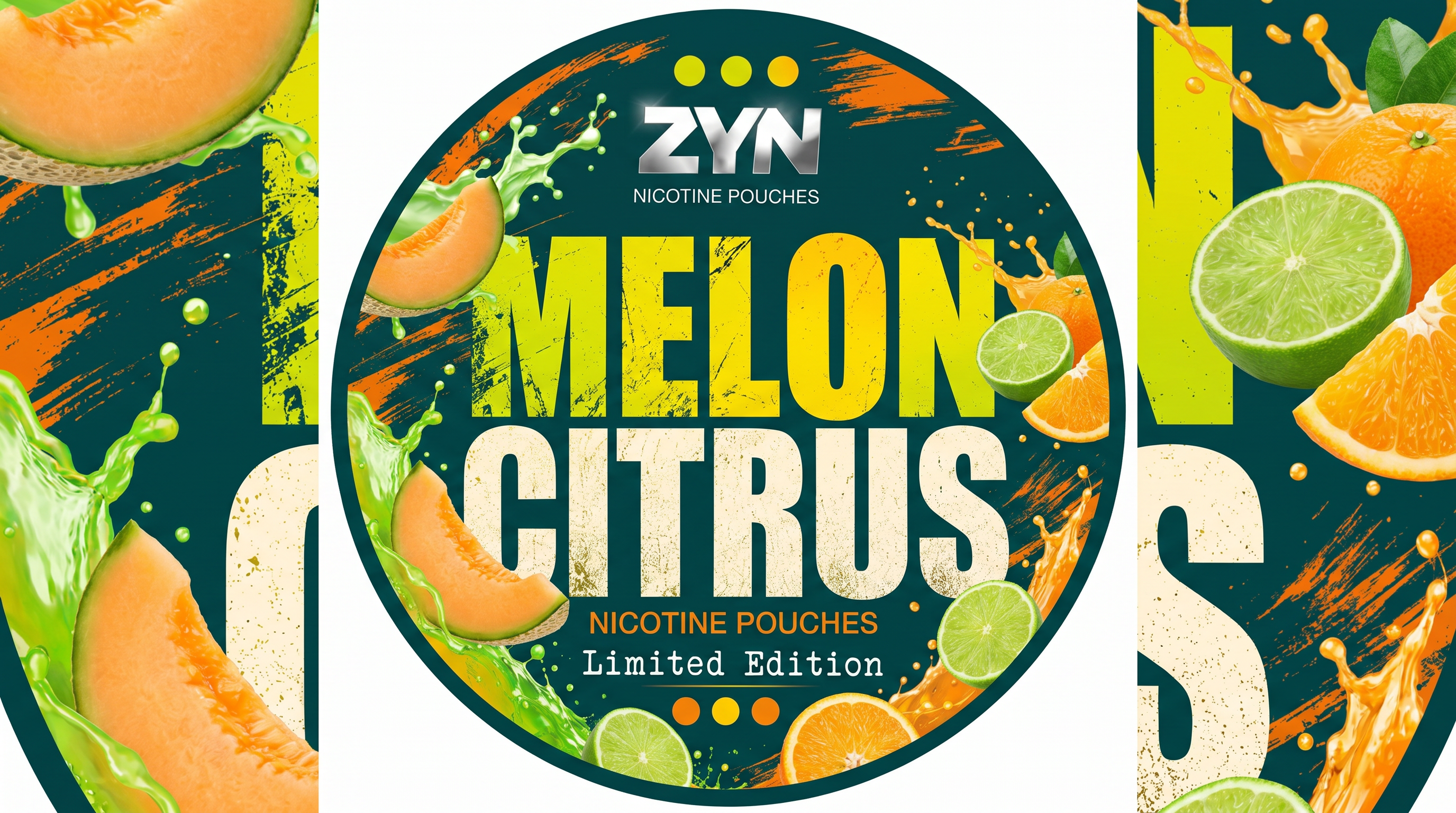
参考原图设计风格,生成圆形的MelonCitrus柑橘蜜瓜味尼…
参考原图设计风格,生成圆形的MelonCitrus柑橘蜜瓜味尼古丁口糖包装贴纸,保留做旧大字体、水果实物、液体喷溅元素,配色适配柑橘蜜瓜主题
GD624763900
2026.06.18
做同款
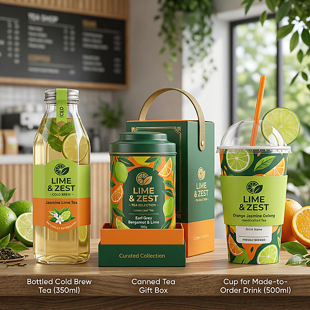
茶饮品牌3款包装设计,分别为瓶装冷泡茶包装、罐装茶叶礼盒包装、杯装现调饮品包装,延续品牌青柠绿与活力橙配色,兼顾实用性与视觉吸引力,适配不同售卖场景
武呼起飞
将图一中的果汁包装产品,按照图二中的产品摆放方式和俯视视角进行重新呈现,保留图一产品的包装设计和元素
黄豆X
请给我多种水果拼接的海报 类似这样的 多给我几张
哇库哇库😊
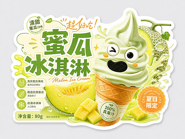
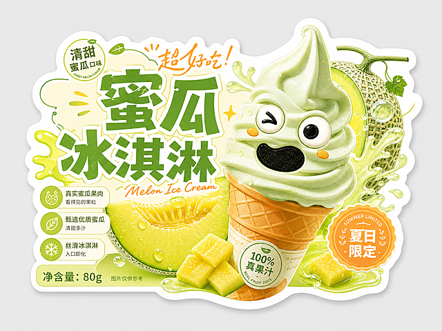
设计一张蜜瓜冰淇淋异形产品标签,参考图一水果标签排版风格和图二产品标签设计,采用可爱画风,高饱和度清新色彩,突出可爱搞怪的蜜瓜冰淇淋产品,标签上有醒目的文字"蜜瓜冰淇淋",异形轮廓设计,整体活泼有设计感
蛋黄包包蛋黄🥨
设计一张蜜瓜冰淇淋异形产品标签,参考图一水果标签排版风格和图二产品标签设计,采用可爱画风,高饱和度清新色彩,突出可爱搞怪的蜜瓜冰淇淋产品,标签上有醒目的文字"蜜瓜冰淇淋",异形轮廓设计,整体活泼有设计感
蛋黄包包蛋黄🥨
将背景替换为夏日泳池场景,有蓝色水面、游泳圈和西瓜切片,保持产品和文字信息不变
1q0wg4877fbgi9a5-HB
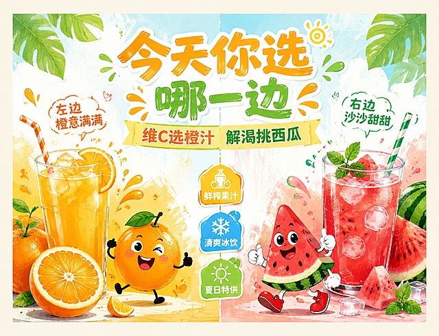
横版非异形灯箱海报,活泼卡通手绘风格,夏日清爽氛围,左右分栏展示橙汁和西瓜汁,保留文案:主标题"今天你选哪一边",副标题"维C选橙汁 解渴挑西瓜",装饰文案"左边橙意满满 右边沙沙甜甜",卖点标签"鲜榨果汁""清爽冰饮""夏日特供",左侧展示橙子和橙汁饮品,右侧展示西瓜和西瓜汁饮品,搭配拟人化卡通水果形象,背景干净配色明亮清爽,版式精美,四边留有安全边距,适合68*52cm横版灯箱使用,不做异形裁切
GD389568412
高饱和度扁平化茶饮主题海报,采用日式新丑风趣味插画风格,参考上传图片的日式新丑风设计思路,背景为大面积清爽高饱和纯色(如浅粉、薄荷绿、奶白、柠黄),主体为拟人化的卡通茶饮元素形象(如茶叶、柠檬、桃子、奶泡、茶包等),造型圆润夸张,带有简单呆萌的表情与线条细节,以平涂色块呈现,无复杂光影与渐变。画面搭配多语言文字元素,包含实验性变形英文字体、日文假名与粗体汉字,字体简洁粗黑,与图形穿插排版,整体色彩对比明快清新,线条干净利落,风格搞怪活泼又充满潮流感,包含品牌名"之周茶饮"、茶饮主题“清爽柠檬茶”、产品信息“柠香相伴,慢享温柔”文案,适配茶饮品牌宣传海报。
用户qTFJF7or
[第7张] Core Selling Points - 3 key reasons to choose this watermelon drink. This image uses [Image 1] as the central product subject. [Atmosphere/Style] Infographic style product page, clean and organized, modern minimalist design, information-focused. [Element Layout] The watermelon soda can positioned vertically in center, occupying about 35-40% of frame; three numbered feature sections arranged around it: top-left (Reason 1), top-right (Reason 2), bottom-center (Reason 3); each section has a small circular icon and short description; thin leader lines connect features to relevant parts of the can; background is clean light gradient. [Lighting & Texture] Even soft studio lighting; product clearly lit from front; subtle drop shadow beneath can; clean and crisp overall look. [Color Palette] Global background gradient #F8F9FA to #E9ECEF light gray-blue; accent colors: watermelon red #E63946 for highlights, teal #2A9D8F for icons; text in dark charcoal #343A40. [Composition & Perspective] Central product with surrounding info graphics; symmetrical balanced layout; front view of can; clear visual hierarchy. [Text Layout] Layout: top main title + center product + 3 surrounding feature blocks. Main title: "Why Choose Summer Watermelon?"; Feature 1 (top-left with fruit icon): "Real Fruit Taste - Made with authentic watermelon juice"; Feature 2 (top-right with snowflake icon): "Ultimate Refreshment - Crisp, cold, and perfectly carbonated"; Feature 3 (bottom with leaf icon): "Clean Ingredients - No artificial colors or preservatives". All text in modern sans-serif, English only, clear hierarchy. [Aspect Ratio & Resolution] 9:16 vertical ratio, 2K resolution, crisp text, high definition. [Negative Prompt] Chinese text, deformed can, wrong colors, watermark, cluttered design, blurry text, low quality.
GD481862041
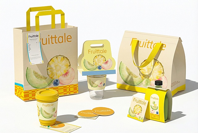
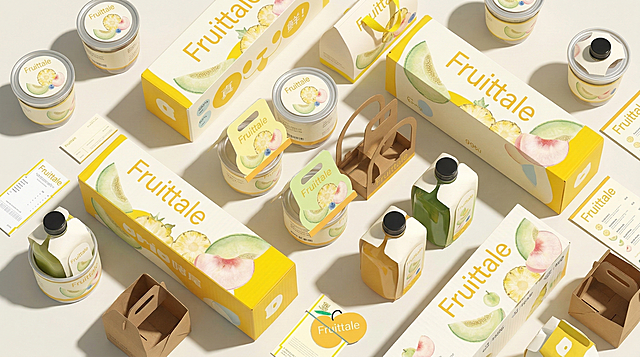
将图1中的Fruittale品牌的饮品、手提袋、杯托、卡片等产品,按照图2的排列方式重新组合摆放,保留图1的产品设计风格
黄豆X
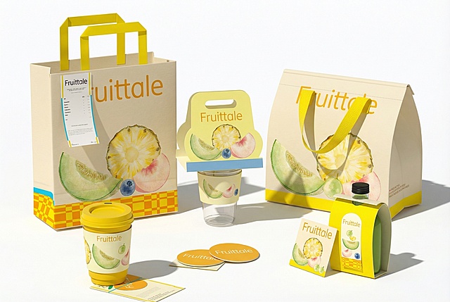
将图1中的Fruittale品牌的饮品、手提袋、杯托、卡片等产品,按照图2的排列方式重新组合摆放,保留图1的产品设计风格
黄豆X
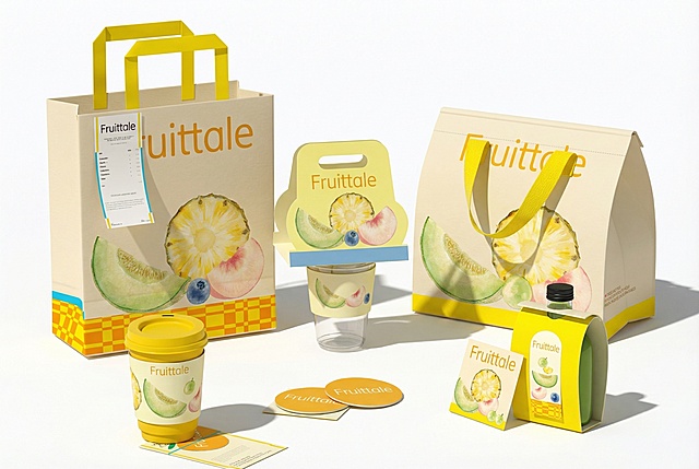
将图1中的Fruittale品牌的饮品、手提袋、杯托、卡片等产品,按照图2的排列方式重新组合摆放,保留图1的产品设计风格
黄豆X
将背景替换为复古海滨浴场风格,遮阳伞、沙滩椅和复古泳装元素,保持产品和文字信息不变
1q0wg4877fbgi9a5-HB
将背景更换为阳光果园场景,有挂满蜜瓜的藤蔓,周围散落新鲜的梨和菠萝,充满清新果香氛围
1q0wg4877fbgi9a5-HB
商业产品展示图,一次性展示3个扁圆柱尼古丁袋小圆罐(暖橙黄色闪电包装)的不同摆放角度同框:①正面顶盖正对镜头俯视,顶盖印刷NICOPOP品牌、Peach Pineapple 6mg、法定尼古丁成瘾警示条;②45°斜侧立体视角,同时露出顶盖正面+罐身侧面围边,罐身环绕闪电图案围边;③底部背面朝上视角,底盖完整印刷全部美国合规法规文字、条码、配料警示。产品为扁矮圆柱体造型,直径7.5cm,罐身高度2.5cm,白色塑料盒身,整套统一暖橙黄色闪电美式潮流包装设计。柔和室内柔光,干净浅灰色极简背景,产品高清质感,色彩饱和度均匀,包装文字清晰可读,电商商超产品展示图,8K高清,写实摄影,无变形失真,整体视觉统一协调
创意 × 1
高总GO
将背景替换为糖果主题乐园,有彩色糖果、马卡龙和梦幻糖果机,保持产品和文字信息不变
1q0wg4877fbgi9a5-HB
将背景替换为阳光果园场景,有绿色藤蔓和新鲜的蜜瓜切片,保持产品和文字信息不变
1q0wg4877fbgi9a5-HB
「图片1」帮我生成西瓜和西瓜酱一起的效果图,要清爽,有意境
1qr9xcbtw3YvClng-HB
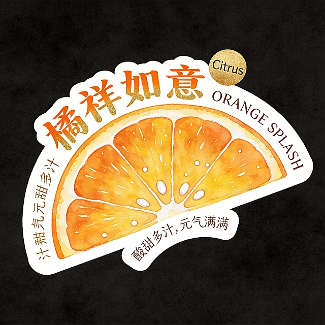
异形卡片,整体为半圆形橘子切片轮廓,卡片白色底色带清晰白色粗描边,整体放置在纯黑背景上。主体是橙黄饱满的橘子切片,带有白色果络与籽点,水彩质感清爽明亮。文字全部环绕在水果外围排版:主标题"橘祥如意"使用国风隶书体,颜色为橘橙加金箔渐变,小字标语"酸甜多汁,元气满满"使用手写体沿底部弧形排列,右上角添加烫金圆形小标"Citrus",英文"ORANGE SPLASH"置于右侧边缘,文字不遮挡主体,排版温暖高级
GD1330252355
将背景更换为糖果乐园场景,有彩色的糖果、棒棒糖和棉花糖,营造甜美梦幻氛围
1q0wg4877fbgi9a5-HB
将图1中的Fruittale品牌的饮品、手提袋、杯托、卡片等产品,按照图2的排列方式重新组合摆放,保留图1的产品设计风格
黄豆X
果园场景,仰拍视觉,前景草地上平铺黄白格子布,参考图1的橙汁杯位于画面中间略微靠右位置,视觉聚焦橙汁杯,保持橙汁杯Logo"IJOoz"文字和设计不变,保持主体物理结构不变。橙汁杯旁边放一个对半切开的橙子,果肉清晰果粒饱满多汁,还放一个带叶子和水珠的新鲜橙子。镜头下方两角有少许绿枝虚影伸入,增加景深感。背景是果园,果园背景偏左位置放置参考图2的橙汁自动售卖机,保持售卖机"IJOoz"品牌标识和整体结构不变。前景橙汁杯和背景售卖机形成前后斜角构图,画面平衡。户外阳光明媚,蓝天白云,清新自然,商业高调摄影,极强自然光,黄金时刻逆光,清晰景深感,最前面叶子虚化,背景售卖机略带景深,远处果园模糊,符合光影一致性,生成正确投影,环境色漫反射自然,消除抠图白边。保持橙汁杯和售卖机主体结构不变,Logo文字不扭曲不变形,结构锁死刚体,呈现新鲜食欲感。避免:瓶身扭曲、Logo变形、比例失调、死黑阴影、畸变透视
南栀著花未
扁圆柱形尼古丁口含烟圆盒顶盖平面贴纸,盒子实物尺寸直径7.5cm,高度2.5cm,俯视正圆视角,纯白外盒白边,整套统一暖橙黄色闪电潮流美式快消风格,底色暖橙黄色,四周分布白色闪电几何装饰,外圈深蓝色细边框,右上角水滴白色图标内标注"6mg",画面中心超大加粗白色无衬线字体"NICOPOP®",下方小字白色"Peach Pineapple"口味名,中部一条完整白色横警示条,黑色加粗法定警示文字"WARNING: THIS PRODUCT CONTAINS NICOTINE. NICOTINE IS AN ADDICTIVE CHEMICAL.",最底部深蓝色横条,白色文字"20 NICOTINE POUCHES",文字清晰无扭曲、排版工整合规,高清印刷矢量质感,纯色纯白背景,无多余杂物
创意 × 1
高总GO
「图片1」水、麦芽、啤酒花、苹果汁、金桔、柠檬、海盐、藻蓝蛋白,根据以上配料生成一张插画,风格与参考图中近似
1qunmytc2iHmQPLg-HB
整体缩小饮料和水果图案,删除右侧所有水果,只保留中间主区域柚子,保持大PET瓶饮料和带气泡玻璃杯,16:9比例,夏日清新背景不变
创意 × 1
GD735962657







![[第7张] Core Selling Points - 3 key reasons to choose this watermelon drink. This image uses [Image 1] as the central product subject.
[Atmosphere/Style] Infographic style product page, clean and organized, modern minimalist design, information-focused.
[Element Layout] The watermelon soda can positioned vertically in center, occupying about 35-40% of frame; three numbered feature sections arranged around it: top-left (Reason 1), top-right (Reason 2), bottom-center (Reason 3); each section has a small circular icon and short description; thin leader lines connect features to relevant parts of the can; background is clean light gradient.
[Lighting & Texture] Even soft studio lighting; product clearly lit from front; subtle drop shadow beneath can; clean and crisp overall look.
[Color Palette] Global background gradient #F8F9FA to #E9ECEF light gray-blue; accent colors: watermelon red #E63946 for highlights, teal #2A9D8F for icons; text in dark charcoal #343A40.
[Composition & Perspective] Central product with surrounding info graphics; symmetrical balanced layout; front view of can; clear visual hierarchy.
[Text Layout] Layout: top main title + center product + 3 surrounding feature blocks. Main title: "Why Choose Summer Watermelon?"; Feature 1 (top-left with fruit icon): "Real Fruit Taste - Made with authentic watermelon juice"; Feature 2 (top-right with snowflake icon): "Ultimate Refreshment - Crisp, cold, and perfectly carbonated"; Feature 3 (bottom with leaf icon): "Clean Ingredients - No artificial colors or preservatives". All text in modern sans-serif, English only, clear hierarchy.
[Aspect Ratio & Resolution] 9:16 vertical ratio, 2K resolution, crisp text, high definition.
[Negative Prompt] Chinese text, deformed can, wrong colors, watermark, cluttered design, blurry text, low quality.](https://gd-cms.dancf.com/gd-cms/xi19e5/0/0525d479-2030-4a7f-a5c0-6f63819bf8aa17813.jpeg?x-oss-process=image/resize,w_640,type_6/sharpen,120/interlace,1)