

「图片1」,生成电商主图(8张),商品名称是PrimeCell…
「图片1」,生成电商主图(8张),商品名称是PrimeCell系列CORE,卖点是【1】CORE 是 PrimeCell 系列中的基础型核心产品,用于支持细胞能量系统的长期稳定运行。随着年龄增长,人体

1r45eznk6nL...
2026.06.21「图片1」,生成电商主图(8张),商品名称是PrimeCell系列CORE,卖点是【1】CORE 是 PrimeCell 系列中的基础型核心产品,用于支持细胞能量系统的长期稳定运行。随着年龄增长,人体
1r45eznk6nL...
2026.06.21

![[第4屏] 核心功效 benefits 展示页-PrimeCell CORE three core benefits. This screen uses [image1] as product main body.
[atmosphere/style] Premium minimalist style, consistent with the overall deep green gold color matching, commercial design texture, referencing the reference card layout.
[element layout] Product bottle on the left, three benefit cards stacked vertically on the right. Each benefit has a golden check circle icon. Product bottle is placed on the left, accounting for about 40% of the screen, maintaining original product characteristics. Three benefits: activate cell function, antioxidant protection, anti-aging support.
[light and shadow texture] Front soft light, clear product layering, icon lines clear.
[color scheme] Background off-white, benefit card background deep green, text gold and white, color matching coordination.
[perspective composition] Left product right text card layout, clear information level.
[text layout] Top main title "PrimeCell CORE Benefits", deep green large font; 1. "Activate Cells" activate mitochondrial function, boost cellular energy; 2. "Antioxidant" neutralize free radicals, protect cell health; 3. "Anti-Aging" support cell renewal, slow aging process; bottom brand slogan "Science · Purity · Renewal"; all English text, clear and readable.
[proportion resolution] 2:3 vertical ratio, 1K resolution, high-definition picture quality, text clearly recognizable.
[negative prompt] product deformation, wrong text, color deviation, blurred product, watermark, Chinese characters.](https://gd-cms.dancf.com/gd-cms/xi19e5/0/19880d58-1928-45e9-a888-ab2f70892f5649328.jpeg?x-oss-process=image/resize,w_640,type_6/sharpen,120/interlace,1)

![[第3屏] 核心成分解析页-PrimeCell CORE five key ingredients introduction.
[atmosphere/style] Clean scientific health care style, professional and trustworthy, referencing the reference icon layout style.
[element layout] Title at the top, five core ingredients are listed vertically below, each ingredient is matched with a circular icon, product bottle is placed on the right side, accounting for about 40% of the screen. Product shape and material are consistent with the original image. Five ingredients are NMN, Coenzyme Q10, PQQ, Resveratrol, Curcumin, each with clear功效 description.
[light and shadow texture] Soft uniform lighting, icons and text are clearly distinguishable, product presents three-dimensional sense.
[color scheme] Global background color #ffffff; main text color dark green, icon border dark green, key information emphasized with gold, clean and layered.
[perspective composition] Left text right product vertical layout, reading from top to bottom.
[text layout] Top main title "Core Science-Backed Ingredients", dark green large font; each ingredient has a bold name + a one-line efficacy description; bottom slogan "Revitalize Your Cellular Energy"; all in English, text size moderate, clearly readable.
[proportion resolution] 2:3 vertical ratio, 1K resolution, high-definition picture quality, text clearly recognizable.
[negative prompt] product deformation, wrong ingredients, garbled text, wrong color, blurred picture, watermark, Chinese characters.](https://gd-cms.dancf.com/gd-cms/xi19e5/0/8dd4bd55-73e5-4e0a-9a17-501a6b002a6450134.jpeg?x-oss-process=image/resize,w_640,type_6/sharpen,120/interlace,1)
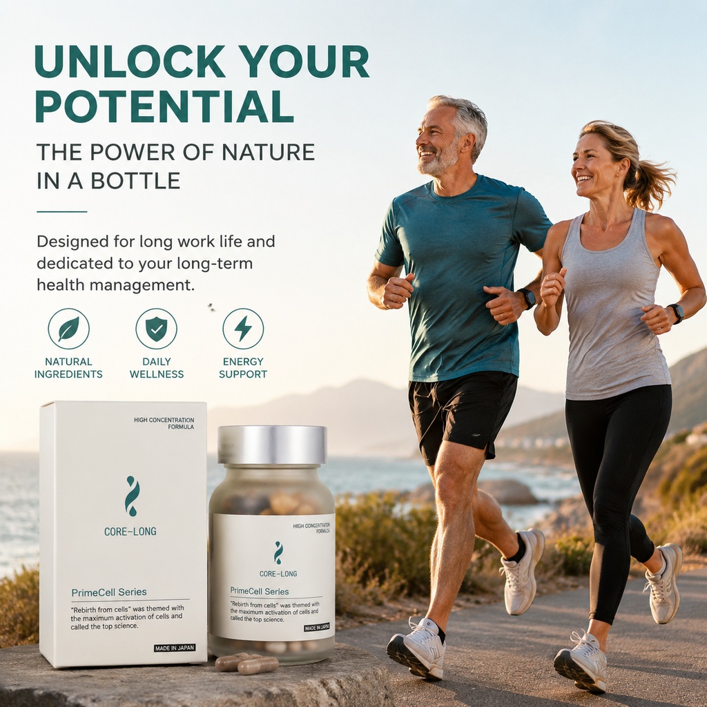
![[第1屏] 详情页头图-PrimeCell Series CORE dietary supplement main visual poster. This screen uses [image1] as the product main body.
[atmosphere/style] Minimalist premium health care style, clean and professional, commercial photography texture, following the reference layout style.
[element layout] The product bottle and packaging box are placed in the center-right of the screen, accounting for about 65% of the total area; the title area is reserved at the top, and the product's bottle structure, frosted material, silver cap, and label color are consistent with the input product image. Add subtle green leaf decoration in the upper left corner to increase layering.
[light and shadow texture] Soft front light, natural projection at the bottom, clear highlight on the silver bottle cap, ensure the product is clearly visible and three-dimensional.
[color scheme] Global background color #f8f8f5; main colors dark green and gold; auxiliary off-white and silver, maintaining a harmonious and low-saturation professional style.
[perspective composition] Front perspective, product as the visual center, reading order from top title to center product to bottom information.
[text layout] Top main title "PrimeCell Series", large font dark green; second line subtitle "CORE - Your Cellular Energy Foundation", gold font; bottom right corner label "Made in Japan"; all text is in English, clear and readable, no text occlusion of the product body.
[proportion resolution] 2:3 vertical ratio, 1K resolution, high-definition picture quality, text clearly recognizable.
[negative prompt] product deformation, missing parts, color deviation, garbled text, blurred product image, watermark, Chinese characters.](https://gd-cms.dancf.com/gd-cms/xi19e5/0/3205b213-40fe-4d3b-8551-a1dee7fe1ebf50063.jpeg?x-oss-process=image/resize,w_640,type_6/sharpen,120/interlace,1)




![[第2屏] 痛点原理说明页-PrimeCell CORE cellular energy support. This screen uses [image1] product appearance reference.
[atmosphere/style] Clean professional health care style, minimalist design, high-end commercial texture.
[element layout] Title at the top, the pain point description area on the left, the product bottle on the right. Product bottle maintains the original frosted glass texture, silver cap and label design, accounts for about 40% of the screen. Each pain point is matched with a simple icon to increase recognition.
[light and shadow texture] Soft uniform light, clear layering, product outline is clear, no harsh shadow.
[color scheme] Global background color #f5f5f0; main color dark green, auxiliary color gold, text contrast clear.
[perspective composition] Left text right product layout, horizontal reading order, clear primary and secondary.
[text layout] Main title "Support Your Long-Term Cellular Energy Stability", dark green bold font; four pain point cards: 1. "Age-Related NAD+ Decline" icon with mitochondria, 2. "Reduced Mitochondrial Efficiency" 3. "Unstable Energy Levels" 4. "Slower Recovery After Activity"; bottom subtitle "CORE: The Foundation of Your Daily Energy Management"; all English text, clear and readable.
[proportion resolution] 2:3 vertical ratio, 1K resolution, high-definition picture quality, text clearly recognizable.
[negative prompt] product deformation, color deviation, garbled text, blurred image, watermark, Chinese characters, exaggerated expression.](https://gd-cms.dancf.com/gd-cms/xi19e5/0/b6aebab4-8189-49f7-b5d5-d447d649de3b49957.jpeg?x-oss-process=image/resize,w_640,type_6/sharpen,120/interlace,1)




![[商品] 使用【图1】康森瑞得优星多维片白色药瓶;保留瓶身所有结构、颜色、Logo、标签文字和图案;商品处理:清晰化瓶身文字,增强质感,保持原比例不变。产品放置在办公桌一角,占画面约25%。
[画面] 目标:场景种草页,展示现代上班族在办公场景中使用产品,体现居家办公外出都可食用的便捷性。构图:场景沉浸型,欧美白领女性(25-35岁,职业装)坐在现代简约办公桌前,手边放着产品瓶和水杯,电脑旁有文件,自然的办公氛围;产品位于画面右下前景处,清晰可见。画面层次:前景产品瓶+水杯、中景办公桌+电脑+人物手部、后景虚化办公室环境,共3层。
[视觉] 套系策略:风格=跨境极简高级商业摄影;标题字=现代无衬线粗体(Helvetica Neue Bold风格);正文字=简洁无衬线体;主色=深紫蓝+白色;背景延展=基于深紫蓝做低饱和同色渐变融入办公场景,整体色调统一偏冷调;强调色=金色,仅用于小面积图标和标签;标题色=白色;正文色=浅灰蓝;组件=左上角半透明标题卡;光影=自然办公室冷白光,左侧窗光为主光源。
[文字] 左上角半透明卡片放主标题"Perfect for Busy Professionals",副标题"Stay Nutritious On-the-Go";下方小字"Great for office workers, busy adults, anyone with unbalanced eating habits";文字全部横向排版,不遮挡产品主体。
[规格] 图片比例9:16竖版,4K分辨率,负向提示:避免变形、错字、文字过小、亚洲面孔、医疗化宣传、瓶身文字错乱、颜色改变、人物脸部过大抢产品焦点。](https://gd-cms.dancf.com/gd-cms/xi19e5/0/5336c6f8-bb7e-42b5-94fa-6f899c4b30ef23662.jpeg?x-oss-process=image/resize,w_640,type_6/sharpen,120/interlace,1)




![电商详情页第六张,使用场景页——运动健身日常保健。本张使用【图5】作为场景和产品参考,将英文全部替换为中文,瓶身英文保留不翻译。
[氛围/风格] 健康运动风,户外露台瑜伽场景,真实自然有生活感,大字标题有冲击力。
[元素布局] 产品瓶身置于画面左侧前景木质地板上,占比约30%;背景中一位亚洲男性在瑜伽垫上做拉伸动作,远处有城市建筑和热带植物;整体景深效果,前景产品清晰,背景人物虚化。瓶身外观与输入图一致,标签英文原样保留。
[光影质感] 自然光感,日间柔和阳光,木质地板有自然纹理,瓶身有环境反光,整体温暖明亮。
[配色色系] 全局底色偏自然暖调;主色 #0F4C5C 墨绿;辅助色 #B08968 金棕;绿色植物点缀。
[视角构图] 前景产品+背景人物场景,阅读动线顶部大标题 → 左侧产品 → 背景人物场景。
[文字版式] 画面顶部居中排版,全中文。主标题「支持身体自然pH调节」超大字号墨绿粗体;下方副标题「尤其在饮食压力或高强度运动期间 身体酸负荷可能增加时」,其中「高强度运动」金棕色加粗突出。文字大气醒目。
[比例分辨率] 3:4竖版比例,4K分辨率,文字清晰锐利。
[负向提示词] 英文残留,文字错乱,瓶身变形,人物模糊,水印,颜色偏差。](https://gd-cms.dancf.com/gd-cms/xi19e5/0/d4aa5d77-233f-4be4-9260-ccde3a0da48214448.png?x-oss-process=image/resize,w_640,type_6/sharpen,120/interlace,1)


![[主图-7] 适用人群与场景展示,Who Is This For?。
[氛围风格] 真实场景多格展示,原生可信,符合跨境平台风格。
[画质] 商业摄影质感、光线柔和通透、产品清晰真实、画面干净高级,所有小图光影色调统一。
[元素] 用户提供的产品瓶身放置在画面顶部居中位置,保持产品外观与原图完全一致,占比约30%。产品下方分为三个宫格,每个宫格展示一个适用场景:第一格展示办公室成年女性久坐放松,第二格展示中老年男士户外散步,第三格展示成年人居家休闲拉伸,每个场景自然真实,模特均为欧美身形,符合亚马逊目标市场特征,场景色调风格统一,不喧宾夺主。
[光影] 整体光影统一柔和,每个宫格光线自然,产品打光清晰突出。
[配色] 低饱和浅灰背景,场景自然原色,文字深蓝色,整体干净协调。
[视角构图] 上标题产品,下三宫格场景,版式分区清晰,符合多场景展示需求。
[文字版式] 顶部大标题:SUITABLE FOR DAILY SUPPORT,每个宫格下方配对应短句:• Office Workers • Older Adults • Active Individuals,文字小而清晰,标注每个场景,全英文干净排版。
[输出要求] 1:1比例,2048x2048px,超高清商业摄影质感。
[负向提示词] 变形,文字错乱,产品图模糊,背景杂乱,水印,电商平台Logo,中文,不同模特肤色杂乱,夸张场景](https://gd-cms.dancf.com/gd-cms/xi19e5/0/56560d54-5919-4bed-935c-d18d393f942b2051.jpeg?x-oss-process=image/resize,w_640,type_6/sharpen,120/interlace,1)


![[第1屏] 详情页头图-Key of health Prostate Care前列腺护理胶囊产品宣传海报。本屏使用【图1】和【图2】拼接展示商品主体,瓶身结构、包装文字、认证标识与输入产品图一致。
[氛围/风格] 简约专业的跨境健康护理风格,低饱和绿色渐变背景,真实商业摄影质感,整体客观可信。
[元素布局] 产品瓶身居中放置,占画面约65%-70%,顶部预留大标题区域,底部预留信息条区域。产品轮廓、瓶身颜色、标签版式与原图完全一致。背景搭配浅橄榄绿色渐变,增加柔和光影层次。
[光影质感] 顶部柔光打亮瓶身,右侧自然投影,瓶身标签文字清晰可见,整体明暗均匀通透。
[配色色系] 全局底色 #F0F5F0;主色:瓶身白色+标签绿色;辅助色:深绿色文字,浅灰色背景渐变。
[视角构图] 正面平视,产品为视觉中心,阅读动线:顶部标题 → 中心产品 → 底部信息条。
[文字版式] 版式:顶部标题 + 中心产品 + 底部信息条。主标题「Natural Prostate Support」,副标题「Key of Health Prostate Care」,主标题加粗深绿色,副标题浅灰色,均顶部居中。底部信息条标注:"One Capsule Daily | Vegan Friendly",文字清晰不遮挡产品主体。
[比例分辨率] 9:16 竖版比例,4K分辨率,文字清晰可辨,高清画质。
[负向提示词] 瓶身变形,包装文字错乱,缺件错件,颜色偏差,中文字符,绝对化宣传,水印,背景杂乱](https://gd-cms.dancf.com/gd-cms/xi19e5/0/7cebd497-949c-4ce7-b73a-60b2b6b65a0c10602.jpeg?x-oss-process=image/resize,w_640,type_6/sharpen,120/interlace,1)
