
![[第7屏] 施工案例 - 实车装贴效果展示,本屏使用【图3】真… - 图片创意预览](https://gd-cms.dancf.com/gd-cms/xi19e5/0/fae8cd3a-04bf-48ff-8f58-b04a1abb49f325601.jpeg)

[第7屏] 施工案例 - 实车装贴效果展示,本屏使用【图3】真…
[第7屏] 施工案例 - 实车装贴效果展示,本屏使用【图3】真实车内车外对比效果展示。 [氛围/风格] 真实案例展示风格,自然光照,真实场景,清晰对比装贴效果。 [元素布局] 整屏分为三个区域:上半部

1q20fwosf01...
2026.07.11[第7屏] 施工案例 - 实车装贴效果展示,本屏使用【图3】真实车内车外对比效果展示。 [氛围/风格] 真实案例展示风格,自然光照,真实场景,清晰对比装贴效果。 [元素布局] 整屏分为三个区域:上半部
1q20fwosf01...
2026.07.11![[第7屏] Application Effect display for different scenarios and percentages. 本屏 uses 【图4】 to show outdoor, indoor and night time visibility for different tint percentages. 70%, 55%, 35%, 20%, 5% divided into three horizontal sections for outdoor, indoor and night effect. Each percentage labeled clearly, keep the original comparison, make labels and title standardized English for Amazon.
[氛围/风格] Real effect demonstration, objective comparison, clear difference between different percentages, true to actual use.
[元素布局] Three panels stacked vertically: top panel "Outdoor View", middle panel "Indoor View", bottom panel "Night View". Each panel shows five different tint percentage side-by-side, labels under each percentage. Keep the road and car background consistent with original image, show how visibility changes with different tint darkness.
[光影质感] Natural light for outdoor, soft artificial light for indoor, street light for night, each panel lighting consistent with scenario, visibility differences clear.
[配色色系] Background #eef2f7, labels have light green brush background like original image, black text, maintain the comparison style from reference, adapt for Amazon with clean layout.
[文字版式] Top main title "Visibility Comparison By Tint Percentage", each panel title in English, percentage labels 70%, 55%, 35%, 20%, 5%. All text in English, no Chinese characters, labels clear and legible.
[比例分辨率] 9:16 vertical, 4K resolution, high definition, text legible.
[负向提示词] Chinese characters, wrong percentage labels, distorted perspective, blurry images, wrong tint darkness, cluttered layout.](https://gd-cms.dancf.com/gd-cms/xi19e5/0/fe82855f-9fa1-4e2b-901b-88d6468028e324199.jpeg?x-oss-process=image/resize,w_640,type_6/sharpen,120/interlace,1)
![[第7屏] Application Effect display for different scenarios and percentages. 本屏 uses 【图4】 to show outdoor, indoor and night time visibility for different tint percentages. 70%, 55%, 35%, 20%, 5% divided into three horizontal sections for outdoor, indoor and night effect. Each percentage labeled clearly, keep the original comparison, make labels and title standardized English for Amazon.
[氛围/风格] Real effect demonstration, objective comparison, clear difference between different percentages, true to actual use.
[元素布局] Three panels stacked vertically: top panel "Outdoor View", middle panel "Indoor View", bottom panel "Night View". Each panel shows five different tint percentage side-by-side, labels under each percentage. Keep the road and car background consistent with original image, show how visibility changes with different tint darkness.
[光影质感] Natural light for outdoor, soft artificial light for indoor, street light for night, each panel lighting consistent with scenario, visibility differences clear.
[配色色系] Background #eef2f7, labels have light green brush background like original image, black text, maintain the comparison style from reference, adapt for Amazon with clean layout.
[文字版式] Top main title "Visibility Comparison By Tint Percentage", each panel title in English, percentage labels 70%, 55%, 35%, 20%, 5%. All text in English, no Chinese characters, labels clear and legible.
[比例分辨率] 9:16 vertical, 4K resolution, high definition, text legible.
[负向提示词] Chinese characters, wrong percentage labels, distorted perspective, blurry images, wrong tint darkness, cluttered layout.](https://gd-cms.dancf.com/gd-cms/xi19e5/0/276c8d92-c367-4c6d-bc71-47fdf0a3fb3b24655.jpeg?x-oss-process=image/resize,w_640,type_6/sharpen,120/interlace,1)
![[第7屏] Application Effect display for different scenarios and percentages. 本屏 uses 【图4】 to show outdoor, indoor and night time visibility for different tint percentages. 70%, 55%, 35%, 20%, 5% divided into three horizontal sections for outdoor, indoor and night effect. Each percentage labeled clearly, keep the original comparison, make labels and title standardized English for Amazon.
[氛围/风格] Real effect demonstration, objective comparison, clear difference between different percentages, true to actual use.
[元素布局] Three panels stacked vertically: top panel "Outdoor View", middle panel "Indoor View", bottom panel "Night View". Each panel shows five different tint percentage side-by-side, labels under each percentage. Keep the road and car background consistent with original image, show how visibility changes with different tint darkness.
[光影质感] Natural light for outdoor, soft artificial light for indoor, street light for night, each panel lighting consistent with scenario, visibility differences clear.
[配色色系] Background #eef2f7, labels have light green brush background like original image, black text, maintain the comparison style from reference, adapt for Amazon with clean layout.
[文字版式] Top main title "Visibility Comparison By Tint Percentage", each panel title in English, percentage labels 70%, 55%, 35%, 20%, 5%. All text in English, no Chinese characters, labels clear and legible.
[比例分辨率] 9:16 vertical, 4K resolution, high definition, text legible.
[负向提示词] Chinese characters, wrong percentage labels, distorted perspective, blurry images, wrong tint darkness, cluttered layout.](https://gd-cms.dancf.com/gd-cms/xi19e5/0/55a29b77-5dfe-408d-b194-abc0e405d3d623888.jpeg?x-oss-process=image/resize,w_640,type_6/sharpen,120/interlace,1)
![[第7屏] Application Effect display for different scenarios and percentages. 本屏 uses 【图4】 to show outdoor, indoor and night time visibility for different tint percentages. 70%, 55%, 35%, 20%, 5% divided into three horizontal sections for outdoor, indoor and night effect. Each percentage labeled clearly, keep the original comparison, make labels and title standardized English for Amazon.
[氛围/风格] Real effect demonstration, objective comparison, clear difference between different percentages, true to actual use.
[元素布局] Three panels stacked vertically: top panel "Outdoor View", middle panel "Indoor View", bottom panel "Night View". Each panel shows five different tint percentage side-by-side, labels under each percentage. Keep the road and car background consistent with original image, show how visibility changes with different tint darkness.
[光影质感] Natural light for outdoor, soft artificial light for indoor, street light for night, each panel lighting consistent with scenario, visibility differences clear.
[配色色系] Background #eef2f7, labels have light green brush background like original image, black text, maintain the comparison style from reference, adapt for Amazon with clean layout.
[文字版式] Top main title "Visibility Comparison By Tint Percentage", each panel title in English, percentage labels 70%, 55%, 35%, 20%, 5%. All text in English, no Chinese characters, labels clear and legible.
[比例分辨率] 9:16 vertical, 4K resolution, high definition, text legible.
[负向提示词] Chinese characters, wrong percentage labels, distorted perspective, blurry images, wrong tint darkness, cluttered layout.](https://gd-cms.dancf.com/gd-cms/xi19e5/0/ad1f4597-4f66-4c89-988c-4c7e1ed5a34724595.jpeg?x-oss-process=image/resize,w_640,type_6/sharpen,120/interlace,1)
![[第7屏] Application Effect display for different scenarios and percentages. 本屏 uses 【图4】 to show outdoor, indoor and night time visibility for different tint percentages. 70%, 55%, 35%, 20%, 5% divided into three horizontal sections for outdoor, indoor and night effect. Each percentage labeled clearly, keep the original comparison, make labels and title standardized English for Amazon.
[氛围/风格] Real effect demonstration, objective comparison, clear difference between different percentages, true to actual use.
[元素布局] Three panels stacked vertically: top panel "Outdoor View", middle panel "Indoor View", bottom panel "Night View". Each panel shows five different tint percentage side-by-side, labels under each percentage. Keep the road and car background consistent with original image, show how visibility changes with different tint darkness.
[光影质感] Natural light for outdoor, soft artificial light for indoor, street light for night, each panel lighting consistent with scenario, visibility differences clear.
[配色色系] Background #eef2f7, labels have light green brush background like original image, black text, maintain the comparison style from reference, adapt for Amazon with clean layout.
[文字版式] Top main title "Visibility Comparison By Tint Percentage", each panel title in English, percentage labels 70%, 55%, 35%, 20%, 5%. All text in English, no Chinese characters, labels clear and legible.
[比例分辨率] 9:16 vertical, 4K resolution, high definition, text legible.
[负向提示词] Chinese characters, wrong percentage labels, distorted perspective, blurry images, wrong tint darkness, cluttered layout.](https://gd-cms.dancf.com/gd-cms/xi19e5/0/f0b807ce-8be7-4013-baa1-0cc2c887e71124606.jpeg?x-oss-process=image/resize,w_640,type_6/sharpen,120/interlace,1)
![[第7屏] Application Effect display for different scenarios and percentages. 本屏 uses 【图4】 to show outdoor, indoor and night time visibility for different tint percentages. 70%, 55%, 35%, 20%, 5% divided into three horizontal sections for outdoor, indoor and night effect. Each percentage labeled clearly, keep the original comparison, make labels and title standardized English for Amazon.
[氛围/风格] Real effect demonstration, objective comparison, clear difference between different percentages, true to actual use.
[元素布局] Three panels stacked vertically: top panel "Outdoor View", middle panel "Indoor View", bottom panel "Night View". Each panel shows five different tint percentage side-by-side, labels under each percentage. Keep the road and car background consistent with original image, show how visibility changes with different tint darkness.
[光影质感] Natural light for outdoor, soft artificial light for indoor, street light for night, each panel lighting consistent with scenario, visibility differences clear.
[配色色系] Background #eef2f7, labels have light green brush background like original image, black text, maintain the comparison style from reference, adapt for Amazon with clean layout.
[文字版式] Top main title "Visibility Comparison By Tint Percentage", each panel title in English, percentage labels 70%, 55%, 35%, 20%, 5%. All text in English, no Chinese characters, labels clear and legible.
[比例分辨率] 9:16 vertical, 4K resolution, high definition, text legible.
[负向提示词] Chinese characters, wrong percentage labels, distorted perspective, blurry images, wrong tint darkness, cluttered layout.](https://gd-cms.dancf.com/gd-cms/xi19e5/0/f03ae15c-8eaa-4af1-8229-9844086df09a24639.jpeg?x-oss-process=image/resize,w_640,type_6/sharpen,120/interlace,1)
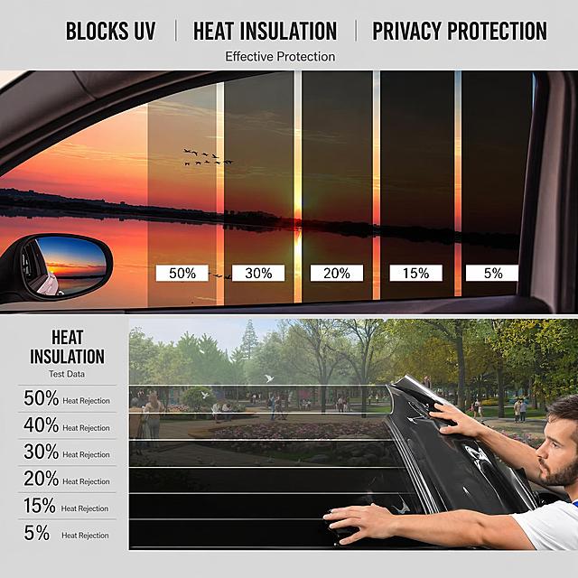

![[第3屏] 核心卖点总览-Premium Car Window Tint 五大核心优势展示。本屏使用【图1】【图4】展示产品,分五大卡片布局。
[氛围/风格] 专业信息可视化风格,简约卡片式排版,低饱和灰调背景,清晰突出每个卖点。
[元素布局] 顶部主标题,下方分为五个圆角卡片,从上到下两排布局:第一排两个卡片,第二排三个卡片。每个卡片配对应小图和卖点文字:1. Crystal Clarity 展示膜材本身【图1】,保证内透外清;2. Heat Insulation 隔热降温,减少车内热量积聚;3. UV Blocking 阻挡99%有害紫外线,保护内饰;4. Shatter Safety 安全防爆,防止玻璃飞溅;5. Privacy Protection 外隐私内清晰,使用【图4】效果展示。每个卡片保持产品结构与输入图一致。
[光影质感] 均匀柔光,卡片自带轻微投影,信息层级分明,整体通透干净。
[配色色系] 全局底色 #F5F7FA;主色深灰文字;卡片浅蓝底色,黑色边框;卖点标签使用深绿色强调。
[视角构图] 从上到下通屏排版,卡片对齐整齐,阅读动线清晰从上到下。
[文字版式] 顶部主标题 "Five Core Benefits",每个卡片顶部是卖点标题,底部1行短句描述;字体大小适中,全部英文,无中文字符;文字不遮挡产品主体。
[比例分辨率] 9:16 竖版比例,width 1080px height 1920px,4K 分辨率,文字清晰可辨,高清画质。
[负向提示词] 产品变形,文字错乱,中文字符,卡片歪扭,颜色偏差,水印,背景杂乱](https://gd-cms.dancf.com/gd-cms/xi19e5/0/9878150d-24b7-4f64-8780-4ee5e54fe48f24855.jpeg?x-oss-process=image/resize,w_640,type_6/sharpen,120/interlace,1)
![[商品] 本页为痛点页,不使用产品实物图,仅用场景化画面表达普通窗膜的问题。
[画面] 目标为直击用户痛点,激发购买需求;上下分栏构图,上半部分为车内驾驶场景的困扰画面,下半部分为四个痛点卡片横向排列;上半部分占约50%,展示驾驶员在烈日下眯眼、车内仪表盘反光刺眼的真实场景,欧美男性驾驶员,现代轿车内部;下半部分四张深色圆角卡片,每张配一个痛点图标与说明文字。
[视觉] 套系策略:风格=深色科技性能商业摄影;标题字=现代无衬线粗体英文字;正文字=简洁无衬线英文字体;主色=深海蓝;背景延展=基于深海蓝做深浅渐变与细腻粒子质感;强调色=警示橙红,仅用于痛点图标与标签点缀;标题色=纯白色;正文色=浅灰蓝色;组件=圆角深色信息卡、简约线性图标;光影=偏暗调氛围光,突出困扰感。
[文字] 顶部主标题"Driving Without Quality Window Film?",副标题"Common Problems You May Face";四个痛点卡片:①"Poor Heat Rejection - Hot Interior, AC Overworks" ②"Harmful UV Exposure - Skin & Interior Damage" ③"Signal Interruption - GPS & Bluetooth Issues" ④"Low Visibility - Blurry View, Safety Risks";全部文字横向排版,清晰易读。
[规格] 图片比例1:1,4K分辨率,负向提示:避免出现产品图、中文文案、过度夸张、纯白底、人物亚洲面孔、文字竖排。](https://gd-cms.dancf.com/gd-cms/xi19e5/0/24dd1e86-85a8-4f6e-9a84-5b5d7081d5dd1514.jpeg?x-oss-process=image/resize,w_640,type_6/sharpen,120/interlace,1)
![[第4屏] Product Function Introduction page. This page explain each core function in detail.
[氛围/风格] Clean informative style, Amazon A+ design, simple structure, professional.
[元素布局] Top main title, then five horizontal sections, each section has function image on left, text description on right. Use existing product images to show effect, keep function clear. Images are sharp, text aligned left, spacing balanced.
[光影质感] Soft diffused lighting, clear separation between sections, good readability.
[配色色系] Global background #f5f7fa, section background white, accent blue for titles, black for body text, clean and clear.
[视角构图] Vertical 9:16 layout, sequential reading from top to bottom, clear visual hierarchy.
[文字版式] Main title "Why Choose Our Window Tint", each section: 1. High Clarity: "Crystal-clear optical grade film ensures outstanding visibility"; 2. Heat Insulation: "Advanced nano-ceramic coating blocks infrared heat"; 3. UV Blocking: "Blocks 99% of harmful UVA/UVB rays to protect skin"; 4. Privacy Protection: "One-way visibility protects your personal space"; 5. Shatterproof: "Holds glass shards together in case of breakage for safety". All English, correct grammar and capitalization, no Chinese.
[比例分辨率] 9:16 vertical, 4K resolution, text clear and legible.
[负向提示词] Chinese characters, wrong function description, blurry images, misspelled words, cluttered layout, distorted products.](https://gd-cms.dancf.com/gd-cms/xi19e5/0/db18ce56-7b5b-4409-adff-3a637abfaeac24202.jpeg?x-oss-process=image/resize,w_640,type_6/sharpen,120/interlace,1)
![[第4屏] Product Function Introduction page. This page explain each core function in detail.
[氛围/风格] Clean informative style, Amazon A+ design, simple structure, professional.
[元素布局] Top main title, then five horizontal sections, each section has function image on left, text description on right. Use existing product images to show effect, keep function clear. Images are sharp, text aligned left, spacing balanced.
[光影质感] Soft diffused lighting, clear separation between sections, good readability.
[配色色系] Global background #f5f7fa, section background white, accent blue for titles, black for body text, clean and clear.
[视角构图] Vertical 9:16 layout, sequential reading from top to bottom, clear visual hierarchy.
[文字版式] Main title "Why Choose Our Window Tint", each section: 1. High Clarity: "Crystal-clear optical grade film ensures outstanding visibility"; 2. Heat Insulation: "Advanced nano-ceramic coating blocks infrared heat"; 3. UV Blocking: "Blocks 99% of harmful UVA/UVB rays to protect skin"; 4. Privacy Protection: "One-way visibility protects your personal space"; 5. Shatterproof: "Holds glass shards together in case of breakage for safety". All English, correct grammar and capitalization, no Chinese.
[比例分辨率] 9:16 vertical, 4K resolution, text clear and legible.
[负向提示词] Chinese characters, wrong function description, blurry images, misspelled words, cluttered layout, distorted products.](https://gd-cms.dancf.com/gd-cms/xi19e5/0/4f263093-46db-445f-ba79-547497cad56023910.jpeg?x-oss-process=image/resize,w_640,type_6/sharpen,120/interlace,1)
![[第4屏] Product Function Introduction page. This page explain each core function in detail.
[氛围/风格] Clean informative style, Amazon A+ design, simple structure, professional.
[元素布局] Top main title, then five horizontal sections, each section has function image on left, text description on right. Use existing product images to show effect, keep function clear. Images are sharp, text aligned left, spacing balanced.
[光影质感] Soft diffused lighting, clear separation between sections, good readability.
[配色色系] Global background #f5f7fa, section background white, accent blue for titles, black for body text, clean and clear.
[视角构图] Vertical 9:16 layout, sequential reading from top to bottom, clear visual hierarchy.
[文字版式] Main title "Why Choose Our Window Tint", each section: 1. High Clarity: "Crystal-clear optical grade film ensures outstanding visibility"; 2. Heat Insulation: "Advanced nano-ceramic coating blocks infrared heat"; 3. UV Blocking: "Blocks 99% of harmful UVA/UVB rays to protect skin"; 4. Privacy Protection: "One-way visibility protects your personal space"; 5. Shatterproof: "Holds glass shards together in case of breakage for safety". All English, correct grammar and capitalization, no Chinese.
[比例分辨率] 9:16 vertical, 4K resolution, text clear and legible.
[负向提示词] Chinese characters, wrong function description, blurry images, misspelled words, cluttered layout, distorted products.](https://gd-cms.dancf.com/gd-cms/xi19e5/0/75a405cf-03b5-4eff-b7d6-fb90f1fbe80f24626.jpeg?x-oss-process=image/resize,w_640,type_6/sharpen,120/interlace,1)
![[第4屏] Product Function Introduction page. This page explain each core function in detail.
[氛围/风格] Clean informative style, Amazon A+ design, simple structure, professional.
[元素布局] Top main title, then five horizontal sections, each section has function image on left, text description on right. Use existing product images to show effect, keep function clear. Images are sharp, text aligned left, spacing balanced.
[光影质感] Soft diffused lighting, clear separation between sections, good readability.
[配色色系] Global background #f5f7fa, section background white, accent blue for titles, black for body text, clean and clear.
[视角构图] Vertical 9:16 layout, sequential reading from top to bottom, clear visual hierarchy.
[文字版式] Main title "Why Choose Our Window Tint", each section: 1. High Clarity: "Crystal-clear optical grade film ensures outstanding visibility"; 2. Heat Insulation: "Advanced nano-ceramic coating blocks infrared heat"; 3. UV Blocking: "Blocks 99% of harmful UVA/UVB rays to protect skin"; 4. Privacy Protection: "One-way visibility protects your personal space"; 5. Shatterproof: "Holds glass shards together in case of breakage for safety". All English, correct grammar and capitalization, no Chinese.
[比例分辨率] 9:16 vertical, 4K resolution, text clear and legible.
[负向提示词] Chinese characters, wrong function description, blurry images, misspelled words, cluttered layout, distorted products.](https://gd-cms.dancf.com/gd-cms/xi19e5/0/d11762d2-4583-4d4b-9ac5-58c3afe6c62a24602.jpeg?x-oss-process=image/resize,w_640,type_6/sharpen,120/interlace,1)
![[第4屏] Product Function Introduction page. This page explain each core function in detail.
[氛围/风格] Clean informative style, Amazon A+ design, simple structure, professional.
[元素布局] Top main title, then five horizontal sections, each section has function image on left, text description on right. Use existing product images to show effect, keep function clear. Images are sharp, text aligned left, spacing balanced.
[光影质感] Soft diffused lighting, clear separation between sections, good readability.
[配色色系] Global background #f5f7fa, section background white, accent blue for titles, black for body text, clean and clear.
[视角构图] Vertical 9:16 layout, sequential reading from top to bottom, clear visual hierarchy.
[文字版式] Main title "Why Choose Our Window Tint", each section: 1. High Clarity: "Crystal-clear optical grade film ensures outstanding visibility"; 2. Heat Insulation: "Advanced nano-ceramic coating blocks infrared heat"; 3. UV Blocking: "Blocks 99% of harmful UVA/UVB rays to protect skin"; 4. Privacy Protection: "One-way visibility protects your personal space"; 5. Shatterproof: "Holds glass shards together in case of breakage for safety". All English, correct grammar and capitalization, no Chinese.
[比例分辨率] 9:16 vertical, 4K resolution, text clear and legible.
[负向提示词] Chinese characters, wrong function description, blurry images, misspelled words, cluttered layout, distorted products.](https://gd-cms.dancf.com/gd-cms/xi19e5/0/c5afa8ad-d78c-43cc-a08d-82626c2deb8823872.jpeg?x-oss-process=image/resize,w_640,type_6/sharpen,120/interlace,1)
![[第4屏] Product Function Introduction page. This page explain each core function in detail.
[氛围/风格] Clean informative style, Amazon A+ design, simple structure, professional.
[元素布局] Top main title, then five horizontal sections, each section has function image on left, text description on right. Use existing product images to show effect, keep function clear. Images are sharp, text aligned left, spacing balanced.
[光影质感] Soft diffused lighting, clear separation between sections, good readability.
[配色色系] Global background #f5f7fa, section background white, accent blue for titles, black for body text, clean and clear.
[视角构图] Vertical 9:16 layout, sequential reading from top to bottom, clear visual hierarchy.
[文字版式] Main title "Why Choose Our Window Tint", each section: 1. High Clarity: "Crystal-clear optical grade film ensures outstanding visibility"; 2. Heat Insulation: "Advanced nano-ceramic coating blocks infrared heat"; 3. UV Blocking: "Blocks 99% of harmful UVA/UVB rays to protect skin"; 4. Privacy Protection: "One-way visibility protects your personal space"; 5. Shatterproof: "Holds glass shards together in case of breakage for safety". All English, correct grammar and capitalization, no Chinese.
[比例分辨率] 9:16 vertical, 4K resolution, text clear and legible.
[负向提示词] Chinese characters, wrong function description, blurry images, misspelled words, cluttered layout, distorted products.](https://gd-cms.dancf.com/gd-cms/xi19e5/0/2b32b402-398e-4a32-8941-faf909484b1023897.jpeg?x-oss-process=image/resize,w_640,type_6/sharpen,120/interlace,1)
![[商品] 使用【图1】车内视角图和【图3】车外视角图;保留汽车内饰、车窗、车身的真实结构;表现贴膜前后温度差异。
[画面] 目标:隔热效果实测,用数据证明性能。左右PK对比型版式。左侧为普通车窗:车内温度计显示高温数值,用红色热成像视觉效果表现热量穿透玻璃进入车内,阳光直射仪表台。右侧为纳米陶瓷膜车窗:车内温度计显示低温数值,用蓝色冷色调表现热量被阻隔在车外,车内凉爽舒适。两侧各有半辆车的截面示意,用箭头表示热量走向。中间有VS分隔标识。
[视觉] 套系策略:风格=跨境实测对比信息图;标题字=现代无衬线粗体;正文字=简洁无衬线体;主色=左右分色(左暖红右冷蓝);背景延展=左侧暖红渐变+热成像纹理,右侧冷蓝渐变+清凉纹理;强调色=亮红/亮蓝分别用于两侧数据高亮;标题色=白色;正文色=浅灰;组件=大号温度计数据卡、热量箭头示意、VS分隔标识;光影=左侧强光高温感,右侧柔光清凉感。
[文字] 顶部主标题:Feel the Difference;左侧标题:Ordinary Window Glass + 温度数据 High Heat Inside;右侧标题:With Nano Ceramic Film + 温度数据 Cool & Comfortable。底部说明:Blocks Up to 99% of UV Rays and Significant Infrared Heat。全部英文横排,温度数字最大最醒目,标题粗体。
[规格] 图片比例4:3横版,4K分辨率,避免变形、错字、文字过小、中文文字、绝对化100%表述、数据无依据夸大、汽车结构失真。](https://gd-cms.dancf.com/gd-cms/xi19e5/0/6da03bdb-beb4-4513-bd60-070a489063e61720.jpeg?x-oss-process=image/resize,w_640,type_6/sharpen,120/interlace,1)
![[商品] 本页为痛点页,不使用产品图。
[画面] 目标:直击普通车窗膜的三大痛点,激发用户需求。构图:上下结构,顶部大标题,下方三栏痛点场景,每栏配真实困扰画面+痛点描述。场景:左栏-皮肤晒伤/内饰老化褪色(紫外线伤害),中栏-夏季车内闷热烫手(隔热差),右栏-夜间眩光/雨天模糊(视野差)。真实汽车内部困扰场景,人物表情略带困扰。
[视觉] 套系策略:风格=跨境极简高级商业摄影;标题字=现代无衬线粗体;正文字=简洁无衬线体;主色=深邃炭黑;背景延展=炭黑到深蓝灰渐变,带细腻金属颗粒质感;强调色=品牌金黄,仅用于小面积图标、引线和标签;标题色=纯白;正文色=浅灰白;组件=圆角半透明深色信息卡、细线图标;光影=柔和侧光,场景真实有质感。
[文字] 顶部主标题:Tired of Poor Window Film?;副标题:Common Problems Drivers Face Every Day;三栏痛点标题+描述:1. Harmful UV Rays - Fades interior & damages skin / 2. Extreme Heat - Hot seats & wasted AC fuel / 3. Glare & Haze - Unsafe driving & poor visibility。所有文字横排。
[规格] 图片比例1:1,4K分辨率,负向提示:避免产品出现、错字、文字过小、冷蓝主色、竖排文字、亚洲面孔。](https://gd-cms.dancf.com/gd-cms/xi19e5/0/8f291d79-46b4-42ef-9814-7d7a92acafe5926.jpeg?x-oss-process=image/resize,w_640,type_6/sharpen,120/interlace,1)
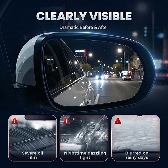

![[Screen 2] Pain points of night driving, analyze problems with traditional headlights. No product image needed.
[Atmosphere/Style] Realistic scene style, contrast to highlight problems, dim atmosphere, authentic night driving experience.
[Layout] Split into top and bottom: top shows dim road with traditional headlight, bottom lists 3 core pain points, each with simple icon, comfortable spacing, clear text.
[Lighting] Dim tone simulates natural night light, pain point text highlighted in light color, clear contrast to emphasize problems.
[Color Palette] Background #1a1a22, main dark gray, accent light gray, white text, red warning icons.
[Composition] Vertical split, top scene bottom text, top to bottom reading flow.
[Typography] Main title at top: "Night Driving - Are You Facing These Issues?", three pain points below: 1. "Narrow beam, limited visibility on corners" 2. "Low brightness, poor long-distance vision" 3. "Scattered light, glare for oncoming traffic", each with red exclamation mark, clear hierarchy, mobile-friendly reading.
[Ratio/Resolution] 9:16 vertical, 4K resolution, clear text, high definition.
[Negative Prompt] Garbled text, small text, blur, watermark, messy code, deformation.](https://gd-cms.dancf.com/gd-cms/xi19e5/0/c4790bf5-e470-4991-a799-739bff385fd822202.jpeg?x-oss-process=image/resize,w_640,type_6/sharpen,120/interlace,1)
![[垫图] https://gdesign-dam-hz.dancf.com/35975696890316953/a84d6c37c24e4655bb3449f4ca8b25de.png
详情页主题:Before & After Comparison
氛围风格:Problem solution comparison style
画面元素:Sliced two-panel layout, left slice shows old streaky blurry rear window, right slice shows new wiper clear clean rear view, both include Dacia vehicle to show the application, 产品保持原图外观展示在 bottom center, 切片分区不切割产品,对比清晰,真实车内光影
配色色系:Left panel darker (bad effect), right panel brighter (good effect), white contrast text
视角构图:Left-right sliced comparison layout
文字版式:"Improve Visibility / Eliminate Streaks" main title, "OLD / NEW" labels on each slice, "Crystal Clear Rear Vision" bottom description, all English, bold text, high contrast for readability](https://gd-cms.dancf.com/gd-cms/xi19e5/0/f1485be4-add0-4057-8648-f61474043a071226.png?x-oss-process=image/resize,w_640,type_6/sharpen,120/interlace,1)
![[商品] 本张为痛点直击页,不使用产品主图,仅用场景化对比画面呈现传统窗膜的四大痛点。
[画面] 目标:第2张痛点直击,激发用户对传统窗膜问题的共鸣,为后续产品解决方案铺垫。构图:2x2 四宫格布局,每格一个痛点场景,顶部居中大标题,四格下方留统一深色底边;阅读动线从上标题→左上→右上→左下→右下。四格场景:①左上格:驾驶员眯眼皱眉看前方强光,车窗深色模糊,表现"Low Visibility · 低透光影响驾驶视野";②右上格:车内温度计显示高温数字,乘客擦汗,阳光直射车内,表现"Poor Heat Insulation · 隔热差车内闷热";③左下格:手机信号格只剩1格,导航卡顿,表现"Signal Interference · 金属膜干扰信号";④右下格:手臂皮肤泛红晒伤示意图标,表现"UV Damage · 紫外线伤害皮肤"。
[视觉] 套系策略:风格=深色科技性能商业摄影;标题字=现代无衬线粗体(英文字体);正文字=简洁无衬线体;主色=深海蓝(#0A2463);背景延展=基于深海蓝做上下深浅渐变、同色系光晕和细腻粒子质感;强调色=警示橙红(#E63946),仅用于痛点图标、警示标记和重点问题词;标题色=纯白色;正文色=浅灰蓝;组件=圆角深色卡片、红色警示线性图标、细分割线;光影=每格内独立场景光,整体偏暗调突出问题感,卡片有轻微投影。
[文字] 顶部居中主标题:"Common Problems With Traditional Window Films"(白色粗体);副标题:"Is Your Window Film Holding You Back?"(浅灰蓝);四格每格底部有痛点标题 + 简短说明,横排文字,不遮挡人物主体。所有文案为英文,地道表达,无中文。
[规格] 图片比例1:1方图,4K,quality=medium,避免变形、错字、文字过小、出现产品图、中文文案、过度美化痛点场景。](https://gd-cms.dancf.com/gd-cms/xi19e5/0/055d7b76-2270-49d4-ae25-88d66f5149be1525.jpeg?x-oss-process=image/resize,w_640,type_6/sharpen,120/interlace,1)

![[第3屏] Temperature comparison - Cools Down Quickly. This screen uses 【image1】 as the product subject.
[Atmosphere/Style] Data comparison style, simple and clear, objective and convincing.
[Element Layout] Left and right split layout: left half show before installation, car interior high temperature picture, thermometer display high reading; right half show after installing the sunshade, thermometer display significantly lower temperature. The product sunshade placed at bottom center to highlight the product effect. Product shape consistent with input image.
[Light and Shadow Texture] Even soft light, thermometer readings and text clearly visible, comparison contrast obvious.
[Color Matching] Global background color #F0F4F8; left warm orange to indicate high temperature, right cool blue to indicate low temperature; text black and white.
[Perspective Composition] Split left-right comparison, clear contrast relationship.
[Text Layout] Top title "Significant Temperature Reduction", left subtitle "Before: High Temperature Stuffiness", right subtitle "After: Rapidly Cool Down", bottom note "Keeps Interior Cool Even In Strong Sunlight", all English text, clear typesetting.
[Proportion Resolution] 1:1 square ratio, 4K resolution, clear text, high-definition picture quality.
[Negative Prompt] Thermometer reading blur, text disorder, wrong comparison effect, Chinese characters, product deformation, watermark.](https://gd-cms.dancf.com/gd-cms/xi19e5/0/7d37d306-40fb-4653-9aeb-96c8d7271e1915813.jpeg?x-oss-process=image/resize,w_640,type_6/sharpen,120/interlace,1)

![[第2屏] 痛点直击-传统汽车窗膜使用痛点分析。无需产品图。
[氛围/风格] 问题导向,简约冷静风格,浅蓝低饱和背景,真实场景痛点展示。
[元素布局] 左侧展示苦恼车主在高温车内擦汗的场景,右侧分三栏列出核心痛点:glare from sun 导致视线模糊、heat build-up 车内闷热、no privacy 车内隐私暴露、faded interior 紫外线老化内饰,每个痛点配简约警示图标,文字清晰不遮挡场景。
[光影质感] 均匀柔和室内照明,场景与文字层次清晰,无强烈硬阴影。
[配色色系] 全局底色 #E8F0F8;主色深蓝文字;辅助色浅橙警示标签;对比清晰。
[视角构图] 左右分栏构图,左场景右文字,符合欧美消费者阅读习惯。
[文字版式] 顶部大标题 "Why Upgrade Your Window Tint?",分三行痛点:"Blocks Glare For Safer Driving", "Keeps Car Cooler In Hot Summer", "Protects Your Privacy & Interior",每行痛点配圆角标签,字体清晰易读。
[比例分辨率] 9:16 竖版比例,width 1080px height 1920px,4K 分辨率,文字清晰可辨,高清画质。
[负向提示词] 文字错乱,中文字符,水印,夸张过度,人物面部扭曲,背景杂乱](https://gd-cms.dancf.com/gd-cms/xi19e5/0/ce417a2a-bbc5-45e1-bfc3-495f4bb70dce24862.jpeg?x-oss-process=image/resize,w_640,type_6/sharpen,120/interlace,1)