
![[第2屏] Pain points and solutions… - 图片创意预览](https://gd-cms.dancf.com/gd-cms/xi19e5/0/aed637ad-c63b-49b6-a07f-6d9b69fa7d5d22025.jpeg)

[第2屏] Pain points and solutions…
[第2屏] Pain points and solutions comparison for insulin injection. This screen uses [image1] to show

用户r7mzbMAL
2026.07.21[第2屏] Pain points and solutions comparison for insulin injection. This screen uses [image1] to show
用户r7mzbMAL
2026.07.21![[第1屏] Main headline visual - Universal insulin pen needles product poster. This screen uses [image1] as the product main body.
[Atmosphere/Style] Clean, professional, minimalist medical commercial photography, true to product colors and structure.
[Element Layout] Six product boxes arranged neatly in the center, occupying 60%-70% of the screen; top headline area, bottom information bar; product physical structure, packaging color and size are consistent with the input product image.
[Light and Shadow Texture] Soft front lighting, even light distribution, natural projection, clear texture of packaging, product display clear and sharp.
[Color Matching] Global background color #f0f4f8; main color white with packaging multi-color matching; auxiliary color light gray gradient.
[Perspective Composition] Front perspective, product as the center, reading flow from top title -> center product -> bottom information bar.
[Text Layout] Top headline "Universal Insulin Pen Needles", subtitle "Less Pain, Smoother Injection", bold sans-serif font, center alignment; bottom information bar "Compatible With Most Insulin Pens", text does not block the main product. All text uses English, no Chinese characters.
[Proportional Resolution] 9:16 vertical ratio, 4K resolution, clear text, high definition.
[Negative Prompt] Product deformation, missing parts, wrong color, packaging text confusion, blurry product image, watermark, text distortion, Chinese characters.](https://gd-cms.dancf.com/gd-cms/xi19e5/0/353c5562-5bf3-4561-8aea-77348a83f4d522967.jpeg?x-oss-process=image/resize,w_640,type_6/sharpen,120/interlace,1)
![[第1屏] Main headline visual - Universal insulin pen needles product poster, matching the style of the uploaded reference images. This screen uses the original product box image [image0] as the product main body.
[Atmosphere/Style] Clean, professional, minimalist medical commercial photography, consistent with the reference picture warm beige tone style.
[Element Layout] Product boxes arranged in the center, occupying 60%-70% of the screen; top headline area, bottom information bar; product physical structure, packaging color consistent with the input image.
[Light and Shadow Texture] Soft front lighting, even light distribution, natural projection, clear texture, product display clear and sharp.
[Color Matching] Global background color #f2e8d9; main color matches the reference warm beige tone, keep product original packaging color.
[Perspective Composition] Front perspective, product as the center, reading flow from top title -> center product -> bottom information bar.
[Text Layout] Top headline "Universal Insulin Pen Needles", subtitle "Less Pain, Smoother Injection", bold sans-serif font, center alignment, consistent with reference text style; bottom information bar "Compatible With Most Insulin Pens", text does not block the main product. All text uses English, no Chinese characters.
[Proportional Resolution] 9:16 vertical ratio, 4K resolution, clear text, high definition.
[Negative Prompt] Product deformation, missing parts, wrong color, packaging text confusion, blurry product image, watermark, text distortion, Chinese characters, inconsistent style with reference.](https://gd-cms.dancf.com/gd-cms/xi19e5/0/b9c74513-8f86-4832-9c2a-bb673828b94922458.jpeg?x-oss-process=image/resize,w_640,type_6/sharpen,120/interlace,1)


![[第3屏] Core structure and material analysis, four advantages display. This screen uses partial details from [image1] product.
[Atmosphere/Style] Technical, clear professional medical explanation style.
[Element Layout] 2x2 four-grid layout, each grid showing one core advantage; overall layout neat, each grid independent: grid 1 thin-wall tech, grid 2 multi-section polish, grid 3 low bevel angle, grid 4 32G slim needle tube. Each grid has product detail and text description.
[Light and Shadow Texture] Even lighting, clear close-up details of each part, sharp focus on the needle structure.
[Color Matching] Global background #f0f4f8; each grid with light blue light background, main text dark gray, label blue.
[Perspective Composition] Even 2x2 grid composition, balanced vision, each area independent and clear.
[Text Layout] Top headline "Core Design For More Comfort"; each grid: 1. "Thin-Wall Tech - Smooth Injection, Less Pain"; 2. "Polished Needle - Sharp Tip, Easy Puncture"; 3. "Low Bevel < 22° - Smooth Insertion"; 4. "32G Slim Tube - Less Skin Trauma"; clear text, each title + description structure. All text English.
[Proportional Resolution] 9:16 vertical ratio, 4K resolution, clear text, high definition.
[Negative Prompt] Blurry details, wrong structure, text overlap, Chinese characters, distorted needle shape, watermark.](https://gd-cms.dancf.com/gd-cms/xi19e5/0/18ff5d85-726b-4eac-aaaa-ae873c9ad7a618011.jpeg?x-oss-process=image/resize,w_640,type_6/sharpen,120/interlace,1)
![[第6屏] Sterile four-layer sealed packaging display, match the style of reference image [image2] open box display. This screen uses the open box product display from reference image [image2].
[Atmosphere/Style] Real product display, clean hygienic trustworthy style, same warm tone as reference.
[Element Layout] Top headline, middle open box with scattered insulin needles, left top circular inset of hand injection demonstration; completely match reference composition, product placement consistent with reference.
[Light and Shadow Texture] Natural soft indoor lighting, clear product texture, soft shadow, real and vivid.
[Color Matching] Global background #f2e8d9; same off-white warm background as reference; product green transparent color consistent with reference.
[Perspective Composition] Top title + main product display + left circular inset, same composition as reference.
[Text Layout] Top headline "Four-Layer Independent Sealed Sterile Packaging"; description "Sterile single-use needles, full protection for needle tip from damage and contamination"; all text English, clearly visible.
[Proportional Resolution] 9:16 vertical ratio, 4K resolution, clear text, high definition.
[Negative Prompt] Deformed product, wrong composition, blurry picture, Chinese text, inconsistent color with reference.](https://gd-cms.dancf.com/gd-cms/xi19e5/0/f82594e9-7c38-45b0-83b3-ac5314d7f71818221.jpeg?x-oss-process=image/resize,w_640,type_6/sharpen,120/interlace,1)
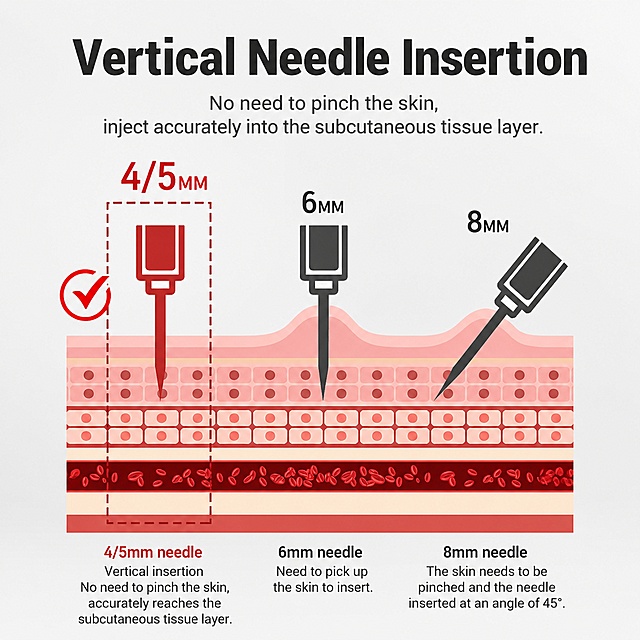
![[第5屏] 4/5mm Needle length advantage introduction. This screen uses the orange 4mm and purple 5mm products from [image1].
[Atmosphere/Style] Clear, informative professional product introduction.
[Element Layout] Upper half displays the two specifications of product packaging side by side; lower half text explains the advantages of this length; each product has its own label; clear comparison of the two sizes. Maintain the original packaging color and text.
[Light and Shadow Texture] Even soft light, natural shadow, packaging texture clear, two products equally prominent.
[Color Matching] Global background #f0f4f8; keep original orange and purple packaging colors, text dark gray.
[Perspective Composition] Top product display, bottom text description, upper and lower split layout, clear hierarchy.
[Text Layout] Top headline "Perfect Length For Accurate Injection"; left product label "four mm", right product label "five mm"; description "Correct length allows for one-handed injection, accurately reaches the subcutaneous tissue, no deeper than needed for extra comfort"; all text English, clear reading.
[Proportional Resolution] 9:16 vertical ratio, 4K resolution, clear text, high definition.
[Negative Prompt] Wrong packaging color, product deformation, text confusion, Chinese characters, blurry image, overlapping content.](https://gd-cms.dancf.com/gd-cms/xi19e5/0/03adfae6-2ed6-42ac-a67c-65915de5e79d22066.jpeg?x-oss-process=image/resize,w_640,type_6/sharpen,120/interlace,1)
![[第6屏] Sterilization and packaging safety introduction. This screen uses [image1] product packaging.
[Atmosphere/Style] Trustworthy, clean hygienic medical safety style.
[Element Layout] Product packaging placed in the center, surrounding text explains packaging advantages; highlight the four-layer independent sealed design; show complete outer packaging, structure consistent with input image.
[Light and Shadow Texture] Soft lighting, clean and bright picture, highlights the sealed and sterile packaging characteristics.
[Color Matching] Global background #e8f4f0; packaging maintains original color, text dark green accent.
[Perspective Composition] Center product, surrounding text layout, focus on packaging protection.
[Text Layout] Top headline "Sterile Safety, Sealed Protection"; main points: "1. Sterile medical grade needle for single use"; "2. Four-layer independent sealed packaging"; "3. Protects needle tip from external damage and contamination"; "4. Ready to use, safe and hygienic"; each point with check icon, text clearly visible. All text English.
[Proportional Resolution] 9:16 vertical ratio, 4K resolution, clear text, high definition.
[Negative Prompt] Damaged packaging, wrong structure, text confusion, Chinese characters, blurry product, exaggerated expression.](https://gd-cms.dancf.com/gd-cms/xi19e5/0/97fe8810-91ae-4f8d-9295-c8cdbc32721422024.jpeg?x-oss-process=image/resize,w_640,type_6/sharpen,120/interlace,1)
![[第3屏] 32G Slim Needle Tube Advantage, match the uploaded reference image [image2] circular composition style. This screen uses the injection demonstration content from reference image [image2].
[Atmosphere/Style] Clear, informative, warm tone professional medical style, consistent with reference picture style.
[Element Layout] Top headline text, bottom large circular frame contains the injection demonstration picture, bottom left placed two independent insulin needles to show product appearance; structure matches reference composition, maintain the hand injection action consistent with reference.
[Light and Shadow Texture] Soft natural light, circular picture clear, soft transition between picture and background.
[Color Matching] Global background #f2e8d9; same warm beige background as reference; product keeps green transparent color consistent with reference.
[Perspective Composition] Top text + center circular picture + bottom product display, clear hierarchy, same composition as reference.
[Text Layout] Top headline "32G Slim Needle Tube Reduces Injection Pain"; main text "Combined with thin-wall technology, reduces skin damage area and alleviates injection discomfort"; text matches reference font style, clearly visible. All text English.
[Proportional Resolution] 9:16 vertical ratio, 4K resolution, clear text, high definition.
[Negative Prompt] Wrong hand posture, deformed needle, blurry picture, text confusion, Chinese characters, inconsistent background color.](https://gd-cms.dancf.com/gd-cms/xi19e5/0/9fee4ef5-b104-479c-bf0c-13a0378ce95217822.jpeg?x-oss-process=image/resize,w_640,type_6/sharpen,120/interlace,1)
![[第5屏] Needle length advantage, 4/5mm different specifications display, match the style of reference images. This screen uses the product packaging original image.
[Atmosphere/Style] Clean product display, consistent with the reference warm minimalist style.
[Element Layout] Top headline, middle two product packaging side by side, bottom text description; 4mm and 5mm specifications separately displayed, product packaging color consistent with original image, clear comparison.
[Light and Shadow Texture] Even soft lighting, natural shadow, packaging texture clear, two products equally prominent.
[Color Matching] Global background #f2e8d9; same warm beige background as reference, keep product original packaging color.
[Perspective Composition] Top title, middle product, bottom text, upper-middle-lower split layout, clear hierarchy.
[Text Layout] Top headline "Perfect Length For Accurate Injection"; left label "four mm", right label "five mm"; description "One-handed injection, accurately reaches subcutaneous tissue, extra comfort"; all text English, clean layout.
[Proportional Resolution] 9:16 vertical ratio, 4K resolution, clear text, high definition.
[Negative Prompt] Wrong packaging color, product deformation, text confusion, Chinese characters, inconsistent background.](https://gd-cms.dancf.com/gd-cms/xi19e5/0/35a431f7-647a-49c8-9210-21f0eccce2de18219.jpeg?x-oss-process=image/resize,w_640,type_6/sharpen,120/interlace,1)
![[商品] 使用【图1】BEITAGOGO 纱布绷带卷产品图;保留白色纱布卷的外观、卷装形态、尺寸比例与材质纹理;商品处理:提取纱布卷与包装元素,用于各痛点格中的产品展示,清晰化纱布纹理。
[画面] 页面目标:痛点与解决页,展示日常伤口护理的4个常见问题及纱布绷带的对应解决方案;构图采用2×2四宫格多格说明型,每格为一个小场景+短标题+图标;产品占画面约40%,分散于四格中;景别为中景拼贴;阅读动线从左上到右下;每格包含痛点场景示意、产品小图与解决说明。
[视觉] 套系策略:风格=亚马逊A+极简专业医疗商业摄影;标题字=现代无衬线粗体(英文);正文字=简洁无衬线体(英文);主色=深墨绿;背景延展=基于浅蓝-浅薄荷绿做低饱和同色渐变,四格用深浅交替的圆角卡片区分;强调色=明黄色,仅用于对勾图标与解决标签;标题色=深炭灰;正文色=中灰;组件=圆角信息卡、绿色分割线、对勾图标;光影=柔和均匀无影光。
[文字] 顶部主标题"Solve Your Wound Care Needs";四格分别为:左上"Fragile Skin?"配"Soft & Gentle"解决、右上"Poor Breathability?"配"Air-Permeable Design"解决、左下"Insufficient Length?"配"6 Meters Per Roll"解决、右下"Unhygienic Storage?"配"Individually Wrapped"解决;所有文字横向排版,英文表达地道。
[规格] 图片比例9:16竖版,4K分辨率,medium质量;避免变形、错字、文字过小、中文文案、血腥伤口画面、夸张恐吓式痛点表达、绝对化用语。](https://gd-cms.dancf.com/gd-cms/xi19e5/0/00a79a67-eae1-45db-96f2-ace3cbc3532231365.png?x-oss-process=image/resize,w_640,type_6/sharpen,120/interlace,1)

![[第2屏] Common skin concerns page for Houmai Freckle Removing Cream. This screen uses [image1] product reference to keep packaging consistent. Main title: "Target Your Skin Concerns". [Atmosphere/Style] Clean problem-solution layout, soft neutral background, professional skincare aesthetic. [Element Layout] Left side three numbered cards, each for one common concern: 1. "Uneven Skin Tone", 2. "Stubborn Dark Spots", 3. "Dull Complexion". Right side small product display. Each card uses simple icons and short descriptions. All elements well spaced, no crowding. [Lighting & Texture] Soft diffuse lighting, clear card borders, comfortable visual hierarchy. [Color Scheme] Global background #f8f8f8, card background white, main text dark gray, accent color matching product red. [Perspective & Composition] Left cards right product, two-column layout, clear reading flow. [Text Layout] All texts in English, short descriptions for each concern, clear hierarchy, text not overlapping product. [Resolution & Ratio] 9:16 vertical ratio, 4K resolution, clear text, high definition. [Negative Prompt] Deformed product, Chinese characters, exaggerated comparison, text blur, distorted layout, watermark.](https://gd-cms.dancf.com/gd-cms/xi19e5/0/3b33c16c-e670-45a5-93d6-9f10e32f479451362.jpeg?x-oss-process=image/resize,w_640,type_6/sharpen,120/interlace,1)
![[商品] 使用【图1】一次性使用三棱针(蓝色防滑手柄+银色金属针尖)及独立灭菌包装;保留针体结构比例、蓝色手柄颜色材质、包装上"一次性使用无菌粉刺针""本品已灭菌处理""STERILE EO"等文字与蓝色印刷风格,不改变商品本体外观与包装文字;真实功能方向为针尖用于皮肤挑痘/清洁闭口/中医理疗点刺。
[画面] 目标:头图海报,建立医用级专业信任感与淡蓝色创意视觉。构图:上下分层+左右呼应,上方为标题主视觉区,中下方产品主体斜向摆放,三棱针与独立包装呈高低错落组合,产品占画面约55%。景别:中景偏特写,针尖细节清晰可见。阅读动线:从上至下,从标题到产品再到卖点图标。前中后景:前景淡蓝色渐变光晕,中景产品主体+柔和投影,背景为淡蓝色几何线条与医疗十字元素抽象组合,营造科技医疗氛围;加入细微的分子结构/网格线作为创意装饰,增强设计感。
[视觉] 套系策略:风格=淡蓝色医疗科技风,简约高级有设计创意感,干净通透;标题字=现代无衬线粗黑体(思源黑体Heavy),字重厚实有力;正文字=简洁无衬线体(思源黑体Regular);主色=淡蓝色(#E3F0FF 浅天蓝);背景延展=基于淡蓝色做深浅渐变、同色系几何块面、细腻磨砂玻璃质感与柔光光晕;强调色=医用深蓝(#1E88E5),仅用于小面积图标、引线、标签、数字徽章和局部光效;标题色=深海军蓝(#0D47A1);正文色=中蓝灰(#37474F);组件=圆角半透明信息卡、细线引线、圆形图标徽章、玻璃拟态卡片;光影=左前侧柔和冷白光,产品底部带柔和接触阴影,背景有淡蓝色光晕与环境光。
[文字] 顶部居中主标题:「一次性使用三棱针」(8字),副标题:「医用级灭菌 一用一抛更安心」;下方环绕8个圆形图标卖点:独立包装、针尖锋利、防滑手柄、美容挑痘、清洁闭口、中医理疗、医用械字号、EO灭菌,每图标配1行短文字;文字区不遮挡针尖与产品主体;所有文字横向排版,字号保证手机端清晰可读。
[规格] 图片比例9:16竖版,4K分辨率,负向提示:避免变形、错字、文字过小、产品颜色改变、针尖模糊、血腥画面、夸张功效承诺、极限词(最好/第一/顶级)、白底无设计、杂乱背景。](https://gd-cms.dancf.com/gd-cms/xi19e5/0/753839a4-21ec-41da-9dbc-94a7f916eafa4175.jpeg?x-oss-process=image/resize,w_640,type_6/sharpen,120/interlace,1)
![[第2屏] 适用问题痛点说明屏-医用痔疮凝胶适用症状说明。
[氛围/风格] 清晰专业的症状说明,简洁直观,医疗科普风格,温和不刺激。
[元素布局] 基于原产品图提取益焜源医用痔疮凝胶产品放在画面顶部,缩小尺寸占画面约20%高度,保持产品包装颜色和外观一致。下方分四个绿色圆角卡片,每个卡片展示一个适用症状,卡片整齐排列为2行2列网格。背景为淡绿白色,整体无边框满铺,每个卡片配对应小图标。
[光影质感] 整体均匀柔和光线,卡片和文字清晰锐利,没有明显硬阴影,干净专业。
[配色色系] 全局统一底色:#F2F9F4(淡绿白);主体配色:#228B39(深绿卡片边框)+#FFFFFF(卡片背景)+#1A1A1A(文字);辅助色延续首屏红色标注点缀。
[视角构图] 顶部分产品小图展示,下方分四格说明,顶轻底重,构图均衡清晰,信息一目了然。
[文字版式] 顶部主标题"针对多种痔疮问题"深绿色加粗,居中排列。四个卡片内分别标注:适用于内痔、适用于外痔、改善肛门坠胀、缓解粘膜充血,每个标题配简单小图标,文字清晰,排版整齐,字体沿用首屏无衬线字体,保持风格统一。
[比例分辨率] 9:16竖版比例,1080宽度,1920高度,2K分辨率,文字清晰可辨,超高清。
[负向提示词] 恶心画面,夸张低俗,产品变形,文字错乱,水印,背景杂乱,颜色冲突。](https://gd-cms.dancf.com/gd-cms/xi19e5/0/7b418ec3-8130-40c9-8d27-4ca7d229ea1161.png?x-oss-process=image/resize,w_640,type_6/sharpen,120/interlace,1)


![第1张 详情页头图主视觉-一次性使用皮肤点刺针产品全貌宣传海报。本张使用【图1】作为商品主体(包装盒+滚针产品组合),保持产品外观、结构、颜色、包装文字与原图一致。
[氛围/风格] 淡蓝色系医疗专业风,干净通透,简约高级,商业摄影质感,突出一类医疗器械专业可信气质。
[元素布局] 产品包装盒置于画面左侧中部,皮肤滚针产品置于右侧偏上,两者错落摆放形成层次,产品整体占比约60%-65%;背景为淡蓝色渐变,底部有浅蓝几何台面承托;左上角留标题区,右下角放规格信息条;保持产品物理结构、比例轮廓、材质质感、颜色色号与输入产品图完全一致。
[光影质感] 左上方柔和无影光照明,右下自然浅投影,产品边缘清晰,整体明亮干净,医疗级洁净感。
[配色色系] 全局底色 #E8F4FD(淡天蓝渐变);主色 #2B8DD6(医疗蓝);辅助色 #FFFFFF 白色、浅灰蓝点缀。
[视角构图] 正面微俯视,产品为视觉中心,阅读动线左上标题 → 中部产品 → 底部信息条。
[文字版式] 版式为左上标题 + 中部产品 + 底部信息条。主标题「一次性使用皮肤点刺针」,副标题「一类械字号 三证齐全」,两行黑体左对齐;标题下方小字英文装饰「DISPOSABLE SKIN PRICK NEEDLE」;中部右侧竖排卖点标签:独立包装、按压出液、快速导入、优质针头;底部横排规格信息:多种规格 0.2mm / 0.3mm / 0.5mm / 0.75mm / 1.0mm;文字不遮挡产品主体,字号清晰可读。
[比例分辨率] 9:16 竖版比例,4K 分辨率,文字清晰可辨,高清画质。
[负向提示词] 产品变形,缺件错件,结构错误,颜色偏差,包装文字错乱,水印,文字错乱,文字过小,产品图模糊,背景杂乱,密集恐惧元素。](https://gd-cms.dancf.com/gd-cms/xi19e5/0/721488ef-1127-498d-8909-c3caa336e86d9774.png?x-oss-process=image/resize,w_640,type_6/sharpen,120/interlace,1)
![[第3张] 结构材质解析页,一次性使用皮肤点刺针细节特写。本张使用【图1】作为商品主体,放大展示针头与针栓细节。
[氛围/风格] 淡蓝色科技医疗风,微距特写,专业严谨,商业微距摄影质感。
[元素布局] 画面中央放大展示单支点刺针,占比约60%;上下左右用引线标注关键部位;背景为淡蓝色渐变科技背景,带细微的分子结构纹理;左侧针栓区域放大展示聚丙烯材质切面;右侧针头区域放大展示斜口光滑锋利切面;产品结构、颜色、比例与输入图一致。
[光影质感] 环形柔光打光,突出针管通透感与金属针头锐利质感,细节清晰,阴影柔和。
[配色色系] 全局底色#E3F0FF淡蓝色;主色深蓝#0D47A1;辅助色白色、浅绿。
[视角构图] 中心产品特写+四周引线标注,微距特写视角,阅读动线中心产品→四周标注。
[文字版式] 顶部主标题精工品质 细节见真章;针栓引线标注品质针栓 聚丙烯材质 无毒无臭无味 接触药物不反应;针头引线标注医用不锈钢 斜口光滑锋利 无毛刺 穿刺快 不堵塞 痛感小;引线文字清晰,不遮挡产品关键结构。
[比例分辨率] 9:16竖版比例,4K分辨率,文字清晰可辨,高清画质。
[负向提示词] 产品变形,结构错误,针头模糊,文字错乱,水印,颜色偏差,医疗违规标识。](https://gd-cms.dancf.com/gd-cms/xi19e5/0/865d4c9b-2dec-4a96-9149-12cabdcfe71917587.png?x-oss-process=image/resize,w_640,type_6/sharpen,120/interlace,1)
![[第2屏] 痛点直击-祁仲天穴位压力刺激贴痛点解决方案页。本屏使用【图1】作为商品主体。
[氛围/风格] 清晰易懂的对比风格,简约干净,突出问题与解决的反差。
[元素布局] 左右分栏布局,左栏展示日常身体不适的痛点场景(如颈部腰部酸胀不适),右栏展示使用产品后的舒适状态,产品包装盒放置在右下角;保证产品外观与原图一致。
[光影质感] 均匀布光,左右画面光影一致,主体突出清晰。
[配色色系] 全局底色 #fcf8f3,左栏痛点区浅灰调,右栏解决区浅橘调,主色橘橙色 #e67e22。
[视角构图] 左右对比构图,左右均衡,阅读动线从左到右。
[文字版式] 顶部主标题「哪里不适贴哪里 日常舒缓好帮手」,左栏痛点标题「酸胀不适 行动受限」,右栏解决标题「一贴舒缓 轻松自在」,文字分区排版,大标题清晰醒目,说明文字大小适中可读。
[比例分辨率] 9:16 竖版比例,4K分辨率,文字清晰可辨,高清画质。
[负向提示词] 产品变形,包装文字错乱,文字模糊不清,极端夸张不适画面,医疗承诺用语](https://gd-cms.dancf.com/gd-cms/xi19e5/0/49643118-60be-4d03-9dea-36464a359bfb2024.jpeg?x-oss-process=image/resize,w_640,type_6/sharpen,120/interlace,1)

![[第4屏] Needle tip detail explanation, showcasing ultra-sharp low angle design. This screen uses product detail from [image1].
[Atmosphere/Style] Close-up technical display, clear and professional, highlighting precision craftsmanship.
[Element Layout] Large close-up of the needle tip in the center, occupying about 60% of the screen; top headline, bottom text description; lead line marking the bevel angle area; show the smooth needle tube surface and sharp tip. Keep product structure consistent with the actual product.
[Light and Shadow Texture] Studio soft lighting, highlights the sharpness of the needle tip, clear texture of the tube surface, good contrast, clear level.
[Color Matching] Global background #e8f0f8; main color light gray, accent blue for marking lines and text.
[Perspective Composition] Center close-up perspective, focus on needle tip detail, clear focus.
[Text Layout] Top headline "Ultra-Sharp Tip For Gentle Puncture"; main description "Bevel angle less than twenty-two degrees, electroplated and polished for maximum sharpness"; bottom "Reduces resistance during insertion for less discomfort"; text clean and clear, does not cover key details. All text English.
[Proportional Resolution] 9:16 vertical ratio, 4K resolution, clear text, high definition.
[Negative Prompt] Deformed needle, blurred tip, text too small, Chinese characters, wrong angle, dirty background.](https://gd-cms.dancf.com/gd-cms/xi19e5/0/e89a1d15-0859-45b6-bea0-f1f94308b40122457.jpeg?x-oss-process=image/resize,w_640,type_6/sharpen,120/interlace,1)




![[第8屏] 产品信息-规格参数与注意事项。本屏使用【图10】作为参数参考,【图8】作为产品展示。
[氛围/风格] 简约专业信息风,暖棕色调,清晰规整,商业设计质感。
[元素布局] 画面上方中央放置一片红点艾灸贴产品图,占比约30%;下方大圆角矩形信息卡展示产品参数;信息卡内分多行清晰列出:产品名称、产品成分、使用方法、贮存方式、有效期;背景为浅暖棕色,简洁干净;产品外观与输入图一致。
[光影质感] 均匀柔光,产品区清晰突出,信息卡平整干净,整体明亮专业。
[配色色系] 全局底色 #F0E0C8(浅暖棕);主色驼色 #C19A6B 信息卡底色 + 深棕 #4A3728 文字;辅助色金色 #DAA520 标题点缀。
[视角构图] 上下构图,产品在上居中,信息卡在下方占主要区域,阅读动线从上到下。
[文字版式] 顶部大标题「产品信息」,英文小字「PRODUCT INFORMATION」装饰;信息卡内每项参数用【】标注项目名,内容文字左对齐,行间距宽松;黑体清晰可读,参数文字大小适中不拥挤。
[比例分辨率] 3:4竖版比例,width 1200,height 1600,4K分辨率,文字清晰可辨。
[负向提示词] 文字错乱,参数模糊,产品变形,水印,颜色偏差,布局拥挤。](https://gd-cms.dancf.com/gd-cms/xi19e5/0/b6d38880-9975-461f-a5b3-cb2a4502e92928599.jpeg?x-oss-process=image/resize,w_640,type_6/sharpen,120/interlace,1)
![[商品] 使用【图1】BEITAGOGO 纱布绷带卷产品图;保留白色纱布卷的外观、卷装形态与材质纹理;商品处理:展示纱布卷展开、缠绕的不同状态,保留产品原貌与颜色。
[画面] 页面目标:使用步骤演示页,清晰展示伤口包扎的4步正确流程;构图采用上下分栏的步骤演示型,上方大标题,下方4步横向排列步骤条;产品占画面约50%;景别为中景;阅读动线从上到下、从左到右;每步配手部动作示意与纱布状态,步骤间用箭头连接。
[视觉] 套系策略:风格=亚马逊A+极简专业医疗商业摄影;标题字=现代无衬线粗体(英文);正文字=简洁无衬线体(英文);主色=深墨绿;背景延展=基于浅蓝-浅薄荷绿做低饱和同色渐变,步骤用白色圆角卡片承载;强调色=明黄色,仅用于步骤编号与箭头;标题色=深炭灰;正文色=中灰;组件=编号胶囊、箭头连接线、圆角步骤卡;光影=柔和均匀无影光。
[文字] 顶部主标题"Easy 4-Step Application";四步分别为:Step 1 "Clean the Wound Area"、Step 2 "Unroll & Start Wrapping"、Step 3 "Wrap Firmly & Evenly"、Step 4 "Secure the End";每步配简短说明,所有文字横向排版,英文专业地道。
[规格] 图片比例9:16竖版,4K分辨率,medium质量;避免变形、错字、文字过小、中文文案、血腥伤口特写、医疗治疗承诺、夸张效果。](https://gd-cms.dancf.com/gd-cms/xi19e5/0/5bc40418-990f-4755-b33b-142cf2623c3b37853.png?x-oss-process=image/resize,w_640,type_6/sharpen,120/interlace,1)

