![[Screen 2] This screen is pain… - 图片创意预览](https://gd-cms.dancf.com/gd-cms/xi19e5/0/e8c27491-be4f-4ce7-92db-108848e7e37619576.jpeg)

[Screen 2] This screen is pain…
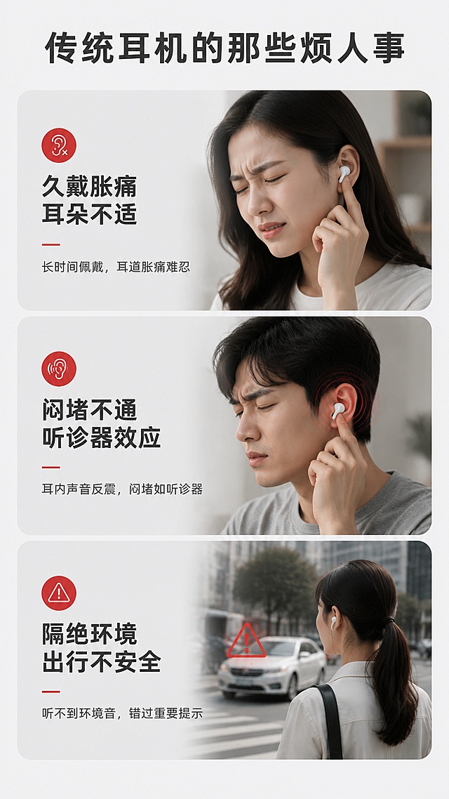
[Screen 2] This screen is pain point comparison for G03A Wired Sound Card Headset. Show the discomfo

用户r7mzbMAL
2026.07.21[Screen 2] This screen is pain point comparison for G03A Wired Sound Card Headset. Show the discomfo
用户r7mzbMAL
2026.07.21![[Screen 8] This screen is full product parameter information and packaging display, last screen of the detail page. Use image 9 for packaging reference. Atmosphere: clean product and packaging display, light simple background. Visual: top half shows G03A headset with all accessories: main headset, Type-C cable, USB adapter, controller, product packaging box. Bottom half shows clear parameter table. Parameters include: Model: G03A, Net Weight: 32g (1.13oz), Wearing Style: Open-ear Neckband, Microphone: Integrated Boom Mic, Interfaces: Dual USB / Type-C, Compatibility: Phone / Tablet / Laptop / Desktop. Highlight the advantages compared with traditional 3.5mm headphones: independent sound card, directional sound transmission, titanium silicone frame, noise-canceling mic. Product and packaging must match input image. Light and shadow: soft even lighting, natural shadow, product clear and bright. Color scheme: global background #eef5ff, product packaging main colors black, white and red, parameter table clean white background. Perspective: front slightly elevated view, product and packaging arranged neatly. Text layout: top title "Complete Package & Specification", bottom parameter table with clear columns, all English text, no Chinese characters, parameter text clear and readable. Resolution ratio: 9:16 vertical, 4K resolution, clear text, high quality. Negative prompt: wrong parameter, deformed packaging, text disorder, Chinese characters, watermark.](https://gd-cms.dancf.com/gd-cms/xi19e5/0/da6c3b03-83c3-4d0e-ade5-befe7a3f9d3c19295.jpeg?x-oss-process=image/resize,w_640,type_6/sharpen,120/interlace,1)
![[Screen 1] This screen is the first detail page header banner for G03A Wired Sound Card Headset. This screen uses image 1 as the product main body. The design is a wide e-commerce detail header banner with gradient blue tech style background, G03A dual interface sound card wired headset is displayed at center C position, highlight the open-ear non-intrusive design, display USB and Type-C interfaces in separate left-right columns, marked "Independent Sound Card Headset", core selling points layered as large text: 32g Ultra-lightweight, Flexible Titanium Frame, Soft Skin-friendly Silicone, Secure Fit No Falling, Directional Sound Transmission, HD Noise-canceling Microphone. Below place small product images of desktop computer, laptop, android phone, tablet. Divide three sections for main usage scenarios: Gaming Esports, Customer Service, Business Online Classes. Tech minimalist design, vector icons match physical product photos, high-definition commercial poster, neat layout, no messy watermark. The overall structure, material, color of the headset must be consistent with the input image. Atmosphere: professional tech style, clean commercial photography. Element layout: product center, top title area, lower scenarios and device icons. Light and shadow: soft top lighting, natural projection at bottom, clear highlights on product surface. Color scheme: global background gradient #e6f2ff, main color black product, accent cyan blue text labels. Perspective: front view, product as center, reading flow top to bottom. Text layout: top main title "G03A Dual Interface Sound Card Headset", left-right interface labels, core selling points as layered text blocks, scenario icons and descriptions at bottom, all text in English, no Chinese characters, text does not block product main body, font clear and readable. Resolution ratio: 9:16 vertical, 4K resolution, clear text, high definition quality. Negative prompt: product deformation, missing parts, wrong structure, color deviation, watermark, messy background, blurred product, Chinese characters.](https://gd-cms.dancf.com/gd-cms/xi19e5/0/bc3b5f49-8cd7-41a0-9560-b1bdd0c0c40823663.jpeg?x-oss-process=image/resize,w_640,type_6/sharpen,120/interlace,1)

![[第5屏] Dual Mode Function Test - Hearing Aid & Bluetooth 2-in-1. This screen uses [image2] as the product display.
[Atmosphere/Style] Functional comparison style, objective clear, split layout, real experience display.
[Element Layout] Screen is split into upper and lower halves, each half shows one mode. Upper half: "Hearing Aid Mode" - shows the product with a label "Amplify Environment Voice", small scene thumbnail of daily conversation. Lower half: "Bluetooth Mode" - shows the product with a label "Connect to Phone for Music & Calls", small thumbnail of streaming music. Product shape and structure consistent with input image, each mode has independent description, layout uniform.
[Light and Shadow] Uniform soft lighting, both modes have consistent exposure, product clearly distinguishable in each section.
[Color Scheme] Global background #f0f2f5; upper card background #e3f2fd; lower card background #f3e5f5; text all dark gray, labels blue and purple.
[Perspective Composition] Up-down split comparison, clear reading flow from top to bottom.
[Text Layout] Main title at top: "Two Modes One Device Meet Your Different Needs"; upper subtitle: "Hearing Aid Mode - Amplify voice for daily conversation"; lower subtitle: "Bluetooth Mode - Listen to music & take calls directly"; all text English, prominent level, clear reading.
[Proportion Resolution] 9:16 vertical ratio, 4K resolution, clear text, high definition.
[Negative Prompt] Product deformation, wrong structure, color deviation, Chinese characters, watermark, text confusion, blurry picture](https://gd-cms.dancf.com/gd-cms/xi19e5/0/7097987b-847c-46da-af83-3c766271442716727.jpeg?x-oss-process=image/resize,w_640,type_6/sharpen,120/interlace,1)
![[Main Image 4] Noise reduction and transparency mode contrast for Amazon. [Atmosphere Style] Clear function comparison, technology contrast style. [Image Quality] Commercial photography texture, soft and transparent light, clear and realistic product, clean and advanced picture. [Elements] Left and right two-column comparison layout, left column shows Hybrid ANC noise reduction mode, the right column shows Transparency mode. Both columns use the same 930PLUS black头戴式 wireless headphones, keep the product appearance consistent with the input image. Left noise reduction mode with deep blue sound wave visualization effect, marking the maximum noise reduction depth of 42dB. Right transparency mode with light green sound wave, showing the effect of transparent through ambient sound. Headphone product in the middle of each column, the comparison effect is obvious. Background uses gradual gray difference to distinguish the two modes. [Lighting] Uniform soft light, the product details of the two sides are clearly visible, the sound wave effect has soft light emission. [Color Matching] Left main color deep blue, right main color light green, product unified matte black, background light gray. [Text Layout] All English, each column has a title, left "Hybrid ANC Up to 42dB", right "Transparency Mode", the bottom of the column has a short description of the function, clear contrast. [Proportion Resolution] 1:1 proportion, 2048px * 2048px, 2K resolution. [Negative Prompt] Deformation, watermark, text disorder, blurred product image, messy background, Chinese characters.](https://gd-cms.dancf.com/gd-cms/xi19e5/0/f3d290f8-7224-424e-b5b1-4f9fe39b0ca74734.png?x-oss-process=image/resize,w_640,type_6/sharpen,120/interlace,1)


![[Screen 6] Ergonomic Design - Comfortable Neckband Wearing Experience. This screen uses [image1] as product main body, [image9] ergonomic reference.
[Atmosphere/Style] Light gray professional explanatory style, clear illustration, intuitive understanding.
[Element Layout] Upper main title, center display ergonomic ear fitting diagram using reference from [image9], lower product detail display with [image1], highlight neckband structure does not oppress ear canal. Diagram and product structure consistent with original images.
[Light and Shadow] Soft diffuse light, clear structure display, no strong shadow, uniform picture brightness.
[Color Matching] Global background #f0f2f5, diagram background white, outline red, product natural color, text dark gray.
[Perspective Composition] Top title center diagram bottom product vertical layout, clear hierarchy.
[Text Layout] Top main title "Comfortable Painless Wearing", three advantages: 1. Neck hanging design, no压迫 on ear canal, 2. Natural anti-lost structure, not easy to fall, 3. Body away from ear canal, reduce damage from earwax and moisture. Each advantage with icon and short description. All English text.
[Resolution and Ratio] 9:16 vertical proportion, 4K resolution, clear text, high quality.
[Negative Prompt] Chinese characters, product deformation, wrong ear structure, blurry diagram, text disorder, watermark.](https://gd-cms.dancf.com/gd-cms/xi19e5/0/996c607a-2991-436d-89e6-e83f3b91b8a020922.jpeg?x-oss-process=image/resize,w_640,type_6/sharpen,120/interlace,1)
![[Screen 6] Ergonomic Design - Comfortable Neckband Wearing Experience. This screen uses [image1] as product main body, [image9] ergonomic reference.
[Atmosphere/Style] Light gray professional explanatory style, clear illustration, intuitive understanding.
[Element Layout] Upper main title, center display ergonomic ear fitting diagram using reference from [image9], lower product detail display with [image1], highlight neckband structure does not oppress ear canal. Diagram and product structure consistent with original images.
[Light and Shadow] Soft diffuse light, clear structure display, no strong shadow, uniform picture brightness.
[Color Matching] Global background #f0f2f5, diagram background white, outline red, product natural color, text dark gray.
[Perspective Composition] Top title center diagram bottom product vertical layout, clear hierarchy.
[Text Layout] Top main title "Comfortable Painless Wearing", three advantages: 1. Neck hanging design, no压迫 on ear canal, 2. Natural anti-lost structure, not easy to fall, 3. Body away from ear canal, reduce damage from earwax and moisture. Each advantage with icon and short description. All English text.
[Resolution and Ratio] 9:16 vertical proportion, 4K resolution, clear text, high quality.
[Negative Prompt] Chinese characters, product deformation, wrong ear structure, blurry diagram, text disorder, watermark.](https://gd-cms.dancf.com/gd-cms/xi19e5/0/cd5a7e0b-3f6f-4299-a9f0-e9ff9a3a309221272.jpeg?x-oss-process=image/resize,w_640,type_6/sharpen,120/interlace,1)
![[主图-2] S15睡眠耳机核心舒适卖点图
[氛围风格] 跨境电商信息图风格,功能化客观中立,延续桌面场景暖调质感
[画质] 商业摄影质感、光线柔和通透、产品清晰真实、画面干净高级。
[元素] 画面左侧为S15睡眠有线耳机主视觉,黑色双层硅胶耳塞特写放大,展示亲肤软硅胶材质与人体工学双层入耳结构;右侧为浅木色电脑桌面局部场景小窗,展示耳机放在白色机械键盘旁的真实桌面环境。保持耳机外观(即物理结构、材质质感、颜色、双层硅胶耳塞造型、线控按键)与输入产品图保持绝对一致,杜绝任何变形和色差,精细化处理。画面配有3个圆角图标卡片,分别对应三大舒适卖点:侧睡零压、防漏音贴合、轻量隐形。
[光影] 主光来自左前方45°柔和自然光,辅光为桌面暖光台灯补光,硅胶耳塞哑光质感细腻,线控塑料有适度高光,整体暖调通透。
[配色] 主色浅灰渐变背景;辅色木色桌面暖棕、黑色产品;强调色深灰图标卡片、白色文字。
[视角构图] 左主右辅构图,左侧产品特写为视觉中心,右侧场景小窗为语境补充,景深适中,产品主体锐利。
[文字版式] 顶部大标题左对齐:"Sleep in Zero Pressure",黑色粗体无衬线大号字体;副标题小字:"Ergonomic Dual-Layer Silicone Design",深灰色中号。下方三个圆角矩形卡片横向排列,每个卡片上图标下文字:卡片1图标为侧卧人头简标,文字"Zero Side Pressure" "Pain-Free for Side Sleeping";卡片2图标为耳道剖面简标,文字"Snug Canal Fit" "Prevent Sound Leakage";卡片3图标为轻量羽毛简标,文字"Lightweight & Compact" "Hidden In-Ear Fit"。文字全部英文,清晰可读,不遮挡产品主体。
[输出要求] 1:1比例,2048px*2048px,文字清晰锐利,超高清商业摄影质感。
[负向提示词] 变形,文字错乱,产品图模糊,背景杂乱,水印,电商平台Logo,中文文字。](https://gd-cms.dancf.com/gd-cms/xi19e5/0/26620bcc-fad5-453c-b229-6a069dcf8db137741.jpeg?x-oss-process=image/resize,w_640,type_6/sharpen,120/interlace,1)

![[Screen 3] Core Selling Points Overview - LT2309 Neckband Hearing Aid. This screen uses [image6] original overview page, update core title to 32-channel.
[Atmosphere/Style] Card-style information layout, technology minimalist style, clear information hierarchy.
[Element Layout] One large card on the left for main product display, two small cards stacked on the right for core function display. Update first core advantage from Professional Acoustic Core 4-channel to 32-channel Professional Acoustic Core. Product structure and details consistent with original image.
[Light and Shadow] Soft uniform lighting, card with subtle shadow, three-dimensional sense hierarchy clear.
[Color Matching] Global background #1a1a20, card background #2d3038, title white, description light gray, highlight label red.
[Perspective Composition] Asymmetric left large right small composition, visual focus on left product, right information supplement, reasonable layout.
[Text Layout] Top main title "Five Core Advantages", first large card main title "32-Channel Professional Acoustic Core", right first card "Easy Operation for Seniors", second card "Long Battery Life Ready Anytime". Each card short description corresponding卖点. All English text, font size layered. Update all mentions of 4-channel to 32-channel.
[Resolution and Ratio] 9:16 vertical proportion, 4K resolution, clear text, high definition.
[Negative Prompt] Chinese characters, product deformation, overlapping text, wrong structure, blurred image, watermark, retain old 4-channel text.](https://gd-cms.dancf.com/gd-cms/xi19e5/0/8c9cc69e-a88d-4039-8d8f-860d24ddc3d420923.jpeg?x-oss-process=image/resize,w_640,type_6/sharpen,120/interlace,1)


![[第6屏] Comparison With Traditional Hearing Aids. This screen uses [image3] as the product display for our item.
[Atmosphere/Style] Neutral comparison style, objective fair, clear column comparison, highlight advantages.
[Element Layout] Left-right two column layout. Left column: "Traditional Hearing Aids", right column: "Our Neckband Bluetooth Hearing Aid". Each column has product position, three rows of comparison indicators: Appearance, Function, Operation. In right column, the product shape and structure are consistent with input image; each row compares the difference: traditional are bulky/only hearing aid/complex touch; our are stealthy/dual mode/physical buttons easy to operate. Comparison clear, do not denigrate other products, only show difference.
[Light and Shadow] Uniform neutral light, both columns have same brightness, text and product all clear.
[Color Scheme] Global background #f8f9fa; left column background #f5f5f5; right column background #e8f5e9; text dark gray, advantage checkmarks green.
[Perspective Composition] Left-right comparison, clear contrast, reading flow from top indicators -> left-right comparison.
[Text Layout] Main title at top: "What Makes Our Hearing Aid Different"; comparison indicators: "Appearance", "Functions", "Operation"; labels for each item, all English, clear readable text, checkmarks mark our advantages.
[Proportion Resolution] 9:16 vertical ratio, 4K resolution, clear text, high definition.
[Negative Prompt] Product deformation, color deviation, Chinese characters, watermark, text confusion, exaggerated bias](https://gd-cms.dancf.com/gd-cms/xi19e5/0/856a9428-3fed-486d-b48d-f976564cd2dc16724.jpeg?x-oss-process=image/resize,w_640,type_6/sharpen,120/interlace,1)
![[主图-2] 双佩戴方式对比展示主图,展示短柄入耳式与耳夹式两种佩戴选择。
[氛围风格] TikTok商业风格,潮流科技美学,高清质感,科技对比展示
[画质] 商业摄影质感、光线柔和通透、产品清晰真实、画面干净高级。
[元素] 画面分为上下两栏,上栏展示短柄入耳耳机佩戴效果,下栏展示耳夹式耳机佩戴效果,保持两种耳机外观、材质、颜色与输入产品图绝对一致,杜绝变形色差。两栏之间用细银线分割,每栏左侧为佩戴示意图,右侧标注文字说明。背景为浅灰渐变科技背景。
[光影] 均匀布光,双侧补光,两种佩戴方式都清晰展示,产品细节清晰,金属部分保留自然高光。
[配色] 主色浅科技灰,产品本色点缀,文字深灰与浅色背景形成对比。
[视角构图] 两栏平分构图,视角均为近距离平视,突出耳机佩戴结构。
[文字版式] 上栏标题"In-Ear Mode"下栏标题"Earclip Mode",下方小字分别标注"For normal earlobes"和"For non-pierced ears",文字清晰,排版规整,不遮挡主体。
[比例分辨率] 9:16比例,4k分辨率,文字清晰锐利,画面超高清。
[负向提示词] 变形,水印,文字错乱,产品图模糊,背景杂乱。](https://gd-cms.dancf.com/gd-cms/xi19e5/0/c1d4d032-8a96-4527-a3f3-6a8fc00ef6ec9650.png?x-oss-process=image/resize,w_640,type_6/sharpen,120/interlace,1)


![[第6张] 详情页使用前后对比-普通耳机vs本款白绿菱纹耳机体验差异。本张使用【图1】作为右侧对比产品。
[氛围/风格] 对比测评风,左右分栏冷暖色调对比,直观强烈商业质感。
[元素布局] 画面左右分栏对比布局;左栏「普通耳机」:暗灰色调,展示廉价塑料耳机、夹头不适、音质模糊的示意场景;右栏「本款耳机」:青绿色明亮色调,展示白绿菱纹耳机、舒适佩戴、高清音质的优质场景;中间有VS标识分隔;右侧耳机外观与输入产品图一致。
[光影质感] 左栏偏暗冷调,右栏明亮暖调,中间有明显光影对比过渡,产品光照均匀清晰。
[配色色系] 左栏底色 #3A3A3A 深灰,文字白色+红色标注;右栏底色 #E8F8F5 浅青绿,文字深灰+青绿色高亮;中间VS标识白色底黑字。
[视角构图] 左右对比分栏,中间VS分隔,阅读动线从左到右对比阅读。
[文字版式] 版式为左右PK对比栏。左栏标题「普通耳机」,下方3个痛点:「塑料感强 颜值低」「夹头压耳 戴不久」「音质模糊 体验差」,每项配红色叉号;右栏标题「我们的耳机」,下方3个优势:「菱纹设计 潮流外观」「柔软耳罩 久戴舒适」「高清动圈 音质出众」,每项配青绿色对号;中间顶部大VS标识;文字清晰对比强烈。
[比例分辨率] 3:4 竖版比例,4K分辨率,文字清晰可辨,高清画质。
[负向提示词] 耳机变形,颜色偏差,水印,左右栏混乱,文字不清晰,对比不明显。](https://gd-cms.dancf.com/gd-cms/xi19e5/0/e3749aac-b056-4ecd-88fd-a74b356b60f524443.png?x-oss-process=image/resize,w_640,type_6/sharpen,120/interlace,1)

![[Screen 7] This screen is core acoustic technology display for G03A Wired Sound Card Headset. Use image 5 for acoustic structure reference. Atmosphere: tech exploded view style, highlight internal speaker structure. Visual: exploded view of the earphone unit, show 16mm composite diaphragm speaker and ACS acoustic cavity resonance structure, from outer shell to inner diaphragm layers separated for clear display. Mark each component: outer shell, acoustic cavity, composite diaphragm. Highlight the advantage of panoramic sound coverage and high-resolution sound quality. The external earhook structure matches the input image. Light and shadow: technical cool lighting, glowing effect on speaker diaphragm to highlight the structure, clear layering between components. Color scheme: global background #f0f5ff, accent blue and gold on speaker components, black earphone shell. Perspective: front 45-degree exploded view, all key components are visible and clearly separated. Text layout: top main title "Advanced Acoustic Technology", side labels for "16mm Composite Diaphragm", "ACS Panoramic Sound", bottom subtitle "Clear Detail, Immersive Sound", all English text, no Chinese characters. Resolution ratio: 9:16 vertical, 4K resolution, clear structure, high definition. Negative prompt: wrong structure, deformed components, blurry exploded view, Chinese characters, watermark.](https://gd-cms.dancf.com/gd-cms/xi19e5/0/dc0f4575-aaa4-4322-a272-a44998deecff23938.jpeg?x-oss-process=image/resize,w_640,type_6/sharpen,120/interlace,1)

![[第2屏] 痛点直击对比屏-YB108白色蓝牙耳机与普通耳机对比展示。本屏直击传统蓝牙耳机续航短、佩戴不适的痛点。
[氛围/风格] 清晰对比展示风,浅科技背景,专业客观的商业展示风格,干净明了。
[元素布局] 画面使用左右分栏布局,左侧展示YB108蓝牙耳机开盖状态,保持产品结构颜色与参考图完全一致,右侧展示普通蓝牙耳机糟糕使用场景示意图。左右对比清晰,每侧产品占比约40%,顶部预留标题区域,底部预留总结文字区域。背景包含浅灰色网格装饰,整体简洁明了。
[光影质感] 左右产品光照均匀一致,YB108产品更亮,突出优势,右侧痛点区域适当压暗,对比分明,整体清晰自然。
[配色色系] 全局底色:#F5F8FA;左侧产品保持原白色+浅蓝色配色,右侧用浅灰色调弱化,文字用深灰和红色标注痛点,绿色标注优势,对比清晰。
[视角构图] 左右分栏对称构图,两款产品均为45度斜侧视角,方便对比,标题位于顶部通栏,总结位于底部通栏。
[文字版式] 顶部主标题:"摆脱传统痛点 享受持久音乐"深灰色粗体,居中排列。左侧栏标题:"YB108"绿色小字,下方标注优势"久戴不痛 续航持久";右侧栏标题:"传统耳机"红色小字,下方标注痛点"佩戴胀痛 频繁充电"。底部总结文字:"持久续航舒适佩戴,一次满足"居中深灰色。所有文字为英文,排版清晰,不遮挡主体产品。
[比例分辨率] 9:16竖版比例,4K分辨率,文字清晰可辨,超高清。
[负向提示词] 产品变形,结构错误,颜色偏差,文字错乱,恶意丑化,水印,背景杂乱,诱导点击。](https://gd-cms.dancf.com/gd-cms/xi19e5/0/2d8d3dd5-7b0c-4891-beca-926cd901931a439.png?x-oss-process=image/resize,w_640,type_6/sharpen,120/interlace,1)