
[主图-7] 核心优势总览图,效率+寿命+易用性+性价比四大优… - 图片创意预览

[主图-7] 核心优势总览图,效率+寿命+易用性+性价比四大优…

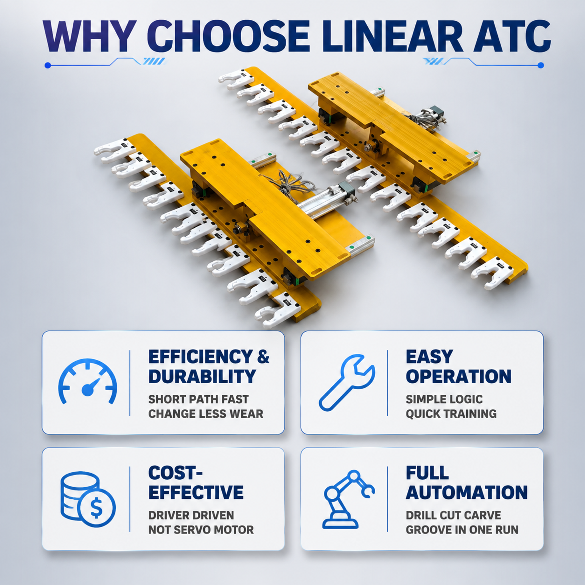
[主图-7] 核心优势总览图,效率+寿命+易用性+性价比四大优势集中展示。 [统一基调] 工业专业风,浅灰色渐变背景+科技蓝点缀色,产品金色金属质感保留,统一无衬线粗体英文字体(类似Arial Bla
用户头像

Tiny Jinan...

2026.08.15
[主图-20] 总结与采购引导图,核心卖点回顾+B2B采购信息。 [统一基调] 工业专业风,浅灰色渐变背景+科技蓝点缀色,产品金色金属质感保留,统一无衬线粗体英文字体(类似Arial Black/Montserrat Bold),标题字号大且醒目,辅助文字缩小50%以上,统一画框式构图,全套风格一致。 [画面] 画面采用总结式布局:顶部大标题区,中部左侧为产品主视觉约占45%,右侧为核心卖点回顾约占45%,底部为B2B采购信息条。右侧卖点回顾用四个图标+短句列出:1. 刀具图标+"8-16 Tools Capacity";2. 秒表图标+"<10s Fast Tool Change";3. 面积图标+"Save 40% Space";4. 性价比图标+"High Cost Performance"。底部信息条包含:"Customization Available"、"Factory Direct Supply"、"Quality Assurance"三个B2B卖点,横向排列。 [光影质感] 产品工业摄影精修质感,图标和信息条扁平化设计,整体专业且有采购引导感,适合阿里国际站B2B买家。 [配色] 背景浅灰渐变,底部信息条深蓝色底白字,图标科技蓝色,卖点文字深蓝色加粗,标题最大最醒目。 [文字版式] 顶部大标题"Linear ATC Tool Magazine",副标题"Reliable Efficient Cost-Effective",右侧四个卖点整齐排列,底部信息条三栏均分,全部无衬线粗体英文。 [输出要求] 800×800px 1:1方图,总结清晰,采购引导明确,整体专业。负向:变形、错字、模糊、中文、促销感过强、信息过载。[主图-20] 总结与采购引导图,核心卖点回顾+B2B采购信息。
[统一基调] 工业专业风,浅灰色渐变背景+科技蓝点缀色,产品金色金属质感保留,统一无衬线粗体英文字体(类似Arial Black/Montserrat Bold),标题字号大且醒目,辅助文字缩小50%以上,统一画框式构图,全套风格一致。
[画面] 画面采用总结式布局:顶部大标题区,中部左侧为产品主视觉约占45%,右侧为核心卖点回顾约占45%,底部为B2B采购信息条。右侧卖点回顾用四个图标+短句列出:1. 刀具图标+"8-16 Tools Capacity";2. 秒表图标+"<10s Fast Tool Change";3. 面积图标+"Save 40% Space";4. 性价比图标+"High Cost Performance"。底部信息条包含:"Customization Available"、"Factory Direct Supply"、"Quality Assurance"三个B2B卖点,横向排列。
[光影质感] 产品工业摄影精修质感,图标和信息条扁平化设计,整体专业且有采购引导感,适合阿里国际站B2B买家。
[配色] 背景浅灰渐变,底部信息条深蓝色底白字,图标科技蓝色,卖点文字深蓝色加粗,标题最大最醒目。
[文字版式] 顶部大标题"Linear ATC Tool Magazine",副标题"Reliable Efficient Cost-Effective",右侧四个卖点整齐排列,底部信息条三栏均分,全部无衬线粗体英文。
[输出要求] 800×800px 1:1方图,总结清晰,采购引导明确,整体专业。负向:变形、错字、模糊、中文、促销感过强、信息过载。
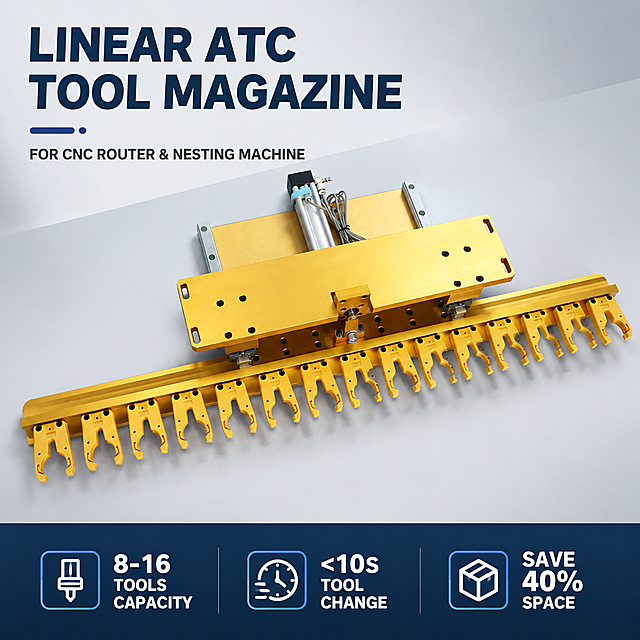
[主图-1] 首图产品主视觉,展示雕刻机直排换刀库整体外观,建立专业工业产品第一印象。 [统一基调] 工业专业风,浅灰色渐变背景+科技蓝点缀色,产品金色金属质感保留,统一无衬线粗体英文字体(类似Arial Black/Montserrat Bold),标题字号大且醒目,辅助文字缩小50%以上,统一画框式构图(产品居中+四周留白+底部信息条),全套风格一致。 [画面] 产品完整居中展示,采用45°俯视角度,主体占画面约75%,金色直排换刀库结构清晰可见,刀爪整齐排列如士兵列队,横梁、导轨、气缸等部件完整呈现。背景为浅灰色渐变工业风背景,干净专业。底部有一条深蓝色信息条。 [光影质感] 商业工业摄影质感,主光从左上方45°照射,金属表面有清晰高光反射,刀爪塑料部分有柔和漫反射,底部有自然接触阴影,立体感强,产品精修无灰尘划痕。 [配色] 背景浅灰渐变(#F0F2F5到#E0E4E8),标题字深蓝色(#1A3A5C),辅助文字深灰色(#333333),强调色科技蓝(#2E86DE),信息条深蓝色(#0F2C4A)配白色文字。 [文字版式] 顶部左侧大标题"Linear ATC Tool Magazine",副标题"For CNC Router & Nesting Machine",底部信息条左侧"8-16 Tools Capacity",中间"<10s Tool Change",右侧"Save 40% Space",全部大写无衬线粗体,文字清晰不遮挡产品。 [输出要求] 800×800px 1:1方图,产品清晰锐利,文字清晰可读,整体专业工业风。负向:变形、错字、模糊、杂乱背景、水印、中文文字、装饰边框、悬浮感。[主图-1] 首图产品主视觉,展示雕刻机直排换刀库整体外观,建立专业工业产品第一印象。
[统一基调] 工业专业风,浅灰色渐变背景+科技蓝点缀色,产品金色金属质感保留,统一无衬线粗体英文字体(类似Arial Black/Montserrat Bold),标题字号大且醒目,辅助文字缩小50%以上,统一画框式构图(产品居中+四周留白+底部信息条),全套风格一致。
[画面] 产品完整居中展示,采用45°俯视角度,主体占画面约75%,金色直排换刀库结构清晰可见,刀爪整齐排列如士兵列队,横梁、导轨、气缸等部件完整呈现。背景为浅灰色渐变工业风背景,干净专业。底部有一条深蓝色信息条。
[光影质感] 商业工业摄影质感,主光从左上方45°照射,金属表面有清晰高光反射,刀爪塑料部分有柔和漫反射,底部有自然接触阴影,立体感强,产品精修无灰尘划痕。
[配色] 背景浅灰渐变(#F0F2F5到#E0E4E8),标题字深蓝色(#1A3A5C),辅助文字深灰色(#333333),强调色科技蓝(#2E86DE),信息条深蓝色(#0F2C4A)配白色文字。
[文字版式] 顶部左侧大标题"Linear ATC Tool Magazine",副标题"For CNC Router & Nesting Machine",底部信息条左侧"8-16 Tools Capacity",中间"<10s Tool Change",右侧"Save 40% Space",全部大写无衬线粗体,文字清晰不遮挡产品。
[输出要求] 800×800px 1:1方图,产品清晰锐利,文字清晰可读,整体专业工业风。负向:变形、错字、模糊、杂乱背景、水印、中文文字、装饰边框、悬浮感。
[主图-3] 关键参数总览图,集中展示刀库容量、换刀速度、空间占用三大核心参数。 [统一基调] 工业专业风,浅灰色渐变背景+科技蓝点缀色,产品金色金属质感保留,统一无衬线粗体英文字体(类似Arial Black/Montserrat Bold),标题字号大且醒目,辅助文字缩小50%以上,统一画框式构图,全套风格一致。 [画面] 画面采用上下结构:上部约40%为产品俯视角展示,主体占上部70%;下部约60%为三个大参数卡片横向排列。每个参数卡片为圆角矩形,带浅蓝底色和深蓝色标题。卡片1:大数字"8-16"+文字"Tools Capacity"+小图标(刀具图标);卡片2:大数字"<10s"+文字"Tool Change Speed"+小图标(秒表图标);卡片3:大数字"40%"+文字"Space Saving vs Disc Type"+小图标(面积对比图标)。 [光影质感] 产品部分保持工业摄影精修质感,参数卡片为扁平化设计但有轻微阴影增加层次,整体干净专业。 [配色] 背景浅灰渐变,参数卡片背景浅蓝色(#E8F4FD),卡片标题深蓝色,大数字科技蓝色加粗,图标深蓝色线条。 [文字版式] 顶部大标题"Key Specifications",三个参数卡片内大数字字号最大最醒目,说明文字在数字下方,全部无衬线粗体,英文大写。 [输出要求] 800×800px 1:1方图,参数清晰易读,产品与信息区层次分明。负向:变形、错字、模糊、中文、信息杂乱、卡片风格不统一。[主图-3] 关键参数总览图,集中展示刀库容量、换刀速度、空间占用三大核心参数。
[统一基调] 工业专业风,浅灰色渐变背景+科技蓝点缀色,产品金色金属质感保留,统一无衬线粗体英文字体(类似Arial Black/Montserrat Bold),标题字号大且醒目,辅助文字缩小50%以上,统一画框式构图,全套风格一致。
[画面] 画面采用上下结构:上部约40%为产品俯视角展示,主体占上部70%;下部约60%为三个大参数卡片横向排列。每个参数卡片为圆角矩形,带浅蓝底色和深蓝色标题。卡片1:大数字"8-16"+文字"Tools Capacity"+小图标(刀具图标);卡片2:大数字"<10s"+文字"Tool Change Speed"+小图标(秒表图标);卡片3:大数字"40%"+文字"Space Saving vs Disc Type"+小图标(面积对比图标)。
[光影质感] 产品部分保持工业摄影精修质感,参数卡片为扁平化设计但有轻微阴影增加层次,整体干净专业。
[配色] 背景浅灰渐变,参数卡片背景浅蓝色(#E8F4FD),卡片标题深蓝色,大数字科技蓝色加粗,图标深蓝色线条。
[文字版式] 顶部大标题"Key Specifications",三个参数卡片内大数字字号最大最醒目,说明文字在数字下方,全部无衬线粗体,英文大写。
[输出要求] 800×800px 1:1方图,参数清晰易读,产品与信息区层次分明。负向:变形、错字、模糊、中文、信息杂乱、卡片风格不统一。
[主图-9] 自动化多工序能力图,展示钻孔/开料/雕刻/开槽多工序连续作业能力。 [统一基调] 工业专业风,浅灰色渐变背景+科技蓝点缀色,产品金色金属质感保留,统一无衬线粗体英文字体(类似Arial Black/Montserrat Bold),标题字号大且醒目,辅助文字缩小50%以上,统一画框式构图,全套风格一致。 [画面] 画面采用上下结构:上部约35%为产品主视觉;下部约65%为四个工序图标横向排列,每个图标上方是工序示意图标,下方是工序名称。四个工序分别是:1. 钻孔图标+"Drilling";2. 开料/切割图标+"Cutting & Nesting";3. 雕刻图标+"Engraving";4. 开槽图标+"Grooving"。图标之间用箭头连接表示连续作业流程,底部标注"One Machine Multi-Process No Manual Tool Change"。 [光影质感] 产品工业摄影精修质感,工序图标为扁平化矢量风格,箭头有流动感光效,整体体现自动化连续作业的流畅感。 [配色] 背景浅灰渐变,工序图标科技蓝色,箭头渐变蓝色,工序名称深蓝色加粗,底部说明条深蓝色底白字。 [文字版式] 顶部大标题"Multi-Process Automation",副标题"Complete Multiple Operations in One Run",四个工序名称统一字号,底部说明条文字醒目,全部无衬线粗体英文。 [输出要求] 800×800px 1:1方图,工序表达清晰,流程感强。负向:变形、错字、模糊、中文、图标风格不统一、箭头过多杂乱。[主图-9] 自动化多工序能力图,展示钻孔/开料/雕刻/开槽多工序连续作业能力。
[统一基调] 工业专业风,浅灰色渐变背景+科技蓝点缀色,产品金色金属质感保留,统一无衬线粗体英文字体(类似Arial Black/Montserrat Bold),标题字号大且醒目,辅助文字缩小50%以上,统一画框式构图,全套风格一致。
[画面] 画面采用上下结构:上部约35%为产品主视觉;下部约65%为四个工序图标横向排列,每个图标上方是工序示意图标,下方是工序名称。四个工序分别是:1. 钻孔图标+"Drilling";2. 开料/切割图标+"Cutting & Nesting";3. 雕刻图标+"Engraving";4. 开槽图标+"Grooving"。图标之间用箭头连接表示连续作业流程,底部标注"One Machine Multi-Process No Manual Tool Change"。
[光影质感] 产品工业摄影精修质感,工序图标为扁平化矢量风格,箭头有流动感光效,整体体现自动化连续作业的流畅感。
[配色] 背景浅灰渐变,工序图标科技蓝色,箭头渐变蓝色,工序名称深蓝色加粗,底部说明条深蓝色底白字。
[文字版式] 顶部大标题"Multi-Process Automation",副标题"Complete Multiple Operations in One Run",四个工序名称统一字号,底部说明条文字醒目,全部无衬线粗体英文。
[输出要求] 800×800px 1:1方图,工序表达清晰,流程感强。负向:变形、错字、模糊、中文、图标风格不统一、箭头过多杂乱。
[主图-5] 换刀速度与效率优势图,展示直排式换刀路径短、速度快的核心优势。 [统一基调] 工业专业风,浅灰色渐变背景+科技蓝点缀色,产品金色金属质感保留,统一无衬线粗体英文字体(类似Arial Black/Montserrat Bold),标题字号大且醒目,辅助文字缩小50%以上,统一画框式构图,全套风格一致。 [画面] 画面左侧为产品侧视图约占45%,右侧为效率说明区约占55%。用动态箭头示意换刀路径:从主轴位置到刀爪位置的短距离直线箭头,标注"Short Tool Change Path"。右侧配三个效率卖点图标加文字:1. 闪电图标+"Fast Tool Change <10s";2. 齿轮图标+"Simple Mechanism Less Wear";3. 时钟图标+"Higher Productivity"。底部有一条对比条:直排式路径短vs圆盘式需旋转找刀的示意对比。 [光影质感] 产品工业摄影精修质感,箭头和图标为扁平化矢量风格,有轻微科技感光效增加动感,整体专业且有科技感。 [配色] 背景浅灰渐变,箭头和强调元素用科技蓝色,图标深蓝色,卖点文字深灰色,标题深蓝色加粗。 [文字版式] 顶部大标题"Fast Tool Change Efficiency",副标题"Short Path Direct Action Design",三个卖点各带图标和英文说明,字体统一无衬线粗体。 [输出要求] 800×800px 1:1方图,效率卖点清晰,动效示意不杂乱。负向:变形、错字、模糊、中文、过度装饰、信息过载。[主图-5] 换刀速度与效率优势图,展示直排式换刀路径短、速度快的核心优势。
[统一基调] 工业专业风,浅灰色渐变背景+科技蓝点缀色,产品金色金属质感保留,统一无衬线粗体英文字体(类似Arial Black/Montserrat Bold),标题字号大且醒目,辅助文字缩小50%以上,统一画框式构图,全套风格一致。
[画面] 画面左侧为产品侧视图约占45%,右侧为效率说明区约占55%。用动态箭头示意换刀路径:从主轴位置到刀爪位置的短距离直线箭头,标注"Short Tool Change Path"。右侧配三个效率卖点图标加文字:1. 闪电图标+"Fast Tool Change <10s";2. 齿轮图标+"Simple Mechanism Less Wear";3. 时钟图标+"Higher Productivity"。底部有一条对比条:直排式路径短vs圆盘式需旋转找刀的示意对比。
[光影质感] 产品工业摄影精修质感,箭头和图标为扁平化矢量风格,有轻微科技感光效增加动感,整体专业且有科技感。
[配色] 背景浅灰渐变,箭头和强调元素用科技蓝色,图标深蓝色,卖点文字深灰色,标题深蓝色加粗。
[文字版式] 顶部大标题"Fast Tool Change Efficiency",副标题"Short Path Direct Action Design",三个卖点各带图标和英文说明,字体统一无衬线粗体。
[输出要求] 800×800px 1:1方图,效率卖点清晰,动效示意不杂乱。负向:变形、错字、模糊、中文、过度装饰、信息过载。
[主图-18] 安装方式与适配机型图,展示刀库安装在机床横梁下方的结构与适配机型。 [统一基调] 工业专业风,浅灰色渐变背景+科技蓝点缀色,产品金色金属质感保留,统一无衬线粗体英文字体(类似Arial Black/Montserrat Bold),标题字号大且醒目,辅助文字缩小50%以上,统一画框式构图,全套风格一致。 [画面] 画面采用安装示意图形式:上方用简化的机床横梁示意图+刀库安装位置示意,用箭头标注"Mounted Under Machine Beam",配文字"Moves Synchronously with Spindle"。下方左侧为产品实物图约占40%,右侧为适配机型列表约占50%,列出三种适配机型:1. CNC Router(木工雕刻机);2. Nesting Machine(开料机);3. CNC Engraving Machine(数控雕刻机)。每个机型配小图标。 [光影质感] 产品实物图工业摄影精修质感,机床横梁示意图为简洁的工业线稿风格,半透明蓝色填充,整体虚实结合。 [配色] 背景浅灰渐变,安装示意图线条科技蓝色,适配机型图标深蓝色,标题深蓝色,说明文字深灰色。 [文字版式] 顶部大标题"Installation & Compatibility",副标题"Mounted Under Machine Crossbeam",适配机型列表文字清晰,全部无衬线粗体英文。 [输出要求] 800×800px 1:1方图,安装方式表达清晰,适配机型明确。负向:变形、错字、模糊、中文、机床示意图过于复杂、布局混乱。[主图-18] 安装方式与适配机型图,展示刀库安装在机床横梁下方的结构与适配机型。
[统一基调] 工业专业风,浅灰色渐变背景+科技蓝点缀色,产品金色金属质感保留,统一无衬线粗体英文字体(类似Arial Black/Montserrat Bold),标题字号大且醒目,辅助文字缩小50%以上,统一画框式构图,全套风格一致。
[画面] 画面采用安装示意图形式:上方用简化的机床横梁示意图+刀库安装位置示意,用箭头标注"Mounted Under Machine Beam",配文字"Moves Synchronously with Spindle"。下方左侧为产品实物图约占40%,右侧为适配机型列表约占50%,列出三种适配机型:1. CNC Router(木工雕刻机);2. Nesting Machine(开料机);3. CNC Engraving Machine(数控雕刻机)。每个机型配小图标。
[光影质感] 产品实物图工业摄影精修质感,机床横梁示意图为简洁的工业线稿风格,半透明蓝色填充,整体虚实结合。
[配色] 背景浅灰渐变,安装示意图线条科技蓝色,适配机型图标深蓝色,标题深蓝色,说明文字深灰色。
[文字版式] 顶部大标题"Installation & Compatibility",副标题"Mounted Under Machine Crossbeam",适配机型列表文字清晰,全部无衬线粗体英文。
[输出要求] 800×800px 1:1方图,安装方式表达清晰,适配机型明确。负向:变形、错字、模糊、中文、机床示意图过于复杂、布局混乱。
[主图-17] 直排式vs圆盘式对比图(下),空间/容量/驱动/精度/防护对比。 [统一基调] 工业专业风,浅灰色渐变背景+科技蓝点缀色,产品金色金属质感保留,统一无衬线粗体英文字体(类似Arial Black/Montserrat Bold),标题字号大且醒目,辅助文字缩小50%以上,统一画框式构图,全套风格一致。 [画面] 画面延续上一张的对比表格风格,左右两列对比,保持视觉统一。左侧列"Linear Type",右侧列"Disc Type"。对比五行内容:第1行"Space Occupation" - 左"Smaller Save 40% Space",右"Larger More Space Needed";第2行"Common Capacity" - 左"8-12 Tools Up to 16",右"8 12 or More Tools";第3行"Drive Method" - 左"Driver Driven",右"Servo Motor Driven";第4行"Accuracy" - 左"Standard Machining Needs",右"Higher Precision Machining";第5行"Protection" - 左"Exposed Needs Extra Cover",右"Better Enclosed Design"。每行配对应小图标。 [光影质感] 表格扁平化设计,图标简洁线性风格,整体干净专业,与第16张对比图风格完全统一。 [配色] 背景浅灰渐变,左侧列表头科技蓝色底白字,右侧列表头灰色底白字,图标深蓝色,表格线浅灰色,重点数据用科技蓝色加粗。 [文字版式] 顶部大标题"Detailed Comparison Table",副标题"Linear ATC vs Disc Type ATC",表格内容对齐整齐,全部无衬线粗体英文。 [输出要求] 800×800px 1:1方图,对比信息完整,表格风格与上一张统一。负向:变形、错字、模糊、中文、表格风格与上一张不统一、信息过载。[主图-17] 直排式vs圆盘式对比图(下),空间/容量/驱动/精度/防护对比。
[统一基调] 工业专业风,浅灰色渐变背景+科技蓝点缀色,产品金色金属质感保留,统一无衬线粗体英文字体(类似Arial Black/Montserrat Bold),标题字号大且醒目,辅助文字缩小50%以上,统一画框式构图,全套风格一致。
[画面] 画面延续上一张的对比表格风格,左右两列对比,保持视觉统一。左侧列"Linear Type",右侧列"Disc Type"。对比五行内容:第1行"Space Occupation" - 左"Smaller Save 40% Space",右"Larger More Space Needed";第2行"Common Capacity" - 左"8-12 Tools Up to 16",右"8 12 or More Tools";第3行"Drive Method" - 左"Driver Driven",右"Servo Motor Driven";第4行"Accuracy" - 左"Standard Machining Needs",右"Higher Precision Machining";第5行"Protection" - 左"Exposed Needs Extra Cover",右"Better Enclosed Design"。每行配对应小图标。
[光影质感] 表格扁平化设计,图标简洁线性风格,整体干净专业,与第16张对比图风格完全统一。
[配色] 背景浅灰渐变,左侧列表头科技蓝色底白字,右侧列表头灰色底白字,图标深蓝色,表格线浅灰色,重点数据用科技蓝色加粗。
[文字版式] 顶部大标题"Detailed Comparison Table",副标题"Linear ATC vs Disc Type ATC",表格内容对齐整齐,全部无衬线粗体英文。
[输出要求] 800×800px 1:1方图,对比信息完整,表格风格与上一张统一。负向:变形、错字、模糊、中文、表格风格与上一张不统一、信息过载。
Redesign a premium industrial brand poster for linear guide typical applications, 950x1150 pixels, ultra HD 4K quality, photorealistic commercial photography style, completely new layout design. Background: clean light off-white and subtle cool gray gradient background with faint geometric line patterns (thin diagonal lines suggesting precision and motion). The linear guide rail product from the reference image is subtly integrated as a small decorative element in the top-right corner area, semi-transparent and naturally blended into the light background, not dominating. Completely new layout structure: - TOP SECTION (upper 25%): Main title area on the left side. Large bold main title "PRECISION IN EVERY MOTION" in dark charcoal gray uppercase sans-serif font. Below it, subtitle "Linear Guides for Advanced Automation" in medium blue-gray font. A thin accent blue line under the subtitle. - MIDDLE SECTION (middle 50%): Four high-quality photorealistic industrial equipment images arranged in a clean asymmetric grid layout - two larger images on top row, two slightly smaller images on bottom row with slight offset for visual interest. Each equipment image is a crisp, detailed, professional industrial photograph: 1. Fiber Laser Cutting Machine: close-up of laser head cutting metal sheet with bright precise laser beam and fine sparks, clean industrial workshop background 2. CNC Press Brake: modern CNC press brake machine with precision metal bending, clean metallic finish 3. Robotic Welding Cell: industrial robotic arm performing precision welding with bright concentrated weld arc, safety cell environment 4. Automatic Production Line: wide shot of fully flexible automated production line with multiple robotic stations and conveyor system, modern factory setting Each image has clean edges and a subtle thin border. Equipment photos must be accurate, realistic and professional - no distorted or incorrect machinery. - BOTTOM SECTION (bottom 25%): Four application labels aligned horizontally below their corresponding images, each with a small icon and the equipment name in clean typography. A subtle footer area with a thin blue accent line. No technical drawings or blueprints at the bottom - keep it clean and modern. Design style: minimalist high-end industrial technology aesthetic, strong design sense, sophisticated asymmetric layout, generous whitespace, professional color palette of charcoal gray, steel blue, and silver on light background, modern clean sans-serif typography, balanced composition, premium corporate feel. All text in ENGLISH ONLY - NO Chinese characters anywhere. All text must be clearly legible and precisely rendered. Equipment images must be accurate depictions of the named machines - photorealistic, detailed, professional industrial photography quality.Redesign a premium industrial brand poster for linear guide typical applications, 950x1150 pixels, ultra HD 4K quality, photorealistic commercial photography style, completely new layout design.

Background: clean light off-white and subtle cool gray gradient background with faint geometric line patterns (thin diagonal lines suggesting precision and motion). The linear guide rail product from the reference image is subtly integrated as a small decorative element in the top-right corner area, semi-transparent and naturally blended into the light background, not dominating.

Completely new layout structure:
- TOP SECTION (upper 25%): Main title area on the left side. Large bold main title "PRECISION IN EVERY MOTION" in dark charcoal gray uppercase sans-serif font. Below it, subtitle "Linear Guides for Advanced Automation" in medium blue-gray font. A thin accent blue line under the subtitle.

- MIDDLE SECTION (middle 50%): Four high-quality photorealistic industrial equipment images arranged in a clean asymmetric grid layout - two larger images on top row, two slightly smaller images on bottom row with slight offset for visual interest. Each equipment image is a crisp, detailed, professional industrial photograph:
  1. Fiber Laser Cutting Machine: close-up of laser head cutting metal sheet with bright precise laser beam and fine sparks, clean industrial workshop background
  2. CNC Press Brake: modern CNC press brake machine with precision metal bending, clean metallic finish
  3. Robotic Welding Cell: industrial robotic arm performing precision welding with bright concentrated weld arc, safety cell environment
  4. Automatic Production Line: wide shot of fully flexible automated production line with multiple robotic stations and conveyor system, modern factory setting
  Each image has clean edges and a subtle thin border. Equipment photos must be accurate, realistic and professional - no distorted or incorrect machinery.

- BOTTOM SECTION (bottom 25%): Four application labels aligned horizontally below their corresponding images, each with a small icon and the equipment name in clean typography. A subtle footer area with a thin blue accent line. No technical drawings or blueprints at the bottom - keep it clean and modern.

Design style: minimalist high-end industrial technology aesthetic, strong design sense, sophisticated asymmetric layout, generous whitespace, professional color palette of charcoal gray, steel blue, and silver on light background, modern clean sans-serif typography, balanced composition, premium corporate feel.

All text in ENGLISH ONLY - NO Chinese characters anywhere. All text must be clearly legible and precisely rendered. Equipment images must be accurate depictions of the named machines - photorealistic, detailed, professional industrial photography quality.
[主图-16] 直排式vs圆盘式对比图(上),结构与换刀速度对比。 [统一基调] 工业专业风,浅灰色渐变背景+科技蓝点缀色,产品金色金属质感保留,统一无衬线粗体英文字体(类似Arial Black/Montserrat Bold),标题字号大且醒目,辅助文字缩小50%以上,统一画框式构图,全套风格一致。 [画面] 画面为对比表格形式,左右两列对比。左侧列标题"Linear Type"配直排式产品小图;右侧列标题"Disc Type"配圆盘式简化示意图。对比三行内容:第1行"Tool Arrangement" - 左"Straight Single Row"配直线排列图标,右"Circular Rotation"配圆形转盘图标;第2行"Structure Complexity" - 左"Simpler Lower Cost"配简单线条图标,右"More Complex Higher Cost"配复杂线条图标;第3行"Tool Change Speed" - 左"Faster Shorter Path"配快速箭头图标,右"Slower Rotation Needed"配慢速旋转图标。每行有对勾/叉号或强弱指示。 [光影质感] 左侧直排式小图为真实产品精修缩略图,右侧圆盘式为简洁线框示意图,表格扁平化设计,对比清晰。 [配色] 背景浅灰渐变,左侧列表头科技蓝色底白字,右侧列表头灰色底白字,优势项用绿色对勾,劣势项用橙色圆点,表格线浅灰色。 [文字版式] 顶部大标题"Linear vs Disc Type Comparison",列表头加粗,对比内容清晰易读,全部无衬线粗体英文,表格排版整齐。 [输出要求] 800×800px 1:1方图,对比清晰,表格易读。负向:变形、错字、模糊、中文、表格过于复杂、圆盘式画得过于详细。[主图-16] 直排式vs圆盘式对比图(上),结构与换刀速度对比。
[统一基调] 工业专业风,浅灰色渐变背景+科技蓝点缀色,产品金色金属质感保留,统一无衬线粗体英文字体(类似Arial Black/Montserrat Bold),标题字号大且醒目,辅助文字缩小50%以上,统一画框式构图,全套风格一致。
[画面] 画面为对比表格形式,左右两列对比。左侧列标题"Linear Type"配直排式产品小图;右侧列标题"Disc Type"配圆盘式简化示意图。对比三行内容:第1行"Tool Arrangement" - 左"Straight Single Row"配直线排列图标,右"Circular Rotation"配圆形转盘图标;第2行"Structure Complexity" - 左"Simpler Lower Cost"配简单线条图标,右"More Complex Higher Cost"配复杂线条图标;第3行"Tool Change Speed" - 左"Faster Shorter Path"配快速箭头图标,右"Slower Rotation Needed"配慢速旋转图标。每行有对勾/叉号或强弱指示。
[光影质感] 左侧直排式小图为真实产品精修缩略图,右侧圆盘式为简洁线框示意图,表格扁平化设计,对比清晰。
[配色] 背景浅灰渐变,左侧列表头科技蓝色底白字,右侧列表头灰色底白字,优势项用绿色对勾,劣势项用橙色圆点,表格线浅灰色。
[文字版式] 顶部大标题"Linear vs Disc Type Comparison",列表头加粗,对比内容清晰易读,全部无衬线粗体英文,表格排版整齐。
[输出要求] 800×800px 1:1方图,对比清晰,表格易读。负向:变形、错字、模糊、中文、表格过于复杂、圆盘式画得过于详细。
Composite the linear guide rail product image (image2) onto the bottom of the poster (image1). CRITICAL REQUIREMENT: The linear guide product image must be placed COMPLETELY UNCHANGED - no distortion, no stretching, no morphing, no perspective change, no alteration to its shape, proportions, or details whatsoever. It must retain its exact original appearance. Instructions: 1. Keep the entire poster (image1) exactly as is - all equipment cards 01-05, all text, all images, the top title "PRECISION IN EVERY MOTION" and subtitle "Linear Guides for Advanced Automation" remain completely unchanged. 2. Place the linear guide rail product (image2, already cutout with transparent background) at the bottom area of the poster, positioned diagonally from bottom-left toward center-right, in the background layer behind the bottom empty card. 3. Reduce the opacity of the linear guide to approximately 25-30% so it blends naturally as a subtle background watermark element. 4. The linear guide must maintain its EXACT original proportions, shape, details, and angle. DO NOT distort, stretch, skew, warp, or reshape it in any way. It must look identical to the original product photo. 5. Ensure the linear guide does not cover or obscure any equipment cards, text, or important content. It sits in the bottom background area only. 6. The overall poster design, lighting, and 3D style must remain consistent and natural-looking. The linear guide is a background decorative element at the bottom - visible but soft, integrated naturally, and completely faithful to its original appearance.Composite the linear guide rail product image (image2) onto the bottom of the poster (image1). CRITICAL REQUIREMENT: The linear guide product image must be placed COMPLETELY UNCHANGED - no distortion, no stretching, no morphing, no perspective change, no alteration to its shape, proportions, or details whatsoever. It must retain its exact original appearance.

Instructions:
1. Keep the entire poster (image1) exactly as is - all equipment cards 01-05, all text, all images, the top title "PRECISION IN EVERY MOTION" and subtitle "Linear Guides for Advanced Automation" remain completely unchanged.
2. Place the linear guide rail product (image2, already cutout with transparent background) at the bottom area of the poster, positioned diagonally from bottom-left toward center-right, in the background layer behind the bottom empty card.
3. Reduce the opacity of the linear guide to approximately 25-30% so it blends naturally as a subtle background watermark element.
4. The linear guide must maintain its EXACT original proportions, shape, details, and angle. DO NOT distort, stretch, skew, warp, or reshape it in any way. It must look identical to the original product photo.
5. Ensure the linear guide does not cover or obscure any equipment cards, text, or important content. It sits in the bottom background area only.
6. The overall poster design, lighting, and 3D style must remain consistent and natural-looking.

The linear guide is a background decorative element at the bottom - visible but soft, integrated naturally, and completely faithful to its original appearance.
[商品] 使用【图6】Hydraulic Cylinder NUGP 63 液压缸侧视特写;保留黑色缸体、镀铬活塞杆、红色油口堵头、蓝色限位开关组件、安装法兰板的完整结构与材质;修复表面灰尘,增强金属加工纹理与精密感,不改变产品结构比例。 [画面] 目标:结构材质证明页,拆解关键部件展示精密工艺。构图:产品侧视居中占画面55%,四周用引线标注4个关键结构部位;阅读动线从产品向四周扩散;背景为深灰渐变,突出产品结构。 [视觉] 套系策略:风格=跨境工业极简专业商业摄影;标题字=现代无衬线粗体(英文);正文字=简洁无衬线体(英文);主色=深炭灰/金属黑;背景延展=基于深炭灰做深浅层级渐变、金属拉丝纹理与工业质感模块;强调色=工业橙红,仅用于小面积图标、引线、数据标签和重点数字;标题色=纯白;正文色=浅银灰;组件=深色半透明信息卡、细银线引线、工业风图标;光影=侧前方硬光,突出产品侧面轮廓与各部件层次。 [文字] 顶部主标题"Precision Structure Design",副标题"Every Component Built for Durability";4个引线标注分别指向:1."High Strength Steel Cylinder Body - Black Oxide Finish" 2."Hard Chrome Plated Piston Rod - Wear Resistant" 3."Built-in Limit Switch - Position Control" 4."Guide Rods - Stable Linear Motion";全部英文横排,引线清晰不遮挡关键结构。 [规格] 图片比例9:16竖版,4K分辨率,medium质量;避免变形、错字、文字过小、中文文字、纯白背景、产品结构失真、引线混乱。[商品] 使用【图6】Hydraulic Cylinder NUGP 63 液压缸侧视特写;保留黑色缸体、镀铬活塞杆、红色油口堵头、蓝色限位开关组件、安装法兰板的完整结构与材质;修复表面灰尘,增强金属加工纹理与精密感,不改变产品结构比例。
[画面] 目标:结构材质证明页,拆解关键部件展示精密工艺。构图:产品侧视居中占画面55%,四周用引线标注4个关键结构部位;阅读动线从产品向四周扩散;背景为深灰渐变,突出产品结构。
[视觉] 套系策略:风格=跨境工业极简专业商业摄影;标题字=现代无衬线粗体(英文);正文字=简洁无衬线体(英文);主色=深炭灰/金属黑;背景延展=基于深炭灰做深浅层级渐变、金属拉丝纹理与工业质感模块;强调色=工业橙红,仅用于小面积图标、引线、数据标签和重点数字;标题色=纯白;正文色=浅银灰;组件=深色半透明信息卡、细银线引线、工业风图标;光影=侧前方硬光,突出产品侧面轮廓与各部件层次。
[文字] 顶部主标题"Precision Structure Design",副标题"Every Component Built for Durability";4个引线标注分别指向:1."High Strength Steel Cylinder Body - Black Oxide Finish" 2."Hard Chrome Plated Piston Rod - Wear Resistant" 3."Built-in Limit Switch - Position Control" 4."Guide Rods - Stable Linear Motion";全部英文横排,引线清晰不遮挡关键结构。
[规格] 图片比例9:16竖版,4K分辨率,medium质量;避免变形、错字、文字过小、中文文字、纯白背景、产品结构失真、引线混乱。