
Facebook广告图,800x800方形,赛博朋克游戏支付广… - 图片创意预览

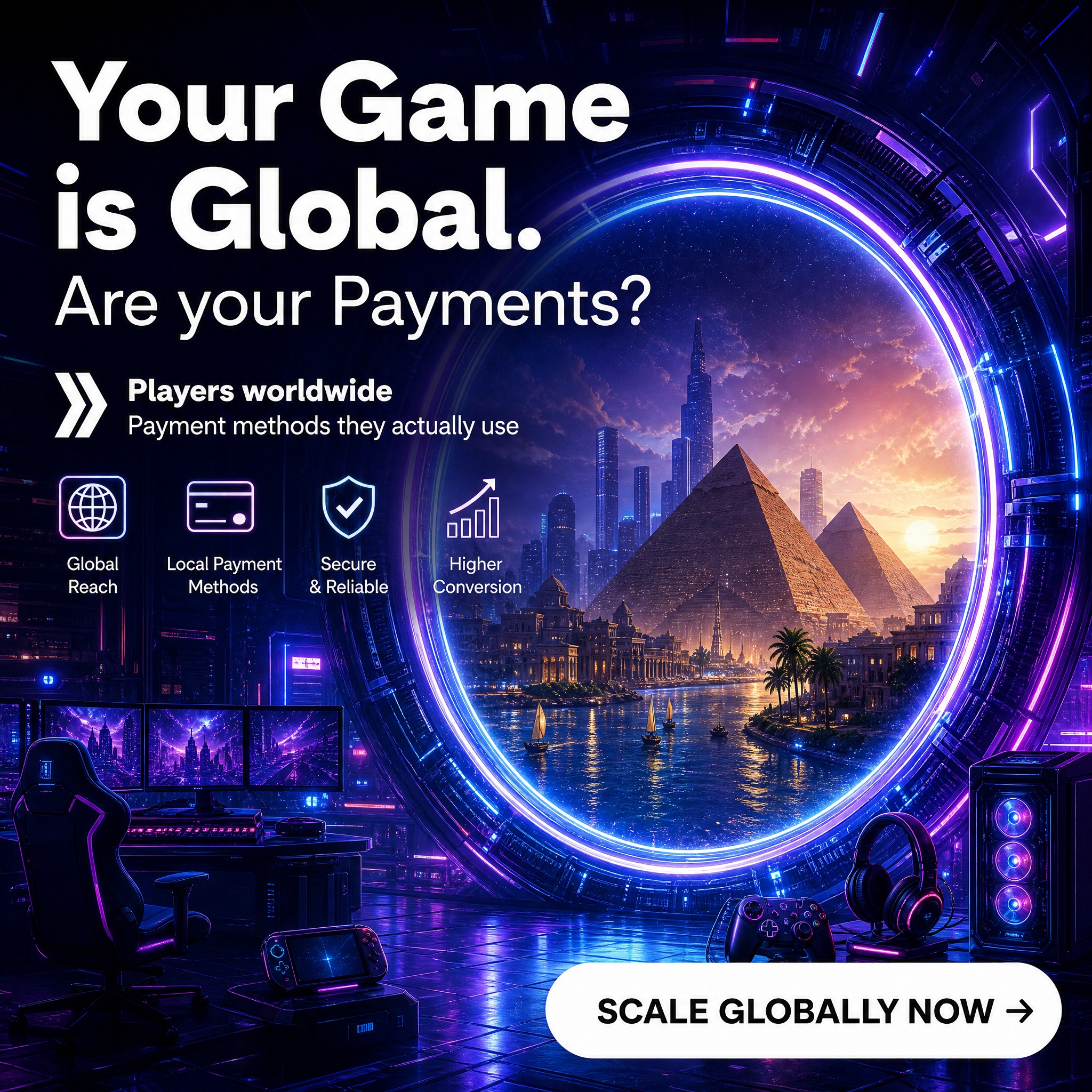
Facebook广告图,800x800方形,赛博朋克游戏支付广…

Facebook广告图,800x800方形,赛博朋克游戏支付广告。深紫色蓝色霓虹背景,画面中央是一个大型发光传送门/圆环,门内是古埃及金字塔和现代城市结合的奇幻风景,传送门有蓝紫色霓虹光效。左上角大标

用户头像

GD156413457...

2026.08.29
[商品] 使用【图1】凌云手柄 Lingyun Controller 正面主视图;保留手柄结构、浅灰磨砂材质、红色摇杆内环、祥云纹握把图案、Logo 与商品本体文字("凌云 AETHER" 字样与品牌标);将手柄自然融入玩家双手握持使用场景中,不改变产品比例与部件位置。 [画面] 页面目标:真实使用场景展示,增强代入感与可信度。构图采用场景氛围型,画面主体为一位欧美成年男性玩家坐在电竞桌前,双手握持凌云手柄专注操作,面前电脑屏幕显示游戏画面(模糊处理避免版权);桌面有键盘、鼠标、耳机等电竞设备;产品在玩家手中清晰可见,占画面约 25%;画面右侧留白放置文案;前景为桌面物品,中景为玩家与手柄,后景为电竞房间环境与屏幕暖光;阅读动线从右侧标题到中部玩家手部再到手柄细节。 [视觉] 套系策略:风格=跨境硬核科技生活摄影(参考图4/图5风格);标题字=现代无衬线粗体(英文);正文字=简洁无衬线体(英文);主色=深棕黑;背景延展=基于深棕黑做深浅层级,融入电竞房间暖色环境光与屏幕橙光;强调色=橙黄色,用于屏幕光、设备点缀和标签;标题色=纯白;正文色=浅暖灰;组件=细线圆角信息卡、极简标签;光影=屏幕暖光 + 环境弱光,手柄在手中有自然阴影和接触光,真实自然。 [文字] 右侧主标题:"Elevate Your Game",副标题:"Designed for Serious Players";下方 3 个短卖点:"Comfortable Ergonomic Grip"、"Plug and Play on All Platforms"、"Built for Long Gaming Sessions"。所有文字横向排版,不遮挡人物与手柄。 [规格] 亚马逊高级A+(电脑端)61:25 横版比例,2K 分辨率,英文文案;负向提示:避免亚洲面孔、中文文案、白底、产品变形、手柄握持姿势不符合人体工学、屏幕出现具体游戏 IP 画面、人物面部过于清晰抢镜、冷蓝主调。[商品] 使用【图1】凌云手柄 Lingyun Controller 正面主视图;保留手柄结构、浅灰磨砂材质、红色摇杆内环、祥云纹握把图案、Logo 与商品本体文字("凌云 AETHER" 字样与品牌标);将手柄自然融入玩家双手握持使用场景中,不改变产品比例与部件位置。
[画面] 页面目标:真实使用场景展示,增强代入感与可信度。构图采用场景氛围型,画面主体为一位欧美成年男性玩家坐在电竞桌前,双手握持凌云手柄专注操作,面前电脑屏幕显示游戏画面(模糊处理避免版权);桌面有键盘、鼠标、耳机等电竞设备;产品在玩家手中清晰可见,占画面约 25%;画面右侧留白放置文案;前景为桌面物品,中景为玩家与手柄,后景为电竞房间环境与屏幕暖光;阅读动线从右侧标题到中部玩家手部再到手柄细节。
[视觉] 套系策略:风格=跨境硬核科技生活摄影(参考图4/图5风格);标题字=现代无衬线粗体(英文);正文字=简洁无衬线体(英文);主色=深棕黑;背景延展=基于深棕黑做深浅层级,融入电竞房间暖色环境光与屏幕橙光;强调色=橙黄色,用于屏幕光、设备点缀和标签;标题色=纯白;正文色=浅暖灰;组件=细线圆角信息卡、极简标签;光影=屏幕暖光 + 环境弱光,手柄在手中有自然阴影和接触光,真实自然。
[文字] 右侧主标题:"Elevate Your Game",副标题:"Designed for Serious Players";下方 3 个短卖点:"Comfortable Ergonomic Grip"、"Plug and Play on All Platforms"、"Built for Long Gaming Sessions"。所有文字横向排版,不遮挡人物与手柄。
[规格] 亚马逊高级A+(电脑端)61:25 横版比例,2K 分辨率,英文文案;负向提示:避免亚洲面孔、中文文案、白底、产品变形、手柄握持姿势不符合人体工学、屏幕出现具体游戏 IP 画面、人物面部过于清晰抢镜、冷蓝主调。
[商品] 使用【图1】凌云手柄 Lingyun Controller 正面主视图;保留手柄结构、浅灰磨砂材质、红色摇杆内环、祥云纹握把图案、Logo 与商品本体文字("凌云 AETHER" 字样与品牌标);将手柄自然融入玩家双手握持使用场景中,不改变产品比例与部件位置。 [画面] 页面目标:真实使用场景展示,增强代入感与可信度。构图采用场景氛围型,画面主体为一位欧美成年男性玩家坐在电竞桌前,双手握持凌云手柄专注操作,面前电脑屏幕显示游戏画面(模糊处理避免版权);桌面有键盘、鼠标、耳机等电竞设备;产品在玩家手中清晰可见,占画面约 20%;画面上方留白放置标题文案;前景为桌面物品,中景为玩家与手柄,后景为电竞房间环境与屏幕暖光;阅读动线从顶部标题到中部玩家手部再到手柄细节。 [视觉] 套系策略:风格=跨境硬核科技生活摄影(参考图4/图5风格);标题字=现代无衬线粗体(英文);正文字=简洁无衬线体(英文);主色=深棕黑;背景延展=基于深棕黑做深浅层级,融入电竞房间暖色环境光与屏幕橙光;强调色=橙黄色,用于屏幕光、设备点缀和标签;标题色=纯白;正文色=浅暖灰;组件=细线圆角信息卡、极简标签;光影=屏幕暖光 + 环境弱光,手柄在手中有自然阴影和接触光,真实自然。 [文字] 顶部主标题:"Elevate Your Game",副标题:"Designed for Serious Players";下方 3 个短卖点:"Comfortable Ergonomic Grip"、"Plug and Play on All Platforms"、"Built for Long Gaming Sessions"。所有文字横向排版,不遮挡人物与手柄。 [规格] 亚马逊高级A+(移动端)4:3 比例,2K 分辨率,英文文案;负向提示:避免亚洲面孔、中文文案、白底、产品变形、手柄握持姿势不符合人体工学、屏幕出现具体游戏 IP 画面、人物面部过于清晰抢镜、冷蓝主调。[商品] 使用【图1】凌云手柄 Lingyun Controller 正面主视图;保留手柄结构、浅灰磨砂材质、红色摇杆内环、祥云纹握把图案、Logo 与商品本体文字("凌云 AETHER" 字样与品牌标);将手柄自然融入玩家双手握持使用场景中,不改变产品比例与部件位置。
[画面] 页面目标:真实使用场景展示,增强代入感与可信度。构图采用场景氛围型,画面主体为一位欧美成年男性玩家坐在电竞桌前,双手握持凌云手柄专注操作,面前电脑屏幕显示游戏画面(模糊处理避免版权);桌面有键盘、鼠标、耳机等电竞设备;产品在玩家手中清晰可见,占画面约 20%;画面上方留白放置标题文案;前景为桌面物品,中景为玩家与手柄,后景为电竞房间环境与屏幕暖光;阅读动线从顶部标题到中部玩家手部再到手柄细节。
[视觉] 套系策略:风格=跨境硬核科技生活摄影(参考图4/图5风格);标题字=现代无衬线粗体(英文);正文字=简洁无衬线体(英文);主色=深棕黑;背景延展=基于深棕黑做深浅层级,融入电竞房间暖色环境光与屏幕橙光;强调色=橙黄色,用于屏幕光、设备点缀和标签;标题色=纯白;正文色=浅暖灰;组件=细线圆角信息卡、极简标签;光影=屏幕暖光 + 环境弱光,手柄在手中有自然阴影和接触光,真实自然。
[文字] 顶部主标题:"Elevate Your Game",副标题:"Designed for Serious Players";下方 3 个短卖点:"Comfortable Ergonomic Grip"、"Plug and Play on All Platforms"、"Built for Long Gaming Sessions"。所有文字横向排版,不遮挡人物与手柄。
[规格] 亚马逊高级A+(移动端)4:3 比例,2K 分辨率,英文文案;负向提示:避免亚洲面孔、中文文案、白底、产品变形、手柄握持姿势不符合人体工学、屏幕出现具体游戏 IP 画面、人物面部过于清晰抢镜、冷蓝主调。
[商品] 使用【图1】凌云手柄 Lingyun Controller 正面主视图;保留手柄结构、颜色材质、Logo 与商品本体文字;将手柄自然融入玩家双手握持使用场景中,不改变产品比例与部件位置。 [画面] 页面目标:真实使用场景展示,增强代入感与可信度。构图采用场景氛围型,画面主体为一位欧美成年男性玩家坐在电竞桌前,双手握持凌云手柄专注操作,面前电脑屏幕显示游戏画面(模糊处理避免版权);桌面有 RGB 键盘、鼠标、耳机等电竞设备;产品在玩家手中清晰可见,占画面约 25%;画面右侧留白放置文案;前景为桌面物品,中景为玩家与手柄,后景为电竞房间环境与屏幕光;阅读动线从右侧标题到中部玩家手部再到手柄细节。 [视觉] 套系策略:风格=跨境极简高级科技生活摄影;标题字=现代无衬线粗体(英文);正文字=简洁无衬线体(英文);主色=深空炭黑;背景延展=基于深空炭黑做深浅层级,融入电竞房间冷色环境光与屏幕蓝光;强调色=电光蓝,用于屏幕光、设备 RGB 点缀和标签;标题色=纯白;正文色=浅冷灰;组件=细线圆角信息卡、极简标签;光影=屏幕冷光 + 环境弱光,手柄在手中有自然阴影和接触光,真实自然。 [文字] 右侧主标题:"Elevate Your Game",副标题:"Designed for Serious Players";下方 3 个短卖点:"Comfortable Ergonomic Grip"、"Plug and Play on All Platforms"、"Built for Long Gaming Sessions"。所有文字横向排版,不遮挡人物与手柄。 [规格] 亚马逊高级A+(电脑端)61:25 横版比例,2K 分辨率,英文文案;负向提示:避免亚洲面孔、中文文案、白底、产品变形、手柄握持姿势不符合人体工学、屏幕出现具体游戏 IP 画面、人物面部过于清晰抢镜。[商品] 使用【图1】凌云手柄 Lingyun Controller 正面主视图;保留手柄结构、颜色材质、Logo 与商品本体文字;将手柄自然融入玩家双手握持使用场景中,不改变产品比例与部件位置。
[画面] 页面目标:真实使用场景展示,增强代入感与可信度。构图采用场景氛围型,画面主体为一位欧美成年男性玩家坐在电竞桌前,双手握持凌云手柄专注操作,面前电脑屏幕显示游戏画面(模糊处理避免版权);桌面有 RGB 键盘、鼠标、耳机等电竞设备;产品在玩家手中清晰可见,占画面约 25%;画面右侧留白放置文案;前景为桌面物品,中景为玩家与手柄,后景为电竞房间环境与屏幕光;阅读动线从右侧标题到中部玩家手部再到手柄细节。
[视觉] 套系策略:风格=跨境极简高级科技生活摄影;标题字=现代无衬线粗体(英文);正文字=简洁无衬线体(英文);主色=深空炭黑;背景延展=基于深空炭黑做深浅层级,融入电竞房间冷色环境光与屏幕蓝光;强调色=电光蓝,用于屏幕光、设备 RGB 点缀和标签;标题色=纯白;正文色=浅冷灰;组件=细线圆角信息卡、极简标签;光影=屏幕冷光 + 环境弱光,手柄在手中有自然阴影和接触光,真实自然。
[文字] 右侧主标题:"Elevate Your Game",副标题:"Designed for Serious Players";下方 3 个短卖点:"Comfortable Ergonomic Grip"、"Plug and Play on All Platforms"、"Built for Long Gaming Sessions"。所有文字横向排版,不遮挡人物与手柄。
[规格] 亚马逊高级A+(电脑端)61:25 横版比例,2K 分辨率,英文文案;负向提示:避免亚洲面孔、中文文案、白底、产品变形、手柄握持姿势不符合人体工学、屏幕出现具体游戏 IP 画面、人物面部过于清晰抢镜。
Complete structural redesign of an A4 vertical B2B one-pager for "Meshy 3D Agent for Game Studios". Premium overseas AI company B2B sales sheet aesthetic — like something you'd find at GDC. Clean, restrained, sophisticated. NOT a game poster or infographic template. Background: near-black dark charcoal (#0D0F12) with very subtle deep green gradient at top, NOT pure black. Minimal atmosphere, no heavy glow effects. Color system: fluorescent lime green (#A3FF00) used sparingly as accent only on key elements — total green area under 15% of page. White for primary text, light gray for secondary text. Typography: max 2 font families. Bold display sans-serif for headlines. Clean modern sans-serif (Inter/Manrope style) for body. Normal width, highly readable. Consistent left alignment throughout. Layout: 12-column grid. 6% safe margin on all sides. 40-56px spacing between major sections. 24-32px internal padding inside cards. Minimum 25% white/negative space on the page. FOUR MAIN SECTIONS ONLY (no giant section numbers): --- SECTION 1: HERO (top ~30% of page) --- 60/40 two-column layout. Left column = text, right column = visual. LEFT COLUMN (60%): - Small lime green eyebrow label: "AI 3D WORKFLOW FOR GAME PRODUCTION" (all caps, tight tracking, very small) - Main headline in large bold white, max 3 lines: "Create Game-Ready 3D Assets Through Conversation" - One short subtitle line in light gray: "Turn prompts, concept art and ideas into customizable 3D characters, props and environments in one AI-assisted workflow." - Single primary CTA button below: lime green fill, dark text: "Try Meshy 3D Agent" with small arrow icon. - Below button, a single thin line of small light gray text with three pain points separated by middle dots: "Slow iteration · Repetitive production · Disconnected workflows" RIGHT COLUMN (40%): - One large high-quality stylized 3D game character (medieval fantasy knight/ranger in green/brown leather armor) as the sole focal point. Subtle rim lighting, no glow effects. - 1-2 very small background elements only — a stone wall fragment and one wooden barrel, minimal. Clean negative space around character. - NO multiple NPCs cluttering the hero. --- SECTION 2: THREE GAME USE CASES (~32% of page) — VISUAL CORE --- Section header: small lime green label "02 / USE CASES" + bold white title "Built for Faster Game Asset Exploration". Left-aligned. Three wide horizontal visual cards stacked vertically with generous spacing between them. NO bright green glowing borders — use subtle dark rounded rectangles or no border at all. Each card has large visual area and minimal text on left side. Card 1 — NPC Variations at Scale: Left side: title in bold white "Generate NPC Variations at Scale" + one short line of light gray text "Explore multiple NPC directions from prompts or references, with consistent art style." Right side (70% of card width): visual of 1 character portrait → simple lime green arrow → 4 distinct NPC character designs lined up. Clean presentation. Internal padding ~28px. Card 2 — Multiple Character Skins: Left side: title "Create Multiple Skins for One Character" + one short line "Generate alternative outfits, materials and visual styles from a single concept." Right side: visual of 1 base character at center → 4 different armor/skin variants around it. Clean layout. Card 3 — Props and Environments: Left side: title "Build Props and Environments" + one short line "Turn briefs and reference images into reusable scene props and environment assets." Right side: visual of a small concept/reference image → arrow → medieval buildings, props, and a small village scene. --- SECTION 3: FROM IDEA TO PIPELINE (~14% of page) --- Section header: small lime green label "03 / WORKFLOW" + bold white title "From Idea to Production Pipeline". Left-aligned. A single clean horizontal workflow line across the full width. NO giant circular icons. Four small steps evenly spaced, connected by thin light gray horizontal lines with tiny lime green arrowheads: Each step = small lime green number (01, 02, 03, 04) + thin line icon above + step name in bold white + one very short description in small light gray below: - 01 / Describe or Upload — "Text, sketch or concept image" - 02 / Generate — "Characters, props and variations" - 03 / Refine — "Geometry, textures and style" - 04 / Export and Integrate — "Into your game pipeline" Below workflow line: a single row of 5 lightweight capability tags — NO heavy borders, NO big cards. Just small text labels with tiny icons, separated by thin dividers or spaced out: "Text to 3D" "Image to 3D" "AI Texturing" "Smart Topology" "Rigging & Animation" Light gray text, small size. Lime green only on the tiny icons. --- SECTION 4: BUSINESS VALUE AND FINAL CTA (~20% of page) --- Split into two parts: value points on left 60%, CTA block on right 40%. LEFT — Business Value: Section header: small lime green label "04 / VALUE" + bold white title "Explore More Before Full Production". Four clean borderless data points arranged in 2x2 grid. NO cards, NO borders, NO backgrounds. Just icon + title + short phrase, left-aligned: - Faster Validation — "Test visual directions earlier." - More Variations — "Explore more design directions." - Less Repetitive Work — "Cut down on manual iteration." - Flexible Integration — "Fits into existing pipelines." Each point has a small lime green line icon, bold white title, and one short light gray phrase. Clean and minimal. RIGHT — Final CTA Block: Dark rounded rectangle (subtle, almost same as background, just slightly lighter) with generous padding. Inside, centered: - Bold white headline: "Turn Your Next Idea into a 3D Asset" - QR placeholder square (solid dark with "QR" label inside, no actual QR pattern) — medium size - Below QR: "Scan to Explore Meshy" in small white text - Two text links below in small text: "meshy.ai" (lime green) and "Contact Sales" (underlined white) --- FOOTER (bottom ~4% of page) --- Very small light gray text, centered: "Portfolio Concept — Not an Official Meshy Publication" --- OVERALL DESIGN RULES --- - Remove 90% of glow effects and stroke borders - Generous negative space — at least 25% of page is empty/background - All major content left-aligned (except CTA block and footer) - Clean 12-column grid feel - Restrained, premium, professional B2B tech aesthetic - Green used only for: eyebrow labels, CTA button, small icons, arrows, key highlights - No giant numbers taking up columns - No heavy card borders with glow - No cluttered infographic feel - Think: Stripe / Linear / Midjourney enterprise sales sheet — minimal, confident, lots of space A4 vertical, 2:3 ratio. High quality 3D character renders, stylized game art style, consistent quality across all visuals.Complete structural redesign of an A4 vertical B2B one-pager for "Meshy 3D Agent for Game Studios". Premium overseas AI company B2B sales sheet aesthetic — like something you'd find at GDC. Clean, restrained, sophisticated. NOT a game poster or infographic template.

Background: near-black dark charcoal (#0D0F12) with very subtle deep green gradient at top, NOT pure black. Minimal atmosphere, no heavy glow effects.

Color system: fluorescent lime green (#A3FF00) used sparingly as accent only on key elements — total green area under 15% of page. White for primary text, light gray for secondary text.

Typography: max 2 font families. Bold display sans-serif for headlines. Clean modern sans-serif (Inter/Manrope style) for body. Normal width, highly readable. Consistent left alignment throughout.

Layout: 12-column grid. 6% safe margin on all sides. 40-56px spacing between major sections. 24-32px internal padding inside cards. Minimum 25% white/negative space on the page.

FOUR MAIN SECTIONS ONLY (no giant section numbers):

--- SECTION 1: HERO (top ~30% of page) ---
60/40 two-column layout. Left column = text, right column = visual.

LEFT COLUMN (60%):
- Small lime green eyebrow label: "AI 3D WORKFLOW FOR GAME PRODUCTION" (all caps, tight tracking, very small)
- Main headline in large bold white, max 3 lines: "Create Game-Ready 3D Assets Through Conversation"
- One short subtitle line in light gray: "Turn prompts, concept art and ideas into customizable 3D characters, props and environments in one AI-assisted workflow."
- Single primary CTA button below: lime green fill, dark text: "Try Meshy 3D Agent" with small arrow icon.
- Below button, a single thin line of small light gray text with three pain points separated by middle dots: "Slow iteration · Repetitive production · Disconnected workflows"

RIGHT COLUMN (40%):
- One large high-quality stylized 3D game character (medieval fantasy knight/ranger in green/brown leather armor) as the sole focal point. Subtle rim lighting, no glow effects.
- 1-2 very small background elements only — a stone wall fragment and one wooden barrel, minimal. Clean negative space around character.
- NO multiple NPCs cluttering the hero.

--- SECTION 2: THREE GAME USE CASES (~32% of page) — VISUAL CORE ---
Section header: small lime green label "02 / USE CASES" + bold white title "Built for Faster Game Asset Exploration". Left-aligned.

Three wide horizontal visual cards stacked vertically with generous spacing between them. NO bright green glowing borders — use subtle dark rounded rectangles or no border at all. Each card has large visual area and minimal text on left side.

Card 1 — NPC Variations at Scale:
Left side: title in bold white "Generate NPC Variations at Scale" + one short line of light gray text "Explore multiple NPC directions from prompts or references, with consistent art style."
Right side (70% of card width): visual of 1 character portrait → simple lime green arrow → 4 distinct NPC character designs lined up. Clean presentation.
Internal padding ~28px.

Card 2 — Multiple Character Skins:
Left side: title "Create Multiple Skins for One Character" + one short line "Generate alternative outfits, materials and visual styles from a single concept."
Right side: visual of 1 base character at center → 4 different armor/skin variants around it. Clean layout.

Card 3 — Props and Environments:
Left side: title "Build Props and Environments" + one short line "Turn briefs and reference images into reusable scene props and environment assets."
Right side: visual of a small concept/reference image → arrow → medieval buildings, props, and a small village scene.

--- SECTION 3: FROM IDEA TO PIPELINE (~14% of page) ---
Section header: small lime green label "03 / WORKFLOW" + bold white title "From Idea to Production Pipeline". Left-aligned.

A single clean horizontal workflow line across the full width. NO giant circular icons.
Four small steps evenly spaced, connected by thin light gray horizontal lines with tiny lime green arrowheads:

Each step = small lime green number (01, 02, 03, 04) + thin line icon above + step name in bold white + one very short description in small light gray below:
- 01 / Describe or Upload — "Text, sketch or concept image"
- 02 / Generate — "Characters, props and variations"
- 03 / Refine — "Geometry, textures and style"
- 04 / Export and Integrate — "Into your game pipeline"

Below workflow line: a single row of 5 lightweight capability tags — NO heavy borders, NO big cards. Just small text labels with tiny icons, separated by thin dividers or spaced out:
"Text to 3D"  "Image to 3D"  "AI Texturing"  "Smart Topology"  "Rigging & Animation"
Light gray text, small size. Lime green only on the tiny icons.

--- SECTION 4: BUSINESS VALUE AND FINAL CTA (~20% of page) ---
Split into two parts: value points on left 60%, CTA block on right 40%.

LEFT — Business Value:
Section header: small lime green label "04 / VALUE" + bold white title "Explore More Before Full Production".

Four clean borderless data points arranged in 2x2 grid. NO cards, NO borders, NO backgrounds. Just icon + title + short phrase, left-aligned:
- Faster Validation — "Test visual directions earlier."
- More Variations — "Explore more design directions."
- Less Repetitive Work — "Cut down on manual iteration."
- Flexible Integration — "Fits into existing pipelines."

Each point has a small lime green line icon, bold white title, and one short light gray phrase. Clean and minimal.

RIGHT — Final CTA Block:
Dark rounded rectangle (subtle, almost same as background, just slightly lighter) with generous padding.
Inside, centered:
- Bold white headline: "Turn Your Next Idea into a 3D Asset"
- QR placeholder square (solid dark with "QR" label inside, no actual QR pattern) — medium size
- Below QR: "Scan to Explore Meshy" in small white text
- Two text links below in small text: "meshy.ai" (lime green) and "Contact Sales" (underlined white)

--- FOOTER (bottom ~4% of page) ---
Very small light gray text, centered: "Portfolio Concept — Not an Official Meshy Publication"

--- OVERALL DESIGN RULES ---
- Remove 90% of glow effects and stroke borders
- Generous negative space — at least 25% of page is empty/background
- All major content left-aligned (except CTA block and footer)
- Clean 12-column grid feel
- Restrained, premium, professional B2B tech aesthetic
- Green used only for: eyebrow labels, CTA button, small icons, arrows, key highlights
- No giant numbers taking up columns
- No heavy card borders with glow
- No cluttered infographic feel
- Think: Stripe / Linear / Midjourney enterprise sales sheet — minimal, confident, lots of space

A4 vertical, 2:3 ratio. High quality 3D character renders, stylized game art style, consistent quality across all visuals.
[商品] 使用【图1】凌云手柄 Lingyun Controller 正面主视图;保留手柄结构、颜色材质、Logo 与商品本体文字("凌云 AETHER" 字样与品牌标);将手柄自然融入玩家双手握持使用场景中,不改变产品比例与部件位置。 [画面] 页面目标:真实使用场景展示,增强代入感与可信度。构图采用场景氛围型,画面主体为一位欧美成年男性玩家坐在电竞桌前,双手握持凌云手柄专注操作,面前电脑屏幕显示游戏画面(模糊处理避免版权);桌面有键盘、鼠标、耳机等电竞设备;产品在玩家手中清晰可见,占画面约 25%;画面右侧留白放置文案;前景为桌面物品,中景为玩家与手柄,后景为电竞房间环境与屏幕光;阅读动线从右侧标题到中部玩家手部再到手柄细节。 [视觉] 套系策略:风格=跨境极简高级科技生活摄影;标题字=现代无衬线粗体(英文);正文字=简洁无衬线体(英文);主色=深空炭黑;背景延展=基于深空炭黑做深浅层级,融入电竞房间冷色环境光与屏幕蓝光;强调色=电光蓝,用于屏幕光、设备 RGB 点缀和标签;标题色=纯白;正文色=浅冷灰;组件=细线圆角信息卡、极简标签;光影=屏幕冷光 + 环境弱光,手柄在手中有自然阴影和接触光,真实自然。 [文字] 右侧主标题:"Elevate Your Game",副标题:"Designed for Serious Players";下方 3 个短卖点:"Comfortable Ergonomic Grip"、"Plug and Play on All Platforms"、"Built for Long Gaming Sessions"。所有文字横向排版,不遮挡人物与手柄。 [规格] 亚马逊高级A+(电脑端)61:25 横版比例,2K 分辨率,英文文案;负向提示:避免亚洲面孔、中文文案、白底、产品变形、手柄握持姿势不符合人体工学、屏幕出现具体游戏 IP 画面、人物面部过于清晰抢镜。[商品] 使用【图1】凌云手柄 Lingyun Controller 正面主视图;保留手柄结构、颜色材质、Logo 与商品本体文字("凌云 AETHER" 字样与品牌标);将手柄自然融入玩家双手握持使用场景中,不改变产品比例与部件位置。
[画面] 页面目标:真实使用场景展示,增强代入感与可信度。构图采用场景氛围型,画面主体为一位欧美成年男性玩家坐在电竞桌前,双手握持凌云手柄专注操作,面前电脑屏幕显示游戏画面(模糊处理避免版权);桌面有键盘、鼠标、耳机等电竞设备;产品在玩家手中清晰可见,占画面约 25%;画面右侧留白放置文案;前景为桌面物品,中景为玩家与手柄,后景为电竞房间环境与屏幕光;阅读动线从右侧标题到中部玩家手部再到手柄细节。
[视觉] 套系策略:风格=跨境极简高级科技生活摄影;标题字=现代无衬线粗体(英文);正文字=简洁无衬线体(英文);主色=深空炭黑;背景延展=基于深空炭黑做深浅层级,融入电竞房间冷色环境光与屏幕蓝光;强调色=电光蓝,用于屏幕光、设备 RGB 点缀和标签;标题色=纯白;正文色=浅冷灰;组件=细线圆角信息卡、极简标签;光影=屏幕冷光 + 环境弱光,手柄在手中有自然阴影和接触光,真实自然。
[文字] 右侧主标题:"Elevate Your Game",副标题:"Designed for Serious Players";下方 3 个短卖点:"Comfortable Ergonomic Grip"、"Plug and Play on All Platforms"、"Built for Long Gaming Sessions"。所有文字横向排版,不遮挡人物与手柄。
[规格] 亚马逊高级A+(电脑端)61:25 横版比例,2K 分辨率,英文文案;负向提示:避免亚洲面孔、中文文案、白底、产品变形、手柄握持姿势不符合人体工学、屏幕出现具体游戏 IP 画面、人物面部过于清晰抢镜。