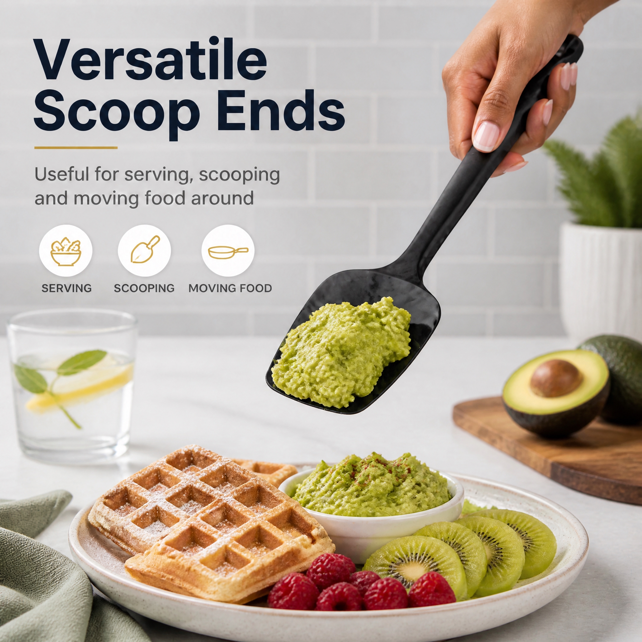

修改这张硅胶刮刀勺头主图,避免和原图完全一样:将炒鸡蛋换成牛油…
修改这张硅胶刮刀勺头主图,避免和原图完全一样:将炒鸡蛋换成牛油果泥,吐司换成华夫饼,草莓蓝莓换成猕猴桃和树莓,模特的手换成不同的手部姿态和肤色,背景换成浅灰色瓷砖墙,保留Versatile Scoop

GD899491528
2026.09.07修改这张硅胶刮刀勺头主图,避免和原图完全一样:将炒鸡蛋换成牛油果泥,吐司换成华夫饼,草莓蓝莓换成猕猴桃和树莓,模特的手换成不同的手部姿态和肤色,背景换成浅灰色瓷砖墙,保留Versatile Scoop
GD899491528
2026.09.07


![[第4屏] 功能演示屏-不粘翻炒效果展示(英文版)。氛围风格:real cooking scene, warm kitchen warm light, full of life, commercial photography. Elements layout: this screen uses【图1】as product, silicone spatula lifts a complete golden fried egg in non-stick pan, warm steam rising around, background is light wood kitchen stove, small bowl of batter aside, spatula appearance same as original image, action of spatula touching egg is natural and smooth. Light and shadow: warm yellow top light hits fried egg and spatula, soft Tyndall effect through steam, warm and appetizing. Color scheme: overall background #FFF8F0 (warm off-white); main color golden fried egg + off-white spatula + black non-stick pan; auxiliary color #FFE4B5 (warm yellow highlight) + #2C2C2C (dark gray text). Perspective: micro top-down stove view, pan and spatula occupy 70% center area, text space reserved on top left and bottom. Text layout: main title on top "Non-Stick Surface, Smooth Stir-frying" dark brown bold, left-aligned. Two selling points below "No Residue Sticking, Perfect for Frying Eggs & Pancakes", small arrow points to spatula, text do not cover cooking subject. Proportion: 9:16 vertical, 4K resolution, text clear. Negative prompt: broken fried egg, deformed spatula, steam distortion, watermark, text distortion, color deviation.](https://gd-cms.dancf.com/gd-cms/xi19e5/0/14fc46c2-1f3d-4fb2-87fe-2498e4110d0513503.png?x-oss-process=image/resize,w_640,type_6/sharpen,120/interlace,1)





![[第2屏] 痛点对比屏-护锅优势对比展示(英文版)。氛围风格:fresh comparison style, left-right split layout, soft natural light, commercial photography. Elements layout: this screen uses【图1】as product, split screen into left and right, left shows traditional metal scraper scratches non-stick pan coating, right shows this silicone spatula stirs gently in intact non-stick pan, middle split by light gray line. Silicone spatula appearance is same as original image. Background is uniform light off-white, small light gray icons at bottom. Light and shadow: uniform soft light on both sides, no hard shadows, clear contrast. Color scheme: overall background #FAF7F2 (light off-white); left side dark gray metal + damaged black pan, right side off-white silicone + intact light gray non-stick pan; auxiliary color #D4A373 (accent) + #2C2C2C (text). Perspective: front eye-level, symmetrical left-right layout, enough text space on top and bottom, reading flow from left to right. Text layout: main title on top "No More Scratches, Protect Your Pans" dark brown bold, center aligned. Left subtitle "Traditional Metal Scraper" with red cross icon, right subtitle "Soft Silicone Spatula" with green check icon. Three selling points at bottom "Works on All Cookware, Protects Coating, Extends Pan Life", text arranged clearly, not crowded. Proportion: 9:16 vertical, 4K resolution, text clear. Negative prompt: product deformation, exaggerated comparison, watermark, text distortion, wrong pan structure, color deviation.](https://gd-cms.dancf.com/gd-cms/xi19e5/0/a7d9c487-6387-42bc-a61d-47a900657b1313686.png?x-oss-process=image/resize,w_640,type_6/sharpen,120/interlace,1)
![[商品] 使用【图1】中的不锈钢土豆压泥器(折叠款为主);保留不锈钢材质、折叠结构、水滴形镂空压盘,不改变产品外形和颜色。
[画面] 页面目标:多场景应用四宫格,展示压泥器的多种用途。构图:2×2四宫格拼图,每格一个应用场景,顶部标题区。景别:中景组合。左上:土豆泥场景(金黄土豆泥+西蓝花摆盘);右上:紫薯泥场景(紫色紫薯泥+甜点装饰);左下:宝宝辅食场景(细腻米糊/南瓜泥+宝宝餐具);右下:水果泥场景(牛油果泥+吐司)。每格都有压泥器小面积入镜或作为制作工具暗示。
[视觉] 套系策略:风格=日式原木风厨房商业摄影,干净通透有生活感;标题字=思源黑体粗体;正文字=思源黑体常规体;主色=暖米白+原木浅棕;背景延展=基于暖米白做深浅层级、同色渐变和各场景厨房台面材质延展;强调色=暖橘色,仅用于场景编号、小标签;标题色=深炭灰;正文色=中暖灰;组件=圆角场景卡片、编号标签;光影=每格统一暖柔光,风格一致。
[文字] 顶部主标题"一器多用 玩转厨房",四格分别标注:"土豆泥 绵密顺滑"、"紫薯泥 香甜细腻"、"宝宝辅食 营养好吸收"、"水果泥 新鲜即食";全部文字横排。
[规格] 图片比例9:16竖版,4K,负向提示:避免变形、错字、文字过小、冷蓝/蓝灰背景、产品结构改变、四格风格不统一、绝对化用语。](https://gd-cms.dancf.com/gd-cms/xi19e5/0/dc0ba8b4-87f0-433e-8dde-385b6b6228ce15623.jpeg?x-oss-process=image/resize,w_640,type_6/sharpen,120/interlace,1)