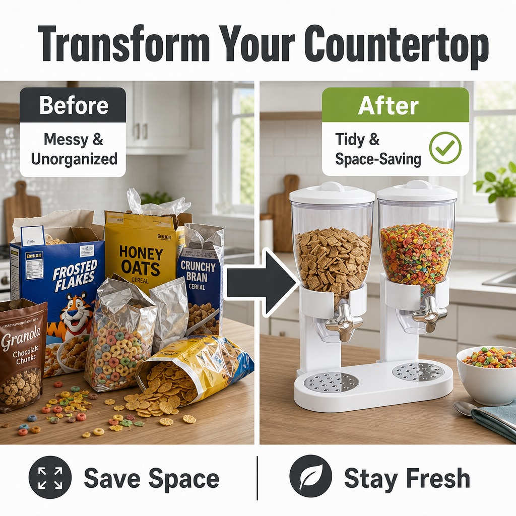

[主图-11] 收纳前后对比 杂乱vs整洁 痛点解决 [统一基… - 图片创意预览

[主图-11] 收纳前后对比 杂乱vs整洁 痛点解决 [统一基…

[主图-11] 收纳前后对比 杂乱vs整洁 痛点解决 [统一基调] 亚马逊跨境电商对比图 左右分屏构图 英文文案 无衬线粗体标题 现代简约风格 1:1正方形 [画面] 左右对比构图 左侧是Before

用户头像

1r45eznk6nL...

2026.09.21
[Main Image 2] Core selling points display of pull-out cabinet basket - Space saving. [Atmosphere Style] Home healing style, clean and practical. [Image quality] Commercial photography texture, soft and transparent light, clear and real product, clean and advanced picture. [Elements] This product is placed in the open space of the kitchen cabinet, and the comparison method is used to display: on the left is a messy kitchen countertop without an organized basket, and on the right is the same space with the cabinet basket installed, which is neatly stored. Keep the product appearance (physical structure, material texture, color) absolutely consistent with the input product image, eliminate any deformation and color difference, and process it carefully. The picture uses a two-column layout, with clear comparison, rich elements and prominent theme. The product main body accounts for about 75%. There are light-colored cabinets and solid wood countertop as the base, which is harmonious with the home style. [Light and shadow] Soft natural light, uniform light on both sides of the comparison chart, clear texture, moderate light ratio, and hierarchical shadow. [Color matching] Main color: warm gray, wood color; auxiliary color: white, soft green. [Perspective composition] Level comparison composition, the perspective is flat, which is convenient to highlight the comparison effect. [Text layout] Top center English title "Space Saving", large characters in thick dark gray, the bottom of the comparison chart is labeled "Cluttered Countertop" and "Organized Storage" respectively, the words are clear, and it conforms to Amazon's compliance specifications without adding extra marketing marks. [Scale resolution] 1:1 scale, 2k resolution, super high definition. [Negative prompt] deformation, watermark, text disorder, blurred product image, messy background[Main Image 2] Core selling points display of pull-out cabinet basket - Space saving. [Atmosphere Style] Home healing style, clean and practical. [Image quality] Commercial photography texture, soft and transparent light, clear and real product, clean and advanced picture. [Elements] This product is placed in the open space of the kitchen cabinet, and the comparison method is used to display: on the left is a messy kitchen countertop without an organized basket, and on the right is the same space with the cabinet basket installed, which is neatly stored. Keep the product appearance (physical structure, material texture, color) absolutely consistent with the input product image, eliminate any deformation and color difference, and process it carefully. The picture uses a two-column layout, with clear comparison, rich elements and prominent theme. The product main body accounts for about 75%. There are light-colored cabinets and solid wood countertop as the base, which is harmonious with the home style. [Light and shadow] Soft natural light, uniform light on both sides of the comparison chart, clear texture, moderate light ratio, and hierarchical shadow. [Color matching] Main color: warm gray, wood color; auxiliary color: white, soft green. [Perspective composition] Level comparison composition, the perspective is flat, which is convenient to highlight the comparison effect. [Text layout] Top center English title "Space Saving", large characters in thick dark gray, the bottom of the comparison chart is labeled "Cluttered Countertop" and "Organized Storage" respectively, the words are clear, and it conforms to Amazon's compliance specifications without adding extra marketing marks. [Scale resolution] 1:1 scale, 2k resolution, super high definition. [Negative prompt] deformation, watermark, text disorder, blurred product image, messy background
[第2屏] 详情页痛点对比屏,展示使用可抽拉咖啡机置物架前后对比。 [氛围/风格] 真实厨房场景对比,简约自然风格,清晰客观展示变化,商业摄影质感。 [元素布局] 画面左右对比布局,左侧展示痛点:厨房台面杂乱,咖啡机、咖啡胶囊、包装袋随意堆放,台面拥挤不堪;右侧展示使用本产品后的整洁效果:咖啡机放置在置物架上层,胶囊和包装收纳在下层抽拉篮,台面整洁有序。保持本产品结构、颜色、材质和输入产品图完全一致,左右两个区域各占画面一半,场景均为同款木质厨房台面。 [光影质感] 左右侧光影一致,均为柔和自然厨房光线,明暗清晰,产品细节保留完整。 [配色色系] 全局底色#F5F1EB(浅暖米);主体配色#FFFFFF(置物架)+ #E8C99B(木色台面);对比区保持场景原生色彩;文字#2C3038深灰。 [视角构图] 左右分屏对比,同等画幅比例,正面平视视角,让对比一目了然,左侧痛点右侧解决,符合阅读习惯。 [文字版式] 顶部分别标注左侧Before右侧After,每个单词首字母大写,深灰色无衬线字体。中间大标题Solve Countertop Clutter居中放置,字号画面宽度5%。左右分栏下方分别标注Messy Countertops和Neat Organized,每个卖点4-8字英文,清晰不遮挡主体对比画面。 [比例分辨率] 1:1正方形比例,2K分辨率,文字清晰可辨,超高清。 [负向提示词] 产品变形,结构错误,颜色偏差,文字错乱,夸大对比,水印,中文字符,违规信息,背景杂乱。[第2屏] 详情页痛点对比屏,展示使用可抽拉咖啡机置物架前后对比。
[氛围/风格] 真实厨房场景对比,简约自然风格,清晰客观展示变化,商业摄影质感。
[元素布局] 画面左右对比布局,左侧展示痛点:厨房台面杂乱,咖啡机、咖啡胶囊、包装袋随意堆放,台面拥挤不堪;右侧展示使用本产品后的整洁效果:咖啡机放置在置物架上层,胶囊和包装收纳在下层抽拉篮,台面整洁有序。保持本产品结构、颜色、材质和输入产品图完全一致,左右两个区域各占画面一半,场景均为同款木质厨房台面。
[光影质感] 左右侧光影一致,均为柔和自然厨房光线,明暗清晰,产品细节保留完整。
[配色色系] 全局底色#F5F1EB(浅暖米);主体配色#FFFFFF(置物架)+ #E8C99B(木色台面);对比区保持场景原生色彩;文字#2C3038深灰。
[视角构图] 左右分屏对比,同等画幅比例,正面平视视角,让对比一目了然,左侧痛点右侧解决,符合阅读习惯。
[文字版式] 顶部分别标注左侧Before右侧After,每个单词首字母大写,深灰色无衬线字体。中间大标题Solve Countertop Clutter居中放置,字号画面宽度5%。左右分栏下方分别标注Messy Countertops和Neat Organized,每个卖点4-8字英文,清晰不遮挡主体对比画面。
[比例分辨率] 1:1正方形比例,2K分辨率,文字清晰可辨,超高清。
[负向提示词] 产品变形,结构错误,颜色偏差,文字错乱,夸大对比,水印,中文字符,违规信息,背景杂乱。
[商品] 使用【图1】12连杯活底马芬烤盘,黑色不粘涂层,带双耳宽柄,12个圆形杯模;保留产品结构、颜色、材质、杯数和手柄造型,展示活底脱模功能,不改变产品比例与外观。 [画面] 页面目标:痛点对比,展示活底设计解决脱模难问题。构图:左右分栏对比,左侧为普通烤盘脱模失败(蛋糕破碎、粘模),右侧为活底烤盘轻松推出完整蛋糕,产品占画面50%。景别:中景。阅读动线:从中间标题向左右两侧对比阅读。前中后景:前景烤盘与蛋糕、中景操作手部、后景统一暖调厨房背景。 [视觉] 套系策略:风格=跨境极简高级商业摄影;标题字=现代无衬线粗体;正文字=简洁无衬线体;主色=炭黑+暖米杏;背景延展=基于暖米杏做深浅层级、同色渐变和细腻哑光台面质感;强调色=暖橙金,仅用于小面积图标、引线和标签;标题色=深炭灰;正文色=中暖灰;组件=圆角浅底信息卡、细线引线、对勾/叉号图标;光影=左前侧暖柔光,自然厨房自然光感。 [文字] 顶部居中主标题"Say Goodbye to Sticky Muffins",副标题"Removable Bottom for Perfect Release",左侧痛点区配文字"Stuck & Broken",右侧解决区配文字"Perfect Shape Every Time",底部3个短卖点:Push-Up Design / No Paper Liners Needed / Clean Edges。文字横向排版。 [规格] 亚马逊高级A+电脑端61:25横版,4K分辨率,避免变形、错字、文字过小、冷蓝背景、产品颜色改变、结构失真。[商品] 使用【图1】12连杯活底马芬烤盘,黑色不粘涂层,带双耳宽柄,12个圆形杯模;保留产品结构、颜色、材质、杯数和手柄造型,展示活底脱模功能,不改变产品比例与外观。
[画面] 页面目标:痛点对比,展示活底设计解决脱模难问题。构图:左右分栏对比,左侧为普通烤盘脱模失败(蛋糕破碎、粘模),右侧为活底烤盘轻松推出完整蛋糕,产品占画面50%。景别:中景。阅读动线:从中间标题向左右两侧对比阅读。前中后景:前景烤盘与蛋糕、中景操作手部、后景统一暖调厨房背景。
[视觉] 套系策略:风格=跨境极简高级商业摄影;标题字=现代无衬线粗体;正文字=简洁无衬线体;主色=炭黑+暖米杏;背景延展=基于暖米杏做深浅层级、同色渐变和细腻哑光台面质感;强调色=暖橙金,仅用于小面积图标、引线和标签;标题色=深炭灰;正文色=中暖灰;组件=圆角浅底信息卡、细线引线、对勾/叉号图标;光影=左前侧暖柔光,自然厨房自然光感。
[文字] 顶部居中主标题"Say Goodbye to Sticky Muffins",副标题"Removable Bottom for Perfect Release",左侧痛点区配文字"Stuck & Broken",右侧解决区配文字"Perfect Shape Every Time",底部3个短卖点:Push-Up Design / No Paper Liners Needed / Clean Edges。文字横向排版。
[规格] 亚马逊高级A+电脑端61:25横版,4K分辨率,避免变形、错字、文字过小、冷蓝背景、产品颜色改变、结构失真。
[商品] 使用【图1】Mr. Coffee白色5杯滴滤式咖啡机;保留产品整体结构、白色机身、透明玻璃壶、Mr. Coffee Logo;产品放置在真实场景中,外观与原图一致。 [画面] 页面目标:真实使用场景展示,体现紧凑设计适合小空间。版式:三格场景拼图横向排列,分别展示小厨房台面、公寓早餐角、办公室茶水间三个场景;每格都有咖啡机在真实环境中使用的画面,搭配欧美成人手部操作(如按按钮、倒咖啡);三格之间有细微白色分割线;整体体现省空间、多场景适用。 [视觉] 套系策略:风格=亚马逊极简高级商业摄影;标题字=现代无衬线粗体(Helvetica Neue Bold);正文字=简洁无衬线体(Helvetica Neue Regular);主色=纯净白+浅灰;背景延展=基于白色和浅暖灰做深浅层级、同色渐变和细腻哑光质感;强调色=深咖啡棕,仅用于小面积标签;标题色=深炭灰;正文色=中暖灰;组件=场景标签条、底部统一标题区;光影=每个场景自然暖光,真实生活感。 [文字] 底部通栏标题区:主标题"Perfect for Small Spaces",副标题"Compact Design Fits Anywhere – Small Kitchens, Apartments, and Offices";三个场景上方分别有小字标签:"Cozy Kitchen"、"Apartment Living"、"Office Break Room";每格场景底部有1行简短说明;所有文字横向排版,不遮挡产品主体。 [规格] 图片比例61:25横版,4K,负向提示:避免变形、错字、文字过小、产品颜色改变、亚洲面孔、中国式家居背景、场景不真实、摆拍感过重。[商品] 使用【图1】Mr. Coffee白色5杯滴滤式咖啡机;保留产品整体结构、白色机身、透明玻璃壶、Mr. Coffee Logo;产品放置在真实场景中,外观与原图一致。
[画面] 页面目标:真实使用场景展示,体现紧凑设计适合小空间。版式:三格场景拼图横向排列,分别展示小厨房台面、公寓早餐角、办公室茶水间三个场景;每格都有咖啡机在真实环境中使用的画面,搭配欧美成人手部操作(如按按钮、倒咖啡);三格之间有细微白色分割线;整体体现省空间、多场景适用。
[视觉] 套系策略:风格=亚马逊极简高级商业摄影;标题字=现代无衬线粗体(Helvetica Neue Bold);正文字=简洁无衬线体(Helvetica Neue Regular);主色=纯净白+浅灰;背景延展=基于白色和浅暖灰做深浅层级、同色渐变和细腻哑光质感;强调色=深咖啡棕,仅用于小面积标签;标题色=深炭灰;正文色=中暖灰;组件=场景标签条、底部统一标题区;光影=每个场景自然暖光,真实生活感。
[文字] 底部通栏标题区:主标题"Perfect for Small Spaces",副标题"Compact Design Fits Anywhere – Small Kitchens, Apartments, and Offices";三个场景上方分别有小字标签:"Cozy Kitchen"、"Apartment Living"、"Office Break Room";每格场景底部有1行简短说明;所有文字横向排版,不遮挡产品主体。
[规格] 图片比例61:25横版,4K,负向提示:避免变形、错字、文字过小、产品颜色改变、亚洲面孔、中国式家居背景、场景不真实、摆拍感过重。