[商品] 使用【图1】We're a Team 情侣牵手装饰画… - 图片创意预览

[商品] 使用【图1】We're a Team 情侣牵手装饰画…

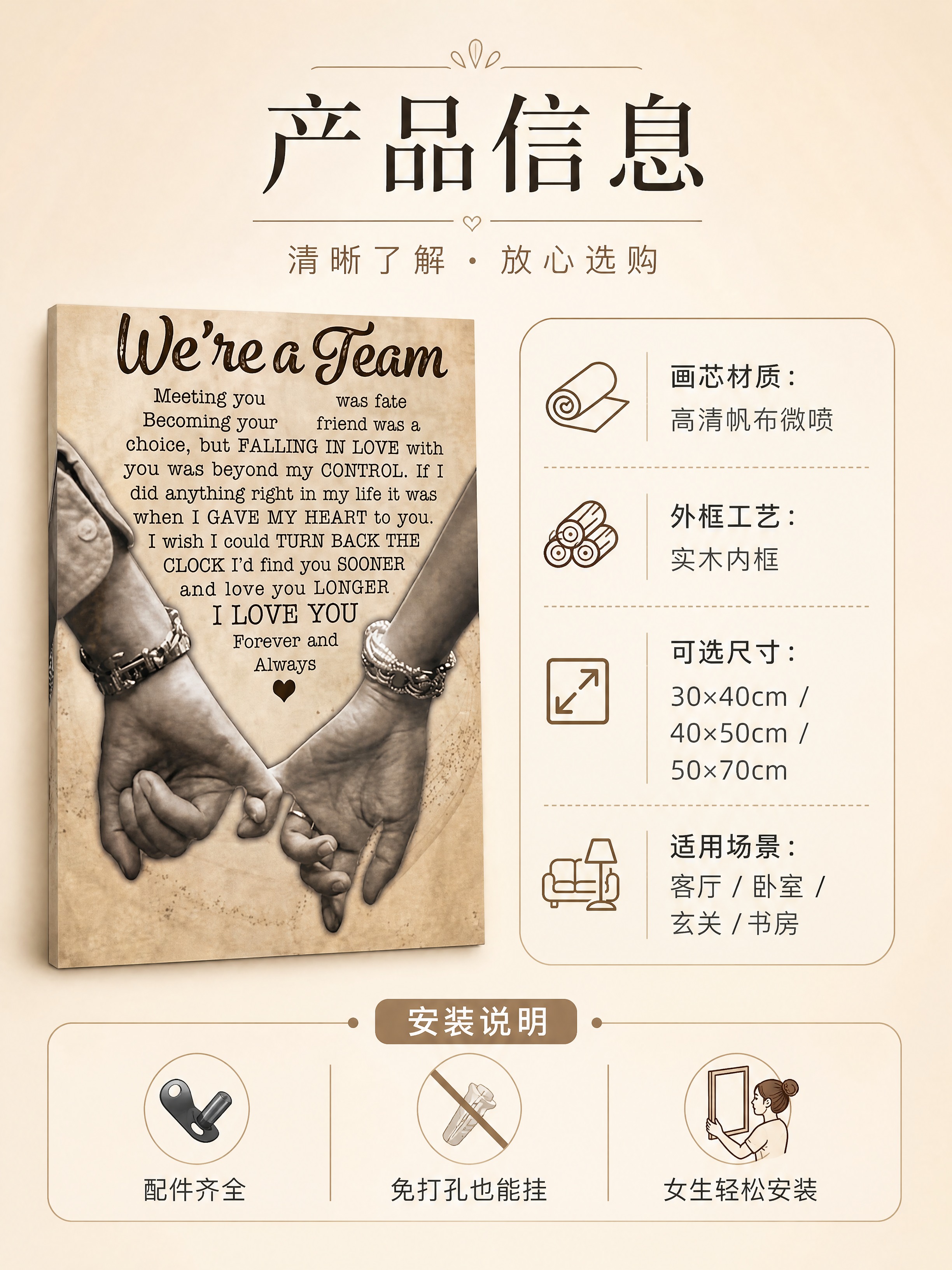
[商品] 使用【图1】We're a Team 情侣牵手装饰画;正面完整展示产品,保留全部文案、图案与材质;产品位于画面左侧,占画面40%。 [画面] 页面目标:规格信息,清晰展示尺寸、材质与安装说明

用户头像

林晚42125

2026.09.26
[商品] 使用【图1】We're a Team 情侣牵手装饰画;放大展示画芯细节:牵手手部纹理、金属手链质感、英文字体笔触、复古做旧纸纹、心形小图标;保留原图所有文字内容与图案细节,清晰化帆布织物纹理。 [画面] 页面目标:细节质感,突出工艺与材质高级感;构图:左文右图,右侧上下两个细节放大区块,上方为文字与手部特写,下方为帆布纹理与画边细节;产品细节占画面65%;景别:微距特写,45°微俯;阅读动线:左侧标题→右侧上方文字细节→右下方材质细节。 [视觉] 套系策略:风格=北欧极简复古暖调商业摄影;标题字=纤细衬线体+英文手写体组合;正文字=简洁无衬线体;主色=米杏暖棕;背景延展=基于米杏色做深浅层级、同色渐变与细腻纸张/帆布质感;强调色=深咖棕,仅用于小面积图标、引线和标签;标题色=深炭棕;正文色=中暖灰;组件=圆角浅底信息卡、细线引线标注、放大镜式细节框;光影=柔和顶侧光,突出帆布纹理凹凸感与金属手链微光。 [文字] 左侧主标题「细节里的用心」,副标题「复古工艺 · 质感看得见」;配3个细节卖点,引线指向对应位置:「高清微喷 · 文字清晰锐利」「帆布画芯 · 肌理细腻有质感」「复古做旧 · 时光沉淀的温度」;文字全部横排,不遮挡核心细节。 [规格] 图片比例3:4竖版,4K,避免变形、错字、文字模糊、冷蓝/冷灰调、纹理失真、颜色偏差。[商品] 使用【图1】We're a Team 情侣牵手装饰画;放大展示画芯细节:牵手手部纹理、金属手链质感、英文字体笔触、复古做旧纸纹、心形小图标;保留原图所有文字内容与图案细节,清晰化帆布织物纹理。
[画面] 页面目标:细节质感,突出工艺与材质高级感;构图:左文右图,右侧上下两个细节放大区块,上方为文字与手部特写,下方为帆布纹理与画边细节;产品细节占画面65%;景别:微距特写,45°微俯;阅读动线:左侧标题→右侧上方文字细节→右下方材质细节。
[视觉] 套系策略:风格=北欧极简复古暖调商业摄影;标题字=纤细衬线体+英文手写体组合;正文字=简洁无衬线体;主色=米杏暖棕;背景延展=基于米杏色做深浅层级、同色渐变与细腻纸张/帆布质感;强调色=深咖棕,仅用于小面积图标、引线和标签;标题色=深炭棕;正文色=中暖灰;组件=圆角浅底信息卡、细线引线标注、放大镜式细节框;光影=柔和顶侧光,突出帆布纹理凹凸感与金属手链微光。
[文字] 左侧主标题「细节里的用心」,副标题「复古工艺 · 质感看得见」;配3个细节卖点,引线指向对应位置:「高清微喷 · 文字清晰锐利」「帆布画芯 · 肌理细腻有质感」「复古做旧 · 时光沉淀的温度」;文字全部横排,不遮挡核心细节。
[规格] 图片比例3:4竖版,4K,避免变形、错字、文字模糊、冷蓝/冷灰调、纹理失真、颜色偏差。
[Product] Use the uploaded "We're a Team" couple holding hands canvas wall art. Full front view of product. Keep all text, pattern, and material. Product on the left side, occupies 40% of frame. [Layout] Product information page. Goal: clearly present size, material, and installation guide to help purchase decisions. Left image, right text. Right side: specification info card area. Medium shot, front eye level. Background: clean warm beige gradient, simple and minimal. Reading flow: top headline → left product → right spec table → bottom installation note. [Visual] Style: Nordic minimalist vintage warm-tone commercial photography. Headline font: thin serif + handwritten English combination. Body font: clean sans-serif. Main color: warm beige & brown. Background: layered beige gradients with subtle matte texture. Accent color: dark coffee brown, used only for small icons, dividers, and table accents. Headline color: dark charcoal brown. Body color: warm medium gray. Components: rounded info table, thin dividers, small icon accents. Lighting: even soft light, product front clear with no harsh shadows. [Text] All marketing copy in English, horizontal layout only. Top main headline: "Product Details". Subheadline: "Know before you buy". Right spec table: "Canvas Material: HD Canvas Print", "Frame: Solid Wood Inner Frame", "Available Sizes: 12×16 in / 16×20 in / 20×28 in", "Perfect for: Living Room / Bedroom / Entryway / Study". Bottom installation note: "All hardware included · No-drill option available · Easy to install". Text size readable on mobile. [Specs] Aspect ratio 3:4 portrait. Avoid distortion, typos, tiny text, cool blue/cool gray backgrounds, fictional parameters.[Product] Use the uploaded "We're a Team" couple holding hands canvas wall art. Full front view of product. Keep all text, pattern, and material. Product on the left side, occupies 40% of frame.
[Layout] Product information page. Goal: clearly present size, material, and installation guide to help purchase decisions. Left image, right text. Right side: specification info card area. Medium shot, front eye level. Background: clean warm beige gradient, simple and minimal. Reading flow: top headline → left product → right spec table → bottom installation note.
[Visual] Style: Nordic minimalist vintage warm-tone commercial photography. Headline font: thin serif + handwritten English combination. Body font: clean sans-serif. Main color: warm beige & brown. Background: layered beige gradients with subtle matte texture. Accent color: dark coffee brown, used only for small icons, dividers, and table accents. Headline color: dark charcoal brown. Body color: warm medium gray. Components: rounded info table, thin dividers, small icon accents. Lighting: even soft light, product front clear with no harsh shadows.
[Text] All marketing copy in English, horizontal layout only. Top main headline: "Product Details". Subheadline: "Know before you buy". Right spec table: "Canvas Material: HD Canvas Print", "Frame: Solid Wood Inner Frame", "Available Sizes: 12×16 in / 16×20 in / 20×28 in", "Perfect for: Living Room / Bedroom / Entryway / Study". Bottom installation note: "All hardware included · No-drill option available · Easy to install". Text size readable on mobile.
[Specs] Aspect ratio 3:4 portrait. Avoid distortion, typos, tiny text, cool blue/cool gray backgrounds, fictional parameters.
[商品] 使用【图1】We're a Team 情侣牵手装饰画;保留画芯全部内容与帆布材质;画悬挂于北欧风格客厅沙发墙,侧面视角展示立体感与墙面融合效果。 [画面] 页面目标:使用效果,真实展示悬挂后的空间氛围感与尺寸比例;构图:单场景大图,产品位于墙面视觉中心,占画面45%;景别:中远景,侧视15°平视;前中后景:前景沙发靠枕与毛毯局部、中景装饰画与边几绿植、后景落地窗与纱帘柔焦;阅读动线:顶部标题→画面主体→底部效果说明。 [视觉] 套系策略:风格=北欧极简复古暖调商业摄影;标题字=纤细衬线体+英文手写体组合;正文字=简洁无衬线体;主色=米杏暖棕;背景延展=基于米杏色做深浅层级、同色渐变与细腻墙面/织物质感;强调色=深咖棕,仅用于小面积图标、引线和标签;标题色=深炭棕;正文色=中暖灰;组件=顶部半透明标题条、底部圆角信息卡;光影=午后侧窗暖光,墙面形成柔和投影,画框边缘有自然高光。 [文字] 顶部主标题「挂上墙,家就有了温度」,副标题「提升空间氛围感的治愈装饰」;底部信息卡横排3个效果点:「尺寸适中 · 沙发墙/床头墙都适配」「重量轻盈 · 女生也能轻松挂」「画质清晰 · 近看远看都精致」;文字全部横排。 [规格] 图片比例3:4竖版,4K,避免变形、错字、文字过小、冷蓝/冷灰背景、透视错误、悬浮感。[商品] 使用【图1】We're a Team 情侣牵手装饰画;保留画芯全部内容与帆布材质;画悬挂于北欧风格客厅沙发墙,侧面视角展示立体感与墙面融合效果。
[画面] 页面目标:使用效果,真实展示悬挂后的空间氛围感与尺寸比例;构图:单场景大图,产品位于墙面视觉中心,占画面45%;景别:中远景,侧视15°平视;前中后景:前景沙发靠枕与毛毯局部、中景装饰画与边几绿植、后景落地窗与纱帘柔焦;阅读动线:顶部标题→画面主体→底部效果说明。
[视觉] 套系策略:风格=北欧极简复古暖调商业摄影;标题字=纤细衬线体+英文手写体组合;正文字=简洁无衬线体;主色=米杏暖棕;背景延展=基于米杏色做深浅层级、同色渐变与细腻墙面/织物质感;强调色=深咖棕,仅用于小面积图标、引线和标签;标题色=深炭棕;正文色=中暖灰;组件=顶部半透明标题条、底部圆角信息卡;光影=午后侧窗暖光,墙面形成柔和投影,画框边缘有自然高光。
[文字] 顶部主标题「挂上墙,家就有了温度」,副标题「提升空间氛围感的治愈装饰」;底部信息卡横排3个效果点:「尺寸适中 · 沙发墙/床头墙都适配」「重量轻盈 · 女生也能轻松挂」「画质清晰 · 近看远看都精致」;文字全部横排。
[规格] 图片比例3:4竖版,4K,避免变形、错字、文字过小、冷蓝/冷灰背景、透视错误、悬浮感。
[商品] 使用【图1】We're a Team 情侣牵手装饰画;保留画芯复古做旧底色、牵手图案、全部英文文案内容、字体风格与心形元素,保留帆布画材质与边框结构;自然融入墙面光影,不改变画面内容与比例。 [画面] 页面目标:氛围头图,第一眼传递浪漫北欧风与空间高级感;构图:左文右图,产品占画面60%,悬挂于北欧极简客厅沙发背景墙中央;景别:中景,平视微侧10°;前中后景:前景沙发抱枕局部、中景装饰画与墙面、后景落地窗柔焦光斑;阅读动线:左上标题→右侧产品主体→下方卖点标签。 [视觉] 套系策略:风格=北欧极简复古暖调商业摄影;标题字=纤细衬线体+英文手写体组合;正文字=简洁无衬线体;主色=米杏暖棕;背景延展=基于米杏色做深浅层级、同色渐变与细腻墙面/织物质感;强调色=深咖棕,仅用于小面积图标、引线和标签;标题色=深炭棕;正文色=中暖灰;组件=圆角浅底信息卡、细线引线、复古印章式标签;光影=左前侧窗光暖柔光,画框边缘微弱轮廓光。 [文字] 左上主标题「爱是双向奔赴」,副标题「We're a Team 情侣复古装饰画」;右侧配3个短卖点:「浪漫文案 · 句句戳心」「复古质感 · 帆布画芯」「北欧百搭 · 墙面点睛」;文字横排,不遮挡画芯主体与牵手图案。 [规格] 图片比例3:4竖版,4K,避免变形、错字、文字过小、冷蓝/冷灰背景、画芯文字错乱、颜色失真。[商品] 使用【图1】We're a Team 情侣牵手装饰画;保留画芯复古做旧底色、牵手图案、全部英文文案内容、字体风格与心形元素,保留帆布画材质与边框结构;自然融入墙面光影,不改变画面内容与比例。
[画面] 页面目标:氛围头图,第一眼传递浪漫北欧风与空间高级感;构图:左文右图,产品占画面60%,悬挂于北欧极简客厅沙发背景墙中央;景别:中景,平视微侧10°;前中后景:前景沙发抱枕局部、中景装饰画与墙面、后景落地窗柔焦光斑;阅读动线:左上标题→右侧产品主体→下方卖点标签。
[视觉] 套系策略:风格=北欧极简复古暖调商业摄影;标题字=纤细衬线体+英文手写体组合;正文字=简洁无衬线体;主色=米杏暖棕;背景延展=基于米杏色做深浅层级、同色渐变与细腻墙面/织物质感;强调色=深咖棕,仅用于小面积图标、引线和标签;标题色=深炭棕;正文色=中暖灰;组件=圆角浅底信息卡、细线引线、复古印章式标签;光影=左前侧窗光暖柔光,画框边缘微弱轮廓光。
[文字] 左上主标题「爱是双向奔赴」,副标题「We're a Team 情侣复古装饰画」;右侧配3个短卖点:「浪漫文案 · 句句戳心」「复古质感 · 帆布画芯」「北欧百搭 · 墙面点睛」;文字横排,不遮挡画芯主体与牵手图案。
[规格] 图片比例3:4竖版,4K,避免变形、错字、文字过小、冷蓝/冷灰背景、画芯文字错乱、颜色失真。
[Product] Use the uploaded "We're a Team" couple holding hands canvas wall art. Zoom in on artwork details: hand texture, metal bracelet texture, English font strokes, vintage paper grain, small heart icon. Keep all original text and pattern details. Enhance canvas fabric texture clearly visible. [Layout] Detail & craftsmanship page. Goal: highlight premium material and craftsmanship quality. Left text, right image. Right side has two detail close-up sections: top = text and hand close-up, bottom = canvas texture and edge detail. Product details occupy 65% of frame. Macro close-up, 45° slight overhead. Reading flow: left headline → top-right text detail → bottom-right material detail. [Visual] Style: Nordic minimalist vintage warm-tone commercial photography. Headline font: thin serif + handwritten English combination. Body font: clean sans-serif. Main color: warm beige & brown. Background: layered beige gradients with subtle paper/canvas textures. Accent color: dark coffee brown, used only for small icons, leader lines, and magnifier-style detail frames. Headline color: dark charcoal brown. Body color: warm medium gray. Components: rounded light info cards, thin leader line annotations. Lighting: soft top-side light, emphasizing canvas texture relief and subtle metal bracelet sheen. [Text] All marketing copy in English, horizontal layout only. Left main headline: "Crafted in Every Detail". Subheadline: "Vintage Craftsmanship · Visible Quality". 3 detail selling points with leader lines: "HD Micro-Spray · Sharp, Clear Text", "Canvas Print · Fine, Rich Texture", "Vintage Finish · Timeless Warmth". Text does not obscure key details. [Specs] Aspect ratio 3:4 portrait. Avoid distortion, typos, blurry text, cool blue/cool gray tones, texture distortion, color deviation.[Product] Use the uploaded "We're a Team" couple holding hands canvas wall art. Zoom in on artwork details: hand texture, metal bracelet texture, English font strokes, vintage paper grain, small heart icon. Keep all original text and pattern details. Enhance canvas fabric texture clearly visible.
[Layout] Detail & craftsmanship page. Goal: highlight premium material and craftsmanship quality. Left text, right image. Right side has two detail close-up sections: top = text and hand close-up, bottom = canvas texture and edge detail. Product details occupy 65% of frame. Macro close-up, 45° slight overhead. Reading flow: left headline → top-right text detail → bottom-right material detail.
[Visual] Style: Nordic minimalist vintage warm-tone commercial photography. Headline font: thin serif + handwritten English combination. Body font: clean sans-serif. Main color: warm beige & brown. Background: layered beige gradients with subtle paper/canvas textures. Accent color: dark coffee brown, used only for small icons, leader lines, and magnifier-style detail frames. Headline color: dark charcoal brown. Body color: warm medium gray. Components: rounded light info cards, thin leader line annotations. Lighting: soft top-side light, emphasizing canvas texture relief and subtle metal bracelet sheen.
[Text] All marketing copy in English, horizontal layout only. Left main headline: "Crafted in Every Detail". Subheadline: "Vintage Craftsmanship · Visible Quality". 3 detail selling points with leader lines: "HD Micro-Spray · Sharp, Clear Text", "Canvas Print · Fine, Rich Texture", "Vintage Finish · Timeless Warmth". Text does not obscure key details.
[Specs] Aspect ratio 3:4 portrait. Avoid distortion, typos, blurry text, cool blue/cool gray tones, texture distortion, color deviation.
[商品] 使用【图1】We're a Team 情侣牵手装饰画;保留画芯全部文案、图案、颜色与帆布材质;分别融入三个不同家居场景,每处悬挂角度符合真实墙面透视。 [画面] 页面目标:场景种草,展示多空间百搭适配性;构图:三格竖排拼图,上格客厅沙发墙、中格卧室床头墙、下格玄关过道墙;每格产品占该格50%,均为真实悬挂状态;景别:每格中景,平视角度;阅读动线:顶部标题→三格场景逐格浏览→底部总结卖点。 [视觉] 套系策略:风格=北欧极简复古暖调商业摄影;标题字=纤细衬线体+英文手写体组合;正文字=简洁无衬线体;主色=米杏暖棕;背景延展=基于米杏色做深浅层级、同色渐变与细腻墙面/织物质感;强调色=深咖棕,仅用于小面积图标、引线和标签;标题色=深炭棕;正文色=中暖灰;组件=圆角浅底信息卡、细线分隔线、场景标签小标;光影=每格均为暖调自然光,客厅侧窗光、卧室床头灯暖光、玄关柔和顶光。 [文字] 顶部主标题「挂在哪里都好看」,副标题「三大家居场景轻松适配」;每格左上角标注场景名:「客厅 · 沙发背景墙」「卧室 · 床头墙面」「玄关 · 入户端景」;底部一行总结:「北欧极简风 · 适配多数家居风格」;文字全部横排。 [规格] 图片比例3:4竖版,4K,避免变形、错字、文字过小、冷蓝/冷灰背景、画芯文字错乱、场景透视错误。[商品] 使用【图1】We're a Team 情侣牵手装饰画;保留画芯全部文案、图案、颜色与帆布材质;分别融入三个不同家居场景,每处悬挂角度符合真实墙面透视。
[画面] 页面目标:场景种草,展示多空间百搭适配性;构图:三格竖排拼图,上格客厅沙发墙、中格卧室床头墙、下格玄关过道墙;每格产品占该格50%,均为真实悬挂状态;景别:每格中景,平视角度;阅读动线:顶部标题→三格场景逐格浏览→底部总结卖点。
[视觉] 套系策略:风格=北欧极简复古暖调商业摄影;标题字=纤细衬线体+英文手写体组合;正文字=简洁无衬线体;主色=米杏暖棕;背景延展=基于米杏色做深浅层级、同色渐变与细腻墙面/织物质感;强调色=深咖棕,仅用于小面积图标、引线和标签;标题色=深炭棕;正文色=中暖灰;组件=圆角浅底信息卡、细线分隔线、场景标签小标;光影=每格均为暖调自然光,客厅侧窗光、卧室床头灯暖光、玄关柔和顶光。
[文字] 顶部主标题「挂在哪里都好看」,副标题「三大家居场景轻松适配」;每格左上角标注场景名:「客厅 · 沙发背景墙」「卧室 · 床头墙面」「玄关 · 入户端景」;底部一行总结:「北欧极简风 · 适配多数家居风格」;文字全部横排。
[规格] 图片比例3:4竖版,4K,避免变形、错字、文字过小、冷蓝/冷灰背景、画芯文字错乱、场景透视错误。
[第4张] 详情页细节质感-原木相框边角+印刷细节微距展示。本张使用【图6】作为相框边角细节主体,【图2】作为画芯印刷参考。 [氛围/风格] 高级质感微距风,细节清晰,品质感强。 [元素布局] 画面采用上下分区:上半部分是相框边角45度微距特写,展示原木色相框的细腻木纹、边角拼接严丝合缝的做工,画芯纸张有质感,文字印刷清晰锐利;下半部分是画芯文字印刷的微距特写,展示高清微喷的细腻墨色和纸张纹理。两个特写区域各占约一半。背景为纯净的浅米色渐变,温暖高级。保持相框木纹、拼接工艺、印刷品质与输入产品图一致。 [光影质感] 侧光打亮木框纹理和纸张质感,明暗层次分明,微距细节清晰,高级感十足。 [配色色系] 全局底色 #F5F0E8 米白色;主色原木色木纹;辅助色深棕文字、米白纸张。 [视角构图] 上下分区微距特写,上半部分相框边角45度视角,下半部分画芯平视微距。 [文字版式] 顶部主标题「精工细作 细节见品质」,深棕色粗体大号居中。上半部分右侧小字标注「原木相框 边角严丝合缝」;下半部分右侧小字标注「高清微喷 文字清晰锐利」。底部三个小图标横向排列:「原木材质」「高清印刷」「做工精致」。 [比例分辨率] 9:16 竖版比例,4K 分辨率,文字清晰可辨,高清画质。 [负向提示词] 变形,水印,文字错乱,文字过小,模糊,背景杂乱,logo。[第4张] 详情页细节质感-原木相框边角+印刷细节微距展示。本张使用【图6】作为相框边角细节主体,【图2】作为画芯印刷参考。
[氛围/风格] 高级质感微距风,细节清晰,品质感强。
[元素布局] 画面采用上下分区:上半部分是相框边角45度微距特写,展示原木色相框的细腻木纹、边角拼接严丝合缝的做工,画芯纸张有质感,文字印刷清晰锐利;下半部分是画芯文字印刷的微距特写,展示高清微喷的细腻墨色和纸张纹理。两个特写区域各占约一半。背景为纯净的浅米色渐变,温暖高级。保持相框木纹、拼接工艺、印刷品质与输入产品图一致。
[光影质感] 侧光打亮木框纹理和纸张质感,明暗层次分明,微距细节清晰,高级感十足。
[配色色系] 全局底色 #F5F0E8 米白色;主色原木色木纹;辅助色深棕文字、米白纸张。
[视角构图] 上下分区微距特写,上半部分相框边角45度视角,下半部分画芯平视微距。
[文字版式] 顶部主标题「精工细作 细节见品质」,深棕色粗体大号居中。上半部分右侧小字标注「原木相框 边角严丝合缝」;下半部分右侧小字标注「高清微喷 文字清晰锐利」。底部三个小图标横向排列:「原木材质」「高清印刷」「做工精致」。
[比例分辨率] 9:16 竖版比例,4K 分辨率,文字清晰可辨,高清画质。
[负向提示词] 变形,水印,文字错乱,文字过小,模糊,背景杂乱,logo。
[Product] Use the uploaded "We're a Team" couple holding hands canvas wall art. Show full front view of the artwork. Keep all English text and hand-holding pattern. Artwork on the right side, emotional quote area on the left. [Layout] Emotional story page. Goal: interpret the love meaning behind the quote to resonate with couples. Left text, right image. Product occupies 50% of frame. Medium shot, front eye level. Background: soft warm beige gradient with scattered light spots and handwritten English decorative accents. Reading flow: top headline → middle quotes → right artwork呼应. [Visual] Style: Nordic minimalist vintage warm-tone commercial photography. Headline font: thin serif + handwritten English combination. Body font: clean sans-serif. Main color: warm beige & brown. Background: layered beige gradients with subtle paper texture. Accent color: dark coffee brown, used only for small icons, dividers, and heart icons. Headline color: dark charcoal brown. Body color: warm medium gray. Components: decorative handwritten English, thin dividers, small heart icons. Lighting: soft diffused light, overall warm and even. [Text] All marketing copy in English, horizontal layout only. Left main headline: "Meeting You Was Fate". Three emotional short lines below: "Meeting you was fate — a beautiful twist of destiny", "Falling in love was beyond my control — utterly and completely", "I love you, forever and always — and always will". Bottom small line: "For the one you love · Anniversary / Valentine's / Birthday gift". [Specs] Aspect ratio 3:4 portrait. Avoid distortion, typos, tiny text, cool blue/cool gray backgrounds, artwork content distortion.[Product] Use the uploaded "We're a Team" couple holding hands canvas wall art. Show full front view of the artwork. Keep all English text and hand-holding pattern. Artwork on the right side, emotional quote area on the left.
[Layout] Emotional story page. Goal: interpret the love meaning behind the quote to resonate with couples. Left text, right image. Product occupies 50% of frame. Medium shot, front eye level. Background: soft warm beige gradient with scattered light spots and handwritten English decorative accents. Reading flow: top headline → middle quotes → right artwork呼应.
[Visual] Style: Nordic minimalist vintage warm-tone commercial photography. Headline font: thin serif + handwritten English combination. Body font: clean sans-serif. Main color: warm beige & brown. Background: layered beige gradients with subtle paper texture. Accent color: dark coffee brown, used only for small icons, dividers, and heart icons. Headline color: dark charcoal brown. Body color: warm medium gray. Components: decorative handwritten English, thin dividers, small heart icons. Lighting: soft diffused light, overall warm and even.
[Text] All marketing copy in English, horizontal layout only. Left main headline: "Meeting You Was Fate". Three emotional short lines below: "Meeting you was fate — a beautiful twist of destiny", "Falling in love was beyond my control — utterly and completely", "I love you, forever and always — and always will". Bottom small line: "For the one you love · Anniversary / Valentine's / Birthday gift".
[Specs] Aspect ratio 3:4 portrait. Avoid distortion, typos, tiny text, cool blue/cool gray backgrounds, artwork content distortion.
[Product] Use the uploaded "We're a Team" couple holding hands canvas wall art. Keep all artwork content and canvas material. Hung on a Nordic living room sofa wall, side angle to show depth and wall integration. [Layout] Hanging effect page. Goal: realistically showcase the spatial atmosphere and size proportion after hanging. Single scene large image. Product at wall visual center, occupies 45% of frame. Medium-long shot, 15° side eye level. Foreground: sofa cushion and blanket detail. Midground: artwork and side table plant. Background: window with sheer curtain soft bokeh. Reading flow: top headline → main image → bottom effect notes. [Visual] Style: Nordic minimalist vintage warm-tone commercial photography. Headline font: thin serif + handwritten English combination. Body font: clean sans-serif. Main color: warm beige & brown. Background: layered beige gradients with subtle wall/fabric textures. Accent color: dark coffee brown, used only for small icons and info cards. Headline color: dark charcoal brown. Body color: warm medium gray. Components: top semi-transparent title bar, bottom rounded info card. Lighting: afternoon side window warm light, soft wall shadow, natural highlight on frame edge. [Text] All marketing copy in English, horizontal layout only. Top main headline: "Hang It, and Your Home Feels Warmer". Subheadline: "A cozy touch that elevates any space". Bottom info card with 3 effect points: "Perfect size · fits sofa wall & headboard walls", "Lightweight · easy to hang by yourself", "Sharp print · looks great up close or far". [Specs] Aspect ratio 3:4 portrait. Avoid distortion, typos, tiny text, cool blue/cool gray backgrounds, perspective errors, floating sensation.[Product] Use the uploaded "We're a Team" couple holding hands canvas wall art. Keep all artwork content and canvas material. Hung on a Nordic living room sofa wall, side angle to show depth and wall integration.
[Layout] Hanging effect page. Goal: realistically showcase the spatial atmosphere and size proportion after hanging. Single scene large image. Product at wall visual center, occupies 45% of frame. Medium-long shot, 15° side eye level. Foreground: sofa cushion and blanket detail. Midground: artwork and side table plant. Background: window with sheer curtain soft bokeh. Reading flow: top headline → main image → bottom effect notes.
[Visual] Style: Nordic minimalist vintage warm-tone commercial photography. Headline font: thin serif + handwritten English combination. Body font: clean sans-serif. Main color: warm beige & brown. Background: layered beige gradients with subtle wall/fabric textures. Accent color: dark coffee brown, used only for small icons and info cards. Headline color: dark charcoal brown. Body color: warm medium gray. Components: top semi-transparent title bar, bottom rounded info card. Lighting: afternoon side window warm light, soft wall shadow, natural highlight on frame edge.
[Text] All marketing copy in English, horizontal layout only. Top main headline: "Hang It, and Your Home Feels Warmer". Subheadline: "A cozy touch that elevates any space". Bottom info card with 3 effect points: "Perfect size · fits sofa wall & headboard walls", "Lightweight · easy to hang by yourself", "Sharp print · looks great up close or far".
[Specs] Aspect ratio 3:4 portrait. Avoid distortion, typos, tiny text, cool blue/cool gray backgrounds, perspective errors, floating sensation.
[第8张] 详情页规格服务-尺寸参数+售后服务信息卡。本张使用【图2】作为产品标准照。 [氛围/风格] 清晰专业信息风,简洁明了,信任感强。 [元素布局] 上方展示原木色相框装饰画标准正面图,居中,占比约35%。下方为规格参数区和售后服务区分两部分。背景为浅米色到白色渐变,干净专业。保持装饰画产品外观与输入产品图一致。 [光影质感] 均匀柔和光线,产品清晰,木框有质感。 [配色色系] 全局底色 #FAF7F2 米白色;主色深棕色文字;辅助色原木色、浅米色卡片。 [视角构图] 上下布局,上产品下信息,阅读动线从上到下。 [文字版式] 产品图下方主标题「产品参数」,深棕色粗体大号居中。参数区用圆角信息卡片,两列排列:「材质」原木色相框+高清画芯 「工艺」微喷印刷 「安装」自带挂扣 横竖可挂 「用途」摆台 挂画 价格牌 展示牌 「定制」内容尺寸均可定制 「包装」珍珠棉+硬纸盒。参数区下方是售后服务区,标题「售后保障」,深棕色粗体中号;四个服务图标横向排列:「破损补寄」「快速发货」「来图定制」「品质保证」。底部小字温馨提示:尺寸为手工测量 存在轻微误差 属正常现象。 [比例分辨率] 9:16 竖版比例,4K 分辨率,文字清晰可辨,高清画质。 [负向提示词] 变形,水印,文字错乱,文字过小,模糊,背景杂乱,logo,二维码。[第8张] 详情页规格服务-尺寸参数+售后服务信息卡。本张使用【图2】作为产品标准照。
[氛围/风格] 清晰专业信息风,简洁明了,信任感强。
[元素布局] 上方展示原木色相框装饰画标准正面图,居中,占比约35%。下方为规格参数区和售后服务区分两部分。背景为浅米色到白色渐变,干净专业。保持装饰画产品外观与输入产品图一致。
[光影质感] 均匀柔和光线,产品清晰,木框有质感。
[配色色系] 全局底色 #FAF7F2 米白色;主色深棕色文字;辅助色原木色、浅米色卡片。
[视角构图] 上下布局,上产品下信息,阅读动线从上到下。
[文字版式] 产品图下方主标题「产品参数」,深棕色粗体大号居中。参数区用圆角信息卡片,两列排列:「材质」原木色相框+高清画芯 「工艺」微喷印刷 「安装」自带挂扣 横竖可挂 「用途」摆台 挂画 价格牌 展示牌 「定制」内容尺寸均可定制 「包装」珍珠棉+硬纸盒。参数区下方是售后服务区,标题「售后保障」,深棕色粗体中号;四个服务图标横向排列:「破损补寄」「快速发货」「来图定制」「品质保证」。底部小字温馨提示:尺寸为手工测量 存在轻微误差 属正常现象。
[比例分辨率] 9:16 竖版比例,4K 分辨率,文字清晰可辨,高清画质。
[负向提示词] 变形,水印,文字错乱,文字过小,模糊,背景杂乱,logo,二维码。
[Product] Use the uploaded "We're a Team" couple holding hands canvas wall art. Keep all artwork, text, pattern, color, and canvas material unchanged. Place the artwork naturally in three different home scenes with correct wall perspective in each. [Layout] Scene inspiration page. Goal: showcase versatility across spaces. Three vertical grid layout: top = living room sofa wall, middle = bedroom headboard wall, bottom = entryway hallway wall. Artwork occupies 50% of each panel, realistically hung naturally. Medium shot, eye level in each panel. Reading flow: top headline → three scenes → bottom summary. [Visual] Style: Nordic minimalist vintage warm-tone commercial photography. Headline font: thin serif + handwritten English combination. Body font: clean sans-serif. Main color: warm beige & brown. Background: layered beige gradients with subtle wall/fabric textures. Accent color: dark coffee brown, used only for small icons, dividers, and scene labels. Headline color: dark charcoal brown. Body color: warm medium gray. Components: rounded light info cards, thin dividers, small scene labels. Lighting: warm natural light in each panel — side window for living room, bedside lamp for bedroom, soft ceiling light for entryway. [Text] All marketing copy in English, horizontal layout only. Top main headline: "Looks Great Everywhere". Subheadline: "Perfect for Three Home Spaces, Effortless Style". Scene labels top-left of each panel: "Living Room · Sofa Accent Wall", "Bedroom · Above the Headboard", "Entryway · Welcome Home Focal Point". Bottom summary line: "Nordic minimalist style · fits most home decors". [Specs] Aspect ratio 3:4 portrait. Avoid distortion, typos, tiny text, cool blue/cool gray backgrounds, artwork text distortion, perspective errors.[Product] Use the uploaded "We're a Team" couple holding hands canvas wall art. Keep all artwork, text, pattern, color, and canvas material unchanged. Place the artwork naturally in three different home scenes with correct wall perspective in each.
[Layout] Scene inspiration page. Goal: showcase versatility across spaces. Three vertical grid layout: top = living room sofa wall, middle = bedroom headboard wall, bottom = entryway hallway wall. Artwork occupies 50% of each panel, realistically hung naturally. Medium shot, eye level in each panel. Reading flow: top headline → three scenes → bottom summary.
[Visual] Style: Nordic minimalist vintage warm-tone commercial photography. Headline font: thin serif + handwritten English combination. Body font: clean sans-serif. Main color: warm beige & brown. Background: layered beige gradients with subtle wall/fabric textures. Accent color: dark coffee brown, used only for small icons, dividers, and scene labels. Headline color: dark charcoal brown. Body color: warm medium gray. Components: rounded light info cards, thin dividers, small scene labels. Lighting: warm natural light in each panel — side window for living room, bedside lamp for bedroom, soft ceiling light for entryway.
[Text] All marketing copy in English, horizontal layout only. Top main headline: "Looks Great Everywhere". Subheadline: "Perfect for Three Home Spaces, Effortless Style". Scene labels top-left of each panel: "Living Room · Sofa Accent Wall", "Bedroom · Above the Headboard", "Entryway · Welcome Home Focal Point". Bottom summary line: "Nordic minimalist style · fits most home decors".
[Specs] Aspect ratio 3:4 portrait. Avoid distortion, typos, tiny text, cool blue/cool gray backgrounds, artwork text distortion, perspective errors.
超写实室内空间摄影。 主体:装饰画严格参照上传产品图,完整保留所有可见组件、部件、轮廓、结构、比例、材质、颜色与产品本体上的文字信息(logo/型号/规格/参数/浮雕/刻度等),与上传图完全一致;自然融入场景光影,与场景共处同一物理空间。产品占画面60%~70%,完整不裁切,近景构图,镜头贴近产品,背景无其他同类产品。 构图与陈列方式:正面平视,微侧≤10°,悬挂于客厅沙发背景墙中央,平整贴墙,下方搭配沙发靠背顶部局部。 风格:北欧极简。 场景概念:北欧极简客厅沙发背景墙角落,午后柔和自然光。 承载与背景:①背景墙,米白色哑光乳胶漆墙面,细腻平整无斑驳;②下方,浅灰色布艺沙发靠背顶部局部,简洁线条。 陪衬物:①沙发左侧扶手旁,一只白色陶瓷小花瓶,插两支尤加利叶,哑光质感;②沙发右侧边几上,一本摊开的浅米色封面书籍,书页自然微卷;③沙发座位上,一只浅米色针织抱枕,柔软肌理。 配色:主色调60%米白+25%浅灰+15%原木与绿植点缀;画面实际颜色5种:米白/浅灰/原木棕/尤加利绿/浅米色。 材质:画面实际材质5种:乳胶漆/布艺/陶瓷/纸质/针织面料。 光影:主光从左侧落地窗斜入45°,柔和漫射照亮装饰画画面与墙面;辅光为环境反射补光,画框边缘微弱轮廓光切分造型,墙面与沙发形成柔和投影,整体光线均匀温暖无硬阴影。 参数:4K写实光追。严格锁定宽高比为1:1。超写实室内空间摄影。
主体:装饰画严格参照上传产品图,完整保留所有可见组件、部件、轮廓、结构、比例、材质、颜色与产品本体上的文字信息(logo/型号/规格/参数/浮雕/刻度等),与上传图完全一致;自然融入场景光影,与场景共处同一物理空间。产品占画面60%~70%,完整不裁切,近景构图,镜头贴近产品,背景无其他同类产品。
构图与陈列方式:正面平视,微侧≤10°,悬挂于客厅沙发背景墙中央,平整贴墙,下方搭配沙发靠背顶部局部。
风格:北欧极简。
场景概念:北欧极简客厅沙发背景墙角落,午后柔和自然光。
承载与背景:①背景墙,米白色哑光乳胶漆墙面,细腻平整无斑驳;②下方,浅灰色布艺沙发靠背顶部局部,简洁线条。
陪衬物:①沙发左侧扶手旁,一只白色陶瓷小花瓶,插两支尤加利叶,哑光质感;②沙发右侧边几上,一本摊开的浅米色封面书籍,书页自然微卷;③沙发座位上,一只浅米色针织抱枕,柔软肌理。
配色:主色调60%米白+25%浅灰+15%原木与绿植点缀;画面实际颜色5种:米白/浅灰/原木棕/尤加利绿/浅米色。
材质:画面实际材质5种:乳胶漆/布艺/陶瓷/纸质/针织面料。
光影:主光从左侧落地窗斜入45°,柔和漫射照亮装饰画画面与墙面;辅光为环境反射补光,画框边缘微弱轮廓光切分造型,墙面与沙发形成柔和投影,整体光线均匀温暖无硬阴影。
参数:4K写实光追。严格锁定宽高比为1:1。
[Product] Use the uploaded "We're a Team" couple holding hands canvas wall art. Keep the original artwork, vintage paper texture, hand-holding image, all English text content, font style, and heart element completely unchanged. Only translate the Chinese marketing copy on the page into English; do not alter the product itself. [Layout] Hero banner page goal: atmospheric opening banner, first impression delivers romantic Nordic style and premium spatial atmosphere. Left text, right image. The artwork hangs centered on a Nordic minimalist living room sofa background wall. Product occupies 60% of the frame. Medium shot, eye level with 10° side angle. Foreground: sofa cushion detail. Midground: artwork and wall. Background: soft bokeh from window light. Reading flow: top-left headline → right product → bottom selling points. [Visual] Style: Nordic minimalist vintage warm-tone commercial photography. Headline font: thin serif + handwritten English combination. Body font: clean sans-serif. Main color: warm beige & brown. Background: layered beige gradients with subtle wall/fabric textures. Accent color: dark coffee brown, used only for small icons, leader lines, and labels. Headline color: dark charcoal brown. Body color: warm medium gray. Components: rounded light info cards, thin leader lines, vintage seal-style tags. Lighting: warm soft window light from front-left, subtle rim light on frame edges. [Text] All marketing copy in English, horizontal layout only. Top-left main headline: "Love is a Two-Way Street". Subheadline: "We're a Team Vintage Couple Canvas Wall Art". 3 short selling points on the right: "Romantic Quote · Heartfelt Words", "Vintage Texture · Canvas Print", "Nordic Style · Wall Accent". Text does not obscure the artwork or the hand-holding image. [Specs] Aspect ratio 3:4 portrait. Avoid distortion, typos, tiny text, cool blue/cool gray backgrounds, artwork text distortion, color distortion.[Product] Use the uploaded "We're a Team" couple holding hands canvas wall art. Keep the original artwork, vintage paper texture, hand-holding image, all English text content, font style, and heart element completely unchanged. Only translate the Chinese marketing copy on the page into English; do not alter the product itself.
[Layout] Hero banner page goal: atmospheric opening banner, first impression delivers romantic Nordic style and premium spatial atmosphere. Left text, right image. The artwork hangs centered on a Nordic minimalist living room sofa background wall. Product occupies 60% of the frame. Medium shot, eye level with 10° side angle. Foreground: sofa cushion detail. Midground: artwork and wall. Background: soft bokeh from window light. Reading flow: top-left headline → right product → bottom selling points.
[Visual] Style: Nordic minimalist vintage warm-tone commercial photography. Headline font: thin serif + handwritten English combination. Body font: clean sans-serif. Main color: warm beige & brown. Background: layered beige gradients with subtle wall/fabric textures. Accent color: dark coffee brown, used only for small icons, leader lines, and labels. Headline color: dark charcoal brown. Body color: warm medium gray. Components: rounded light info cards, thin leader lines, vintage seal-style tags. Lighting: warm soft window light from front-left, subtle rim light on frame edges.
[Text] All marketing copy in English, horizontal layout only. Top-left main headline: "Love is a Two-Way Street". Subheadline: "We're a Team Vintage Couple Canvas Wall Art". 3 short selling points on the right: "Romantic Quote · Heartfelt Words", "Vintage Texture · Canvas Print", "Nordic Style · Wall Accent". Text does not obscure the artwork or the hand-holding image.
[Specs] Aspect ratio 3:4 portrait. Avoid distortion, typos, tiny text, cool blue/cool gray backgrounds, artwork text distortion, color distortion.
[商品] 使用【图7】水晶相册尺寸规格图,保留竖款/横款/方款三种相册外观、水晶封面质感、尺寸对照表结构、各尺寸数值;商品处理:增强三款相册的水晶封面反光质感,统一优化画面清晰度,整理尺寸表格排版精致度,不改变产品外观和尺寸数据。 [画面] 目标:清晰展示多尺寸多版型选择,辅助用户下单决策。构图:上中下三层布局,顶部标题区,中部三款相册并列展示(竖款/横款/方款),底部尺寸对照表;产品与表格占画面约75%。前中后景:背景暖米杏色渐变+细腻哑光质感,中层三款相册带自然投影悬浮排列,底部表格卡片清晰规整。阅读动线:从上至下,标题→款式展示→尺寸对照。 [视觉] 套系策略:风格=高端轻奢商业摄影风;标题字=优雅宋体粗体;正文字=现代简洁黑体;主色=暖米杏色;背景延展=暖米杏色渐变+细腻哑光质感+同色深浅表格底;强调色=香槟金,仅用于表格表头、分隔线和小标签;标题色=深炭黑;正文色=中暖灰;组件=细金线分隔、圆角表格卡片、款式标签框;光影=均匀顶光,相册带柔和投影。 [文字] 顶部主标题「影楼全尺寸定制 规格可选」,副标题「根据照片清晰度选择横竖方大小尺寸」;中部三款相册下方分别标注「竖款相册」「横款相册」「方款相册」;底部尺寸对照表标题「产品尺寸对照表(单位:cm)」,表格分行列展示方款/竖款/横款各尺寸规格,底部小字备注「由于人工测量会有少许差距,具体以实物为准」;所有文字横排,表格清晰手机可读。 [规格] 淘宝/天猫详情页,单屏比例9:16竖版,4K分辨率,负向提示:避免变形、错字、文字过小、冷蓝背景、表格模糊、数据错乱、水印。[商品] 使用【图7】水晶相册尺寸规格图,保留竖款/横款/方款三种相册外观、水晶封面质感、尺寸对照表结构、各尺寸数值;商品处理:增强三款相册的水晶封面反光质感,统一优化画面清晰度,整理尺寸表格排版精致度,不改变产品外观和尺寸数据。
[画面] 目标:清晰展示多尺寸多版型选择,辅助用户下单决策。构图:上中下三层布局,顶部标题区,中部三款相册并列展示(竖款/横款/方款),底部尺寸对照表;产品与表格占画面约75%。前中后景:背景暖米杏色渐变+细腻哑光质感,中层三款相册带自然投影悬浮排列,底部表格卡片清晰规整。阅读动线:从上至下,标题→款式展示→尺寸对照。
[视觉] 套系策略:风格=高端轻奢商业摄影风;标题字=优雅宋体粗体;正文字=现代简洁黑体;主色=暖米杏色;背景延展=暖米杏色渐变+细腻哑光质感+同色深浅表格底;强调色=香槟金,仅用于表格表头、分隔线和小标签;标题色=深炭黑;正文色=中暖灰;组件=细金线分隔、圆角表格卡片、款式标签框;光影=均匀顶光,相册带柔和投影。
[文字] 顶部主标题「影楼全尺寸定制 规格可选」,副标题「根据照片清晰度选择横竖方大小尺寸」;中部三款相册下方分别标注「竖款相册」「横款相册」「方款相册」;底部尺寸对照表标题「产品尺寸对照表(单位:cm)」,表格分行列展示方款/竖款/横款各尺寸规格,底部小字备注「由于人工测量会有少许差距,具体以实物为准」;所有文字横排,表格清晰手机可读。
[规格] 淘宝/天猫详情页,单屏比例9:16竖版,4K分辨率,负向提示:避免变形、错字、文字过小、冷蓝背景、表格模糊、数据错乱、水印。
[第7张] 详情页规格选购-多尺寸对比+安装方式说明。本张使用【图1】中的两款原木色相框作为商品主体,严格保留相框的原木色、边框造型、尺寸比例,产品本体不做任何修改。 [氛围/风格] 清晰信息图风格,简洁明了,选购指南感,商业设计感。 [元素布局] 画面上半部分展示大小两款相框并排放置,旁边有尺寸标注线和数字,占比约45%;下半部分左侧展示支架摆放方式(相框背面支架),右侧展示挂墙安装方式(墙面挂钩示意);背景为浅米色,配简洁线条图标;相框正面造型、颜色、结构与输入产品图完全一致。 [光影质感] 均匀柔和顶光,产品下方轻微投影,整体明亮干净,信息清晰。 [配色色系] 全局底色 #F8F4EE 奶白色;主色原木棕 #C8A97E;辅助色深灰文字、浅灰线条;点缀色橙色尺寸标注。 [视角构图] 正面平视,上下分区,阅读动线顶部尺寸对比 → 中部安装方式 → 底部参数表。 [文字版式] 顶部主标题「多尺寸可选 · 横竖通用」;上半部分尺寸标注「5寸」「6寸」「7寸」「8寸」「10寸」用橙色标签标出;下半部分左右两栏,左栏标题「摆台式」配支架图标,说明「背面自带支架 放置稳固」;右栏标题「挂墙式」配挂钩图标,说明「赠送挂钩 安装简单」;底部圆角参数表,列出材质「松木」、工艺「打磨上漆」、配件「支架+挂钩+卡纸」;文字清晰不遮挡产品。 [比例分辨率] 9:16 竖版比例,4K 分辨率,文字清晰可辨,高清画质。 [负向提示词] 相框变形,边框样式改变,颜色偏差,水印,文字错乱,产品图模糊,木纹质感丢失,参数错误。[第7张] 详情页规格选购-多尺寸对比+安装方式说明。本张使用【图1】中的两款原木色相框作为商品主体,严格保留相框的原木色、边框造型、尺寸比例,产品本体不做任何修改。
[氛围/风格] 清晰信息图风格,简洁明了,选购指南感,商业设计感。
[元素布局] 画面上半部分展示大小两款相框并排放置,旁边有尺寸标注线和数字,占比约45%;下半部分左侧展示支架摆放方式(相框背面支架),右侧展示挂墙安装方式(墙面挂钩示意);背景为浅米色,配简洁线条图标;相框正面造型、颜色、结构与输入产品图完全一致。
[光影质感] 均匀柔和顶光,产品下方轻微投影,整体明亮干净,信息清晰。
[配色色系] 全局底色 #F8F4EE 奶白色;主色原木棕 #C8A97E;辅助色深灰文字、浅灰线条;点缀色橙色尺寸标注。
[视角构图] 正面平视,上下分区,阅读动线顶部尺寸对比 → 中部安装方式 → 底部参数表。
[文字版式] 顶部主标题「多尺寸可选 · 横竖通用」;上半部分尺寸标注「5寸」「6寸」「7寸」「8寸」「10寸」用橙色标签标出;下半部分左右两栏,左栏标题「摆台式」配支架图标,说明「背面自带支架 放置稳固」;右栏标题「挂墙式」配挂钩图标,说明「赠送挂钩 安装简单」;底部圆角参数表,列出材质「松木」、工艺「打磨上漆」、配件「支架+挂钩+卡纸」;文字清晰不遮挡产品。
[比例分辨率] 9:16 竖版比例,4K 分辨率,文字清晰可辨,高清画质。
[负向提示词] 相框变形,边框样式改变,颜色偏差,水印,文字错乱,产品图模糊,木纹质感丢失,参数错误。