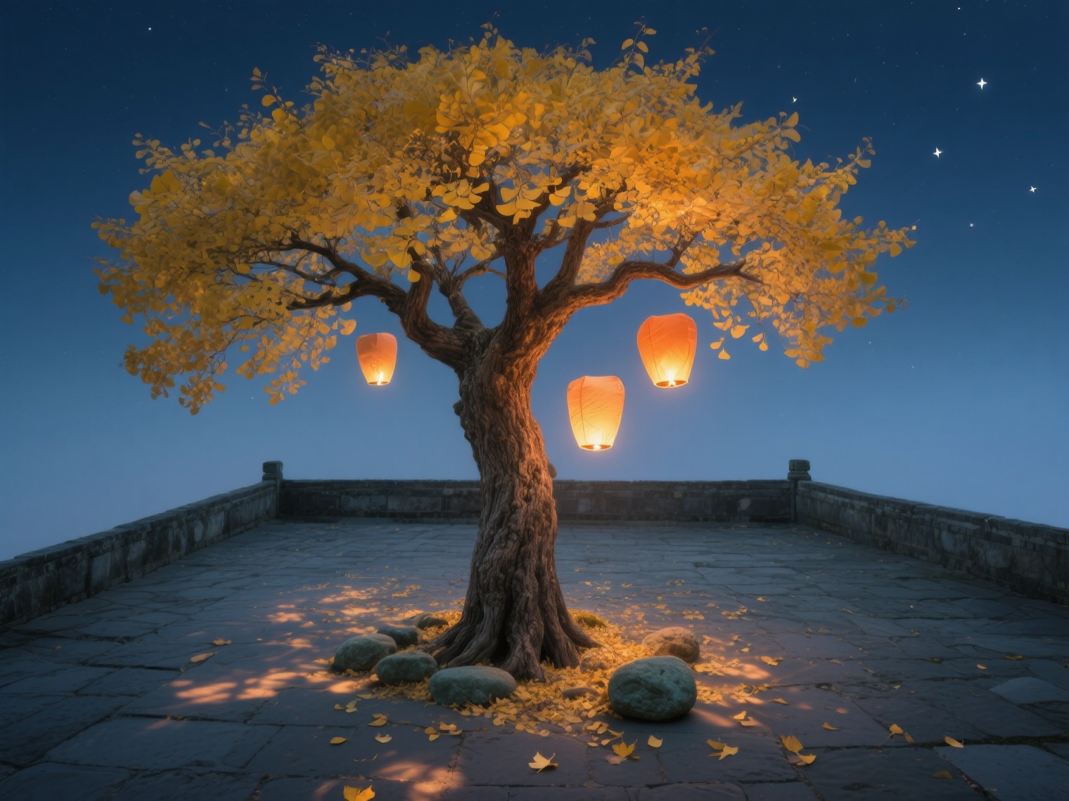

创意预览图

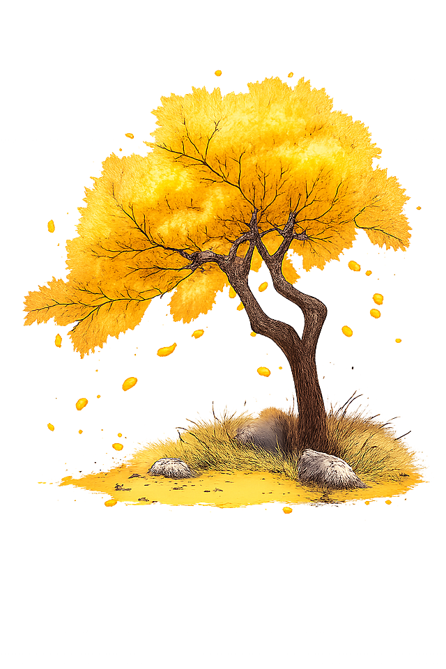
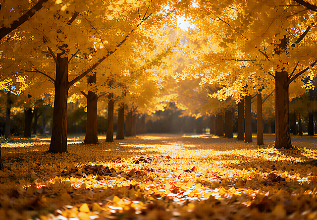
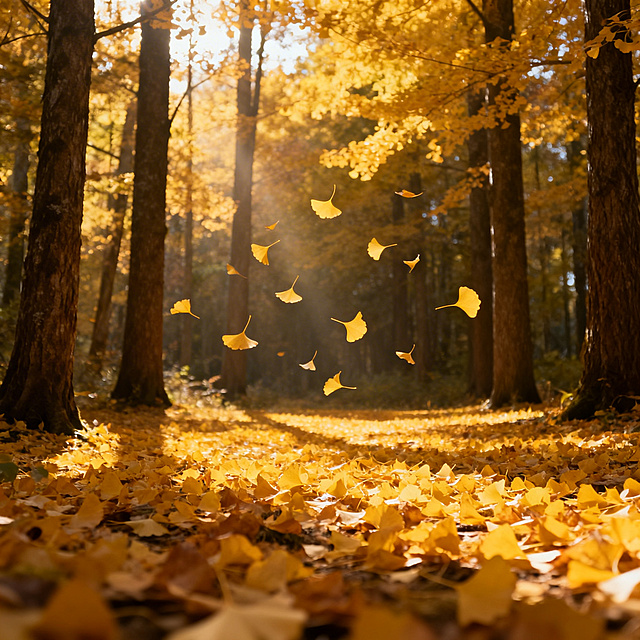
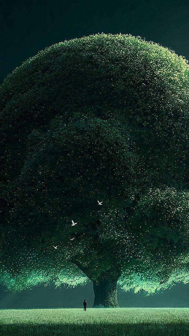
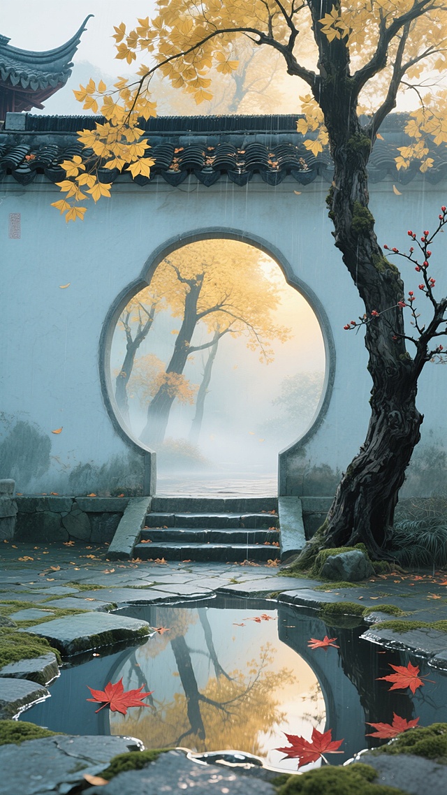
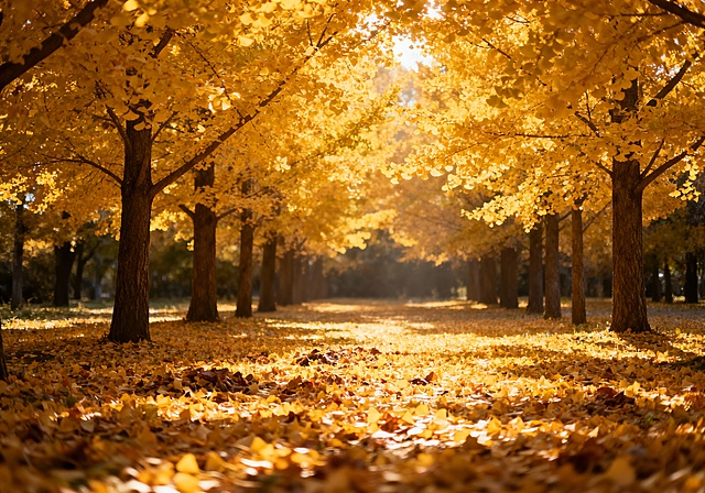
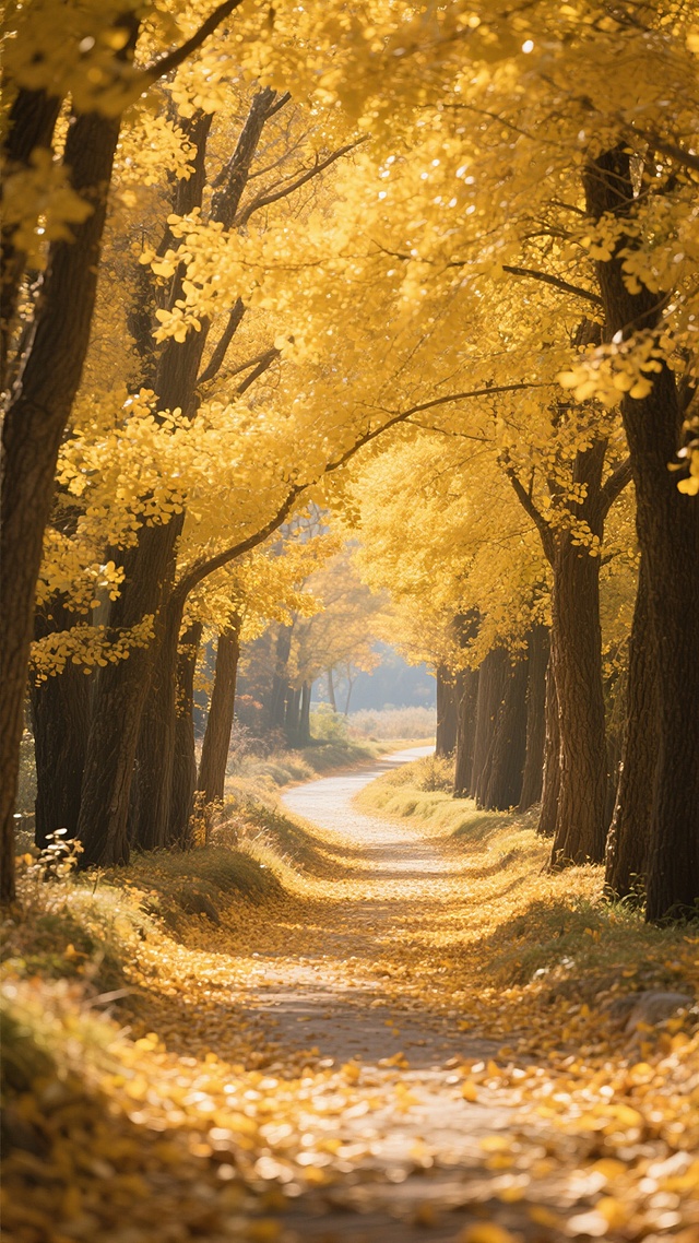
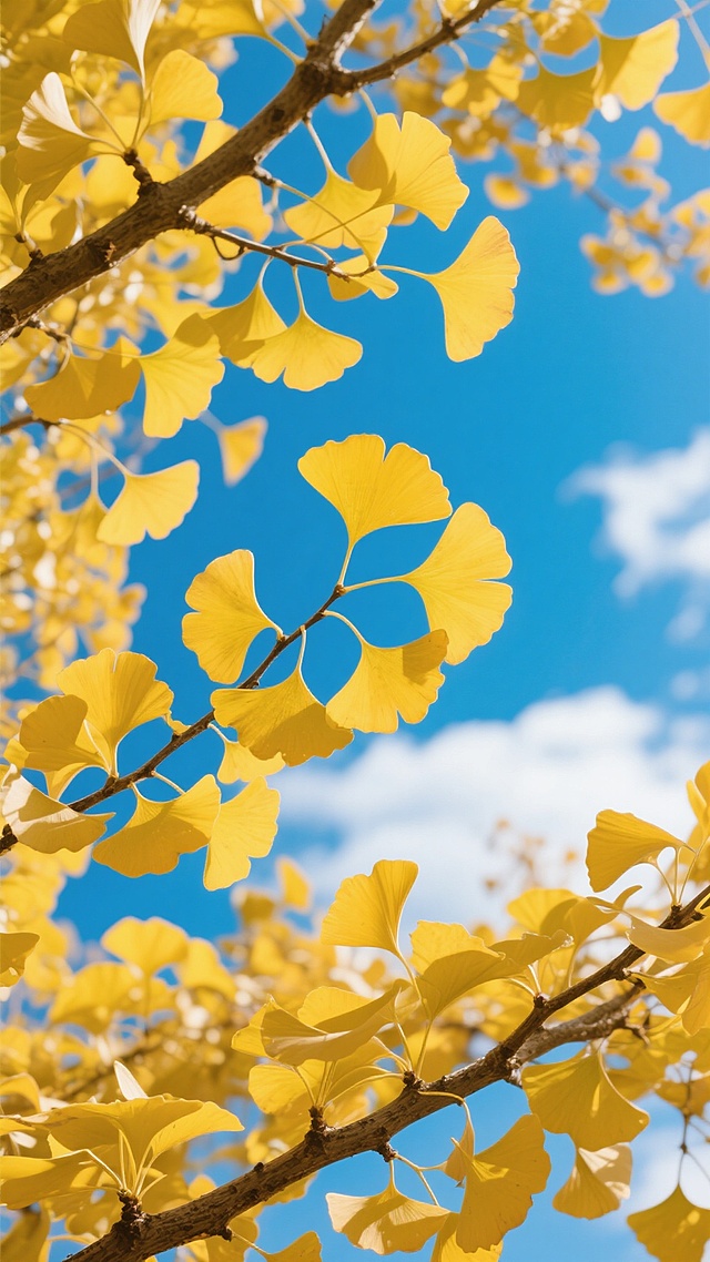
中景俯拍,一株苍劲的百年银杏矗立在青石庭院中央,灰褐色树干上布满岁月刻痕的纹理,分枝如虬龙般向四周舒展成圆满的伞状树冠。扇形叶片正经历着季节的魔法,从树冠边缘开始呈现金黄渐变,阳光穿透叶隙在地面织就斑驳的光影。树干基部散落着几片早落的金叶和圆润的青石,三只孔明灯正从树冠间缓缓升起,其中一只的烛火在叶片间投下温暖摇曳的光斑,背景是渐变的靛蓝夜空,几颗疏星点缀其上。整体色调融合了银杏的琥珀金、夜空的靛蓝与孔明灯的暖橙,营造出中秋夜特有的静谧团圆氛围。

用户头像

1qax0ylvbq1...

2025.07.29
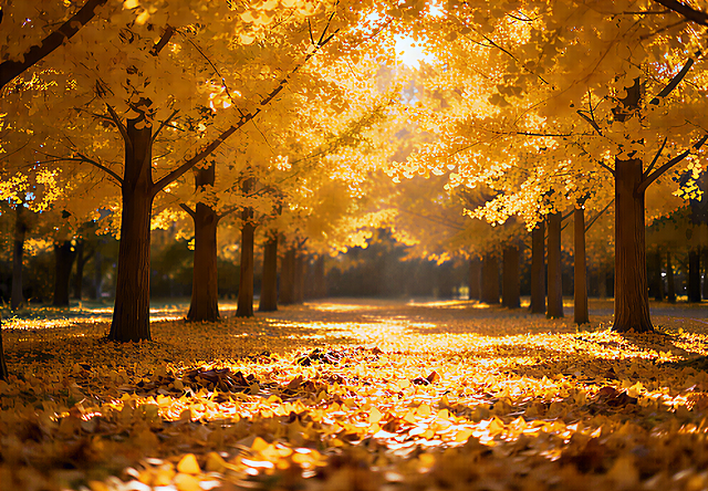
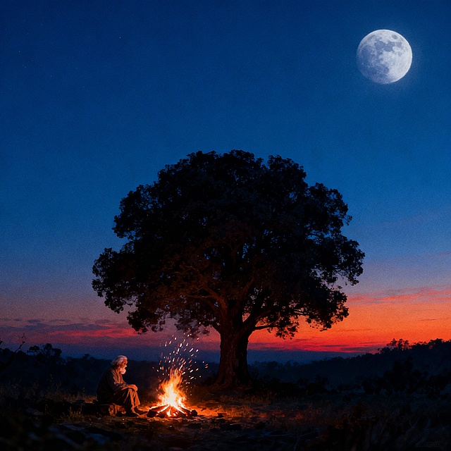
<div class="bg-container"> <div class="moon"></div> <div class="tree"></div> <div class="old-man"></div> <div class="campfire"></div> </div> <style> .bg-container { width: 1080px; height: 1920px; /* 抖音常用竖版比例 */ background: linear-gradient(to bottom, #0a1a30 0%, #0a0e17 100%); position: relative; } .moon { width: 150px; height: 150px; background: radial-gradient(circle, #f9f3c8 30%, transparent 70%); border-radius: 50%; position: absolute; top: 10%; right: 15%; filter: blur(2px); } .tree { width: 400px; height: 900px; background: url("data:image/svg+xml,%3Csvg xmlns='http://www.w3.org/2000/svg' viewBox='0 0 400 900'%3E%3Cpath fill='%23333' d='M200,0 Q250,300 150,500 T200,900 L250,900 Q180,500 250,300 Z'/%3E%3C/svg%3E"); position: absolute; bottom: 0; left: 50%; transform: translateX(-50%); } .old-man { width: 180px; height: 220px; background: url("data:image/svg+xml,%3Csvg xmlns='http://www.w3.org/2000/svg' viewBox='0 0 180 220'%3E%3Cpath fill='%23111' d='M90,0 Q120,50 100,120 L80,220 L100,220 Q110,150 90,120 Z'/%3E%3C/svg%3E"); position: absolute; bottom: 150px; left: 50%; transform: translateX(-30%); } .campfire { width: 30px; height: 50px; background: radial-gradient(circle, #ff9d00 0%, transparent 70%), linear-gradient(to top, #ff6a00 0%, #ff9d00 50%, transparent 100%); position: absolute; bottom: 160px; left: 50%; transform: translateX(20%); border-radius: 50%; animation: flicker 1.5s infinite alternate; filter: blur(1px); } @keyframes flicker { 0% { opacity: 0.7; height: 50px; } 100% { opacity: 1; height: 70px; } } </style><div class="bg-container">
  <div class="moon"></div>
  <div class="tree"></div>
  <div class="old-man"></div>
  <div class="campfire"></div>
</div>

<style>
.bg-container {
  width: 1080px;
  height: 1920px; /* 抖音常用竖版比例 */
  background: linear-gradient(to bottom, #0a1a30 0%, #0a0e17 100%);
  position: relative;
}

.moon {
  width: 150px;
  height: 150px;
  background: radial-gradient(circle, #f9f3c8 30%, transparent 70%);
  border-radius: 50%;
  position: absolute;
  top: 10%;
  right: 15%;
  filter: blur(2px);
}

.tree {
  width: 400px;
  height: 900px;
  background: 
    url("data:image/svg+xml,%3Csvg xmlns='http://www.w3.org/2000/svg' viewBox='0 0 400 900'%3E%3Cpath fill='%23333' d='M200,0 Q250,300 150,500 T200,900 L250,900 Q180,500 250,300 Z'/%3E%3C/svg%3E");
  position: absolute;
  bottom: 0;
  left: 50%;
  transform: translateX(-50%);
}

.old-man {
  width: 180px;
  height: 220px;
  background: 
    url("data:image/svg+xml,%3Csvg xmlns='http://www.w3.org/2000/svg' viewBox='0 0 180 220'%3E%3Cpath fill='%23111' d='M90,0 Q120,50 100,120 L80,220 L100,220 Q110,150 90,120 Z'/%3E%3C/svg%3E");
  position: absolute;
  bottom: 150px;
  left: 50%;
  transform: translateX(-30%);
}

.campfire {
  width: 30px;
  height: 50px;
  background: 
    radial-gradient(circle, #ff9d00 0%, transparent 70%),
    linear-gradient(to top, #ff6a00 0%, #ff9d00 50%, transparent 100%);
  position: absolute;
  bottom: 160px;
  left: 50%;
  transform: translateX(20%);
  border-radius: 50%;
  animation: flicker 1.5s infinite alternate;
  filter: blur(1px);
}

@keyframes flicker {
  0% { opacity: 0.7; height: 50px; }
  100% { opacity: 1; height: 70px; }
}
</style>