
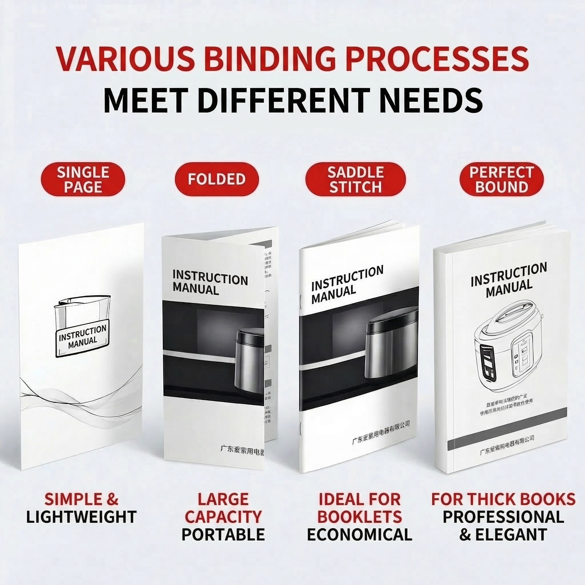

第四张图:保持原有布局和风格,将所有中文文案翻译成英文,保留原…
第四张图:保持原有布局和风格,将所有中文文案翻译成英文,保留原图排版和配色方案,文案位置和大小保持不变。顶部两行大字红色+黑色"VARIous BINDING PROCESSES MEET DIFFE
A张梁广东-中山魅炫印...
2026.03.17第四张图:保持原有布局和风格,将所有中文文案翻译成英文,保留原图排版和配色方案,文案位置和大小保持不变。顶部两行大字红色+黑色"VARIous BINDING PROCESSES MEET DIFFE
A张梁广东-中山魅炫印...
2026.03.17


![[Main image 4] Customization process flow display. [Atmosphere Style] Clear flow chart style, professional and easy to understand. [Picture quality] Commercial photography texture, soft and transparent light, clear and realistic product, clean and advanced picture. [Elements] The customization process is arranged in 9 steps according to the flow direction, the steps are clear and marked with red numbers, all texts are English. Background is light pink, the process is placed in white large area, the layout is clear. Process content: 01 Select product confirm direction, 02 Contact customer confirm details (size material binding quantity), 03 Provide design files (AI CDR PDF supported), 04 Design and confirm, 05 Sample making (sample fee required), 06 Confirm sample, 07 Confirm production arrangement, 08 Check goods, 07 Delivery. Keep the process logic consistent with the reference picture, the text is completely converted to English, no Chinese characters. [Light and shadow] Soft uniform light, text clear, no blur. [Color matching] Main tone light pink white, step number use red, highlight level. [Perspective composition] Head-up, full page layout, step-by-step distribution clear. [Text layout] Top big title "Customization Process", font size is largest, bold. Step number bold, bigger than description text, contrast obvious. [Proportion resolution] 1:1 proportion, 2k resolution. [Negative prompt] Deformation, watermark, text disordered, blurred product image, messy background, Chinese characters](https://gd-cms.dancf.com/gd-cms/xi19e5/0/e3d39eaa-78cf-4825-91b5-b1f4bf8dfb4916383.png?x-oss-process=image/resize,w_640,type_6/sharpen,120/interlace,1)


![[主图-2] 主题:产品细节与印刷品质展示 核心卖点证明。
[统一基调] 1688 B端源头工厂风格,整体专业稳重,背景采用深灰蓝色工业风渐变,主标题白色粗体大字,辅助文字浅灰色,强调色用品牌紫色呼应产品,字体为无衬线粗黑体,卡片用细银灰色边框,图标简洁线性。
[画面] 画面主体为折页翻开状态,展示内页多语言排版(德语、西班牙语、法语等多语言说明文字),产品占画面约60%,居中偏左。右侧为三个细节放大圆形小窗:第一个小窗展示纸张纹理厚度特写,标注"300g铜版纸 厚实挺括";第二个小窗展示印刷色彩细节,标注"高清印刷 色彩还原";第三个小窗展示折痕压线工艺,标注"精准压线 折叠平整"。每个小窗下方有简短说明文字。
[光影质感] 商业摄影质感,产品平铺受光均匀,细节小窗内特写清晰锐利,纸张纹理真实可见,油墨有轻微光泽感,整体干净专业。
[配色] 背景深灰蓝渐变,主标题白色,强调色紫色,辅助文字浅灰,细节小窗边框银灰色。
[文字版式] 顶部大标题"高品质印刷 细节见真章",粗体白色大字。右侧三个圆形小窗竖向排列,每个小窗下方对应说明文字,字号中等。底部一行小字"支持各种纸张工艺定制"。文字横排,不遮挡产品主要展示区域。
[输出要求] 1:1正方形,2048*2048,产品清晰不变形,细节特写清楚,文字清晰无错字,画面专业干净,无水印无平台Logo。](https://gd-cms.dancf.com/gd-cms/xi19e5/0/d0eb3943-37be-4625-ae41-0f82f0a6cc0c37737.jpeg?x-oss-process=image/resize,w_640,type_6/sharpen,120/interlace,1)


![[垫图] https://gdesign-dam-hz.dancf.com/35887141219453044/f66d3013801443e9b3b2e836d05bda3c.jpg
[主图主题] 服务承诺与下单转化图
[氛围/风格] 简约信任风,干净有力,促进转化
[画面元素] 整体浅灰白色背景,中心展示成品说明书合集,画面通透干净,光影柔和,底部预留服务卖点位置,整体排版稳定大气。
[配色色系] 主色调:浅灰白色,辅助色:红色和黑色,延续红黑白统一风格
[视角构图] 中心构图,服务卖点位于底部,整体平衡
[文字版式] 主标题 "厂家直印 放心定制" 顶部居中,底部半透明红色渐变蒙层,横向排列四个服务卖点 "免费打样 免费开票 保证足数 品质保障",每个卖点白色文字配圆角白色小图标装饰。右下角红色胶囊标签 "欢迎对接咨询",字体层级清晰,主标题加粗放大,卖点清晰易读,符合拼多多直白转化风格。](https://gd-cms.dancf.com/gd-cms/xi19e5/0/b4d2b447-18f7-4a56-964c-bc3fc0b33b456978.jpg?x-oss-process=image/resize,w_640,type_6/sharpen,120/interlace,1)

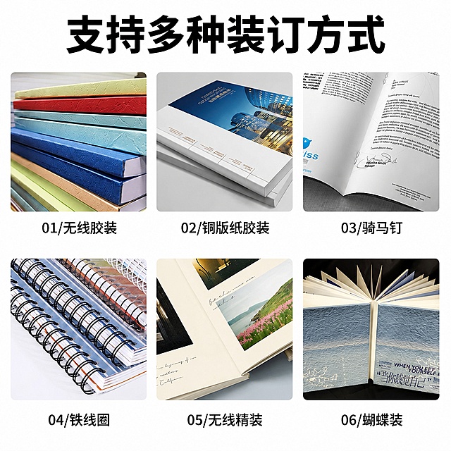
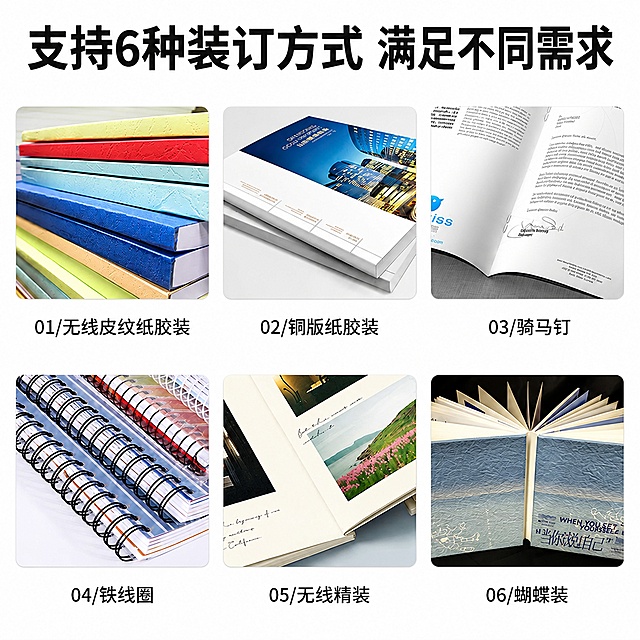
![[Main image 3] Multiple binding methods detail display for custom notebook. [Atmosphere Style] Clear and professional product detail display style. [Picture quality] Commercial photography texture, soft and transparent light, clear and realistic product, clean and advanced picture. [Elements] Three different binding methods (saddle stitch, perfect binding, coil binding) are displayed in three circular close-ups from left to right, arranged horizontally on light pink background, each close-up corresponds to a English name below, clearly show the binding process and effect. Keep the actual binding details consistent with the reference picture, the overall picture is neat and focused. [Light and shadow] Even soft light, each area is clearly visible, no large shadow. [Color matching] Main tone light pink and white, highlight the product itself color. [Perspective composition] Head-up flat lay, three areas evenly distributed, neat and organized. [Text layout] Top big title "Available Binding Methods", the name below each picture is "Saddle Stitch", "Perfect Binding", "Coil Binding", font clear, contrast obvious. [Proportion resolution] 1:1 proportion, 2k resolution. [Negative prompt] Deformation, watermark, text disordered, blurred product image, messy background, Chinese characters](https://gd-cms.dancf.com/gd-cms/xi19e5/0/f8ba9e8c-f2b1-48d3-ba47-62bf2707712a16703.png?x-oss-process=image/resize,w_640,type_6/sharpen,120/interlace,1)


![[第2屏] Core Key Features Overview page for PET Cold Laminating Crystal Film.
[Atmosphere/Style] Clean information card style, simple and clear, consistent with the overall cross-border minimalist style.
[Element Layout] Six independent rounded rectangle feature cards arranged in two rows and three columns on a light gray gradient background. Each card has a simple icon at the top, feature title in the middle, and short description at the bottom. The product thumbnail is placed at the top center of the page, retaining the high transparency characteristics from the input product images.
[Light and Shadow Texture] Soft uniform lighting, subtle drop shadow on the cards to increase layering, text and icons clear and readable.
[Color Matching] Global background #f0f2f5, card background white, icons and key text light blue, description text dark gray.
[Perspective Composition] Vertical full page layout, centered typesetting, clear spacing between cards, easy reading.
[Text Layout] Page title at the top "Core Advantages", six feature cards: first card icon + "Single-sided Adhesive", second icon + "Peel & Stick", third icon + "No Machine Needed", fourth icon + "98% Transparency", fifth icon + "Ultra Clear", sixth icon + "Efficient Convenient". Each title is capitalized for main words, concise and consistent with cross-border expression habits.
[Proportion Resolution] 9:16, 4K, text clear and recognizable.
[Negative Prompt] Cluttered layout, text overlapping, text too small, watermark, deformation, Chinese characters, garbled text.](https://gd-cms.dancf.com/gd-cms/xi19e5/0/45a4c9fd-f902-4fb0-9403-bdbddb5e895b34287.png?x-oss-process=image/resize,w_640,type_6/sharpen,120/interlace,1)



![[主图-4] 定制说明书手册多场景应用展示图
[氛围风格] 商务办公场景,真实使用环境代入感
[画质] 商业场景摄影质感、光线自然、氛围真实
[元素] 现代简约办公桌面场景,木质桌面上摆放着定制说明书手册,手册打开平放在桌面上,旁边有一台笔记本电脑、一支钢笔、一副眼镜、一杯咖啡,营造真实的办公使用氛围。手册展示内页的排版效果。背景是模糊的办公室环境,有落地窗和自然光。保持手册外观(即物理结构、材质质感、颜色)与输入产品图一致,杜绝任何变形和色差,精细化处理。商品主体占比约40%。
[光影] 自然光从左侧窗户射入,柔和明亮,桌面有自然的光影过渡,整体光线温暖舒适
[配色] 主色调暖木色、米白色,辅助色深黑色(手册)、暖金色点缀
[视角构图] 45度俯视角度,桌面场景布局自然,手册为视觉中心,前景后景有层次
[文字版式] 左上角主标题"多场景适用",深棕色粗体大字。下方三个小图标横向排列,分别标注"产品说明""企业宣传""操作指南",深棕色文字配白色圆角底。底部右侧小字"专业定制 满足不同需求"。文字均放在空白区域,不遮挡产品主体。
[输出要求] 1:1比例,文字清晰可辨,超高清商业场景摄影质感
[负向提示词] 变形,文字错乱,产品图模糊,背景杂乱,水印,电商平台Logo](https://gd-cms.dancf.com/gd-cms/xi19e5/0/e773fd16-96a8-4ee0-b51f-bf36c2270dc16861.png?x-oss-process=image/resize,w_640,type_6/sharpen,120/interlace,1)


![[第6屏] User-friendly Easy Operation Design. This screen summarizes the convenience advantages of the product.
[Atmosphere/Style] Simple and practical user experience display.
[Element Layout] Upper part shows the effect of cutting the film to demonstrate easy cutting, lower part uses two key advantages description: 1. Easy to cut to any custom size; 2. Good static control, less dust, less paper jam, smooth batch printing. Match corresponding simple icons.
[Lighting and Texture] Natural soft light, clear cutting demonstration, product texture real.
[Color Scheme] Global background #111827, text white, icon light blue, simple high contrast.
[Perspective and Composition] Upper demonstration lower description, vertical layout, clear hierarchy.
[Text Layout] Top title "Convenient Easy To Use", each advantage point has icon + title + short description, all in English, clear and legible.
[Proportion Resolution] 9:16 vertical proportion, 4K resolution, clear text.
[Negative Prompt] Wrong cutting effect, product deformation, Chinese characters, text blur, messy background.](https://gd-cms.dancf.com/gd-cms/xi19e5/0/6abe28a9-a902-487e-9793-ef5c71f4690d38822.png?x-oss-process=image/resize,w_640,type_6/sharpen,120/interlace,1)
![[第6屏] Premium material and quality detail page, focus on showing craftsmanship. [氛围/风格] Macro detail focus, clean minimalist, highlights premium texture. [元素布局] Three macro close-ups evenly arranged horizontally: stainless steel tumbler surface from image 4, leather notebook cover from image 3, gift box cardboard texture from image 1. Keep original material texture and color. Light gray background, text area at top. [光影质感] Side directional lighting enhances material texture contrast, clear grain details, natural shadows. [配色色系] Global background #F0F0F0, materials show original metallic/leather/cardboard tones, text dark gray. [视角构图] Three equal horizontal sections, each with one macro detail, balanced composition. [文字版式] Top main title "Premium Materials & Durable Design", centered. Labels for each detail: "Food-Grade Stainless Steel", "Premium PU Leather", "High-Grade Rigid Cardboard". All English. [比例分辨率] 1:1 square, 4K resolution. [负向提示词] texture blur, color distortion, wrong material, Chinese characters](https://gd-cms.dancf.com/gd-cms/xi19e5/0/33ebfd2a-9392-488f-b2b3-2b5d5025bb4d29404.png?x-oss-process=image/resize,w_640,type_6/sharpen,120/interlace,1)
