
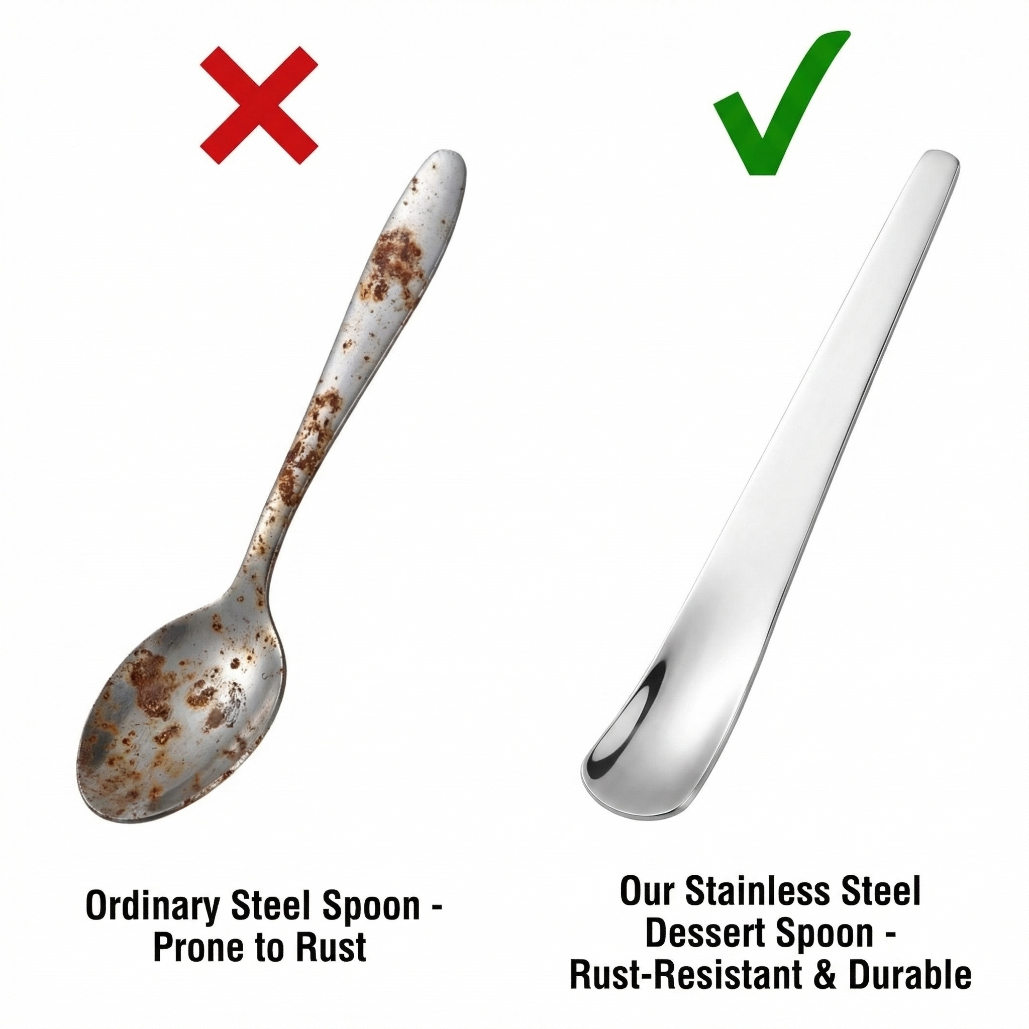

Comparison between ordinary ste…
Comparison between ordinary steel spoon and our stainless steel dessert spoon, ordinary spoon left w
67ckc9n1s-H...
2026.03.24Comparison between ordinary steel spoon and our stainless steel dessert spoon, ordinary spoon left w
67ckc9n1s-H...
2026.03.24![7. [垫图]: ["https://gdesign-dam-hz.dancf.com/35919683615839350/495d6d2c84a44c51aa032cfee9f594a3.jpg", "https://gdesign-dam-hz.dancf.com/35919857144940602/fb0cd266bedd4e63b06b98c974fc66f0.jpg"]
[主图主题]: Compare with Ordinary Coffee Spoons
[氛围/风格]: Minimalist contrast style, clear distinction
[画面元素]: The picture is divided into left and right parts: the left side is an ordinary iron coffee spoon with obvious rust and burr, marked with "Ordinary Steel"; the right side is the product 304 stainless steel coffee spoon, the surface is as bright as new, no rust, marked with "Our 304 Stainless Steel", the background is pure white, highlighting the material difference, the product appearance on the right is consistent with the original image
[配色色系]: Left side: dark rust color; Right side: silver bright; Background: pure white
[视角构图]: Left-right contrast composition, symmetrical, clear focus
[文字版式]: Mark the contrast with checkmarks and crosses: Left side "Easy to Rust" with a cross, Right side "Rust Resistant" with a checkmark, text at the bottom of each side, sans-serif font, clear and easy to read
[比例分辨率]: 1:1 ratio, 2048px * 2048px resolution](https://gd-cms.dancf.com/gd-cms/xi19e5/0/035fed30-116a-4531-a18f-f068d56f31fb11213.png?x-oss-process=image/resize,w_640,type_6/sharpen,120/interlace,1)
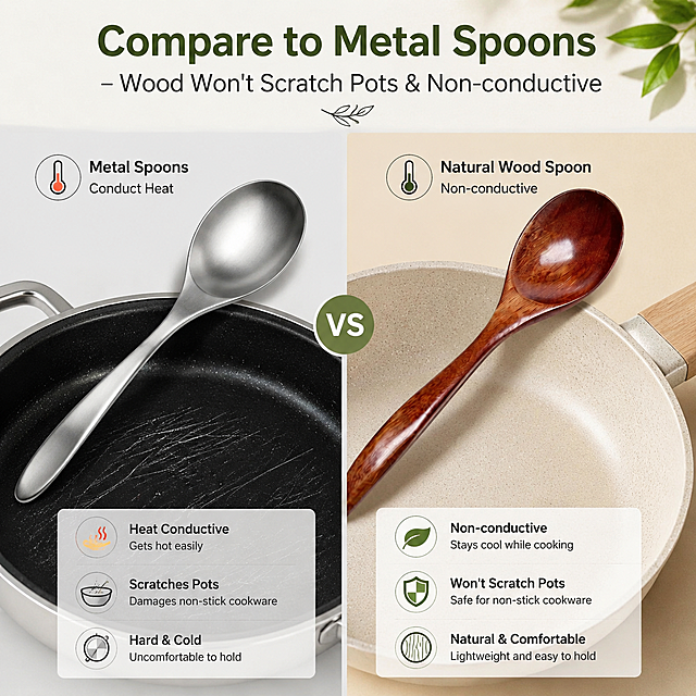

![[Reference image: https://gdesign-dam-hz.dancf.com/35931542883781722/aeb8d5f0bef0477785bc9a7fa7617f99.jpg] Hammered stainless steel earl spoon in modern kitchen scene, placed in a clean dark grey solid wood kitchen countertop, a young Caucasian hand holding the earl spoon, soft natural light, stylish minimalist atmosphere. English text in upper left corner: "Premium Stainless Steel Hammered Spoon", bold sans-serif font, silver color, no text occlusion product main body. In line with Amazon cross-border platform specification, fashion style, consistent product appearance with original image.](https://gd-cms.dancf.com/gd-cms/xi19e5/0/51849c2e-eaca-4e3f-90b3-67935fde4f1511302.jpg?x-oss-process=image/resize,w_640,type_6/sharpen,120/interlace,1)


![[Reference image: https://gdesign-dam-hz.dancf.com/35931542883781722/aeb8d5f0bef0477785bc9a7fa7617f99.jpg] A close-up display of the hammered earl spoon, focusing on the unique hammered texture of the handle. Clean light gray background, soft highlight accentuates the three-dimensional hammered grain. Three core selling points with simple icons arranged on the left: 1. Icon with text "Food Grade Stainless Steel", 2. Icon with text "Hand-hammered Craft", 3. Icon with text "Durable & Rust-proof". Consistent product appearance with original image, fashion style, compliant with Amazon cross-border platform specification.](https://gd-cms.dancf.com/gd-cms/xi19e5/0/f795d01d-51b5-41c6-93d4-da4979da0a7111438.jpg?x-oss-process=image/resize,w_640,type_6/sharpen,120/interlace,1)

![3. [垫图]: ["https://gdesign-dam-hz.dancf.com/35919683615839350/495d6d2c84a44c51aa032cfee9f594a3.jpg", "https://gdesign-dam-hz.dancf.com/35919857144940602/fb0cd266bedd4e63b06b98c974fc66f0.jpg"]
[主图主题]: 304 Stainless Steel Material Highlight Selling Point
[氛围/风格]: Minimalist professional style, clean high-end, highlight material characteristics
[画面元素]: Coffee spoon 304 stainless steel material characteristics, the product is in the center, the surrounding is surrounded by small 3D icons of food safety, which correspond to the product's characteristics, the background is a shallow gradient off-white, highlight the stainless steel metallic texture, the product appearance is 100% consistent with the original image
[配色色系]: Main color: off-white; Auxiliary color: silver metal, light blue icon
[视角构图]: Centered composition, moderate depth of field
[文字版式]: Use a minimalist style, use small icons with labels, text "Food Grade 304", "Rust Resistant", "Long Lasting", "Smooth Edge", the text uses sans-serif, dark gray, small size, placed next to each icon, clean layout does not block the main body
[比例分辨率]: 1:1 ratio, 2048px * 2048px resolution](https://gd-cms.dancf.com/gd-cms/xi19e5/0/949506f5-0c8b-4d14-8764-c3988b2b30b211761.jpg?x-oss-process=image/resize,w_640,type_6/sharpen,120/interlace,1)
![[商品] 使用【图1】玻璃丝正面清洁擦;保留玫瑰金色玻璃丝纹理、椭圆形轮廓、金色挂绳;产品以正在擦拭的角度呈现,动作真实自然。
[画面] 目标:使用效果对比,展示清洁能力。构图:上下分栏对比,上半区"Before":带有油污和食物残渣的不锈钢锅/不粘锅,清洁擦放在旁边;下半区"After":同一口锅被擦拭得光亮洁净,清洁擦握在手中;背景为厨房台面,真实克制,污渍表现适度不恶心。
[视觉] 套系策略:风格=跨境极简高级商业摄影;标题字=现代无衬线粗体(英文字体);正文字=简洁无衬线体;主色=暖米杏 + 玫瑰金棕;背景延展=基于暖米杏做深浅层级、同色渐变和细腻哑光质感;强调色=玫瑰金,仅用于小面积图标、引线和标签;标题色=深炭灰;正文色=中暖灰;组件=圆角浅底信息卡、细线引线;光影=左前侧暖柔光,自然厨房光线。
[文字] 顶部主标题"Effortless Stain Removal";上半区左上角标签"Before"配小字"Stubborn grease & burnt food";下半区左上角标签"After"配小字"Sparkling clean in seconds";右侧配3个短卖点:"Scrubs without scratching"、"Lathers well with soap"、"Durable & long-lasting";所有文字横向排版。
[规格] 图片比例3:4竖版,4K分辨率,medium质量;避免变形、错字、文字过小、冷蓝/蓝灰背景、产品颜色改变、过度夸张污渍、恶心画面。](https://gd-cms.dancf.com/gd-cms/xi19e5/0/4eaab1f4-a55d-4dca-9fcc-51d76aa91b3626155.jpeg?x-oss-process=image/resize,w_640,type_6/sharpen,120/interlace,1)



![4. [垫图]: ["https://gdesign-dam-hz.dancf.com/35919683615839350/495d6d2c84a44c51aa032cfee9f594a3.jpg", "https://gdesign-dam-hz.dancf.com/35919857144940602/fb0cd266bedd4e63b06b98c974fc66f0.jpg"]
[主图主题]: Close-up Display of Coffee Spoon Details
[氛围/风格]: Minimalist style, clean, highlight the fine workmanship
[画面元素]: The square spoon head is magnified in close-up, placed on a light gray background, highlight the smooth polished edges and mirror polished surface, reflect the light to show the metallic texture, the product detail structure is completely consistent with the original image, the picture is clear and the focus is accurate
[配色色系]: Main color: light gray; Auxiliary color: silver reflective metal
[视角构图]: Close-up, the spoon head is in the center, the focus is on the spoon head edge
[文字版式]: The text "Precision Mirror Polished" is placed in the upper left corner, sans-serif font, dark gray, does not block the core details, the layout is clean
[比例分辨率]: 1:1 ratio, 2048px * 2048px resolution](https://gd-cms.dancf.com/gd-cms/xi19e5/0/b3c56bee-6898-407e-87be-6ad6e352f0d111172.jpg?x-oss-process=image/resize,w_640,type_6/sharpen,120/interlace,1)

![[主图-8] 硅胶扫把对比普通扫把对比图。氛围风格:客观对比展示,清晰可信。画质:商业摄影质感、光线柔和通透、产品清晰真实、画面干净高级。元素:左右分栏对比,左侧是普通木质扫把,清理后地面残留毛发和水渍,右侧是本款硅胶扫把,清理后地面干净无残留。保持本款硅胶扫把外观结构颜色与原图一致。浅灰色统一背景,用打勾和叉图标区分优劣。光影:均匀柔和光线,对比清晰,两侧光线一致。配色:浅灰背景,保留产品配色,对勾绿色,叉号红色,清晰区分。文字版式:左侧标题 "Traditional Broom",标注 "Hair Residue Streaks Left",右侧标题 "Silicone Broom",标注 "No Residue Clean One Sweep",文字整齐,对比清晰。输出要求:1:1比例,文字清晰可辨,超高清商业摄影质感。负向提示词:变形,文字错乱,产品模糊,背景杂乱,水印,中文内容,最高级夸大词汇。](https://gd-cms.dancf.com/gd-cms/xi19e5/0/35e649f5-85ec-4669-9d6e-4bbc10852e07605.jpeg?x-oss-process=image/resize,w_640,type_6/sharpen,120/interlace,1)



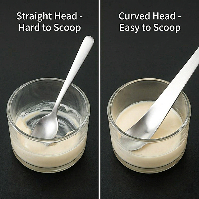
![[商品] 使用【图1】304不锈钢西餐餐具;保留银色镜面材质、圆润握柄、各件结构;左侧普通餐具用示意性表现(发暗、有锈迹、边缘粗糙感),右侧为本款产品清晰展示。
[画面] 目标:痛点对比页,突出本款餐具解决普通餐具的常见问题。构图:左右分栏对比型,左栏暗调表现普通餐具痛点(生锈、轻薄、划嘴、易变形),右栏亮调展示本款优势。景别:中景,产品角度平视微俯。阅读动线:从左到右对比阅读。前中后景:左右各为独立小场景,中间用细分割线区隔。
[视觉] 套系策略:风格=现代轻奢餐厨商业摄影;标题字=思源黑体粗体;正文字=思源黑体常规;主色=暖银灰+原木色;背景延展=基于暖木色与米白色做深浅层级、同色渐变和细腻木纹/餐布纸质感;强调色=香槟金,仅用于小面积图标、引线和标签点缀;标题色=深炭灰;正文色=中暖灰;组件=圆角浅底信息卡、细线引线、香槟金小图标;光影=左前侧暖柔光,金属表面有清晰高光带。
[文字] 顶部主标题「告别劣质餐具 选对一套用十年」,左栏3个痛点配小图标:易生锈 / 手感轻薄 / 边缘划嘴;右栏3个解决点配对勾图标:304不锈钢防锈 / 加厚加重手感 / 圆润打磨不伤嘴。文字横向排版,清晰可读。
[规格] 图片比例9:16竖版,4K分辨率,medium质量,避免变形、错字、文字过小、冷蓝背景、夸张恐吓式表现。](https://gd-cms.dancf.com/gd-cms/xi19e5/0/01a643c8-947c-4c21-98e0-85d5e2f9a41936658.jpeg?x-oss-process=image/resize,w_640,type_6/sharpen,120/interlace,1)

![[Main Image 6] Comparison with ordinary trays. Keep this product appearance consistent with input image. Left and right comparison layout: left side this product, marked "Our Stainless Steel Tray", right side ordinary plastic tray, marked "Ordinary Tray". Compare three dimensions with checkmarks and crosses: Material: ✓Food-grade / ×Unknown](https://gd-cms.dancf.com/gd-cms/xi19e5/0/cdd9bc80-1ccb-4fbb-b565-8aedad643e0617952.png?x-oss-process=image/resize,w_640,type_6/sharpen,120/interlace,1)

![[第2屏] 痛点对比屏-护锅优势对比展示(英文版)。氛围风格:fresh comparison style, left-right split layout, soft natural light, commercial photography. Elements layout: this screen uses【图1】as product, split screen into left and right, left shows traditional metal scraper scratches non-stick pan coating, right shows this silicone spatula stirs gently in intact non-stick pan, middle split by light gray line. Silicone spatula appearance is same as original image. Background is uniform light off-white, small light gray icons at bottom. Light and shadow: uniform soft light on both sides, no hard shadows, clear contrast. Color scheme: overall background #FAF7F2 (light off-white); left side dark gray metal + damaged black pan, right side off-white silicone + intact light gray non-stick pan; auxiliary color #D4A373 (accent) + #2C2C2C (text). Perspective: front eye-level, symmetrical left-right layout, enough text space on top and bottom, reading flow from left to right. Text layout: main title on top "No More Scratches, Protect Your Pans" dark brown bold, center aligned. Left subtitle "Traditional Metal Scraper" with red cross icon, right subtitle "Soft Silicone Spatula" with green check icon. Three selling points at bottom "Works on All Cookware, Protects Coating, Extends Pan Life", text arranged clearly, not crowded. Proportion: 9:16 vertical, 4K resolution, text clear. Negative prompt: product deformation, exaggerated comparison, watermark, text distortion, wrong pan structure, color deviation.](https://gd-cms.dancf.com/gd-cms/xi19e5/0/a7d9c487-6387-42bc-a61d-47a900657b1313686.png?x-oss-process=image/resize,w_640,type_6/sharpen,120/interlace,1)


