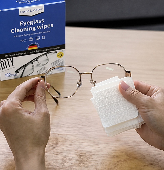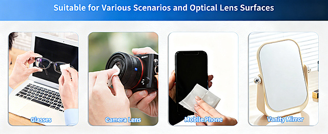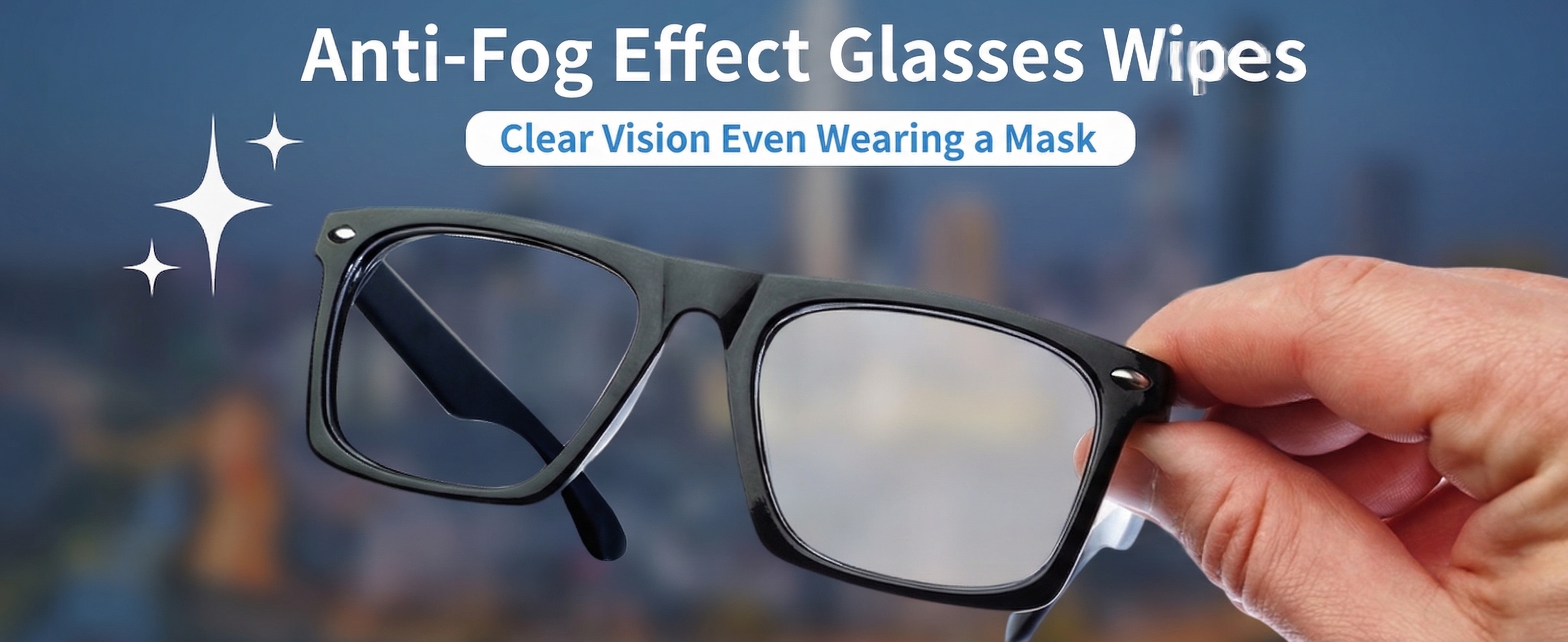

创意预览图

将图中的日语替换为英文:大标题“Anti-Fog Effect Glasses Wipes”,副标题“Clear Vision Even Wearing a Mask”,保持原有排版布局、字体风格颜色

用户头像

1q0gvt6dx2h...

2026.03.27
[第2屏] Pain Point Comparison of Daily Eye Protection.本屏使用【图1】作为商品主体,保持商品外观结构与颜色一致。 [氛围/风格] Clear information contrast style, real scene contrast, simple layout, commercial practical style, easy to understand. [元素布局] The screen is divided into left and right parts. The left side shows the problem: common ordinary glasses without side protection, dust and wind can easily enter the eyes, the picture shows a small amount of dust particles near the side gap; The right side shows the solution: this protective goggles with integrated side shield, the side is completely protected, dust and wind are blocked. Each side accounts for 50% of the width, the product occupies 60% of the vertical space of each area, keep the product structure clear. [光影质感] Uniform soft lighting, clear contrast between left and right, product details are visible, the overall picture is clean and not messy. [配色色系] Global background color: #F5F7FA (light cool gray); left problem area with light red translucent label, right solution area with light green translucent label; text color dark gray. [视角构图] Left and right horizontal comparison layout, the same product perspective, contrast intuitive. [文字版式] Top main title "Before Vs After: Better Eye Protection", left area title "No Side Protection" with small label "Dust & Wind Invasion", right area title "Full Side Shield" with small label "Block Dust & Wind". Each title is placed at the top of the corresponding area, the font is clear, does not block the main body of the product, all text is in English, conform to the capitalization rules, no Chinese. [比例分辨率] 9:16 vertical ratio, 4K resolution, clear and readable text. [负向提示词] Product deformation, structural inconsistency, color deviation, text confusion, Chinese characters, exaggerated dirty picture, watermark, guide button.[第2屏] Pain Point Comparison of Daily Eye Protection.本屏使用【图1】作为商品主体,保持商品外观结构与颜色一致。
[氛围/风格] Clear information contrast style, real scene contrast, simple layout, commercial practical style, easy to understand.
[元素布局] The screen is divided into left and right parts. The left side shows the problem: common ordinary glasses without side protection, dust and wind can easily enter the eyes, the picture shows a small amount of dust particles near the side gap; The right side shows the solution: this protective goggles with integrated side shield, the side is completely protected, dust and wind are blocked. Each side accounts for 50% of the width, the product occupies 60% of the vertical space of each area, keep the product structure clear.
[光影质感] Uniform soft lighting, clear contrast between left and right, product details are visible, the overall picture is clean and not messy.
[配色色系] Global background color: #F5F7FA (light cool gray); left problem area with light red translucent label, right solution area with light green translucent label; text color dark gray.
[视角构图] Left and right horizontal comparison layout, the same product perspective, contrast intuitive.
[文字版式] Top main title "Before Vs After: Better Eye Protection", left area title "No Side Protection" with small label "Dust & Wind Invasion", right area title "Full Side Shield" with small label "Block Dust & Wind". Each title is placed at the top of the corresponding area, the font is clear, does not block the main body of the product, all text is in English, conform to the capitalization rules, no Chinese.
[比例分辨率] 9:16 vertical ratio, 4K resolution, clear and readable text.
[负向提示词] Product deformation, structural inconsistency, color deviation, text confusion, Chinese characters, exaggerated dirty picture, watermark, guide button.
[第4屏] Functional Principle and Advantage Demonstration.本屏使用【图1】商品主体,保持外观结构一致,讲解防蓝光防尘功能。 [氛围/风格] Professional functional explanation, clear principle display, simple scientific style, easy to understand. [元素布局] The glasses are placed in the upper middle of the画面, accounting for about 60% of the space. Below the glasses, three functional advantage cards are arranged horizontally. Each card has an icon and a description: 1. Icon of a shield: blocks dust, wind and splashes; 2. Icon of a wave block: filters harmful blue light from screens; 3. Icon of a feather: lightweight frame for all-day comfortable wear. The cards have rounded corners, do not overlap each other, the overall layout is balanced. [光影质感] The overall light is soft and even, the product is highlighted, the card text is clearly visible, the shadow is natural and not abrupt. [配色系] Global background: #F5F7FA; cards are white with light gray borders, icons use different soft colors to distinguish, text is dark gray, the overall color matching is simple and professional. [视角构图] Front view, product in upper half, function cards in lower half, clear hierarchy, easy reading. [文字版式] Top main title "Multiple Functions For All-Day Protection", below each function card has icon + 4-8 word short description, all text in English, the main title is capitalized correctly, text does not cover the main body of the product. [比例分辨率] 9:16 vertical ratio, 4K resolution, clear and readable text. [负向提示词] Product deformation, inconsistent structure, wrong color, text confusion, Chinese characters, absolute exaggerated words, watermark.[第4屏] Functional Principle and Advantage Demonstration.本屏使用【图1】商品主体,保持外观结构一致,讲解防蓝光防尘功能。
[氛围/风格] Professional functional explanation, clear principle display, simple scientific style, easy to understand.
[元素布局] The glasses are placed in the upper middle of the画面, accounting for about 60% of the space. Below the glasses, three functional advantage cards are arranged horizontally. Each card has an icon and a description:  
1.  Icon of a shield: blocks dust, wind and splashes;  
2.  Icon of a wave block: filters harmful blue light from screens;  
3.  Icon of a feather: lightweight frame for all-day comfortable wear.  
The cards have rounded corners, do not overlap each other, the overall layout is balanced.
[光影质感] The overall light is soft and even, the product is highlighted, the card text is clearly visible, the shadow is natural and not abrupt.
[配色系] Global background: #F5F7FA; cards are white with light gray borders, icons use different soft colors to distinguish, text is dark gray, the overall color matching is simple and professional.
[视角构图] Front view, product in upper half, function cards in lower half, clear hierarchy, easy reading.
[文字版式] Top main title "Multiple Functions For All-Day Protection", below each function card has icon + 4-8 word short description, all text in English, the main title is capitalized correctly, text does not cover the main body of the product.
[比例分辨率] 9:16 vertical ratio, 4K resolution, clear and readable text.
[负向提示词] Product deformation, inconsistent structure, wrong color, text confusion, Chinese characters, absolute exaggerated words, watermark.
[第1屏] 详情页头图-Classic Transparent Grey Protective Safety Glasses promotional poster.本屏使用【图1】作为商品主体,保持商品物理结构、材质质感、透明灰色调与输入产品图一致。 [氛围/风格] Clean and minimalist commercial photography style, real objective, simple and uncluttered, highlight the product itself, high definition commercial photography texture, in line with Southeast Asian cross-border e-commerce aesthetic. [元素布局] The protective goggles are placed in the center of the画面, occupying 65%-70% of the main area. Keep the integrated side shield structure, transparent grey frame, clear lenses, curved temples consistent with the original image. The background is a light gradient cool gray, with soft diffuse reflection at the bottom, leaving enough space for titles on the top, no extra decorative elements to avoid grabbing the product's limelight. [光影质感] Soft main light from the upper left, natural projection on the bottom right, highlight the transparent texture of the frame and the clarity of the lens, the product edges are clear and real, transparent materials have natural light refraction layering. [配色色系] Global background color: #F5F7FA (light cool gray); main color matching: transparent gray frame + clear lenses; auxiliary color: #2C3E50 (dark gray text). [视角构图] 45-degree oblique side perspective, the main product is located in the center, clear level, good reading flow. [文字版式] Top title area, main title "Protective Safety Goggles", subtitle "High Definition Blue Light Blocking" , English standard title capitalization, main title font size accounts for 8%-10% of the画面 width, left-aligned, the product is not occluded. Bottom add small corner mark "One Size Fits Most", all text using English, no Chinese characters. [比例分辨率] 9:16 vertical ratio, 4K resolution, clear and readable text, ultra high definition. [负向提示词] Deformed frame, missing side shield, color deviation, text confusion, Chinese characters, blurred product image, cluttered background, watermark, exaggerated publicity.[第1屏] 详情页头图-Classic Transparent Grey Protective Safety Glasses promotional poster.本屏使用【图1】作为商品主体,保持商品物理结构、材质质感、透明灰色调与输入产品图一致。
[氛围/风格] Clean and minimalist commercial photography style, real objective, simple and uncluttered, highlight the product itself, high definition commercial photography texture, in line with Southeast Asian cross-border e-commerce aesthetic.
[元素布局] The protective goggles are placed in the center of the画面, occupying 65%-70% of the main area. Keep the integrated side shield structure, transparent grey frame, clear lenses, curved temples consistent with the original image. The background is a light gradient cool gray, with soft diffuse reflection at the bottom, leaving enough space for titles on the top, no extra decorative elements to avoid grabbing the product's limelight.
[光影质感] Soft main light from the upper left, natural projection on the bottom right, highlight the transparent texture of the frame and the clarity of the lens, the product edges are clear and real, transparent materials have natural light refraction layering.
[配色色系] Global background color: #F5F7FA (light cool gray); main color matching: transparent gray frame + clear lenses; auxiliary color: #2C3E50 (dark gray text).
[视角构图] 45-degree oblique side perspective, the main product is located in the center, clear level, good reading flow.
[文字版式] Top title area, main title "Protective Safety Goggles", subtitle "High Definition Blue Light Blocking" , English standard title capitalization, main title font size accounts for 8%-10% of the画面 width, left-aligned, the product is not occluded. Bottom add small corner mark "One Size Fits Most", all text using English, no Chinese characters.
[比例分辨率] 9:16 vertical ratio, 4K resolution, clear and readable text, ultra high definition.
[负向提示词] Deformed frame, missing side shield, color deviation, text confusion, Chinese characters, blurred product image, cluttered background, watermark, exaggerated publicity.
[单张主图] 防蓝光眼镜 爆款促销感主图,突出阻隔蓝光保护眼睛的核心卖点。[画面主体] 主体为黑色方框防蓝光眼镜,保持产品外观、物理结构、材质质感、颜色与输入产品图绝对一致,杜绝任何变形和色差,精细化处理。眼镜放置在画面中上部居中位置,商品主体占比严格控制在55%左右,产品清晰完整。[构图版式] 采用顶部大标题型标准三段结构,顶部25%区域放主标题和卖点,中部放产品主体,底部18%区域放信息条。[场景元素] 背景用浅蓝渐变干净底色,搭配淡蓝色发光光晕突出产品,添加小的电子蓝光波形装饰元素体现功能概念,信息分区清晰不杂乱。[文案版式] 顶部居中放置大标题:大字加粗写“专业防蓝光眼镜”,下方小字分三列展示卖点,列一写“阻隔屏幕蓝光”,列二写“减少眼干酸胀”,列三写“舒缓眼部疲劳”。底部信息通栏写“缓解视物模糊 保护视力健康”。文字全部清晰可读,不遮挡眼镜主体。[光影质感] 商业摄影质感,主光正面均匀打亮,突出眼镜框材质和镜片通透感,轮廓清晰阴影柔和,整体画面干净明亮,产品质感真实高级。[配色字体] 主色浅蓝白渐变,文字主色黑色,强调色浅蓝,主标题超大粗黑无衬线字体,卖点文案小号同字体,对比清晰层级分明。[比例分辨率] 1:1比例,800×800像素,文字清晰可辨,超高清。[负向提示词] 变形,文字错乱,产品图模糊,背景杂乱,水印,电商平台Logo,遮挡产品主体[单张主图] 防蓝光眼镜 爆款促销感主图,突出阻隔蓝光保护眼睛的核心卖点。[画面主体] 主体为黑色方框防蓝光眼镜,保持产品外观、物理结构、材质质感、颜色与输入产品图绝对一致,杜绝任何变形和色差,精细化处理。眼镜放置在画面中上部居中位置,商品主体占比严格控制在55%左右,产品清晰完整。[构图版式] 采用顶部大标题型标准三段结构,顶部25%区域放主标题和卖点,中部放产品主体,底部18%区域放信息条。[场景元素] 背景用浅蓝渐变干净底色,搭配淡蓝色发光光晕突出产品,添加小的电子蓝光波形装饰元素体现功能概念,信息分区清晰不杂乱。[文案版式] 顶部居中放置大标题:大字加粗写“专业防蓝光眼镜”,下方小字分三列展示卖点,列一写“阻隔屏幕蓝光”,列二写“减少眼干酸胀”,列三写“舒缓眼部疲劳”。底部信息通栏写“缓解视物模糊 保护视力健康”。文字全部清晰可读,不遮挡眼镜主体。[光影质感] 商业摄影质感,主光正面均匀打亮,突出眼镜框材质和镜片通透感,轮廓清晰阴影柔和,整体画面干净明亮,产品质感真实高级。[配色字体] 主色浅蓝白渐变,文字主色黑色,强调色浅蓝,主标题超大粗黑无衬线字体,卖点文案小号同字体,对比清晰层级分明。[比例分辨率] 1:1比例,800×800像素,文字清晰可辨,超高清。[负向提示词] 变形,文字错乱,产品图模糊,背景杂乱,水印,电商平台Logo,遮挡产品主体