
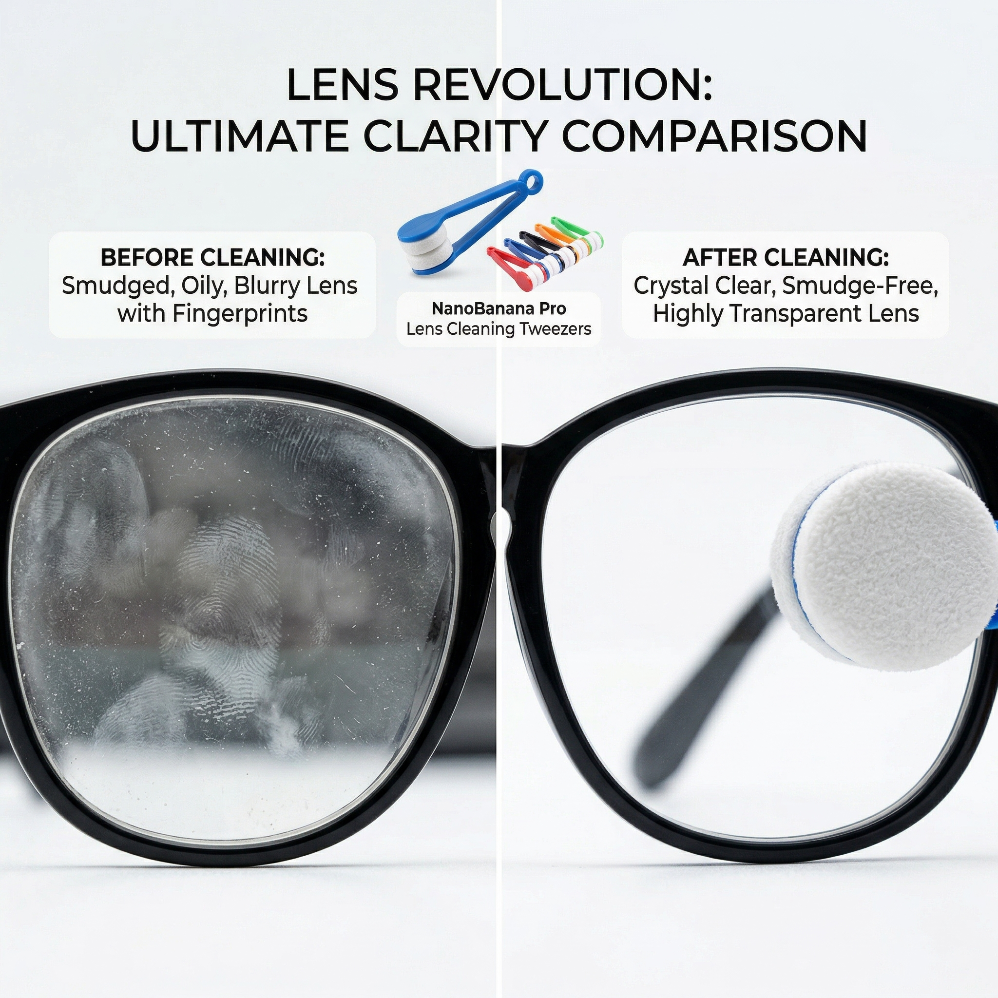

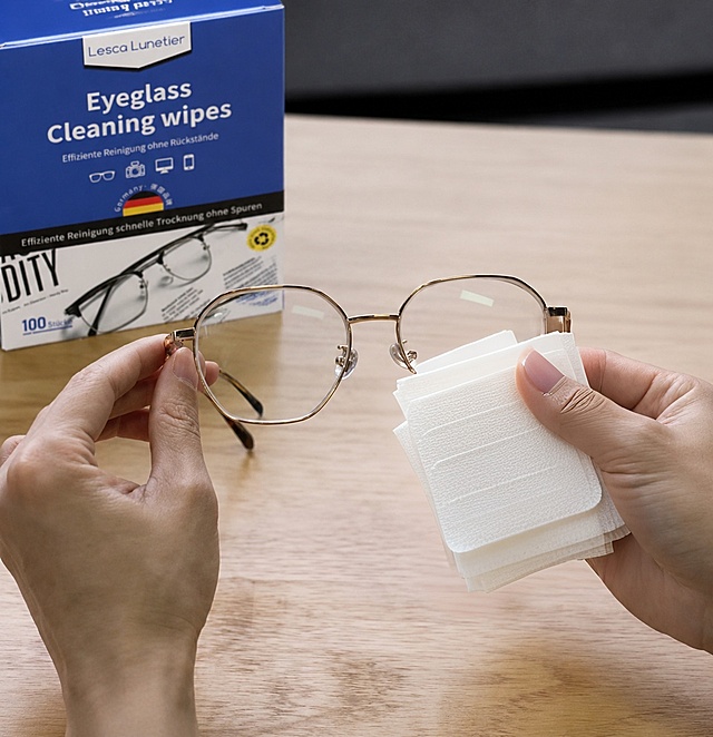
眼镜清洁擦使用前后效果对比图,左侧展示有污渍指纹的模糊眼镜镜片…
眼镜清洁擦使用前后效果对比图,左侧展示有污渍指纹的模糊眼镜镜片,右侧展示使用该清洁擦擦拭后明亮通透无痕迹的镜片,所有文字为英文,标注清洁前后效果,1:1比例,2K分辨率,突出产品清洁效果

GD381995761
2026.03.23眼镜清洁擦使用前后效果对比图,左侧展示有污渍指纹的模糊眼镜镜片,右侧展示使用该清洁擦擦拭后明亮通透无痕迹的镜片,所有文字为英文,标注清洁前后效果,1:1比例,2K分辨率,突出产品清洁效果
GD381995761
2026.03.23
![[第2屏] Pain Point Comparison of Daily Eye Protection.本屏使用【图1】作为商品主体,保持商品外观结构与颜色一致。
[氛围/风格] Clear information contrast style, real scene contrast, simple layout, commercial practical style, easy to understand.
[元素布局] The screen is divided into left and right parts. The left side shows the problem: common ordinary glasses without side protection, dust and wind can easily enter the eyes, the picture shows a small amount of dust particles near the side gap; The right side shows the solution: this protective goggles with integrated side shield, the side is completely protected, dust and wind are blocked. Each side accounts for 50% of the width, the product occupies 60% of the vertical space of each area, keep the product structure clear.
[光影质感] Uniform soft lighting, clear contrast between left and right, product details are visible, the overall picture is clean and not messy.
[配色色系] Global background color: #F5F7FA (light cool gray); left problem area with light red translucent label, right solution area with light green translucent label; text color dark gray.
[视角构图] Left and right horizontal comparison layout, the same product perspective, contrast intuitive.
[文字版式] Top main title "Before Vs After: Better Eye Protection", left area title "No Side Protection" with small label "Dust & Wind Invasion", right area title "Full Side Shield" with small label "Block Dust & Wind". Each title is placed at the top of the corresponding area, the font is clear, does not block the main body of the product, all text is in English, conform to the capitalization rules, no Chinese.
[比例分辨率] 9:16 vertical ratio, 4K resolution, clear and readable text.
[负向提示词] Product deformation, structural inconsistency, color deviation, text confusion, Chinese characters, exaggerated dirty picture, watermark, guide button.](https://gd-cms.dancf.com/gd-cms/xi19e5/0/34bf57ec-f959-4587-bae0-d8cc1c97e4972774.png?x-oss-process=image/resize,w_640,type_6/sharpen,120/interlace,1)

![[第2屏] 痛点直击-脏镜片影响生活,眼镜清洗液轻松解决。本屏使用【图1】产品作为核心元素。
[氛围/风格] 对比说明型,左右分栏对比,清晰直观,简洁干净风格。
[元素布局] 左右分屏对比布局,左栏展示痛点场景:模糊镜片、指纹油污、灰尘残留的镜片使用场景,右栏展示清洁后清晰透亮的镜片效果,瑞弗尔清洗液产品放在右栏下方,产品外观与原图保持一致。
[光影质感] 整体均匀明亮光线,左右光影一致,产品清晰突出。
[配色色系] 全局底色 #F8F9FA;主色浅灰分隔;辅助色黑色标题,绿色标注解决点。
[视角构图] 左右对比构图,阅读动线左痛点 → 右解决 → 产品展示。
[文字版式] 左栏标题「镜片脏污困扰」,列出痛点:指纹残留、灰尘依附、模糊雾感;右栏标题「一喷轻松解决」,列出优势:快速去油污、温和不损伤、保持透亮。文字分区清晰不遮挡主体,文字清晰可读。
[比例分辨率] 9:16竖版比例,4K分辨率,文字清晰可辨,高清画质。
[负向提示词] 画面混乱,过度夸张脏污,产品变形,文字错乱,水印](https://gd-cms.dancf.com/gd-cms/xi19e5/0/3ecede58-b98f-4b61-beb4-5d12884eea9a77445.png?x-oss-process=image/resize,w_640,type_6/sharpen,120/interlace,1)
![[第4屏] Functional Principle and Advantage Demonstration.本屏使用【图1】商品主体,保持外观结构一致,讲解防蓝光防尘功能。
[氛围/风格] Professional functional explanation, clear principle display, simple scientific style, easy to understand.
[元素布局] The glasses are placed in the upper middle of the画面, accounting for about 60% of the space. Below the glasses, three functional advantage cards are arranged horizontally. Each card has an icon and a description:
1. Icon of a shield: blocks dust, wind and splashes;
2. Icon of a wave block: filters harmful blue light from screens;
3. Icon of a feather: lightweight frame for all-day comfortable wear.
The cards have rounded corners, do not overlap each other, the overall layout is balanced.
[光影质感] The overall light is soft and even, the product is highlighted, the card text is clearly visible, the shadow is natural and not abrupt.
[配色系] Global background: #F5F7FA; cards are white with light gray borders, icons use different soft colors to distinguish, text is dark gray, the overall color matching is simple and professional.
[视角构图] Front view, product in upper half, function cards in lower half, clear hierarchy, easy reading.
[文字版式] Top main title "Multiple Functions For All-Day Protection", below each function card has icon + 4-8 word short description, all text in English, the main title is capitalized correctly, text does not cover the main body of the product.
[比例分辨率] 9:16 vertical ratio, 4K resolution, clear and readable text.
[负向提示词] Product deformation, inconsistent structure, wrong color, text confusion, Chinese characters, absolute exaggerated words, watermark.](https://gd-cms.dancf.com/gd-cms/xi19e5/0/9401a1f5-8587-40ea-8054-b3e7682dffdf2777.png?x-oss-process=image/resize,w_640,type_6/sharpen,120/interlace,1)


![[主图-2] 核心价值效果对比,左右分屏展示眼镜清洗前后的直观差异。
[统一基调] 淘宝/天猫专业品质风格,浅灰背景,主标题黑色粗体大字,强调色为亮橙色,字体为现代无衬线粗体,对比强烈视觉冲击强。
[画面] 左右对半分屏对比构图。左侧before区:一副黑框眼镜放在灰色桌面上,镜片上布满明显的指纹印、油渍斑点和灰尘颗粒,用放大镜效果圈出一处重污渍特写,标注污渍细节。右侧after区:同一副眼镜洁净透亮,镜片反光清晰能映出环境,旁边放着正在工作的白色眼镜清洗机,清洗槽内有气泡,产品外观与原图完全一致(白灰配色、右侧黑色数显面板、长椭圆造型)。中间用一条渐变线分隔,从左灰右橙过渡。
[光影质感] 商业棚拍摄影质感,左右光线条件一致,均为顶部柔光,左侧污渍细节清晰可见,右侧镜片透亮反光真实,产品材质表现细腻。
[配色] 背景浅灰色,左侧偏冷灰调,右侧偏暖亮调,强调色橙色用于右侧标签和分隔线,产品白灰配色保持原样。
[文字版式] 画面顶部居中主标题"洗前洗后 眼见为实",黑色粗体大字;左侧上方灰色圆角标签"洗前 满是油污",白字;右侧上方橙色圆角标签"洗后 洁净如新",白字;右下角橙色箭头指向右侧,旁注"一键洗净"。文字不遮挡关键对比区域。
[输出要求] 1:1正方形比例,2048*2048,对比效果真实强烈,产品清晰不变形,文字清晰可读,无错字,无水印,无平台logo。](https://gd-cms.dancf.com/gd-cms/xi19e5/0/a5a15cc4-abf3-4f6e-8607-a88ed9b30a4f8772.jpeg?x-oss-process=image/resize,w_640,type_6/sharpen,120/interlace,1)

![[主图-2] 核心价值效果对比,左右分屏展示眼镜清洗前后的直观差异。
[统一基调] 淘宝/天猫专业品质风格,浅灰背景,主标题黑色粗体大字,强调色为亮橙色,字体为现代无衬线粗体,对比强烈视觉冲击强。
[画面] 左右对半分屏对比构图。左侧before区:一副黑框眼镜放在灰色桌面上,镜片上布满明显的指纹印、油渍斑点和灰尘颗粒,用放大镜效果圈出一处重污渍特写,标注污渍细节。右侧after区:同一副眼镜洁净透亮,镜片反光清晰能映出环境,旁边放着正在工作的白色眼镜清洗机,清洗槽内有气泡,产品外观与原图完全一致(白灰配色、右侧黑色数显面板、长椭圆造型)。中间用一条渐变线分隔,从左灰右橙过渡。
[光影质感] 商业棚拍摄影质感,左右光线条件一致,均为顶部柔光,左侧污渍细节清晰可见,右侧镜片透亮反光真实,产品材质表现细腻。
[配色] 背景浅灰色,左侧偏冷灰调,右侧偏暖亮调,强调色橙色用于右侧标签和分隔线,产品白灰配色保持原样。
[文字版式] 画面顶部居中主标题"洗前洗后 眼见为实",黑色粗体大字;左侧上方灰色圆角标签"洗前 满是油污",白字;右侧上方橙色圆角标签"洗后 洁净如新",白字;右下角橙色箭头指向右侧,旁注"一键洗净"。文字不遮挡关键对比区域。
[输出要求] 1:1正方形比例,2048*2048,对比效果真实强烈,产品清晰不变形,文字清晰可读,无错字,无水印,无平台logo。](https://gd-cms.dancf.com/gd-cms/xi19e5/0/6cbc541b-2944-441a-8e7d-e46dd2f9ac848060.jpeg?x-oss-process=image/resize,w_640,type_6/sharpen,120/interlace,1)


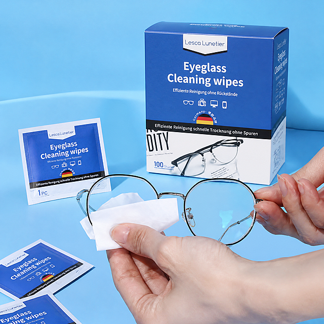



![[对比图] 多功能清洗机清洁前后对比展示,左侧为脏污的眼镜/首饰,右侧为使用本品清洁后的洁净效果,左右对称排版,中间产品居中放置保持外观与原图一致,左侧标注"Before Cleaning",右侧标注"After Cleaning",对比清晰直观,干净白底背景,全英文文字,文字清晰不遮挡主体,符合亚马逊规范,比例1:1,2048x2048,4k高清,负向提示词:变形,多余中文,水印,文字错乱,背景杂乱](https://gd-cms.dancf.com/gd-cms/xi19e5/0/ab18b0d9-4f66-42f8-90de-149226d0a26d7209.png?x-oss-process=image/resize,w_640,type_6/sharpen,120/interlace,1)

![[对比图] 多功能清洗机清洁前后对比展示,左侧为脏污的眼镜/首饰,右侧为使用本品清洁后的洁净效果,左右对称排版,中间产品居中放置保持外观与原图一致,左侧标注"Before Cleaning",右侧标注"After Cleaning",对比清晰直观,干净白底背景,全英文文字,文字清晰不遮挡主体,符合亚马逊规范,比例1:1,2048x2048,4k高清,负向提示词:变形,多余中文,水印,文字错乱,背景杂乱](https://gd-cms.dancf.com/gd-cms/xi19e5/0/e06d07bd-f072-4929-bc28-58e136e8c7a57623.png?x-oss-process=image/resize,w_640,type_6/sharpen,120/interlace,1)
![[主图-6] 功能卖点展示,展示粉色墨镜遮光效果,保持产品外观与输入产品图一致。左半部分展示户外强光环境,右半部分展示透过粉色墨镜看到的柔和遮光效果,拼图版式,浅灰简约背景,文字标注"Blocks UV" "Effective Sun Protection",文字清晰,不遮挡产品。ins简约风格,突出遮阳遮光功能优势。商业摄影质感,画面清晰干净,对比明确。保持产品本身颜色和结构不变。光影:对比展示光线差异,清晰自然。配色:浅灰背景,文字深灰色和白色对比清晰。比例分辨率:3:4比例,4k分辨率,超高清。负向提示词:变形,文字错乱,产品图模糊,背景杂乱,水印,中文文字,夸大词汇。](https://gd-cms.dancf.com/gd-cms/xi19e5/0/4e66db30-d447-4ea9-80ed-fd48897d657b48632.jpeg?x-oss-process=image/resize,w_640,type_6/sharpen,120/interlace,1)
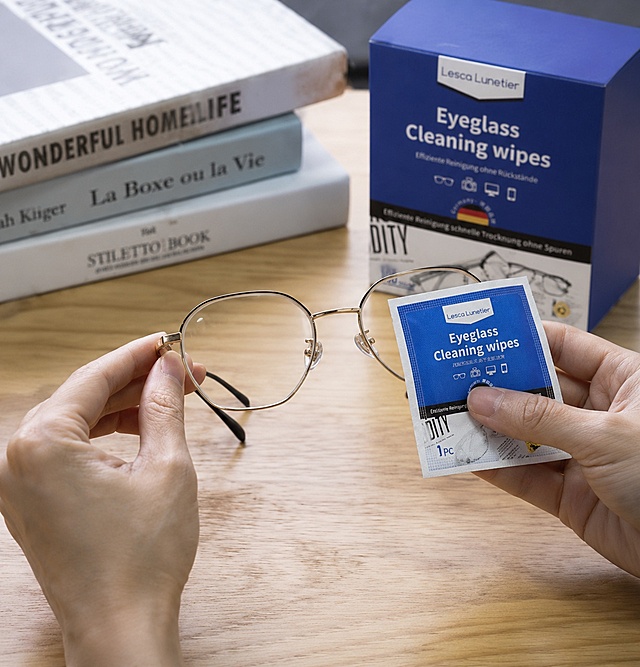
![[第3屏] Four-Grid Core Structure Details Analysis.本屏使用【图1】作为参考,提取各部位细节进行分块展示,保持产品材质和颜色与原图一致。
[氛围/风格] Clear detail display, simple flat layout, professional product introduction style, high definition close-up texture.
[元素布局] The screen is divided into 2 rows by 2 columns of four-grid layout, each grid shows a core structure:
Top left: integrated side shield, show the protective effect on the side of the eye area, close-up of the connection between the shield and the frame;
Top right: hd blue light blocking lens, show the transparent and clear lens texture, highlight the light transmission;
Bottom left: lightweight frame structure, show the overall thickness of the transparent gray frame and the transparent material feel;
Bottom right: flexible curved temples, show the bending degree of the temples and the fit design.
Each grid product details account for about 75% of the grid space, with a small white title bar at the bottom of each grid.
[光影质感] Uniform soft light for each grid, the details of each part are clearly presented, the texture of plastic and lens is real and visible.
[配色色系] Global background color: #F5F7FA; each grid has a light gray background, the title bar is white with dark gray text, the overall color is simple and coordinated.
[视角构图] Each part adopts the best perspective for detail display, close-up focus on the structure, the layout is uniform, the level is clear.
[文字版式] The main title at the top of the whole screen "Key Structure Details", each grid bottom title corresponds to "Side Protection", "HD Lens", "Lightweight Frame", "Flexible Temples", each title is short and clear, font size moderate, all text in English, no Chinese characters.
[比例分辨率] 9:16 vertical ratio, 4K resolution, clear text.
[负向提示词] Structural deformation, inconsistent color, blurred details, text confusion, Chinese characters, watermark, random combination of components.](https://gd-cms.dancf.com/gd-cms/xi19e5/0/055e7dbb-7b96-4d33-a0ae-bd8a8326391a3084.png?x-oss-process=image/resize,w_640,type_6/sharpen,120/interlace,1)
![[Main image 5] Cleaning effect comparison for microfiber cleaning towel. [Atmosphere Style] Clear contrast professional commercial image, Amazon compliant clean style. [Image Quality] Clear contrast between before and after, sharp picture, commercial photography texture. [Elements] Left and right comparison layout: left side - cleaning ordinary cotton towel wiping glass, obvious water marks and lint residue on the glass; right side - this microfiber cleaning towel wiping glass, the glass is completely transparent, no water marks, no lint. The folded microfiber towel is placed at the bottom center of the image. Layout full screen without border. [Light and Shadow] Even soft light, so that the difference between before and after is clearer, no strong shadow. [Color Matching] Neutral light gray background, highlight the contrast effect of glass surface, product color natural. [Perspective Composition] Horizontal comparison, flat perspective, soft depth of field, no distortion. [Text Layout] Top center title "Comparison of Cleaning Effect" bold large font; left bottom "Ordinary Towel", right bottom "Our Microfiber Towel", dark gray text, clear contrast, text does not cover the glass comparison area. [Proportion Resolution] 1:1 ratio, 2K resolution, text clear sharp, ultra HD. [Negative prompt] deformation, watermark, text confusion, blurred picture, exaggerated effect, false comparison](https://gd-cms.dancf.com/gd-cms/xi19e5/0/0aabf58b-f8f8-4142-a6bb-a2cc5dfe714410484.jpeg?x-oss-process=image/resize,w_640,type_6/sharpen,120/interlace,1)


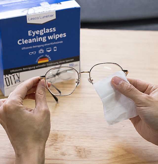
![[主图-2] 核心价值卖点图,展示智能眼镜的蓝牙音乐与智能通话两大核心功能。
[统一基调] 跨境电商科技感信息图,浅冷灰色渐变背景,主标题白色粗体无衬线字,辅助文字浅灰色,强调色为科技蓝,图标线条简洁圆角风格。
[画面] 产品位于画面中央偏左,正面45°视角,占画面约50%。右侧区域分上下两个功能模块:上方模块展示蓝牙音乐功能,配有声波波形图标和耳机音符图标,旁边有一部智能手机通过蓝色虚线信号与眼镜连接,手机屏幕显示音乐播放界面;下方模块展示智能通话功能,配有电话听筒图标和麦克风波形图标,旁边有通话界面小窗示意。画面右上角有一个圆形触控放大图标,标注镜腿触控区域。整体构图左实右虚,产品清晰,功能模块层次分明。
[光影质感] 商业摄影质感,产品光影与首图一致,背景有微弱径向渐变光效,功能图标带轻微科技蓝光晕,整体干净高级。
[配色] 浅冷灰渐变背景,黑色产品,科技蓝(#0066FF)作为功能强调色,白色主标题,浅灰色辅助文字。
[文字版式] 右上角主标题大字"Smart Audio Glasses",下方小字"Hands-Free Calling & Music";音乐模块标题"Bluetooth 5.3 Music",通话模块标题"Clear Voice Calls";触控区域标注"Touch Control"。全部英文,无衬线粗体,左对齐,放在负空间不遮挡产品。
[输出要求] 1:1比例,2048x2048,产品外观与输入图完全一致,文字清晰可读,无变形、无错字、无模糊、无水印、无平台Logo。](https://gd-cms.dancf.com/gd-cms/xi19e5/0/eb881605-90fd-42cf-9c7e-ec9abff9cce238431.jpeg?x-oss-process=image/resize,w_640,type_6/sharpen,120/interlace,1)


