已添加
登录/注册
将这张显示器参数宣传图中的所有英文文字替换为地道的韩语翻译,保…
将这张显示器参数宣传图中的所有英文文字替换为地道的韩语翻译,保持图片整体布局、风格和原有设计不变,只修改文字内容
GD609724180
2026.04.15
做同款
将这张专业色彩宣传图中的所有英文文字替换为地道的韩语翻译,保持图片整体布局、风格和原有设计不变,只修改文字内容
GD609724180
是的
GD609724180
将这张显示器参数宣传图中的所有英文文字替换为地道的韩语翻译,保持图片整体布局、风格和原有设计不变,只修改文字内容
GD609724180
将这张双模式显示器宣传图中的所有英文文字替换为地道的韩语翻译,保持图片整体布局、风格和原有设计不变,只修改文字内容
GD609724180
将这张双模式切换对比图中的所有英文文字替换为地道的韩语翻译,保持图片整体布局、风格和原有设计不变,只修改文字内容
GD609724180
美化一下产品边缘,使显示器支架与文字框交叉部分过渡自然,保留所有文字信息和产品整体构图,保留原来的画面效果
GD609724180
进一步放大显示器主体,让产品占比更大更突出,将屏幕上的交叉线条部分做虚化处理,保留所有已翻译好的英文文案和排版,保持背景融合自然
GD609724180
Amazon product main image, the product is 31.5-inch 6K computer monitor, use classic high-conversion Amazon template, light-colored background, highlight the monitor product. Use main and sub headings and small icons to introduce the product selling point: 99% DCI-P3 wide color gamut coverage. All text is in English, 1:1 square image, high-end style
GD609724180
重新生成全色域覆盖卖点主图:使用您提供的这款28.2寸 4.5k全铝合金机身显示器,改为正面摆放,保留全铝合金机身金属质感,背景干净白色带浅色网格线,屏幕展示CIE色域马蹄图,高亮标注sRGB、AdobeRGB、DCI-P3 100%及BT.2020 95%区域。主标题顶部居中大号字体:"100% COLOR GAMUT MASTERY",副标题在标题下方小一号:"sRGB / AdobeRGB / DCI-P3 100% | BT.2020 95%",四个小图标均匀横向排列在画面底部,每个带数值标签:色环图标对应sRGB 100%,相机+色块图标对应AdobeRGB 100%,电影胶片图标对应DCI-P3 100%,卫星天线图标对应BT.2020 95%。整体风格明亮现代,色域图使用半透明填充,图标色彩鲜明,产品实物与图表结合,突出"大满贯"覆盖,尺寸1000x1000px
GD609724180
放大图片下方的大小标题文字区域,让标题整体更大更突出,保持整体构图协调美观,保留所有英文内容
GD609724180
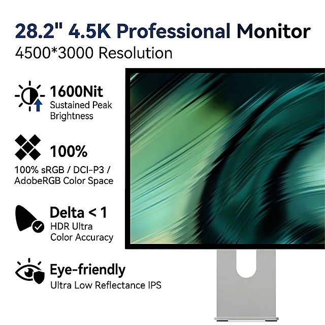
重新优化这张显示器产品宣传图,在显示器上方添加主标题"Premium 4K/5K Monitor"和副标题"Crystal Clear Visual Experience",将所有参数文字翻译为地道英文,优化整体排版,保持原产品布局和深蓝色配色风格,让排版更加美观清晰,参数模块保持但文字替换为英文,生成全新的版本
GD609724180
Amazon product main image, the product is 31.5-inch 6K computer monitor, use classic high-conversion Amazon template, light-colored background, highlight the monitor product. Use main and sub headings and small icons to introduce the product selling point: ≤2 ΔE professional grade color accuracy. All text is in English, 1:1 square image, high-end style
GD609724180
是的
GD609724180
将图中左侧的四个小图标全部修改为纯黑色,同时优化美化主标题"28.2" 4.5K Professional Monitor"和副标题"4500*3000 Resolution"的字体视觉效果,让字体更美观协调,保留原图片所有其他内容和排版不变
GD609724180
Amazon product main image, the product is 31.5-inch 6K computer monitor, use classic high-conversion Amazon template, light-colored background, highlight the monitor product. Use main and sub headings and small icons to introduce the product selling point: 1000 Nit full-screen high brightness. All text is in English, 1:1 square image, high-end style
GD609724180
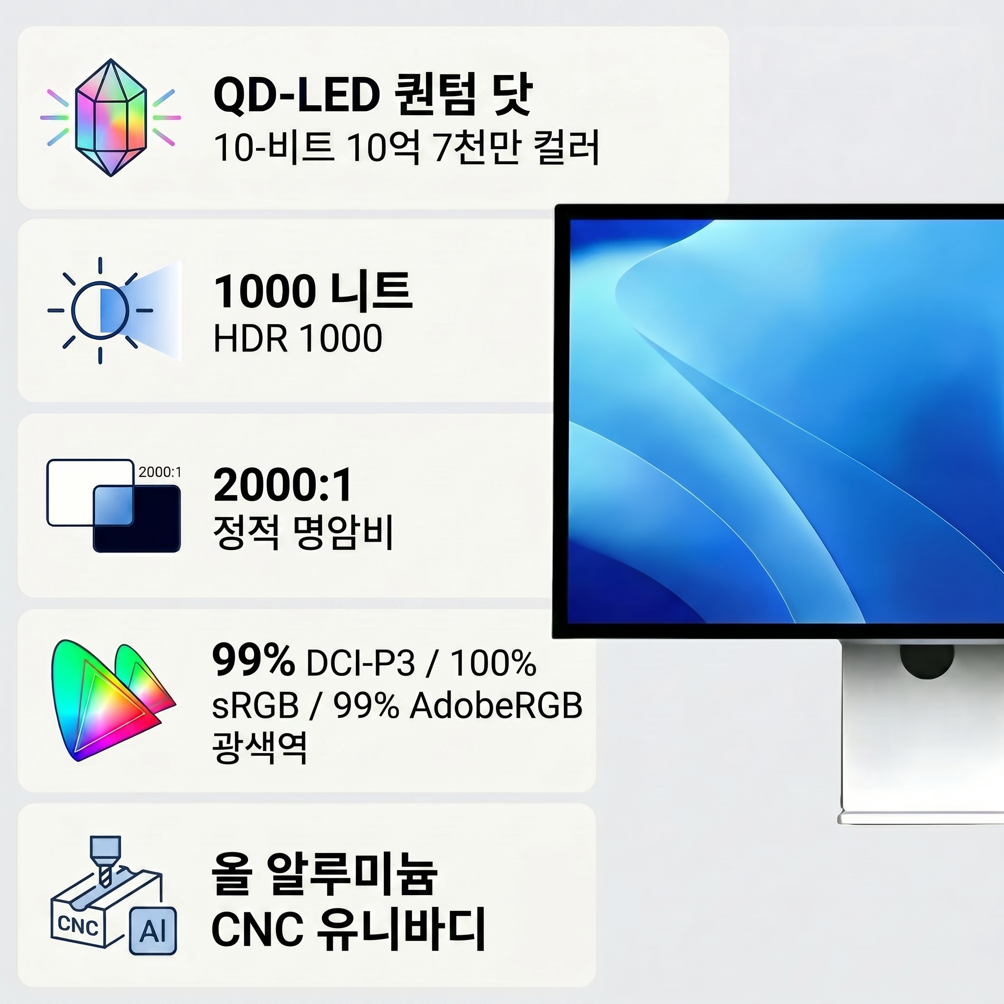
将图片中的中文文案翻译为英语,优化构图,放大产品显示器,优化视觉效果,让整体画面更美观,保持深暗色背景风格。文案翻译结果:HDR1000, 1000 Nit Full Screen Brightness, QDLED Quantum Dot Backlight Technology, 2000:1 Ultra-high Contrast Ratio, Dark Details are Clearly Visible, HDR1000, Greatly Improved Dynamic Range
GD609724180
Amazon product main image, the product is 31.5-inch 6K computer monitor, use classic high-conversion Amazon template, light-colored background, highlight the monitor product. Use main and sub headings and small icons to introduce the product selling point: 10Bit color depth with 10.7 billion colors. All text is in English, 1:1 square image, high-end style
GD609724180
High-click 1000x1000 first image of 4K professional monitor, highlight product selling points, 4K UltraHD 163 PPI, HDR1000 + Quantum Dot, 100% AdobeRGB/DCI-P3/sRGB, 75 adaptive sync, anti-glare coating, eye protection, aluminum passive cooling design, all text in English, e-commerce main image, high contrast high click layout, clean modern tech style, highlight product features. Original product image is the reference.
GD609724180
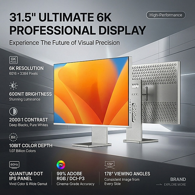
为这款31.5英寸显示器制作一张1:1电商主图卖点海报,整体高端大气风格,全英文设计。使用高点击模板,包含大小标题和图标展示核心卖点:6K 6016×3384 Resolution,600Nit Brightness,2000:1 Contrast,10BIT Color Depth,Quantum Dot IPS Panel,HDR600,60Hz Refresh Rate,99% Adobe RGB / 99% DCI-P3 Color Gamut,178° Viewing Angles。保留产品主体,设计干净高级,突出产品卖点和产品图。
GD609724180
「图片1」参考图片风格,上传您的商品图,生成1套详情页「图片1」「图片1」「图片1」「图片1」内置立体扬声器,无需外接音箱,影音娱乐一键开启
是小香ya
Product main image for 31.5-inch 6K computer monitor, light-colored background to highlight the product, use the provided monitor product image, with size headings and icons to vividly describe product features: 31.5 inch 6K full-fit mirror screen (6016×3384 resolution), 99% DCI-P3 wide color gamut coverage, 1000 Nit full-screen brightness, ≤2 ΔE professional color accuracy, 10Bit color depth (10.7 billion colors). The overall style is high-end and elegant, all text is in English, 1000×1000 square main image with high click-through rate template
GD609724180
是的
GD609724180
[主图-2] Core value & display quality comparison: Demonstrate HD display and accurate color of OLED screen, visual comparison showing quality difference. [Visual style] Premium digital tech aesthetic, cool gray tech style, clean and restrained, soft layered lighting; main colors deep space gray + cool white + tech blue accents, modern sans-serif bold font, rounded thin stroke semi-transparent card style. [Composition] Left-right split screen comparison layout; left side labeled "Standard Screen" showing blurry washed-out display effect; right side labeled "OLED HD Screen" showing sharp vibrant color display; thin vertical line dividing the two sides; below the split screen, a complete phone screen assembly (powered on) sits centered as the product itself, occupying about 40% of the frame; light gray gradient background, overall minimalist. [Lighting & texture] Commercial photography quality, screen display area uniformly bright, colors vivid and transparent, subtle glass reflection on screen, highlight outlining product edges, soft shadow at bottom. [Color palette] Light gray gradient background, left standard screen with dull yellowish blurry feel, right OLED screen with vibrant sharp colors, tech blue as comparison highlight color, dark gray + white text. [Typography] Top center main title "OLED HD True Color Display"; above each split screen side, small labels "Standard Screen" and "OLED HD Screen"; below product, auxiliary text "Accurate Color Responsive Touch Crisp Display"; unified modern sans-serif font, main title largest, labels and auxiliary text smaller. [Output requirements] 1:1 square aspect ratio, comparison effect obvious, product clear, text legible; NO distortion, typos, blur, messy decoration, watermark, platform logo.
GD985773707
[商品] 使用【图7】正面正视图便携显示屏;保留黑色窄边框、圆角屏幕、左侧按键、整体比例;屏幕左右分屏显示不同对比度效果,左侧普通对比度右侧高对比度;产品外观、颜色、材质、结构与输入图一致。 [画面] 第6屏对比度,目标是展示100000:1超高对比度的优势。采用左右对比分屏构图。产品居中偏上,屏幕画面左右分割:左侧显示普通对比度的画面(暗部发灰、亮部过曝),右侧显示OLED高对比度画面(暗部纯黑、亮部通透、细节丰富)。产品上方放主标题,产品下方放对比说明文字和大数字对比度参数。整体Mac极简风格,浅灰背景。 [视觉] 套系策略:风格=Mac简白+浅灰色极简高级感;标题字=现代无衬线粗体(苹方/思源黑体风格);正文字=简洁无衬线体;主色=纯白+浅灰白;背景延展=基于浅灰白做深浅层级渐变、细腻质感;强调色=深炭黑仅文字和细线;标题色=深炭黑#1D1D1F;正文色=中灰#6E6E73;组件=圆角浅灰卡片、极细分隔线、极简线稿图标;光影=柔和顶侧自然光,干净柔和接触阴影,产品边缘细腻高光。 [文字] 顶部居中主标题 100000:1 超高对比度 副标题 亮部不过曝 暗部不死黑 画面立体感更强 屏幕左右两侧上方分别标注小字 普通屏幕 和 OLED屏幕 底部三个短卖点横向排列 暗部细节清晰 亮部层次丰富 画面立体通透 所有文字横排,居中对齐,大数字突出显示。 [规格] 图片比例3:4竖版,4K,避免变形、错字、文字过小、对比效果不明显、产品比例失真、背景杂乱。
▶︎ıllıııllıl19”
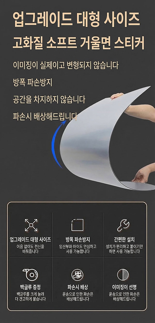
基于原图修改,将图片中的所有中文字符替换为韩语,保持原有设计布局、颜色、图片内容和其他元素完全不变,只更改文字语种。原图文案对应翻译为韩语: 업그레이드 대형 사이즈 고화질 소프트 거울면 스티커 이미징이 실제이고 변형되지 않습니다 방폭 파손방지 공간을 차지하지 않습니다 파손시 배상해드립니다 업그레이드 대형 사이즈 이음 없이도 전신을 비춰줍니다 방폭 파손방지 임산부와 아이도 안심하고 사용 가능합니다 간편한 설치 설치가 편리하고 붙이기만 하면 사용 가능합니다 백글루 증정 백글루를 크게 늘려 더 견고하게 붙습니다 파손시 배상 운송으로 인한 파손은 배상해드립니다 이미징이 선명 운송으로 인한 파손은 배상해드립니다
1quwhdhs2ssOQUNg-HB








![[主图-2] Core value & display quality comparison: Demonstrate HD display and accurate color of OLED screen, visual comparison showing quality difference.
[Visual style] Premium digital tech aesthetic, cool gray tech style, clean and restrained, soft layered lighting; main colors deep space gray + cool white + tech blue accents, modern sans-serif bold font, rounded thin stroke semi-transparent card style.
[Composition] Left-right split screen comparison layout; left side labeled "Standard Screen" showing blurry washed-out display effect; right side labeled "OLED HD Screen" showing sharp vibrant color display; thin vertical line dividing the two sides; below the split screen, a complete phone screen assembly (powered on) sits centered as the product itself, occupying about 40% of the frame; light gray gradient background, overall minimalist.
[Lighting & texture] Commercial photography quality, screen display area uniformly bright, colors vivid and transparent, subtle glass reflection on screen, highlight outlining product edges, soft shadow at bottom.
[Color palette] Light gray gradient background, left standard screen with dull yellowish blurry feel, right OLED screen with vibrant sharp colors, tech blue as comparison highlight color, dark gray + white text.
[Typography] Top center main title "OLED HD True Color Display"; above each split screen side, small labels "Standard Screen" and "OLED HD Screen"; below product, auxiliary text "Accurate Color Responsive Touch Crisp Display"; unified modern sans-serif font, main title largest, labels and auxiliary text smaller.
[Output requirements] 1:1 square aspect ratio, comparison effect obvious, product clear, text legible; NO distortion, typos, blur, messy decoration, watermark, platform logo.](https://gd-cms.dancf.com/gd-cms/xi19e5/0/7a39310a-f510-4c45-a707-6c83f342e6ff17181.jpeg?x-oss-process=image/resize,w_640,type_6/sharpen,120/interlace,1)

![[商品] 使用【图7】正面正视图便携显示屏;保留黑色窄边框、圆角屏幕、左侧按键、整体比例;屏幕左右分屏显示不同对比度效果,左侧普通对比度右侧高对比度;产品外观、颜色、材质、结构与输入图一致。
[画面] 第6屏对比度,目标是展示100000:1超高对比度的优势。采用左右对比分屏构图。产品居中偏上,屏幕画面左右分割:左侧显示普通对比度的画面(暗部发灰、亮部过曝),右侧显示OLED高对比度画面(暗部纯黑、亮部通透、细节丰富)。产品上方放主标题,产品下方放对比说明文字和大数字对比度参数。整体Mac极简风格,浅灰背景。
[视觉] 套系策略:风格=Mac简白+浅灰色极简高级感;标题字=现代无衬线粗体(苹方/思源黑体风格);正文字=简洁无衬线体;主色=纯白+浅灰白;背景延展=基于浅灰白做深浅层级渐变、细腻质感;强调色=深炭黑仅文字和细线;标题色=深炭黑#1D1D1F;正文色=中灰#6E6E73;组件=圆角浅灰卡片、极细分隔线、极简线稿图标;光影=柔和顶侧自然光,干净柔和接触阴影,产品边缘细腻高光。
[文字] 顶部居中主标题 100000:1 超高对比度
副标题 亮部不过曝 暗部不死黑 画面立体感更强
屏幕左右两侧上方分别标注小字 普通屏幕 和 OLED屏幕
底部三个短卖点横向排列 暗部细节清晰 亮部层次丰富 画面立体通透
所有文字横排,居中对齐,大数字突出显示。
[规格] 图片比例3:4竖版,4K,避免变形、错字、文字过小、对比效果不明显、产品比例失真、背景杂乱。](https://gd-cms.dancf.com/gd-cms/xi19e5/0/deeddc4c-7b49-4e43-bfa5-a88f588c280e2042.jpeg?x-oss-process=image/resize,w_640,type_6/sharpen,120/interlace,1)