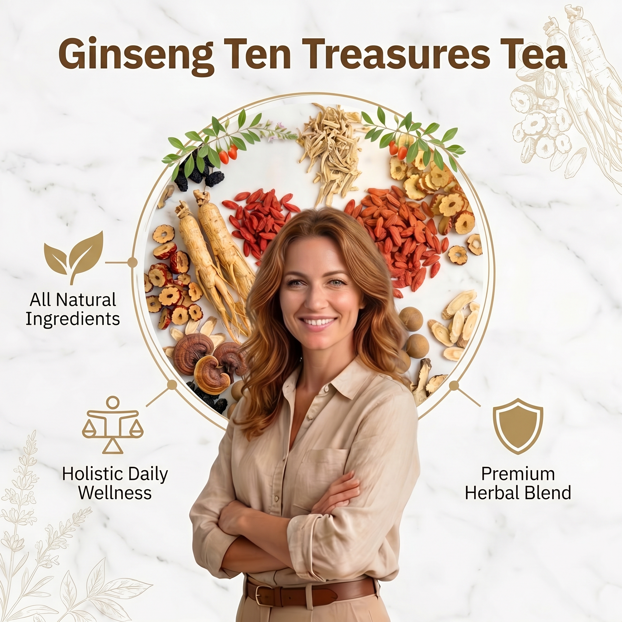

Infographic style product benef…
Infographic style product benefit visual for Ginseng Ten Treasures Tea, centered on the premium herb

GD665707502
2026.04.21Infographic style product benefit visual for Ginseng Ten Treasures Tea, centered on the premium herb
GD665707502
2026.04.21


![[主图-1] 人参九宝茶成分原料展示图,主题为展示九种天然草本原料,建立天然纯净的产品印象。
[统一基调] 暖棕木质天然草本风格,深棕色主标题配米白色副标题,米色标签配深棕色文字,整体温暖自然有食欲感,字体为衬线体,干净优雅。
[画面] 俯视平铺构图,深棕色木质桌面背景,中央放置一杯冒着热气的琥珀色茶汤玻璃杯,周围环绕摆放六个白色小碗,分别装着:红枣片、枸杞、桑葚、人参块、黄精、玛咖粉(对应九宝茶原料),碗边散落一些原料点缀。左上角有一个暖棕色圆角矩形标题区域。每个碗旁边有米色圆角标签标注原料名称:Red Jujubes、Goji Berries、Ginseng、Mulberries、Polygonatum sibiricum、Maca Powder 等。右下角搭一块暖棕色棉麻布料增加质感。产品包装袋不出现,重点展示原料的天然质感。
[光影质感] 自然暖光从上方照射,木质纹理清晰,茶汤通透有热气,食材表面有自然光泽,柔和阴影,商业美食摄影质感。
[配色] 主色深棕色、暖棕色、米色、木色,点缀枸杞红、桑葚黑、人参米白,整体暖色调统一。
[文字版式] 顶部大标题两行:第一行"PURE & NATURAL",第二行"Ginseng Nine Treasure Tea",白色粗衬线字体。副标题一行:"Premium Herbal Ingredients — No Additives",白色细衬线字体。各原料标签为米色圆角底配深棕色衬线字体。
[输出要求] 1:1正方形,文字清晰可读,食材真实自然,画面干净有食欲,禁止变形、错字、模糊、杂乱、水印、平台Logo。](https://gd-cms.dancf.com/gd-cms/xi19e5/0/c38f3a9f-1260-41df-91b2-2506e0cc7f2024795.jpeg?x-oss-process=image/resize,w_640,type_6/sharpen,120/interlace,1)

![[主图-3] 适用人群与功效场景图,主题为展示产品适合疲劳、低能量、缺乏活力的人群,传递天然健康的生活方式。
[统一基调] 暖棕米色天然草本风格,深棕色主标题,整体温暖治愈,字体为衬线体。
[画面] 右侧主体是一位欧美中年男性坐在客厅米色沙发上,面带微笑,手持一杯琥珀色茶汤,穿着驼色毛衣,背景是温暖的客厅环境有窗帘和台灯。左侧有一个竖版暖棕色圆角区域,内含三个圆形头像小图,分别展示三种状态:最上面是疲惫的欧美男性办公扶额,标注"Fatigue & Exhaustion";中间是疲惫的欧美女性靠在沙发上,标注"Low Energy";最下面是头疼的欧美男性,标注"Lack of Vitality"。画面左下角放置一袋Ginseng Nine Treasure Tea产品和一个三角茶包在小桌上。右下角木质托盘上放着产品袋、茶汤杯、原料小碗和茶包。底部大标题区域。
[光影质感] 温暖的自然光从窗户照入,柔和舒适,人物自然真实,产品融入场景不突兀,整体生活方式摄影质感。
[配色] 主色暖棕色、米色、驼色、木色,整体暖色调温馨治愈。
[文字版式] 左侧圆形图标下方白色文字标注三种状态。底部大标题"Ginseng Nine Treasure Tea",深棕色粗衬线字体。副标题"Natural Wellness — Herbal Supplement",深棕色细衬线字体。左下角有小叶子装饰。
[输出要求] 1:1正方形,人物自然真实,产品清晰,文字清晰可读,禁止面部扭曲、畸形、穿模,禁止错字、模糊、水印、平台Logo。](https://gd-cms.dancf.com/gd-cms/xi19e5/0/50924e50-657a-4764-b1d5-c3f7e56a27ec18279.jpeg?x-oss-process=image/resize,w_640,type_6/sharpen,120/interlace,1)
![[主图-5] 冲泡指南步骤图,主题为展示四步冲泡方法,教消费者如何正确饮用。
[统一基调] 暖橙棕色顶部配米色背景,深棕色文字,圆角卡片样式,整体温暖有食欲,字体为衬线体。
[画面] 顶部暖橙棕色标题栏,四角点缀红枣、枸杞、桑葚等原料。主体为2x2排列的四个圆角米色卡片,每个卡片包含圆形图标、步骤标题、说明文字和一张实物小图:1. Prepare:茶包图标,文字"Place one filter tea bag in your favorite mug",小图展示产品袋放在木桌上,旁边有枸杞碗和茶包;2. Add Water:茶壶图标,文字"Pour 8 oz (240 ml) of hot water at 80 degree C",小图展示热水倒入玻璃杯中,茶包在杯中;3. Steep 5-10 min:时钟图标,文字"Let the tea steep for 5-10 minutes for full flavor",小图展示杯中茶汤冒着热气,有枸杞和红枣片漂浮;4. Enjoy:叶子图标,文字"Remove tea bag and enjoy warm and soothing",小图展示一杯泡好的琥珀色茶汤,旁边有枸杞和桑葚点缀。底部深棕色通栏。
[光影质感] 每个小图都是真实美食摄影质感,茶汤通透有热气,木质桌面温暖,整体信息图清晰易读。
[配色] 顶部暖橙棕色、背景浅米色、卡片米色、图标和文字深棕色,整体暖色调统一有食欲。
[文字版式] 顶部大标题"GINSENG NINE TREASURE TEA",白色粗衬线字体。副标题"BREWING GUIDE",白色细衬线字体。每个步骤编号和标题深棕色粗体,说明文字深棕色常规体。底部通栏白色文字:"NATURAL INGREDIENTS | CAFFEINE FREE | DAILY WELLNESS"。
[输出要求] 1:1正方形,步骤清晰,文字可读,小图真实有食欲,禁止变形、错字、模糊、杂乱、水印、平台Logo。](https://gd-cms.dancf.com/gd-cms/xi19e5/0/2c032ad5-aa96-4259-a721-b23c53aeb57824796.jpeg?x-oss-process=image/resize,w_640,type_6/sharpen,120/interlace,1)
![[主图-4] 为什么选择人参九宝茶卖点图,主题为展示五大核心卖点:天然成分、无添加、纯素、非转基因、独立茶包。
[统一基调] 浅米色背景暖棕风格,手绘草本插画装饰,深棕色主标题,整体清新自然,字体为衬线体。
[画面] 浅米色背景,画面正中央放置Ginseng Nine Treasure Tea透明自立袋产品包装,标签清晰。产品周围环绕五个圆形图标卖点,均匀分布:左上"100% Natural Ingredients"配叶子图标;右上"No Additives"配烧瓶禁止图标;左中"100% Vegan"配小苗图标;右中"Non-GMO"配DNA禁止图标;正下方"30 Individual Tea Bags"配茶包图标。画面四个角落有手绘风格的人参、枸杞、桑葚、红枣等草本植物插画装饰,颜色为暖棕、红、绿的手绘风格。底部深棕色通栏。
[光影质感] 产品包装有真实质感,居中展示,整体干净明亮,插画风格统一,信息图风格清晰易读。
[配色] 主色浅米色背景、深棕色文字、暖棕色图标边框,手绘插画用自然的绿、红、棕色调,整体清新温暖。
[文字版式] 顶部大标题"Why Choose Ginseng Nine Treasure Tea?" 分两行,深棕色粗衬线字体。每个图标下方深棕色文字标注卖点名称。底部通栏白色大字:"NON-GMO | NO ADDITIVES | PREMIUM QUALITY"。
[输出要求] 1:1正方形,产品包装完整清晰,文字清晰可读,图标整齐,禁止变形、错字、模糊、杂乱、水印、平台Logo。](https://gd-cms.dancf.com/gd-cms/xi19e5/0/bf6e36bc-a461-475e-bdc6-aeab05932bf824443.jpeg?x-oss-process=image/resize,w_640,type_6/sharpen,120/interlace,1)


![[主图-2] OEM/ODM定制服务展示图,主题为展示品牌定制能力,突出配方、包装、起订量三大优势。
[统一基调] 暖棕木质天然草本风格,深棕色主标题配米色副标题,米色卡片配深棕色文字,整体温暖专业,字体为衬线体。
[画面] 画面中央偏左位置放置完整的Ginseng Nine Treasure Tea透明自立袋产品包装,标签清晰可读,包装放在深色木质托盘上。托盘上摆放人参、桑葚、红枣、枸杞等原料小碗,旁边放一杯泡好的琥珀色茶汤和两个三角茶包。左右两侧各有两个圆角白色信息卡片,左侧两个:1号卡片标题"Custom Formula",配研钵图标,说明"Adjust herbal blend ratios, add/remove ingredients";3号卡片标题"Low MOQ",配合手图标,说明"Flexible minimum order, trial order welcome"。右侧一个:2号卡片标题"Custom Packaging & Label",配纸箱图标,说明"Kraft Paper Bag, Food Stand-up Pouch, Gift Box, Tin Can — plus your logo and multilingual labels"。顶部大标题区域为浅米色背景,两侧有线条绘制的草本植物装饰。底部深棕色通栏文字。
[光影质感] 柔和暖光,产品包装有真实的塑料质感和标签透视,木质托盘有纹理,茶汤通透,整体商业摄影质感,阴影自然。
[配色] 主色深棕色、暖棕色、米色、浅米色背景,点缀原料的自然色彩,整体暖色调统一。
[文字版式] 顶部大标题"OEM / ODM",深棕色粗衬线超大字体。副标题"Customization — Your Brand, Our Formula",深棕色细衬线字体。卡片标题深棕色粗体,说明文字深棕色常规体。底部通栏白色文字:"We support your brand from formula to shelf",下一行小字"Quality Ingredients | Quality Control | GMP Certified | Global Shipping"。
[输出要求] 1:1正方形,产品包装完整清晰,文字清晰可读,禁止变形、错字、模糊、杂乱、水印、平台Logo。](https://gd-cms.dancf.com/gd-cms/xi19e5/0/efad7664-ddc6-4cd5-b249-94d42b67c91a18278.jpeg?x-oss-process=image/resize,w_640,type_6/sharpen,120/interlace,1)


![Main image 5 of Tai Ju Baby Chrysanthemum, usage scenario experience
[氛围/风格] Warm casual home atmosphere, natural afternoon light, lifestyle style
[画面 elements] A young European woman sitting on the sofa in the living room, holding a cup of chrysanthemum tea in her hand, the canned Tai Ju Baby Chrysanthemum is placed on the coffee table next to it, soft books and green plants are placed around, the natural afternoon sunlight slants in from the window, creating a comfortable relaxing leisure afternoon tea atmosphere, all text is English, the picture is full screen without borders
[配色色系] Main color: warm beige and wood tone, auxiliary colors: soft light yellow tea, green plants, natural light warm tone
[视角构图] Natural life Vlog perspective, moderate depth of field, the product and the experience scene are both clearly presented
[文字版式] Title " Your Daily Healthy Tea Choice" at the bottom, white sans-serif font on a soft semi-transparent black gradient bar, the text is clearly visible and does not block the main subject.](https://gd-cms.dancf.com/gd-cms/xi19e5/0/a6b02446-b944-47f6-a6f2-0ba766f20e4f7496.jpg?x-oss-process=image/resize,w_640,type_6/sharpen,120/interlace,1)
![[第3屏] 天然成分屏-Yoni Feminine Care Capsule herbal ingredients display。不需要产品外观图,聚焦成分展示。
[氛围/风格] 专业自然科研风,浅绿低饱和渐变背景,柔和自然光影,干净通透质感。
[元素布局] 画面中心放大展示三种核心草本植物插图,每种成分占比约30%整体排版均衡,大标题在顶部,成分说明在下方对应位置,整体构图简洁突出核心元素。
[光影质感] 均匀柔和自然光,成分轮廓清晰,叶片纹理细腻,整体明亮干净。
[配色色系] 全局底色 #F0F5F0,主色自然绿色,辅助色深绿色文字,浅棕色植物线条。
[视角构图] 平面成分展示构图,中心均衡排列,阅读动线从上到下。
[文字版式] 顶部大标题「100% Natural Chinese Herbal Blend」,每个成分下方标注名称和功效:1.「Ginseng Root - Nourishes & Balances」;2.「Borneol - Refreshing & Soothing」;3.「Motherwort - Supports Natural Recovery」,文字清晰层级分明。
[比例分辨率] 9:16竖版比例,width 1080px height 1920px,4K分辨率,文字清晰可辨,高清画质。
[负向提示词] blurry, distorted, garbled text, watermark, Chinese characters, exaggerated claims, unrealistic elements](https://gd-cms.dancf.com/gd-cms/xi19e5/0/e64662b6-c89e-4d30-9616-c648b74937ba69188.jpeg?x-oss-process=image/resize,w_640,type_6/sharpen,120/interlace,1)

![[商品] 使用【图4】URENUS高丽参胶囊产品图;保留深蓝色玻璃瓶、白色瓶盖、标签所有英文文字、颜色、材质、比例,瓶身文字不翻译不改写,仅清晰化。
[画面] 目标:三大核心卖点拆解页,天然草本支持,传递健康活力理念。构图:上文下图,顶部大标题+3个圆形icon卖点横排,中部产品瓶居中,产品周围环绕人参根、人参叶片、切片等草本元素;产品占画面50%。前中后景:前景胶囊+切片,中景产品瓶,背景虚化人参叶片与暖光。
[视觉] 套系策略:风格=温暖自然草本高级商业摄影;标题字=粗衬线宋体(厚重有力);正文字=简洁无衬线体;主色=米杏暖白;背景延展=基于米杏暖白做深浅渐变、同色层次和细腻哑光质感;强调色=金棕色,仅用于图标、引线和重点高亮;标题色=深金棕色;正文色=中暖棕;组件=圆形金棕色图标、圆角信息卡;光影=左前侧暖柔光,产品立体真实。
[文字] 顶部文字区横排。主标题:「纯净天然 草本支持」(超大字号,深金棕色);下方3个圆形金棕色图标+文字横排:「🏃 日常健康调理」「🌿 传统草本养生」「💪 活力生活常备」。文字不遮挡产品主体。
[规格] 图片比例3:4竖版,4K,负向提示:避免变形、错字、文字过小、冷蓝/蓝灰背景、瓶身文字被替换、产品颜色改变、医疗功效承诺、极限词。](https://gd-cms.dancf.com/gd-cms/xi19e5/0/7b41f1b5-b8b5-45b2-906f-183f13edfca316411.jpeg?x-oss-process=image/resize,w_640,type_6/sharpen,120/interlace,1)
![[主图 1] 18 Flavors Beauty Goddess Tea main product image focusing on ingredients. The large title "18 Flavors Goddess Tea" is at the top of the image with extra large bold sans-serif font, prominent and eye-catching. The picture does not display product packaging, and 18 kinds of natural herbal ingredients such as rose, jasmine, goji berry, chrysanthemum, longan are artistically arranged in the center of the picture, clear and prominent, highlighting the rich natural raw materials of the product. The composition is full without excessive blank space, elements are rich and gorgeous but not piled up, the layout is layered and orderly. All text information is in English, only keep the large title and a small amount of key description, avoid too much text. Conforms to American market aesthetic, highlights product differentiation, focuses on showing the natural formula of 18 ingredients, does not involve organic, non-GMO, weight loss and other content.
[氛围风格] Natural fresh style with gorgeous color matching, high-end commercial food photography.
[画质] Commercial photography texture, soft and transparent light, clear and real product details, clean and advanced picture, super high definition, text clear and recognizable.
[Elements] 18 kinds of natural raw materials are scattered and layered in the center, presenting fresh colors and natural textures. The product ingredients occupy 70% of the picture, full screen without border, the picture is full, the elements are coordinated, and the hierarchy is clear.
[光影] Soft natural main light from the front, auxiliary light brightens the details of ingredients, soft transition between light and shadow, clear texture of each raw material, prominent layering.
[配色] Main color natural plant green, auxiliary color warm gold and natural raw material original colors, fresh and eye-catching, harmonious and attractive.
[视角构图] Front overlook composition, ingredients as the visual center, layered focus, full picture without cutting important elements.
[文字版式] Top center alignment, main title "18 Flavors Goddess Tea" extra large bold white font, slightly drop shadow to ensure readability. Below the main title, a small line of subtitle "Natural 18 Herb Blend For Women", the font size is 1/5 of the main title. All text is placed in the top blank space, does not block the core ingredients in the center, the contrast between size and thickness is clear, the level is distinct.
[比例分辨率] 1:1 ratio, 2k resolution, text clearly recognizable, ultra high definition.
[Negative prompt] Deformation, watermark, messy text, blurred picture, messy background, product packaging display, Chinese text, organic non-GMO weight loss and other sensitive words, excessive blank space.](https://gd-cms.dancf.com/gd-cms/xi19e5/0/3b363b21-c0f5-46c5-ac0a-793299a2a1011956.jpeg?x-oss-process=image/resize,w_640,type_6/sharpen,120/interlace,1)


![[主图-2] 仁和酵科书参满多发酵植物饮品原料与功效卖点图,展示药食同源配方与多重功效。
[统一基调] 国风品质感,红金主色调,深红渐变背景配金色线条装饰,标题金色粗体书法字,辅助文案白色细黑体,强调色朱红与烫金,整体高端大气专业可信。
[画面] 产品礼盒缩小置于画面右下角,占比约30%。画面中央和左侧展示人参、茯苓、黄精、枸杞、桑葚、大枣、蜂蜜、松花粉、覆盆子共9味本草原料,以精美摆盘方式呈现,每种原料旁有细线引出标注名称。背景为深红渐变,点缀金色祥云纹样,营造传统中医养生氛围。顶部有金色分隔线。
[光影质感] 商业摄影质感,自然柔光照射,本草原料纹理清晰,人参须根分明,枸杞饱满透亮,整体温暖有质感,产品与原料自然融合。
[配色] 主背景深红色渐变,文字金色与白色,原料保持天然色泽,金色装饰线条点缀。
[文字版式] 顶部主标题"9味药食同源 君臣佐使配伍"金色大字,下方副标题"人参茯苓黄精枸杞等本草发酵"白色小字。画面中部用四个金色圆角矩形卡片横向排列,分别写"提高免疫力""改善疲劳状态""滋阴补肾养血""延缓衰老活力",卡片内文字白色,图标金色。左下角标注"仁和出品 上市企业"金色小字。文字布局在上方和中部,不遮挡右下角产品。
[输出要求] 1:1正方形比例,2048px,文字清晰可读,产品与原料清晰,无变形错字,无水印无平台logo,画面信息丰富但不杂乱。](https://gd-cms.dancf.com/gd-cms/xi19e5/0/ba21e8c8-5ae7-4181-99d4-6ab2b04c33e034662.jpeg?x-oss-process=image/resize,w_640,type_6/sharpen,120/interlace,1)
![[主图-2] 仁和酵科书参满多发酵植物饮品原料与功效卖点图,展示药食同源配方与多重功效。
[统一基调] 国风品质感,红金主色调,深红渐变背景配金色线条装饰,标题金色粗体书法字,辅助文案白色细黑体,强调色朱红与烫金,整体高端大气专业可信。
[画面] 产品礼盒缩小置于画面右下角,占比约30%。画面中央和左侧展示人参、茯苓、黄精、枸杞、桑葚、大枣、蜂蜜、松花粉、覆盆子共9味本草原料,以精美摆盘方式呈现,每种原料旁有细线引出标注名称。背景为深红渐变,点缀金色祥云纹样,营造传统中医养生氛围。顶部有金色分隔线。
[光影质感] 商业摄影质感,自然柔光照射,本草原料纹理清晰,人参须根分明,枸杞饱满透亮,整体温暖有质感,产品与原料自然融合。
[配色] 主背景深红色渐变,文字金色与白色,原料保持天然色泽,金色装饰线条点缀。
[文字版式] 顶部主标题"9味药食同源 君臣佐使配伍"金色大字,下方副标题"人参茯苓黄精枸杞等本草发酵"白色小字。画面中部用四个金色圆角矩形卡片横向排列,分别写"提高免疫力""改善疲劳状态""滋阴补肾养血""延缓衰老活力",卡片内文字白色,图标金色。左下角标注"仁和出品 上市企业"金色小字。文字布局在上方和中部,不遮挡右下角产品。
[输出要求] 1:1正方形比例,2048px,文字清晰可读,产品与原料清晰,无变形错字,无水印无平台logo,画面信息丰富但不杂乱。](https://gd-cms.dancf.com/gd-cms/xi19e5/0/9bc40878-c7c0-4607-8c96-bc3c77236c4834511.jpeg?x-oss-process=image/resize,w_640,type_6/sharpen,120/interlace,1)