
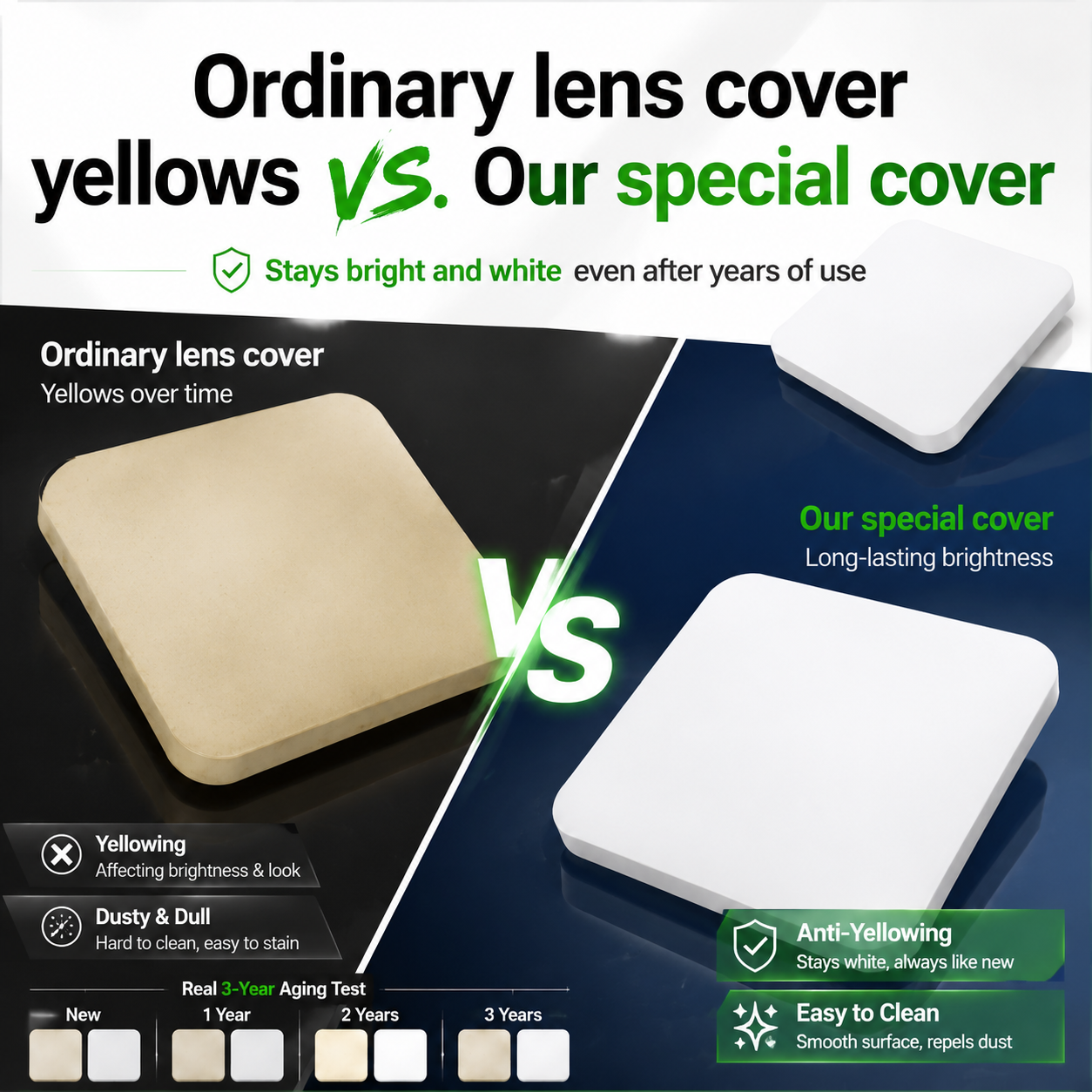

亚马逊风格电商主图设计,基于现有的方形吸顶灯产品图,添加对比展…
亚马逊风格电商主图设计,基于现有的方形吸顶灯产品图,添加对比展示内容。突出大标题大字:"Ordinary lens cover yellows vs. Our special cover",搭配精致图

GD780706222
2026.05.19亚马逊风格电商主图设计,基于现有的方形吸顶灯产品图,添加对比展示内容。突出大标题大字:"Ordinary lens cover yellows vs. Our special cover",搭配精致图
GD780706222
2026.05.19![[第5张] 耐黄变抗污性能页 - Anti-Yellowing & Hydrophobic Stain Resistance双性能展示。本张使用【图1】TPU膜卷作为产品参考。
[氛围/风格] 跨境亚马逊专业洁净风,白色+浅蓝背景,干净明亮,棚拍产品摄影质感,客观可信。
[元素布局] 画面上下分两区,各占约50%。上半区:耐黄变对比。左右并排放置两块透明TPU膜样板,左侧"Standard Film"呈现明显的发黄老化状态,颜色偏黄暗浑浊;右侧"Our Premium PPF"清澈透明如新,中间标注"After 3 Years Outdoor Exposure"。两块样板下方各有紫外线照射的示意光线,表示长期UV暴露。下半区:疏水抗污演示。一块黑色车漆贴膜样板上滴有几滴水珠和少量油污,水珠呈完美球状滚落(荷叶效应),右下角一块白色抹布轻轻一擦污渍即被带走,漆面恢复干净。标注"Hydrophobic Top Coat"和"Easy To Clean - Just Wipe"。顶部大标题"Anti-Yellowing & Stain Resistant"。
[光影质感] 棚拍产品摄影质感,膜片通透有光泽,水珠晶莹剔透有高光点,黄变对比色差真实明显,整体光线均匀明亮,干净整洁。
[配色色系] 全局底色 #F5F9FC 白色偏浅蓝;主色深蓝色 #1E3A5F 标题;辅助色亮黄色 #FFD60A 用于黄变警示标注;文字深灰色为主。
[视角构图] 上下分区布局,上对比下演示,阅读动线顶部标题 → 上半区黄变对比 → 下半区疏水抗污演示。
[文字版式] 全部英文无衬线字体。顶部大标题粗体深蓝色,字号最大。对比样板下方分别标注"Standard Film"和"Premium PPF",深灰色。疏水区域有两处标注,白色文字配半透明深蓝底。文字清晰不遮挡核心展示区。
[比例分辨率] 4:3 横版比例,4K分辨率,文字清晰可辨。
[负向提示词] 中文文字,变形,水印,错字,文字过小,夸张颜色,不真实黄变效果,水珠不自然。](https://gd-cms.dancf.com/gd-cms/xi19e5/0/8fd26a69-03ad-4464-9e8f-9a6a090b4d3e6462.jpeg?x-oss-process=image/resize,w_640,type_6/sharpen,120/interlace,1)

![[第5张] 耐黄变抗污性能页 - Anti-Yellowing & Hydrophobic Stain Resistance双性能展示。本张使用【图1】TPU膜卷作为产品参考。
[氛围/风格] 跨境亚马逊专业洁净风,白色+浅蓝背景,干净明亮,棚拍产品摄影质感,客观可信。
[元素布局] 画面上下分两区,各占约50%。上半区:耐黄变对比。左右并排放置两块透明TPU膜样板,左侧"Standard Film"呈现明显的发黄老化状态,颜色偏黄暗浑浊;右侧"Our Premium PPF"清澈透明如新,中间标注"After 3 Years Outdoor Exposure"。两块样板下方各有紫外线照射的示意光线,表示长期UV暴露。下半区:疏水抗污演示。一块黑色车漆贴膜样板上滴有几滴水珠和少量油污,水珠呈完美球状滚落(荷叶效应),右下角一块白色抹布轻轻一擦污渍即被带走,漆面恢复干净。标注"Hydrophobic Top Coat"和"Easy To Clean - Just Wipe"。顶部大标题"Anti-Yellowing & Stain Resistant"。
[光影质感] 棚拍产品摄影质感,膜片通透有光泽,水珠晶莹剔透有高光点,黄变对比色差真实明显,整体光线均匀明亮,干净整洁。
[配色色系] 全局底色 #F5F9FC 白色偏浅蓝;主色深蓝色 #1E3A5F 标题;辅助色亮黄色 #FFD60A 用于黄变警示标注;文字深灰色为主。
[视角构图] 上下分区布局,上对比下演示,阅读动线顶部标题 → 上半区黄变对比 → 下半区疏水抗污演示。
[文字版式] 全部英文无衬线字体。顶部大标题粗体深蓝色,字号最大。对比样板下方分别标注"Standard Film"和"Premium PPF",深灰色。疏水区域有两处标注,白色文字配半透明深蓝底。文字清晰不遮挡核心展示区。
[比例分辨率] 4:3 横版比例,4K分辨率,文字清晰可辨。
[负向提示词] 中文文字,变形,水印,错字,文字过小,夸张颜色,不真实黄变效果,水珠不自然。](https://gd-cms.dancf.com/gd-cms/xi19e5/0/c5f00891-1464-4006-a683-f561137648f16803.jpeg?x-oss-process=image/resize,w_640,type_6/sharpen,120/interlace,1)
![[第5张] 耐黄变抗污性能页 - Anti-Yellowing & Hydrophobic Stain Resistance双性能展示。本张使用【图1】TPU膜卷作为产品参考。
[氛围/风格] 跨境亚马逊专业洁净风,白色+浅蓝背景,干净明亮,棚拍产品摄影质感,客观可信。
[元素布局] 画面上下分两区,各占约50%。上半区:耐黄变对比。左右并排放置两块透明TPU膜样板,左侧"Standard Film"呈现明显的发黄老化状态,颜色偏黄暗浑浊;右侧"Our Premium PPF"清澈透明如新,中间标注"After 3 Years Outdoor Exposure"。两块样板下方各有紫外线照射的示意光线,表示长期UV暴露。下半区:疏水抗污演示。一块黑色车漆贴膜样板上滴有几滴水珠和少量油污,水珠呈完美球状滚落(荷叶效应),右下角一块白色抹布轻轻一擦污渍即被带走,漆面恢复干净。标注"Hydrophobic Top Coat"和"Easy To Clean - Just Wipe"。顶部大标题"Anti-Yellowing & Stain Resistant"。
[光影质感] 棚拍产品摄影质感,膜片通透有光泽,水珠晶莹剔透有高光点,黄变对比色差真实明显,整体光线均匀明亮,干净整洁。
[配色色系] 全局底色 #F5F9FC 白色偏浅蓝;主色深蓝色 #1E3A5F 标题;辅助色亮黄色 #FFD60A 用于黄变警示标注;文字深灰色为主。
[视角构图] 上下分区布局,上对比下演示,阅读动线顶部标题 → 上半区黄变对比 → 下半区疏水抗污演示。
[文字版式] 全部英文无衬线字体。顶部大标题粗体深蓝色,字号最大。对比样板下方分别标注"Standard Film"和"Premium PPF",深灰色。疏水区域有两处标注,白色文字配半透明深蓝底。文字清晰不遮挡核心展示区。
[比例分辨率] 4:3 横版比例,4K分辨率,文字清晰可辨。
[负向提示词] 中文文字,变形,水印,错字,文字过小,夸张颜色,不真实黄变效果,水珠不自然。](https://gd-cms.dancf.com/gd-cms/xi19e5/0/1f42e020-1488-470d-96ce-673db9dd80a26492.jpeg?x-oss-process=image/resize,w_640,type_6/sharpen,120/interlace,1)
![[主图-5] 耐黄变抗污性能图,主题为Anti-Yellowing & Stain Resistant,核心任务是证明产品长期使用不发黄、易清洁抗污渍。
[统一基调] 跨境亚马逊信息图风格,纯白色背景搭配浅蓝点缀,干净明亮,主色白+深蓝+亮黄色警示色,标题深蓝色粗体无衬线,辅助文字深灰色,专业洁净感。
[画面] 画面上半部分展示耐黄变对比:左右并排放置两块TPU膜样板,左侧是普通廉价车衣,呈现明显的发黄老化状态,颜色偏黄暗;右侧是本品TPU膜,清澈透明如新,用时间箭头标注"After 3 Years"表示长期使用后的对比。画面下半部分展示抗污易清洁:一块黑色车漆贴膜样板上滴有几滴水珠、油污和咖啡渍,水珠呈球状滚落(荷叶效应),用一块白色抹布轻轻一擦污渍即被带走,漆面恢复干净。旁边标注"Hydrophobic Coating"和"Easy to Clean"。顶部有大标题"Anti-Yellowing & Stain Resistant"。
[光影质感] 棚拍产品摄影质感,膜片通透有光泽,水珠晶莹剔透有高光点,对比色差真实明显,整体光线均匀明亮。
[配色] 白色背景,深蓝色标题与图标,亮黄色用于标注黄变对比警示,深灰色说明文字,透明膜体本色。
[文字版式] 全部英文无衬线字体,顶部大标题居中,上下两个模块各有副标题,对比标签分别标注"Ordinary Film"和"Our Premium PPF",文字不遮挡核心对比区域。
[输出要求] 1:1正方形比例,2048x2048,对比清晰,材质真实。负向:中文、变形、错字、模糊、水印、夸张颜色、不真实黄变效果。](https://gd-cms.dancf.com/gd-cms/xi19e5/0/bc3ba89b-ff3d-4013-8c42-bd7ea080cc846750.jpeg?x-oss-process=image/resize,w_640,type_6/sharpen,120/interlace,1)
![[主图-5] 耐黄变抗污性能图,主题为Anti-Yellowing & Stain Resistant,核心任务是证明产品长期使用不发黄、易清洁抗污渍。
[统一基调] 跨境亚马逊信息图风格,纯白色背景搭配浅蓝点缀,干净明亮,主色白+深蓝+亮黄色警示色,标题深蓝色粗体无衬线,辅助文字深灰色,专业洁净感。
[画面] 画面上半部分展示耐黄变对比:左右并排放置两块TPU膜样板,左侧是普通廉价车衣,呈现明显的发黄老化状态,颜色偏黄暗;右侧是本品TPU膜,清澈透明如新,用时间箭头标注"After 3 Years"表示长期使用后的对比。画面下半部分展示抗污易清洁:一块黑色车漆贴膜样板上滴有几滴水珠、油污和咖啡渍,水珠呈球状滚落(荷叶效应),用一块白色抹布轻轻一擦污渍即被带走,漆面恢复干净。旁边标注"Hydrophobic Coating"和"Easy to Clean"。顶部有大标题"Anti-Yellowing & Stain Resistant"。
[光影质感] 棚拍产品摄影质感,膜片通透有光泽,水珠晶莹剔透有高光点,对比色差真实明显,整体光线均匀明亮。
[配色] 白色背景,深蓝色标题与图标,亮黄色用于标注黄变对比警示,深灰色说明文字,透明膜体本色。
[文字版式] 全部英文无衬线字体,顶部大标题居中,上下两个模块各有副标题,对比标签分别标注"Ordinary Film"和"Our Premium PPF",文字不遮挡核心对比区域。
[输出要求] 1:1正方形比例,2048x2048,对比清晰,材质真实。负向:中文、变形、错字、模糊、水印、夸张颜色、不真实黄变效果。](https://gd-cms.dancf.com/gd-cms/xi19e5/0/6adf731a-d9b1-4437-81c7-57f12b12ab37444.jpeg?x-oss-process=image/resize,w_640,type_6/sharpen,120/interlace,1)
![[主图-5] 耐黄变抗污性能图,主题为Anti-Yellowing & Stain Resistant,核心任务是证明产品长期使用不发黄、易清洁抗污渍。
[统一基调] 跨境亚马逊信息图风格,纯白色背景搭配浅蓝点缀,干净明亮,主色白+深蓝+亮黄色警示色,标题深蓝色粗体无衬线,辅助文字深灰色,专业洁净感。
[画面] 画面上半部分展示耐黄变对比:左右并排放置两块TPU膜样板,左侧是普通廉价车衣,呈现明显的发黄老化状态,颜色偏黄暗;右侧是本品TPU膜,清澈透明如新,用时间箭头标注"After 3 Years"表示长期使用后的对比。画面下半部分展示抗污易清洁:一块黑色车漆贴膜样板上滴有几滴水珠、油污和咖啡渍,水珠呈球状滚落(荷叶效应),用一块白色抹布轻轻一擦污渍即被带走,漆面恢复干净。旁边标注"Hydrophobic Coating"和"Easy to Clean"。顶部有大标题"Anti-Yellowing & Stain Resistant"。
[光影质感] 棚拍产品摄影质感,膜片通透有光泽,水珠晶莹剔透有高光点,对比色差真实明显,整体光线均匀明亮。
[配色] 白色背景,深蓝色标题与图标,亮黄色用于标注黄变对比警示,深灰色说明文字,透明膜体本色。
[文字版式] 全部英文无衬线字体,顶部大标题居中,上下两个模块各有副标题,对比标签分别标注"Ordinary Film"和"Our Premium PPF",文字不遮挡核心对比区域。
[输出要求] 1:1正方形比例,2048x2048,对比清晰,材质真实。负向:中文、变形、错字、模糊、水印、夸张颜色、不真实黄变效果。](https://gd-cms.dancf.com/gd-cms/xi19e5/0/87938891-2a5b-4317-85c2-f1236777f9276816.jpeg?x-oss-process=image/resize,w_640,type_6/sharpen,120/interlace,1)
![[主图-5] 耐黄变抗污性能图,主题为Anti-Yellowing & Stain Resistant,核心任务是证明产品长期使用不发黄、易清洁抗污渍。
[统一基调] 跨境亚马逊信息图风格,纯白色背景搭配浅蓝点缀,干净明亮,主色白+深蓝+亮黄色警示色,标题深蓝色粗体无衬线,辅助文字深灰色,专业洁净感。
[画面] 画面上半部分展示耐黄变对比:左右并排放置两块TPU膜样板,左侧是普通廉价车衣,呈现明显的发黄老化状态,颜色偏黄暗;右侧是本品TPU膜,清澈透明如新,用时间箭头标注"After 3 Years"表示长期使用后的对比。画面下半部分展示抗污易清洁:一块黑色车漆贴膜样板上滴有几滴水珠、油污和咖啡渍,水珠呈球状滚落(荷叶效应),用一块白色抹布轻轻一擦污渍即被带走,漆面恢复干净。旁边标注"Hydrophobic Coating"和"Easy to Clean"。顶部有大标题"Anti-Yellowing & Stain Resistant"。
[光影质感] 棚拍产品摄影质感,膜片通透有光泽,水珠晶莹剔透有高光点,对比色差真实明显,整体光线均匀明亮。
[配色] 白色背景,深蓝色标题与图标,亮黄色用于标注黄变对比警示,深灰色说明文字,透明膜体本色。
[文字版式] 全部英文无衬线字体,顶部大标题居中,上下两个模块各有副标题,对比标签分别标注"Ordinary Film"和"Our Premium PPF",文字不遮挡核心对比区域。
[输出要求] 1:1正方形比例,2048x2048,对比清晰,材质真实。负向:中文、变形、错字、模糊、水印、夸张颜色、不真实黄变效果。](https://gd-cms.dancf.com/gd-cms/xi19e5/0/4224b219-1012-4aca-bae0-3b7dbf4b338d6545.jpeg?x-oss-process=image/resize,w_640,type_6/sharpen,120/interlace,1)
![[第5屏] Brightness & Uniformity Test Result. This screen demonstrates the actual lighting performance of our LED strip. 本屏 uses 【图1】 as the product main image.
[氛围/风格] Real test comparison, professional, objective, visual contrast.
[元素布局] Left side shows our LED strip working full brightness, right side shows a common low quality LED strip. Compare the light output uniformity side-by-side. Our product in left side keeps the same shape, light effect and structure from original image. Background neutral light grey.
[光影质感] Our product shows soft, even and warm white light, clear contrast between bright LED area and dark background, no glare, no dark spots.
[配色色系] Overall background #f3f3f3; left product our warm white LED strip; right comparison product dull uneven light; text #333333.
[视角构图] Side-by-side comparison layout, clear dividing line between two products, each product has its own title description.
[文字版式] Top title "Brightness Uniformity Comparison", left label "Our LED Strip - Even Glow", right label "Ordinary Strip - Dark Spots", all English, large enough text, clear to read.
[比例分辨率] 1:1, 4K, high definition.
[负向提示词] product distortion, wrong comparison, blurry image, Chinese characters, misleading, bad language.](https://gd-cms.dancf.com/gd-cms/xi19e5/0/06862a41-8c16-4c61-bdeb-0c41e86abdeb76905.jpeg?x-oss-process=image/resize,w_640,type_6/sharpen,120/interlace,1)


![[第6屏] High Transparency Performance Test comparison page for PET Cold Laminating Crystal Film.
[Atmosphere/Style] Objective comparison test style, intuitive visual effect, convincing.
[Element Layout] The screen is divided into upper and lower comparison areas. Upper area is "Without Lamination", lower area is "With Our PET Crystal Lamination". The same text and pattern is placed behind the film in lower area to show the high transparency effect. Place our product diagonally in the lower area to show the through effect. Keep the product transparency consistent with input images.
[Light and Shadow Texture] Uniform lighting, contrast effect clear, text behind the film still clearly visible, highlighting the 98% high transparency feature.
[Color Matching] Background light gray, comparison partition line light blue, text black, test result label green.
[Perspective Composition] Up-down comparison composition, intuitive contrast.
[Text Layout] Top title "98% Ultra High Transparency", each comparison area label, bottom result label "Clear Visual Effect No Blur".
[Proportion Resolution] 9:16, 4K, text clear and recognizable.
[Negative Prompt] Unclear contrast, low transparency display, product deformation, text garbled, Chinese characters, watermark.](https://gd-cms.dancf.com/gd-cms/xi19e5/0/548a8194-e629-4243-b210-bcb038a2f68933849.png?x-oss-process=image/resize,w_640,type_6/sharpen,120/interlace,1)


![[单张主图] Customizable Acrylic LED Night Light,爆款促销感主图,展示可定制装饰台灯。
[参考比对] 参考图采用顶部大标题+产品中心+四个信息模块分开展示卖点的版式,整体深色背景搭配浅米色信息块,金色标题文字分区分层清晰。参考图核心逻辑是突出产品定制化能力,用图片结合文字标注每个定制卖点。本生成沿用该版式结构,背景改为浅米色,替换为当前产品。
[画面主体] 产品为圆形亚克力面板白色底座LED台灯,保持产品外观(物理结构、材质质感、颜色)与输入产品图绝对一致,杜绝任何变形和色差,精细化处理。产品居中放置,占画面约60%,完整展示产品整体造型,亚克力面板通透干净,白色底座质感细腻,开关按钮清晰可见。
[构图版式] 采用顶部大标题型版式,顶部占28%放标题,中部产品占55%,底部占17%放卖点信息条。
[场景元素] 背景为浅米色纯色,整体干净简约,符合亚马逊跨境规范。顶部主标题,中部展示完整产品,底部分三列展示三个卖点,每个卖点配有简化图标和文字,符合参考图的信息分区逻辑,信息清晰不遮挡产品。
[文案版式] 顶部大标题 "Product Customization" 白色大字体;副标题 "Acrylic LED Light Lamp" 小字。底部三列式卖点,第一列 "Custom Base Color",第二列 "Custom LED Color",第三列 "Custom Panel Shape",文字清晰,深色字在浅米色背景上对比强烈,排版对齐工整。所有文字使用英文,符合跨境平台要求。
[光影质感] 主光从正面均匀打亮产品,光线柔和通透,亚克力面板呈现清澈质感,白色底座保留自然哑光,产品下方有轻微自然阴影,整体商业摄影质感,产品清晰真实,画面干净高级。
[配色字体] 主背景浅米色,文字深灰色,主标题白色,整体配色干净简约,符合跨境电商规范。字体使用无衬线字体,主标题粗体大字号,卖点文字清晰易读,层级对比明显。
[比例分辨率] 3:4 比例,2K 分辨率,文字清晰可辨,超高清。
[负向提示词] 变形,水印,文字错乱,产品图模糊,背景杂乱,中文文字,遮挡产品,错字,结构错误](https://gd-cms.dancf.com/gd-cms/xi19e5/0/800598c0-b39f-4e1d-a468-f078bcf9d36b4501.png?x-oss-process=image/resize,w_640,type_6/sharpen,120/interlace,1)
![[第2屏] Pain Point Comparison of Daily Eye Protection.本屏使用【图1】作为商品主体,保持商品外观结构与颜色一致。
[氛围/风格] Clear information contrast style, real scene contrast, simple layout, commercial practical style, easy to understand.
[元素布局] The screen is divided into left and right parts. The left side shows the problem: common ordinary glasses without side protection, dust and wind can easily enter the eyes, the picture shows a small amount of dust particles near the side gap; The right side shows the solution: this protective goggles with integrated side shield, the side is completely protected, dust and wind are blocked. Each side accounts for 50% of the width, the product occupies 60% of the vertical space of each area, keep the product structure clear.
[光影质感] Uniform soft lighting, clear contrast between left and right, product details are visible, the overall picture is clean and not messy.
[配色色系] Global background color: #F5F7FA (light cool gray); left problem area with light red translucent label, right solution area with light green translucent label; text color dark gray.
[视角构图] Left and right horizontal comparison layout, the same product perspective, contrast intuitive.
[文字版式] Top main title "Before Vs After: Better Eye Protection", left area title "No Side Protection" with small label "Dust & Wind Invasion", right area title "Full Side Shield" with small label "Block Dust & Wind". Each title is placed at the top of the corresponding area, the font is clear, does not block the main body of the product, all text is in English, conform to the capitalization rules, no Chinese.
[比例分辨率] 9:16 vertical ratio, 4K resolution, clear and readable text.
[负向提示词] Product deformation, structural inconsistency, color deviation, text confusion, Chinese characters, exaggerated dirty picture, watermark, guide button.](https://gd-cms.dancf.com/gd-cms/xi19e5/0/34bf57ec-f959-4587-bae0-d8cc1c97e4972774.png?x-oss-process=image/resize,w_640,type_6/sharpen,120/interlace,1)

![[主图-3 英文版] Thickened PP Material eco-friendly drop & pressure resistant material details display
Replace all Chinese text with English. Keep the product appearance, material texture, lighting, composition, color scheme and layout exactly the same as the input image.
[画面] 70-30 composition. Upper 70%: full-screen macro close-up of toilet seat PP material surface, smooth and delicate texture, pure white color. A hand gently pressing the edge of seat showing material toughness and thickness. Side view angle showing thickened cross-section of seat, indicating thickness. Product material and color identical to input image. Lower 30%: three equal-width grid cells. Left cell: heavy weight pressing on seat not breaking, label "Drop & Pressure Resistant". Middle cell: eco-friendly material badge with green leaf icon, label "Eco-Friendly PP Material". Right cell: comparison of old yellowed seat vs new white seat, label "Yellowing Resistant".
[文字版式 - 全部英文] Top main title "Thickened PP Material Eco-Friendly & Durable" in bold dark gray large font. Subtitle "High Strength Drop Resistant Yellowing Proof" in medium gray. Bottom three grid cells each with short label at bottom, uniformly aligned, text clear.
[输出要求] 1:1 ratio, all text in English, text clear and readable, material details clear, no deformation, no typos, no watermark, no platform logo, realistic texture](https://gd-cms.dancf.com/gd-cms/xi19e5/0/c68ae0d0-0356-4377-98a5-1cbd05143a0131226.jpeg?x-oss-process=image/resize,w_640,type_6/sharpen,120/interlace,1)

![[主图3] Four Layers of All-Round Protection卖点展示,四个核心防护功能。本图使用【图6】作为参考展示材质。
[氛围风格] 功能说明,简约卡片风格,清晰直观,真实材质展示。
[画质] 高清商业摄影,每个功能细节清晰,文字可读。
[元素] 顶部大标题,下方2x2四宫格布局,每个宫格展示一个功能:左上防水防污,展示水滴在膜表面;右上防刮耐磨,展示硬币刮擦测试;左下防指纹,展示手指触摸;右下抗紫外线耐黄变,展示对比测试。产品纹理和材质保持和输入图片一致,每个宫格配图标和简短说明。
[光影] 每个宫格光影均匀,细节展示清晰,整体明暗一致,色彩自然。
[配色] 浅灰色背景,每个宫格白色底,黑色文字,蓝色功能图标,整体干净统一。
[视角构图] 四宫格排版,每个宫格正方形,对称整齐,1:1比例构图舒适。
[文字版式] 顶部主标题 "Four Layers of Comprehensive Protection",每个宫格标题分别是 "Waterproof & Stain Resistant", "Scratch & Tear Resistant", "Fingerprint Resistant", "UV Resistance Anti-Yellowing",文字在每个宫格底部,字体大小适中,清晰可读。
[比例分辨率] 1:1 比例,4k 分辨率,文字清晰可辨。
[负向提示词] 纹理变形,功能演示不清晰,文字错乱,颜色偏差,水印,中文文字](https://gd-cms.dancf.com/gd-cms/xi19e5/0/351deebb-1738-4968-b2b4-11a8a9fb658d37672.png?x-oss-process=image/resize,w_640,type_6/sharpen,120/interlace,1)



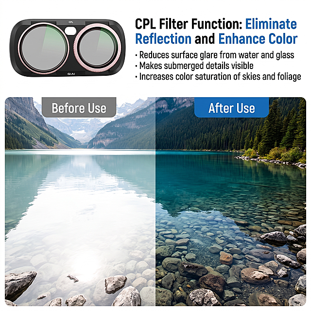
![[主图-3] 材质性能卖点图,主题为抗污耐黄变性能展示,突出TPH材质的抗污能力和耐老化特性。
[统一基调] 跨境亚马逊/速卖通风格,整体科技专业干净,背景为纯净浅灰色渐变,主色调为深灰+亮银+科技蓝点缀,标题字为白色粗体无衬线,辅助字为浅灰色,强调色为亮蓝色,字体为现代无衬线英文字体,卡片为圆角半透明深色玻璃质感,整体克制高级不杂乱。
[画面] 画面主体展示两片TPH膜材对比,左侧为普通膜,表面泛黄且有水渍污渍残留,右侧为高品质TPH膜,表面清澈透明,水珠滚落不留痕迹,体现疏水抗污效果。上方展示水滴在膜表面形成球状滚落的特写,示意疏水自洁。右下角用局部放大展示膜层的致密涂层结构。背景隐约可见黑色汽车车身局部作为使用场景语境。
[光影质感] 商业摄影质感,膜材体现透明塑胶材质的通透感,水珠有清晰高光和折射,泛黄膜体现老化后的浑浊感,对比鲜明。
[配色] 背景浅灰渐变,左侧普通膜偏黄暗调,右侧TPH膜清亮透明,水珠用蓝色高光点缀。
[文字版式] 顶部大标题粗体白色英文 "Stain Resistant & Anti Yellowing",左侧标签 "Ordinary Film",右侧标签 "TPH Premium Film",水珠旁标注 "Hydrophobic Coating",文字清晰不遮挡主体。
[输出要求] 比例3:4,材质真实,对比清晰,文字清晰,无变形,无错字,无水印,无平台logo。](https://gd-cms.dancf.com/gd-cms/xi19e5/0/760037cd-b513-42b2-b347-ebacf3ff9d351156.jpeg?x-oss-process=image/resize,w_640,type_6/sharpen,120/interlace,1)
![[主图-3] 材质细节与双面结构,展示百洁布双层结构:绿色粗糙百洁布面 + 黄色柔软海绵面,突出耐用与多功能,证明品质。
[统一基调] 跨境 TikTok Shop 1:1 方图,英文文案,东南亚视觉偏明亮洁净,主色为洁净白+清新绿+活力黄,标题字色深绿,辅助字色中灰,强调色为品牌亮黄;字体为现代无衬线粗体,组件为圆角卡片与引线标注,整体干净通透。
[画面] 浅灰渐变背景,画面中央偏左放置 1 片竖立倾斜的百洁布,呈 3/4 视角,同时展示绿色百洁布面与黄色海绵面,产品占画面约 60%。右侧有两个圆形局部放大窗口:上方窗口放大绿色百洁布纤维纹理,可见粗糙耐磨的纤维结构,旁边引线标注 "Scrub Side - Heavy Duty Scouring";下方窗口放大黄色海绵多孔结构,可见柔软吸水的海绵孔隙,旁边引线标注 "Sponge Side - Soft Absorbent Foam"。底部横向排列 3 个小图标,分别代表耐用、吸水、双面可用,配英文短词。产品外观、颜色、比例与输入图完全一致。
[光影质感] 商业产品摄影质感,侧逆光突出材质纹理,百洁布纤维根根分明有粗糙感,海绵孔隙有通透感与柔软弹性;产品底部有自然接触阴影,立体感强,无悬浮。
[配色] 浅灰渐变背景,突出产品本身的绿与黄;标注引线为深灰色,图标用深绿与亮黄点缀;整体洁净专业。
[文字版式] 顶部大标题 "Dual-Sided Design",粗体深绿色;副标题 "Scrub & Sponge in One" 浅灰色;两个放大窗口旁各有一行英文说明文字,字号中等;底部 3 个图标配词 "Durable" "Absorbent" "2-in-1",均为英文横排。文字放在负空间,不遮挡产品主体。
[输出要求] 1:1 比例 2048x2048,材质纹理清晰,文字锐利;禁止变形、错字、模糊、杂乱、水印、平台 Logo、中文。](https://gd-cms.dancf.com/gd-cms/xi19e5/0/88b48e28-ba6e-4c24-8c50-eecb4f8d2d1f8290.jpeg?x-oss-process=image/resize,w_640,type_6/sharpen,120/interlace,1)
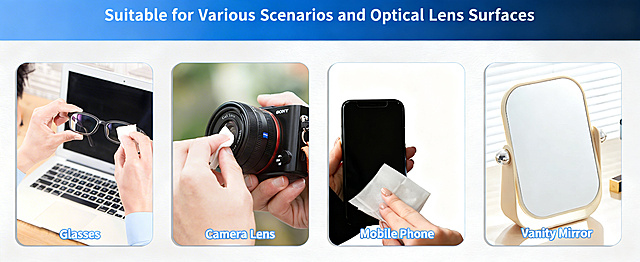

![[主图-2] 偏光防紫外线功能展示图,太阳镜户外驾驶场景。
[氛围风格] 跨境电商专业信息图风格,冷灰高级调,功能化客观展示。
[画质] 商业摄影质感、光线清晰通透、产品真实、画面干净有层次。
[元素] 黑色方框太阳镜位于画面左侧主视觉,正面45°视角。右侧展示偏光功能证据组件:偏光测试卡图案透过镜片清晰可见的对比示意,UV400防护图标。背景为浅冷灰色渐变,简洁高级。右下角有小型场景小窗,展示欧美男性驾驶员佩戴同款太阳镜开车的侧影局部(仅肩部以上,突出佩戴效果)。保持太阳镜外观与输入产品图完全一致,杜绝变形色差。商品主体占比约60%。
[光影] 主光从左上方照射,镜框有清晰高光,镜片有反光质感,整体光线干净利落,冷调棚拍光。
[配色] 主色冷灰背景;辅色黑色(镜框)、深墨绿(镜片);强调色深蓝色(功能标签)。
[视角构图] 产品左中位置主视觉,右侧信息组件,右下场景小窗,构图平衡有层次。
[文字版式] 右上位置英文大标题"Polarized UV400 Protection",粗体无衬线黑色大字。下方小字两行:"Blocks 100% UVA UVB Rays" "Reduce Glare Enhance Clarity",字号约为标题的一半,深灰色。偏光测试卡旁标注"Polarized Lens"小标签,蓝底白字圆角矩形。所有文字清晰可读,不遮挡产品主体。
[输出要求] 1:1比例,文字清晰锐利,超高清商业摄影质感。
[负向提示词] 变形,文字错乱,产品图模糊,背景杂乱,水印,电商平台Logo,东亚面孔,亚洲面孔,韩系妆容,国内网感人像,多余的手,畸形手。](https://gd-cms.dancf.com/gd-cms/xi19e5/0/3c2501ec-5acb-4367-b6dc-5cdedb82c5c89593.jpeg?x-oss-process=image/resize,w_640,type_6/sharpen,120/interlace,1)
![[主图-6] 功能卖点展示,展示粉色墨镜遮光效果,保持产品外观与输入产品图一致。左半部分展示户外强光环境,右半部分展示透过粉色墨镜看到的柔和遮光效果,拼图版式,浅灰简约背景,文字标注"Blocks UV" "Effective Sun Protection",文字清晰,不遮挡产品。ins简约风格,突出遮阳遮光功能优势。商业摄影质感,画面清晰干净,对比明确。保持产品本身颜色和结构不变。光影:对比展示光线差异,清晰自然。配色:浅灰背景,文字深灰色和白色对比清晰。比例分辨率:3:4比例,4k分辨率,超高清。负向提示词:变形,文字错乱,产品图模糊,背景杂乱,水印,中文文字,夸大词汇。](https://gd-cms.dancf.com/gd-cms/xi19e5/0/4e66db30-d447-4ea9-80ed-fd48897d657b48632.jpeg?x-oss-process=image/resize,w_640,type_6/sharpen,120/interlace,1)