

「图片1」「图片1」「图片1」「图片1」「图片1」「图片1」「…
「图片1」「图片1」「图片1」「图片1」「图片1」「图片1」「图片1」「图片1」根据提供的产品图片及图片中的卖点生成一组国际站英文版的详情页突出弯头纱地毯触感柔软回弹性好耐脏好打理吸尘器吸尘即可,网格
Umfyi5Xf
2026.05.23「图片1」「图片1」「图片1」「图片1」「图片1」「图片1」「图片1」「图片1」根据提供的产品图片及图片中的卖点生成一组国际站英文版的详情页突出弯头纱地毯触感柔软回弹性好耐脏好打理吸尘器吸尘即可,网格
Umfyi5Xf
2026.05.23
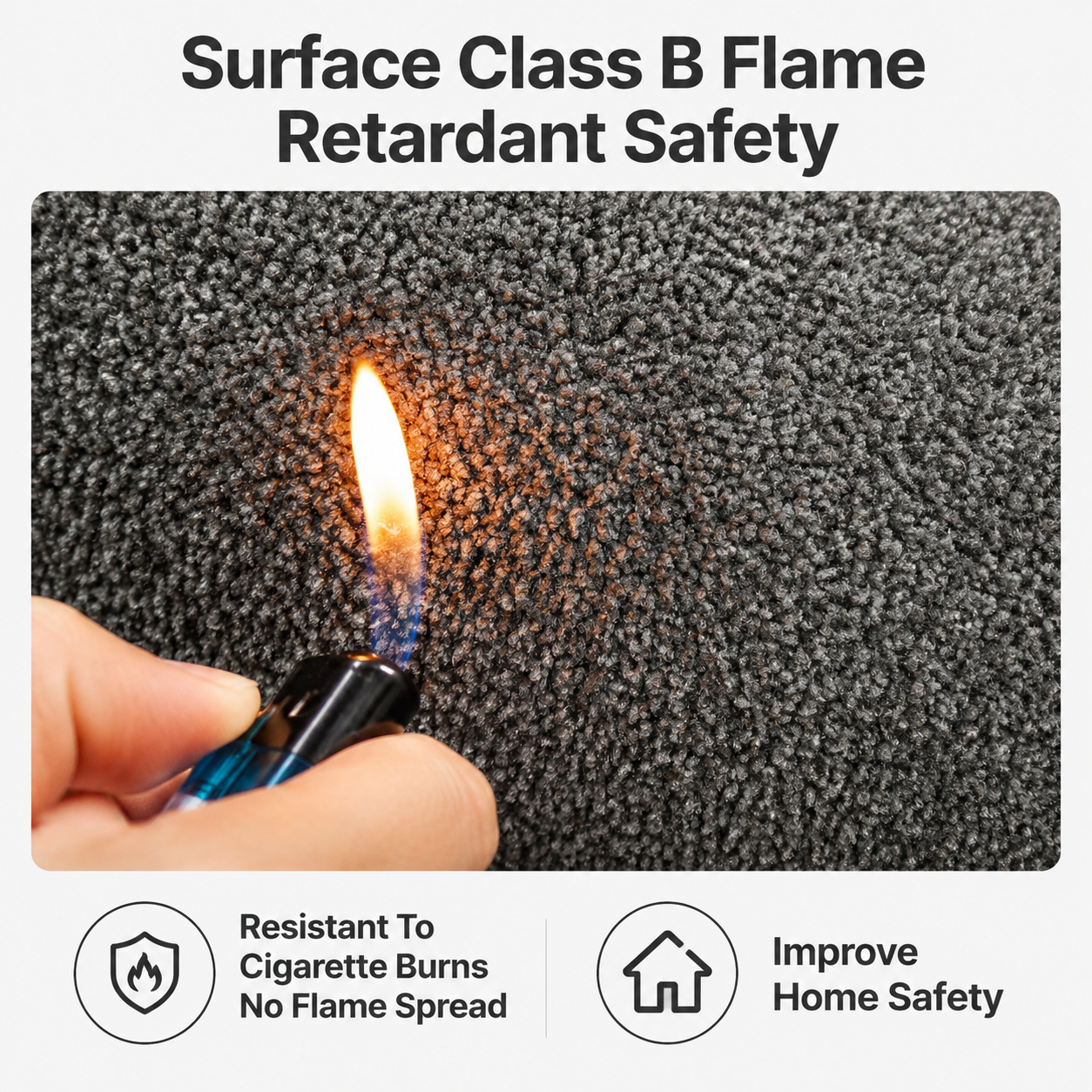
![[第4屏] 阻燃性能测试展示。本屏使用【图1】燃烧测试实拍图,保持打火机火焰烧地毯的动作和场景不变。
[氛围/风格] 真实可信实验风,白底干净背景,突出产品阻燃特性,直观有说服力。
[元素布局] 画面主体保留原图的手部、打火机和火焰烧灰色地毯的内容,保持位置和动作不变,只替换干净背景优化排版,添加文案说明。主体占据画面约70%区域,清晰展示测试过程,证明遇火不燃烧的特性。底部区域留给文字说明。
[光影质感] 保留原图真实光影,火焰暖光突出,产品清晰,明暗自然,整体画面干净不杂乱。
[配色色系] 全局底色:#FFFFFF;主体保留地毯灰色、打火机金属色、火焰暖黄色;文字:#222222;警示点缀色:#E74C3C。
[视角构图] 保留原图特写视角,竖向排版,主体在中上,文字在底部。
[文字版式] 顶部主标题「「表面阻燃处理 遇火不燃烧」」加粗深色大字,居中。主体图片下方说明文字「经过特殊阻燃处理,燃烧不蔓延,使用更安全放心」,居中小号字。右下角加上安全认证风格小标签「「阻燃达标」」浅黄色底深色字。
[比例分辨率] 9:16竖版比例,4K分辨率,文字清晰可辨。
[负向提示词] 构图改变,动作变形,文字模糊,颜色失真,水印,多余元素遮挡主体。](https://gd-cms.dancf.com/gd-cms/xi19e5/0/dd94f5e1-ba9e-4371-bc7d-f81fa0a29f2d3111.png?x-oss-process=image/resize,w_640,type_6/sharpen,120/interlace,1)

![[第2屏] 核心 key selling points page for premium carpet.
[氛围/风格] Clean and structured information layout, professional and credible, minimalist international style, commercial design.
[元素布局] Five core selling points presented in two rows of three and two, each point has product detail image from user's images on top, text description below. Keep all product details consistent with original texture and color. 1: Top left - "Short Pile Surface" using image 3. 2: Top middle - "Thickened Insulation" using image 5. 3: Top right - "Cotton Backing" using image 1. 4: Bottom left - "Non-slip Bottom" using image 9. 5: Bottom right - "Flame Retardant" with fire safety test demo. All blocks evenly spaced on off-white background, add simple dividing lines between blocks. Full screen no border.
[光影质感] Even soft lighting, clear display of each detail photo, consistent light and shadow across the entire screen.
[配色色系] Global background color: #F5F5F5 (off white); Text color: #1A1A1A (dark grey); Accent color: #0066AA to match product blue.
[视角构图] Flat lay with each section aligned neatly, good balance and white space.
[文字版式] Section title for each selling point in bold: "Short Pile Surface", "Thickened Insulation", "Cotton Backing", "Non-slip Bottom", "Flame Retardant". Short description below each title, all in English, each word correct spelling, first letter of major words capitalized. Keep font clean modern sans-serif.
[比例分辨率] 15:16, 2K resolution, super high definition, all text clear and readable.
[负向提示词] Distortion, watermark, scrambled text, wrong spelling, blurry details, Chinese characters, messy layout, wrong product colors.](https://gd-cms.dancf.com/gd-cms/xi19e5/0/f985a69b-3a84-4c10-a69a-5e75634289bb246.png?x-oss-process=image/resize,w_640,type_6/sharpen,120/interlace,1)






![[Screen 2] Core selling points highlight page for Premium Area Rugs on international station. 4 core advantages: Exquisite Detail, Flame Retardant, Eco-Friendly, Noise Reduction, Fully Customizable. Modern minimalist commercial style, clean light off-white #f5f5f5 background. Divide the screen into four equal quadrants, each quadrant displays one selling point. Each quadrant uses a corresponding close-up detail image from user's provided pictures (surface texture, side cutting, backing, finished edge), keep the original material texture and structure completely consistent with input images. Each quadrant has a large icon on top, selling point title in the middle, short description text below. All English, first letter of main words capitalized, text clearly legible. 15:16 vertical proportion, 4K resolution. Layout balanced, information clear. Negative: deformed structure, color distortion, blur, text confusion, watermark, Chinese characters](https://gd-cms.dancf.com/gd-cms/xi19e5/0/841fb094-88e1-4da3-8c33-51184960df943.png?x-oss-process=image/resize,w_640,type_6/sharpen,120/interlace,1)
![[Screen 2] Core selling points highlight page for Premium Area Rugs on international station. 4 core advantages: Exquisite Detail, Flame Retardant, Eco-Friendly, Noise Reduction, Fully Customizable. Modern minimalist commercial style, clean light off-white #f5f5f5 background. Divide the screen into four equal quadrants, each quadrant displays one selling point. Each quadrant uses a corresponding close-up detail image from user's provided pictures (surface texture, side cutting, backing, finished edge), keep the original material texture and structure completely consistent with input images. Each quadrant has a large icon on top, selling point title in the middle, short description text below. All English, first letter of main words capitalized, text clearly legible. 15:16 vertical proportion, 4K resolution. Layout balanced, information clear. Negative: deformed structure, color distortion, blur, text confusion, watermark, Chinese characters](https://gd-cms.dancf.com/gd-cms/xi19e5/0/722f41f7-d15a-4dae-b243-65ee4bb2bc6c11.png?x-oss-process=image/resize,w_640,type_6/sharpen,120/interlace,1)
![[Screen 2] Core selling points highlight page for Premium Area Rugs on international station. 4 core advantages: Exquisite Detail, Flame Retardant, Eco-Friendly, Noise Reduction, Fully Customizable. Modern minimalist commercial style, clean light off-white #f5f5f5 background. Divide the screen into four equal quadrants, each quadrant displays one selling point. Each quadrant uses a corresponding close-up detail image from user's provided pictures (surface texture, side cutting, backing, finished edge), keep the original material texture and structure completely consistent with input images. Each quadrant has a large icon on top, selling point title in the middle, short description text below. All English, first letter of main words capitalized, text clearly legible. 15:16 vertical proportion, 4K resolution. Layout balanced, information clear. Negative: deformed structure, color distortion, blur, text confusion, watermark, Chinese characters](https://gd-cms.dancf.com/gd-cms/xi19e5/0/343a7f53-20eb-4b5c-bb91-d053141cef6113.png?x-oss-process=image/resize,w_640,type_6/sharpen,120/interlace,1)
![[Screen 2] Core selling points highlight page for Premium Area Rugs on international station. 4 core advantages: Exquisite Detail, Flame Retardant, Eco-Friendly, Noise Reduction, Fully Customizable. Modern minimalist commercial style, clean light off-white #f5f5f5 background. Divide the screen into four equal quadrants, each quadrant displays one selling point. Each quadrant uses a corresponding close-up detail image from user's provided pictures (surface texture, side cutting, backing, finished edge), keep the original material texture and structure completely consistent with input images. Each quadrant has a large icon on top, selling point title in the middle, short description text below. All English, first letter of main words capitalized, text clearly legible. 15:16 vertical proportion, 4K resolution. Layout balanced, information clear. Negative: deformed structure, color distortion, blur, text confusion, watermark, Chinese characters](https://gd-cms.dancf.com/gd-cms/xi19e5/0/ac7d9d3f-b198-48ba-b4a5-609f99e7b6fb43.png?x-oss-process=image/resize,w_640,type_6/sharpen,120/interlace,1)
![[Screen 2] Core selling points highlight page for Premium Area Rugs on international station. 4 core advantages: Exquisite Detail, Flame Retardant, Eco-Friendly, Noise Reduction, Fully Customizable. Modern minimalist commercial style, clean light off-white #f5f5f5 background. Divide the screen into four equal quadrants, each quadrant displays one selling point. Each quadrant uses a corresponding close-up detail image from user's provided pictures (surface texture, side cutting, backing, finished edge), keep the original material texture and structure completely consistent with input images. Each quadrant has a large icon on top, selling point title in the middle, short description text below. All English, first letter of main words capitalized, text clearly legible. 15:16 vertical proportion, 4K resolution. Layout balanced, information clear. Negative: deformed structure, color distortion, blur, text confusion, watermark, Chinese characters](https://gd-cms.dancf.com/gd-cms/xi19e5/0/1b867bf2-53ff-4b6c-8029-9f713649c62948.png?x-oss-process=image/resize,w_640,type_6/sharpen,120/interlace,1)
![[Screen 2] Core selling points highlight page for Premium Area Rugs on international station. 4 core advantages: Exquisite Detail, Flame Retardant, Eco-Friendly, Noise Reduction, Fully Customizable. Modern minimalist commercial style, clean light off-white #f5f5f5 background. Divide the screen into four equal quadrants, each quadrant displays one selling point. Each quadrant uses a corresponding close-up detail image from user's provided pictures (surface texture, side cutting, backing, finished edge), keep the original material texture and structure completely consistent with input images. Each quadrant has a large icon on top, selling point title in the middle, short description text below. All English, first letter of main words capitalized, text clearly legible. 15:16 vertical proportion, 4K resolution. Layout balanced, information clear. Negative: deformed structure, color distortion, blur, text confusion, watermark, Chinese characters](https://gd-cms.dancf.com/gd-cms/xi19e5/0/9b774fad-3673-424b-ae7a-afd8553e69ef7.png?x-oss-process=image/resize,w_640,type_6/sharpen,120/interlace,1)
![[第6屏] 防水阻燃性能测试页 - 同质透心PVC塑胶地板防水+阻燃实验场景。本屏使用【图6】的防水和阻燃测试作为参考,【图2】蓝绿色系地板作为测试基材。
[氛围/风格] 专业实验风,可视化强,安全可信。
[元素布局] 左右分栏布局;左侧:防水测试 - 地板表面有大量水珠,呈现荷叶效应,水珠圆润饱满不渗透,旁边有一杯正在倒水的玻璃杯;右侧:阻燃测试 - 地板上有燃烧的烟头/小火焰,火焰周围地板无明显损伤,离火自熄效果展示;底部有一条横向的地板截面浸水示意图,展示不吸水不变形。
[光影质感] 顶部柔光,水珠有高光折射,火焰有暖光映照,对比鲜明。
[配色色系] 全局底色 #E6F2F7(水感浅蓝);主色 #3B8EA5(水蓝);辅助色 #FF6B35(火焰橙)、#4CAF50(安全绿);文字深灰蓝。
[视角构图] 左右对称分栏,中间有竖线分隔,阅读动线:顶部标题 → 左栏防水 → 右栏阻燃 → 底部补充说明。
[文字版式] 顶部居中主标题「防水阻燃 安全加倍」;左栏大标题「防水防滑」,下方小字「荷叶效应 不渗水不变形」,底部标注「遇水更涩 行走安全」;右栏大标题「防火阻燃」,下方小字「离火自熄 不易燃烧」,底部标注「使用更安心」;底部横条文字「PVC材质 安全性能有保障」;文字清晰,层级分明。
[比例分辨率] 9:16竖版比例,4K分辨率,文字清晰可辨,高清画质。
[负向提示词] 水珠不真实,火焰效果假,地板变形,水印,文字错乱,颜色偏差。](https://gd-cms.dancf.com/gd-cms/xi19e5/0/2a1d18ba-328c-4bc0-a9c0-42ed6d234d628671.jpeg?x-oss-process=image/resize,w_640,type_6/sharpen,120/interlace,1)


![[第4屏] Safety Performance - Flame retardant and eco-friendly material. This screen needs to showcase the safety advantages.
[Atmosphere/Style] Clean trustworthy commercial infographic style, safe and reassuring.
[Element Layout] Top: Title area; Middle: Two divided sections, left section shows flame retardant feature, right section shows eco-friendly feature. Left side can have a conceptual illustration of small flame testing on carpet surface showing no burning, right side shows a family scene with child and senior to emphasize safety. Keep the carpet texture consistent with original product.
[Lighting & Texture] Even soft lighting, clean division, clear information, trustworthy product display.
[Color Scheme] Global background color: #FAFAFA; main color: natural carpet tone; green as safety auxiliary color; text dark gray.
[Perspective & Composition] Information split layout, balanced, clear reading order.
[Text Layout] Main title "Safe For Whole Family", two section titles: "Surface Flame Retardant" and "Eco-Friendly Material", bullet points: "Does Not Catch Fire Easily", "Non-Toxic Harmless", "Safe For Kids & Elders", follow English capitalization rules, clear typesetting.
[Resolution & Ratio] 15:16 vertical ratio, 1200px width, 1280px height, 4K resolution, text clear and readable.
[Negative Prompt] exaggerated flame, dangerous scene, distorted carpet, text garbled, wrong information, color cast](https://gd-cms.dancf.com/gd-cms/xi19e5/0/e967930d-214b-4ad1-8a6f-f06472c65aba707.png?x-oss-process=image/resize,w_640,type_6/sharpen,120/interlace,1)
![[第7屏] 本屏功能定义:灭火毯功能阻燃效果验证对比展示页。展示灭火毯的阻燃防火性能,通过对比实验直观验证效果。
[氛围/风格] 专业严谨的安全产品展示风格,简洁干净,突出实验对比效果,具备电商详情页的商业展示质感。
[元素布局] 画面分为左右两部分,左侧展示未使用灭火毯的燃烧场景,右侧展示使用灭火毯覆盖后火焰被扑灭的场景。本屏使用【图1】作为灭火毯产品主体,灭火毯保持红色包装、印刷文字清晰的外观,物理结构、材质质感、颜色与输入产品图一致。主体灭火毯产品放在画面下半部分居中位置,占据约60%画面区域。上半部分为对比实验展示区,配有简洁的文字说明。
[光影质感] 均匀明亮的室内布光,主体产品清晰突出,对比区域明暗层次分明,火焰效果自然真实,产品边缘清晰干净。
[配色色系] 全局底色:#f5f5f5(浅灰白);主体配色:#e53935(包装红色)+#ffffff(包装白色文字);辅助色:#f44336(火焰橙红)+#212121(文字深灰)。
[视角构图] 正面平视视角,上下分割构图,上半部分对比展示,下半部分产品展示,阅读动线从上到下,构图均衡清晰。
[文字版式] 顶部主标题“阻燃效果实测 高效隔烟灭火”,字体加粗黑色,居中排列,字号占画面宽度8%。左右分区各自配有小标题:左侧“未覆盖:火焰持续燃烧”,右侧“覆盖后:迅速隔绝氧气灭火”,每个分区小标题用红色加粗字体,左对齐。底部产品下方添加3个信息卖点图标配文字:“玻璃纤维材质”“阻燃耐高温”“灭火迅速”,文字清晰不遮挡主体。
[比例分辨率] 9:16 竖版比例,4K分辨率,文字清晰可辨,超高清。
[负向提示词] 产品变形,文字错乱,颜色偏差,包装模糊,背景杂乱,火焰效果虚假,结构错误,水印,畸形](https://gd-cms.dancf.com/gd-cms/xi19e5/0/cea93575-864b-4064-b440-64d81342dec4824.png?x-oss-process=image/resize,w_640,type_6/sharpen,120/interlace,1)
![[垫图] https://gdesign-dam-hz.dancf.com/35887301598627911/e9bf496fc7f445ec8804ac667eaf0f46.webp
[主图主题] Material details display of car wash brush
[氛围/风格] Hot-selling clean and professional style, consistent light and texture with the first image
[画面 elements] Extreme macro shot, magnify the thickened pure cotton fiber of the brush head, a hand holding the brush head, highlighting the soft and thick cotton fiber texture, the picture superimposes a circular magnifying glass effect to highlight the fiber details, the main product features are completely consistent with the original image, full screen without border
[配色色系] Main color: neutral gray (fiber), auxiliary colors: black (handle), keep the overall color clean
[视角构图] Local close-up, focus on fiber texture
[文字版式] Main title "Thickened Pure Cotton Fiber", subtitle "Soft, Absorbent, Lint-Free", centered layout; Lower right corner place a capsule label "Scratch Free to Paint", sans-serif font, clear level, text is directly suspended on the picture, no occlusion to the main texture.](https://gd-cms.dancf.com/gd-cms/xi19e5/0/53713178-c762-48c6-895f-c2e59ed952ab6705.png?x-oss-process=image/resize,w_640,type_6/sharpen,120/interlace,1)




![[第2屏] 淘宝详情页核心卖点对比屏,展示黑白几何阻燃地毯的阻燃性能对比。
[氛围/风格] 直观对比风格,清晰明了,专业测评质感,干净清爽。
[元素布局] 本屏采用左右分栏对比布局。左侧区域展示普通地毯:小块火星掉落后开始燃烧,冒出黑烟,展示安全隐患;右侧区域展示我们的阻燃地毯(使用【图1】的地毯主体,保持图案颜色结构不变),同样大小的火星落在地毯表面,地毯没有燃烧、没有损伤,完好无损,突出阻燃特性。分割线使用浅橙色信息条标注"普通地毯 vs 我们的阻燃地毯"。
[光影质感] 均匀布光,左右光线一致,对比效果清晰直观,细节展示清楚。
[配色色系] 全局底色:#FFFFFF(纯白);主体配色:左右对比,左侧突出燃烧效果,右侧保持地毯原本黑白配色;分割线使用浅橙色突出对比。
[视角构图] 正面平视,左右等分构图,对比一目了然。
[文字版式] 顶部大标题"阻燃科技 无惧火星"黑色居中,下方左右分栏各标注小标题,文字清晰不遮挡对比主体。
[比例分辨率] 9:16竖版,4K分辨率,文字清晰可辨。
[负向提示词] 地毯图案变形,颜色偏差,文字错乱,水印,产品模糊,对比不清晰,燃烧效果失真。](https://gd-cms.dancf.com/gd-cms/xi19e5/0/3f960af7-929a-4b58-a789-20c2348d856b28431.png?x-oss-process=image/resize,w_640,type_6/sharpen,120/interlace,1)
![[Screen 6] Multi-layer structure side cut display page for the area rug, 15:16 vertical, international station detail page. Use the hand holding the side cross-section image from user sixth image, keep the original layered structure: surface fiber, middle sound insulation layer, non-slip backing completely consistent with input. Focus on showing the thick multi-layer construction, which supports flame retardant and sound insulation benefits. Plain light gray background makes the structure more clearer. Top title "Thick Multi-Layer Construction", bullet points: Flame Retardant Core Layer, Enhanced Noise Reduction. All English text, clearly legible, 4K resolution. Negative: distorted structure, texture blur, color error, text confusion, Chinese characters](https://gd-cms.dancf.com/gd-cms/xi19e5/0/5b64fd52-5d2b-4a32-9a08-373ada24bfae6.png?x-oss-process=image/resize,w_640,type_6/sharpen,120/interlace,1)
![[Screen 6] Multi-layer structure side cut display page for the area rug, 15:16 vertical, international station detail page. Use the hand holding the side cross-section image from user sixth image, keep the original layered structure: surface fiber, middle sound insulation layer, non-slip backing completely consistent with input. Focus on showing the thick multi-layer construction, which supports flame retardant and sound insulation benefits. Plain light gray background makes the structure more clearer. Top title "Thick Multi-Layer Construction", bullet points: Flame Retardant Core Layer, Enhanced Noise Reduction. All English text, clearly legible, 4K resolution. Negative: distorted structure, texture blur, color error, text confusion, Chinese characters](https://gd-cms.dancf.com/gd-cms/xi19e5/0/ad7b35d9-264c-4ad2-b692-707faa9829b910.png?x-oss-process=image/resize,w_640,type_6/sharpen,120/interlace,1)