
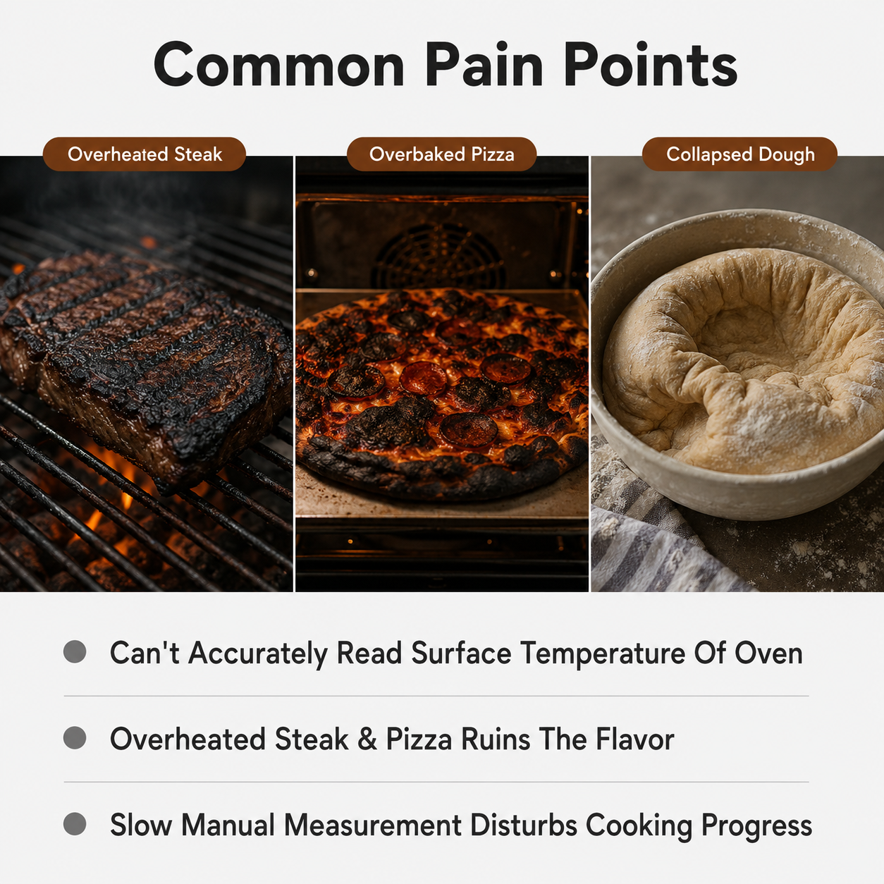

[第2屏] 痛点直击页,展示传统测温方式在烧烤烘焙中的使用困扰。 [氛围/风格] 写实生活场景,真实客观,简约对比风格,符合跨境电商审美,商业摄影质感。 [元素布局] 画面分为上下两个场景,上半部分为
1pzzr5n3hj-...
2026.06.04[第2屏] 痛点直击页,展示传统测温方式在烧烤烘焙中的使用困扰。 [氛围/风格] 写实生活场景,真实客观,简约对比风格,符合跨境电商审美,商业摄影质感。 [元素布局] 画面分为上下两个场景,上半部分为
1pzzr5n3hj-...
2026.06.04


![[Page 2] Pain point page - Three common problems with regular beer pouring. No product image needed.
[Style] Dark realistic style, real trouble scenes, resonance building, commercial photography texture.
[Elements] Upper half: a hand holding a beer bottle pouring into a glass, foam sparse and dissipating quickly, beer surface flat and dull (only hand and cup shown, no face). Lower half: three pain point cards arranged vertically, each with a small icon and pain point description. Dark bar table background, low atmosphere.
[Lighting] Top light dim, overall cool gray tone, creating trouble feeling; beer cup transparent but dull, foam sparse and flat; heavy shadows emphasizing problem feeling.
[Color scheme] Global background #2C2C3C dark gray-blue; main color cool gray + dark brown; secondary color dark beer gold; accent color dark red pain point labels.
[Composition] 3:4 vertical, upper half pouring scene centered, lower half three pain point cards vertical arrangement, clear upper-lower division.
[Text layout] Top main title "Tired Of Flat Beer?" white large bold sans-serif; subtitle "Common Problems With Regular Pouring" light gray medium. Three pain point card text: "Watery Foam That Disappears Fast"、"Bloating & Discomfort After Drinking"、"Flat Taste Missing Aroma",white text with dark red small icons.
[Output] 3:4 vertical ratio, 4K resolution, clear text, HD quality.
[Negative] deformation, watermark, text disorder, cluttered background, Chinese text, character face, product appearing, wood grain base.](https://gd-cms.dancf.com/gd-cms/xi19e5/0/b26e0824-3134-4e60-bcb9-bb021ee4186b2585.jpeg?x-oss-process=image/resize,w_640,type_6/sharpen,120/interlace,1)
![[Page 2] Pain point page - Three common problems with regular beer pouring. No product image needed.
[Style] Dark realistic style, real trouble scenes, resonance building, commercial photography texture.
[Elements] Upper half: a hand holding a beer bottle pouring into a glass, foam sparse and dissipating quickly, beer surface flat and dull (only hand and cup shown, no face). Lower half: three pain point cards arranged vertically, each with a small icon and pain point description. Dark bar table background, low atmosphere.
[Lighting] Top light dim, overall cool gray tone, creating trouble feeling; beer cup transparent but dull, foam sparse and flat; heavy shadows emphasizing problem feeling.
[Color scheme] Global background #2C2C3C dark gray-blue; main color cool gray + dark brown; secondary color dark beer gold; accent color dark red pain point labels.
[Composition] 3:4 vertical, upper half pouring scene centered, lower half three pain point cards vertical arrangement, clear upper-lower division.
[Text layout] Top main title "Tired Of Flat Beer?" white large bold sans-serif; subtitle "Common Problems With Regular Pouring" light gray medium. Three pain point card text: "Watery Foam That Disappears Fast"、"Bloating & Discomfort After Drinking"、"Flat Taste Missing Aroma",white text with dark red small icons.
[Output] 3:4 vertical ratio, 4K resolution, clear text, HD quality.
[Negative] deformation, watermark, text disorder, cluttered background, Chinese text, character face, product appearing, wood grain base.](https://gd-cms.dancf.com/gd-cms/xi19e5/0/dec94ec1-668e-4fd8-ac31-9daa9b2ec5152675.jpeg?x-oss-process=image/resize,w_640,type_6/sharpen,120/interlace,1)
![[Page 2] Pain point page - Three common problems with regular beer pouring. No product image needed.
[Style] Dark realistic style, real trouble scenes, resonance building, commercial photography texture.
[Elements] Upper half: a hand holding a beer bottle pouring into a glass, foam sparse and dissipating quickly, beer surface flat and dull (only hand and cup shown, no face). Lower half: three pain point cards arranged vertically, each with a small icon and pain point description. Dark bar table background, low atmosphere.
[Lighting] Top light dim, overall cool gray tone, creating trouble feeling; beer cup transparent but dull, foam sparse and flat; heavy shadows emphasizing problem feeling.
[Color scheme] Global background #2C2C3C dark gray-blue; main color cool gray + dark brown; secondary color dark beer gold; accent color dark red pain point labels.
[Composition] 3:4 vertical, upper half pouring scene centered, lower half three pain point cards vertical arrangement, clear upper-lower division.
[Text layout] Top main title "Tired Of Flat Beer?" white large bold sans-serif; subtitle "Common Problems With Regular Pouring" light gray medium. Three pain point card text: "Watery Foam That Disappears Fast"、"Bloating & Discomfort After Drinking"、"Flat Taste Missing Aroma",white text with dark red small icons.
[Output] 3:4 vertical ratio, 4K resolution, clear text, HD quality.
[Negative] deformation, watermark, text disorder, cluttered background, Chinese text, character face, product appearing, wood grain base.](https://gd-cms.dancf.com/gd-cms/xi19e5/0/e0c31ed1-53f6-4d8b-98c7-a2e979e5e0d62595.jpeg?x-oss-process=image/resize,w_640,type_6/sharpen,120/interlace,1)


![[第3屏] 核心卖点总览页,展示测温枪的六大核心优势。
[氛围/风格] 简约现代科技风,干净通透,专业可信,符合跨境电商审美,商业展示质感。
[元素布局] 顶部大标题,下方六个卖点卡片分为两行三列排列,每个卡片包含一个简约图标、主标题和副标题,整体卡片间距均匀,不拥挤,留足留白。每个卖点卡片背景为浅白色,边框用产品主色橙黄色点缀,卡片大小一致,排版规整。
[光影质感] 整体光线均匀明亮,每个卡片阴影柔和,图标和文字清晰突出,无明显光影死角。
[配色色系] 全局底色:#F5F5F5(浅灰);卡片底色:#FFFFFF(纯白);主体配色:#FFA826(橙黄边框与图标) + #222222(深灰文字);辅助色:#888888(浅灰副标题)。
[视角构图] 平面平视构图,满屏分布,顶标题下六卡片,1:1比例平衡舒适,阅读动线从上到下从左到右。
[文字版式] 顶部主标题 "Core Advantages",深灰色粗体,居中,字号约画面宽度8%。六个卖点分别为:
1. Icon + "Fast Reading" + "One Second Measure"
2. Icon + "Non-contact" + "Hygienic & Safe"
3. Icon + "Clear Display" + "Green Backlight"
4. Icon + "Versatile" + "Bbq Baking Steak"
5. Icon + "Ergonomic" + "Comfortable Grip"
6. Icon + "Auto Power Off" + "Energy Saving"
所有文字均为英文,每个卖点主标题粗体深灰,副标题常规浅灰,字号适中,移动端清晰可读,无中文字符。
[比例分辨率] 1:1方图比例,4K分辨率,文字清晰可辨,超高清。
[负向提示词] 中文字符,文字错乱,卡片变形,排版杂乱,水印,背景花哨,夸张过度,绝对化宣传。](https://gd-cms.dancf.com/gd-cms/xi19e5/0/f7239337-0a18-48ac-87be-2031b02e64812848.png?x-oss-process=image/resize,w_640,type_6/sharpen,120/interlace,1)
![[商品] 使用【图2】棕色电子刮刀硅胶温度计可拆卸三件套(完整组装态+硅胶套+不锈钢探针);保留产品棕色硅胶材质、304不锈钢探针、LCD显示屏、按钮结构。
[画面] 页面目标:痛点解决,对比传统烘焙测温的麻烦与本品二合一的便捷。构图:左右分栏对比型,左半部分45%为痛点场景,右半部分55%为解决后状态。左侧痛点:传统烘焙需要多个工具(单独温度计+刮刀+勺子),手忙脚乱,工具散落台面,画面偏冷灰调。右侧解决:只用一把刮刀温度计,同时测温+搅拌,整洁高效,暖棕色调,产品居中展示可拆卸三件套。底部有3个短标签说明解决的问题。
[视觉] 套系策略:风格=跨境极简高级商业摄影风;标题字=现代无衬线粗体(Helvetica Bold风格);正文字=简洁无衬线体;主色=暖棕色(巧克力棕 #8B5A2B);背景延展=基于暖棕色做深浅层级,左侧痛点区用冷灰调反衬,右侧解决区用暖棕厨房台面;强调色=暖金色,仅用于小面积图标、引线和数据高亮;标题色=深棕近黑;正文色=中暖灰;组件=圆角信息卡、对比分割线、勾选/叉号图标;光影=左前侧暖柔光,产品自然阴影。
[文字] 顶部大标题"Baking Just Got Easier",左侧痛点区小标题"Before: Too Many Tools"配3个痛点:"Switch between thermometer & spatula"、"Risk of burning while reading temp"、"More tools to clean";右侧解决区小标题"After: One Tool Does It All"配3个对勾卖点:"Measure & stir simultaneously"、"One-handed operation"、"Detachable for easy cleaning"。所有文字为英文。
[规格] 图片比例4:3横版,4K分辨率,quality=medium。避免变形、错字、文字过小、亚洲面孔、产品颜色改变、结构失真、悬浮。](https://gd-cms.dancf.com/gd-cms/xi19e5/0/84eeda52-4d20-4b78-ba88-f8b2ef69e80919937.jpeg?x-oss-process=image/resize,w_640,type_6/sharpen,120/interlace,1)

![[第2屏] 痛点与解决对比页-对比传统餐盘和本品分格设计优势。本屏使用【图1】作为商品主体,保留产品结构与颜色和原图一致。
[氛围/风格] 清晰对比风格,客观真实,简约商业摄影,符合亚马逊平台展示逻辑。
[元素布局] 画面左右分栏对比布局:左侧展示传统无分格餐盘混合食物的痛点场景,右侧展示本品分格后食物分类摆放的解决效果。本品占右侧区域60%以上面积,保留产品原有结构和颜色。标注清晰对比说明文字,不遮挡产品主体。
[光影质感] 均匀柔和布光,左右对比区域光影一致,产品细节清晰可见,木纹突出。
[配色色系] 全局底色:#F5F1EB(浅米灰);主体配色:#6B4423+ #D9B38C;辅助色:#DC3545(痛点标识)+ #28A745(解决标识)。
[视角构图] 左右对称对比构图,每个区域产品居中放置,标题在各区域上方,对比清晰直观。
[文字版式] 左上方主标题 "Common Problems With Traditional Trays",中下方左右分栏标注:左侧 "Messy Food Mixing" 痛点标题,右侧 "Neat Separate Serving" 解决标题,每个标题下方配2行简短说明文字,文字清晰,不遮挡产品。全英文文案,符合亚马逊规范。
[比例分辨率] 9:16 竖版比例,4K分辨率,文字清晰可辨。
[负向提示词] 产品结构变形,颜色偏差,缺件错件,水印,文字错乱,背景杂乱,中文字符,夸张恐吓画面。](https://gd-cms.dancf.com/gd-cms/xi19e5/0/bb8a9b8a-5478-4f7a-b1c1-4a6f2cf4d21611049.png?x-oss-process=image/resize,w_640,type_6/sharpen,120/interlace,1)
![[第2张] 痛点直击页-普通倒酒的困扰。本张无需产品图,纯场景痛点表达。
[氛围/风格] 暗调写实风格,真实困扰场景,引发共鸣,商业摄影质感。
[元素布局] 画面上半部分:一只手拿着啤酒瓶往杯子里倒酒,泡沫稀少且很快消散,啤酒表面平淡无质感,人物表情略显失望(仅展示手部和杯子,不展示面部)。画面下半部分:三个痛点卡片横向排列,每个卡片配一个小图标和痛点描述。背景为深色酒吧台面,氛围低沉。
[光影质感] 顶光偏暗,整体色调偏冷灰,营造困扰感;啤酒杯通透但无光泽,泡沫稀疏扁平;阴影较重,突出问题感。
[配色色系] 全局底色 #2C2C3C 深灰蓝;主色冷灰+暗棕;辅助色啤酒暗金色;强调色暗红色痛点标签。
[视角构图] 竖版3:4,上半部分倒酒场景居中,下半部分三痛点卡片等距排列,上下分区清晰。
[文字版式] 顶部主标题"Tired of Flat Beer?"白色大号粗体无衬线;副标题"Common Problems With Regular Pouring"浅灰色中号。底部三个痛点卡片,卡片内文字:"Watery Foam That Disappears Fast"、"Bloating & Discomfort After Drinking"、"Missing That Fresh Pub Taste",白色字配暗红色小图标。
[比例分辨率] 3:4竖版比例,4K分辨率,文字清晰可辨,高清画质。
[负向提示词] 变形,水印,文字错乱,背景杂乱,中文文字,人物面部,产品出现,木纹底座。](https://gd-cms.dancf.com/gd-cms/xi19e5/0/4d2a5db1-80b1-4c67-bf12-7452323c8b5119582.jpeg?x-oss-process=image/resize,w_640,type_6/sharpen,120/interlace,1)


![Redesign 360° 3D Convection Baking System page to match the style of reference image [image2]. Keep the content of image1, change the background, layout, text color and card style to be consistent with the overall style of other pages.
[Reference style from image2] : Light gray #F0F2F5 global background, dark blue #0a2463 main title color, dark gray body text color, white rounded corner card for content blocks, consistent font style and size, clean professional layout.
[Keep original content] : Title 360° 3D Convection Baking System](https://gd-cms.dancf.com/gd-cms/xi19e5/0/a6a7e3db-d31a-4e81-a8a9-0a600aaf6e4d38013.png?x-oss-process=image/resize,w_640,type_6/sharpen,120/interlace,1)
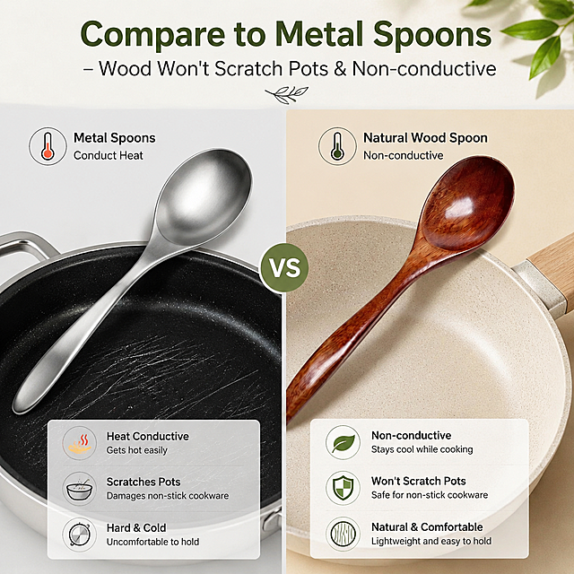
![[第2屏] 痛点对比屏-护锅优势对比展示(英文版)。氛围风格:fresh comparison style, left-right split layout, soft natural light, commercial photography. Elements layout: this screen uses【图1】as product, split screen into left and right, left shows traditional metal scraper scratches non-stick pan coating, right shows this silicone spatula stirs gently in intact non-stick pan, middle split by light gray line. Silicone spatula appearance is same as original image. Background is uniform light off-white, small light gray icons at bottom. Light and shadow: uniform soft light on both sides, no hard shadows, clear contrast. Color scheme: overall background #FAF7F2 (light off-white); left side dark gray metal + damaged black pan, right side off-white silicone + intact light gray non-stick pan; auxiliary color #D4A373 (accent) + #2C2C2C (text). Perspective: front eye-level, symmetrical left-right layout, enough text space on top and bottom, reading flow from left to right. Text layout: main title on top "No More Scratches, Protect Your Pans" dark brown bold, center aligned. Left subtitle "Traditional Metal Scraper" with red cross icon, right subtitle "Soft Silicone Spatula" with green check icon. Three selling points at bottom "Works on All Cookware, Protects Coating, Extends Pan Life", text arranged clearly, not crowded. Proportion: 9:16 vertical, 4K resolution, text clear. Negative prompt: product deformation, exaggerated comparison, watermark, text distortion, wrong pan structure, color deviation.](https://gd-cms.dancf.com/gd-cms/xi19e5/0/a7d9c487-6387-42bc-a61d-47a900657b1313686.png?x-oss-process=image/resize,w_640,type_6/sharpen,120/interlace,1)
![[商品] 使用【图3】棕色电子刮刀硅胶温度计;保留产品整体结构、棕色硅胶外观。
[画面] 页面目标:多场景应用,展示6大使用场景。构图:左侧30%产品竖版大图,右侧70%为2行×3列宫格场景图,每格一个使用场景。6个场景:1) 巧克力融化 - 玻璃碗中融化的巧克力,温度计插入 2) 糖果糖浆 - 小锅中沸腾的糖浆 3) 烘焙面团 - 面团旁放温度计 4) 油炸 - 油锅测温 5) 婴儿奶 - 奶瓶测温 6) BBQ烤肉 - 烤架上的牛排插着温度计。背景为浅暖棕色大理石台面质感。
[视觉] 套系策略:风格=跨境极简高级商业摄影风;标题字=现代无衬线粗体(Helvetica Bold风格);正文字=简洁无衬线体;主色=暖棕色(巧克力棕 #8B5A2B);背景延展=浅暖棕大理石纹理背景,同色系深浅层级;强调色=暖金色,仅用于小面积图标和标签;标题色=深棕近黑;正文色=中暖灰;组件=圆角宫格、场景标签、分割细线;光影=统一顶侧暖光,每个场景光影一致自然。
[文字] 顶部主标题"Wide Range of Application",副标题"One Tool for All Your Kitchen Needs"。6个场景底部标签:"Chocolate"、"Candy & Syrup"、"Baking"、"Deep Fry"、"Baby Milk"、"BBQ & Meat"。所有文字为英文。
[规格] 图片比例4:3横版,4K分辨率,quality=medium。避免变形、错字、文字过小、产品颜色改变、结构失真、食物不真实、场景拼接违和。](https://gd-cms.dancf.com/gd-cms/xi19e5/0/d1a67346-d9bf-4444-9380-54d0f777d5aa21162.jpeg?x-oss-process=image/resize,w_640,type_6/sharpen,120/interlace,1)




![[Screen 2] Pain Point Analysis - Traditional Checkout Problems. This page does not use product images, focuses on pain point expression. Atmosphere: neutral objective problem-oriented style, light gray background. Elements: 4 pain point cards arranged vertically, each card has an icon on the left and text description on the right. Titles and text all in English: "Slow Checkout Speed Long Queues", "Inaccurate Manual Price Calculation", "No Integrated Printing Need Extra Equipment", "Single Angle Display Poor Customer Experience". Text clear, each point separated by thin lines. All English, no Chinese characters. 15:16 vertical proportion, 4K resolution, clean layout. Negative prompt: distortion, watermark, garbled text, extra Chinese characters, unreasonable layout.](https://gd-cms.dancf.com/gd-cms/xi19e5/0/48556e7c-5fd4-4fe9-88b6-76feac55bf8c40390.png?x-oss-process=image/resize,w_640,type_6/sharpen,120/interlace,1)
![[第2张] 亚马逊详情页痛点对比页 - 普通薄盘 vs 加厚加硬白色餐盘效果对比。本张使用【图2】8寸圆盘作为右侧优质产品主体,左侧为普通薄盘示意。
[氛围/风格] 真实对比展示,克制客观,跨境电商风格,无夸张恐吓。
[元素布局] 左右分栏对比构图,各占50%;左侧为普通薄盘:装食物后明显下凹变形、汤汁渗漏、软塌,颜色偏灰暗;右侧为加厚白色餐盘:盛装意面和酱汁后依然平整坚挺、无变形无渗漏,餐盘结构与【图2】完全一致;中间用VS分隔;背景为浅灰蓝渐变,底部有台面纹理。
[光影质感] 顶部均匀柔光,两侧亮度一致,确保对比公平,餐盘底部有柔和投影。
[配色色系] 全局底色 #EEF2F7;左侧冷灰调 #94A3B8,右侧明亮白+浅蓝点缀;文字深灰 #1E293B。
[视角构图] 正面平视,左右对称构图,中间垂直分割线,阅读动线从左到右对比。
[文字版式] 顶部居中主标题"Say Goodbye to Flimsy Plates",无衬线粗体;左侧上方小标题"Ordinary Thin Plates",下方三个叉号标签:"Easily Deformed"、"Leak & Spill"、"Not Microwave Safe";右侧上方小标题"Our Thickened Plates",下方三个对勾标签:"Thick & Sturdy Build"、"No Leak No Deform"、"Microwave Safe";标签为圆角胶囊样式。
[比例分辨率] 3:4竖版比例,width 1200,height 1600,4K分辨率,文字清晰。
[负向提示词] 餐盘变形,颜色偏差,中文字符,水印,文字错乱,夸张恶心画面,背景杂乱,产品结构错误。](https://gd-cms.dancf.com/gd-cms/xi19e5/0/0c33d152-bd62-4443-87d6-4ecaaa31b3514245.jpeg?x-oss-process=image/resize,w_640,type_6/sharpen,120/interlace,1)

![[第2张] 详情页痛点直击 - 传统爆米花机常见问题对比。本张无需产品图,纯场景痛点展示。
[氛围/风格] 跨境极简理性风,深灰渐变背景,问题场景真实感,商业插画+实景结合风格。
[元素布局] 画面分为上下两部分,上半部分展示三个痛点场景小图:左侧是糊底烧焦的爆米花锅,中间是等待很久才出爆米花的焦急人物,右侧是难以清洁的油腻机器;下半部分为文字总结区;背景为深灰到浅灰渐变,配红色警示点缀。
[光影质感] 整体偏暗调,突出问题感,每个痛点场景有独立光源,阴影明显,营造困扰氛围。
[配色色系] 全局底色 #2C3E50 深灰蓝渐变;主色深灰、黑色;辅助色红色警示点缀、白色文字。
[视角构图] 上下构图,上半部分三宫格痛点场景,下半部分文字总结,阅读动线从上到下。
[文字版式] 顶部大标题"Tired of These Popcorn Problems?",粗体白色大字居中;三宫格每格下方配短文案:"Burnt & Sticky Bottom"、"Slow & Uneven Popping"、"Hard to Clean Up";底部总结句"Upgrade to a Professional Solution"配红色箭头向下;全部英文,无中文字符。
[比例分辨率] 9:16 竖版比例,4K分辨率,文字清晰可辨,高清画质。
[负向提示词] 中文字符,水印,文字错乱,产品图出现,画面模糊,颜色偏差。](https://gd-cms.dancf.com/gd-cms/xi19e5/0/8fbf52de-df63-4fb3-b83e-7156d7018de739828.jpeg?x-oss-process=image/resize,w_640,type_6/sharpen,120/interlace,1)