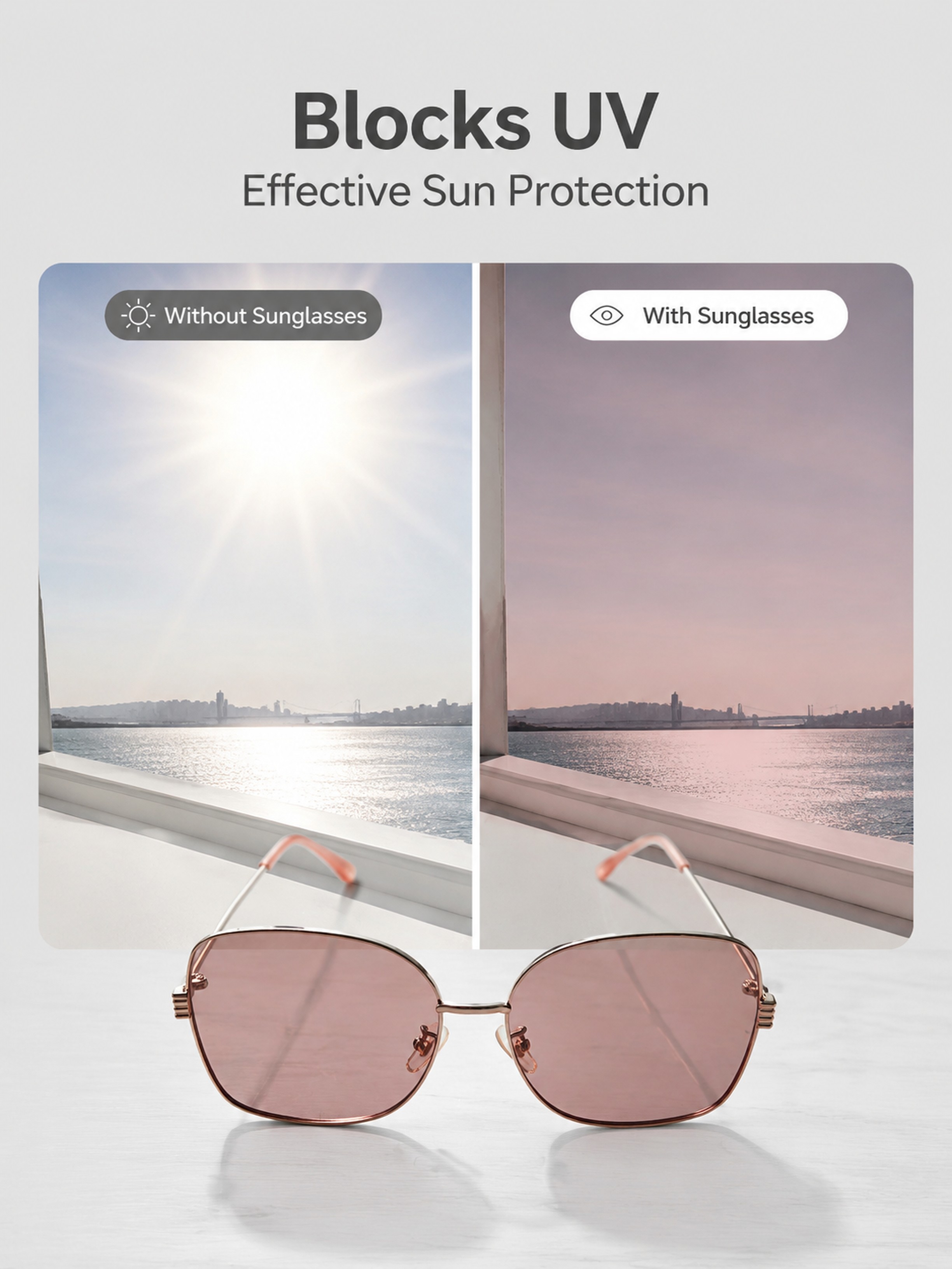
[主图-6] 功能卖点展示,展示粉色墨镜遮光效果,保持产品外观与输入产品图一致。左半部分展示户外强光环境,右半部分展示透过粉色墨镜看到的柔和遮光效果,拼图版式,浅灰简约背景,文字标注"Blocks U
GD513696992





![[第4屏] Functional Principle and Advantage Demonstration.本屏使用【图1】商品主体,保持外观结构一致,讲解防蓝光防尘功能。
[氛围/风格] Professional functional explanation, clear principle display, simple scientific style, easy to understand.
[元素布局] The glasses are placed in the upper middle of the画面, accounting for about 60% of the space. Below the glasses, three functional advantage cards are arranged horizontally. Each card has an icon and a description:
1. Icon of a shield: blocks dust, wind and splashes;
2. Icon of a wave block: filters harmful blue light from screens;
3. Icon of a feather: lightweight frame for all-day comfortable wear.
The cards have rounded corners, do not overlap each other, the overall layout is balanced.
[光影质感] The overall light is soft and even, the product is highlighted, the card text is clearly visible, the shadow is natural and not abrupt.
[配色系] Global background: #F5F7FA; cards are white with light gray borders, icons use different soft colors to distinguish, text is dark gray, the overall color matching is simple and professional.
[视角构图] Front view, product in upper half, function cards in lower half, clear hierarchy, easy reading.
[文字版式] Top main title "Multiple Functions For All-Day Protection", below each function card has icon + 4-8 word short description, all text in English, the main title is capitalized correctly, text does not cover the main body of the product.
[比例分辨率] 9:16 vertical ratio, 4K resolution, clear and readable text.
[负向提示词] Product deformation, inconsistent structure, wrong color, text confusion, Chinese characters, absolute exaggerated words, watermark.](https://gd-cms.dancf.com/gd-cms/xi19e5/0/9401a1f5-8587-40ea-8054-b3e7682dffdf2777.png?x-oss-process=image/resize,w_640,type_6/sharpen,120/interlace,1)

![[第6屏] 功能解读页-亮黑框复古圆框太阳镜防蓝光偏光功能展示。
[氛围/风格] 对比直观功能展示风格,清晰易懂,拼多多直白图文风格,商业图文质感。
[元素布局] 画面上半部分展示偏光功能对比,左侧为普通镜片眩光效果示意图,右侧为偏光镜片清晰效果示意图。下半部分放置太阳镜整体实物图,保持太阳镜外观结构颜色材质与输入产品图完全一致,占据下半部分约45%画面。背景干净浅灰,对比区域清晰分区,不混乱。
[光影质感] 均匀棚拍光线,对比区域光影清晰,太阳镜产品光线均匀,高光和反光自然,整体清晰通透,文字和对比图都清晰可辨。
[配色色系] 全局底色:#F5F5F5(浅灰);主体配色:#000000(镜框)+#636363(镜片);对比区:左侧眩光区偏黄,右侧清晰区偏冷,辅助色:黑字+白底对比块,清晰对比。
[视角构图] 上图下文排版,上半部分对比展示,下半部分产品展示,纵向阅读动线清晰,产品居中放置,完整呈现。
[文字版式] 顶部主标题「偏光防蓝光 舒适更护眼」黑色粗体居中,对比区域左侧标注「普通镜片」右侧标注「偏光镜片」小字,下半部分产品左右放两个卖点标签:「过滤眩光」「阻挡有害蓝光」圆角黑底白字标签,清晰不遮挡产品主体。
[比例分辨率] 2:3 竖版比例,4K分辨率,文字清晰可辨,超高清适合移动端浏览。
[负向提示词] 墨镜变形,颜色偏差,对比区域错乱,文字遮挡主体,文字模糊,水印,背景杂乱。](https://gd-cms.dancf.com/gd-cms/xi19e5/0/3cad6e43-a4d0-4bab-aa64-bf0222867b426885.png?x-oss-process=image/resize,w_640,type_6/sharpen,120/interlace,1)


![[第2屏] 灰色透明猫眼墨镜置于英文书页场景。文艺静谧风,底色#F9F9F9。墨镜斜放书页中央,镜片微反光;左上半透明白蒙版内写「在喧嚣中,保持自己的轮廓」黑体字;右下UV标识+「有效阻隔99% UV」。产品结构复现【图1】灰色款:醋酸透明框、金属铰链、镜腿刻字可见。柔光侧逆光,景深适中。负向:结构错误、文字错乱、水印、背景杂乱。](https://gd-cms.dancf.com/gd-cms/xi19e5/0/99e28ed8-04b8-44da-8288-6b0c178f6b9c3305.png?x-oss-process=image/resize,w_640,type_6/sharpen,120/interlace,1)
![[第2屏] 灰色透明猫眼墨镜置于英文书页场景。文艺静谧风,底色#F9F9F9。墨镜斜放书页中央,镜片微反光;左上半透明白蒙版内写「在喧嚣中,保持自己的轮廓」黑体字;右下UV标识+「有效阻隔99% UV」。产品结构复现【图1】灰色款:醋酸透明框、金属铰链、镜腿刻字可见。柔光侧逆光,景深适中。负向:结构错误、文字错乱、水印、背景杂乱。](https://gd-cms.dancf.com/gd-cms/xi19e5/0/78711d6b-599c-4c9c-9f7b-ed618658534a2923.png?x-oss-process=image/resize,w_640,type_6/sharpen,120/interlace,1)
![[第3屏] 三款猫眼墨镜卖点对比屏。干净白底#FFFFFF,垂直三区:上黑/中灰透/下玳瑁,每区产品+3图标标签(轻盈/UV/复古)。主标题「不止好看,更懂你」居顶。产品结构严格按【图1】:镜框弧度、银饰位置、镜片深灰一致。图标用圆角矩形底色区分。负向:混色、缺件、文字超长、水印。](https://gd-cms.dancf.com/gd-cms/xi19e5/0/96caed00-f087-4c6f-b357-eb9f98db02ca2847.png?x-oss-process=image/resize,w_640,type_6/sharpen,120/interlace,1)
![[第3屏] 三款猫眼墨镜卖点对比屏。干净白底#FFFFFF,垂直三区:上黑/中灰透/下玳瑁,每区产品+3图标标签(轻盈/UV/复古)。主标题「不止好看,更懂你」居顶。产品结构严格按【图1】:镜框弧度、银饰位置、镜片深灰一致。图标用圆角矩形底色区分。负向:混色、缺件、文字超长、水印。](https://gd-cms.dancf.com/gd-cms/xi19e5/0/c7e4cfce-9319-4d00-9286-84028cd844182937.png?x-oss-process=image/resize,w_640,type_6/sharpen,120/interlace,1)
![[第3屏] 三款猫眼墨镜卖点对比屏。干净白底#FFFFFF,垂直三区:上黑/中灰透/下玳瑁,每区产品+3图标标签(轻盈/UV/复古)。主标题「不止好看,更懂你」居顶。产品结构严格按【图1】:镜框弧度、银饰位置、镜片深灰一致。图标用圆角矩形底色区分。负向:混色、缺件、文字超长、水印。](https://gd-cms.dancf.com/gd-cms/xi19e5/0/a084549d-4c59-4537-98f6-45444a209c743481.png?x-oss-process=image/resize,w_640,type_6/sharpen,120/interlace,1)
![[第1屏] 详情页头图-磁吸套镜渐绿框偏光双灰C18主视觉宣传。本屏使用【图1】作为商品主体。
[氛围/风格] 极简主义,现代北欧生活美学,商业高级质感,宁静优雅氛围。
[元素布局] 磁吸套镜放置在画面中心偏下位置,占比约70%;背景为带有自然灰色纹路的白色大理石平面,左上与右下角点缀几枝浅米色干花,产品结构、渐绿透明框颜色、偏光镜片与输入产品图保持一致,保持自然裂纹与光泽质感。
[光影质感] 自然侧光,光照柔和均匀,明亮通透,保留清晰高光与自然投影,整体质感细腻真实。
[配色色系] 全局底色 #F5F5F5,主色系灰白搭配,辅助色浅米色干花点缀。
[视角构图] 正视图,对角线与三角形平衡布局,产品为视觉中心,阅读动线从上到下。
[文字版式] 版式为顶部标题+中心产品+底部信息。顶部主标题「磁吸套镜 一镜两用」,副标题「便捷吸附 偏光防晒」,字体简约干净,居中排列,不遮挡产品主体。
[比例分辨率] 9:16竖版比例,4K分辨率,文字清晰可辨,高清画质。
[负向提示词] 产品变形,缺件错件,颜色偏差,水印,文字错乱,产品图模糊,背景杂乱,文字过小。](https://gd-cms.dancf.com/gd-cms/xi19e5/0/c2a47811-bb54-4965-9c50-f2bd3d3d271052843.png?x-oss-process=image/resize,w_640,type_6/sharpen,120/interlace,1)

![[单张主图] 男士方形金属偏光太阳镜 爆款促销感主图,适配亚马逊跨境平台,生成1:1电商主图。参考图为深色质感背景加镜面反射构图,借鉴参考图核心风格:深色磨砂背景、玻璃反射倒影构图、产品斜向摆放,保持当前产品外观:金色金属框、深蓝色镜片、黑色镜腿,保持物理结构、材质质感、颜色与输入产品图绝对一致,杜绝任何变形和色差,精细化处理。构图版式采用双主体清爽背书型,产品主体沿左上到右下斜向动线摆放在画面偏右下位置,占画面60%,下方玻璃反光台倒映出完整眼镜倒影,完美复刻参考图的倒影布局。场景元素:深灰色磨砂纹理背景,下方黑色高反光玻璃斜台承托眼镜,增加高级质感。全英文文案,符合跨境平台要求:左上区域大标题 "POLARIZED SUNGLASSES",下方分三行卖点文字 "Anti Blue Light" "UV Protection" "Perfect for Driving Fishing",均为白色无衬线字体,字号对比清晰,文字不遮挡产品主体。光影质感:主光源从左上方打光,金属框产生清晰高光,镜片深邃均匀,黑色背景产生柔和渐变,倒影清晰自然,产品边缘轮廓锐利,景深较浅,背景虚化,突出主体。配色字体:主色调深炭灰,强调色金属金,文字为纯白色,字体采用粗体无衬线,标题字号最大,卖点依次缩小,对比强烈。比例分辨率:1:1比例,2048x2048分辨率,文字清晰可辨,超高清。负向提示词:变形,水印,文字错乱,产品图模糊,背景杂乱,中文,遮挡主体,色差](https://gd-cms.dancf.com/gd-cms/xi19e5/0/f7d30e73-377e-412e-8616-d135923bb7211565.png?x-oss-process=image/resize,w_640,type_6/sharpen,120/interlace,1)

![[第2屏] 详情页第一卖点-日夜两用功能解析。本屏使用【图1】作为商品主体。
[氛围/风格] 科技对比风,清晰直观,专业可信。
[元素布局] 画面上下分屏,上半部分展示阴天弱光场景下的佩戴效果,下半部分展示晴天强光场景下的变色效果;产品主体放置画面中心,两侧添加文字说明区域;保留商品原有结构配色与输入图一致。
[光影质感] 上下分区打光,上区柔冷光模拟阴天,下区暖强光模拟晴天,过渡自然,产品轮廓清晰。
[配色色系] 全局底色 #F0F4F8;主色产品黑银;辅助色浅蓝(弱光区)、浅橙(强光区)、深灰文字。
[视角构图] 上下对比构图,中心产品突出,左右文字信息平衡。
[文字版式] 顶部主标题「智能感光 日夜两用」,上区副标题「弱光环境增晰通透」,下区副标题「强光环境防眩遮阳」;两侧文字清晰不遮挡产品。
[比例分辨率] 9:16竖版比例,4K分辨率,文字清晰可辨,高清画质。
[负向提示词] 变形,水印,文字错乱,文字过小,颜色偏差,结构错误,产品模糊](https://gd-cms.dancf.com/gd-cms/xi19e5/0/17c50bb4-e8f1-409b-a1c4-b95b5fcc1e6a74984.jpeg?x-oss-process=image/resize,w_640,type_6/sharpen,120/interlace,1)
![[主图-8] 多场景情绪展示,保持粉色墨镜外观与输入产品图一致。上中下三格拼图画廊版式,分别展示通勤、海边、咖啡馆三个日常场景的佩戴局部,整体浅灰统一背景,下方文字"For Every Moment",整体传递适配多场景的产品优势,ins简约时尚风格,符合跨境平台审美。保持每个场景中的墨镜外观和颜色与原图一致,人物为同一位欧美女性,不同场景姿势自然不重复。商业摄影质感,整体风格色调统一,画面干净高级。光影:每个场景光线自然统一。配色:低饱和统一色调,突出产品粉色。比例分辨率:3:4比例,4k分辨率,超高清。负向提示词:变形,文字错乱,产品图模糊,背景杂乱,水印,中文,夸大词汇。](https://gd-cms.dancf.com/gd-cms/xi19e5/0/892a0190-5553-4ceb-b790-0cb7b899cf0048635.jpeg?x-oss-process=image/resize,w_640,type_6/sharpen,120/interlace,1)
![[第2屏] 核心卖点展示-亮黑色太阳镜特写+三大优势图标化。[氛围/风格] 高级感商业摄影,浅灰纹理背景,突出产品质感与卖点信息。[元素布局] 亮黑色太阳镜(使用【图1】主体)置于画面右侧中上区域,占据55%面积,镜框亮黑+金饰细节清晰可见;左侧留白区域垂直排列三个圆形图标+文字模块:①「轻盈舒适」图标(羽毛符号)+说明「仅重28g,佩戴无负担」;②「金属点缀」图标(金属光泽符号)+说明「高光镀金铰链,精致耐用」;③「防刮镀膜」图标(盾牌符号)+说明「多层镀膜工艺,抗刮耐磨」;底部横幅标注「通过SGS认证」小字。[光影质感] 左上方柔光主光突出镜框光泽,镜片呈现自然反光,金属件有清晰高光边缘,整体明亮通透,产品边缘锐利真实。[配色色系] 全局底色:#F0F0F0(浅灰白);主体配色:#000000(镜框)+#D4AF37(金饰);辅助色:#2E2E2E(标题黑)+#555555(说明灰)。[视角构图] 正面微侧45°视角,镜框朝向观众,左侧信息区与产品形成视觉平衡,阅读动线从产品→左上图标→左下认证。[文字版式] 主标题「三大核心优势」居左上,黑体加粗;三个卖点模块图标直径约80px,文字字号适中清晰;底部认证文字小号灰色,不喧宾夺主。[比例分辨率] 9:16竖版,4K分辨率。[负向提示词] 镜框变形,金饰缺失,文字错乱,水印,背景杂乱,产品模糊,图标失真。](https://gd-cms.dancf.com/gd-cms/xi19e5/0/97d1e466-372b-4e24-9e1b-58a3a72140ab1701.png?x-oss-process=image/resize,w_640,type_6/sharpen,120/interlace,1)


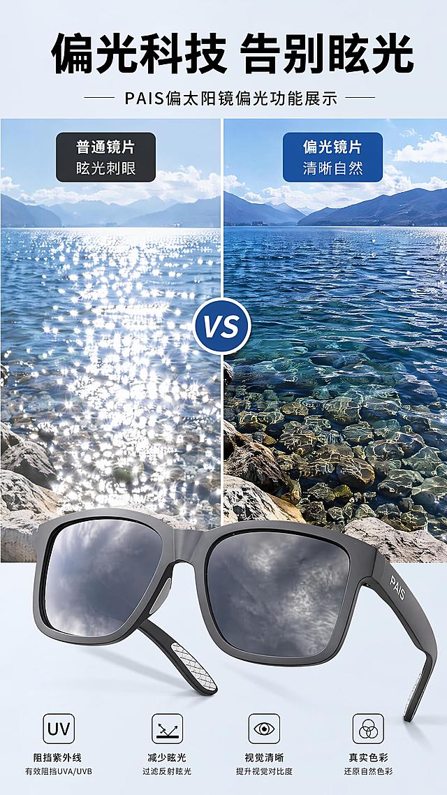
![[第4屏] 偏光功能演示-黑色偏光太阳镜偏光效果展示。
[氛围/风格] 实景对比风,真实直观,突出偏光改善视觉效果的优势。
[元素布局] 画面上下分屏,上半部分为「无偏光效果」,展示水面眩光杂乱画面;下半部分为「佩戴偏光镜效果」,展示眩光消除后水面清晰纹理画面。本屏在画面右上角放置放大版【图1】产品局部特写,展示镜片区域,产品颜色结构和输入图一致。
[光影质感] 自然光效果,眩光和清晰效果对比明显,光线真实自然,局部特写光影自然。
[配色色系] 全局底色:#F0F4F8(浅蓝灰);主体效果:上半部分亮白眩光,下半部分蓝绿水色;产品保持原有黑灰配色;文字为深黑色。
[视角构图] 上下对比构图,上半部分眩光效果,下半部分清晰效果,右上角产品特写,信息展示直观。
[文字版式] 左右两侧分别标注「无偏光:眩光刺眼 视野模糊」和「偏光镜:眩光消除 视野清晰」,左侧文字白色描黑边,右侧文字黑色,清晰可读。顶部主标题「偏光科技 清晰视野」,加粗居中。
[比例分辨率] 9:16 竖版比例,2K 分辨率,文字清晰可辨,超高清。
[负向提示词] 对比不明显,产品变形,文字错乱,颜色偏差,水印。](https://gd-cms.dancf.com/gd-cms/xi19e5/0/20d154ef-ae23-4e16-a71d-4131f1a7d17628389.png?x-oss-process=image/resize,w_640,type_6/sharpen,120/interlace,1)

![[第2屏] Pain Point Comparison of Daily Eye Protection.本屏使用【图1】作为商品主体,保持商品外观结构与颜色一致。
[氛围/风格] Clear information contrast style, real scene contrast, simple layout, commercial practical style, easy to understand.
[元素布局] The screen is divided into left and right parts. The left side shows the problem: common ordinary glasses without side protection, dust and wind can easily enter the eyes, the picture shows a small amount of dust particles near the side gap; The right side shows the solution: this protective goggles with integrated side shield, the side is completely protected, dust and wind are blocked. Each side accounts for 50% of the width, the product occupies 60% of the vertical space of each area, keep the product structure clear.
[光影质感] Uniform soft lighting, clear contrast between left and right, product details are visible, the overall picture is clean and not messy.
[配色色系] Global background color: #F5F7FA (light cool gray); left problem area with light red translucent label, right solution area with light green translucent label; text color dark gray.
[视角构图] Left and right horizontal comparison layout, the same product perspective, contrast intuitive.
[文字版式] Top main title "Before Vs After: Better Eye Protection", left area title "No Side Protection" with small label "Dust & Wind Invasion", right area title "Full Side Shield" with small label "Block Dust & Wind". Each title is placed at the top of the corresponding area, the font is clear, does not block the main body of the product, all text is in English, conform to the capitalization rules, no Chinese.
[比例分辨率] 9:16 vertical ratio, 4K resolution, clear and readable text.
[负向提示词] Product deformation, structural inconsistency, color deviation, text confusion, Chinese characters, exaggerated dirty picture, watermark, guide button.](https://gd-cms.dancf.com/gd-cms/xi19e5/0/34bf57ec-f959-4587-bae0-d8cc1c97e4972774.png?x-oss-process=image/resize,w_640,type_6/sharpen,120/interlace,1)
![[主图 3] UPF50+防晒特性详情页,使用左右双切片构图,左切片展示伞内侧黑胶涂层,右切片展示紫外线阻挡示意图。包含2把雨伞产品,产品保持与原图外观结构颜色完全一致,不切割产品,仅切片分区。背景为蓝色科技渐变背景,非纯白,主题突出防晒功能。商业摄影质感,清晰通透。文字版式:左侧大标题加粗 "UPF50+ UV Blocking",右侧副标题 "Blocks 99% Harmful UV Rays",全部英文突出显示,字体对比清晰。1:1 800x800 2K,文字清晰,产品不变形。负向提示词:变形,水印,中文,文字错乱。](https://gd-cms.dancf.com/gd-cms/xi19e5/0/b0dd78fc-e765-475c-998f-1f031a08d7e029576.png?x-oss-process=image/resize,w_640,type_6/sharpen,120/interlace,1)
![[第3屏] 详情页第二卖点-专业UV防护功能展示。本屏使用【图1】作为商品主体。
[氛围/风格] 数据可视化专业风,清晰直观,科技感。
[元素布局] 左侧放置骑行眼镜完整展示图,右侧为紫外线阻隔示意图;添加测试数据模块展示防护效果;保留商品原有结构配色与输入图一致。
[光影质感] 均匀正面布光,产品清晰无暗角,示意图层次分明。
[配色色系] 全局底色 #FAFAFA;主色黑银产品;辅助色紫色紫外线射线、绿色阻隔层、黑色文字。
[视角构图] 左产品右信息构图,左右平衡,信息层级清晰。
[文字版式] 顶部主标题「全频段UV 高效阻隔」,副标题「阻挡紫外线 保护双眼」;右侧数据区标注「UV400防护 阻隔99%以上紫外线」;文字清晰,排版舒适。
[比例分辨率] 9:16竖版比例,4K分辨率,文字清晰可辨,高清画质。
[负向提示词] 变形,水印,文字错乱,文字过小,缺件错件,颜色偏差,背景杂乱](https://gd-cms.dancf.com/gd-cms/xi19e5/0/272d78db-def7-4185-bf8d-6613ca1e6ab675036.jpeg?x-oss-process=image/resize,w_640,type_6/sharpen,120/interlace,1)

![[第3屏] 卖点解析页-亮黑框灰片复古圆框太阳镜突出TR90材质优势。
[氛围/风格] 直白通透卖点展示风格,拼多多高性价比质感,干净清晰商业图文版式。
[元素布局] 画面左侧放置太阳镜整体实物图,右侧为卖点文字区域。保持太阳镜外观结构、材质颜色与输入产品图完全一致,产品占画面左侧约45%区域,清晰完整呈现整体轮廓。背景采用浅灰色渐变,干净不抢主体,三个卖点卡片纵向排列在右侧,每个卡片留白充足,不拥挤。
[光影质感] 均匀柔和棚拍光,左侧产品光线均匀对称,镜框材质高光清晰,材质质感突出,没有生硬阴影,整体通透干净。
[配色色系] 全局底色:#F5F5F5(浅灰渐变);主体配色:#000000(镜框)+#636363(镜片);辅助色:#000000(标题黑)+#FFFFFF(卡片白底)+#222222(文字黑)。
[视角构图] 太阳镜左侧45度斜侧放置,正面展示,文字纵向排列右侧,版式左右分割清晰,符合从上到下阅读顺序。
[文字版式] 顶部通栏放主标题「好材质才有好体验」黑色粗体大字,居中对齐。左侧产品,右侧三个卖点卡片:卡片1标题「TR90韧性镜框」加粗黑标题,下方小字「不易断裂 韧性出色 久戴不变形」;卡片2标题「偏光过滤眩光」加粗黑标题,下方小字「开车逛街 视野清晰柔和」;卡片3标题「防蓝光设计」加粗黑标题,下方小字「日常出行 阻挡有害蓝光」。文字排版左对齐,卡片圆角设计,文字大小对比清晰,移动端可读。
[比例分辨率] 2:3 竖版比例,4K分辨率,文字清晰可辨,超高清适合移动端浏览。
[负向提示词] 墨镜变形,颜色偏差,文字错乱,水印,背景杂乱,产品主体模糊,卖点卡片重叠。](https://gd-cms.dancf.com/gd-cms/xi19e5/0/8b757bda-2ed1-4933-9cdb-49b8664fdc477296.png?x-oss-process=image/resize,w_640,type_6/sharpen,120/interlace,1)