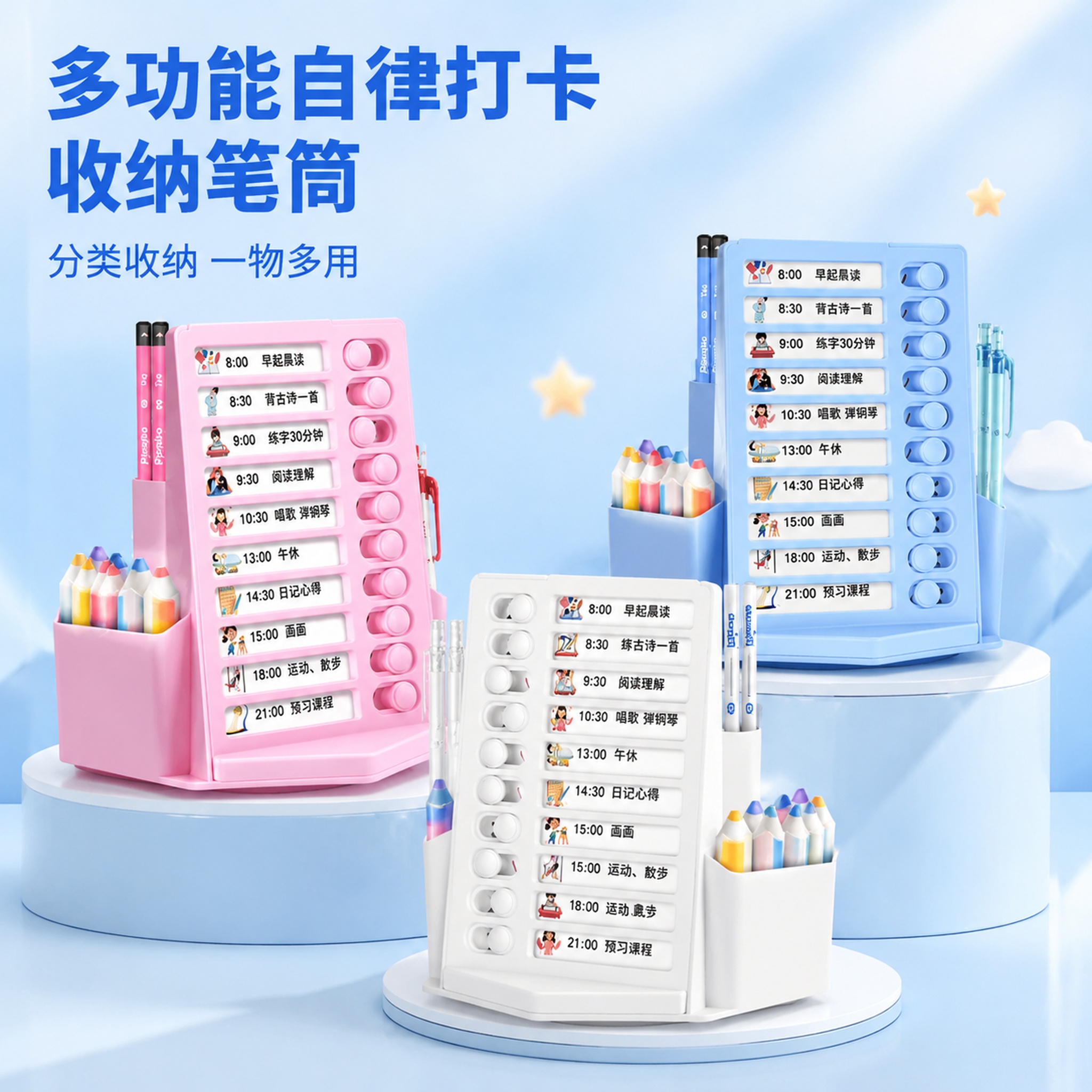

「图片1」「图片1」「图片1」,生成一套主图(5张),商品名称… - 图片创意预览

「图片1」「图片1」「图片1」,生成一套主图(5张),商品名称…

「图片1」「图片1」「图片1」,生成一套主图(5张),商品名称是收纳笔筒,卖点是多功能自律打卡器,分隔笔筒,分类收纳,一物多用,适配淘宝/天猫平台,主图比例为1:1不要改变笔筒原本形态,按照我给的图片

用户头像

1qurgplq9kc...

2026.07.01
[主图-2] 核心卖点证明,展示文具盒大容量分层收纳功能,证明能装下很多文具。 [统一基调] 抖音风格,场景化强视觉冲击,清新活泼学生向;背景主色为浅蓝+淡紫渐变,标题字色为深紫色,辅助字色为白色,强调色为明黄色;字体为圆润粗体无衬线,字号层级分明,卡片用圆角半透明白底,图标为可爱手绘风。 [画面] 紫色文具盒打开状态,呈现在画面中央,占比约70%,展示内部双层收纳结构。上层摆放几支彩色铅笔、一块橡皮、一把直尺,下层放着钢笔、便签本等文具,清晰展示分层收纳空间。背景是虚化的书桌场景,突出文具盒内部结构。 [光影质感] 商业摄影质感,顶部柔光均匀照射,内部每一层都清晰可见,文具摆放整齐,文具盒内壁材质清晰,有真实的开合角度和深度感。 [配色] 背景浅蓝淡紫渐变虚化,文具盒内外均为马卡龙紫色,文具颜色丰富但不抢主体,标题深紫,强调明黄。 [文字版式] 顶部大标题"大容量分层收纳",深紫色粗体大字;左侧两个圆角白底图标卡片,分别写"双层设计"和"能装20+文具",配小图标;右下角小字"学习用品 一盒搞定"。文字不遮挡文具盒开口和内部展示。 [输出要求] 1:1正方形比例,2048*2048,文字清晰可读,产品清晰不变形,无错字,无杂乱元素,无水印,无平台Logo,无悬浮感。[主图-2] 核心卖点证明,展示文具盒大容量分层收纳功能,证明能装下很多文具。
[统一基调] 抖音风格,场景化强视觉冲击,清新活泼学生向;背景主色为浅蓝+淡紫渐变,标题字色为深紫色,辅助字色为白色,强调色为明黄色;字体为圆润粗体无衬线,字号层级分明,卡片用圆角半透明白底,图标为可爱手绘风。
[画面] 紫色文具盒打开状态,呈现在画面中央,占比约70%,展示内部双层收纳结构。上层摆放几支彩色铅笔、一块橡皮、一把直尺,下层放着钢笔、便签本等文具,清晰展示分层收纳空间。背景是虚化的书桌场景,突出文具盒内部结构。
[光影质感] 商业摄影质感,顶部柔光均匀照射,内部每一层都清晰可见,文具摆放整齐,文具盒内壁材质清晰,有真实的开合角度和深度感。
[配色] 背景浅蓝淡紫渐变虚化,文具盒内外均为马卡龙紫色,文具颜色丰富但不抢主体,标题深紫,强调明黄。
[文字版式] 顶部大标题"大容量分层收纳",深紫色粗体大字;左侧两个圆角白底图标卡片,分别写"双层设计"和"能装20+文具",配小图标;右下角小字"学习用品 一盒搞定"。文字不遮挡文具盒开口和内部展示。
[输出要求] 1:1正方形比例,2048*2048,文字清晰可读,产品清晰不变形,无错字,无杂乱元素,无水印,无平台Logo,无悬浮感。
[单张主图] 抽屉式多功能书桌文具整理收纳盒多巴胺洞洞板,高级氛围感主图,展示产品整洁收纳效果,适配拼多多平台。保持产品外观(米白色主体搭配红色收纳盒、带透明抽屉的物理结构、材质质感、颜色)与输入产品图绝对一致,杜绝任何变形和色差,精细化处理。产品主体完整居中放置,占画面约50%,展示产品整体结构和收纳状态。采用左文右物场景型版式,左侧大面积留白放置文案,右侧产品放大展示,底部用原木桌面承托,整体简约少女心风格。左侧文字排版:顶部品牌区域放小字英文装饰"Desk Storage",主标题"多巴胺洞洞板收纳盒",大号中文粗体无衬线;下方三条短卖点:"抽屉大容量"、"多功能分区"、"省桌面空间",每条搭配浅色线稿图标。背景为浅奶白色,搭配柔和木纹桌面和少量马卡龙色系小文具点缀,干净不杂乱。光影采用自然桌面柔光,主光从左侧斜射,右侧形成柔和投影,光线均匀通透,产品轮廓清晰,塑料材质质感表现自然,抽屉通透感真实。主色调奶白色,辅助色红色和浅木色,强调色粉色马卡龙点缀,字体为轻无衬线,字重克制,主标题最大,卖点文字缩小一半,对比清晰。1:1比例,2k分辨率,文字清晰可辨,超高清。负向提示词:变形,文字错乱,产品图模糊,背景杂乱,水印,电商平台Logo,主体遮挡,错字,结构错误[单张主图] 抽屉式多功能书桌文具整理收纳盒多巴胺洞洞板,高级氛围感主图,展示产品整洁收纳效果,适配拼多多平台。保持产品外观(米白色主体搭配红色收纳盒、带透明抽屉的物理结构、材质质感、颜色)与输入产品图绝对一致,杜绝任何变形和色差,精细化处理。产品主体完整居中放置,占画面约50%,展示产品整体结构和收纳状态。采用左文右物场景型版式,左侧大面积留白放置文案,右侧产品放大展示,底部用原木桌面承托,整体简约少女心风格。左侧文字排版:顶部品牌区域放小字英文装饰"Desk Storage",主标题"多巴胺洞洞板收纳盒",大号中文粗体无衬线;下方三条短卖点:"抽屉大容量"、"多功能分区"、"省桌面空间",每条搭配浅色线稿图标。背景为浅奶白色,搭配柔和木纹桌面和少量马卡龙色系小文具点缀,干净不杂乱。光影采用自然桌面柔光,主光从左侧斜射,右侧形成柔和投影,光线均匀通透,产品轮廓清晰,塑料材质质感表现自然,抽屉通透感真实。主色调奶白色,辅助色红色和浅木色,强调色粉色马卡龙点缀,字体为轻无衬线,字重克制,主标题最大,卖点文字缩小一半,对比清晰。1:1比例,2k分辨率,文字清晰可辨,超高清。负向提示词:变形,文字错乱,产品图模糊,背景杂乱,水印,电商平台Logo,主体遮挡,错字,结构错误
[主图-4] 使用场景与适用范围,展示文具盒在学生日常学习多场景中的使用。 [统一基调] 抖音风格,场景化强视觉冲击,清新活泼学生向;背景主色为浅蓝+淡紫渐变,标题字色为深紫色,辅助字色为白色,强调色为明黄色;字体为圆润粗体无衬线,字号层级分明,卡片用圆角半透明白底,图标为可爱手绘风。 [画面] 三宫格场景拼图,每格都是真实使用场景。左上格:教室课桌场景,文具盒放在课本旁边,学生手正在拿铅笔;右上格:书包内部场景,文具盒整齐放在书包夹层里;下方大格:家里书桌学习场景,文具盒打开,旁边有台灯和作业本,营造温馨学习氛围。紫色文具盒在每个场景中都清晰可见,保持外观一致。 [光影质感] 每个场景都是真实自然光质感,教室明亮,书包内有柔和光线,家里书桌暖光,文具盒在每个场景中都自然融入,光影匹配。 [配色] 三个场景各有环境色,但整体色调统一在清新蓝紫系,标题深紫,分隔线为明黄色。 [文字版式] 顶部大标题"多场景适用 陪伴学习每一天",深紫色粗体大字;三宫格每格右下角分别标注"课堂学习"、"便携收纳"、"居家写作业",白色小字配半透明深紫底。文字不遮挡文具盒主体。 [输出要求] 1:1正方形比例,2048*2048,文字清晰可读,产品清晰不变形,无错字,无杂乱元素,无水印,无平台Logo,无悬浮感。[主图-4] 使用场景与适用范围,展示文具盒在学生日常学习多场景中的使用。
[统一基调] 抖音风格,场景化强视觉冲击,清新活泼学生向;背景主色为浅蓝+淡紫渐变,标题字色为深紫色,辅助字色为白色,强调色为明黄色;字体为圆润粗体无衬线,字号层级分明,卡片用圆角半透明白底,图标为可爱手绘风。
[画面] 三宫格场景拼图,每格都是真实使用场景。左上格:教室课桌场景,文具盒放在课本旁边,学生手正在拿铅笔;右上格:书包内部场景,文具盒整齐放在书包夹层里;下方大格:家里书桌学习场景,文具盒打开,旁边有台灯和作业本,营造温馨学习氛围。紫色文具盒在每个场景中都清晰可见,保持外观一致。
[光影质感] 每个场景都是真实自然光质感,教室明亮,书包内有柔和光线,家里书桌暖光,文具盒在每个场景中都自然融入,光影匹配。
[配色] 三个场景各有环境色,但整体色调统一在清新蓝紫系,标题深紫,分隔线为明黄色。
[文字版式] 顶部大标题"多场景适用 陪伴学习每一天",深紫色粗体大字;三宫格每格右下角分别标注"课堂学习"、"便携收纳"、"居家写作业",白色小字配半透明深紫底。文字不遮挡文具盒主体。
[输出要求] 1:1正方形比例,2048*2048,文字清晰可读,产品清晰不变形,无错字,无杂乱元素,无水印,无平台Logo,无悬浮感。
1:1 square format, sweet cute cream healing macaron style, warm off-white desk surface (#FAF5EF), natural soft light from top left with gentle shadows. In the center of the desk, a transparent plastic box of 6 dual-tip double-color highlighters (pudding salad series, no brand LOGO) is placed diagonally. 3-4 highlighter pens are scattered naturally around the box. One highlighter with chisel tip (4mm) is realistically hand-painting a high-saturation fluorescent orange base stroke vertically on an open notebook, with visible brush texture, uneven color, and rough edges; the other end round tip (1mm) shows a different color. Surrounding props: top left corner of a white keyboard, top right white mouse, left side scattered colorful paper clips, bottom right edge of a light blue tennis racket, bottom part an open notebook page. On the notebook page there are 3 sets of realistic hand-applied chisel tip high-saturation fluorescent base color strokes + round tip realistic handwritten high-saturation fluorescent English overlay text: Set 1: high-saturation fluorescent orange chisel base with same pen round tip high-saturation fluorescent blue handwritten 'Find your fire', handwriting is full and rounded about 1mm thick, with pen pressure variation and connected strokes, color matches the round tip exactly. Set 2: high-saturation fluorescent pink chisel base with same pen round tip high-saturation fluorescent purple handwritten 'Keep spirit', purple is high-saturation fluorescent matching the round tip. Set 3: high-saturation fluorescent yellow chisel base with same pen round tip high-saturation fluorescent purple handwritten 'Enjoy moment', purple matches the round tip color. All handwritten English strokes are evenly thick and full about 1mm, realistic handwriting texture, not thin needle pen effect. Main title '笔记・绘画・手账・标记' in cute rounded font light purple, centered at the top of the image, four words separated by dots. Subtitle '双头双色 高颜值文具' in cute rounded font macaron mint blue-green, below the main title. Left-aligned minimalist layout, text concentrated at the top, product scene occupies the lower 70% of the image. Design emphasis: realistic scene with life atmosphere, all highlighter stroke colors are high-saturation fluorescent bright colors (not macaron low-saturation colors), notebook overlay strokes are realistic hand-applied traces + full handwritten English (1mm round tip thickness), handwritten text color strictly matches the corresponding round tip, both chisel tip coloring and round tip handwriting are presented simultaneously, warm and healing lighting, macaron soft background sets off the bright fluorescent strokes, products blend naturally, no brand logo. Pen body has 'COLOR LAYING' text and wave bubble pattern, single pen length 150mm, double-ended dual-color highlighter with chisel tip (4mm) on one end and round tip (1mm) on the other, each end a different color. Slightly different composition and angle from previous version.1:1 square format, sweet cute cream healing macaron style, warm off-white desk surface (#FAF5EF), natural soft light from top left with gentle shadows. In the center of the desk, a transparent plastic box of 6 dual-tip double-color highlighters (pudding salad series, no brand LOGO) is placed diagonally. 3-4 highlighter pens are scattered naturally around the box. One highlighter with chisel tip (4mm) is realistically hand-painting a high-saturation fluorescent orange base stroke vertically on an open notebook, with visible brush texture, uneven color, and rough edges; the other end round tip (1mm) shows a different color. Surrounding props: top left corner of a white keyboard, top right white mouse, left side scattered colorful paper clips, bottom right edge of a light blue tennis racket, bottom part an open notebook page. On the notebook page there are 3 sets of realistic hand-applied chisel tip high-saturation fluorescent base color strokes + round tip realistic handwritten high-saturation fluorescent English overlay text: Set 1: high-saturation fluorescent orange chisel base with same pen round tip high-saturation fluorescent blue handwritten 'Find your fire', handwriting is full and rounded about 1mm thick, with pen pressure variation and connected strokes, color matches the round tip exactly. Set 2: high-saturation fluorescent pink chisel base with same pen round tip high-saturation fluorescent purple handwritten 'Keep spirit', purple is high-saturation fluorescent matching the round tip. Set 3: high-saturation fluorescent yellow chisel base with same pen round tip high-saturation fluorescent purple handwritten 'Enjoy moment', purple matches the round tip color. All handwritten English strokes are evenly thick and full about 1mm, realistic handwriting texture, not thin needle pen effect. Main title '笔记・绘画・手账・标记' in cute rounded font light purple, centered at the top of the image, four words separated by dots. Subtitle '双头双色 高颜值文具' in cute rounded font macaron mint blue-green, below the main title. Left-aligned minimalist layout, text concentrated at the top, product scene occupies the lower 70% of the image. Design emphasis: realistic scene with life atmosphere, all highlighter stroke colors are high-saturation fluorescent bright colors (not macaron low-saturation colors), notebook overlay strokes are realistic hand-applied traces + full handwritten English (1mm round tip thickness), handwritten text color strictly matches the corresponding round tip, both chisel tip coloring and round tip handwriting are presented simultaneously, warm and healing lighting, macaron soft background sets off the bright fluorescent strokes, products blend naturally, no brand logo. Pen body has 'COLOR LAYING' text and wave bubble pattern, single pen length 150mm, double-ended dual-color highlighter with chisel tip (4mm) on one end and round tip (1mm) on the other, each end a different color. Slightly different composition and angle from previous version.
[主图 1] 晨光按动中性笔礼盒首图,书桌书写场景。 [氛围风格] 马卡龙色系清新治愈风,干净明亮的自然光,强调清洁感和书写质感。 [画质] 商业摄影质感,光线柔和通透,产品清晰真实,画面干净高级。 [元素] 马卡龙色系的晨光按动中性笔礼盒居中摆放,拆开后露出整齐排列的10支彩色笔杆中性笔,旁边赠送一个同色系笔袋,一支笔斜放在摊开的笔记本上,展示书写状态。桌面是浅原木色,搭配马卡龙浅蓝桌面垫,摆有小绿植和陶瓷水杯做点缀,整体温馨整洁。商品主体占比严格控制在60%-80%之间,画面满屏无边框。 [光影] 柔和自然光从左侧窗户洒入,作为主光照亮产品,暖调温柔;右侧桌面漫反射做填充辅光,马卡龙背景带有低亮度漫反射高光,整体光比舒适通透,高光不溢出,暗部有层次。 [配色] 主色调为低饱和度马卡龙色系:浅粉、浅蓝、浅绿、浅紫搭配浅原木色,清新柔和。 [视角构图] 平视角度,以产品礼盒为视觉中心,前中后景分层,景深适中,产品完整不裁切。 [文字版式] 左上负空间左对齐留安全边距,主标题“书写顺滑 刷题不累”,黑色最大号粗体无衬线字体。副标题“速干不晕墨,考试日常都好用”,字号约为标题的一半,同色系略浅。底部通栏浅马卡龙色块,展示促销信息:左侧“礼盒价”黑色小字,右侧“39.9元”大号加粗数字,再右侧“赠笔袋”醒目标签字。文字清晰,与背景对比强烈,不遮挡产品主体。 [比例分辨率] 1:1比例,2k分辨率,文字清晰可辨,超高清。 [负向提示词] 变形,水印,文字错乱,产品图模糊,背景杂乱,冷色调,夸张配色,遮挡主体。[主图 1] 晨光按动中性笔礼盒首图,书桌书写场景。
[氛围风格] 马卡龙色系清新治愈风,干净明亮的自然光,强调清洁感和书写质感。
[画质] 商业摄影质感,光线柔和通透,产品清晰真实,画面干净高级。
[元素] 马卡龙色系的晨光按动中性笔礼盒居中摆放,拆开后露出整齐排列的10支彩色笔杆中性笔,旁边赠送一个同色系笔袋,一支笔斜放在摊开的笔记本上,展示书写状态。桌面是浅原木色,搭配马卡龙浅蓝桌面垫,摆有小绿植和陶瓷水杯做点缀,整体温馨整洁。商品主体占比严格控制在60%-80%之间,画面满屏无边框。
[光影] 柔和自然光从左侧窗户洒入,作为主光照亮产品,暖调温柔;右侧桌面漫反射做填充辅光,马卡龙背景带有低亮度漫反射高光,整体光比舒适通透,高光不溢出,暗部有层次。
[配色] 主色调为低饱和度马卡龙色系:浅粉、浅蓝、浅绿、浅紫搭配浅原木色,清新柔和。
[视角构图] 平视角度,以产品礼盒为视觉中心,前中后景分层,景深适中,产品完整不裁切。
[文字版式] 左上负空间左对齐留安全边距,主标题“书写顺滑 刷题不累”,黑色最大号粗体无衬线字体。副标题“速干不晕墨,考试日常都好用”,字号约为标题的一半,同色系略浅。底部通栏浅马卡龙色块,展示促销信息:左侧“礼盒价”黑色小字,右侧“39.9元”大号加粗数字,再右侧“赠笔袋”醒目标签字。文字清晰,与背景对比强烈,不遮挡产品主体。
[比例分辨率] 1:1比例,2k分辨率,文字清晰可辨,超高清。
[负向提示词] 变形,水印,文字错乱,产品图模糊,背景杂乱,冷色调,夸张配色,遮挡主体。