
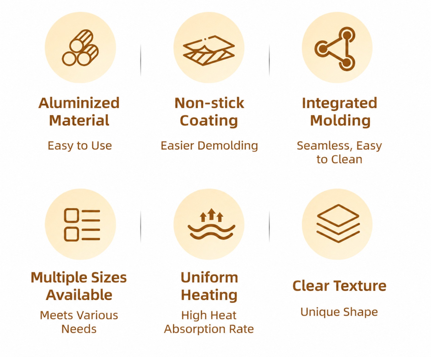

将这张图内所有中文文字替换为英文,保留原图片布局、圆形图标、颜…
将这张图内所有中文文字替换为英文,保留原图片布局、圆形图标、颜色风格不变。文字内容翻译:Aluminized Material, Easy to Use; Non-stick Coating, Eas

1r8o826tw6E...
2026.07.15将这张图内所有中文文字替换为英文,保留原图片布局、圆形图标、颜色风格不变。文字内容翻译:Aluminized Material, Easy to Use; Non-stick Coating, Eas
1r8o826tw6E...
2026.07.15

![[第5屏] Production Technology and Material Structure display. 本屏 use 4 layers cross-section diagram to explain the manufacturing process.
[氛围/风格] Technical illustration style, clear structure, professional and trustworthy.
[元素布局] Cross-section diagram of window tint film on center, each material layer labeled with引线 annotation. From top to bottom: scratch-resistant protective layer, anti-UV layer, nano-ceramic heat insulation layer, pressure-sensitive adhesive layer. Each layer has a one-line benefit description. Background clean, lines thin and clear.
[光影质感] Soft studio lighting, clear layer boundaries, soft shadow for depth.
[配色色系] Background #f0f4f8, layer colors from top to bottom: clear, light gray, dark gray, yellow adhesive, text labels dark gray, clear contrast.
[视角构图] Vertical cross-section centered, labels placed next to each layer, easy to understand.
[文字版式] Top main title "Advanced Multi-layer Manufacturing Process", each layer label "Scratch Resistant Top Coat" "UV Blocking Layer" "Nano-ceramic Insulation Core" "Pressure Sensitive Adhesive". All English, labels clear, no Chinese characters.
[比例分辨率] 9:16 vertical, 4K resolution, text clear and legible.
[负向提示词] messy layers, wrong structure, blurry labels, Chinese characters, exaggerated colors, distorted diagram.](https://gd-cms.dancf.com/gd-cms/xi19e5/0/d99f581a-b65e-4caa-a41e-3212bd4c1eb724179.jpeg?x-oss-process=image/resize,w_640,type_6/sharpen,120/interlace,1)

![[第5屏] Production Technology and Material Structure display. 本屏 use 4 layers cross-section diagram to explain the manufacturing process.
[氛围/风格] Technical illustration style, clear structure, professional and trustworthy.
[元素布局] Cross-section diagram of window tint film on center, each material layer labeled with引线 annotation. From top to bottom: scratch-resistant protective layer, anti-UV layer, nano-ceramic heat insulation layer, pressure-sensitive adhesive layer. Each layer has a one-line benefit description. Background clean, lines thin and clear.
[光影质感] Soft studio lighting, clear layer boundaries, soft shadow for depth.
[配色色系] Background #f0f4f8, layer colors from top to bottom: clear, light gray, dark gray, yellow adhesive, text labels dark gray, clear contrast.
[视角构图] Vertical cross-section centered, labels placed next to each layer, easy to understand.
[文字版式] Top main title "Advanced Multi-layer Manufacturing Process", each layer label "Scratch Resistant Top Coat" "UV Blocking Layer" "Nano-ceramic Insulation Core" "Pressure Sensitive Adhesive". All English, labels clear, no Chinese characters.
[比例分辨率] 9:16 vertical, 4K resolution, text clear and legible.
[负向提示词] messy layers, wrong structure, blurry labels, Chinese characters, exaggerated colors, distorted diagram.](https://gd-cms.dancf.com/gd-cms/xi19e5/0/88982fc4-f946-4901-824e-1f3a86aea46b24184.jpeg?x-oss-process=image/resize,w_640,type_6/sharpen,120/interlace,1)
![[第5屏] Production Technology and Material Structure display. 本屏 use 4 layers cross-section diagram to explain the manufacturing process.
[氛围/风格] Technical illustration style, clear structure, professional and trustworthy.
[元素布局] Cross-section diagram of window tint film on center, each material layer labeled with引线 annotation. From top to bottom: scratch-resistant protective layer, anti-UV layer, nano-ceramic heat insulation layer, pressure-sensitive adhesive layer. Each layer has a one-line benefit description. Background clean, lines thin and clear.
[光影质感] Soft studio lighting, clear layer boundaries, soft shadow for depth.
[配色色系] Background #f0f4f8, layer colors from top to bottom: clear, light gray, dark gray, yellow adhesive, text labels dark gray, clear contrast.
[视角构图] Vertical cross-section centered, labels placed next to each layer, easy to understand.
[文字版式] Top main title "Advanced Multi-layer Manufacturing Process", each layer label "Scratch Resistant Top Coat" "UV Blocking Layer" "Nano-ceramic Insulation Core" "Pressure Sensitive Adhesive". All English, labels clear, no Chinese characters.
[比例分辨率] 9:16 vertical, 4K resolution, text clear and legible.
[负向提示词] messy layers, wrong structure, blurry labels, Chinese characters, exaggerated colors, distorted diagram.](https://gd-cms.dancf.com/gd-cms/xi19e5/0/5e18f80d-b994-4fac-9af5-f84b7270095324603.jpeg?x-oss-process=image/resize,w_640,type_6/sharpen,120/interlace,1)
![[第5屏] Production Technology and Material Structure display. 本屏 use 4 layers cross-section diagram to explain the manufacturing process.
[氛围/风格] Technical illustration style, clear structure, professional and trustworthy.
[元素布局] Cross-section diagram of window tint film on center, each material layer labeled with引线 annotation. From top to bottom: scratch-resistant protective layer, anti-UV layer, nano-ceramic heat insulation layer, pressure-sensitive adhesive layer. Each layer has a one-line benefit description. Background clean, lines thin and clear.
[光影质感] Soft studio lighting, clear layer boundaries, soft shadow for depth.
[配色色系] Background #f0f4f8, layer colors from top to bottom: clear, light gray, dark gray, yellow adhesive, text labels dark gray, clear contrast.
[视角构图] Vertical cross-section centered, labels placed next to each layer, easy to understand.
[文字版式] Top main title "Advanced Multi-layer Manufacturing Process", each layer label "Scratch Resistant Top Coat" "UV Blocking Layer" "Nano-ceramic Insulation Core" "Pressure Sensitive Adhesive". All English, labels clear, no Chinese characters.
[比例分辨率] 9:16 vertical, 4K resolution, text clear and legible.
[负向提示词] messy layers, wrong structure, blurry labels, Chinese characters, exaggerated colors, distorted diagram.](https://gd-cms.dancf.com/gd-cms/xi19e5/0/b229b3f5-86f4-443a-b711-e53cdfb1836423868.jpeg?x-oss-process=image/resize,w_640,type_6/sharpen,120/interlace,1)
![[第5屏] Production Technology and Material Structure display. 本屏 use 4 layers cross-section diagram to explain the manufacturing process.
[氛围/风格] Technical illustration style, clear structure, professional and trustworthy.
[元素布局] Cross-section diagram of window tint film on center, each material layer labeled with引线 annotation. From top to bottom: scratch-resistant protective layer, anti-UV layer, nano-ceramic heat insulation layer, pressure-sensitive adhesive layer. Each layer has a one-line benefit description. Background clean, lines thin and clear.
[光影质感] Soft studio lighting, clear layer boundaries, soft shadow for depth.
[配色色系] Background #f0f4f8, layer colors from top to bottom: clear, light gray, dark gray, yellow adhesive, text labels dark gray, clear contrast.
[视角构图] Vertical cross-section centered, labels placed next to each layer, easy to understand.
[文字版式] Top main title "Advanced Multi-layer Manufacturing Process", each layer label "Scratch Resistant Top Coat" "UV Blocking Layer" "Nano-ceramic Insulation Core" "Pressure Sensitive Adhesive". All English, labels clear, no Chinese characters.
[比例分辨率] 9:16 vertical, 4K resolution, text clear and legible.
[负向提示词] messy layers, wrong structure, blurry labels, Chinese characters, exaggerated colors, distorted diagram.](https://gd-cms.dancf.com/gd-cms/xi19e5/0/ae57f9c2-9522-4d8d-b8c4-be87454a274f24191.jpeg?x-oss-process=image/resize,w_640,type_6/sharpen,120/interlace,1)
![[第5屏] Production Technology and Material Structure display. 本屏 use 4 layers cross-section diagram to explain the manufacturing process.
[氛围/风格] Technical illustration style, clear structure, professional and trustworthy.
[元素布局] Cross-section diagram of window tint film on center, each material layer labeled with引线 annotation. From top to bottom: scratch-resistant protective layer, anti-UV layer, nano-ceramic heat insulation layer, pressure-sensitive adhesive layer. Each layer has a one-line benefit description. Background clean, lines thin and clear.
[光影质感] Soft studio lighting, clear layer boundaries, soft shadow for depth.
[配色色系] Background #f0f4f8, layer colors from top to bottom: clear, light gray, dark gray, yellow adhesive, text labels dark gray, clear contrast.
[视角构图] Vertical cross-section centered, labels placed next to each layer, easy to understand.
[文字版式] Top main title "Advanced Multi-layer Manufacturing Process", each layer label "Scratch Resistant Top Coat" "UV Blocking Layer" "Nano-ceramic Insulation Core" "Pressure Sensitive Adhesive". All English, labels clear, no Chinese characters.
[比例分辨率] 9:16 vertical, 4K resolution, text clear and legible.
[负向提示词] messy layers, wrong structure, blurry labels, Chinese characters, exaggerated colors, distorted diagram.](https://gd-cms.dancf.com/gd-cms/xi19e5/0/c60888af-0de4-4b55-b06f-f35ad86bec4124201.jpeg?x-oss-process=image/resize,w_640,type_6/sharpen,120/interlace,1)





![[第2屏] Core Selling Points Overview - Three Advantages Icon Display.
[氛围/风格] Simple and clear information card style, light background, clean layout, business style suitable for cross-border e-commerce.
[元素布局] The overall layout is top title + middle three icon selling points. Keep the overall style consistent with the previous screen, the top title area accounts for 15% of the height, the middle three icons are evenly arranged in a row, each icon matches a selling point description, the bottom is appropriately blank. The style is uniform, the hierarchy is clear.
[光影质感] Uniform soft light, no obvious hard shadow, clear icons and text, bright overall, high readability.
[配色色系] Global background color: #F5F5F5 (light gray), consistent with the previous screen; icon color uses the main product color #8A9A9E, text color #1E1E1E, no additional new colors.
[视角构图] Flat lay, front view, evenly spaced, balanced layout.
[文字版式] Top main title "Core Advantages" in bold sans-serif font, left-aligned. Three selling points from left to right: 1. Icon + "Unrestricted Movement", 2. Icon + "Skin-friendly Fabric", 3. Icon + "Breathable & Cool". Each selling point icon is on top and text is below, centered. Text are all in English, no Chinese characters.
[比例分辨率] 1:1 square ratio, 1024px width, 1024px height, 2K resolution, clear text, ultra HD.
[负向提示词] Deformation, watermark, text disorder, cluttered layout, Chinese characters.](https://gd-cms.dancf.com/gd-cms/xi19e5/0/383bbfc5-8cdb-4300-8b1c-bd56c1de4a503547.png?x-oss-process=image/resize,w_640,type_6/sharpen,120/interlace,1)



![[主图 3] 多功能卖点展示图。
[氛围风格] 温馨舒适家居治愈风;符合欧美市场审美,清晰功能展示。
[画质] 商业摄影质感,光线柔和通透,产品清晰真实,画面干净高级。
[元素] 产品静电隐私窗膜居中展示,周围环绕5个悬浮胶囊标签分别展示五大核心卖点,用纤细引线连接对应说明。保持窗膜菱形格纹材质与输入产品图绝对一致,杜绝任何变形和色差,精细化处理。背景为柔和渐变浅米色,画面干净不杂乱。商品主体占比约60%,画面满屏无边框。
[光影] 均匀柔和顶光,突出产品质感和标签清晰度,无生硬阴影。
[配色] 主色浅米白,标签使用低饱和莫兰迪色系深浅搭配,文字深灰清晰可辨。
[视角构图] 平视居中构图,焦点落在产品主体。
[文字版式] 每个胶囊标签内含英文卖点文字:主卖点加粗大写,小字号说明:1. PRIVACY PROTECTION Translucent not transparent 2. MULTIPLE STYLES Match different decors 3. COST EFFECTIVE Affordable price 4. HEAT INSULATION Blocks UV rays 5. EASY CLEAN Wipe with damp cloth。文字大小对比清晰,不遮挡主体,符合跨境规范。
[比例分辨率] 1:1 比例,2k 分辨率;文字清晰锐利,画面超高清。
[负向提示词] 变形,水印,文字错乱,产品图模糊,背景杂乱,中文文字,夸张词汇,边框](https://gd-cms.dancf.com/gd-cms/xi19e5/0/5a09eaed-e6b6-47c2-9f72-84246f599a4130740.png?x-oss-process=image/resize,w_640,type_6/sharpen,120/interlace,1)

![[第2屏] 核心卖点总览-PVC螺旋塑筋管四大优势展示。本屏使用【图1】作为产品参考。
[氛围/风格] 简约清晰卖点卡设计,专业工业风,低干扰背景,信息层级明确。
[元素布局] 顶部预留主标题区,下方2行2列排列四个卖点icon卡片,每张卡片一个核心卖点,卡片配简约线框icon和说明文字;背景浅灰渐变,卡片留足间距不拥挤。
[光影质感] 均匀柔光照明,卡片边框轻微阴影增强层次感,文字清晰锐利。
[配色色系] 全局底色 #f0f4f8;主色深灰标题文字;辅助色浅蓝卡片边框,灰色正文。
[视角构图] 平面排版,居中对称构图,信息阅读流畅从上到下。
[文字版式] 顶部主标题 "Core Product Advantages",四个卖点分别为:1. "Reinforced Structure" - High Pressure Resistance;2. "Flexible Bend" - Easy Installation;3. "Corrosion Resistant" - Long Service Life;4. "Widely Used" - Multiple Scenarios;所有文字均为英文,卖点标题加粗突出,说明文字浅色辅助。
[比例分辨率] 1:1 方图比例,2K分辨率,文字清晰可辨,高清画质。
[负向提示词] 变形,水印,文字错乱,文字过小,中文字符,背景杂乱,信息拥挤。](https://gd-cms.dancf.com/gd-cms/xi19e5/0/2841d305-bb70-4940-ada1-717a2831adea12543.png?x-oss-process=image/resize,w_640,type_6/sharpen,120/interlace,1)

![[第2屏] 核心卖点总览,四宫格展示防水灌封胶四大性能。
[氛围/风格] 简约信息卡风格,专业清晰,低饱和度配色。
[元素布局] 顶部主标题区域,下方为2×2四宫格,每个宫格对应一个核心卖点,搭配简约图标,整体留白适中。
[光影质感] 均匀柔光,每个宫格信息清晰区分,无明显硬阴影。
[配色色系] 全局底色 #f0f0f0;主色深蓝色标题,浅蓝信息卡,灰色文字。
[视角构图] 正面平视,满版信息排版,阅读从上到下,从左到右。
[文字版式] 顶部主标题 "Key Features",四个宫格文案分别为:"Strong Weather Resistance", "Excellent Permeability", "Easy Application", "Self-Leveling",每个标题下方配一句简短说明,文字大小适中清晰可读。
[比例分辨率] 9:16 竖版比例,4K 分辨率,高清画质。
[负向提示词] 图标变形,文字重叠,颜色刺眼,排版拥挤,中文字符。](https://gd-cms.dancf.com/gd-cms/xi19e5/0/bc8e803e-12a3-468c-9278-8191c03e511253176.png?x-oss-process=image/resize,w_640,type_6/sharpen,120/interlace,1)
![[第7屏] Product Detail Macro display page for PET Cold Laminating Crystal Film.
[Atmosphere/Style] Detail close-up professional style, highlighting product quality.
[Element Layout] Three key detail close-ups arranged vertically: 1. Edge cutting detail, 2. Adhesive layer surface detail, 3. Flexibility performance detail. Each close-up has a small title and description on the right. Keep all detail features consistent with the overall product characteristics from input images.
[Light and Shadow Texture] Side lighting to highlight the surface texture and edge details, soft shadow, clear texture layering.
[Color Matching] Global background #f0f2f5, detail area background white, title dark gray, description light gray.
[Perspective Composition] Left image right text for each detail block, clear arrangement, easy reading.
[Text Layout] Top title "Exquisite Detail Quality", three detail titles: "Clean Cut Edge", "Uniform Adhesive Distribution", "Good Flexibility". Each with short benefit description.
[Proportion Resolution] 9:16, 4K, text clear and recognizable.
[Negative Prompt] Blurred details, product deformation, text garbled, Chinese characters, watermark.](https://gd-cms.dancf.com/gd-cms/xi19e5/0/4c8332e3-7e63-4d0b-8b68-bbb5caaf3e2734667.png?x-oss-process=image/resize,w_640,type_6/sharpen,120/interlace,1)

![[Main Image 3] Core selling points display, centered on PVC fiber water hose product, use thin indicator lines to connect each key part, mark 5 core functions with small dots: 1.Thickened Wall Pressure Resistant, 2.Freeze & Explosion Proof Low Temp Resistant, 3.Oil Corrosion Acid Alkali Resistant, 4.Sun Protection Anti Aging, 5.Pressure Resistant Flexible Bending. All text in English, dark background, highlight each selling point with simple icon, clear hierarchy, product in center, annotations around, 1:1 2048x2048 2K, minimalist industrial style.](https://gd-cms.dancf.com/gd-cms/xi19e5/0/c6a93f54-0be1-45cd-86b6-b91a3c2067028762.png?x-oss-process=image/resize,w_640,type_6/sharpen,120/interlace,1)



![[主图 3] 静电隐私窗膜五大核心卖点展示。[氛围风格] 温馨舒适家居治愈风,简洁清晰功能展示。[画质] 商业摄影质感,光线柔和通透,产品清晰真实,画面干净高级。[元素] 保持原产品竹纹图案、材质质感与透光效果与输入图片保持绝对一致,杜绝任何变形和色差,精细化处理。画面分为五个卡片模块,整齐排列,每个模块搭配图标和简洁英文卖点文案,分别展示:1 Privacy Protection 透光不透明,2 Multiple Styles Match Different Decor,3 Cost Effective Low Price,4 Heat Insulation UV Blocking,5 Easy Clean Wipe With Damp Cloth。背景为浅米白温馨客厅场景,保留浅景深虚化效果,整体保持统一温馨风格。[光影] 白天柔和自然光,整体光线均匀,每个模块清晰可见,色彩自然。[配色] 浅米白主背景,深灰色文字,浅灰模块分隔线,干净清爽。[视角构图] 正面平视,构图均衡,五个模块大小一致整齐排列。[文字版式] 每个模块图标在上,卖点文字在下,字体大小对比清晰,图标+文字布局,符合跨境平台信息展示规范,无营销夸张词汇。[比例分辨率] 1:1 比例,2k 分辨率,文字清晰可辨,超高清。[负向提示词] 变形,水印,文字错乱,产品模糊,背景杂乱,中文,最高级词汇。](https://gd-cms.dancf.com/gd-cms/xi19e5/0/1ae6990f-8a40-4956-906d-40e7796f70fe30642.png?x-oss-process=image/resize,w_640,type_6/sharpen,120/interlace,1)
![[Screen 6] Multi-layer structure side cut display page for the area rug, 15:16 vertical, international station detail page. Use the hand holding the side cross-section image from user sixth image, keep the original layered structure: surface fiber, middle sound insulation layer, non-slip backing completely consistent with input. Focus on showing the thick multi-layer construction, which supports flame retardant and sound insulation benefits. Plain light gray background makes the structure more clearer. Top title "Thick Multi-Layer Construction", bullet points: Flame Retardant Core Layer, Enhanced Noise Reduction. All English text, clearly legible, 4K resolution. Negative: distorted structure, texture blur, color error, text confusion, Chinese characters](https://gd-cms.dancf.com/gd-cms/xi19e5/0/6fa06a34-342a-4077-bc14-d51a425f1f6a44.png?x-oss-process=image/resize,w_640,type_6/sharpen,120/interlace,1)

![[Screen 6] Multi-layer structure side cut display page for the area rug, 15:16 vertical, international station detail page. Use the hand holding the side cross-section image from user sixth image, keep the original layered structure: surface fiber, middle sound insulation layer, non-slip backing completely consistent with input. Focus on showing the thick multi-layer construction, which supports flame retardant and sound insulation benefits. Plain light gray background makes the structure more clearer. Top title "Thick Multi-Layer Construction", bullet points: Flame Retardant Core Layer, Enhanced Noise Reduction. All English text, clearly legible, 4K resolution. Negative: distorted structure, texture blur, color error, text confusion, Chinese characters](https://gd-cms.dancf.com/gd-cms/xi19e5/0/cffc52c9-a18b-4f75-add9-1fa05a05a04a20.png?x-oss-process=image/resize,w_640,type_6/sharpen,120/interlace,1)