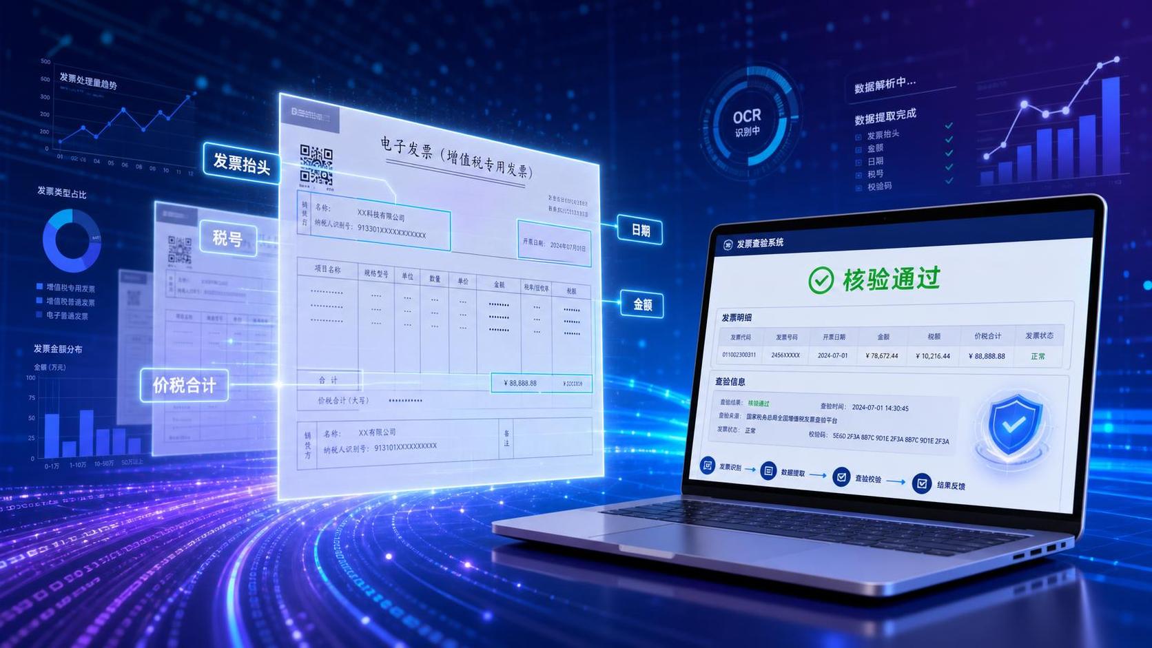

发票读写与查验概念配图,商务科技风格。画面中央展示多张电子发票… - 图片创意预览

发票读写与查验概念配图,商务科技风格。画面中央展示多张电子发票…

发票读写与查验概念配图,商务科技风格。画面中央展示多张电子发票悬浮在空中,发票上有数据提取的高亮框线标注出发票抬头、金额、日期等字段。右侧有一台笔记本电脑屏幕显示发票查验系统界面,显示"核验通过"绿色

用户头像

679zv7cei1d...

2026.08.03

A professional financial voucher anomaly quality inspection dashboard UI design, titled "财务凭证异常质检看板" at the top left in bold dark text. Light modern business SaaS style, pure white and very light gray background, clean and fresh. Bento grid layout with well-organized modules, Figma top-tier design, high definition, professional financial software. Top filter bar: Four dropdown filter controls in a row - "公司代码", "会计年月", "分组", "凭证号", each with a clean dropdown arrow and light gray border. Upper metrics section: 3 white rounded cards with soft shadows. Card 1: total voucher count with blue icon. Card 2: anomaly voucher count with red warning icon #FF4D4F. Card 3: anomaly ratio percentage with orange icon. Each card has bold black large numbers and gray description text below. Middle charts section (bento grid): Left side - a donut/ring chart showing status distribution with three segments: 待确认 (pending - yellow/orange), 已修改 (modified - blue), 确认无误 (confirmed correct - green #52C41A), with clear legend on the right. Right side - a line chart showing anomaly count trend across fiscal months, smooth curve with soft blue gradient area fill below the line, x-axis labeled with months, y-axis with count numbers. Bottom section: A clean data table with rounded corners and very thin light gray borders, showing voucher-level detail list. Table columns: 公司代码, 公司名称, 会计年度, 会计月份, 过账日期, 分组, 凭证号 (as clickable blue hyperlink with underline hint), 未通过检查项 (showing specific issues like tax rate error/account error in red tag style), 入账人员用户名, 数据更新时间, 数据来源. Subtle row hover highlight effect with light blue background. Table header with light gray background and bold text. Overall style: modern minimalist, plenty of white space, rigorous typography, B-end product design. Accent colors: warning red #FF4D4F for anomalies, safety green #52C41A for confirmed, primary blue #1890FF for links and charts. Ultra detailed UI, 16:9 landscape aspect ratio.A professional financial voucher anomaly quality inspection dashboard UI design, titled "财务凭证异常质检看板" at the top left in bold dark text. Light modern business SaaS style, pure white and very light gray background, clean and fresh. Bento grid layout with well-organized modules, Figma top-tier design, high definition, professional financial software.

Top filter bar: Four dropdown filter controls in a row - "公司代码", "会计年月", "分组", "凭证号", each with a clean dropdown arrow and light gray border.

Upper metrics section: 3 white rounded cards with soft shadows. Card 1: total voucher count with blue icon. Card 2: anomaly voucher count with red warning icon #FF4D4F. Card 3: anomaly ratio percentage with orange icon. Each card has bold black large numbers and gray description text below.

Middle charts section (bento grid): Left side - a donut/ring chart showing status distribution with three segments: 待确认 (pending - yellow/orange), 已修改 (modified - blue), 确认无误 (confirmed correct - green #52C41A), with clear legend on the right. Right side - a line chart showing anomaly count trend across fiscal months, smooth curve with soft blue gradient area fill below the line, x-axis labeled with months, y-axis with count numbers.

Bottom section: A clean data table with rounded corners and very thin light gray borders, showing voucher-level detail list. Table columns: 公司代码, 公司名称, 会计年度, 会计月份, 过账日期, 分组, 凭证号 (as clickable blue hyperlink with underline hint), 未通过检查项 (showing specific issues like tax rate error/account error in red tag style), 入账人员用户名, 数据更新时间, 数据来源. Subtle row hover highlight effect with light blue background. Table header with light gray background and bold text.

Overall style: modern minimalist, plenty of white space, rigorous typography, B-end product design. Accent colors: warning red #FF4D4F for anomalies, safety green #52C41A for confirmed, primary blue #1890FF for links and charts. Ultra detailed UI, 16:9 landscape aspect ratio.
[主图-3] 服务亮点与功能展示-六大核心能力 [氛围风格] 简约专业科技风,功能矩阵布局,清晰有条理 [画质] 商业设计质感,图标精致,文字清晰,整体高级感 [元素] 画面采用2行3列的功能卡片矩阵布局,共6个功能模块卡片。每个卡片为白色圆角矩形,带轻微阴影,卡片内上方是蓝色线性风格图标,下方是功能名称和简短说明。六个功能分别为:智能记账、多维分析、实时报表、预算管理、税务筹划、数据可视化。图标风格统一为细线蓝色图标。卡片之间有均匀间距,排列整齐。背景为极浅的蓝色渐变,顶部有淡淡的数据线条装饰,底部留白。整体画面干净有序,专业感强。 [光影] 均匀柔和的漫射光,卡片有轻微投影增加层次感,整体明亮通透,无强烈明暗对比 [配色] 主色白色卡片;背景浅蓝灰(#F0F4F8);图标和标题深蓝色(#1E40AF);说明文字深灰色;点缀色浅蓝色(#3B82F6) [视角构图] 正面平视,居中对称构图,六宫格矩阵排列,视觉重心在画面中部,四周留足边距 [文字版式] 顶部居中主标题"六大核心功能 全面覆盖财务需求",深蓝色粗体大号字;副标题"一站式智能财务管理解决方案",灰色中号字,在主标题下方。六个卡片内,图标在上占卡片上半部分,功能名称在图标下方深蓝色粗体中号字,功能说明在最下方深灰色小号字。每个卡片文字居中对齐。底部有一行小字"持续迭代更新 更多功能等你发现",浅灰色小号字居中。所有文字清晰可读,不拥挤 [输出要求] 1:1比例,文字清晰锐利,超高清商业设计质感 [负向提示词] 变形,文字错乱,模糊,背景杂乱,水印,电商平台Logo[主图-3] 服务亮点与功能展示-六大核心能力
[氛围风格] 简约专业科技风,功能矩阵布局,清晰有条理
[画质] 商业设计质感,图标精致,文字清晰,整体高级感
[元素] 画面采用2行3列的功能卡片矩阵布局,共6个功能模块卡片。每个卡片为白色圆角矩形,带轻微阴影,卡片内上方是蓝色线性风格图标,下方是功能名称和简短说明。六个功能分别为:智能记账、多维分析、实时报表、预算管理、税务筹划、数据可视化。图标风格统一为细线蓝色图标。卡片之间有均匀间距,排列整齐。背景为极浅的蓝色渐变,顶部有淡淡的数据线条装饰,底部留白。整体画面干净有序,专业感强。
[光影] 均匀柔和的漫射光,卡片有轻微投影增加层次感,整体明亮通透,无强烈明暗对比
[配色] 主色白色卡片;背景浅蓝灰(#F0F4F8);图标和标题深蓝色(#1E40AF);说明文字深灰色;点缀色浅蓝色(#3B82F6)
[视角构图] 正面平视,居中对称构图,六宫格矩阵排列,视觉重心在画面中部,四周留足边距
[文字版式] 顶部居中主标题"六大核心功能 全面覆盖财务需求",深蓝色粗体大号字;副标题"一站式智能财务管理解决方案",灰色中号字,在主标题下方。六个卡片内,图标在上占卡片上半部分,功能名称在图标下方深蓝色粗体中号字,功能说明在最下方深灰色小号字。每个卡片文字居中对齐。底部有一行小字"持续迭代更新 更多功能等你发现",浅灰色小号字居中。所有文字清晰可读,不拥挤
[输出要求] 1:1比例,文字清晰锐利,超高清商业设计质感
[负向提示词] 变形,文字错乱,模糊,背景杂乱,水印,电商平台Logo