![[主图-2] 香调成分解析,展示Liorene Frozen… - 图片创意预览](https://gd-cms.dancf.com/gd-cms/xi19e5/0/7003ddd0-99e7-45c0-a526-9ad9f8fd29ce39991.jpeg)

[主图-2] 香调成分解析,展示Liorene Frozen…
[主图-2] 香调成分解析,展示Liorene Frozen Breeze香水的前中后调香调结构,核心卖点是清新海洋冷调香氛。 [统一基调] 高端简约海洋风,深蓝渐变背景,主标题字体为干净现代非衬线体

6c1i9u40lQZ...
2026.08.18[主图-2] 香调成分解析,展示Liorene Frozen Breeze香水的前中后调香调结构,核心卖点是清新海洋冷调香氛。 [统一基调] 高端简约海洋风,深蓝渐变背景,主标题字体为干净现代非衬线体
6c1i9u40lQZ...
2026.08.18![[主图-3] 持久留香功效展示,核心卖点24小时长效持香,用时间轴和场景小窗证明留香持久。
[统一基调] 高端简约海洋风,深蓝渐变背景,主标题字体为干净现代非衬线体纤细优雅,标题字色白色,辅助字色浅冰蓝色,强调色银色,极简细线风格,圆角半透明卡片。
[画面] 香水瓶位于画面左侧中部,瓶身深蓝渐变玻璃质感真实。右侧是一条从早到晚的时间轴,从早晨9点到晚上9点共12小时,时间轴上有三个圆形场景小窗:第一个小窗是早晨办公室场景,第二个是午后约会场景,第三个是夜晚派对场景。每个小窗下方标注对应时段,显示香水在不同时段依然留香。时间轴用发光的冰蓝色线条表示,末端有"24H LONG LASTING"大号数字强调。
[光影质感] 商业摄影质感,冷调科技光感,瓶身玻璃有细腻高光,场景小窗清晰明亮,整体光影统一。
[配色] 深蓝渐变背景,冰蓝色发光线条,白色文字,银色点缀,产品保持原色。
[文字版式] 顶部大标题白色大写"24H LONG LASTING FRAGRANCE",时间轴旁标注"Morning" "Afternoon" "Evening",底部小字"All Day Fresh Scent"。数字"24H"用最大号冰蓝色加粗字体突出。文字清晰,不遮挡产品主体。
[输出要求] 比例3:4,产品清晰,文字清晰可读,无变形,无错字,无水印,无平台Logo。](https://gd-cms.dancf.com/gd-cms/xi19e5/0/ead06f5e-4283-4e16-9837-0f315f22ce0b39990.jpeg?x-oss-process=image/resize,w_640,type_6/sharpen,120/interlace,1)
![[主图-4] 多场合适用展示,核心卖点是适合日常、办公、约会等多种场景,展现香水的百搭属性。
[统一基调] 高端简约海洋风,浅冰蓝渐变背景,主标题字体为干净现代非衬线体纤细优雅,标题字色深蓝色,辅助字色深灰色,强调色冰蓝色,极简细线风格,圆角场景卡片。
[画面] 香水瓶位于画面中心偏下位置,瓶身深蓝渐变玻璃质感真实。上方分布三个圆角矩形场景卡片呈品字形排列:左上是优雅办公场景(简约办公桌、笔记本电脑、咖啡杯),右上是浪漫约会场景(烛光晚餐、红酒杯、玫瑰花),下方是日常休闲场景(海边漫步、沙滩、日落)。每个场景卡片都有精致的细线边框,场景中隐约可见香水的使用氛围。
[光影质感] 商业摄影质感,柔和自然光感,瓶身玻璃有细腻高光,场景卡片画面清晰,整体光影统一柔和。
[配色] 浅冰蓝渐变背景,深蓝色标题,深灰辅助文字,冰蓝色点缀,产品保持原色。
[文字版式] 顶部大标题深蓝色大写"PERFECT FOR EVERY OCCASION",三个场景卡片下方分别标注"Office" "Date Night" "Daily Casual",底部小字"Versatile Fragrance for All Moments"。文字清晰,不遮挡产品主体。
[输出要求] 比例3:4,产品清晰,文字清晰可读,无变形,无错字,无水印,无平台Logo。](https://gd-cms.dancf.com/gd-cms/xi19e5/0/4f6a4acf-ddb8-429e-8880-b0eec83d32af39759.jpeg?x-oss-process=image/resize,w_640,type_6/sharpen,120/interlace,1)


![[第4张] 详情页香调层次页-前中后调拆解展示。本张使用【图1】作为商品主体。
[氛围/风格] 深紫金轻奢,香调分层可视化,高级质感信息图风格,参考图3香调页版式气质。
[元素布局] 画面纵向分为前调、中调、后调三层,每层左侧对应香调原料视觉化呈现;每层左侧中部偏右放置香水瓶,占比约35%;每层配对应原料意象:前调层配柠檬片薄荷叶蔷薇花瓣、中调层配水润玫瑰天竺葵、后调层配雪松木块檀香木;背景深紫渐变+金色细线条分隔。
[光影质感] 每层独立柔光,原料元素微微发光,瓶身居中高光,整体通透有层次。
[配色色系] 全局底色 #1A0F2E 深紫黑;主色 紫罗兰紫;辅助色 香槟金分隔线;点缀色 各层原料本色。
[视角构图] 纵向三层香调+右侧产品,阅读动线上到下前中后调依次展开。
[文字版式] 顶部主标题「气味层次 Fragrance Notes」,副标题「清冷中性木质玫瑰」;三层分别标注01前调「柠檬 薄荷 蔷薇」+短句描述;02中调「水润玫瑰 天竺葵」+短句描述;03后调「雪松木 愈创木 檀香」+短句描述;编号金色大号数字+纤细字体,金色+米白文字,每层左对齐排版。
[比例分辨率] 9:16竖版比例,4K分辨率,文字清晰可辨,高清画质。
[负向提示词] 瓶身变形,颜色偏差,水印,文字错乱,分层不清。](https://gd-cms.dancf.com/gd-cms/xi19e5/0/dd53b2ab-749a-4fd4-8974-f239568f2705431.jpeg?x-oss-process=image/resize,w_640,type_6/sharpen,120/interlace,1)


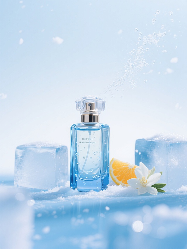
![[主图-1] 亚马逊首图,纯白背景,展示Liorene Frozen Breeze香水正装瓶和外包装盒,品牌调性高端清冷。
[统一基调] 高端简约海洋风,纯白背景,主标题字体为干净现代非衬线体纤细优雅,标题字色深蓝色,辅助字色银灰色,强调色冰蓝色,极简细线风格。
[画面] 香水瓶和包装盒并排居中摆放,瓶身是深蓝色渐变玻璃,银色金属瓶盖,方形透明瓶盖顶部,瓶身印有白色Liorene品牌Logo和FROZEN BREEZE EAU DE PARFUM字样;旁边是深蓝色包装盒,银色菱形边框装饰,正面印有白色Liorene品牌名和FROZEN BRYEEZE EAU DE PARFUM 100ml字样。产品完整不切割,正面45度微侧视角,产品占画面85%以上。
[光影质感] 商业摄影质感,柔光箱均匀打光,瓶身玻璃有细腻高光反射,底部柔和接触阴影,纯白背景干净无杂物。
[配色] 纯白背景,产品本身深蓝渐变+银色,保持产品原色。
[文字版式] 首图无任何额外文字,仅保留产品本身印刷文字。
[输出要求] 比例3:4,产品清晰锐利,玻璃质感真实,无变形,无水印,无平台Logo,无多余杂物。](https://gd-cms.dancf.com/gd-cms/xi19e5/0/c4678df1-8307-4110-b681-21a025e83d8039407.jpeg?x-oss-process=image/resize,w_640,type_6/sharpen,120/interlace,1)



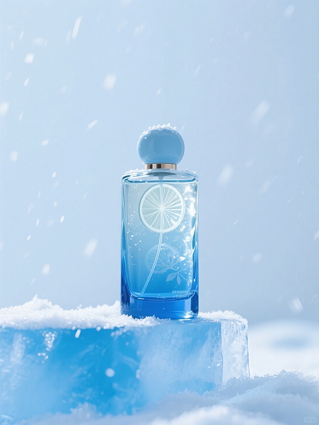
![[单张主图] LEION VETRTS Daisy Pearl Fresh Eau de Toilette, long-lasting floral fragrance for women. This is a premium atmospheric main image for Amazon cross-border e-commerce, following the high-level atmospheric route. [Reference comparison] The input image provides product appearance details, and the generation strictly retains the product shape, color and decorative elements. [Screen subject] The perfume bottle is placed on the right side of the picture, accounting for about 50% of the picture. Keep the appearance (physical structure, material texture, color, LOGO, daisy and pearl decoration) of this perfume completely consistent with the input product image, eliminate any deformation and color difference, and deal with it carefully. [Composition layout] Adopt the left text and right object scene layout. The left side retains a large area of soft light blank for text placement, and the product is placed on the right side and magnified, and the bottom is supported by light wood grain tabletop. [Scene elements] The background is a low-saturation cream white soft mist gradient, with fresh daisy petals and natural light and shadow falling, soft light and foggy effects, creating a fresh and natural atmosphere, which sets off the product without grabbing the focus. Add 3 thin-line light-colored ICONs at the bottom to correspond to the three selling points respectively. [Copy layout] LEION VETRTS on the top left, DAISY PEARL on the second line, the main title FRESH LONG-LASTING FLORAL in large characters, the auxiliary subtitle LIGHT FRAGRANCE FOR DAILY COMMUTE in small characters. The bottom three light ICONs correspond to the selling point texts: DAISY FLORAL, 8H LONG-LASTING, PREMIUM GLASS. All texts are in English, the text is clear and legible, and placed in the blank space without blocking the perfume. [Light and shadow texture] Main light is natural soft window light from the upper left, auxiliary light fills the right side, the projection is soft and light, the glass bottle highlights the transparent light transmission feeling, the liquid has a warm golden glossy, the petals have clear layers, the overall picture is clean, transparent and high-level, the depth of field is slightly fanned out, and the commercial product photography has a high-level texture. [Color matching font] Main color is cream white, auxiliary color is champagne gold and light leaf green, emphasizing the fresh and gentle atmosphere. The font uses light sans-serif, the main title is larger and thicker, the auxiliary text is smaller, the layers are clear, and the word color has strong contrast with the background. [Proportion resolution] 1:1 proportion, 2K resolution, text is clear and distinguishable, ultra HD. [Negative prompt] Deformation, text confusion, blurred product drawing, cluttered background, watermark, e-commerce platform Logo, Chinese characters, text blocking subject, color difference.](https://gd-cms.dancf.com/gd-cms/xi19e5/0/227c1486-6907-4720-bbe8-58106379956158611.png?x-oss-process=image/resize,w_640,type_6/sharpen,120/interlace,1)







![[第2屏] 香调解析屏,美丽香水香调构成展示。本屏使用【图1】商品主体作为参考。
[氛围/风格] 简约高级感,清透干净,艺术化表达,商业插画质感。
[元素布局] 画面中心分三层展示前调、中调、后调香调构成,每个香调区域搭配对应原料小插图;左上方展示迷你版美丽香水瓶,保留原产品颜色和瓶型;各香调区域用淡蓝色渐变分隔,元素占比均匀,每个核心香调原料图占本屏30%以上画面。
[光影质感] 均匀柔和布光,文字清晰突出,色彩干净明快。
[配色色系] 全局底色 #F2F8FC;主色淡蓝渐变;辅助色浅米色底、金色装饰线。
[视角构图] 从上到下通屏排版,信息层级清晰。
[文字版式] 顶部大标题「清新分层香调」,分三行展示:前调「柑橘 柠檬」,中调「海洋 茉莉」,后调「麝香 木质」,每个香调用圆角卡片承载,文字清晰不拥挤。
[比例分辨率] 9:16 竖版比例,4K分辨率,文字清晰可辨,高清画质。
[负向提示词] 产品变形,文字错乱,颜色偏差,构图拥挤,文字模糊](https://gd-cms.dancf.com/gd-cms/xi19e5/0/0104043a-b807-4a60-a75e-b416e4be886055088.jpeg?x-oss-process=image/resize,w_640,type_6/sharpen,120/interlace,1)