
创意预览图

Design a two-week social media content calendar in a real month-view grid layout with individual day
用户头像

1qy209r4r24...

2026.05.21
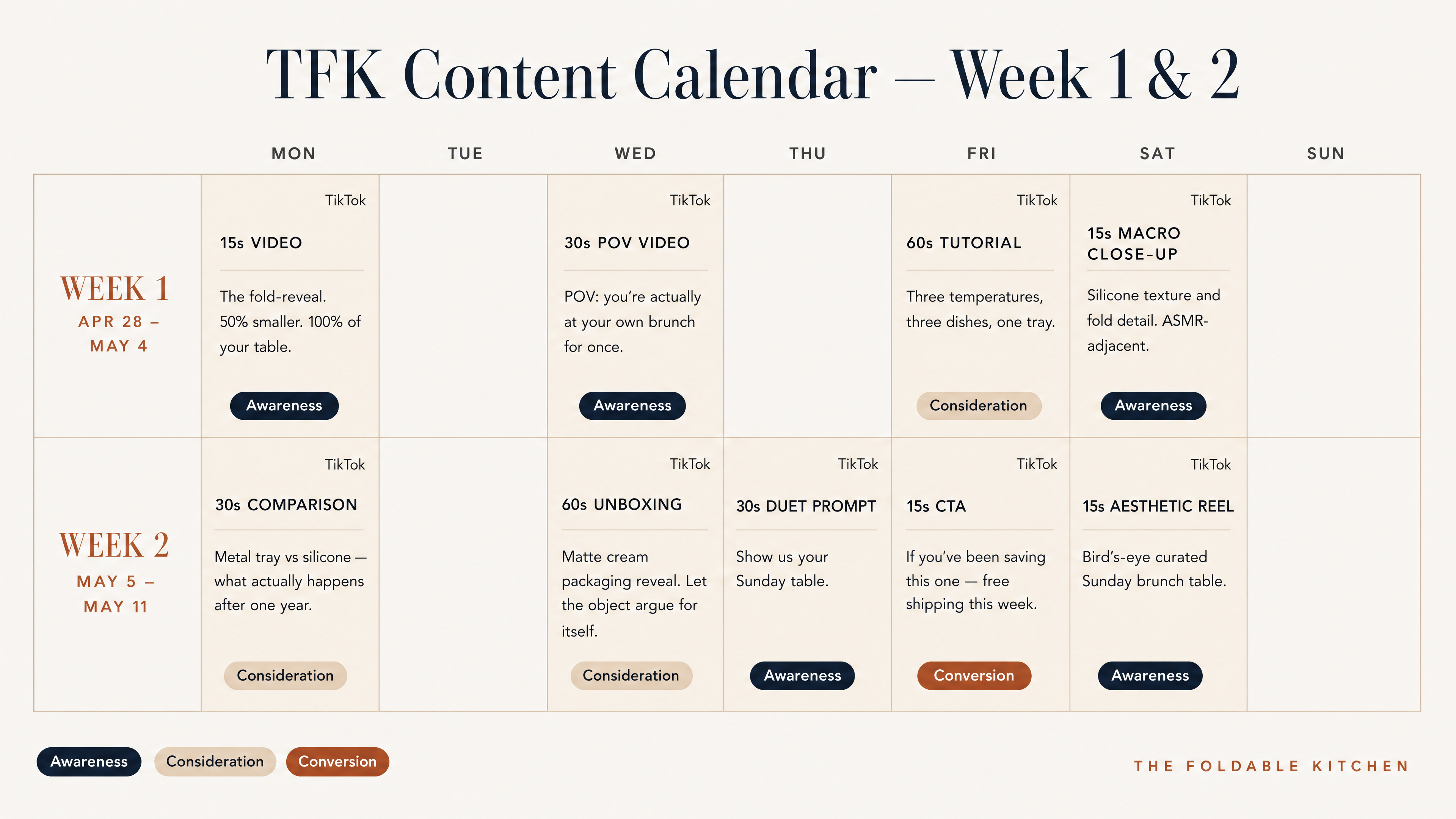
Create a professional social media content calendar slide for the premium lifestyle brand The Foldable Kitchen (TFK). Design style: Nordic minimalist, with clean white space and architectural layout, no decorative elements. Brand colour palette: background is #F6F3ED, all heading text and table headers are #102029 deep navy, body text and table rows are #4C4C4C, accent elements including column header backgrounds, week divider bars and funnel stage tags use #A35D26 warm terracotta, secondary highlights and alternating row tints are #D4BFA8 warm sand, subtle section backgrounds are #F1E3CE. Typography: use Bodoni-style serif display font for slide title and section headers, use clean geometric sans-serif (like Barlow or Inter) for all table text, labels and body copy, use light-to-medium font weights, no bold everywhere. Layout: at the top, add a clearly labelled title "Content Calendar — Week 1 & 2 · TikTok" in Bodoni-style serif. Add a thin 1px #D4BFA8 horizontal rule below the slide title. Below is a structured 5-column table, columns are labelled: Date · Platform · Format · Topic · Funnel Stage. The table has 9 rows of content from the two reference images. All table text must be legible at slide size, with minimum 10pt equivalent. Funnel stage tags are small pill-shaped: Awareness with #102029 background and #F6F3ED text, Consideration with #D4BFA8 background and #102029 text, Conversion with #A35D26 background and #F6F3ED text. The table should have no gradients, no shadows, and no rounded corners. At the bottom right, place the TFK wordmark "THE FOLDABLE KITCHEN" in small caps using Bodoni-style serif with #A35D26 color. Overall feel should resemble a page from a Scandinavian editorial design studio: restrained and precise. Reference content from the two uploaded images: 9 rows in total, including all date, platform, format, topic/hook and funnel stage information.Create a professional social media content calendar slide for the premium lifestyle brand The Foldable Kitchen (TFK). Design style: Nordic minimalist, with clean white space and architectural layout, no decorative elements.
Brand colour palette: background is #F6F3ED, all heading text and table headers are #102029 deep navy, body text and table rows are #4C4C4C, accent elements including column header backgrounds, week divider bars and funnel stage tags use #A35D26 warm terracotta, secondary highlights and alternating row tints are #D4BFA8 warm sand, subtle section backgrounds are #F1E3CE.
Typography: use Bodoni-style serif display font for slide title and section headers, use clean geometric sans-serif (like Barlow or Inter) for all table text, labels and body copy, use light-to-medium font weights, no bold everywhere.
Layout: at the top, add a clearly labelled title "Content Calendar — Week 1 & 2 · TikTok" in Bodoni-style serif. Add a thin 1px #D4BFA8 horizontal rule below the slide title. Below is a structured 5-column table, columns are labelled: Date · Platform · Format · Topic · Funnel Stage. The table has 9 rows of content from the two reference images. All table text must be legible at slide size, with minimum 10pt equivalent. Funnel stage tags are small pill-shaped: Awareness with #102029 background and #F6F3ED text, Consideration with #D4BFA8 background and #102029 text, Conversion with #A35D26 background and #F6F3ED text. The table should have no gradients, no shadows, and no rounded corners. At the bottom right, place the TFK wordmark "THE FOLDABLE KITCHEN" in small caps using Bodoni-style serif with #A35D26 color. Overall feel should resemble a page from a Scandinavian editorial design studio: restrained and precise.
Reference content from the two uploaded images: 9 rows in total, including all date, platform, format, topic/hook and funnel stage information.
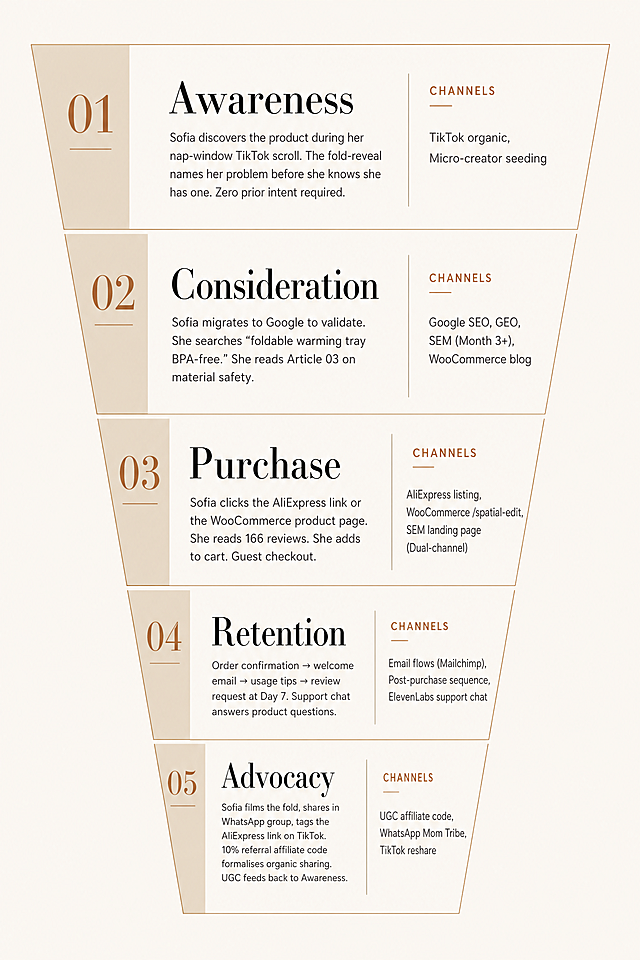
A five-stage marketing visual funnel with Scandinavian editorial design style, restrained and architectural, no decorative elements. Brand colors: #F6F3ED, #1A1A1A, #4C4C4C, #D4BFA8, #a35d26. Typography: Libre Bodoni headings, Inter body text. Funnel stages top to bottom: 1. "Awareness" - Channels: TikTok organic, Micro-creator seeding. Description: Sofia discovers the product during her nap-window TikTok scroll. The fold-reveal names her problem before she knows she has one. Zero prior intent required. 2. "Consideration" - Channels: Google SEO, GEO, SEM (Month 3+), WooCommerce blog. Description: Sofia migrates to Google to validate. She searches "foldable warming tray BPA-free." She reads Article 03 on material safety. 3. "Purchase" - Channels: AliExpress listing, WooCommerce /spatial-edit, SEM landing page (Dual-channel). Description: Sofia clicks the AliExpress link or the WooCommerce product page. She reads 166 reviews. She adds to cart. Guest checkout. 4. "Retention" - Channels: Email flows (Mailchimp), Post-purchase sequence, ElevenLabs support chat. Description: Order confirmation → welcome email → usage tips → review request at Day 7. Support chat answers product questions. 5. "Advocacy" - Channels: UGC affiliate code, WhatsApp Mom Tribe, TikTok reshare. Description: Sofia films the fold, shares in WhatsApp group, tags the AliExpress link on TikTok. 10% referral affiliate code formalises organic sharing. UGC feeds back to Awareness. Funnel shape with all text clearly labeled.A five-stage marketing visual funnel with Scandinavian editorial design style, restrained and architectural, no decorative elements. Brand colors: #F6F3ED, #1A1A1A, #4C4C4C, #D4BFA8, #a35d26. Typography: Libre Bodoni headings, Inter body text. Funnel stages top to bottom:
1. "Awareness" - Channels: TikTok organic, Micro-creator seeding. Description: Sofia discovers the product during her nap-window TikTok scroll. The fold-reveal names her problem before she knows she has one. Zero prior intent required.
2. "Consideration" - Channels: Google SEO, GEO, SEM (Month 3+), WooCommerce blog. Description: Sofia migrates to Google to validate. She searches "foldable warming tray BPA-free." She reads Article 03 on material safety.
3. "Purchase" - Channels: AliExpress listing, WooCommerce /spatial-edit, SEM landing page (Dual-channel). Description: Sofia clicks the AliExpress link or the WooCommerce product page. She reads 166 reviews. She adds to cart. Guest checkout.
4. "Retention" - Channels: Email flows (Mailchimp), Post-purchase sequence, ElevenLabs support chat. Description: Order confirmation → welcome email → usage tips → review request at Day 7. Support chat answers product questions.
5. "Advocacy" - Channels: UGC affiliate code, WhatsApp Mom Tribe, TikTok reshare. Description: Sofia films the fold, shares in WhatsApp group, tags the AliExpress link on TikTok. 10% referral affiliate code formalises organic sharing. UGC feeds back to Awareness. Funnel shape with all text clearly labeled.
[第6屏] 本屏功能定义:Multiple occasions styling for women's long sleeve tee, showing work travel daily layering looks. [氛围/风格] 时尚穿搭展示,自然真实多场景,明快干净,简约欧美风格,四个小场景拼接,统一高级排版。 [元素布局] 本屏使用不同颜色商品图组合展示:画面分为四个等大小格子,左上格:搭配西装外套职场造型使用【图2】白色T恤,右上格:搭配牛仔裤休闲造型使用【图1】灰色T恤,左下格:搭配 leggings 运动日常造型使用【图3】黑色T恤,右下格:搭配半身裙简约造型使用【图4】酒红色T恤。每个格子保持T恤颜色、版型与对应输入产品图一致,背景为对应场景简单背景,不抢主体。下方预留文案区域。 [光影质感] 每个格子保持均匀一致的明亮采光,整体影调统一,色彩自然。 [配色色系] 全局底色:#F5F5F5;四个格子分别展示不同T恤颜色:白/灰/黑/酒红;文字:深灰色。 [视角构图] 四宫格拼图构图,每个格子都是中景穿搭展示,排版整齐,信息清晰。 [文字版式] 顶部左对齐排版:主标题"From Work to Weekend",加粗无衬线字体深灰色;正文"Layer it under a blazer, wear it with jeans, or pack it for travel. This long sleeve tee works anywhere — spring, fall, or cool summer evenings.",常规字号灰色,行间距舒适。 [比例分辨率] 61:25 亚马逊高级A+电脑端比例,宽度1464px,高度600px,4K超高清分辨率,文字清晰可辨。 [负向提示词] 颜色偏差,版型变形,格子错位,文字错乱,水印,中文,背景杂乱。[第6屏] 本屏功能定义:Multiple occasions styling for women's long sleeve tee, showing work travel daily layering looks.
[氛围/风格] 时尚穿搭展示,自然真实多场景,明快干净,简约欧美风格,四个小场景拼接,统一高级排版。
[元素布局] 本屏使用不同颜色商品图组合展示:画面分为四个等大小格子,左上格:搭配西装外套职场造型使用【图2】白色T恤,右上格:搭配牛仔裤休闲造型使用【图1】灰色T恤,左下格:搭配 leggings 运动日常造型使用【图3】黑色T恤,右下格:搭配半身裙简约造型使用【图4】酒红色T恤。每个格子保持T恤颜色、版型与对应输入产品图一致,背景为对应场景简单背景,不抢主体。下方预留文案区域。
[光影质感] 每个格子保持均匀一致的明亮采光,整体影调统一,色彩自然。
[配色色系] 全局底色:#F5F5F5;四个格子分别展示不同T恤颜色:白/灰/黑/酒红;文字:深灰色。
[视角构图] 四宫格拼图构图,每个格子都是中景穿搭展示,排版整齐,信息清晰。
[文字版式] 顶部左对齐排版:主标题"From Work to Weekend",加粗无衬线字体深灰色;正文"Layer it under a blazer, wear it with jeans, or pack it for travel. This long sleeve tee works anywhere — spring, fall, or cool summer evenings.",常规字号灰色,行间距舒适。
[比例分辨率] 61:25 亚马逊高级A+电脑端比例,宽度1464px,高度600px,4K超高清分辨率,文字清晰可辨。
[负向提示词] 颜色偏差,版型变形,格子错位,文字错乱,水印,中文,背景杂乱。
横向商务排期图(甘特图样式),白色背景,整体参考第二张图的时间轴+彩色条块版式结构,配色体系参照第二张图(蓝色为主色调,搭配绿色、橙色、黑色等区分不同模块)。 顶部大标题:"一、总体节奏规划(Roadmap)",黑色粗体大字,居中。 顶部时间轴:一条横向灰色时间轴线,上面有5个金色圆形节点,分别标注时间:"2025.02"、"2025.03"、"2025.04"、"2025.05"、"2025.06-持续" 时间轴上方对应5个蓝色矩形标签,白色文字:"STEP1 预热期"、"STEP2 爆发期"、"STEP2 爆发期"、"STEP3 延续期"、"STEP4 转化期" 下方为5行彩色条块排期,每行左侧为模块名称,右侧为对应时间段的彩色条块,条块内白色文字标注内容: 第1行(蓝色条块)- 白皮书: - 2025.02位置:蓝色条块,文字"预热发布" - 2025.03位置:蓝色条块,文字"正式发布·留资入口开启" - 2025.06-持续位置:蓝色条块,文字"持续分发" 第2行(浅蓝色/蓝色条块)- KOL测评: - 2025.02位置:蓝色条块,文字"KOL筛选与内容共创" - 2025.03位置:蓝色条块,文字"内容共创" - 2025.04位置:蓝色条块,文字"测评内容集中发布" - 2025.05位置:蓝色条块,文字"二次传播与发酵" - 2025.06-持续位置:蓝色条块,文字"长尾持续导流" 第3行(绿色条块)- 发布会: - 2025.02位置:绿色条块,文字"筹备" - 2025.03位置:绿色条块,文字"三地巡回私享会" - 2025.04位置:绿色条块,文字"三地巡回私享会" - 2025.05位置:绿色条块,文字"会后试样跟进" - 2025.06-持续位置:绿色条块,文字"试样跟进与转化" 第4行(橙色条块)- 学术背书: - 2025.02位置:橙色条块,文字"初步接洽" - 2025.03位置:橙色条块,文字"合作推进" - 2025.04位置:橙色条块,文字"合作推进" - 2025.05位置:橙色条块,文字"正式落地·权威背书" - 2025.06-持续位置:橙色条块,文字"学术成果持续发酵" 第5行(深灰/黑色条块)- 转化收口: - 2025.03位置:深色条块,文字"留资+属地跟进" - 2025.04位置:深色条块,文字"留资+属地跟进" - 2025.05位置:深色条块,文字"试样推进+销售转化" - 2025.06-持续位置:深色条块,文字"持续转化" 整体风格:商务专业、简洁清晰,排版精美,对齐工整,色彩区分明确,所有文字清晰可读,画面为完整的成品排期图。横向商务排期图(甘特图样式),白色背景,整体参考第二张图的时间轴+彩色条块版式结构,配色体系参照第二张图(蓝色为主色调,搭配绿色、橙色、黑色等区分不同模块)。

顶部大标题:"一、总体节奏规划(Roadmap)",黑色粗体大字,居中。

顶部时间轴:一条横向灰色时间轴线,上面有5个金色圆形节点,分别标注时间:"2025.02"、"2025.03"、"2025.04"、"2025.05"、"2025.06-持续"
时间轴上方对应5个蓝色矩形标签,白色文字:"STEP1 预热期"、"STEP2 爆发期"、"STEP2 爆发期"、"STEP3 延续期"、"STEP4 转化期"

下方为5行彩色条块排期,每行左侧为模块名称,右侧为对应时间段的彩色条块,条块内白色文字标注内容:

第1行(蓝色条块)- 白皮书:
- 2025.02位置:蓝色条块,文字"预热发布"
- 2025.03位置:蓝色条块,文字"正式发布·留资入口开启"
- 2025.06-持续位置:蓝色条块,文字"持续分发"

第2行(浅蓝色/蓝色条块)- KOL测评:
- 2025.02位置:蓝色条块,文字"KOL筛选与内容共创"
- 2025.03位置:蓝色条块,文字"内容共创"
- 2025.04位置:蓝色条块,文字"测评内容集中发布"
- 2025.05位置:蓝色条块,文字"二次传播与发酵"
- 2025.06-持续位置:蓝色条块,文字"长尾持续导流"

第3行(绿色条块)- 发布会:
- 2025.02位置:绿色条块,文字"筹备"
- 2025.03位置:绿色条块,文字"三地巡回私享会"
- 2025.04位置:绿色条块,文字"三地巡回私享会"
- 2025.05位置:绿色条块,文字"会后试样跟进"
- 2025.06-持续位置:绿色条块,文字"试样跟进与转化"

第4行(橙色条块)- 学术背书:
- 2025.02位置:橙色条块,文字"初步接洽"
- 2025.03位置:橙色条块,文字"合作推进"
- 2025.04位置:橙色条块,文字"合作推进"
- 2025.05位置:橙色条块,文字"正式落地·权威背书"
- 2025.06-持续位置:橙色条块,文字"学术成果持续发酵"

第5行(深灰/黑色条块)- 转化收口:
- 2025.03位置:深色条块,文字"留资+属地跟进"
- 2025.04位置:深色条块,文字"留资+属地跟进"
- 2025.05位置:深色条块,文字"试样推进+销售转化"
- 2025.06-持续位置:深色条块,文字"持续转化"

整体风格:商务专业、简洁清晰,排版精美,对齐工整,色彩区分明确,所有文字清晰可读,画面为完整的成品排期图。
| 类别 | 细分文案 | 内容设计要点 |<br/>| ---- | ---- | ---- |<br/>| 店铺首页 | 店招模块 | 底纹采用柔和蕾丝暗纹,搭配浅米底色;左侧放置中英店名「墨韵婚纱 INK RHYME」,点缀小花朵蕾丝装饰;设置收藏店铺按钮;底部添加通栏导航栏,整体轻奢大气,适配海外审美 |<br/>| | 导航条模块 | 横向双语导航,分类包含:白纱主婚纱、中式红礼服、晚宴礼服、新品专区、定制服务、客服中心;鼠标悬浮浅金色高亮,字体纤细优雅 |<br/>| | 店铺海报模块 | 2张全屏焦点图区分风格:左西式白婚纱户外款、右国风红色敬酒服;用服装色彩做视觉区分,每张海报添加跳转按钮,搭配英文场景文案 |<br/>| | 商品分类模块 | 分三大品类区块展示婚纱礼服,每个区块配模特上身效果图+英文介绍;中间插入店长推荐横栏,统一商品缩略图尺寸,方便买家浏览全品类 |<br/>| | 活动专区模块 | 对称排版4组活动卡片,主题:跨境满减、新品折扣、礼服套装优惠、免费改衣服务;统一图片大小,添加水晶珍珠装饰,双语标注优惠信息,页面整洁不乱 |<br/>| | 页尾模块 | 左侧陈列全部礼服款式缩略图;中间放置跨境物流、尺码对照表、定制须知;右侧展示海外买家实拍穿戴图;底部放售后客服、品牌介绍 |<br/>| | 设计思路 | 店铺主打田园温柔风,融合西式婚纱与中国红礼服;大量蕾丝、曲线、水晶珍珠凸显高端质感;米白+酒红撞色让页面鲜活;整体浏览逻辑:品牌认知→场景海报→全品类浏览→优惠刺激→实拍售后,降低海外买家顾虑,促进下单转化 || 类别 | 细分文案 | 内容设计要点 |<br/>| ---- | ---- | ---- |<br/>| 店铺首页 | 店招模块 | 底纹采用柔和蕾丝暗纹,搭配浅米底色;左侧放置中英店名「墨韵婚纱 INK RHYME」,点缀小花朵蕾丝装饰;设置收藏店铺按钮;底部添加通栏导航栏,整体轻奢大气,适配海外审美 |<br/>| | 导航条模块 | 横向双语导航,分类包含:白纱主婚纱、中式红礼服、晚宴礼服、新品专区、定制服务、客服中心;鼠标悬浮浅金色高亮,字体纤细优雅 |<br/>| | 店铺海报模块 | 2张全屏焦点图区分风格:左西式白婚纱户外款、右国风红色敬酒服;用服装色彩做视觉区分,每张海报添加跳转按钮,搭配英文场景文案 |<br/>| | 商品分类模块 | 分三大品类区块展示婚纱礼服,每个区块配模特上身效果图+英文介绍;中间插入店长推荐横栏,统一商品缩略图尺寸,方便买家浏览全品类 |<br/>| | 活动专区模块 | 对称排版4组活动卡片,主题:跨境满减、新品折扣、礼服套装优惠、免费改衣服务;统一图片大小,添加水晶珍珠装饰,双语标注优惠信息,页面整洁不乱 |<br/>| | 页尾模块 | 左侧陈列全部礼服款式缩略图;中间放置跨境物流、尺码对照表、定制须知;右侧展示海外买家实拍穿戴图;底部放售后客服、品牌介绍 |<br/>| | 设计思路 | 店铺主打田园温柔风,融合西式婚纱与中国红礼服;大量蕾丝、曲线、水晶珍珠凸显高端质感;米白+酒红撞色让页面鲜活;整体浏览逻辑:品牌认知→场景海报→全品类浏览→优惠刺激→实拍售后,降低海外买家顾虑,促进下单转化 |