
创意预览图

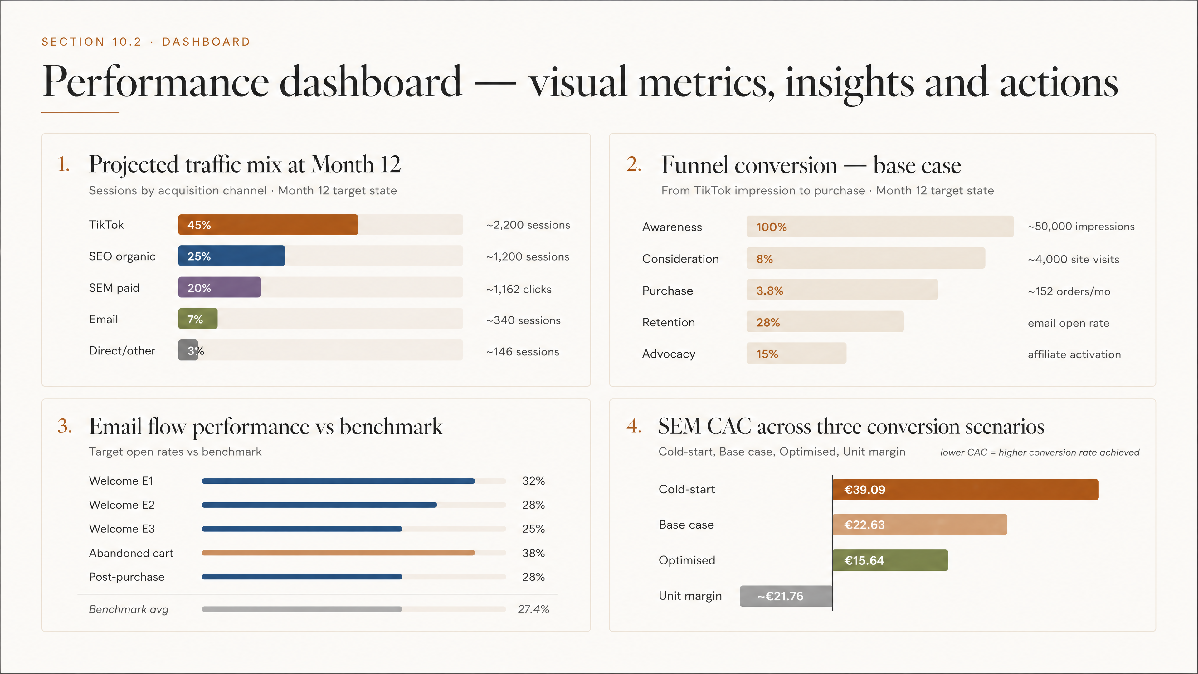
Recreate the Performance dashboard with all visual metrics, insights and actions, include all four s
用户头像

1qy209r4r24...

2026.05.22
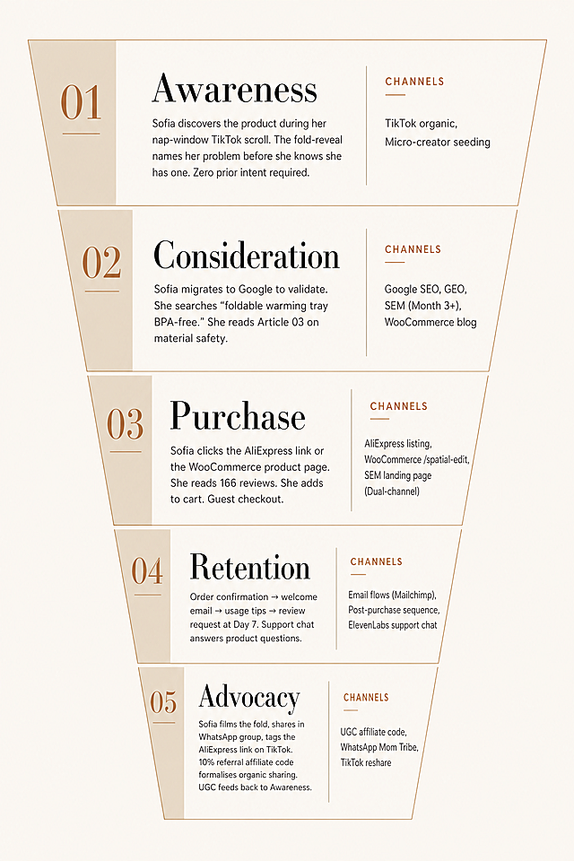
A five-stage marketing visual funnel with Scandinavian editorial design style, restrained and architectural, no decorative elements. Brand colors: #F6F3ED, #1A1A1A, #4C4C4C, #D4BFA8, #a35d26. Typography: Libre Bodoni headings, Inter body text. Funnel stages top to bottom: 1. "Awareness" - Channels: TikTok organic, Micro-creator seeding. Description: Sofia discovers the product during her nap-window TikTok scroll. The fold-reveal names her problem before she knows she has one. Zero prior intent required. 2. "Consideration" - Channels: Google SEO, GEO, SEM (Month 3+), WooCommerce blog. Description: Sofia migrates to Google to validate. She searches "foldable warming tray BPA-free." She reads Article 03 on material safety. 3. "Purchase" - Channels: AliExpress listing, WooCommerce /spatial-edit, SEM landing page (Dual-channel). Description: Sofia clicks the AliExpress link or the WooCommerce product page. She reads 166 reviews. She adds to cart. Guest checkout. 4. "Retention" - Channels: Email flows (Mailchimp), Post-purchase sequence, ElevenLabs support chat. Description: Order confirmation → welcome email → usage tips → review request at Day 7. Support chat answers product questions. 5. "Advocacy" - Channels: UGC affiliate code, WhatsApp Mom Tribe, TikTok reshare. Description: Sofia films the fold, shares in WhatsApp group, tags the AliExpress link on TikTok. 10% referral affiliate code formalises organic sharing. UGC feeds back to Awareness. Funnel shape with all text clearly labeled.A five-stage marketing visual funnel with Scandinavian editorial design style, restrained and architectural, no decorative elements. Brand colors: #F6F3ED, #1A1A1A, #4C4C4C, #D4BFA8, #a35d26. Typography: Libre Bodoni headings, Inter body text. Funnel stages top to bottom:
1. "Awareness" - Channels: TikTok organic, Micro-creator seeding. Description: Sofia discovers the product during her nap-window TikTok scroll. The fold-reveal names her problem before she knows she has one. Zero prior intent required.
2. "Consideration" - Channels: Google SEO, GEO, SEM (Month 3+), WooCommerce blog. Description: Sofia migrates to Google to validate. She searches "foldable warming tray BPA-free." She reads Article 03 on material safety.
3. "Purchase" - Channels: AliExpress listing, WooCommerce /spatial-edit, SEM landing page (Dual-channel). Description: Sofia clicks the AliExpress link or the WooCommerce product page. She reads 166 reviews. She adds to cart. Guest checkout.
4. "Retention" - Channels: Email flows (Mailchimp), Post-purchase sequence, ElevenLabs support chat. Description: Order confirmation → welcome email → usage tips → review request at Day 7. Support chat answers product questions.
5. "Advocacy" - Channels: UGC affiliate code, WhatsApp Mom Tribe, TikTok reshare. Description: Sofia films the fold, shares in WhatsApp group, tags the AliExpress link on TikTok. 10% referral affiliate code formalises organic sharing. UGC feeds back to Awareness. Funnel shape with all text clearly labeled.
Create a professional social media content calendar slide for the premium lifestyle brand The Foldable Kitchen (TFK). Design style: Nordic minimalist, with clean white space and architectural layout, no decorative elements. Brand colour palette: background is #F6F3ED, all heading text and table headers are #102029 deep navy, body text and table rows are #4C4C4C, accent elements including column header backgrounds, week divider bars and funnel stage tags use #A35D26 warm terracotta, secondary highlights and alternating row tints are #D4BFA8 warm sand, subtle section backgrounds are #F1E3CE. Typography: use Bodoni-style serif display font for slide title and section headers, use clean geometric sans-serif (like Barlow or Inter) for all table text, labels and body copy, use light-to-medium font weights, no bold everywhere. Layout: at the top, add a clearly labelled title "Content Calendar — Week 1 & 2 · TikTok" in Bodoni-style serif. Add a thin 1px #D4BFA8 horizontal rule below the slide title. Below is a structured 5-column table, columns are labelled: Date · Platform · Format · Topic · Funnel Stage. The table has 9 rows of content from the two reference images. All table text must be legible at slide size, with minimum 10pt equivalent. Funnel stage tags are small pill-shaped: Awareness with #102029 background and #F6F3ED text, Consideration with #D4BFA8 background and #102029 text, Conversion with #A35D26 background and #F6F3ED text. The table should have no gradients, no shadows, and no rounded corners. At the bottom right, place the TFK wordmark "THE FOLDABLE KITCHEN" in small caps using Bodoni-style serif with #A35D26 color. Overall feel should resemble a page from a Scandinavian editorial design studio: restrained and precise. Reference content from the two uploaded images: 9 rows in total, including all date, platform, format, topic/hook and funnel stage information.Create a professional social media content calendar slide for the premium lifestyle brand The Foldable Kitchen (TFK). Design style: Nordic minimalist, with clean white space and architectural layout, no decorative elements.
Brand colour palette: background is #F6F3ED, all heading text and table headers are #102029 deep navy, body text and table rows are #4C4C4C, accent elements including column header backgrounds, week divider bars and funnel stage tags use #A35D26 warm terracotta, secondary highlights and alternating row tints are #D4BFA8 warm sand, subtle section backgrounds are #F1E3CE.
Typography: use Bodoni-style serif display font for slide title and section headers, use clean geometric sans-serif (like Barlow or Inter) for all table text, labels and body copy, use light-to-medium font weights, no bold everywhere.
Layout: at the top, add a clearly labelled title "Content Calendar — Week 1 & 2 · TikTok" in Bodoni-style serif. Add a thin 1px #D4BFA8 horizontal rule below the slide title. Below is a structured 5-column table, columns are labelled: Date · Platform · Format · Topic · Funnel Stage. The table has 9 rows of content from the two reference images. All table text must be legible at slide size, with minimum 10pt equivalent. Funnel stage tags are small pill-shaped: Awareness with #102029 background and #F6F3ED text, Consideration with #D4BFA8 background and #102029 text, Conversion with #A35D26 background and #F6F3ED text. The table should have no gradients, no shadows, and no rounded corners. At the bottom right, place the TFK wordmark "THE FOLDABLE KITCHEN" in small caps using Bodoni-style serif with #A35D26 color. Overall feel should resemble a page from a Scandinavian editorial design studio: restrained and precise.
Reference content from the two uploaded images: 9 rows in total, including all date, platform, format, topic/hook and funnel stage information.
页面 1:封面(开篇吸睛,传递温暖)​ ​ ​ ​ 背景色:渐变暖橙(#FFE8D6 到 #FFDBA9),模拟夕阳余晖的柔和感​ 标题:【加粗 + 阴影】AI + 社区银发智能陪伴站(字号 32 号,字体:思源黑体 Bold)​ 副标题:科技守护・温暖不缺席(字号 20 号,字体:思源黑体 Light,颜色 #73503C)​ 配图:优化后的社区线下智能服务站场景示意图(4:3,画面中心突出智能终端,背景有老人微笑剪影)​ 交互细节:页面加载完成后,标题从下往上缓慢浮现,配图带轻微缩放动画​ 底部提示:【小字体 14 号】向下滑动,了解更多 →(颜色 #9A7B66)​ ​ ​ 页面 2:核心思路(清晰易懂,突出重点)​ 背景色:米白(#FAF7F2),搭配浅棕色边框装饰(1px 实线,#E8D9C7)​ 标题栏:​ 图标:【暖橙色小房子图标】(尺寸 24px)​ 标题:我们在做什么?(字号 26 号,颜色 #6B4C32,加粗)​ 下划线:底部添加 3px 宽暖橙渐变线(#FFB88A 到 #FF9F69)​ 正文:​ 开篇总述:【16 号,颜色 #5A432E】专门为独居老人打造「线上 + 线下」双重守护方案,兼顾情感陪伴、健康监测与日常需求。​ 分点展示(带图标,增强视觉引导):​ 【图标:暖橙色终端图标】线下:社区智能服务站 → 语音交互、一键呼叫,操作简单不用学​ 【图标:暖橙色云朵图标】线上:AI 数字人陪伴 + 健康小程序监测,随时响应不打烊​ 【图标:暖橙色握手图标】闭环:联动网格员、周边商家,需求解决更高效​ 配图:线上 + 线下服务闭环的系统示意图(4:3,配色与 H5 统一,线条加粗至 2px,关键节点用暖橙高亮)​ 排版:文字左对齐,行间距 1.8 倍,分点之间空 1 行,提升阅读舒适度​ ​ ​ 页面 3:落地路径(步骤清晰,有执行力)​ 背景色:淡暖黄(#FFF9E8),搭配浅橙色圆角卡片(#FFEDD8,圆角 8px)​ 标题栏:​ 图标:【暖橙色路径图标】(尺寸 24px)​ 标题:我们要怎么做?(字号 26 号,颜色 #6B4C32,加粗)​ 下划线:底部添加 3px 宽暖橙渐变线(#FFB88A 到 #FF9F69)​ 正文:4 条路径分 4 个卡片展示(卡片间距 15px,hover 时轻微上浮)​ 卡片 1:【序号 1 + 街道图标】先试点 → 和街道合作,选取 2-3 个老龄化率高的社区搭建首批站点(16 号字,颜色 #5A432E)​ 卡片 2:【序号 2 + 系统图标】做系统 → 开发轻量化 AI 陪伴系统,对接现有养老平台,降低成本(16 号字,颜色 #5A432E)​ 卡片 3:【序号 3 + 商家图标】找帮手 → 签约周边药店、餐饮店、维修店,提供上门配送 / 维修服务(16 号字,颜色 #5A432E)​ 卡片 4:【序号 4 + 志愿者图标】有人兜底 → 招募志愿者团队,承接 AI 无法解决的紧急需求(如就医)(16 号字,颜色 #5A432E)​ 配图:落地路径流程示意图(4:3,用箭头串联 4 个步骤,图标与卡片一致,颜色统一暖橙)​ 细节:序号用圆形暖橙背景(#FF9F69),白色数字,尺寸 24px,增强层次感​ ​ ​ 页面 4:创新亮点(突出优势,传递价值)​ 背景色:淡粉橙(#FFEEE0),搭配白色圆角卡片(#FFFFFF,圆角 10px,阴影:0 2px 8px rgba (255,159,105,0.1))​ 标题栏:​ 图标:【暖橙色星星图标】(尺寸 24px)​ 标题:我们的核心优势(字号 26 号,颜色 #6B4C32,加粗)​ 下划线:底部添加 3px 宽暖橙渐变线(#FFB88A 到 #FF9F69)​ 正文:3 个亮点分 3 个卡片展示(卡片内边距 20px)​ 卡片 1:​ 图标:【暖橙色人形图标】(尺寸 32px)​ 标题:定制化情感陪伴(20 号字,颜色 #6B4C32,加粗)​ 内容:AI 数字人可复刻家人声音 / 形象(如远居子女、已故伴侣),缓解老人孤独感(15 号字,颜色 #5A432E,行间距 1.6 倍)​ 卡片 2:​ 图标:【暖橙色齿轮图标】(尺寸 32px)​ 标题:轻量化资源整合(20 号字,颜色 #6B4C32,加粗)​ 内容:不新增硬件基建,仅通过智能终端 + 软件系统,整合社区现有资源实现服务升级(15 号字,颜色 #5A432E,行间距 1.6 倍)​ 卡片 3:​ 图标:【暖橙色手机图标】(尺寸 32px)​ 标题:子女实时监护(20 号字,颜色 #6B4C32,加粗)​ 内容:老人健康数据自动同步至子女手机端,解决异地子女的监护焦虑(15 号字,颜色 #5A432E,行间距 1.6 倍)​ 配图:AI 数字人交互、健康数据同步的功能示意图(4:3,画面中老人与 AI 数字人微笑对话,子女手机端显示数据同步弹窗)​ ​ ​ 页面 5:结尾(引导行动,传递温度)​ 背景色:渐变暖红(#FFE0D0 到 #FFC0A8),营造温暖收尾的氛围​ 标题:【加粗 + 阴影】一起为老人多添一份温暖(字号 28 号,颜色 #734833,字体:思源黑体 Bold)​ 正文:【16 号字,颜色 #5A432E,行间距 1.8 倍】​ 如果你是社区工作者、周边商家,​ 或是想贡献力量的志愿者,​ 欢迎加入我们,让科技的温度触达每一位独居老人~​ 预留区域:​ 标题:联系方式(字号 20 号,颜色 #734833,加粗,搭配电话图标)​ 内容框:【白色圆角框,圆角 10px】可填写手机号、微信二维码位置、邮箱(提示文字:请在此处添加联系方式)​ 配图:老人使用智能终端微笑的场景示意图(4:3,画面色调温暖,老人表情慈祥,智能终端屏幕亮着暖光)​ 交互细节:预留区域 hover 时,边框变为暖橙色(#FF9F69),添加轻微缩放动画​ 底部落款:【小字体 14 号,颜色 #9A7B66】AI + 社区银发智能陪伴站 版权所有页面 1:封面(开篇吸睛,传递温暖)​ ​ ​ ​ 背景色:渐变暖橙(#FFE8D6 到 #FFDBA9),模拟夕阳余晖的柔和感​ 标题:【加粗 + 阴影】AI + 社区银发智能陪伴站(字号 32 号,字体:思源黑体 Bold)​ 副标题:科技守护・温暖不缺席(字号 20 号,字体:思源黑体 Light,颜色 #73503C)​ 配图:优化后的社区线下智能服务站场景示意图(4:3,画面中心突出智能终端,背景有老人微笑剪影)​ 交互细节:页面加载完成后,标题从下往上缓慢浮现,配图带轻微缩放动画​ 底部提示:【小字体 14 号】向下滑动,了解更多 →(颜色 #9A7B66)​ ​ ​ 页面 2:核心思路(清晰易懂,突出重点)​ 背景色:米白(#FAF7F2),搭配浅棕色边框装饰(1px 实线,#E8D9C7)​ 标题栏:​ 图标:【暖橙色小房子图标】(尺寸 24px)​ 标题:我们在做什么?(字号 26 号,颜色 #6B4C32,加粗)​ 下划线:底部添加 3px 宽暖橙渐变线(#FFB88A 到 #FF9F69)​ 正文:​ 开篇总述:【16 号,颜色 #5A432E】专门为独居老人打造「线上 + 线下」双重守护方案,兼顾情感陪伴、健康监测与日常需求。​ 分点展示(带图标,增强视觉引导):​ 【图标:暖橙色终端图标】线下:社区智能服务站 → 语音交互、一键呼叫,操作简单不用学​ 【图标:暖橙色云朵图标】线上:AI 数字人陪伴 + 健康小程序监测,随时响应不打烊​ 【图标:暖橙色握手图标】闭环:联动网格员、周边商家,需求解决更高效​ 配图:线上 + 线下服务闭环的系统示意图(4:3,配色与 H5 统一,线条加粗至 2px,关键节点用暖橙高亮)​ 排版:文字左对齐,行间距 1.8 倍,分点之间空 1 行,提升阅读舒适度​ ​ ​ 页面 3:落地路径(步骤清晰,有执行力)​ 背景色:淡暖黄(#FFF9E8),搭配浅橙色圆角卡片(#FFEDD8,圆角 8px)​ 标题栏:​ 图标:【暖橙色路径图标】(尺寸 24px)​ 标题:我们要怎么做?(字号 26 号,颜色 #6B4C32,加粗)​ 下划线:底部添加 3px 宽暖橙渐变线(#FFB88A 到 #FF9F69)​ 正文:4 条路径分 4 个卡片展示(卡片间距 15px,hover 时轻微上浮)​ 卡片 1:【序号 1 + 街道图标】先试点 → 和街道合作,选取 2-3 个老龄化率高的社区搭建首批站点(16 号字,颜色 #5A432E)​ 卡片 2:【序号 2 + 系统图标】做系统 → 开发轻量化 AI 陪伴系统,对接现有养老平台,降低成本(16 号字,颜色 #5A432E)​ 卡片 3:【序号 3 + 商家图标】找帮手 → 签约周边药店、餐饮店、维修店,提供上门配送 / 维修服务(16 号字,颜色 #5A432E)​ 卡片 4:【序号 4 + 志愿者图标】有人兜底 → 招募志愿者团队,承接 AI 无法解决的紧急需求(如就医)(16 号字,颜色 #5A432E)​ 配图:落地路径流程示意图(4:3,用箭头串联 4 个步骤,图标与卡片一致,颜色统一暖橙)​ 细节:序号用圆形暖橙背景(#FF9F69),白色数字,尺寸 24px,增强层次感​ ​ ​ 页面 4:创新亮点(突出优势,传递价值)​ 背景色:淡粉橙(#FFEEE0),搭配白色圆角卡片(#FFFFFF,圆角 10px,阴影:0 2px 8px rgba (255,159,105,0.1))​ 标题栏:​ 图标:【暖橙色星星图标】(尺寸 24px)​ 标题:我们的核心优势(字号 26 号,颜色 #6B4C32,加粗)​ 下划线:底部添加 3px 宽暖橙渐变线(#FFB88A 到 #FF9F69)​ 正文:3 个亮点分 3 个卡片展示(卡片内边距 20px)​ 卡片 1:​ 图标:【暖橙色人形图标】(尺寸 32px)​ 标题:定制化情感陪伴(20 号字,颜色 #6B4C32,加粗)​ 内容:AI 数字人可复刻家人声音 / 形象(如远居子女、已故伴侣),缓解老人孤独感(15 号字,颜色 #5A432E,行间距 1.6 倍)​ 卡片 2:​ 图标:【暖橙色齿轮图标】(尺寸 32px)​ 标题:轻量化资源整合(20 号字,颜色 #6B4C32,加粗)​ 内容:不新增硬件基建,仅通过智能终端 + 软件系统,整合社区现有资源实现服务升级(15 号字,颜色 #5A432E,行间距 1.6 倍)​ 卡片 3:​ 图标:【暖橙色手机图标】(尺寸 32px)​ 标题:子女实时监护(20 号字,颜色 #6B4C32,加粗)​ 内容:老人健康数据自动同步至子女手机端,解决异地子女的监护焦虑(15 号字,颜色 #5A432E,行间距 1.6 倍)​ 配图:AI 数字人交互、健康数据同步的功能示意图(4:3,画面中老人与 AI 数字人微笑对话,子女手机端显示数据同步弹窗)​ ​ ​ 页面 5:结尾(引导行动,传递温度)​ 背景色:渐变暖红(#FFE0D0 到 #FFC0A8),营造温暖收尾的氛围​ 标题:【加粗 + 阴影】一起为老人多添一份温暖(字号 28 号,颜色 #734833,字体:思源黑体 Bold)​ 正文:【16 号字,颜色 #5A432E,行间距 1.8 倍】​ 如果你是社区工作者、周边商家,​ 或是想贡献力量的志愿者,​ 欢迎加入我们,让科技的温度触达每一位独居老人~​ 预留区域:​ 标题:联系方式(字号 20 号,颜色 #734833,加粗,搭配电话图标)​ 内容框:【白色圆角框,圆角 10px】可填写手机号、微信二维码位置、邮箱(提示文字:请在此处添加联系方式)​ 配图:老人使用智能终端微笑的场景示意图(4:3,画面色调温暖,老人表情慈祥,智能终端屏幕亮着暖光)​ 交互细节:预留区域 hover 时,边框变为暖橙色(#FF9F69),添加轻微缩放动画​ 底部落款:【小字体 14 号,颜色 #9A7B66】AI + 社区银发智能陪伴站 版权所有