已添加
登录/注册
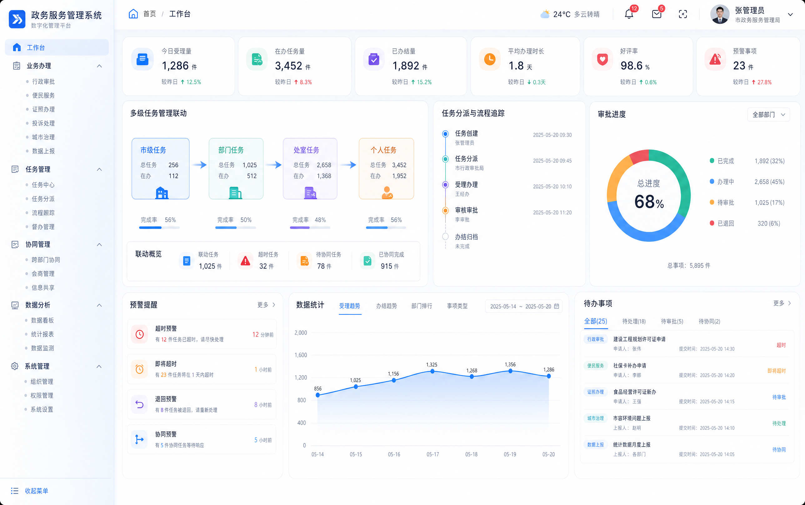
设计一个政务服务管理系统后台管理页面,浅色系现代UI设计,简洁…
设计一个政务服务管理系统后台管理页面,浅色系现代UI设计,简洁干净的界面风格,包含多级任务管理联动功能模块,展示多种政务服务业务场景入口,数字化管理管控界面
litian12345...
2026.06.01
做同款
生成一个民政机构物资库存动态管理系统的后台管理系统页面设计,整体采用浅色系风格,页面需要包含功能模块:物资类目与参数配置、库存动态监控、过期物资处置、物资入库管理、物资出库核销、库存盘点与维保,界面设计简洁现代,布局清晰,以浅色白色为主色调,突出功能模块分区,专业清晰的后台管理界面设计
litian123456789
参考图片的B端SaaS后台管理系统界面风格,重新生成一套企业OA办公系统首页界面,保持相同的浅蓝白配色、圆角卡片、柔和阴影、3D图标风格,左侧导航栏,顶部导航栏,主内容区包含数据统计卡片、最近使用模块、流程概览分类、日程安排和考勤数据看板,整体现代简洁的企业级UI设计风格
WXuci_慧儿
安防集成平台后台管理首页,白色背景,商务科技风格,导航栏,左侧菜单,主内容区域概览,整体商务干净
GD835856161
科技感与商务感融合的扁平风设计,轻拟物元素点缀,简约主义布局搭配玻璃风渐变效果,展现智慧医疗平台的专业与高效。
Kid the Phantom Thief
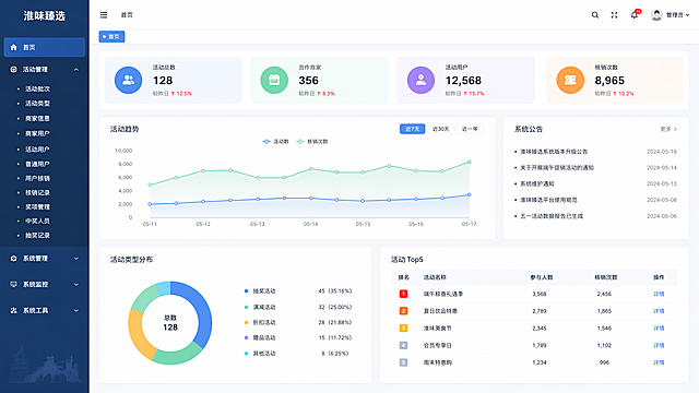
设计淮味臻选系统首页,尺寸1920*1080,左上角显示系统名称"淮味臻选",左侧菜单栏:1、活动管理(包含子菜单:活动批次、活动类型、商家信息、商家用户、活动用户、普通用户、用户核销、核销记录、奖项管理、中奖人员、抽奖记录),2、系统管理,3、系统监控,4、系统工具,整体蓝色简约后台管理系统风格
1pzzxhlo5hsfruu-HB
设计淮味臻选系统首页,尺寸1920*1080,左上角显示系统名称"淮味臻选",左侧菜单栏:1、活动管理(包含子菜单:活动批次、活动类型、商家信息、商家用户、活动用户、普通用户、用户核销、核销记录、奖项管理、中奖人员、抽奖记录),2、系统管理,3、系统监控,4、系统工具,整体蓝色简约后台管理系统风格
1pzzxhlo5hsfruu-HB
资源协同平台-评审任务管理页面高保真UI设计,蓝色企业级B端后台风格,左侧深蓝色侧边栏导航,顶部蓝色导航栏有平台Logo、搜索框、消息铃铛、用户头像(显示教务专责身份)。左侧导航当前选中评审管理模块并展开子菜单,高亮评审任务管理。主内容区:顶部面包屑导航,页面大标题评审任务管理。页面顶部为数据概览卡片行,4个统计卡片横向排列:待评审任务数、进行中评审、已完成评审、本月新增评审,每个卡片有图标、数值、环比趋势。下方为操作与筛选区:左侧有新建评审计划按钮(蓝色主按钮)、发起评审按钮、批量分派按钮;右侧为筛选条件:评审类型下拉、评审状态下拉(全部/待发起/进行中/已完成/已驳回)、时间范围选择、关键词搜索框、查询重置按钮。主体为评审任务列表表格,表头包含:复选框、任务编号、评审任务名称、评审类型(如课程评审/师资评审/案例评审)、关联资源数、评审专家、计划开始时间、计划结束时间、当前状态(不同颜色标签:待发起灰色/进行中橙色/已完成绿色/已驳回红色)、进度条、操作列(查看详情、分派专家、编辑、删除)。表格展示8-10行数据,每行有进度百分比条。页面底部分页组件。整体风格与资源申报审核页一致,蓝色主调,专业清晰,卡片精致有质感
若木42641
参考提供的管理系统UI界面风格,生成台账报表导出打印界面。顶部蓝色导航栏,下方有查询筛选区:日期范围选择、餐次下拉选择、报表类型下拉选择、查询按钮、绿色导出报表按钮、打印按钮。中间四个数据统计卡片:报表总数量、已导出报表、已打印报表、待处理报表,每个卡片有图标、数值、较上月变化百分比。下方是报表列表表格,列包括序号、报表名称、生成日期、报表类型、餐次范围、数据条数、状态、操作(预览/导出/打印/下载)。底部分页组件。整体风格与参考图完全一致:蓝色主题、白色卡片、简洁现代的后台管理系统UI设计,清晰的表格布局,专业的企业管理系统界面
1q5brjneengrk3p6-HB
重新生成拾光智伴后台管理数据看板,整合用户总量、今日订单、完成率、收益数据,用饼图展示服务分类占比,折线图展示30天订单走势,左侧功能菜单栏,右侧数据看板,清晰大气的数据可视化设计,符合管理后台使用场景。
6adhucitqSFIi0g-HB
简洁大气的企业B端后台管理系统界面,人行上报单条数据详情页,右侧抽屉形式从右侧滑出,纯白色背景,无多余装饰,字体清晰。抽屉顶部有标题上报详情和关闭按钮。内容分为四个部分,每部分有小标题和细灰色分隔线。第一部分基本信息:上报ID、模型分类、资产名称、操作类型,两列布局,标签灰色,值黑色加粗。第二部分校验信息:校验状态彩色标签、校验时间yyyy-mm-dd HH:mm:ss、校验结果,失败时显示红色可点击的查看详情链接。第三部分上报信息:上报状态彩色标签、上报时间yyyy-mm-dd HH:mm:ss、上报结果,失败时显示红色可点击的查看详情链接。第四部分操作记录:简洁表格,表头操作时间、操作类型、操作结果、备注,展示多条操作历史,无多余装饰。左侧背景隐约可见列表页。整体极简风格,留白充足,蓝色主色调,高质量UI设计,16:9宽屏
GD177920199
参考该参考图的左侧菜单+右侧内容的布局风格,修改为"企业办公统一门户"系统界面,左侧菜单导航,点击后右侧内容区选项卡打开对应内容,首页包含待办、公告/通知、快捷应用、日程模块,区分已开发模块和待开发模块,顶部保留系统名称和个人信息,保持现代简约浅蓝商务后台UI风格
神出错了1
安防集成平台后台报警类型设置页面,白色背景商务风,可管理不同报警类型配置,列表展示,白色底色商务设计
GD835856161
超精细高保真企业级SaaS后台管理系统工作台首页,UI设计稿。左侧深色侧边栏:顶部品牌logo区带渐变图标,导航菜单每项有精致线性图标+文字+角标,选中项有渐变背景高亮和左侧指示条,底部用户信息卡片带头像和退出按钮。顶部导航栏:面包屑导航,全局搜索框带放大镜图标和快捷键提示,主题切换按钮,通知铃铛带红色数字角标,设置齿轮,用户头像下拉。主内容区:欢迎语横幅带渐变背景和装饰图形,四个数据统计卡片(总用户、今日订单、月营收、转化率)每个都有独特渐变色图标、数字、同比增长百分比箭头、迷你折线图sparkline。下方两栏布局:左栏是最近7天访问量趋势柱状图,带图例和交互提示;右栏是热门内容排行榜。再下方是最近操作记录表格。整体采用深浅模式切换的蓝紫色系,极致细腻的阴影层次,12px圆角,充足留白,像素级对齐,专业B端设计,Figma级高保真
1q2rqdj61m-HB
资源协同平台首页高保真UI设计,现代企业级B端后台风格,蓝色主色调,白色背景,清晰的卡片式布局。页面顶部为导航栏,左侧Logo写着"资源协同平台",中间有搜索框,右侧有消息铃铛图标、用户头像和姓名。左侧为侧边栏导航菜单,包含首页、资源中心、评审管理、审批流程、系统设置等菜单项,当前选中"首页"。主内容区分为三大模块:1.顶部欢迎区和个人概览卡片,显示"欢迎回来,张老师",包含待办数量、未读消息、资源使用进度条等数据概览,以及常用功能快捷入口图标(资源申请、评审提交、课程管理、基地预约);2.中部左侧为消息待办中心卡片,标题"待办与消息",包含评审任务、审批待办、流程催办、系统公告四个标签页,列出若干条待办事项,每条有标题、来源、时间、状态标签,支持待办/已办切换;3.中部右侧为热门资源展示区,标题"热门资源",有资源类型筛选标签(全部、师资、课程、案例、教学、基地),以卡片网格形式展示6个资源卡片,每个卡片有缩略图、资源名称、类型标签、浏览量、评分。整体风格简洁专业,信息层级清晰,符合企业级SaaS后台设计规范,界面精致有质感,阴影柔和,圆角适中
若木42641
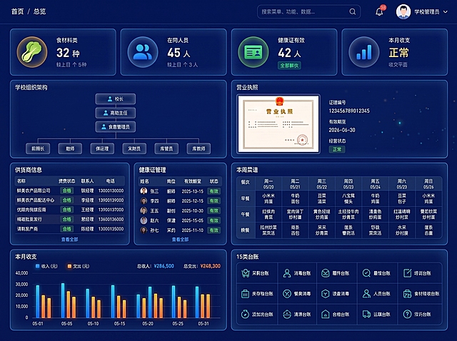
将图中的背景改为统一的纯深蓝色,完全去除渐变效果,背景颜色上下左右完全一致均匀,保持所有数据模块、文字内容、卡片布局和图标完全不变
1q5brjneengrk3p6-HB
去掉图片右下角的水印文字,保持页面其他所有内容、布局、文字和样式完全不变,修复自然无痕迹,画质清晰
1r9o22ztackhAFaA-HB
民政政务资讯与公开管理系统后台管理系统页面设计,整体为浅色系风格,包含菜单栏、数据展示板块和功能模块区域,界面简洁清晰专业,符合政务系统调性,左侧导航栏显示系统功能菜单,顶部是系统标题"民政政务资讯与公开管理系统"
litian123456789
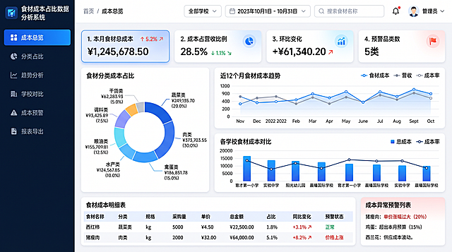
食材成本占比数据分析系统UI界面,16:9宽屏后台管理风格,蓝色科技商务主题。左侧导航栏包含成本总览、分类占比、趋势分析、学校对比、成本预警、报表导出,当前选中成本总览。顶部面包屑导航、学校选择器、时间范围筛选、搜索、通知、用户头像。主界面仪表盘布局: 顶部4个核心数据卡片:本月食材总成本、成本占营收比例、环比变化、预警品类数,各配图标和趋势箭头; 中上左侧:食材分类成本占比环形饼图,展示蔬菜类、肉类、禽蛋类、水产类、粮油类、调料类、干货类占比及金额; 中上右侧:近12个月食材成本趋势折线图,叠加营收曲线显示占比波动; 中部:各学校食材成本对比柱状图,横向对比多所学校的总成本和成本率; 底部:食材成本明细表,包含食材名称、分类、规格、采购量、单价、总金额、占比、同比变化、预警状态,支持排序筛选; 右下角:成本异常预警列表,显示价格波动大、超预算的食材提醒。 蓝色渐变配色、卡片式布局、白色背景、现代SaaS后台高保真UI设计,界面精致专业
GD772623220
重新生成定向采集任务管理功能设计效果图,优化界面布局,明确功能分区:顶部导航栏,左侧任务列表,中间关键词/平台/时间周期设置面板,右侧任务进度可视化看板,突出批量导入按钮,现代化科技感后台管理界面,蓝色主调,所有功能文字清晰可辨
GD312968130
安防集成平台后台门禁历史记录查询页面,白色背景商务风,每个门对应历史开门记录列表,人员车辆分开显示,白色底色商务设计
GD835856161
参考这张学生管理后台页面,生成一张完全一样的高清学生管理系统界面图,保持原有的浅蓝色科技风格、左侧导航栏、顶部搜索栏、学生搜索与筛选模块、学生画像与成长分析图表模块、考勤预警模块、班级管理模块、家长沟通记录模块、学籍异动记录模块等所有布局和内容,文字清晰可辨,UI界面精致,2K高清画质
1r9o22ztackhAFaA-HB
校园餐县级管理平台 - 角色管理页面,现代化B端后台管理系统UI设计。左侧深蓝色侧边栏导航,顶部导航栏有搜索、通知、用户头像。主内容区标题为"角色管理",副标题"管理系统角色及权限分配"。页面上方有"新增角色"蓝色按钮和搜索框。中间区域左侧为角色列表,展示角色卡片:超级管理员、县级管理员、学校管理员、食堂管理员、教师角色、家长角色,每个角色卡片显示角色名称、角色描述、用户数量、状态,当前选中"学校管理员"角色高亮显示。右侧为角色详情配置面板,包含:角色名称输入框、角色描述文本域、状态开关、数据权限范围(全部/本区县/本校)下拉选择、保存按钮。整体蓝色主色调,白色卡片,布局清晰,专业企业级UI设计,16:9宽屏比例
1rcmd4bubuDi7zZg-HB
A professional financial voucher anomaly quality inspection dashboard UI design, titled "财务凭证异常质检看板" at the top left in bold dark text. Light modern business SaaS style, pure white and very light gray background, clean and fresh. Bento grid layout with well-organized modules, Figma top-tier design, high definition, professional financial software. Top filter bar: Four dropdown filter controls in a row - "公司代码", "会计年月", "分组", "凭证号", each with a clean dropdown arrow and light gray border. Upper metrics section: 3 white rounded cards with soft shadows. Card 1: total voucher count with blue icon. Card 2: anomaly voucher count with red warning icon #FF4D4F. Card 3: anomaly ratio percentage with orange icon. Each card has bold black large numbers and gray description text below. Middle charts section (bento grid): Left side - a donut/ring chart showing status distribution with three segments: 待确认 (pending - yellow/orange), 已修改 (modified - blue), 确认无误 (confirmed correct - green #52C41A), with clear legend on the right. Right side - a line chart showing anomaly count trend across fiscal months, smooth curve with soft blue gradient area fill below the line, x-axis labeled with months, y-axis with count numbers. Bottom section: A clean data table with rounded corners and very thin light gray borders, showing voucher-level detail list. Table columns: 公司代码, 公司名称, 会计年度, 会计月份, 过账日期, 分组, 凭证号 (as clickable blue hyperlink with underline hint), 未通过检查项 (showing specific issues like tax rate error/account error in red tag style), 入账人员用户名, 数据更新时间, 数据来源. Subtle row hover highlight effect with light blue background. Table header with light gray background and bold text. Overall style: modern minimalist, plenty of white space, rigorous typography, B-end product design. Accent colors: warning red #FF4D4F for anomalies, safety green #52C41A for confirmed, primary blue #1890FF for links and charts. Ultra detailed UI, 16:9 landscape aspect ratio.
GD528910067
参考原图UI设计风格,重新生成光伏储能App界面,保持多页面排版布局的移动端设计,简约清新绿色调,保留数据展示、功能入口、工单信息、告警统计等光伏储能管理功能模块
GD214142686
生成问卷调研系统后台管理页面的任务列表页设计,遵循如下布局结构: 顶部左侧为「新建任务」按钮,右侧为搜索框「搜索任务...」 接下来是Tab切换栏,包含全部 | 草稿(3) | 进行中(8) | 已关闭(34)几个选项 然后是过滤栏:场景筛选:[全部 ▼] 部门:[全部 ▼] 时间:[最近30天 ▼] 主体是任务表格,表头包含:任务名称 | 场景(彩色标签) | 部门 | 时间范围 | 状态(标签)| 已填/总数(含进度条)| 剩余名额 | 可见范围 | 操作(查看/统计/更多 ▼) 表格样例行:任务名称「2025年度考核」,场景标签「人员考核」,状态「进行中」,进度「67%」 表格样例行:任务名称「食堂满意度调查」,场景标签「满意度」,状态「进行中」,进度「89%」 操作菜单“更多”下拉包含:编辑任务(仅草稿)、发布任务(仅草稿)、查看进度、二维码管理、统计分析、关闭任务、删除(仅草稿) 表格下方是分页器:< 1 2 3 ... > 整体风格采用现代简约浅色UI设计,和参考图一致的清爽后台系统风格,保持干净的卡片式布局和一致的配色规范
1q8ikq3gq43vii6m-HB




















![生成问卷调研系统后台管理页面的任务列表页设计,遵循如下布局结构:
顶部左侧为「新建任务」按钮,右侧为搜索框「搜索任务...」
接下来是Tab切换栏,包含全部 | 草稿(3) | 进行中(8) | 已关闭(34)几个选项
然后是过滤栏:场景筛选:[全部 ▼] 部门:[全部 ▼] 时间:[最近30天 ▼]
主体是任务表格,表头包含:任务名称 | 场景(彩色标签) | 部门 | 时间范围 | 状态(标签)| 已填/总数(含进度条)| 剩余名额 | 可见范围 | 操作(查看/统计/更多 ▼)
表格样例行:任务名称「2025年度考核」,场景标签「人员考核」,状态「进行中」,进度「67%」
表格样例行:任务名称「食堂满意度调查」,场景标签「满意度」,状态「进行中」,进度「89%」
操作菜单“更多”下拉包含:编辑任务(仅草稿)、发布任务(仅草稿)、查看进度、二维码管理、统计分析、关闭任务、删除(仅草稿)
表格下方是分页器:< 1 2 3 ... >
整体风格采用现代简约浅色UI设计,和参考图一致的清爽后台系统风格,保持干净的卡片式布局和一致的配色规范](https://gd-cms.dancf.com/gd-cms/xi19e5/0/195b7aee-d00c-47c8-9aa1-c469b90bb68629679.jpg?x-oss-process=image/resize,w_640,type_6/sharpen,120/interlace,1)