已添加
登录/注册
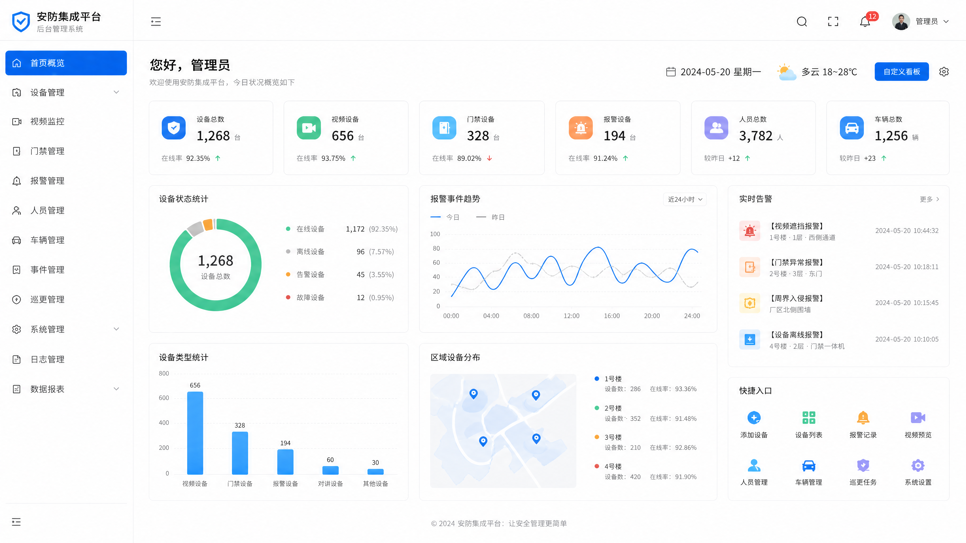
安防集成平台后台管理首页,白色背景,商务科技风格,导航栏,左侧菜单,主内容区域概览,整体商务干净
GD835856161
2026.06.08
做同款
设计一个政务服务管理系统后台管理页面,浅色系现代UI设计,简洁干净的界面风格,包含多级任务管理联动功能模块,展示多种政务服务业务场景入口,数字化管理管控界面
litian123456789
生成一个民政机构物资库存动态管理系统的后台管理系统页面设计,整体采用浅色系风格,页面需要包含功能模块:物资类目与参数配置、库存动态监控、过期物资处置、物资入库管理、物资出库核销、库存盘点与维保,界面设计简洁现代,布局清晰,以浅色白色为主色调,突出功能模块分区,专业清晰的后台管理界面设计
litian123456789
安防集成平台后台门禁历史记录查询页面,白色背景商务风,每个门对应历史开门记录列表,人员车辆分开显示,白色底色商务设计
GD835856161
安防集成平台后台设备接入管理页面,白色背景商务风,可输入厂商名称,选择对接协议,设备列表展示,白色底色商务设计
GD835856161
重新生成拾光智伴后台管理数据看板,整合用户总量、今日订单、完成率、收益数据,用饼图展示服务分类占比,折线图展示30天订单走势,左侧功能菜单栏,右侧数据看板,清晰大气的数据可视化设计,符合管理后台使用场景。
6adhucitqSFIi0g-HB
将这个light模式的后台管理系统首页看板设计图,转换为dark深色模式设计,保持整体布局、所有文字内容、图表数据和产品分布地图完全不变,只把浅色背景改为深色,调整文字和图表颜色适配深色模式
swe༎ຶArt﹏
安防集成平台后台报警类型设置页面,白色背景商务风,可管理不同报警类型配置,列表展示,白色底色商务设计
GD835856161
去掉图片右下角的水印文字,保持页面其他所有内容、布局、文字和样式完全不变,修复自然无痕迹,画质清晰
1r9o22ztackhAFaA-HB
科技感与商务感融合的扁平风设计,轻拟物元素点缀,简约主义布局搭配玻璃风渐变效果,展现智慧医疗平台的专业与高效。
Kid the Phantom Thief
重新分类整理远程银行全渠道数据,将渠道服务数据和运营协同数据分开展示,使用组合图表:堆叠柱状图对比各渠道人工/智能服务量,环形饼图展示分流占比,折线图展示处理效率,设计清爽专业数据看板,布局平衡不杂乱
1qwb45pisqOy-05Q-HB
重新生成定向采集任务管理功能设计效果图,优化界面布局,明确功能分区:顶部导航栏,左侧任务列表,中间关键词/平台/时间周期设置面板,右侧任务进度可视化看板,突出批量导入按钮,现代化科技感后台管理界面,蓝色主调,所有功能文字清晰可辨
GD312968130
参考该参考图的左侧菜单+右侧内容的布局风格,修改为"企业办公统一门户"系统界面,左侧菜单导航,点击后右侧内容区选项卡打开对应内容,首页包含待办、公告/通知、快捷应用、日程模块,区分已开发模块和待开发模块,顶部保留系统名称和个人信息,保持现代简约浅蓝商务后台UI风格
神出错了1
民政政务资讯与公开管理系统后台管理系统页面设计,整体为浅色系风格,包含菜单栏、数据展示板块和功能模块区域,界面简洁清晰专业,符合政务系统调性,左侧导航栏显示系统功能菜单,顶部是系统标题"民政政务资讯与公开管理系统"
litian123456789
移除图片左上角的文字'volvo呼叫中心',使用和原导航栏相同的深蓝色背景填充,保持界面其他内容、布局和颜色完全不变
GD965343187
安防集成平台后台地图区域设置页面,白色背景商务风,可设置周界报警区域,支持自定义划分地图区域,白色底色商务设计
GD835856161
基于原数据,对远程银行全渠道数据进行分类分析,将进线量、应答量等核心数据制作成柱状图,满意度占比数据制作成饼图,不同业务数据趋势制作成折线图,整体数据看板布局清晰,分类科学,包含原始所有数据指标,现代金融BI看板风格,设计专业美观
1qwb45pisqOy-05Q-HB
设计直营加盟烘焙连锁解决方案官网网页中半部分,蓝白简约商务风格,主色#165DFF,企业官网风格。包含板块:4.配套产品&可选模块跳转区(双栏布局,左栏标准标配模块:POS收银系统、会员CRM、外卖聚合系统、门店库存管理;右栏可选增值模块:加盟分账结算、私域小程序、供应链协同、钉钉/飞书协同、BI经营分析、营销拓客插件,全部带超链接样式);5.全链路业务流程图(门店收银-会员营销-外卖订单-加盟结算-供应链配送-财务核算全闭环可视化);6.核心功能详情展示(分模块展示会员营销、加盟结算、外卖运营、门店风控的详细功能点,配图标和说明)。整体排版整洁,留白充足,和上半部分风格完全统一
1r8luyherpEwPosQ-HB
设计16:9比例低代码定制专题任务页面,纯白背景左右分栏布局。左上角固定主标题"态势可视化与综合管控软件",标题下方是可伸缩主菜单,包含三个选项:数据融合与态势生成平台、一体化管控平台、数字孪生与态势共享平台。左侧为低代码可视化配置面板,卡片分组设计,内置专题和场景页面低代码配置工具栏,提供呈现元素、视角参数、展示范围、时间线、动作时序的可视化配置滑块与表单,搭配页面配置参数统计图表、配置项完成度环形图,展示自定义配置维度和参数状态,支持无代码拖拽快速配置孪生场景页面。右侧为孪生页面实时预览窗口,实时渲染低代码配置后的专题任务和场景页面效果,动态展示自定义视角、展示范围、时间线动画、设备动作时序等可视化效果,搭配页面渲染帧率、配置生效耗时实时数据仪表盘,呈现低代码快速定制开发能力,科技简约后台UI设计
1r9fio4ap6wlottg-HB
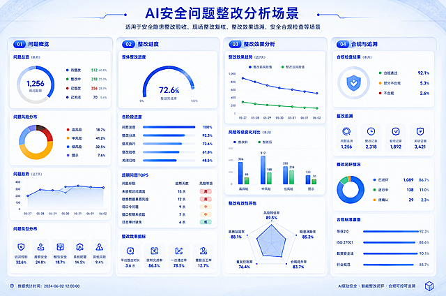
仿照参考图片的蓝白商务大屏风格和四栏布局格式,生成AI安全问题整改分析场景图片,内容介绍为适用于安全隐患整改验收、现场整改复核、整改效果追溯、安全合规检查等场景,图案不要和参考图片一模一样
创意 × 2
GD430461416
参考这张学生管理后台页面,生成一张完全一样的高清学生管理系统界面图,保持原有的浅蓝色科技风格、左侧导航栏、顶部搜索栏、学生搜索与筛选模块、学生画像与成长分析图表模块、考勤预警模块、班级管理模块、家长沟通记录模块、学籍异动记录模块等所有布局和内容,文字清晰可辨,UI界面精致,2K高清画质
1r9o22ztackhAFaA-HB
浅色可视化大屏,整体风格简约清新,以浅绿色作为主色调,包含抽象地图风格的几何区域展示,数据可视化模块布局,科技感大屏界面
是小栗子哇!
设计权限体系管控页面,16:9比例,纯白背景,左右分栏布局。左上角固定展示主标题"态势可视化与综合管控软件",标题下方配置伸缩式主菜单,菜单包含选项:数据融合与态势生成平台、一体化管控平台、数字孪生与态势共享平台,其中数字孪生与态势共享平台为选中状态,当前页面为权限体系管控,支持伸缩展开收起交互。左侧为权限配置可视化面板:构建账号、角色、设备组三维权限管理结构图,分区展示场景搭建、数据查看、告警处理等模块功能权限分配状态,展示设备组对应数据访问范围配置,搭配权限分配占比雷达图、用户权限台账统计表。右侧为权限效果可视化验证区,模拟不同角色用户登录系统,展示对应可操作功能模块、可查看设备数据范围,直观呈现功能权限隔离、数据权限隔离效果,动态验证精细化权限管控、数据安全访问能力,保持简洁科技的B端软件界面风格
1r9fio4ap6wlottg-HB
对原型图进行UI重设计,生成商务扁平风格界面:保持原有所有文字内容完全不变,优化页面布局、视觉层级、色彩搭配和字体排版,使用实色填充纯色卡片,采用面性实心icon风格,卡片为圆角矩形实色底,文字左对齐进入按钮改为渐变色块跳转按钮,合理留白间距,统一配色提升精致感,整体商务干净高级,自适应尺寸,修正原型不合理布局
大陆机电-UI设计
对原型图进行UI重设计,生成商务扁平风格界面:保持原有所有文字内容完全不变,优化页面布局、视觉层级、色彩搭配和字体排版,使用实色填充纯色卡片,采用面性实心icon风格,卡片为圆角矩形实色底,文字左对齐进入按钮改为渐变色块跳转按钮,合理留白间距,统一配色提升精致感,整体商务干净高级,自适应尺寸,修正原型不合理布局
大陆机电-UI设计
参考图片风格,重新生成画面内容「图片1」资源管理系统有2个子项:数据安全和配置中心,数据安全有子级数据源授权,配置中心包含数据源管理,标签管理,应用管理,应用授权
橙色落月