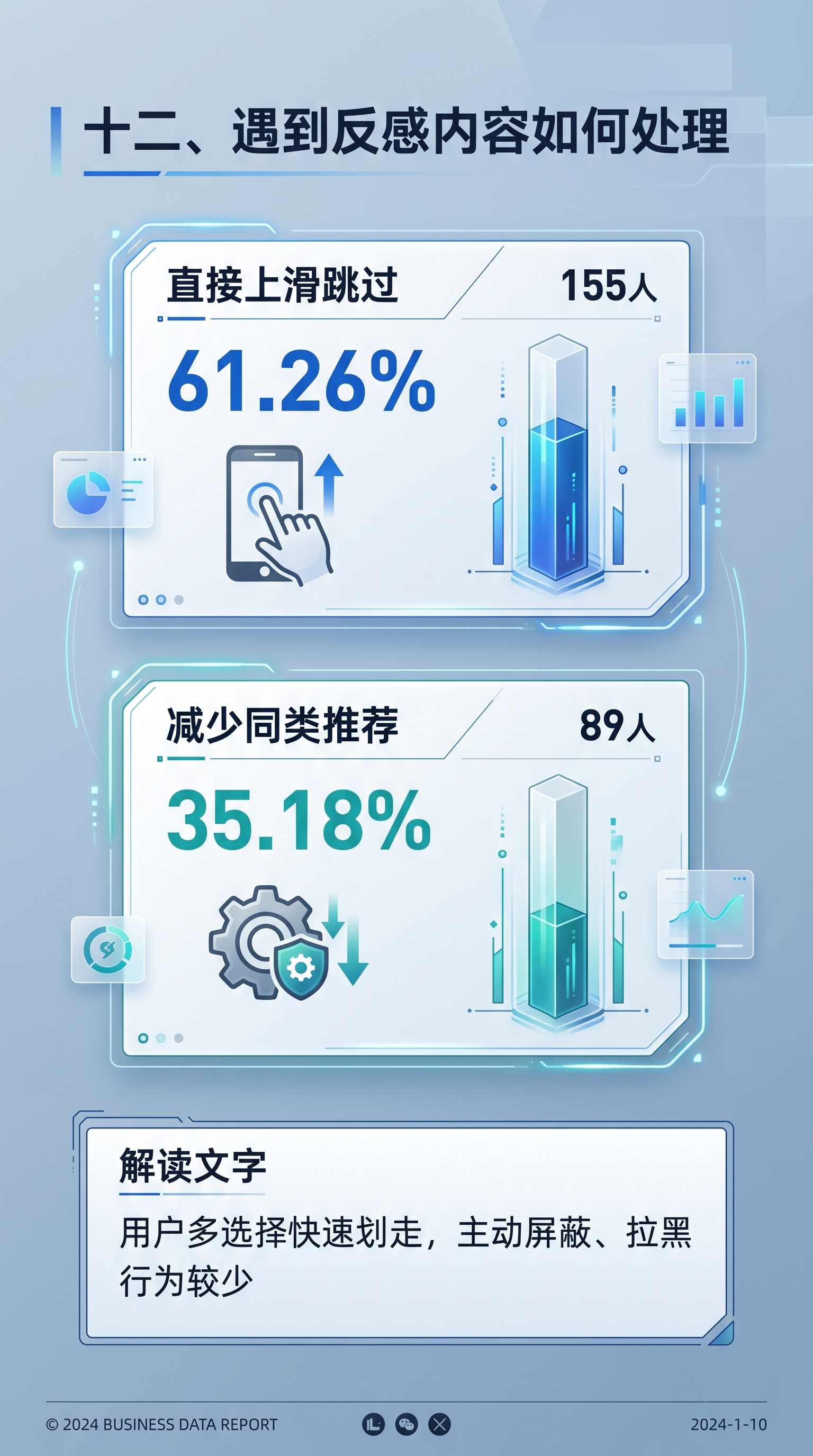

PPT内容页,标题是"十二、遇到反感内容如何处理",展示:直接… - 图片创意预览

PPT内容页,标题是"十二、遇到反感内容如何处理",展示:直接…

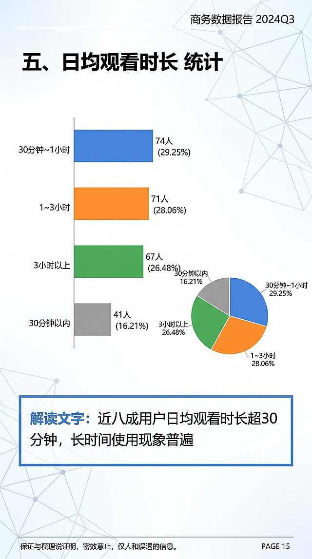
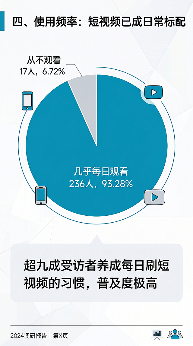
PPT内容页,标题是"十二、遇到反感内容如何处理",展示:直接上滑跳过:155人,61.26%;减少同类推荐:89人,35.18%,解读文字"用户多选择快速划走,主动屏蔽、拉黑行为较少",商务数据报告

[第2张] 客户痛点模块 — 工业安全三大行业挑战场景化呈现。参考图2的玻璃拟态+蓝紫渐变科技风格。 [氛围/风格] 科技专业、清晰呈现行业挑战,玻璃拟态卡片设计,3D图标点缀。 [元素布局] 顶部小标题区"01 / 行业挑战",下方大标题"安全管理的三大难题";主体为三张纵向排列的玻璃拟态白色圆角卡片,每张左侧配一个蓝色圆形信息图标,右侧是挑战标题+描述;背景为浅蓝白渐变,点缀微弱网格线和数据光点;整体积极正向,聚焦解决方案的前置问题分析。 [光影质感] 柔和漫射光,卡片有轻微投影和玻璃通透感,图标有立体感,整体干净明亮。 [配色色系] 全局底色#F5F8FF;主色深蓝#1E56D9;辅助色浅灰卡片底+蓝色图标;文字深灰#333333。 [视角构图] 正面垂直排版,上中下结构,阅读动线从上到下。 [文字版式] 顶部左侧蓝色小字"01 / 行业挑战";下方大标题"安全管理的三大难题"加粗黑体;三张卡片依次为:1."异常发现滞后,预警能力不足"+小字"人工监控难以及时发现潜在风险";2."报警信息过载,关键信号难识别"+小字"海量信息中难以定位真实风险";3."处置依赖经验,决策缺乏支撑"+小字"缺少数据辅助,难以快速响应";每张卡片左侧蓝色圆形信息图标。 [比例分辨率] 9:16竖版比例,4K分辨率,文字清晰可辨。 [负向提示词] 变形,水印,文字错乱,文字过小,颜色偏差,背景杂乱,警示符号,负面元素。[第2张] 客户痛点模块 — 工业安全三大行业挑战场景化呈现。参考图2的玻璃拟态+蓝紫渐变科技风格。
[氛围/风格] 科技专业、清晰呈现行业挑战,玻璃拟态卡片设计,3D图标点缀。
[元素布局] 顶部小标题区"01 / 行业挑战",下方大标题"安全管理的三大难题";主体为三张纵向排列的玻璃拟态白色圆角卡片,每张左侧配一个蓝色圆形信息图标,右侧是挑战标题+描述;背景为浅蓝白渐变,点缀微弱网格线和数据光点;整体积极正向,聚焦解决方案的前置问题分析。
[光影质感] 柔和漫射光,卡片有轻微投影和玻璃通透感,图标有立体感,整体干净明亮。
[配色色系] 全局底色#F5F8FF;主色深蓝#1E56D9;辅助色浅灰卡片底+蓝色图标;文字深灰#333333。
[视角构图] 正面垂直排版,上中下结构,阅读动线从上到下。
[文字版式] 顶部左侧蓝色小字"01 / 行业挑战";下方大标题"安全管理的三大难题"加粗黑体;三张卡片依次为:1."异常发现滞后,预警能力不足"+小字"人工监控难以及时发现潜在风险";2."报警信息过载,关键信号难识别"+小字"海量信息中难以定位真实风险";3."处置依赖经验,决策缺乏支撑"+小字"缺少数据辅助,难以快速响应";每张卡片左侧蓝色圆形信息图标。
[比例分辨率] 9:16竖版比例,4K分辨率,文字清晰可辨。
[负向提示词] 变形,水印,文字错乱,文字过小,颜色偏差,背景杂乱,警示符号,负面元素。
Information security awareness comic poster about social media usage guidelines, 9:16 vertical long format, single page with 5 sections stacked vertically. Blue and white internet flat illustration style, corporate internal propaganda comic style, modern office environment background, dense information but clear hierarchy, high quality rendering, Chinese text, dialogue bubbles and warning icons, 4K resolution. ---SECTION 1 (TOP - MAIN VISUAL): A large hand making a firm stop gesture in front of a smartphone screen. Floating above the phone are social media app icons: WeChat, Douyin, Weibo, Xiaohongshu, Zhihu. Red warning signs around. Background shows blurred silhouette of office buildings. Red and blue main tones with strong visual impact. Large bold slogan at top: "指尖轻点间,安全重于山". Tense warning atmosphere, digital illustration style. ---SECTION 2 (PROHIBITED POSTING): An office worker sitting at desk with phone and laptop. Computer screen shows thumbnails of strategy documents, financial reports, technical docs, and meeting minutes. A giant red circular prohibition symbol covers the screen. Phone pops up red warning dialog box with Chinese text "涉密!禁止发布". Worker has serious expression. Office background. Warning style. ---SECTION 3 (NO WORK ENVIRONMENT PHOTOS): Vertical phone screen showing social media post editing interface. Four thumbnail photos arranged: office panorama, factory workshop interior, employee ID badge/access card, computer screen with code. Each photo has a big red X mark over it. Red warning box in center of screen with Chinese text "内容含敏感环境,禁止发布". Dark background highlighting the phone interface. Infographic style, clear and concise. ---SECTION 4 (VIOLATION CASES): Left-right split comparison warning. Left side: Douyin comment section showing a shipping order photo being hit by a red warning hammer, labeled "二级违规". Right side: WeChat Moments showing workshop interior photo covered with a deduction warning sign, labeled "扣分处罚". At the bottom, shadow of an employment termination document. Dark red background, serious and solemn educational warning style. ---SECTION 5 (BOTTOM - COMPLIANCE): An office worker at desk, left hand holding personal phone (lifestyle/entertainment screen), right hand holding company work phone (enterprise WeChat interface), two phones separated back-to-back. Computer screen on desk shows a document being desensitized with black redactions (hiding logos, data, names). Green safety checkmark on wall with Chinese text "合规分享". Blue and white main color, strong sense of order, flat business illustration style. Overall layout: Five sections stacked vertically from top to bottom, separated by thin divider lines or subtle arrows. Blue and white corporate color scheme with red warning accents throughout. Consistent flat comic style. All text in Chinese characters. Professional quality, sharp details, vertical 9:16 format.Information security awareness comic poster about social media usage guidelines, 9:16 vertical long format, single page with 5 sections stacked vertically. Blue and white internet flat illustration style, corporate internal propaganda comic style, modern office environment background, dense information but clear hierarchy, high quality rendering, Chinese text, dialogue bubbles and warning icons, 4K resolution.

---SECTION 1 (TOP - MAIN VISUAL):
A large hand making a firm stop gesture in front of a smartphone screen. Floating above the phone are social media app icons: WeChat, Douyin, Weibo, Xiaohongshu, Zhihu. Red warning signs around. Background shows blurred silhouette of office buildings. Red and blue main tones with strong visual impact. Large bold slogan at top: "指尖轻点间,安全重于山". Tense warning atmosphere, digital illustration style.

---SECTION 2 (PROHIBITED POSTING):
An office worker sitting at desk with phone and laptop. Computer screen shows thumbnails of strategy documents, financial reports, technical docs, and meeting minutes. A giant red circular prohibition symbol covers the screen. Phone pops up red warning dialog box with Chinese text "涉密!禁止发布". Worker has serious expression. Office background. Warning style.

---SECTION 3 (NO WORK ENVIRONMENT PHOTOS):
Vertical phone screen showing social media post editing interface. Four thumbnail photos arranged: office panorama, factory workshop interior, employee ID badge/access card, computer screen with code. Each photo has a big red X mark over it. Red warning box in center of screen with Chinese text "内容含敏感环境,禁止发布". Dark background highlighting the phone interface. Infographic style, clear and concise.

---SECTION 4 (VIOLATION CASES):
Left-right split comparison warning. Left side: Douyin comment section showing a shipping order photo being hit by a red warning hammer, labeled "二级违规". Right side: WeChat Moments showing workshop interior photo covered with a deduction warning sign, labeled "扣分处罚". At the bottom, shadow of an employment termination document. Dark red background, serious and solemn educational warning style.

---SECTION 5 (BOTTOM - COMPLIANCE):
An office worker at desk, left hand holding personal phone (lifestyle/entertainment screen), right hand holding company work phone (enterprise WeChat interface), two phones separated back-to-back. Computer screen on desk shows a document being desensitized with black redactions (hiding logos, data, names). Green safety checkmark on wall with Chinese text "合规分享". Blue and white main color, strong sense of order, flat business illustration style.

Overall layout: Five sections stacked vertically from top to bottom, separated by thin divider lines or subtle arrows. Blue and white corporate color scheme with red warning accents throughout. Consistent flat comic style. All text in Chinese characters. Professional quality, sharp details, vertical 9:16 format.
16:9横版PPT页面设计,第03页,标题为"03 / 用户运营深度分析与价值思考"。整体风格与前面页面完全统一:深海蓝海洋背景,远处翠绿岛屿和海平面意象,底部海浪海岸线装饰,半透明深蓝玻璃拟态卡片,翠绿色数据/关键词高亮,商务专业感,版式精美,信息层次清晰。 页面分为三大板块,主次分明,字体大小有视觉美感: 【板块一:有效用户运营价值(左侧大卡片)】 标题:有效用户运营的核心价值 核心数据高亮(绿色大字): - 有效用户:近22万 - 整体有效用户转化率:29.7% - 可主动营销跟进用户:12.7万 观点提炼(白色正文): 主动营销用户的转化和复购均远高于整体数据。有效用户增长不是目的,而是持续挖掘有效需求用户后,提升用户资产价值,而非冰冷的数据堆砌。 上海团队实践:以企微+小程序绑定运营的链路闭环,构建获客后、进店前的服务体验——这正是中台流量运营团队的核心价值。 【板块二:转化下降原因分析(右上卡片)】 标题:转化端下降趋势深度剖析 核心数据高亮(绿色大字): - 活跃会员多次到店率同期增幅:19.2% 核心原因: 统一收银率下降(客观因素:政策驱动 / 经销商收银习惯) 思考问题(两行重点): • 过程运营数据提升,但终端转化环节无法把控 • 运营侧重点应是哪里?用户运营的价值体现应在哪里? 【板块三:输出观点与策略(右下卡片,绿色边框强调)】 标题:输出观点与运营策略 核心观点(绿色加粗高亮): 联单复购率的背后是会员的多次到店行为 策略方向(白色正文): 侧重点应围绕可主动触达的用户,做重复到店运营策略和权益释放,短期内高频多形式触达,形成用户记忆点。 整体排版主次分明,大标题醒目,数据绿色高亮,正文清晰易读,玻璃拟态卡片层次丰富,海洋岛屿航线元素点缀,与前两页风格100%统一。16:9横版PPT页面设计,第03页,标题为"03 / 用户运营深度分析与价值思考"。整体风格与前面页面完全统一:深海蓝海洋背景,远处翠绿岛屿和海平面意象,底部海浪海岸线装饰,半透明深蓝玻璃拟态卡片,翠绿色数据/关键词高亮,商务专业感,版式精美,信息层次清晰。

页面分为三大板块,主次分明,字体大小有视觉美感:

【板块一:有效用户运营价值(左侧大卡片)】
标题:有效用户运营的核心价值
核心数据高亮(绿色大字):
- 有效用户:近22万
- 整体有效用户转化率:29.7%
- 可主动营销跟进用户:12.7万
观点提炼(白色正文):
主动营销用户的转化和复购均远高于整体数据。有效用户增长不是目的,而是持续挖掘有效需求用户后,提升用户资产价值,而非冰冷的数据堆砌。
上海团队实践:以企微+小程序绑定运营的链路闭环,构建获客后、进店前的服务体验——这正是中台流量运营团队的核心价值。

【板块二:转化下降原因分析(右上卡片)】
标题:转化端下降趋势深度剖析
核心数据高亮(绿色大字):
- 活跃会员多次到店率同期增幅:19.2%
核心原因:
统一收银率下降(客观因素:政策驱动 / 经销商收银习惯)
思考问题(两行重点):
• 过程运营数据提升,但终端转化环节无法把控
• 运营侧重点应是哪里?用户运营的价值体现应在哪里?

【板块三:输出观点与策略(右下卡片,绿色边框强调)】
标题:输出观点与运营策略
核心观点(绿色加粗高亮):
联单复购率的背后是会员的多次到店行为
策略方向(白色正文):
侧重点应围绕可主动触达的用户,做重复到店运营策略和权益释放,短期内高频多形式触达,形成用户记忆点。

整体排版主次分明,大标题醒目,数据绿色高亮,正文清晰易读,玻璃拟态卡片层次丰富,海洋岛屿航线元素点缀,与前两页风格100%统一。
创意 × 3