已添加
登录/注册
去掉右下角的二维码占位方块,将整体文字内容(包括标题、嘉宾、时…
去掉右下角的二维码占位方块,将整体文字内容(包括标题、嘉宾、时间、地点等所有文字)向上移动一点点,保持原有的排版布局、字体样式、颜色和背景风格不变,画面其他元素保持原样
咖喱牛角包
2026.08.12
做同款
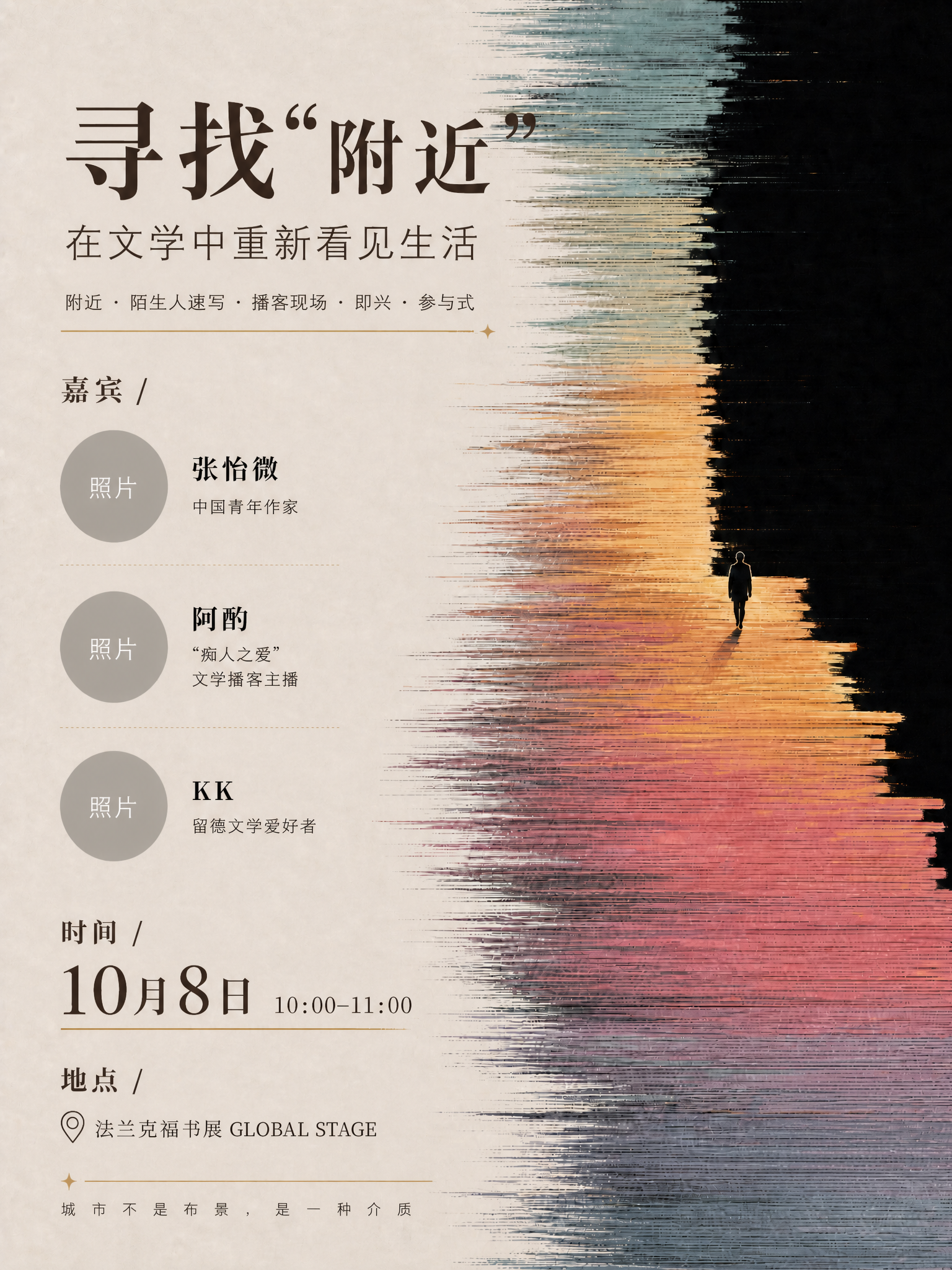
一张文学沙龙活动海报,竖版3:4比例,美术生审美,文学感强烈,面向00后年轻群体,排版舒服自然,色彩协调。 【版式参考】参考图2和图3的左文右图版式骨架:左侧为文字信息区,右侧为抽象主视觉区;保留图2的嘉宾头像+姓名+身份的纵向排列方式,保留图3的时间地点图标化信息排版。 【风格参考】参考图1的抽象艺术氛围:横向笔触条纹质感,暖橙-粉紫-青蓝渐变色带,黑色负空间,一个孤独人物剪影走向光的方向,象征"附近的消失与重新发现"。 【画面分区】 - 顶部左侧:小字英文装饰"LITERATURE SALON",下方主标题"寻找'附近'",字号最大,衬线字体,深棕色 - 主标题下方:副标题"在文学中重新看见生活",字号次之 - 副标题下方:关键词标签横排"附近 · 陌生人速写 · 播客现场 · 即兴 · 参与式",细线条分隔 - 中部左侧:嘉宾区标题"嘉宾 /",下方纵向排列三位嘉宾,每位配圆形头像占位框(灰色圆形占位,标注"照片")+ 姓名 + 身份简介: 1. 张怡微(中国青年作家) 2. 阿酌("痴人之爱"文学播客主播) 3. KK(留德文学爱好者) - 嘉宾区下方:时间区标题"时间 /",下方大字"10月8日",旁边小字"10:00-11:00" - 时间区下方:地点区标题"地点 /",配定位图标,文字"法兰克福书展 GLOBAL STAGE" - 右下角:二维码占位符,纯色方块中央标注"二维码占位"文字 - 最底部:一行小字"城市不是布景,是一种介质" 【右侧主视觉】参考图1风格的抽象艺术画面:横向排列的笔触条纹,从顶部青蓝渐变到中部暖橙再到底部粉紫,右侧大面积黑色负空间,一个小小的人物剪影站在色彩与黑暗的交界处,朝向黑色深处走去,营造孤独又诗意的氛围,象征"附近"的探索。条纹有手绘质感,边缘不规则,像一层层书页或记忆。 【配色】整体暖调文学感:米白/浅米色背景,深棕色标题文字,暖橙+粉紫+青蓝的抽象主视觉色块,金色细线条点缀,莫兰迪色系,低饱和度,高级雅致。 【字体】主标题用优雅衬线宋体,副标题用细黑体,正文用常规黑体,嘉宾姓名加粗,数字用大号衬线体突出。 【氛围】安静、诗意、有思考深度,文学气息浓厚,像一本书的封面,适合年轻文艺青年审美。 画面中所有数字必须精确渲染,不得错位、遗漏或编造。画面中所有信息区域、嘉宾介绍区必须填充完整合理的内容,不得出现空白框。画面中二维码区域使用纯色方块占位符呈现,方块中央标注"二维码占位"文字,严禁生成任何可识别的二维码图案。版式精美,四边留足安全边距。
咖喱牛角包
基于这张海报,保持所有插画图案、建筑场景、人物、三个圆形头像位、所有文字内容、字体、底色、October 8th的位置完全不变。 只做一件事:把第二行 "Frankfurt Book Fair, GLOBAL STAGE (Foyer 5.1/6.1)" 稍微往下挪一点点,拉开它和第一行 October 8th 之间的距离,使第一行到第二行的间距,等于第二行到第三行(10:00-10:30那行)的间距,也等于第三行到第四行的间距。三个间距完全相等,四行均匀对称。 第二行往下挪的幅度很小,只是微调。第三行和第四行的位置保持不动。其他所有元素完全保持原样。
咖喱牛角包
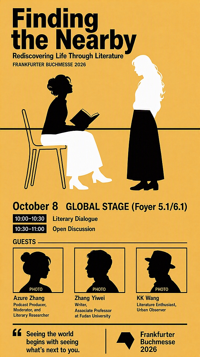
Berlin Literature Festival style artistic vertical poster, 9:16 ratio. Bright mustard yellow background + solid black, classic German Babylon Kino poster style. Keep everything exactly the same as before, make only these three precise adjustments: ADJUSTMENT 1: - Zhang Yiwei's entry: add a comma after "Writer". So it reads: "Writer," on the second line. Full entry: Line 1: "Zhang Yiwei" Line 2: "Writer," Line 3: "Associate Professor at Fudan University" ADJUSTMENT 2: - "GLOBAL STAGE (Foyer 5.1/6.1)" must be EXACTLY the same font size as "October 8". Absolutely identical size. Both are bold, both are the same height. They should look perfectly balanced side by side. Make sure GLOBAL STAGE is not smaller at all - match the size precisely. ADJUSTMENT 3: - The horizontal split line that cuts through both figures must be a SOLID BLACK LINE. Currently it appears yellow/invisible. It should be a clear, sharp black horizontal line running across the entire width of the poster, passing through both figures at their midsection, dividing them into top and bottom halves. This black line is what creates the split composition effect. Everything else stays exactly the same: - Left figure (reader with book and beret): top half solid black, bottom half hollow/outline (yellow shows through) - Right figure (stranger standing): top half hollow/outline (yellow shows through), bottom half solid black - All other text, layout, guest placeholders, tagline, branding remain unchanged. TOP AREA: - Main title large bold: "Finding the Nearby" - Subtitle: "Rediscovering Life Through Literature" - Small: "FRANKFURTER BUCHMESSE 2026" CENTRAL AREA: Two figures with a CLEAR BLACK HORIZONTAL LINE cutting through both at midsection. Left: solid top/hollow bottom. Right: hollow top/solid bottom. BOTTOM AREA: - Date and venue SAME EXACT SIZE, both bold: "October 8 GLOBAL STAGE (Foyer 5.1/6.1)" - Agenda: "10:00-10:30 Literary Dialogue" "10:30-11:00 Open Discussion" GUEST SECTION: - Column 1: PHOTO + "Azure Zhang, Podcast Producer, Moderator, and Literary Researcher" - Column 2: PHOTO + "Zhang Yiwei" + "Writer," + "Associate Professor at Fudan University" - Column 3: PHOTO + "KK Wang, Literature Enthusiast, Urban Observer" BOTTOM: - Tagline: "Seeing the world begins with seeing what's next to you." - Bottom right: "Frankfurter Buchmesse 2026" 画面中所有嘉宾头像区域使用简洁轮廓剪影占位符呈现,标注"PHOTO"字样,严禁生成任何真实人脸图像。 画面中所有信息区域、嘉宾介绍区、议程区等必须填充完整合理的内容,不得出现空白框、空白占位、横线待填写区域、空列表项、空单元格。 画面中所有数字必须精确渲染,不得错位、遗漏或编造。
咖喱牛角包
Berlin Literature Festival style artistic vertical poster, 9:16 ratio. Bright mustard yellow background + solid black, classic German Babylon Kino poster style. Keep everything exactly the same as before, make only these three precise adjustments: ADJUSTMENT 1: - Zhang Yiwei's entry: add a comma after "Writer". So it reads: "Writer," on the second line. Full entry: Line 1: "Zhang Yiwei" Line 2: "Writer," Line 3: "Associate Professor at Fudan University" ADJUSTMENT 2: - "GLOBAL STAGE (Foyer 5.1/6.1)" must be EXACTLY the same font size as "October 8". Absolutely identical size. Both are bold, both are the same height. They should look perfectly balanced side by side. Make sure GLOBAL STAGE is not smaller at all - match the size precisely. ADJUSTMENT 3: - The horizontal split line that cuts through both figures must be a SOLID BLACK LINE. Currently it appears yellow/invisible. It should be a clear, sharp black horizontal line running across the entire width of the poster, passing through both figures at their midsection, dividing them into top and bottom halves. This black line is what creates the split composition effect. Everything else stays exactly the same: - Left figure (reader with book and beret): top half solid black, bottom half hollow/outline (yellow shows through) - Right figure (stranger standing): top half hollow/outline (yellow shows through), bottom half solid black - All other text, layout, guest placeholders, tagline, branding remain unchanged. TOP AREA: - Main title large bold: "Finding the Nearby" - Subtitle: "Rediscovering Life Through Literature" - Small: "FRANKFURTER BUCHMESSE 2026" CENTRAL AREA: Two figures with a CLEAR BLACK HORIZONTAL LINE cutting through both at midsection. Left: solid top/hollow bottom. Right: hollow top/solid bottom. BOTTOM AREA: - Date and venue SAME EXACT SIZE, both bold: "October 8 GLOBAL STAGE (Foyer 5.1/6.1)" - Agenda: "10:00-10:30 Literary Dialogue" "10:30-11:00 Open Discussion" GUEST SECTION: - Column 1: PHOTO + "Azure Zhang, Podcast Producer, Moderator, and Literary Researcher" - Column 2: PHOTO + "Zhang Yiwei" + "Writer," + "Associate Professor at Fudan University" - Column 3: PHOTO + "KK Wang, Literature Enthusiast, Urban Observer" BOTTOM: - Tagline: "Seeing the world begins with seeing what's next to you." - Bottom right: "Frankfurter Buchmesse 2026" 画面中所有嘉宾头像区域使用简洁轮廓剪影占位符呈现,标注"PHOTO"字样,严禁生成任何真实人脸图像。 画面中所有信息区域、嘉宾介绍区、议程区等必须填充完整合理的内容,不得出现空白框、空白占位、横线待填写区域、空列表项、空单元格。 画面中所有数字必须精确渲染,不得错位、遗漏或编造。
咖喱牛角包
修改图中两位女性剪影:1. 左侧坐着读书的女人盘发更优雅精致,抬头望向右侧站立的女人;2. 右侧站立的卷发女人低头望向左侧坐着的女人,两人深情对望有故事感;3. 左边坐着的女人下半部分(腰部以下腿部及鞋子)改为白色剪影,上半身保持黑色剪影;4. 右边站立的女人上半部分(腰部以上身体及头部)改为白色剪影,下半身保持黑色剪影;5. 保持黄色背景、文字内容、椅子、书本、底部头像框等所有其他元素完全不变。
咖喱牛角包
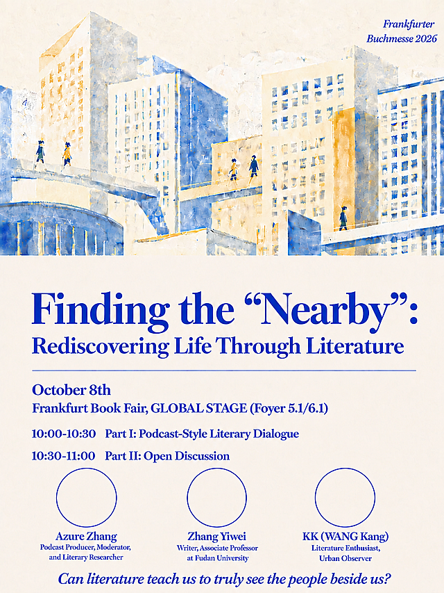
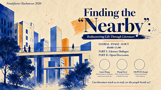
3:4竖版文学活动海报,颗粒质感扁平插画风格,类似Ryo Takemasa插画风格,色块平涂+噪点颗粒纹理。 配色:奶油米白底 + 克莱因蓝 + 暖橙色点缀,三色搭配,文艺温暖。 画面构图(竖版3:4): - 上半部分约55%:城市建筑插画场景——错落的高楼建筑,克莱因蓝和米白色块构成,建筑之间有连廊天桥,天桥上有几个小人物在行走,天空是米白色带颗粒纹理 - 右上角:淡淡的克莱因蓝德语文字 "Frankfurter Buchmesse 2026",低调融入背景 - 下半部分约45%:文字信息区,奶油米白底 文字内容(克莱因蓝 Bodoni 衬线字体): - 主标题(超大粗体):"Finding the "Nearby":" —— Nearby带弯引号,末尾有冒号 - 副标题:"Rediscovering Life Through Literature" - 一条细细的克莱因蓝横线 横线下方四行信息,严格等间距排列,每行之间的距离完全相等,均匀对称: - "October 8th" - "Frankfurt Book Fair, GLOBAL STAGE (Foyer 5.1/6.1)" - "10:00-10:30 Part I: Podcast-Style Literary Dialogue" - "10:30-11:00 Part II: Open Discussion" 再往下是三个等大的圆形轮廓(克莱因蓝细线勾勒,圈内留白),横向均匀排列: - 左圆下:"Azure Zhang / Podcast Producer, Moderator, and Literary Researcher" - 中圆下:"Zhang Yiwei / Writer, Associate Professor at Fudan University" - 右圆下:"KK (WANG Kang) / Literature Enthusiast, Urban Observer" 最底部:"Can literature teach us to truly see the people beside us?"(Bodoni斜体) 重点要求:横线下方的四行信息文字,行与行之间的垂直间距必须完全相等,严格对称,第一行到第二行 = 第二行到第三行 = 第三行到第四行,三个间距一模一样。 整体气质文艺温暖,像独立出版社文学活动海报。版式精美,层次分明。所有数字精确渲染。
咖喱牛角包
严格参考这张图的背景黄色(偏深的暖橙黄色、土黄色调),将上一张有白色填充的海报(左边坐着的女人下半身白色、右边站着的女人上半身白色的版本)的背景黄色精确替换为与参考图完全一致的黄色。保持所有黑色剪影、白色填充部分、文字、线条、底部小图等其他元素完全不变,只改变背景颜色,颜色必须与参考图的黄色一模一样。
咖喱牛角包
重新绘制海报上方的建筑插画部分,去除当前的鳞片状/密集花纹图案,改为干净的水彩手绘风格插画,建筑用平涂色块表现,整体带有细腻的纸张颗粒质感(类似复古印刷的轻微噪点),不要密集纹理。保持建筑的构图、蓝色和橙色调、天桥和人物的位置都不变。下方的文字部分和米色背景完全保持原样不动。
咖喱牛角包
Berlin Literature Festival style artistic vertical poster, 9:16 ratio. Classic German poster design, bold and striking like Babylon cinema / Berlin theater posters. Color palette: Bright mustard yellow background + solid black figures and text. High contrast, bold, graphic, very Berlin, very Weimar Republic / Babylon Kino aesthetic. Clean, powerful, no gradients - pure yellow and black. Central visual: Keep the split horizontal composition with two figures facing each other, but reimagined in bold black-and-yellow graphic style. LEFT FIGURE (the reader with book): Bold black silhouette of a person sitting and reading an open book, wearing a beret, head tilted down. Graphic, clean silhouette style. The figure is on the left side. RIGHT FIGURE (the nearby stranger): Bold black outline silhouette - hollow/empty inside (the yellow background shows through), like a negative cutout shape. Standing, facing toward the reader figure (back to viewer). This represents the nearby stranger - present but unknown. A thin horizontal line cuts across the middle of both figures, creating the split composition effect. Above the line: yellow background with black figures. Below the line: the figures invert (the reader becomes yellow outline on black, the stranger becomes solid black). Wait no - keep it simpler and more graphic: just pure yellow background, two bold black figures, one solid (reader with book) and one hollow outline (stranger). The horizontal split line divides the poster into top and bottom halves, and the figures cross the line. Actually, make it more like classic German graphic design: pure bright yellow background, two bold black silhouettes facing each other in the center - one solid black figure reading a book (with beret), one hollow/outline figure (the stranger). A thin horizontal black line runs across the middle of the poster, passing through both figures. Clean, bold, graphic, very Berlin. All text in black, using bold sans-serif / grotesk font (classic German poster typography) - strong, clean, modernist. Some typewriter font accents for literary feel. TOP AREA (yellow background): - Main title large bold: "Finding the Nearby" - Subtitle: "Rediscovering Life Through Literature" - Small: "FRANKFURTER BUCHMESSE 2026" CENTRAL AREA: The two figures (solid reader + hollow stranger) with horizontal split line crossing through them. Graphic, bold, iconic. BOTTOM AREA (yellow background): - Event details: "October 8, Frankfurt Book Fair" "GLOBAL STAGE (Foyer 5.1/6.1)" - Agenda: "10:00-10:30 Literary Dialogue" "10:30-11:00 Open Discussion" GUEST SECTION: - Three guest portrait placeholder frames horizontally, simple black outline boxes with silhouette and "PHOTO" label - Names and titles: "Azure Zhang, Podcast Producer, Moderator, and Literary Researcher" "Zhang Yiwei, Writer, Associate Professor at Fudan University" "KK Wang, Literature Enthusiast, Urban Observer" BOTTOM: - Tagline: "Seeing the world begins with seeing what's next to you." - Bottom right: "Frankfurter Buchmesse 2026" Visual style: Classic German poster design - bright yellow + black, high contrast, bold graphic silhouettes, clean typography. Reminiscent of Babylon Kino Berlin, Weimar Republic poster design, Swiss/German graphic design. Strong, striking, intellectual, very Berlin. The solid vs hollow figure contrast perfectly represents the known reader vs the unknown nearby stranger. 画面中所有嘉宾头像区域使用简洁轮廓剪影占位符呈现,标注"PHOTO"字样,严禁生成任何真实人脸图像。 画面中所有信息区域、嘉宾介绍区、议程区等必须填充完整合理的内容,不得出现空白框、空白占位、横线待填写区域、空列表项、空单元格。 画面中所有数字必须精确渲染,不得错位、遗漏或编造。
咖喱牛角包
在当前这张图的基础上,将背景黄色稍微提亮一点点,保持暖橙黄的色调不变,只是亮度略微提高,不要改变色相和饱和度太多。所有黑色剪影、白色填充部分、文字、线条、底部小图等其他元素完全保持不变。
咖喱牛角包
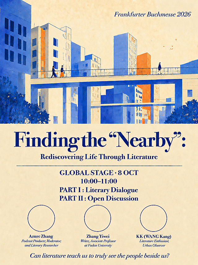
将横线下方的文字内容全部替换为以下内容,全部居中对齐,其他所有内容保持不变: 第一行:GLOBAL STAGE · 8 OCT 第二行:10:00–11:00 第三行:PART I · Podcast Dialogue 第四行:PART II · Open Discussion 保持深蓝色字体风格,整体居中排列,其他图案、颜色、布局完全不变。
咖喱牛角包
在保持整体版式、暖黄色背景、扁平剪影风格和所有文案内容不变的基础上,做两处微调:1)两位人物剪影(坐着读书的黑衣白裙女性和站立的白衣黑裙女性)之间稍微拉开一点距离,不要贴在一起,保持自然对话的间距感;2)右侧GUESTS嘉宾区域整体缩小一点,嘉宾头像框和文字都适当缩小,让右侧嘉宾区更紧凑,给左侧主视觉留出更多空间。其余所有元素、文案、配色、风格完全保持不变。画面中所有数字必须精确渲染,不得错位、遗漏或编造。
咖喱牛角包
Berlin International Literature Festival and Berlinale style vertical poster, 9:16 ratio, cold detached Frankfurt/Berlin aesthetic, high contrast bold color scheme. Deep charcoal gray background with a single striking accent color (electric yellow or vivid red) for maximum visual impact. Minimalist, brutalist, typography-driven design reminiscent of German cultural festival posters. All text uses vintage typewriter font (monospace, retro typewriter style), creating a literary and nostalgic feel. Layout structure from top to bottom: TOP SECTION (upper third): - Main title in large typewriter font: "Finding the Nearby" - Below it subtitle in smaller typewriter text: "Rediscovering Life Through Literature" - Small uppercase text: "FRANKFURTER BUCHMESSE 2026" MIDDLE SECTION (center): - Event details block in typewriter font: "October 8, Frankfurt Book Fair" "GLOBAL STAGE (Foyer 5.1/6.1)" - Agenda timeline with two items: "10:00-10:30 Literary Dialogue" "10:30-11:00 Open Discussion" GUEST SECTION (lower middle): - Three guest portrait placeholder frames arranged horizontally, each with a blank/gray silhouette placeholder for headshot - Below each placeholder, typewriter text names and titles: "Azure Zhang, Podcast Producer, Moderator, and Literary Researcher" "Zhang Yiwei, Writer, Associate Professor at Fudan University" "KK Wang, Literature Enthusiast, Urban Observer" BOTTOM SECTION: - Tagline in centered typewriter text: "Seeing the world begins with seeing what's next to you." - Bottom right: "Frankfurter Buchmesse 2026" Visual style: cold, detached, intellectual, Berlin-style brutalist minimalism. High contrast between dark background and bright accent color. Grainy texture overlay for vintage print feel. Strong geometric composition. No decorative elements beyond typography and simple lines. The overall mood is serious, literary, and distinctly German in its restraint and precision. 画面中所有嘉宾头像区域使用灰色剪影占位符呈现,标注"PHOTO"字样,严禁生成任何真实人脸图像。 画面中所有信息区域、嘉宾介绍区、议程区等必须填充完整合理的内容,不得出现空白框、空白占位、横线待填写区域、空列表项、空单元格。 画面中所有数字必须精确渲染,不得错位、遗漏或编造。
咖喱牛角包
基于参考图进行版式复刻,将海报比例调整为3:4竖版,其余元素和风格基本保持不变,仅按新比例重新排布各元素大小和位置。复古手账拼贴风格,旧牛皮纸书页背景,便签纸、胶带、回形针、贴纸、印章等手绘拼贴元素,怀旧温暖氛围。画面中必须完整呈现以下文字信息: 主标题:"带上你的「人生道具」" 副标题:"PPT相亲大会" 编号①②③④⑤的五个板块内容完整保留 "你有没有一件东西,跟了你很久,别人总问"这什么来头?"一本翻到脱页的旧书,一张再也没去成的演出票根,一个洗到发白但还在床头的玩偶。它不值什么钱,但每次看到它,你都能想起某段日子。" "这场PPT相亲大会,不讲条件,不念资料卡。就讲你带来的那件东西——它从哪里来 / 为什么一直没丢 / 它陪你走过哪段路 / 它让你变成了什么样的人。5分钟,不设限,随便讲。" "你选的物品,就是你的世界。" "有些事资料卡装不下,但一件旧物可以。" "9月27日(周日)15:00" "咩趣星球门店" "好奇心收集者" "每一件旧物都是时光的路标" "旧物不会说谎" "期待与你相遇" 右下角二维码区域使用纯色方块占位符呈现,方块中央标注"二维码占位"文字,严禁生成任何可识别的二维码图案。 画面中所有数字必须精确渲染,不得错位、遗漏或编造。 画面中所有信息区域必须填充完整合理的内容,不得出现空白框、空白占位、横线待填写区域。 版式精美,元素比例协调适配3:4画幅,四周留足安全边距。
1q0k5cf79k-HB
读书会主题大字报海报,竖版9:16,暖黄橙色调,呼应《也许你该找个人聊聊》封面风格。画面中央超大号主标题"也许你该找个人聊聊",下方醒目副标题"为什么最会帮助别人的人也需要被帮助"。左上角标注"02"编号。背景为温暖的暖黄色渐变,有柔和的对话气泡或心形图案装饰,营造温暖治愈的氛围。文字为深棕色和白色,大字醒目,亲切温暖。不放地址、时间、报名方式、二维码。画面中所有信息区域必须填充完整合理的内容,不得出现空白框、空白占位、横线待填写区域。
1pzxoxkpd71m57ihk-HB
重新设计这张法兰克福书展文学活动海报,打造国际范柏林文学节质感,高端吸睛。具体修改要求:1. 排版优化:打破左右分栏布局,采用更有设计感的上下叠加或错落排版,主标题视觉冲击力更强,文字与插画元素穿插融合,层次丰富;2. 树木颜色:所有树木改为深邃的藏蓝色/普鲁士蓝,不要灰白色,颜色浓郁饱和;3. 整体风格:模仿柏林文学节海报的高级质感,简约大气有艺术感,米黄色底色更有肌理质感,蓝色调更沉稳高级,橙色点缀更精致,水彩插画更具艺术笔触,整体呈现国际文学节的专业审美;4. 保留所有原有文字内容和三位嘉宾的圆形头像占位框,保留城市建筑和天桥人物的核心插画元素,16:9横版尺寸
咖喱牛角包
文艺简约风格作家余华宣传海报,主背景为余华定照片做半透明虚化处理,文字清晰排版展示生平经历、文学成就、人格魅力和代表作品。画面主标题为"作家余华",副标题为"在现实中书写人间",装饰文案为"平民书写者 活着的真相",卖点信息为"文坛巨匠、代表作丰富、坚韧文风"。整体风格文艺简约,凸显文学气质,排版精美,文字清晰可读,信息分区合理,留白适当。
1r52yfhp88xt7hhQ-HB
梦幻现实主义风格,9:16竖版海报,全景俯视构图。一位穿白色长裙的女孩安静地躺在一本悬浮在宇宙中的巨大翻开的书本上,仿佛漂浮在宇宙中,书本散发出金色的粒子光芒,无数发光的金色粒子从书页间升腾飘散,环绕在女孩周围。背景是深邃的暗夜蓝(#1E2638)星空,点缀着微弱的星云紫(#4B3B60)雾气和闪烁的星辰,整体氛围静谧、空灵、宏大,充满高级的孤独感与浪漫感。画面左上角空出宇宙区域,放置竖排主标题文字;底部书页的右下角平整处预留合作方信息位置。主标题文字:"你是书页间的星辰",使用造字工房朗宋字体,精致现代风格,镭射银白(#F0F4F8)色,竖排排列在画面左上角。副标题文字:"自我探索主题读书会 | 阅读,是一场盛大的内向旅行",使用微软雅黑 Light字体,镭射银白色,放置在主标题下方。版式精美,文字清晰可读,四周留有安全边距。画面中所有信息区域必须填充完整合理的内容,不得出现空白框、空白占位。画面中所有二维码区域使用纯色方块占位符呈现,方块中央标注"二维码占位"文字,严禁生成任何可识别的二维码图案。超高清画质,细腻的粒子光效,电影级光影质感。
GD757013281
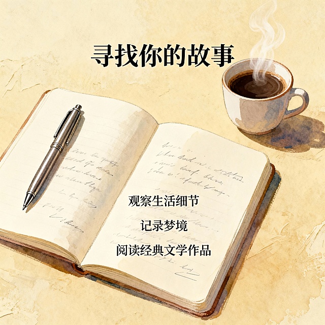
{ "prompt": "设计一张激励写作灵感的图像,包括打开的笔记本、钢笔、咖啡杯等元素。在页面上方写上“寻找你的故事”字样,下方列出几个激发灵感的方法,如“观察生活细节”、“记录梦境”、“阅读经典文学作品”。背景采用柔和色调,营造温馨氛围。特别注意:确保每个文本块周围都有至少宽度/高度5%的空白空间。", "size": "1080*1440" }
1pzydktyd1-HB
简约温暖风读书会招募海报,主标题文字:"第四期·偶遇读书会招募(免费)",副标题:"在阅读里,与相似的灵魂“偶遇”"。左侧放置书籍《阅读是一座随身携带的避难所》实物图,右侧放置招募文案内容,底部放置微信二维码和说明文字,整体色调柔和温馨,适合文艺阅读活动风格,文字清晰排版舒
1qxsgx7qyeYCD2-w-HB
艺术鉴赏主题讲座宣传海报,标题"艺术鉴赏:如何逛一场画展?",主讲人:贵州师范大学美术学院教师周亚军,时间:2026年5月25日(周一)14:00-16:00,地点:弘远楼1楼路演厅(诚己学生社区音乐书屋,A6学生宿舍一楼),人数限制:50人,整体风格简约文艺,搭配艺术绘画元素,排版清晰醒目,适合校园宣传
1q0hdbbthg1dcvh9j-HB
第四屏 公众号推文长图 多线并行的焦虑页面。温暖治愈文艺风,手账质感,奶油米黄底色。画面上半部分是一个杂乱的思维脑图,中心是一个小人,向四周伸出六条分支线,每条线末端一个小图标和标签:抖音小电视、B站电视机、小说书本、作品集文件夹、英语字母、留学飞机。线条交错缠绕,表现思绪混乱。下半部分留白放文字。均匀柔光,明亮干净。主色暖棕色,各分支用不同柔和彩色区分。上方大标题什么都想要 什么都想做好,下方分六小行列出六个想做的事,每行配小图标,底部小字总结想把每一条路都握稳 不想错过任何一种未来。9比16竖版,4K高清,文字清晰。
Jay~~~
重新生成这张艺术展览邀请函海报的画面内容,保留版式骨架与全部文案信息,更换背景画面与视觉氛围,形成全新的艺术感画面。 保留的版式骨架: - 顶部左右角分别为"ART EXHIBITION"和"INVITATION LETTER"小字装饰 - 上部居中为展期时间信息 - 中部为主题中英文短句 - 下部为大主标题与副标题,四角分布"时""光""织""锦"四个大字 - 底部为理念句与定位图标 必须完整呈现的文字信息: - 主标题:"时光织锦" - 副标题:"当代艺术中的记忆与重构" - 英文副标题:"MEMORY AND RECONSTRUCTION IN CONTEMPORARY ART" - 展期:"2025/10/19-24" "10:00-17:00" - 主题句:"在色彩与线条间,打捞岁月的诗意回响" - 英文主题句:"BETWEEN COLORS AND LINES" "FISHING FOR THE POETIC ECHOES OF THE PAST YEARS" - 理念句:"艺术不是孤芳自赏的存在,而是人与人、与时光对话的桥梁" - 装饰英文:"ART EXHIBITION" "INVITATION LETTER" - 四角大字:"时" "光" "织" "锦" 画面要求: - 背景更换为全新的艺术化抽象场景,可使用流动的颜料肌理、水墨晕染、渐变光影或抽象自然元素,营造诗意、沉静、高级的艺术氛围 - 整体配色保持低饱和的高级感,可使用深蓝、墨色、灰蓝、雾白等色系,或带有微妙的暖金点缀 - 版式精美,文字层级清晰,留白充足,符合文化艺术展览的调性 - 写实商业摄影风格,光影柔和有层次,质感细腻 - 画面中所有数字必须精确渲染,不得错位、遗漏或编造 - 画面中所有信息区域必须填充完整合理的内容,不得出现空白框或待填写区域 - 画面中所有二维码区域使用纯色方块占位符呈现,方块中央标注"二维码占位"文字,严禁生成任何可识别的二维码图案
予安22466
在原有邀请函基础上修改文字内容:1. 开始时间START下方改为"13:30",结束时间END下方改为"16:30";2. "与您相约"改为"OH卡沙龙";3. "一场艺术与浪漫的碰撞"改为"寻找心中的麦田";4. "Art and Romance"改为"Soul and Wheat"。保持背景为梵高风格麦田油画,整体版式布局、字体风格和其他文字内容不变。
大海阔天空
9:16竖版高端纪实文学新书发布会主视觉海报,顶级印刷级质感,与图书封面视觉体系统一;基底为与封面一致的哑光米白艺术纸底色,叠加极淡的同款土橘色黄河水纹暗肌理,若隐若现不抢视觉重心;主色调为哑光墨黑、烫古铜金、土橘色,字体选用高端宋体搭配极简无衬线体,排版严谨疏朗,留白充足均衡,兼具文学厚重感与官方发布会仪式感;8K超高清,矢量级文字清晰度,适配线下大屏投放与实体喷绘。版面从上至下严格排布,所有文案完整无遗漏,三张图片位置明确: 顶部主标题区(页面最上端黄金视觉位,居中排布)最大字号烫古铜金加粗宋体主标题:"用生命托举生命 —— 水孩儿纪实文学《黄河好人》作品分享会",字间距适度拉开,沉稳有力量;主标题正下方一根极细烫金短横线;区域上下留白充裕,视觉呼吸感强。 第一道水平分割线:一根贯穿页面左右的极细浅炭灰色直线,利落精致,分隔图书区与上部人物内容区; 上部人物板块(左图右文布局,水平居中对齐,左右边距对称):左侧图片位:微圆角矩形高级纪实人像框,内置主人公高清照https://gdesign-dam-hz.dancf.com/36982563171978352/0c793cad4f8a4e7b82b96bcf2727bbe2.jpg,保持新闻照片的真实感,边缘做极细浅灰描边;图片正下方居中,用墨黑色中等字号宋体标注:"王金清(王三)";右侧文字区(与图片顶部齐平,左对齐,行间距疏朗):下方依次排布常规字重深灰色宋体正文:九曲黄河,生命壮歌 一个渔民和他的水上救援队 30 多年救起 300 多人 用生命托举生命 被誉为 “黄河好人” 第二道水平分割线:第二根贯穿页面左右的极细浅炭灰色直线,分隔上下两个人物叙事板块; 下部人物板块(左文右图布局,水平居中对齐,与上板块形成对称美感):左侧文字区(与图片顶部齐平,左对齐,行间距疏朗):下方依次排布常规字重深灰色宋体正文:历经四年跟踪采访 再现勇者大爱无疆 长篇纪实文学《黄河好人》—— 入选中国作协 2026 年中国文学海外读者俱乐部国际传播项目 右侧图片位:微圆角矩形高级纪实人像框,内置高清照https://gdesign-dam-hz.dancf.com/36982568713955449/52e7a9ac6da9479f9cd950c082ae7c58.png,保持新闻照片的真实感,边缘做极细浅灰描边;光影调性与上一张人像完全统一,柔和自然光感;图片正下方居中,用墨黑色中等字号宋体标注:"水孩儿" 底部文字:"《黄河好人》作者和主人公联袂登台 共同讲述惊涛骇浪中生命的沉沦与托举"(页面底部,居中规整排布,仪式感强) 最底部会务信息区(页面最底端,居中规整排布) 第三道极细浅炭灰色水平分割线,分隔内容区 图书展示区(正下方,页面中上区域,水平垂直居中):居中放置https://gdesign-dam-hz.dancf.com/36982633102168111/5c90d59ffab1497ea44a68cf09539bb9.png 3D立体书模,带柔和自然的左侧投影,哑光纸质质感,精致高级;书模尺寸小一些,不抢夺主标题关注度;书模四周保留均匀留白,视觉舒展大气 第四道极细浅炭灰色水平分割线,分隔内容区与会务信息 分割线下方用规整深灰色无衬线字体,分五行居中对齐,字距均匀: 主持人:薛晓先 分享嘉宾:水孩儿、王金清(王三) 主办:中国通俗文艺研究会内蒙古文艺创研中心 时间:6 月 27 日(周六)15:00 地点:内蒙古文学馆 最底部预留白,版式稳重平衡。 禁用:水印,文字错漏、乱码、变形,图书封面图案错乱、书脊文字模糊,人物面部畸变模糊,高饱和艳色,花哨装饰元素,卡通二次元风格,油画厚涂质感,噪点颗粒过重,边框粗笨,排版拥挤杂乱,信息缺失,廉价塑料感,土味配色,多余图案装饰,背景杂乱,书本投影生硬失真。
GD1853321576